Our new case study is full of playful vibes aimed at growing people’s knowledge. Welcome to check the creative process for Roebuck, the educational mobile app teaching and reinforcing survival knowledge in users interested in bushcraft and survivalist in an engaging and friendly way. Review the massive bunch of bright and cheerful illustrations, a funny mascot, and a user interface the tubik team made for the application.
Client and Project
Roebuck is an educational app that helps users memorize key survival skills. With it, users can complete courses on everything from the core bushcraft techniques of fire starting and shelter construction to helping to deliver a baby outside a hospital setting. It’s really up to a user how advanced they want their knowledge to become, but the world is becoming a dangerous place, and knowledge of survival best practices can’t hurt your situation.
The client approached tubik intending to create a functional, attractive, and joyful user interface design for the application, and then the scope of work was also extended to creating a diverse and consistent pack of illustrations and icons for the educational goals the application covers.
The creative team from the tubik side included Anton Morozov, Olya Bazyaeva, Marina Solomennykova, Kirill Erokhin, and Anastasia Ostapenko.
Design Process and Solutions
Let’s start with observing the wide variety of graphic materials created for the Roebuck app.
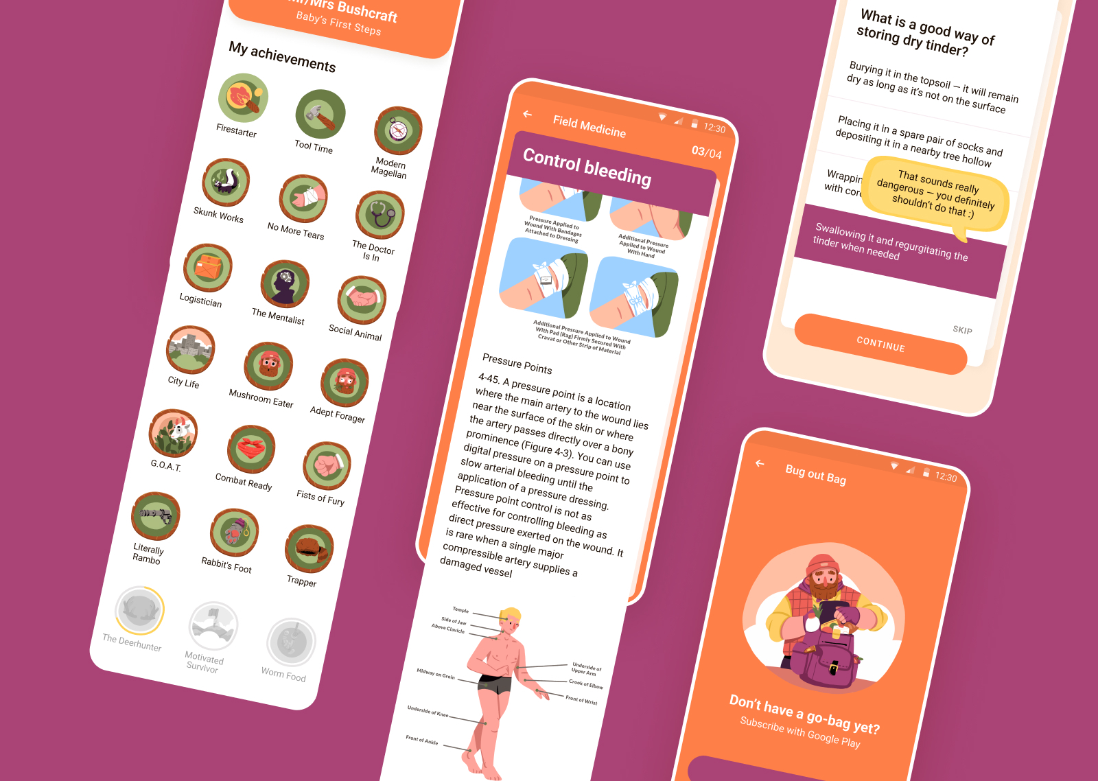
Here’s a look at the vast consistent set of small icon-like illustrations for the application, visualizing a wide diversity of tools, objects, situations, and associations for the theme of survival skills to mark players’ achievements and illustrate things.
![]()
![]()
![]()
![]()
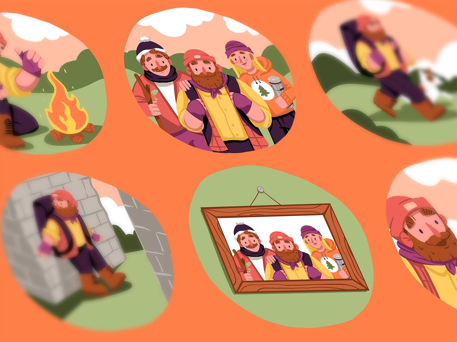
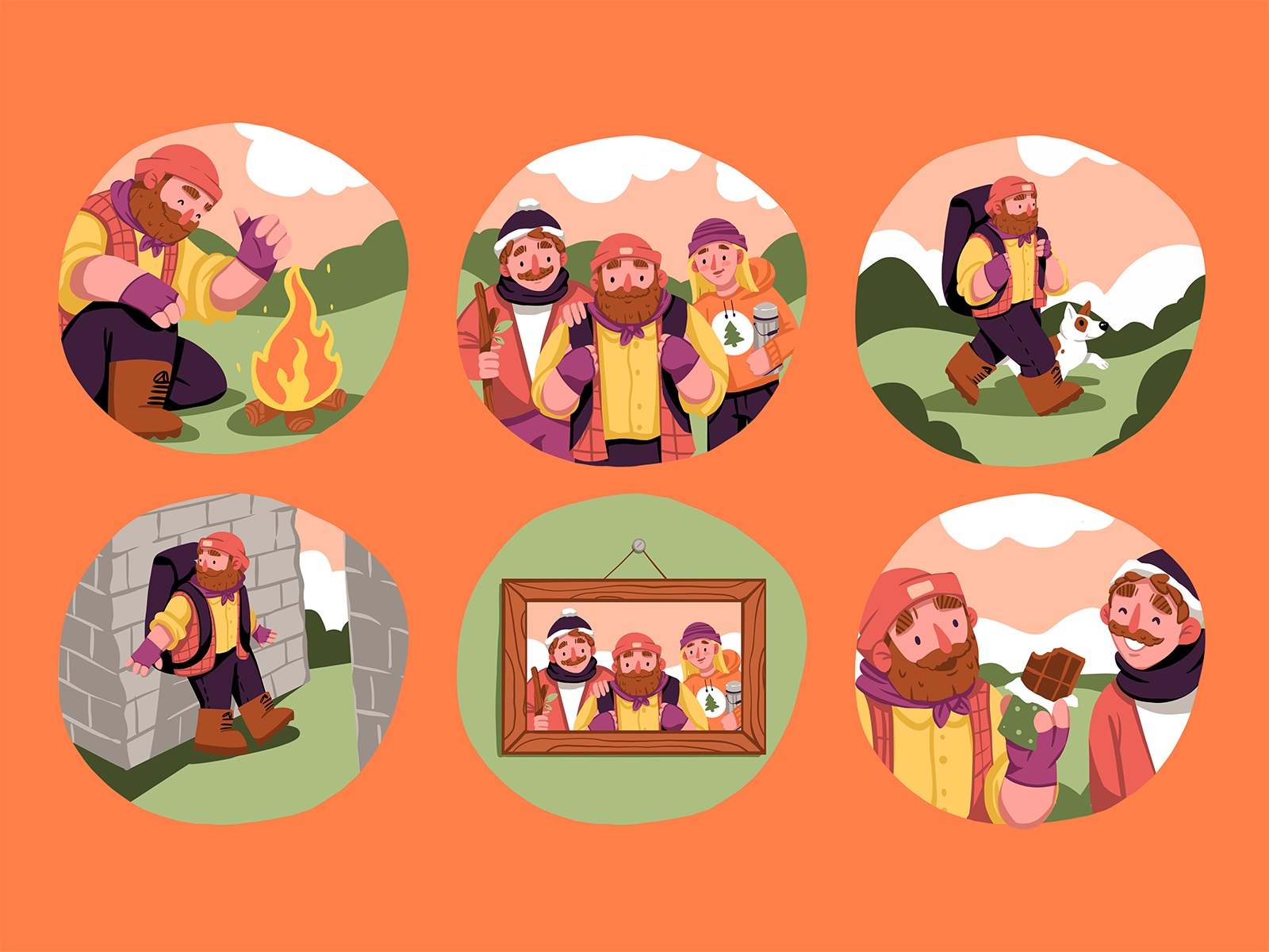
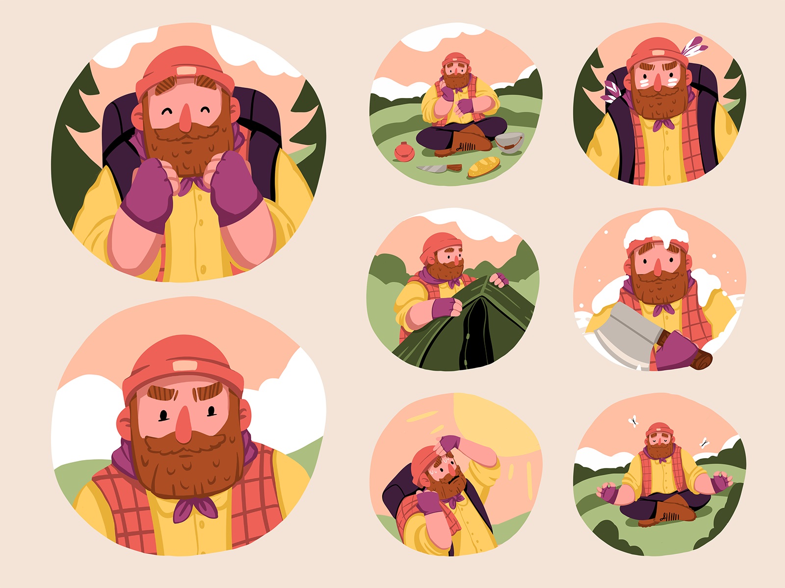
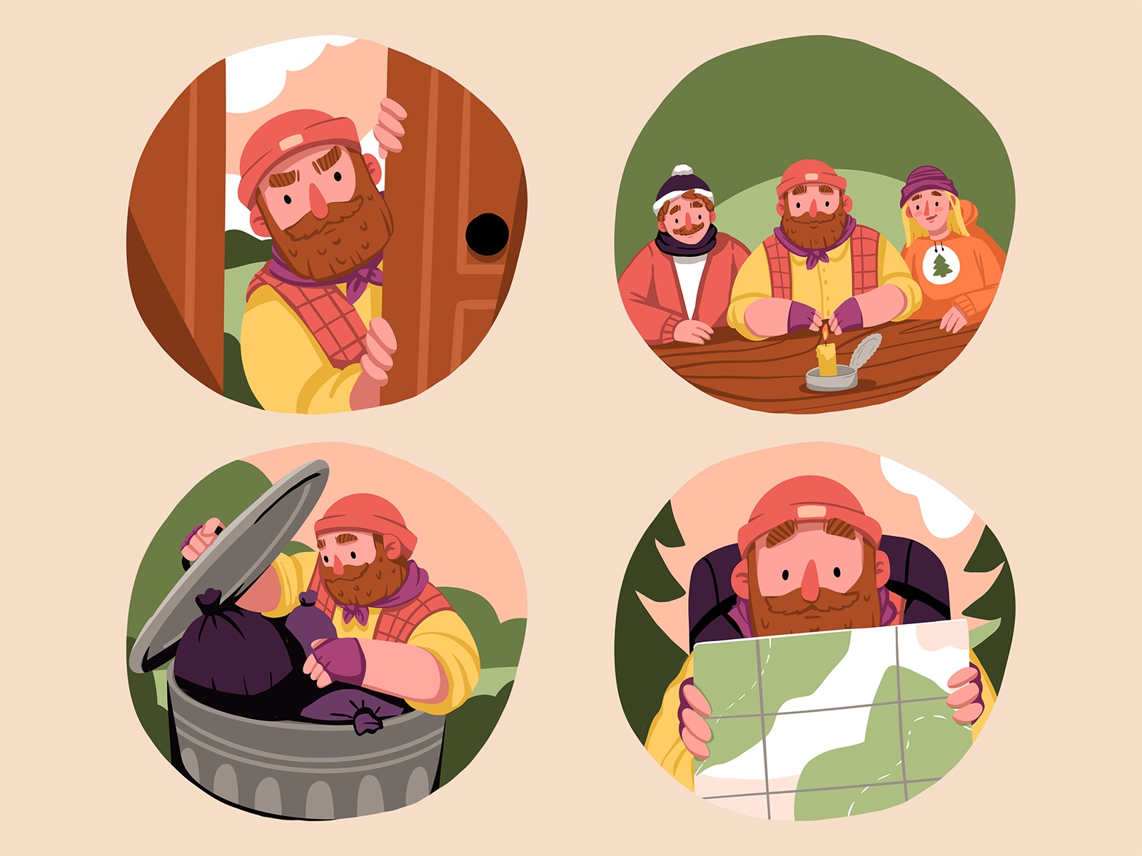
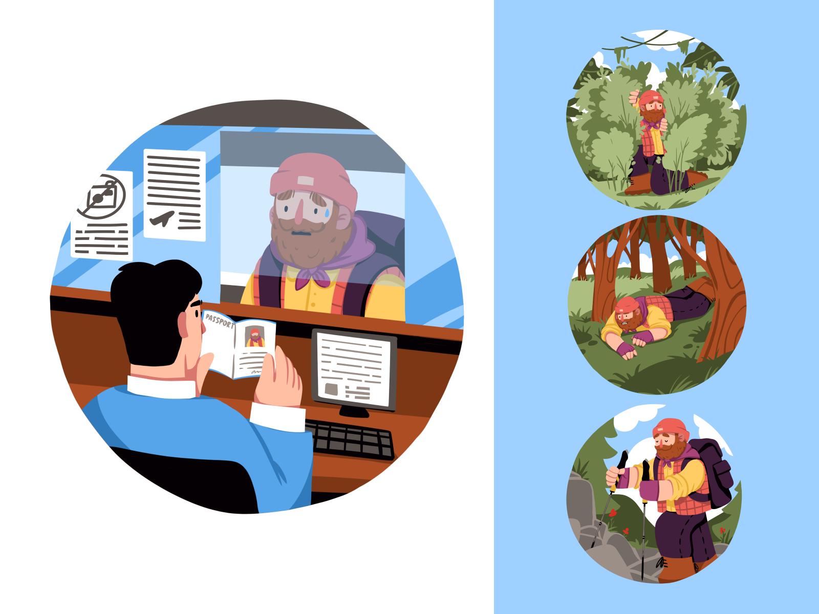
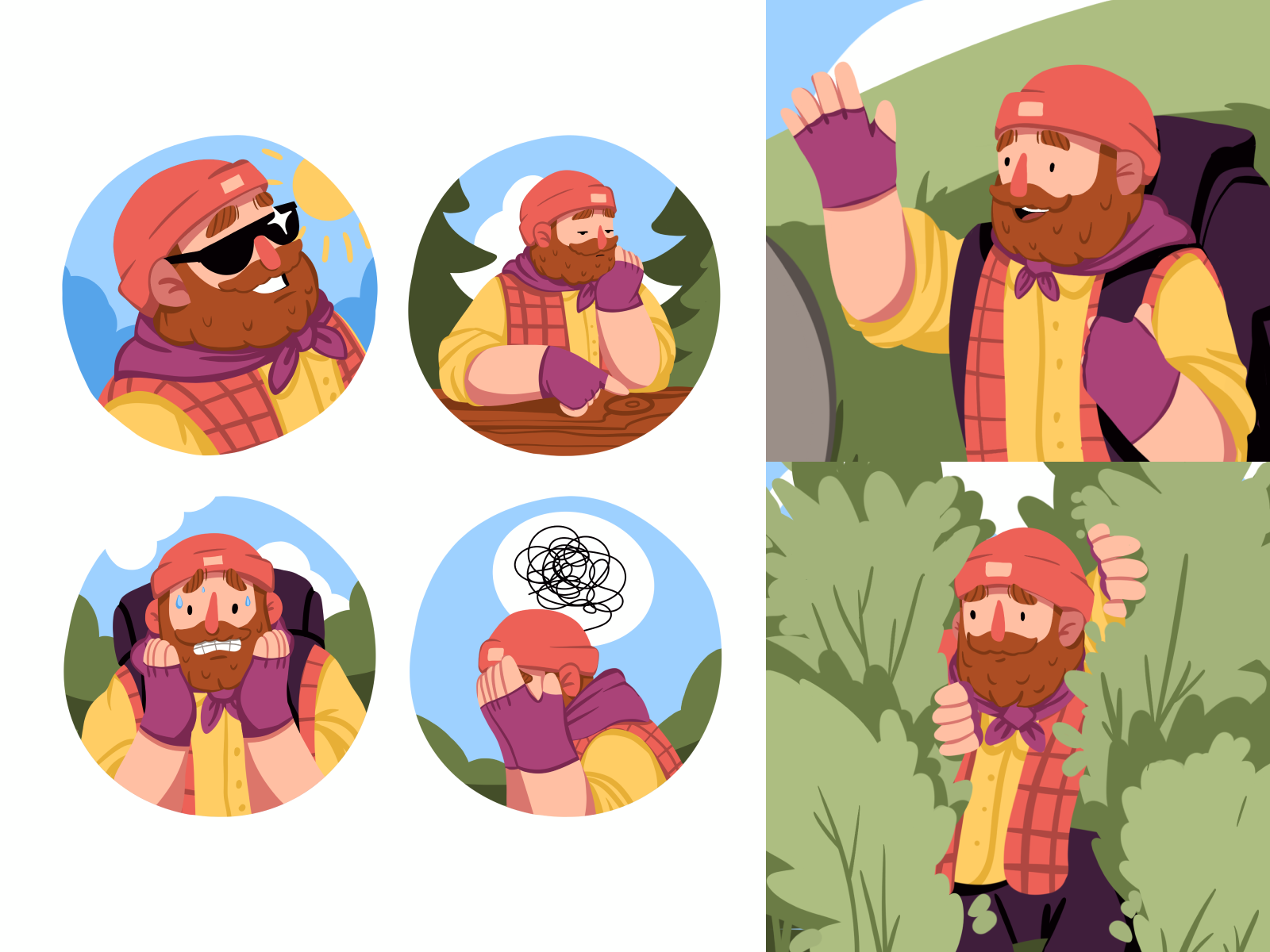
Another direction was to develop a collection of illustrations featuring people and united with the cross-cutting character of a friendly and experienced survivor. This character accompanies the users across all the educational modules and grows with them in the process of knowledge consolidation as well as supports app communication with the users.
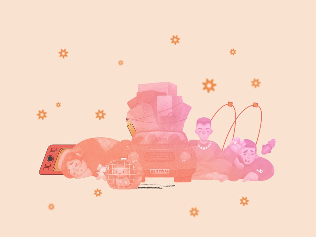
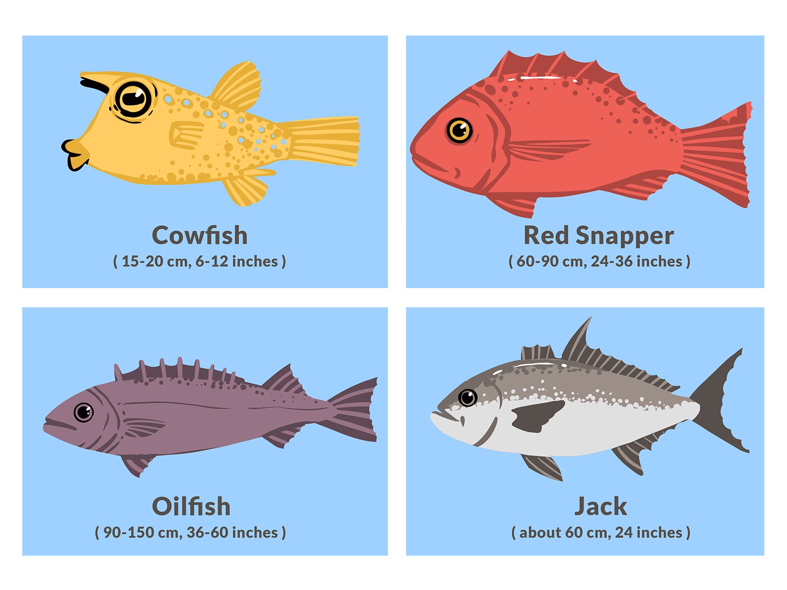
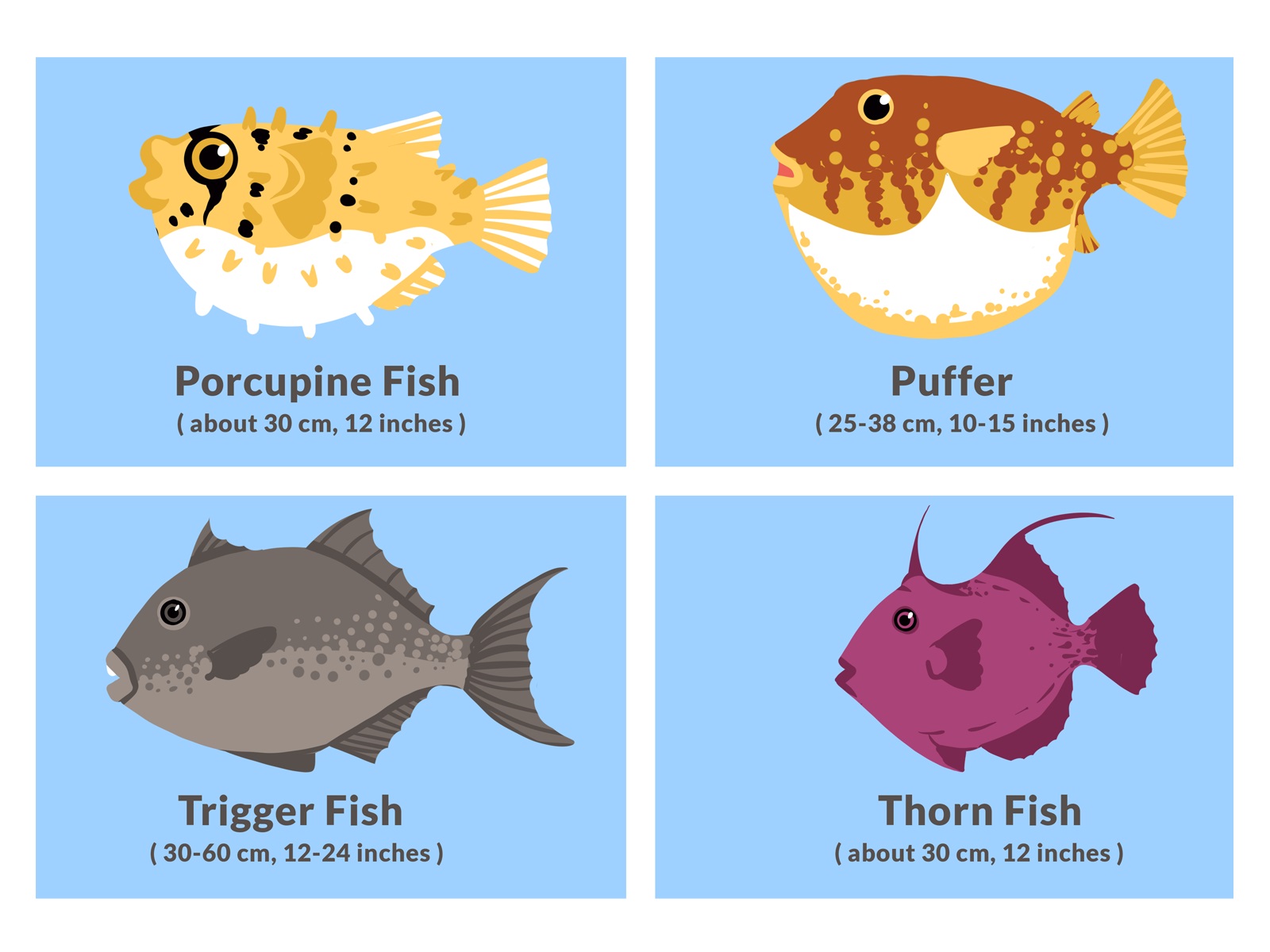
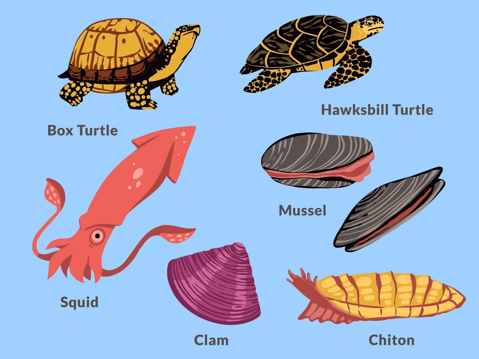
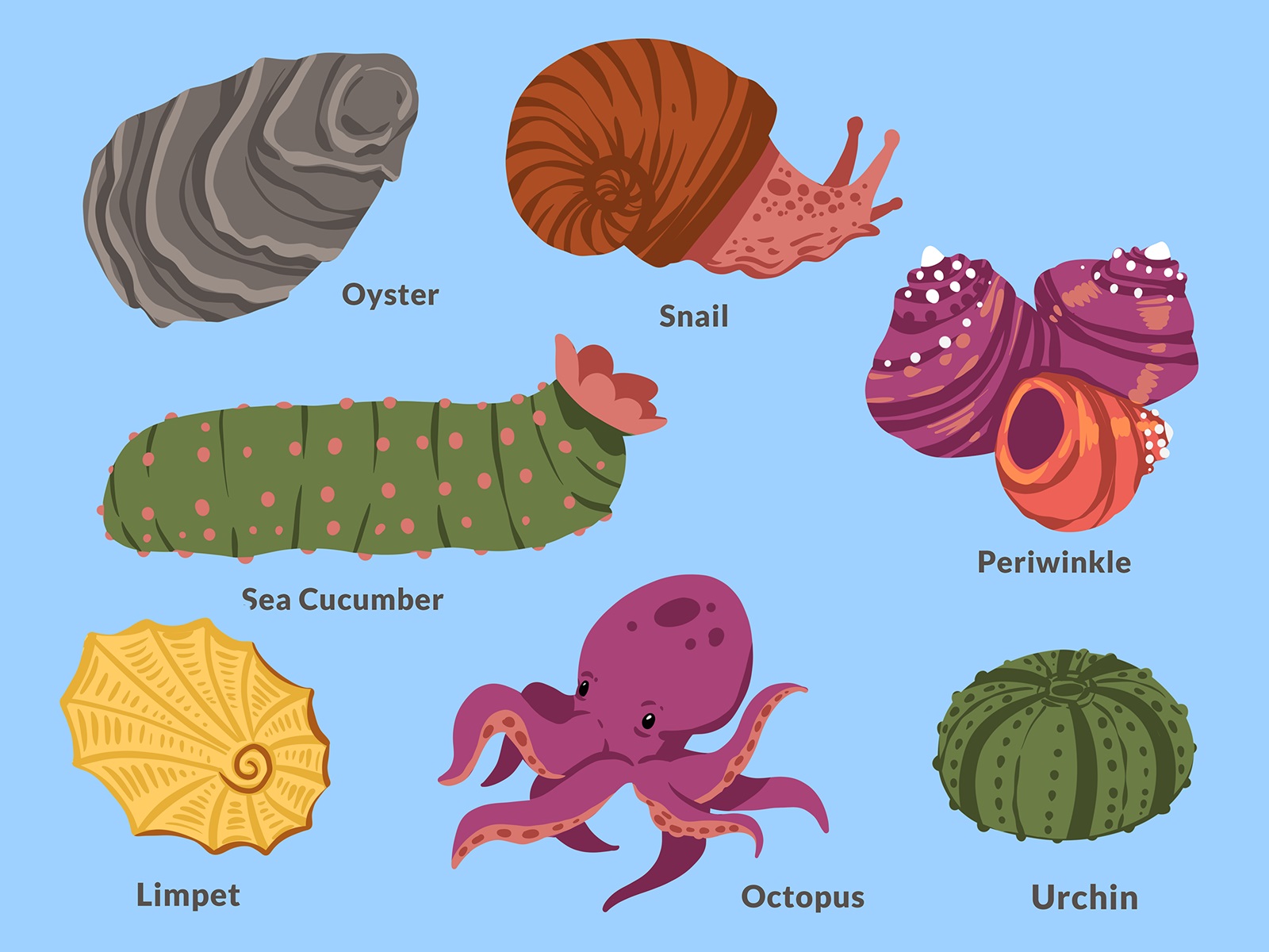
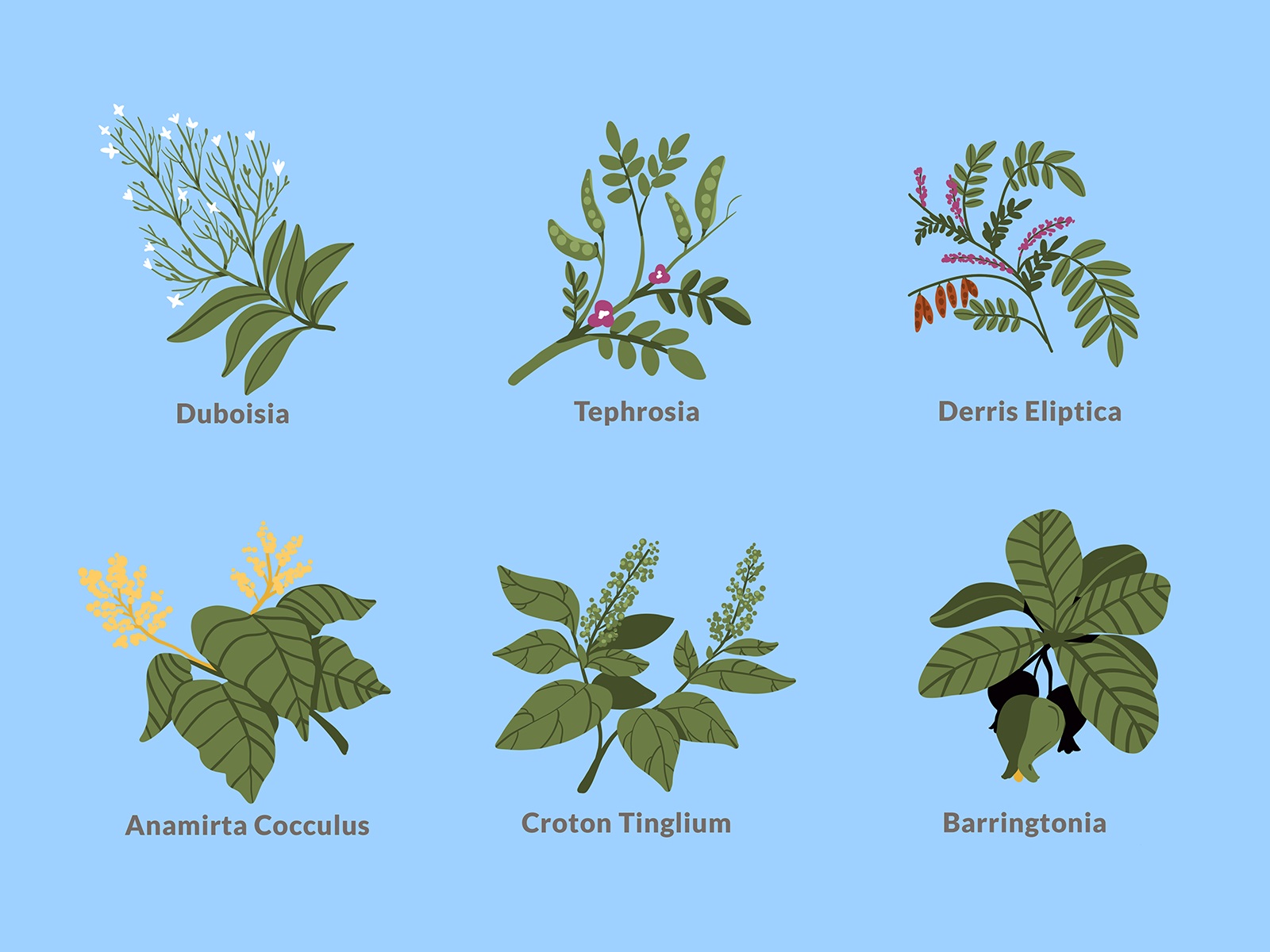
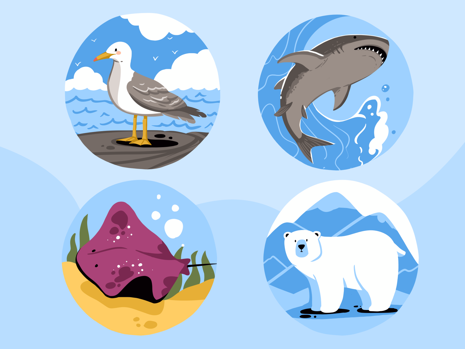
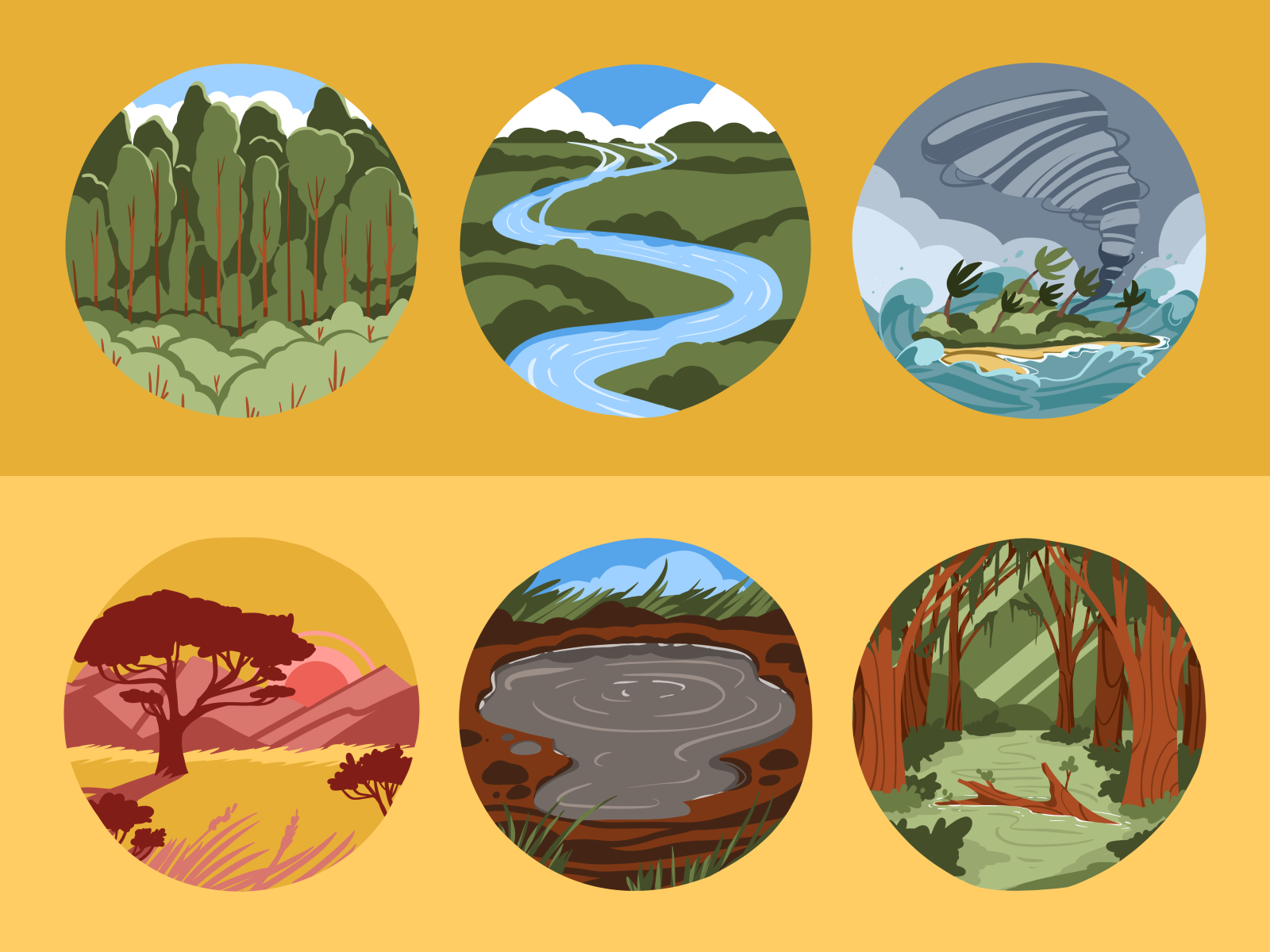
Also, we worked on a vast collection of images illustrating various objects of the natural environment, such as animals, fish, plants, etc. Here’s a glance at some of them, bright, neat, clear, but not over-detailed, already packed in a design system with typographic solutions for descriptions and other textual content.
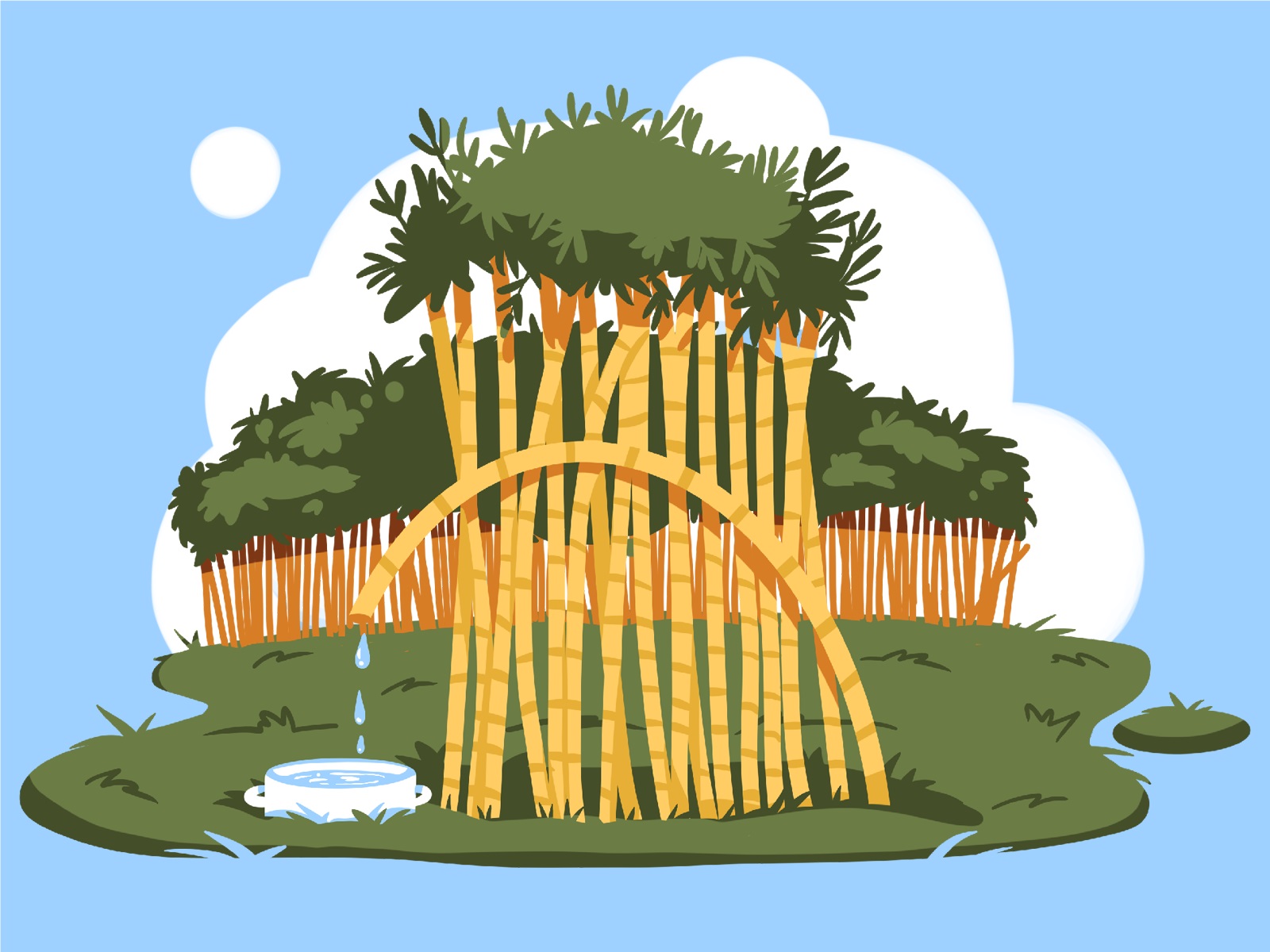
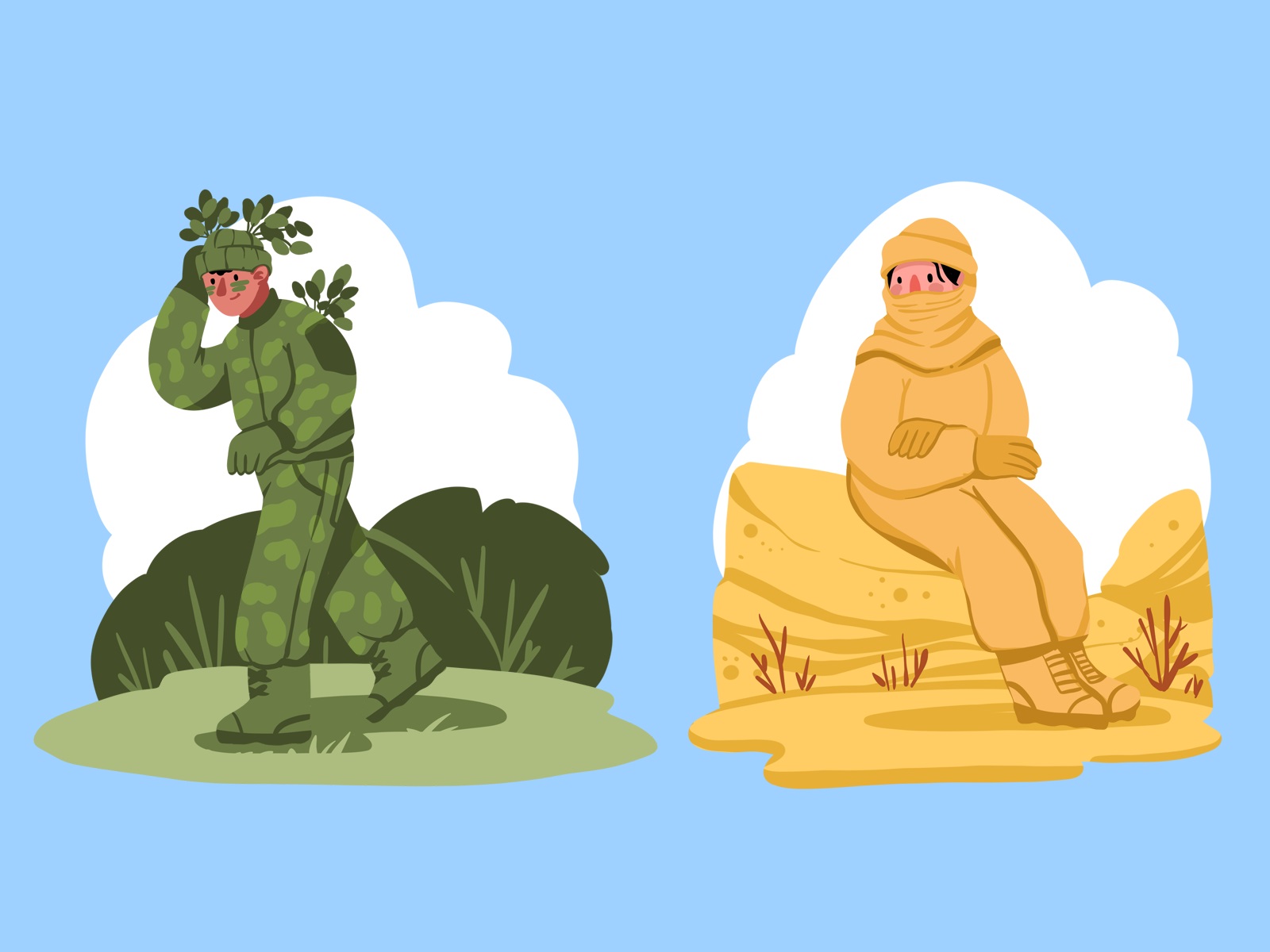
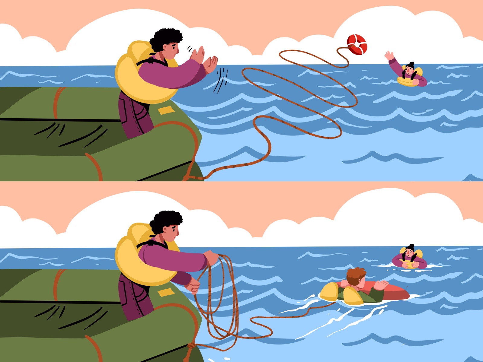
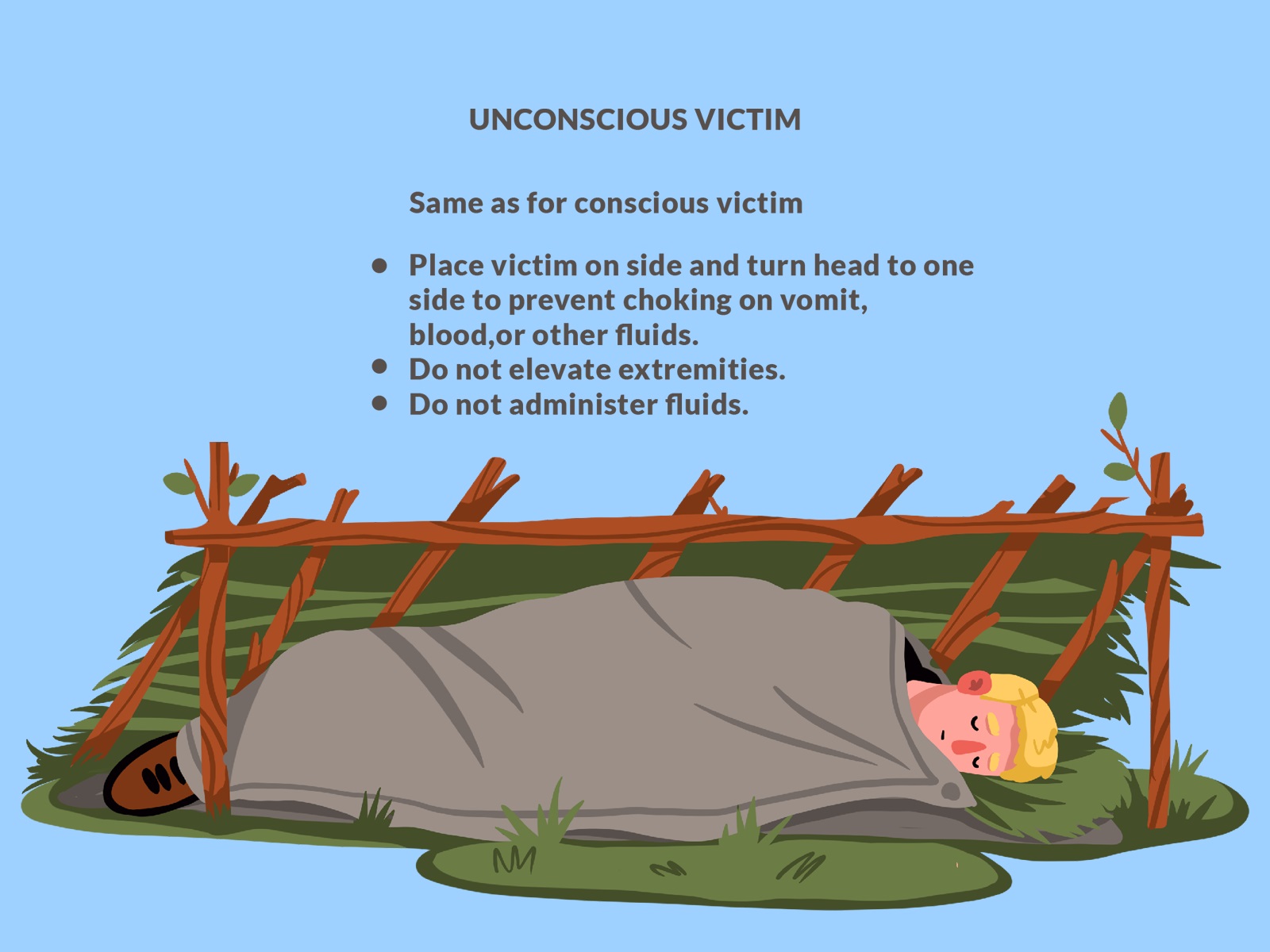
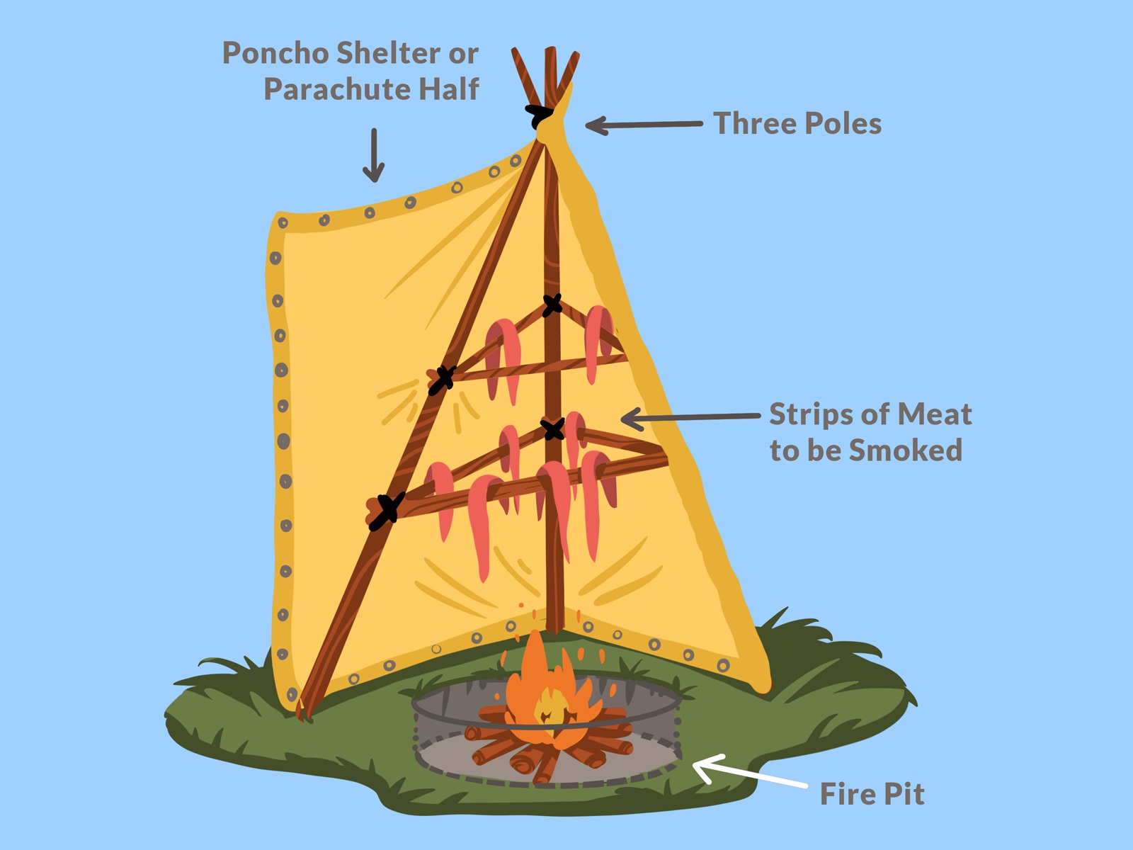
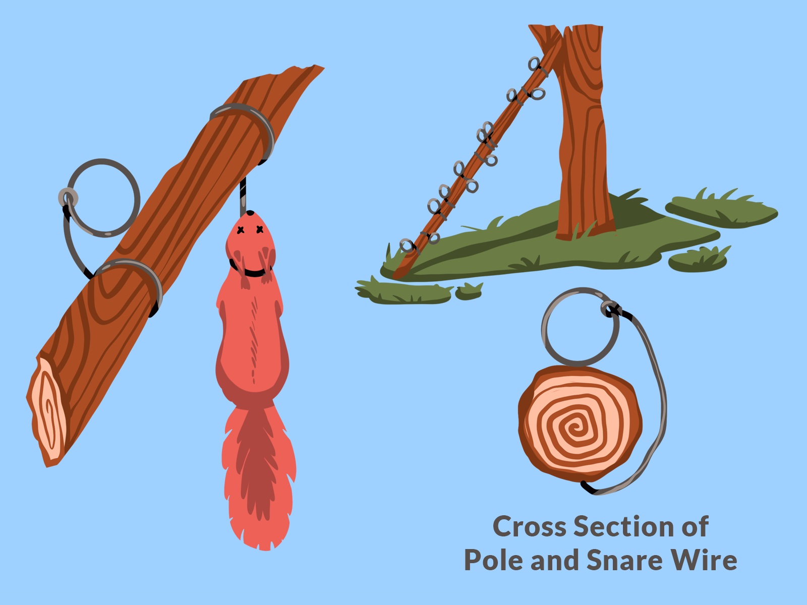
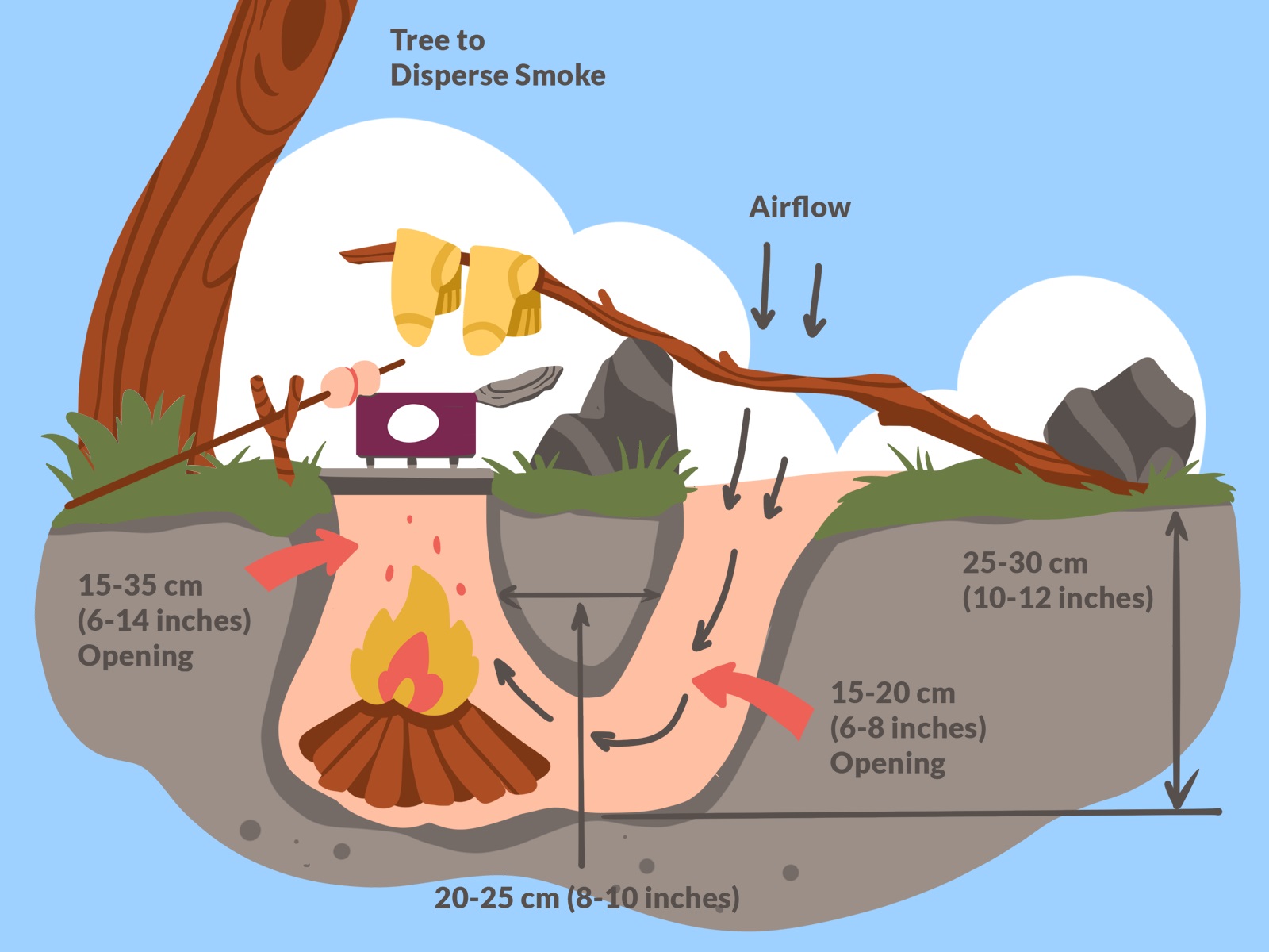
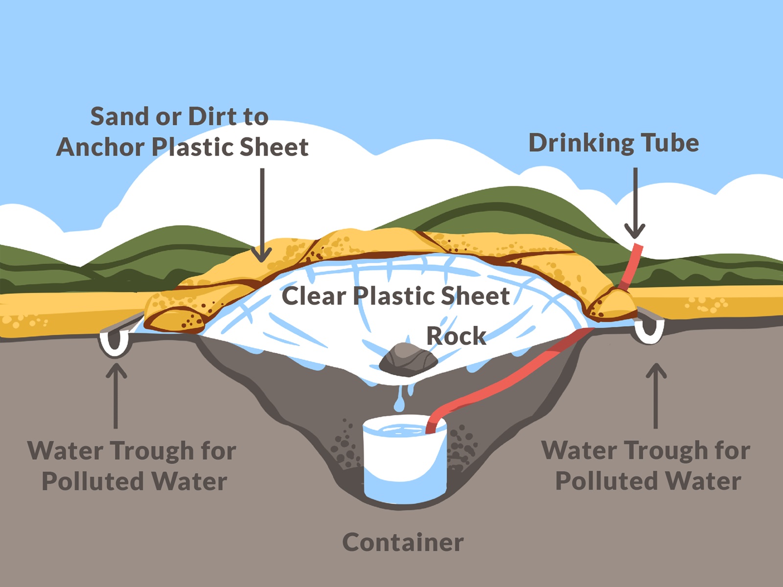
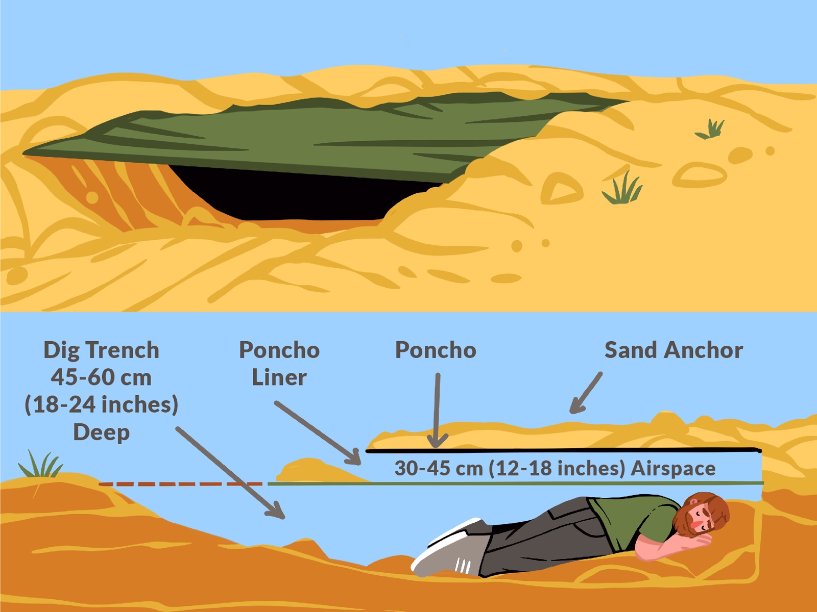
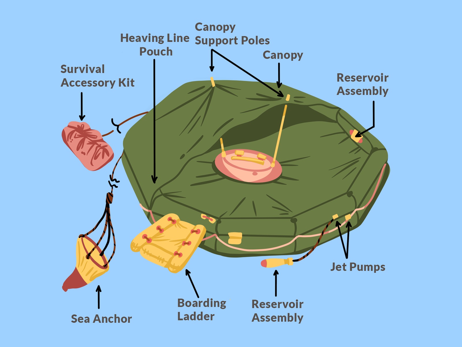
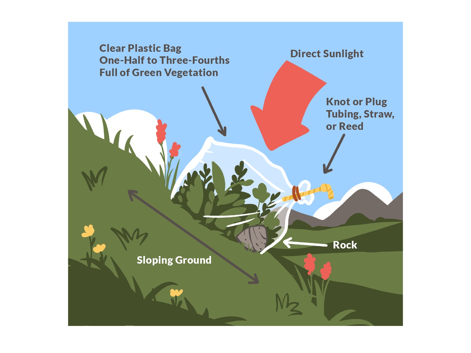
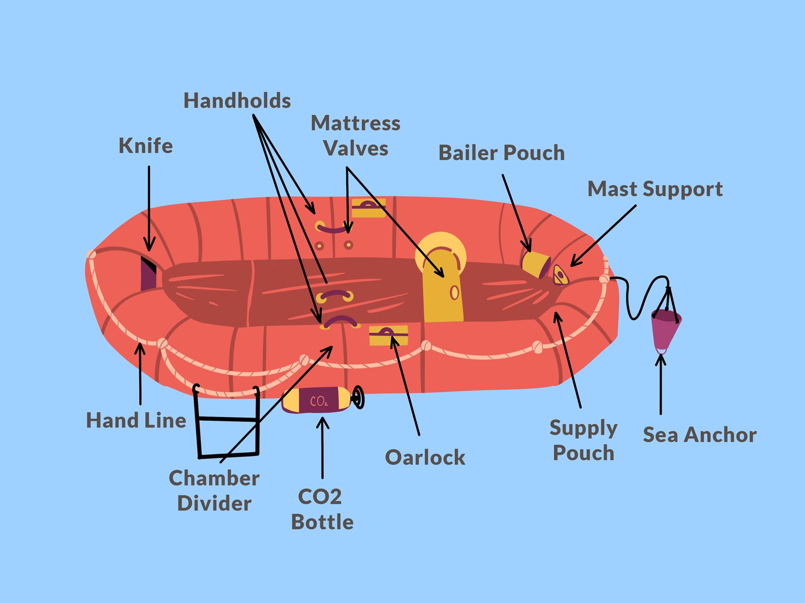
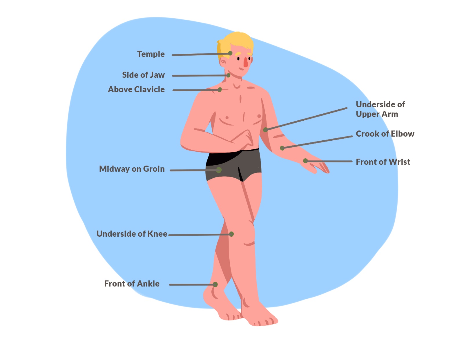
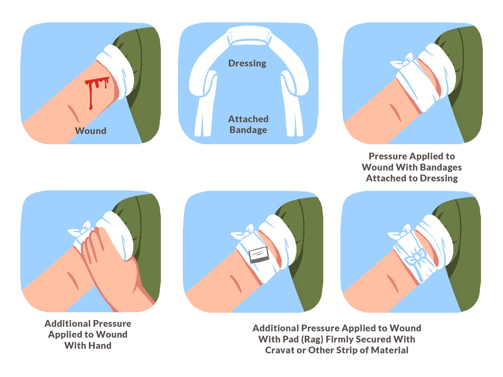
Also, there was a vast and diverse pack of images illustrating situations that may arise in different environments and require specific knowledge or skills to survive. They supported the knowledge modules and enhanced understanding of the presented information.
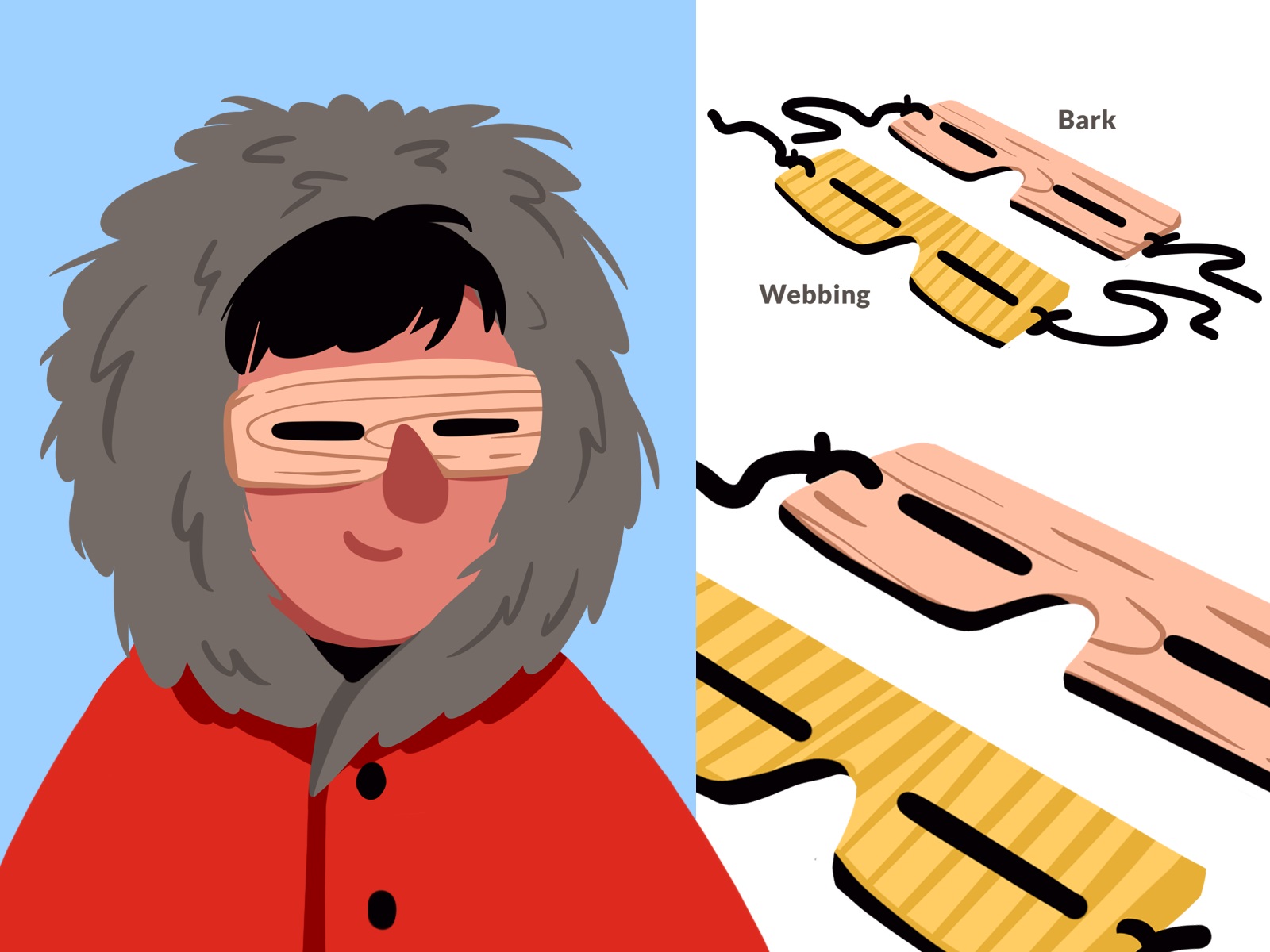
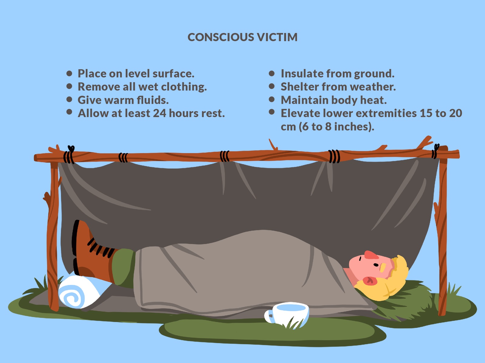
The illustrative material, in most cases, needed text hints, explanations, and directions integrated into images. So, the united design system and typographic approach were developed to keep the diversity of screens and images consistent. So, the app users can enjoy many tutorials and schemes packed in one recognizable visual style.
The user interface for the mobile application performs in a bright, playful style with straightforward and intuitive navigation. The color palette is based on warm, earthy, and natural colors, with a lot of sunny orange to set the positive and energetic mood.
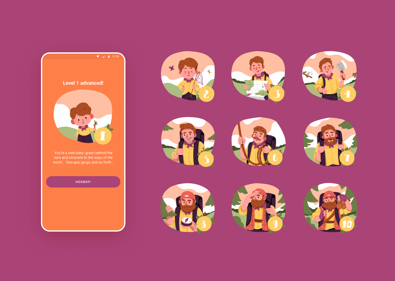
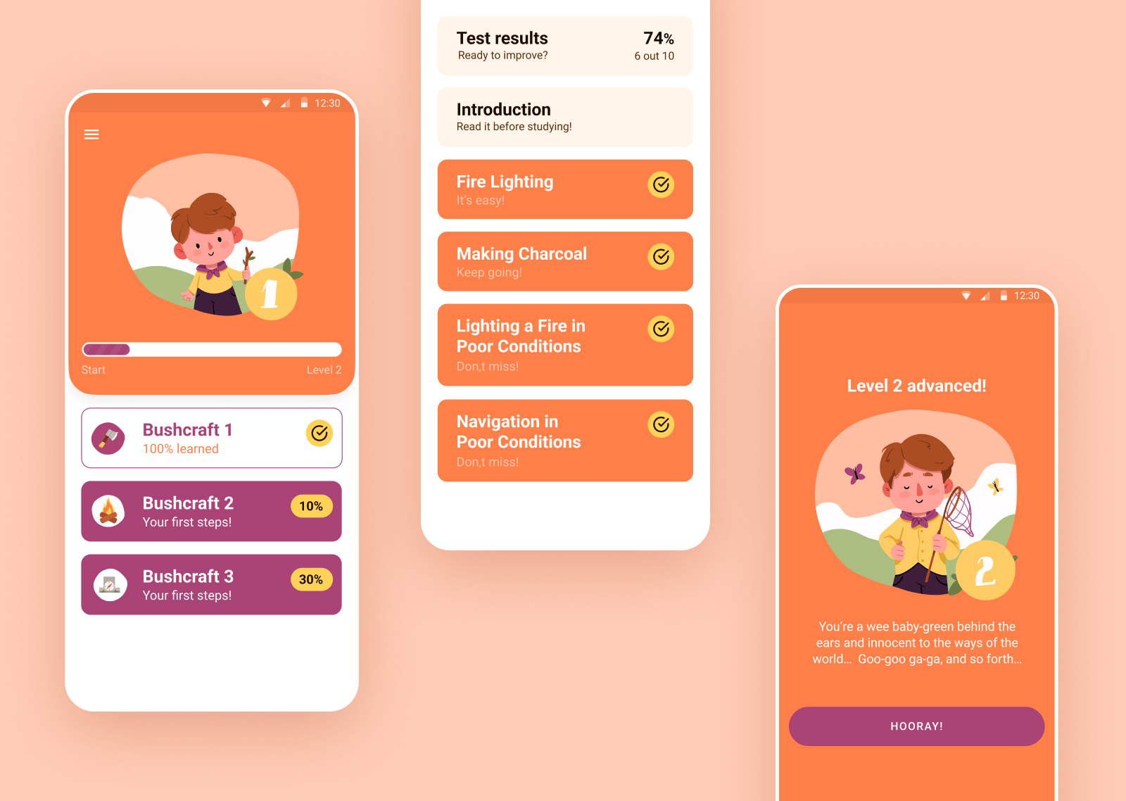
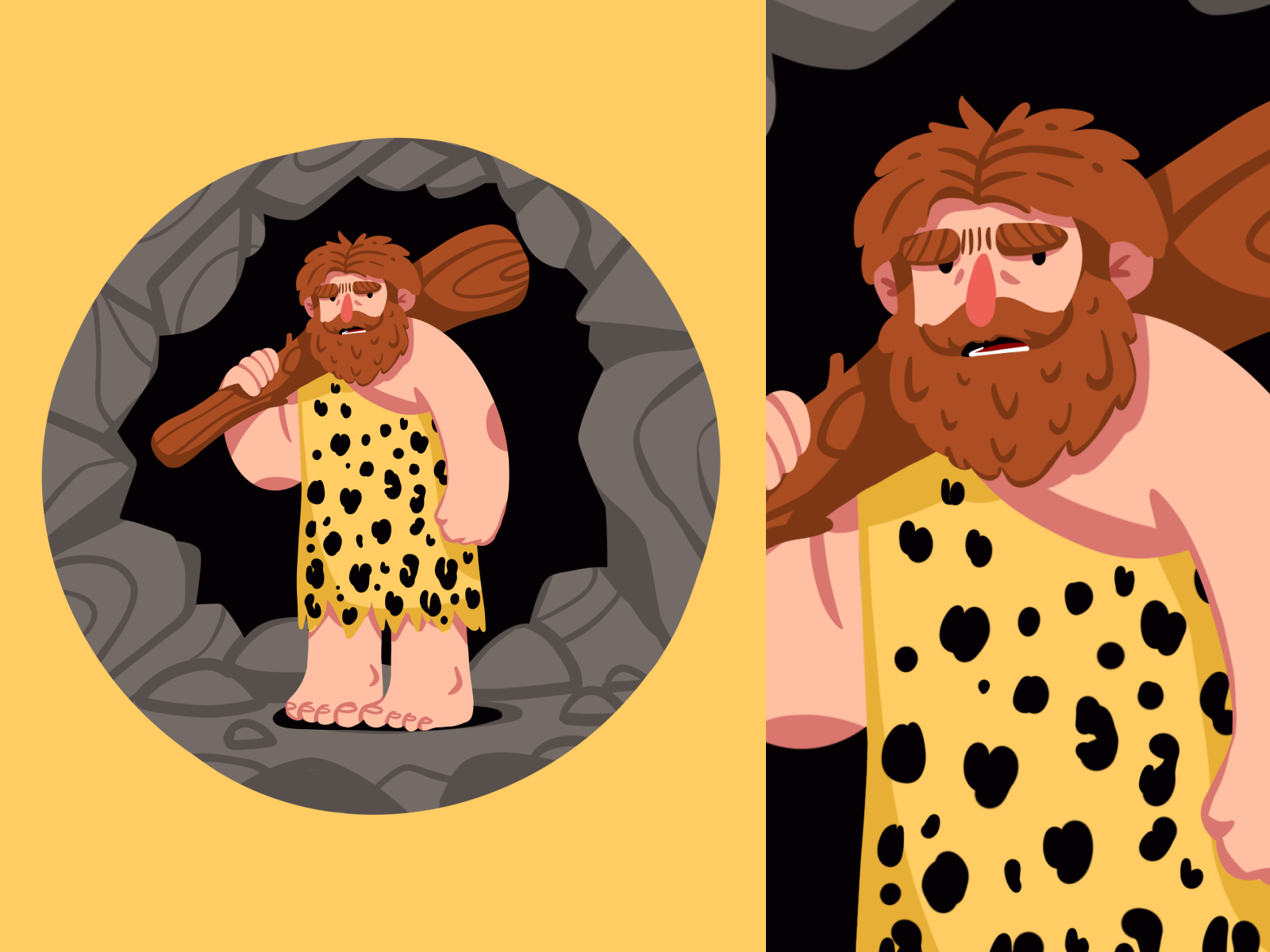
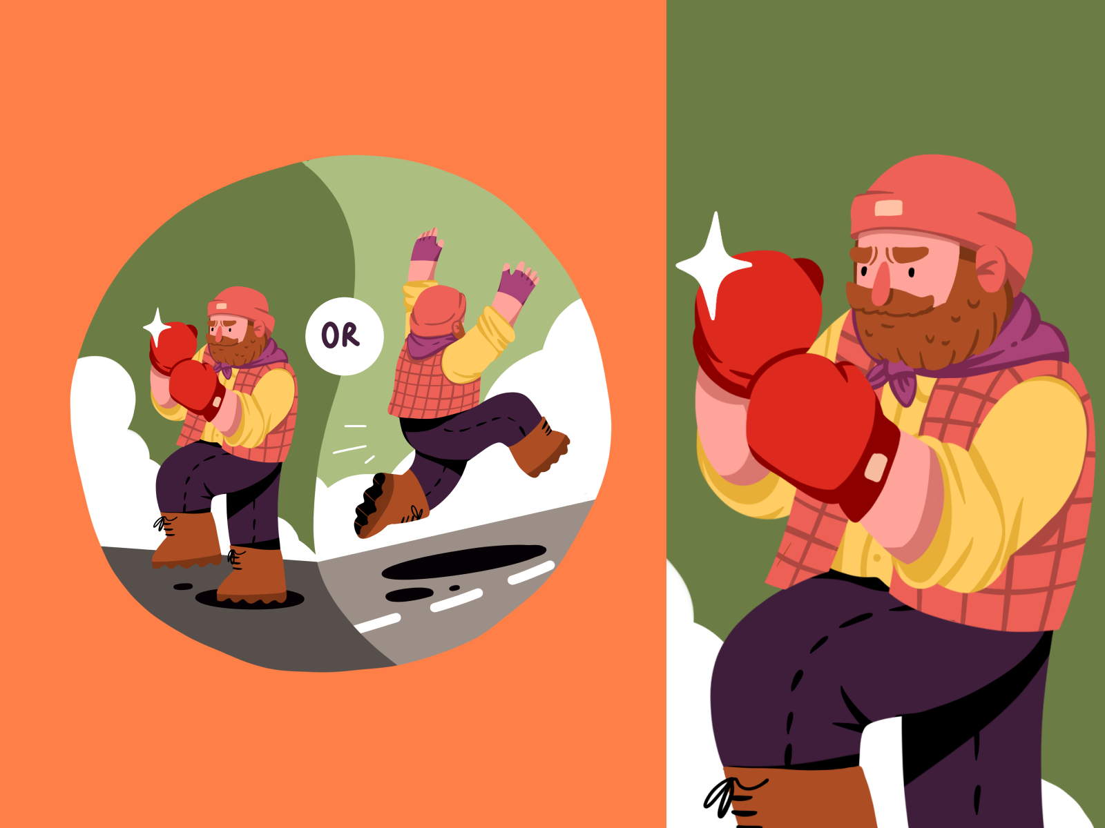
Here’s a look at how the mascot is used across the application to support gamification mechanics: it starts from a cute baby and grows into an experienced and well-prepared survivor together with the users taking lessons and expanding their knowledge.
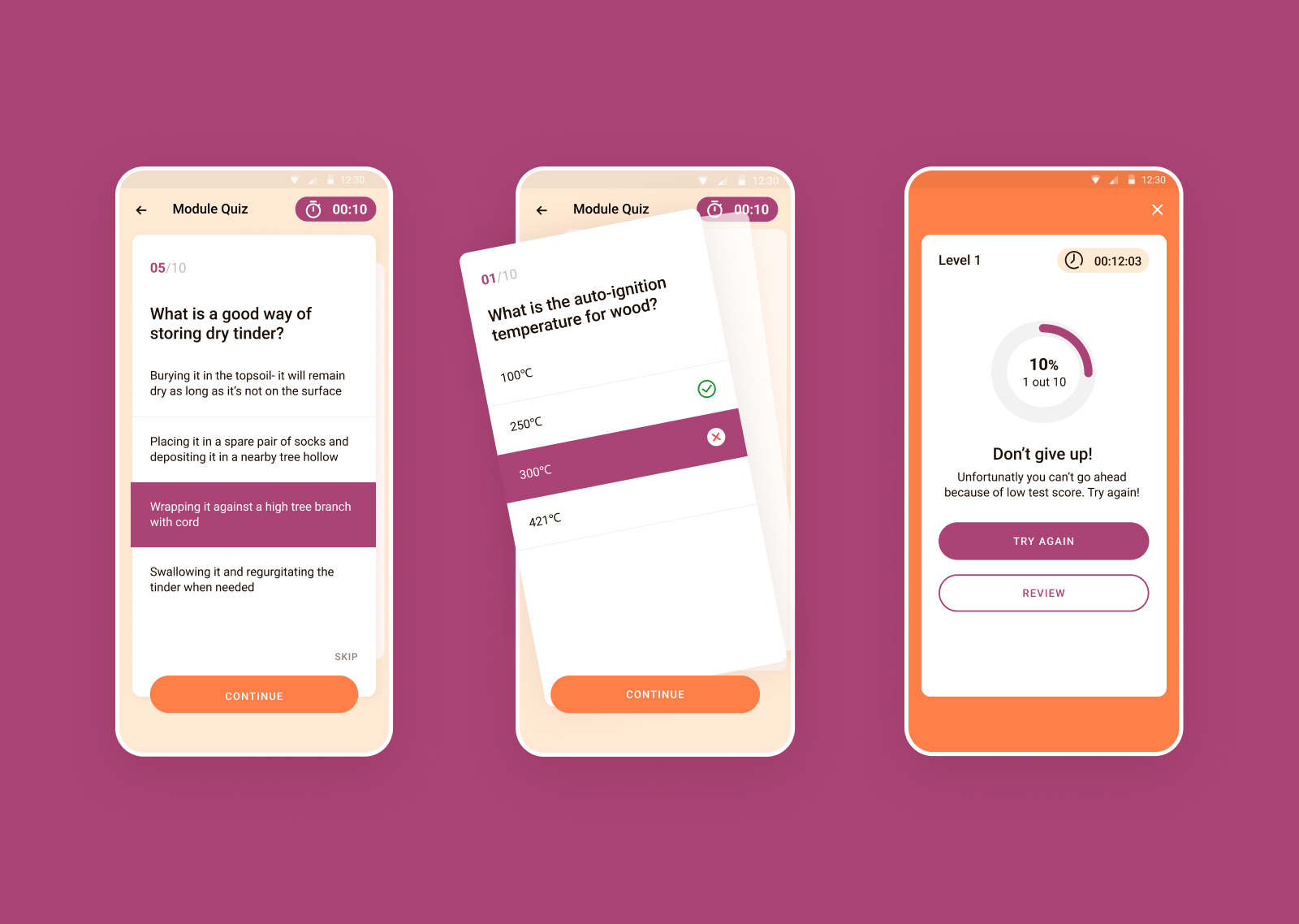
The application consists of educational modules with well-arranged and illustrated content on specific topics and a test that helps users to check their knowledge. Here’s how the illustrations shown above work in the interface as a part of an educational module and an element of gamification marking users’ achievements with cool and funny badges.
Here’s a glance at the airy and uncluttered quiz screens focused on intuitiveness, simplicity, and readability to make the process of knowledge checking feel easy-breezy for users.
And here are the screens that show users’ progress and motivate them to go further.
After some time following the app release and usage, the client got back to us to get more graphics needed for the new chapter of the application. Here’s a glance at some of them.
The design process for Roebuck mobile application was a great chance for our team to participate in creating a product of high educational value, helping people improve and reinforce critical and vital knowledge in a cheerful and engaging way.
New design case studies from our team are coming soon. Stay tuned!
More Design Case Studies
Here’s a set of more case studies sharing the design solutions and approaches for some of the design projects done by the Tubik team.
Kaiten. Identity and Product Design for Food Marketplace
Glup. Delivery App Branding and UX Design
THT. Website Design for Electrical Engineering Service
Komuso. Website Design for Wellness Tool
PointZero25. Identity and Website Design for Event Agency
Nonconventional Show. Website Design for Podcast
uMake. Branding and Website for 3D Design Tool
BEGG. Brand Packaging and Web Design for Food Product Ecommerce
Crezco. Brand Identity and UI/UX Design for Fintech Service
FarmSense. Identity and Web Design for Agricultural Technology