In this case study, we invite you to take a close look at a socially impactful project called Advocacy Through Walls. This is another project the tubik team made in collaboration with Zealous, and the website got wide recognition, including Webby Winner 2024 for Websites and Mobile Sites in the Law category and Webby Honoree in the Diversity, Equity & Inclusion category. Welcome to see how it was created.
Project
Advocacy Through Walls is an interactive guide for public defenders, community-based organizations, and other social justice advocates. It tells how to ethically and intentionally engage with people currently incarcerated or directly impacted by systemic advocacy. The guide is built on research and interviews on trauma-informed care and inside programs focused on self-empowerment.
This project is one more socially beneficial initiative by Zealous, the organization challenging injustice through media, storytelling, and arts.
The creative team from the tubik side included Аnastasiia Zhyltsova, Vlad Taran, Maryna Solomennykova, and Anastasiia Ostapenko.
Web Design
Everything we had to start the work on the project was the idea and the massive amount of text to process and arrange. The guide presented 28 pages of text that we had to turn into a website. So, the team started considering a structure for it that would be informative, memorable, and engaging. It was essential to find a way to present such serious and content-heavy material as an easy-to-use and handy online resource.
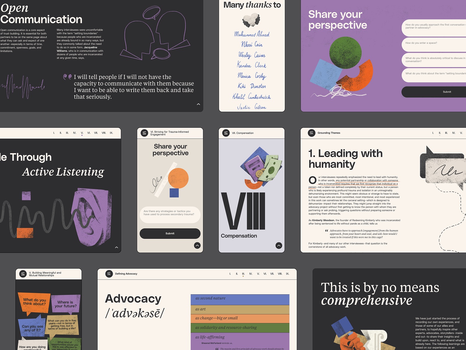
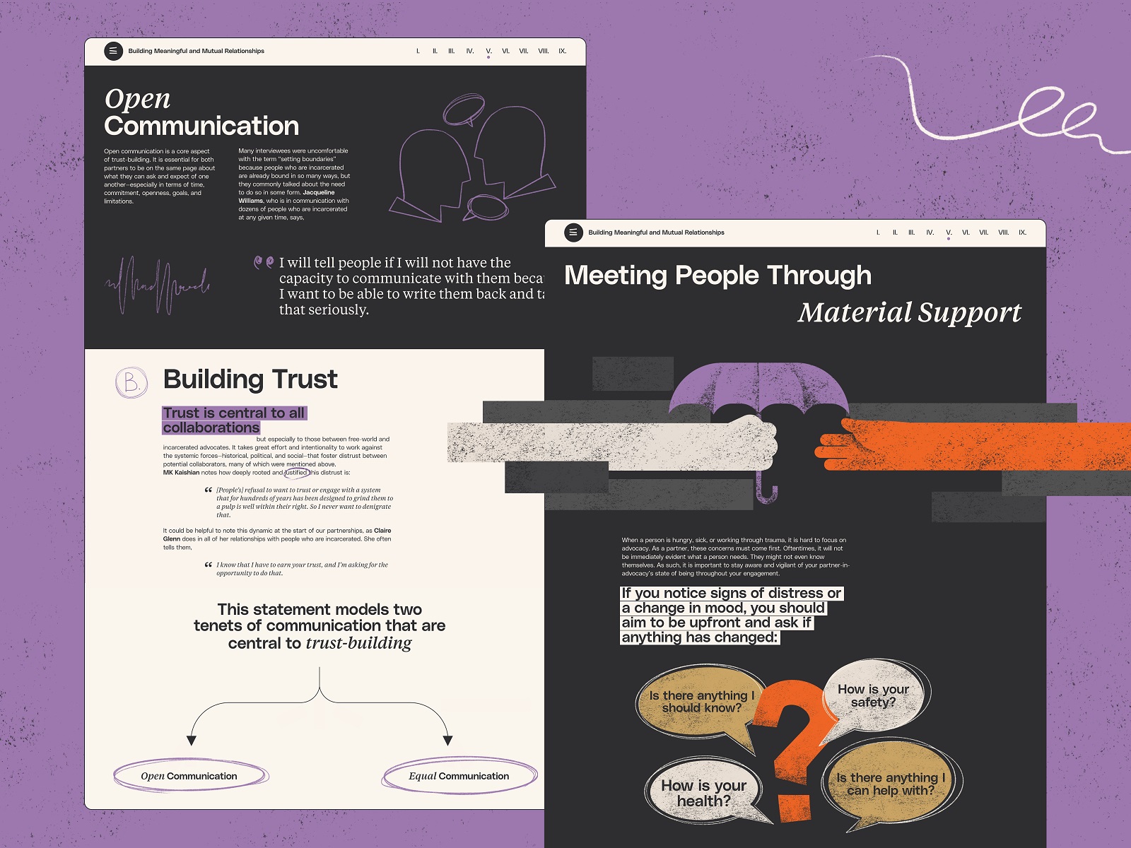
So, after carefully analyzing the guide’s content and the expectations the target audience might have using such a resource, the designers found an efficient structure that combined the design approaches of chapter books and online editorials. Each chapter of the guide has its cover and internal structure of content presentation. It’s easy to reach the needed chapter due to the intuitiveness of website navigation.
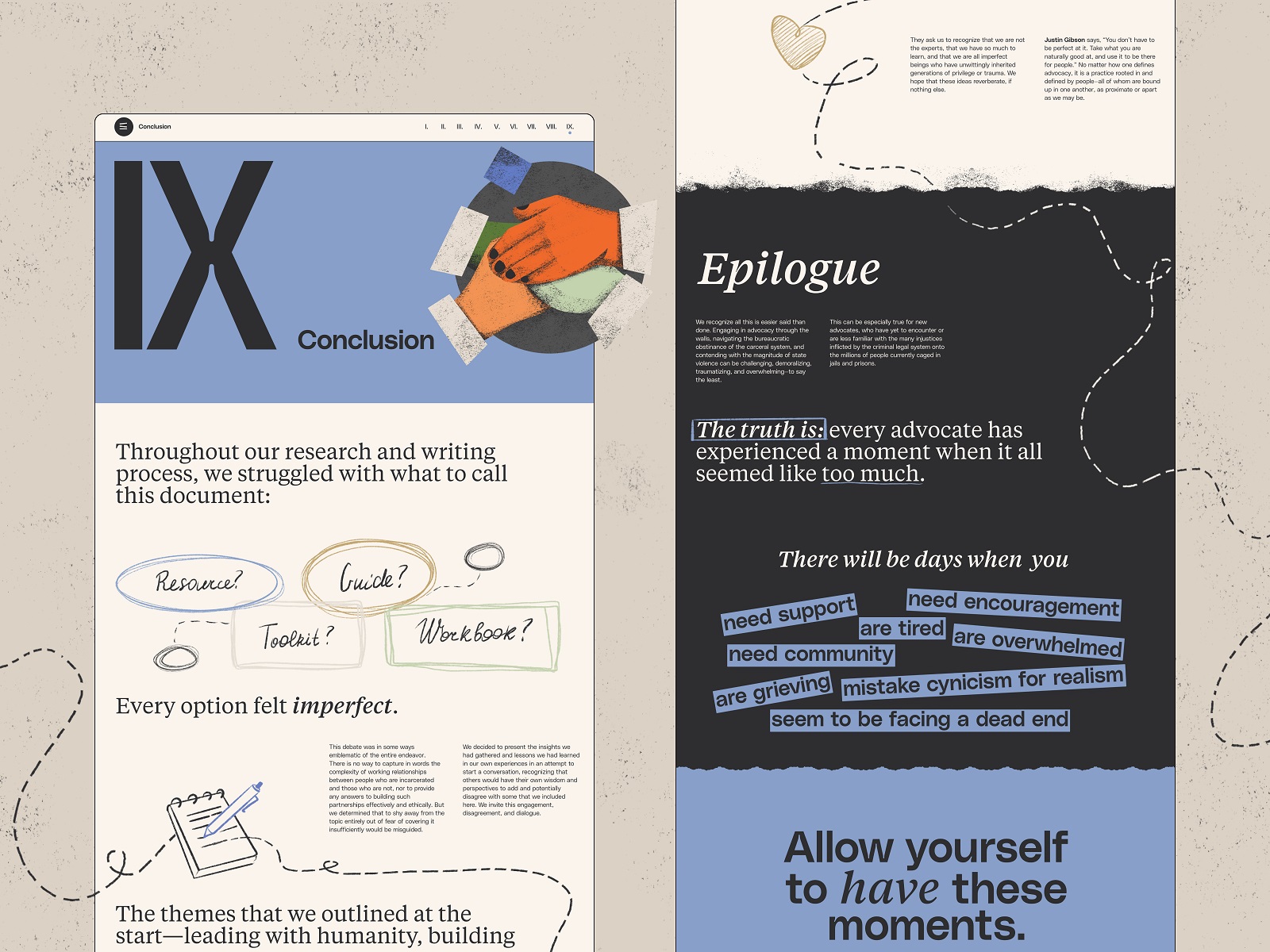
Here’s a glance at the home page. Scrolling the page, the reader smoothly uncovers the information arranged in skimmable sections. Color and typographic contrast, infographic-like numbers, different types of text blocks, bright graphics, and smooth animation all help to make the user experience dynamic while making information accessible to perceive.
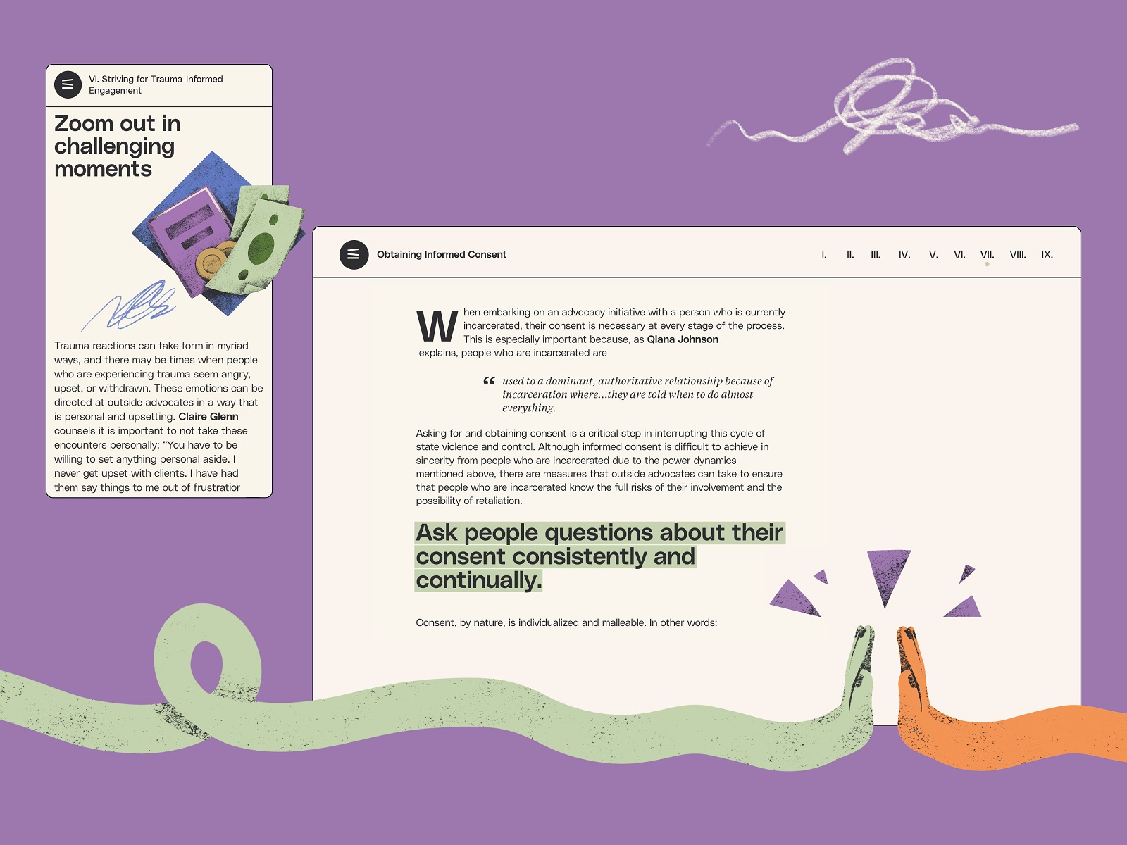
The website’s color palette and typography were thoughtfully chosen, as they were the core elements that influenced the idea of giving the resource both a serious and friendly look. They also contributed to adding some optimistic vibes to the quite difficult topic. Moreover, with the website so heavily packed with text, it was critical to care about readability and a solid visual hierarchy of the pages so that the readers weren’t overwhelmed and didn’t feel tired. Color and size contrast, different typefaces, and highlighting of particular text parts contributed to making the chapters of the guide easy to scan and skim.
Graphics
One more essential aspect of this project was to amplify content presentation and enhance it with visual storytelling techniques. So, we created a massive, consistent set of custom graphics and illustrations. On the website, you can find both line and filled graphics. They help visitors quickly capture the chapter or section’s essence and add emotional and aesthetic appeal to the user experience.
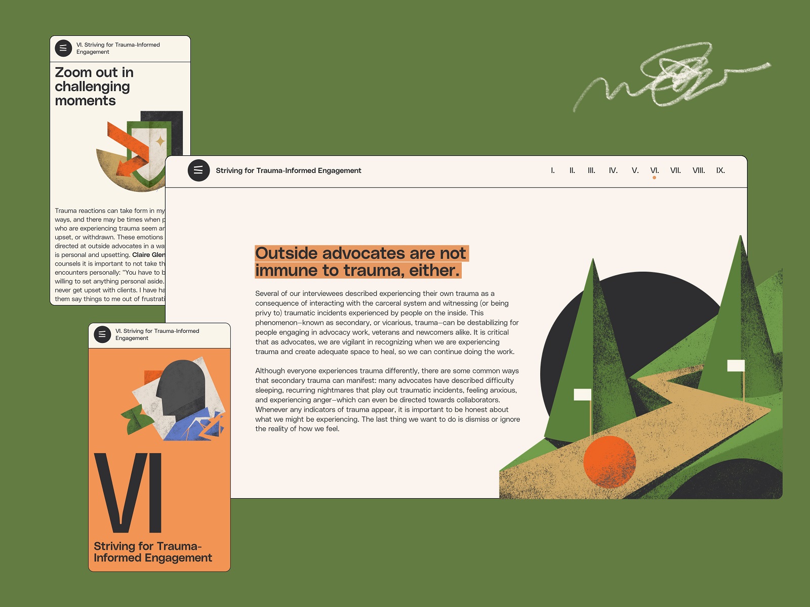
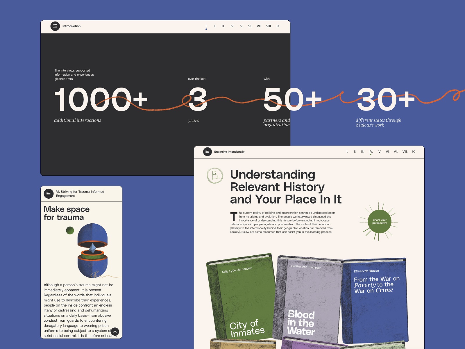
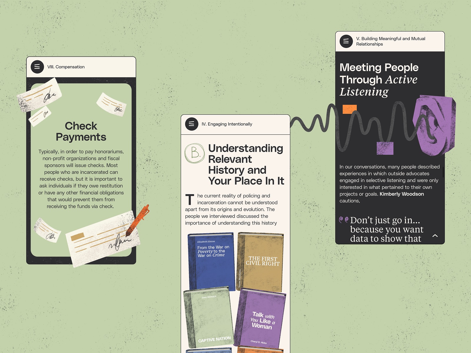
Also, the graphic elements help to enhance the integrity of the user experience and make the transitions and interactions smooth. And sure, we couldn’t resist adding cool motion to them for dynamics and a pinch of fun.
All the efforts resulted in a bright, informative, and attractive website, leading Zealous and tubik teams to one more Webby!
New design case studies from our team are coming soon. Stay tuned!
More Design Case Studies
Here’s a set of more case studies sharing the design solutions and approaches for some of the design projects done by the Tubik team.
Serra. Identity and Product Design for Financial App
MOVA Brewery. Ecommerce Website Design for Beer Producer
HP23. Website and 3D Animation for Prostheses Producer
FluxWear. Web Design and Development for Health Tech Product
UI Design Process for Web and Mobile: 3 Detailed Video Cases
Magma Math. Web Design for Educational Platform
Synthesized 2.0. Web Design for High-Quality Synthetic Data Platform
HotelCard. Brand Identity for Hotel Offers Service
Nibble Health. Identity and UX Design for Healthcare Fintech Service
Physica Magazine. Web Design and Graphics for Scientific Blog
ProAgenda. Identity and Website Design for Golf Management Service
Kaiten. Identity and Product Design for Food Marketplace
THT. Website Design for Electrical Engineering Service


