This case study presents one more fintech project in our portfolio: here, we invite you to take a glance at the brand identity and product design created for the financial application Serra.
Client and Project
Serra is an iOS/Android app that aims to build a culturally aware financial application from the ground up in Montserrat (the Caribbean region) by solving locals’ real-life challenges.
Serra’s goal was to create a mobile finance ecosystem for Monserrat locals. The target audience is not quite used to mobile banking and sees banking as a rather complex and unapproachable service. So, our task was to create an identity and product design that would be welcoming, user-oriented, not complicated, and very approachable.
The creative team from the tubik side included Vladyslav Taran, Anton Morozov, Anton Chyrskyi, Roman Chornyi, Mykyta Litinskyi, Kirill Erokhin, Ladamyra Kunytsia, Olya Zakharyan, and Anastasiia Iliashevych.
The project’s scope involved creating brand identity, web design, product design, and motion design. To cover it, we took the following steps:
- researching and analyzing the common money transaction patterns of the Monserrat local
- designing a friendly and emotionally appealing brand identity emphasizing the simple and amiable nature of the service
- developing a set of graphic elements that imitate hand drawing, which adds a human touch to fintech
- designing an intuitive mobile application with QR-code-based P2P and merchant payments
- creating a website based on the key identity element of a ribbon, which represents continuous money transfers
Identity Design
The brand identity design was based on the analysis of the target audience’s needs and features, which in this case were quite specific due to the fact that the service aimed to be fine-tuned for a local community that was not accustomed to cashless operations and digital finance management. So, the brand image strived to be perceived and was built around a set of characteristics such as reliability, friendliness, speed, modernity, flexibility, and accessibility. The visual identity should be clean and straightforward, employing modern typography and lifestyle photos.
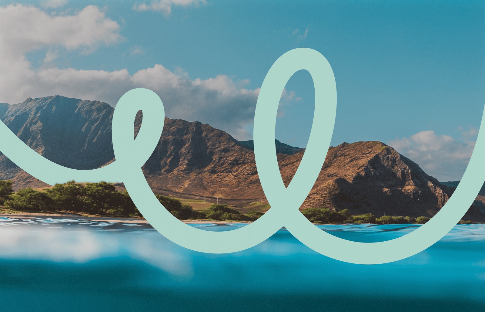
The brand logo was created to be bold, minimalist, and legible in various sizes. It is a wordmark featuring the brand name and mixing typographic and calligraphic approaches. The calligraphic curves added an association with handwriting, making the logo more emotional and closer to users.
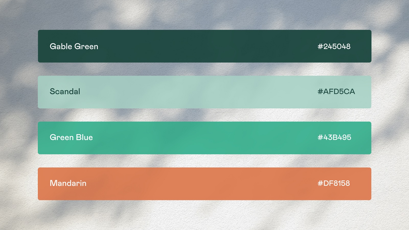
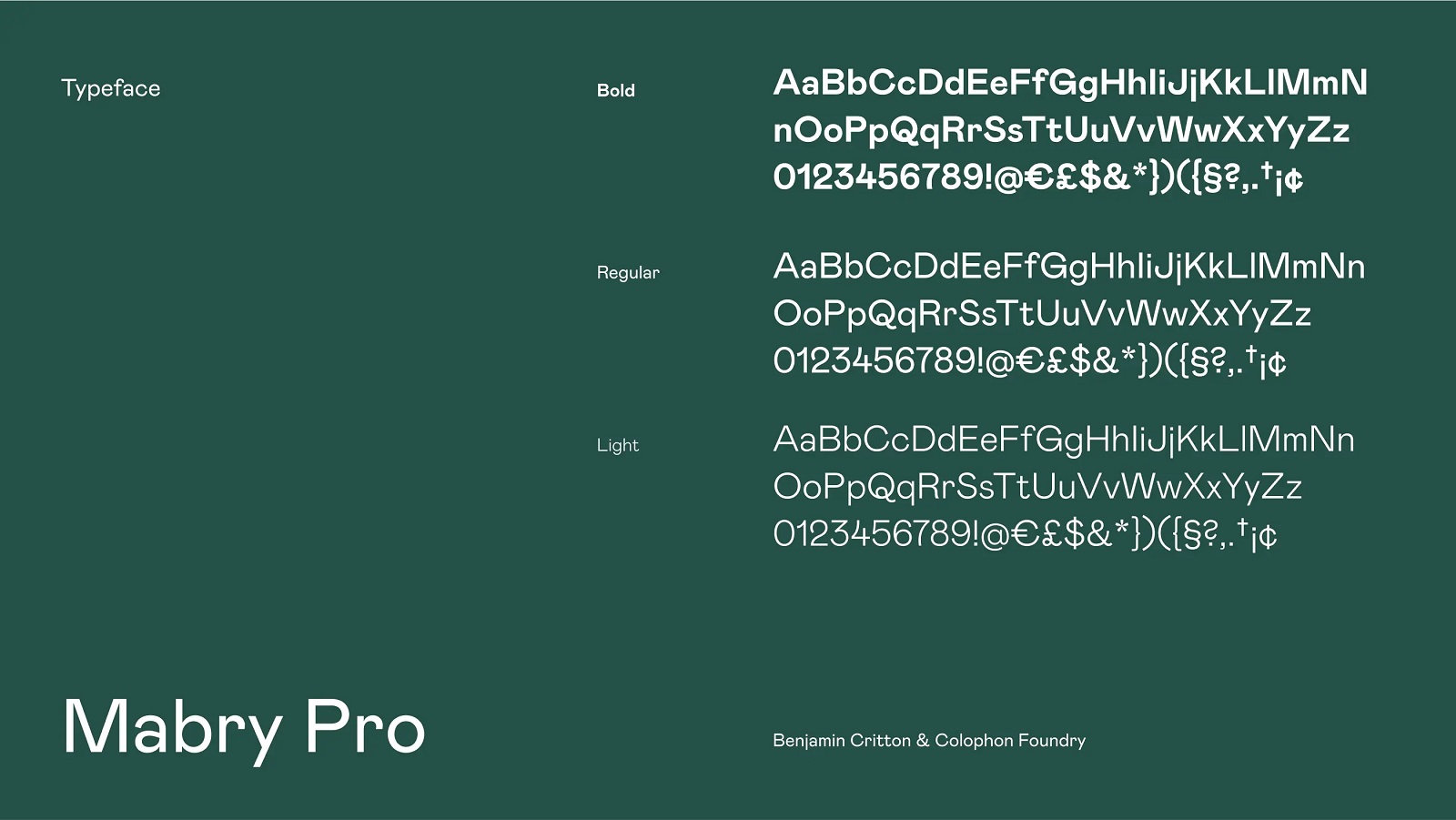
The color palette is close to nature and shares vibes of trustworthiness and friendliness, with a bunch of greens and a contrastive orange color for visual accents. The brand typography choice fell on neat and readable Mabry Pro.
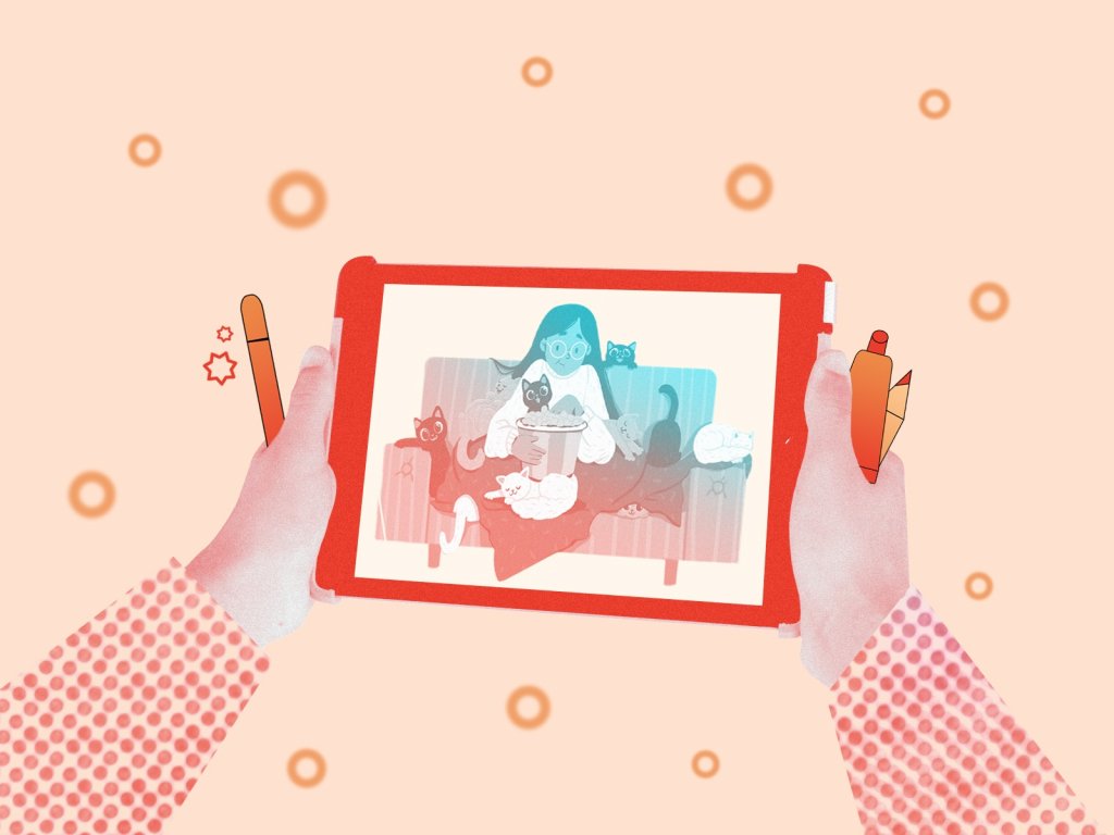
The calligraphic element adding a pinch of uniqueness to the logo design also became a basic for the graphic doodle visually associated with a kind of ribbon or wave and uniting all the elements of brand communication, from logo to marketing graphics, product design and web design. Another important visual element of branding was the approach to photo content, which aimed to add a human element and set a strong emotional connection with the users. Here’s what it looks like and how it works at different touchpoints.
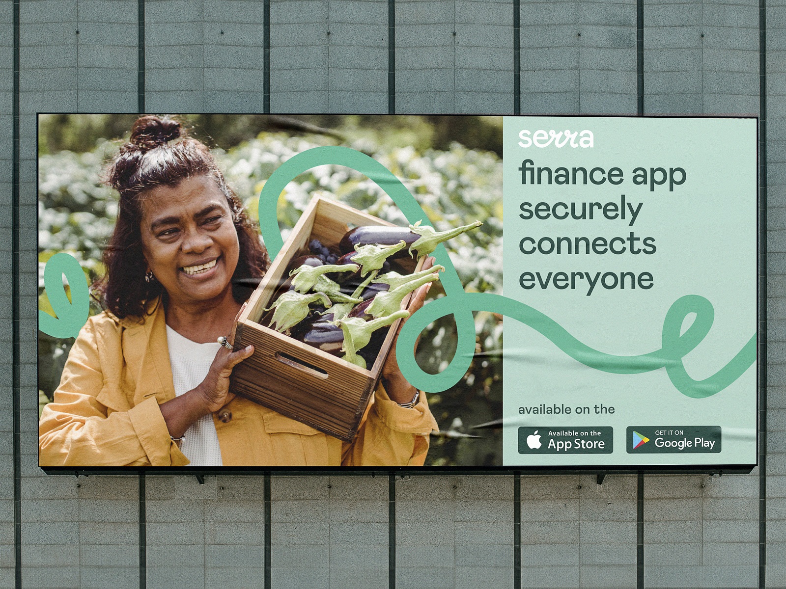
Outdoor advertising banner design
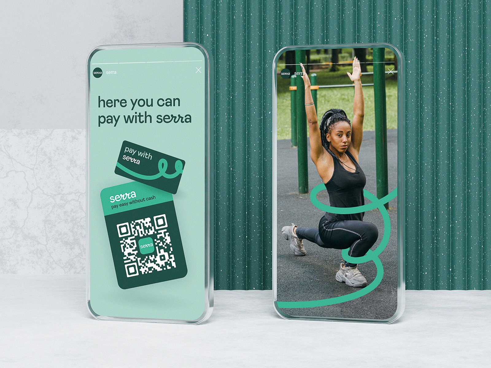
Social media marketing approach
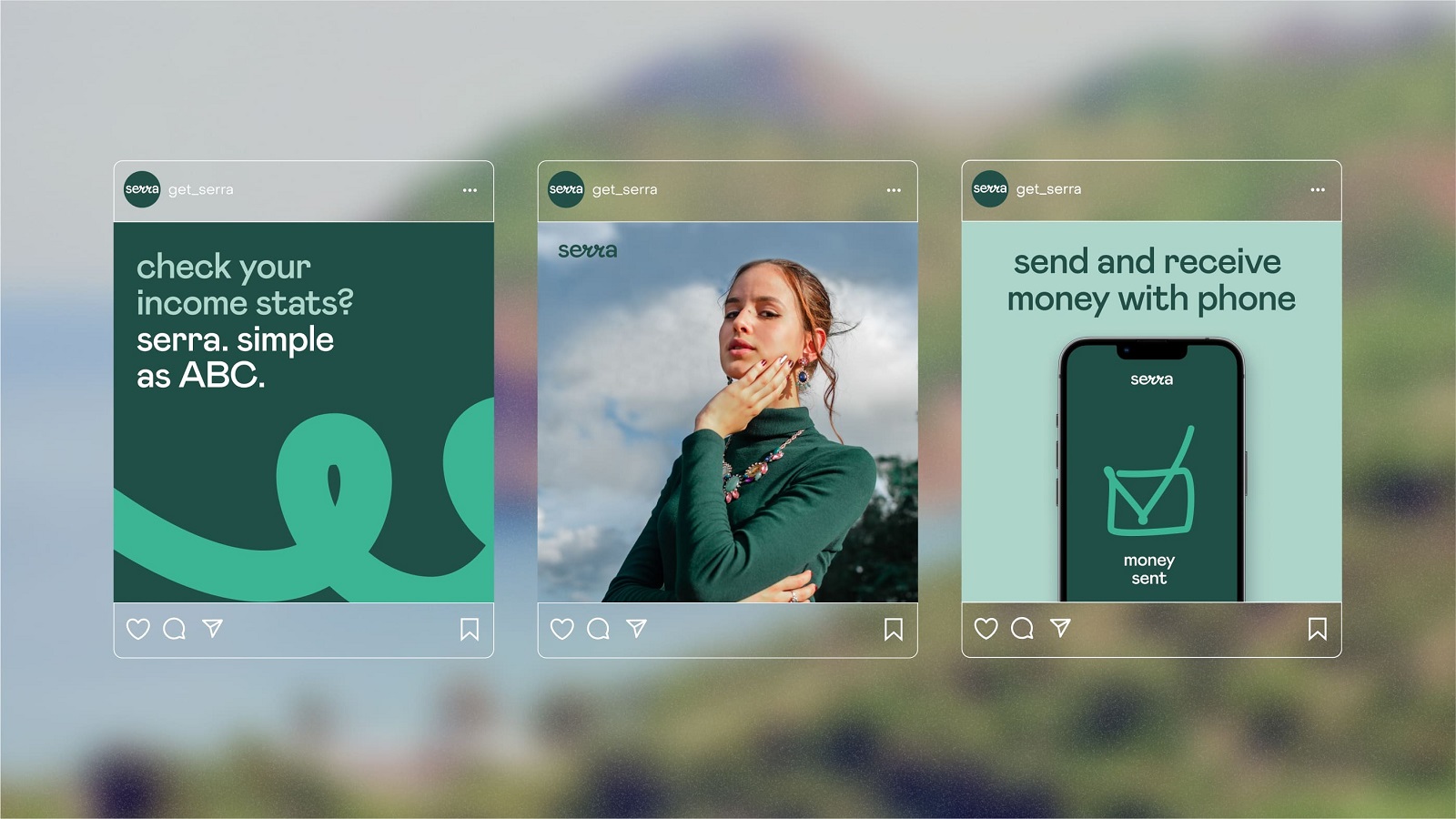
Social media marketing approach
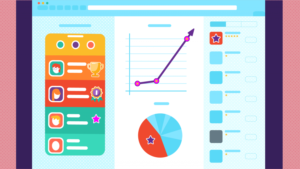
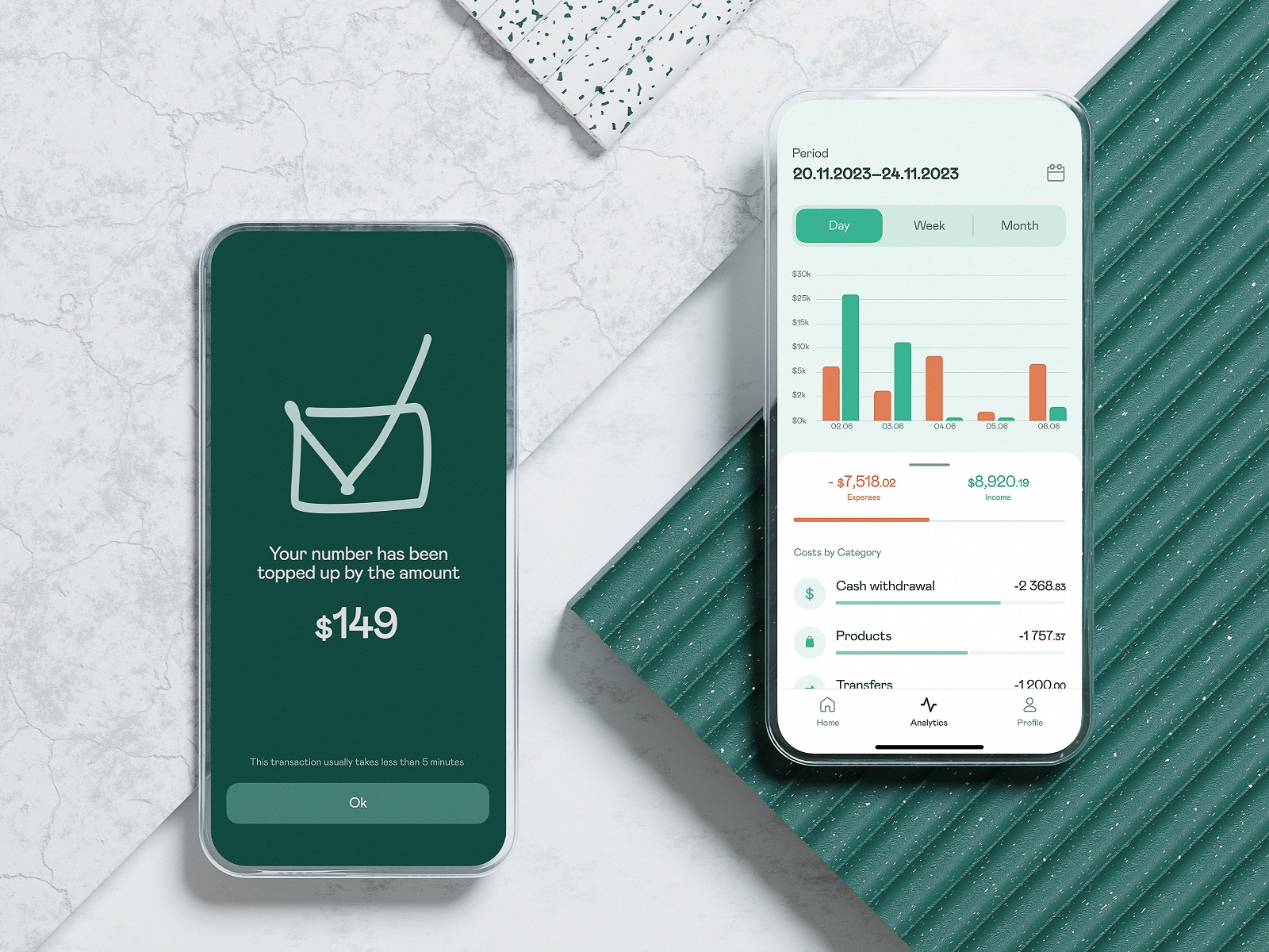
Mobile Application Design
As the core target audience was quite limited and clear in its preferences and background, the major objective behind product design was to make the user interface and interactions as intuitive and clear as possible. The application applies the brand colors in combination with black and white, which allows for effective playing with contrast. Solid visual hierarchy, mastering negative space usage and easy-to-understand interactive elements do their job of making the app user-friendly and trustworthy even for people with little background in using fintech products.

One of the emotionally appealing and stylish details of the app design approach is the integration of custom-drawn graphic elements and icons that also remind doodles or graphics created by hand. And for better customization goals, the design provides the choice of light and dark themes.
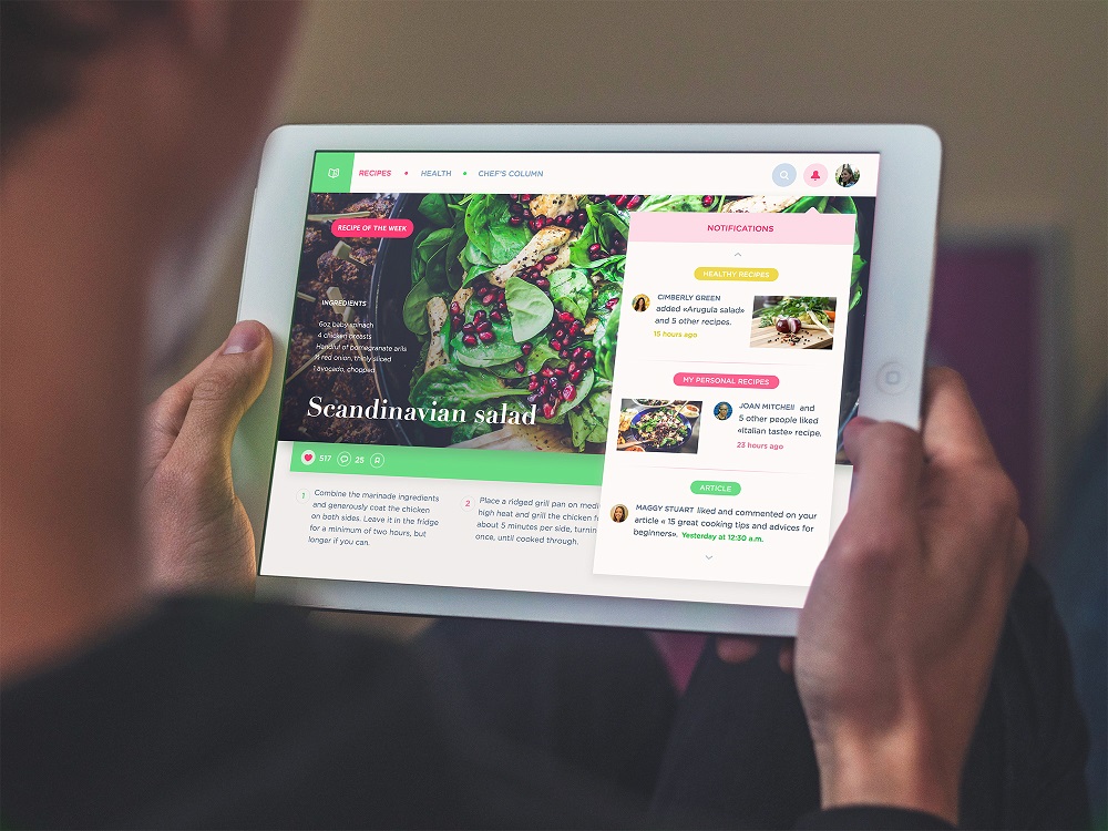
Website Design
Another stage was creating a website that would strengthen the online presence of the mobile application brand. The design is focused on getting the visitors acquainted with what the application looks like, how it works, and, most importantly, how it solves the problems of slow payments and dealing with cash for both individual users and small business owners. So, in this case, there is no place for intriguing or mystic engagement; instead, the home page’s hero section from the first seconds informs about the essence of the product in the tagline and description text block and shows the interface of the application. Each section uncovers more benefits, all of which are also united with the branded ribbon line, symbolizing the smoothness of financial operations and the ability to deal with diverse situations without pitfalls.
Therefore, the branded graphics, the mobile application design, and the website together present a consistent design system that sets a solid foundation for brand recognizability and memorability.
New design case studies from our team are coming soon. Stay tuned!
More Design Case Studies
Here’s a set of more case studies sharing the design solutions and approaches for some of the design projects done by the Tubik team.
MOVA Brewery. Ecommerce Website Design for Beer Producer
HP23. Website and 3D Animation for Prostheses Producer
FluxWear. Web Design and Development for Health Tech Product
UI Design Process for Web and Mobile: 3 Detailed Video Cases
Magma Math. Web Design for Educational Platform
Synthesized 2.0. Web Design for High-Quality Synthetic Data Platform
HotelCard. Brand Identity for Hotel Offers Service
Nibble Health. Identity and UX Design for Healthcare Fintech Service
Physica Magazine. Web Design and Graphics for Scientific Blog
ProAgenda. Identity and Website Design for Golf Management Service
Kaiten. Identity and Product Design for Food Marketplace
THT. Website Design for Electrical Engineering Service