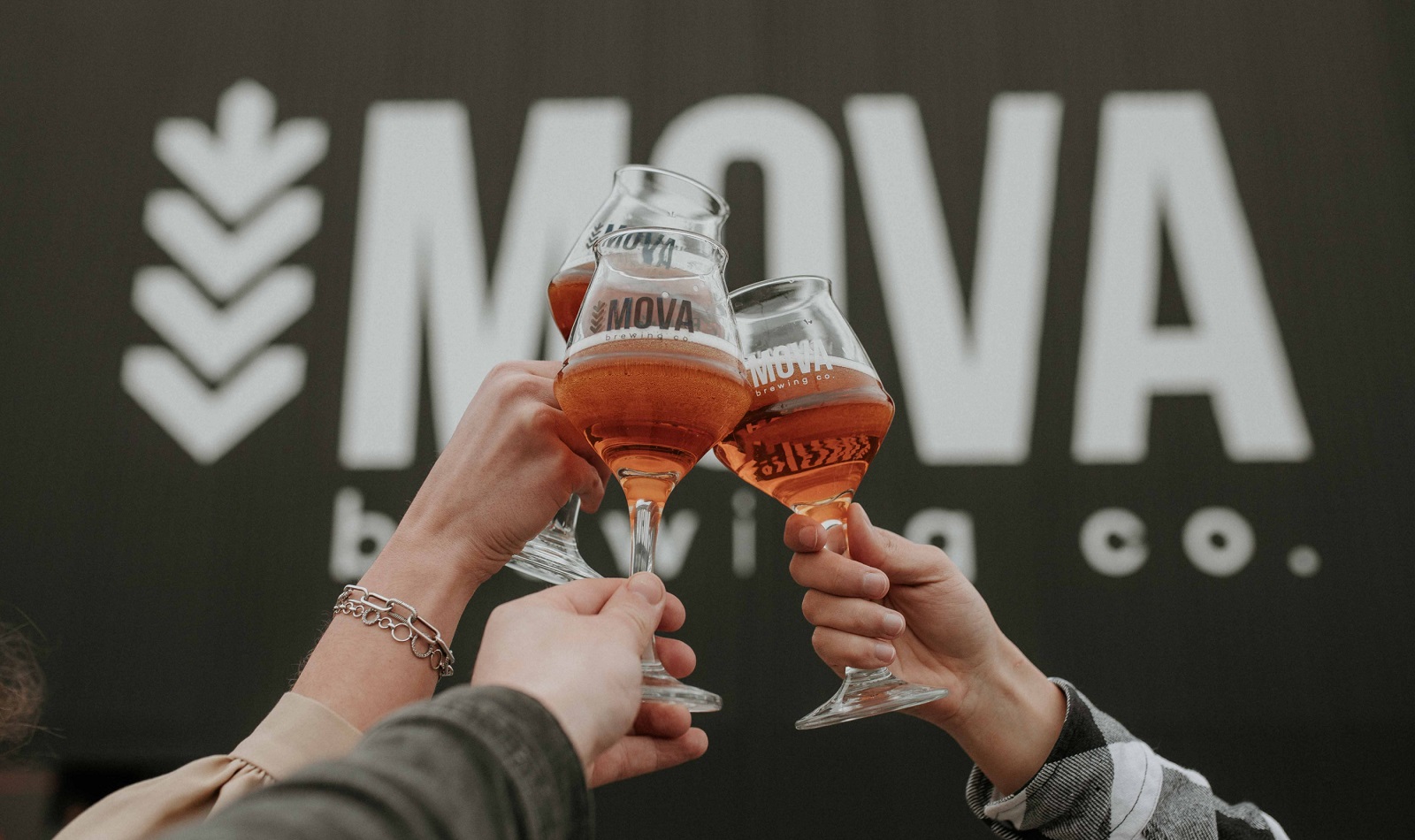
Most e-commerce website design case studies read like a hotel brochure: everything is ‘stunning,’ nothing is specific, and you close the tab remembering nothing except the color blue. This one deserves better, because MOVA Brewery—a craft beer producer out of Dnipro, Ukraine—asked for something that most brands claim to want and almost none actually build: a website that behaves like the place it represents.
The Brief Nobody Actually Follows
Besides just selling beer, MOVA runs festivals, teaches bartending courses, and operates an actual beer museum documenting the history of brewing culture. So when Tubik studio sat down to design the site, the brief wasn’t “make it look nice.” It was “make a bilingual e-commerce platform, in Ukrainian and English, that doesn’t flatten a brand this weird and specific into a template.”
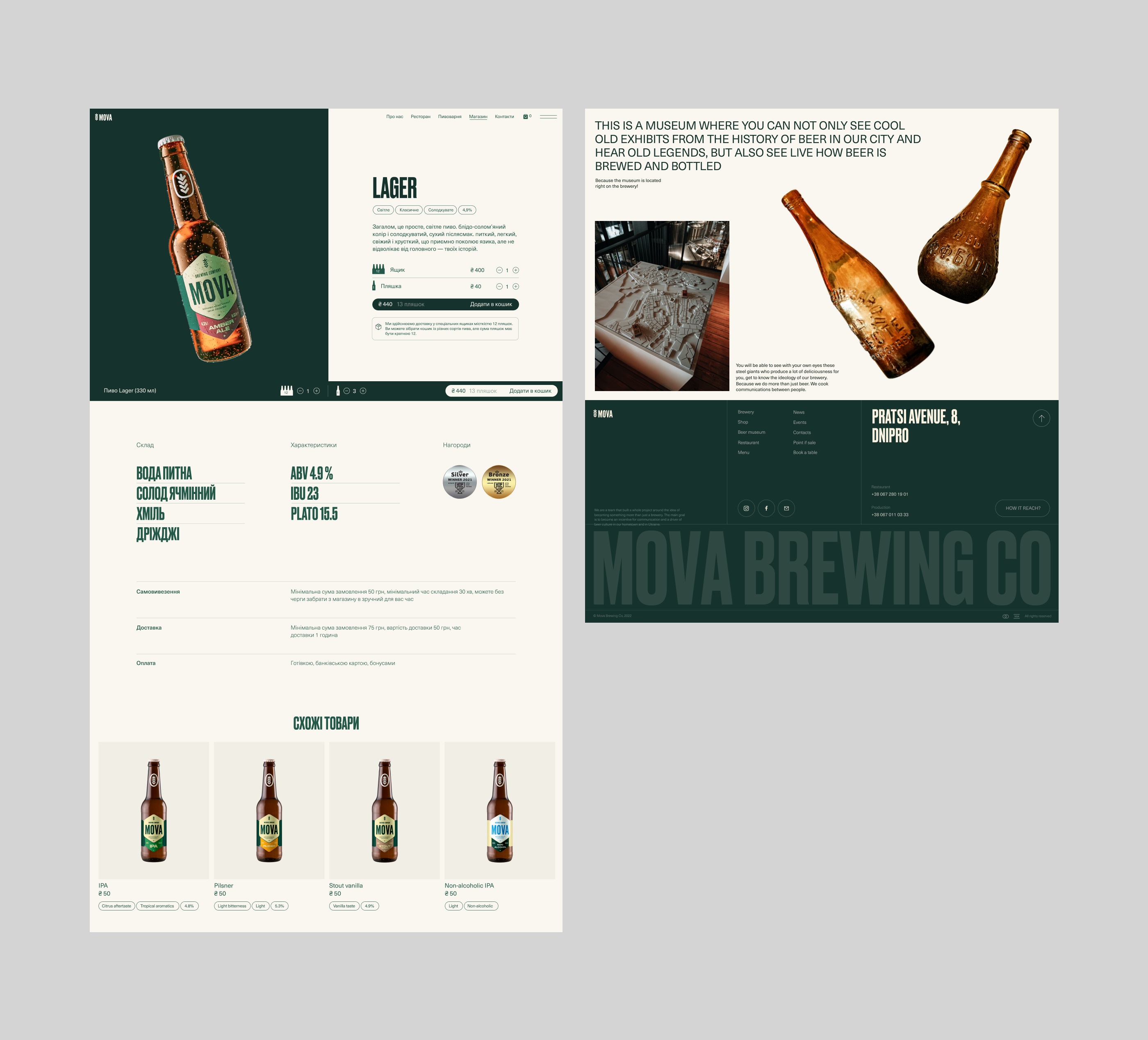
That’s a harder web design problem than it sounds. Bilingual UX design means every layout decision gets tested twice—Ukrainian text runs longer than English on average, and typography that looks balanced in one language can look cramped or lopsided in the other. If you’re building a multilingual site this year, budget extra QA time for text expansion. It’s the detail that breaks launches.
Two Typefaces, No Compromise
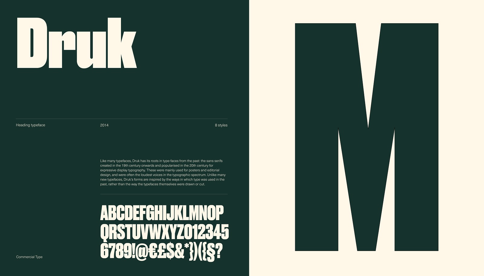
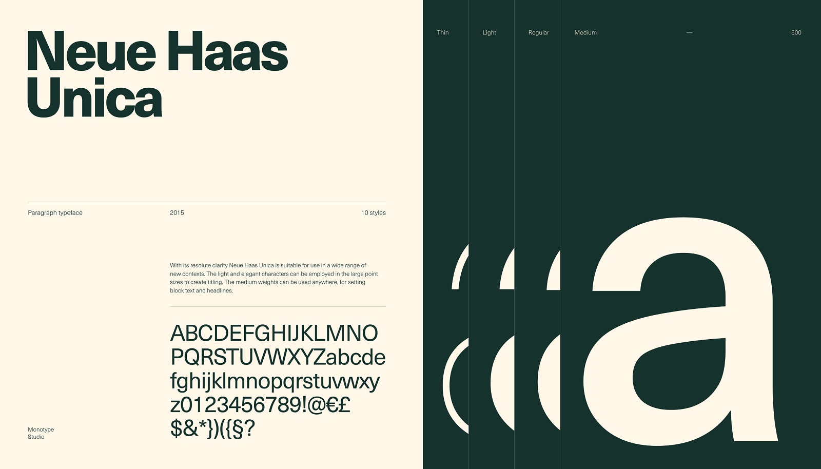
The typography choice here is worth stealing. Tubik paired Druk—bold, blocky, almost aggressive—for headings, with Neue Haas Unica, a lighter and more flexible sans-serif, for body copy. That’s a deliberate contrast strategy: one typeface carries the brand’s swagger, the other carries readability and information density. Most brand identity design projects pick two fonts that look similar enough to be safe and different enough to be pointless. This pairing actually does a job.
Practical takeaway: if you’re picking typefaces for a website redesign, don’t ask “do these look good together.” Ask “what job does each one have to do.” A heading font and a body font solving the same problem is wasted pairing.
The Concept They Threw Away
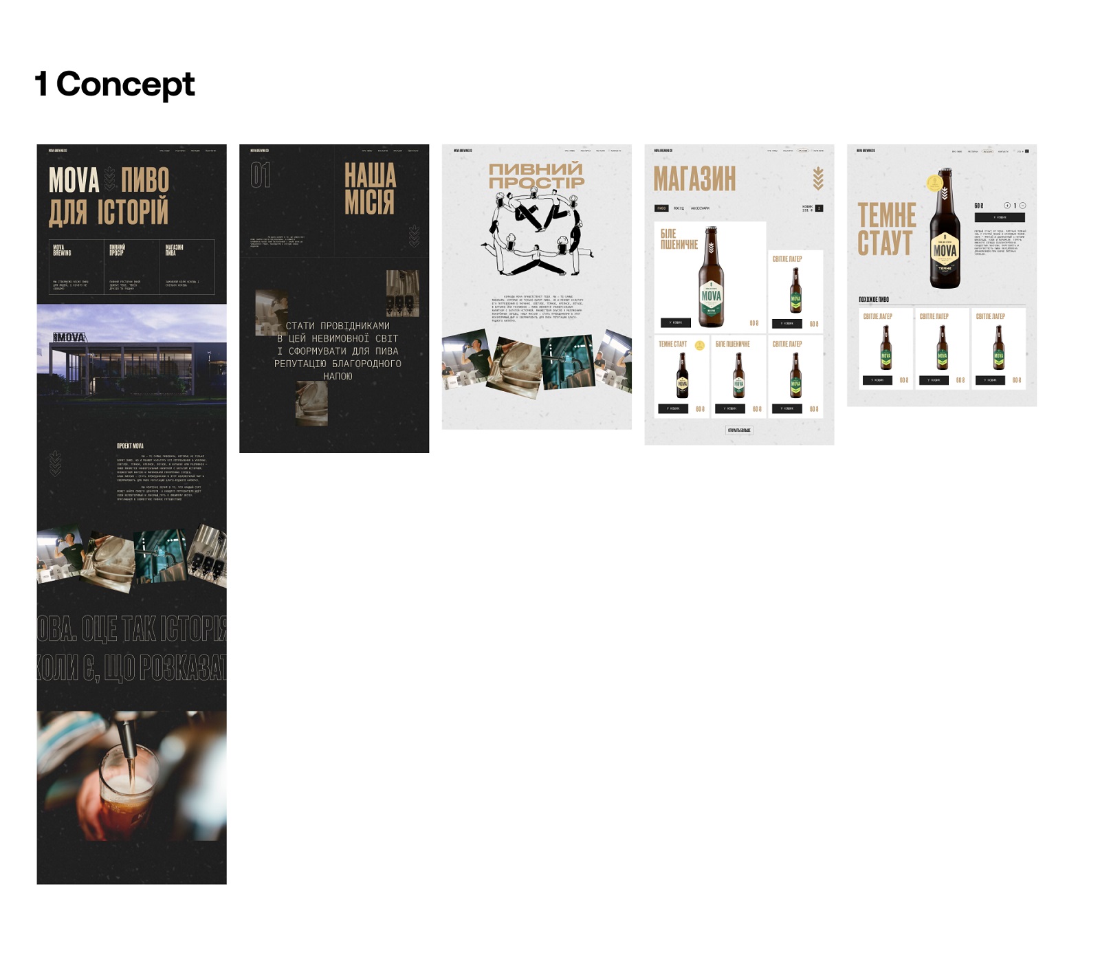
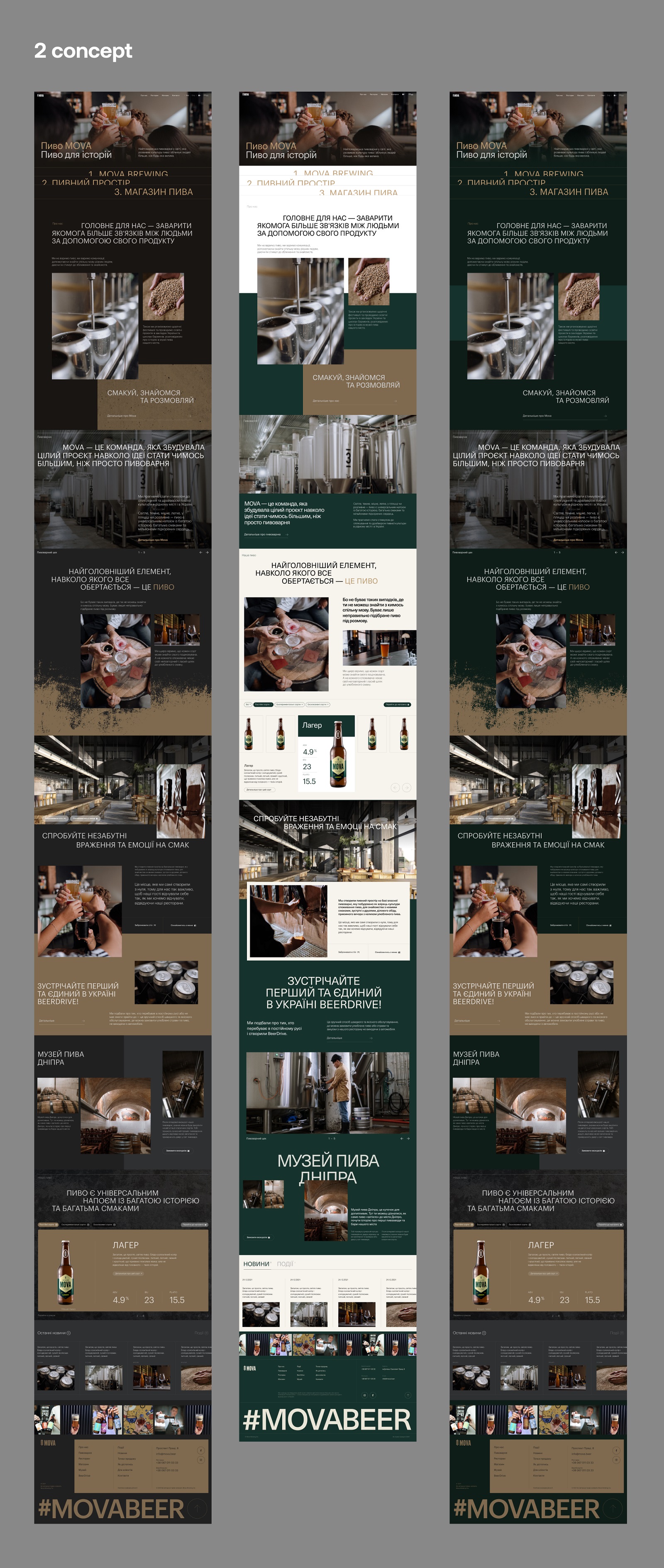
Here’s the part most case studies skip: Tubik built two full concept directions before landing on the final one. The first leaned into bold typography and beer-adjacent color, tested in both light and dark versions. The second went almost entirely dark palette—deep greens, browns, greys, heavier texture. Neither shipped. The final design site sits at the intersection of both, borrowing contrast from the first and restraint from the second.
That’s the unglamorous truth about good visual identity design: the winning direction is rarely concept one or concept two. It’s usually concept three, built from the corpse parts of the first two after you’ve seen them fail in context. If your design process doesn’t produce at least one direction you’re willing to kill, you’re not exploring, you’re decorating.
Photography Doing the Heavy Lifting
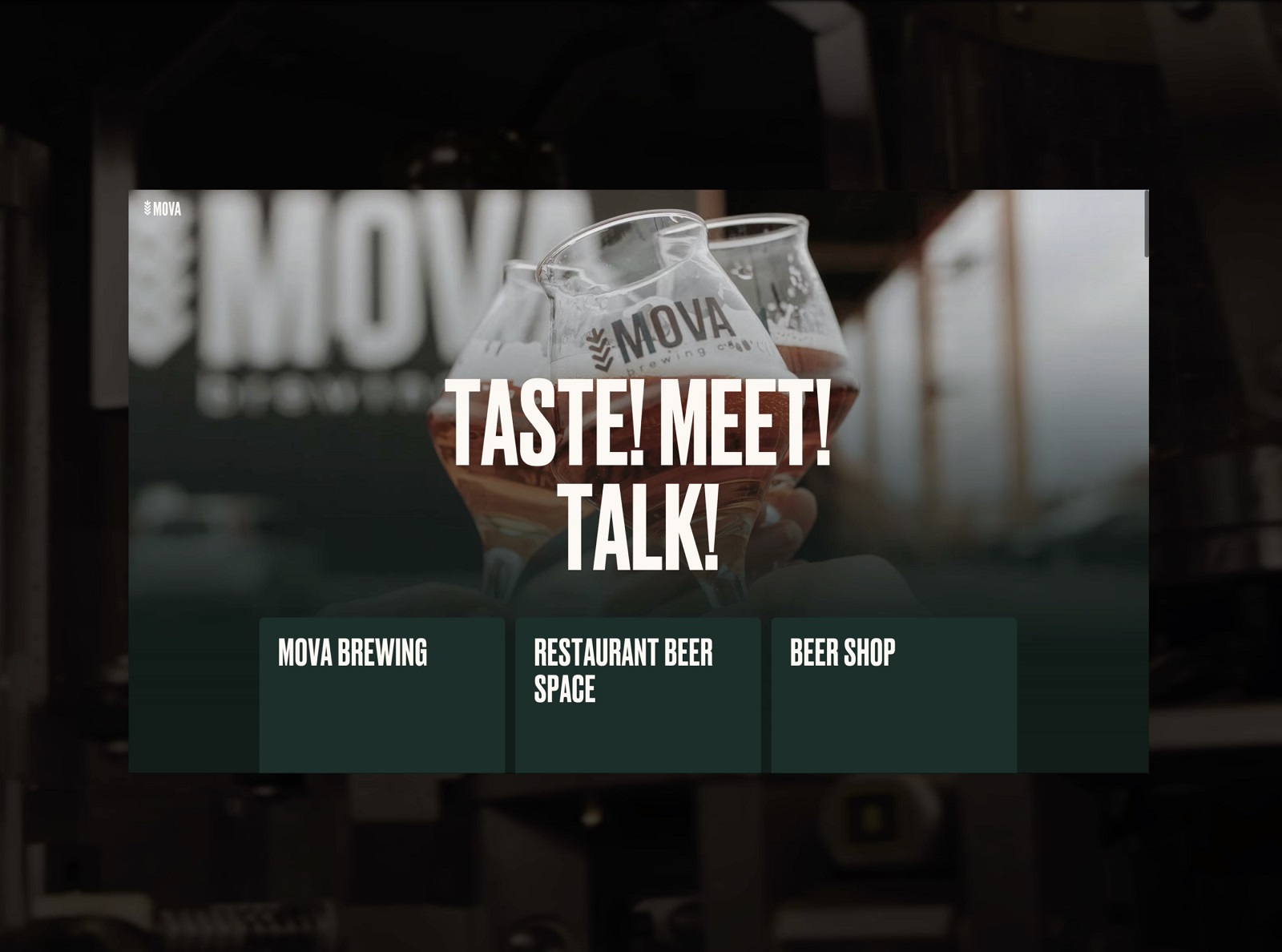
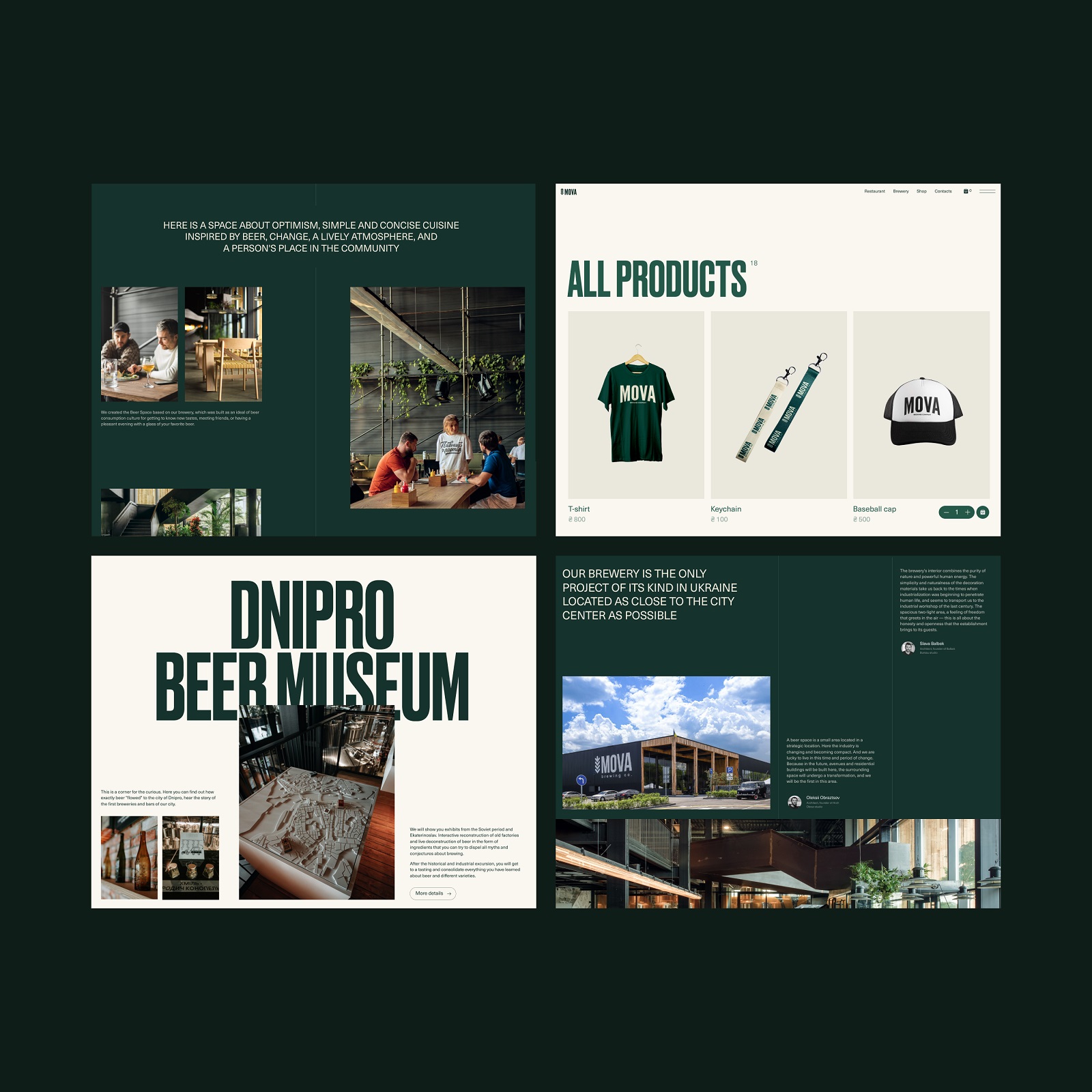
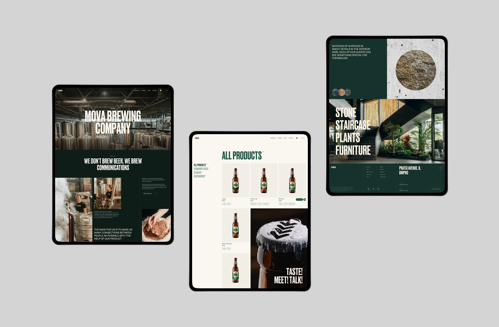
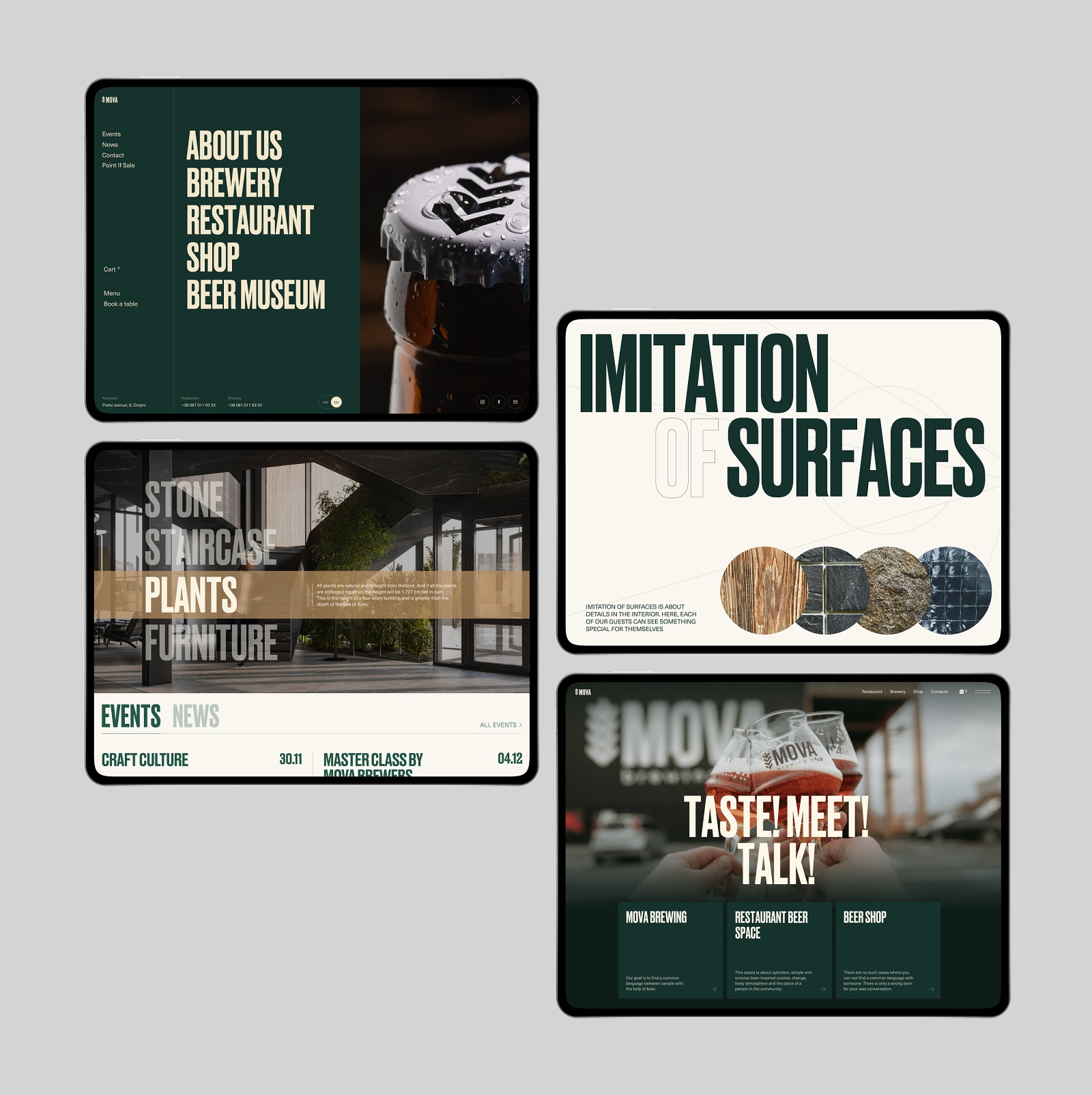
MOVA’s site leans hard on photography rather than illustration or stock imagery, and the photography is specific—real production floors, real people, real spaces, not generic “team high-fiving” stock shots. The homepage hero uses a full-bleed photo paired with a tagline built entirely from verbs: taste, meet, communicate. No adjectives doing the emotional work. The verbs do it.
If your e-commerce homepage design currently leans on adjective-heavy copy (“premium,” “authentic,” “handcrafted”), try the verb test: rewrite your hero copy using only action words. It forces specificity, and specificity is what makes a beer brand feel like an actual place instead of a mood board.
3D Bottles, Not Product Photos
One detail that’s easy to miss: Tubik built a custom set of 3D bottle models for MOVA’s product pages and catalog, rather than relying on standard product photography. That’s a real production investment for a mid-sized brewery, and it pays off in flexibility—3D product visualization lets you reposition, relight, and reuse assets across a catalog without rebooking a photo shoot every time a new label ships. For any e-commerce brand with a growing SKU count, that’s the actual argument for 3D product rendering: not the polish, the operational math.
Webflow, Because Somebody Has to Update This Thing
The site was built on Webflow, which matters less as a design flex and more as a workflow decision. MOVA’s team needs to add seasonal products, update event pages for festivals, and refresh menu content without filing a ticket every time. A no-code CMS platform like Webflow website design is a whole maintenance strategy. If your client’s team can’t update their own content within a year of launch, you didn’t build them a website, you built them a dependency.
The Mobile Version Isn’t an Afterthought Here
Given that a large share of MOVA’s audience buys and books via smartphone, the mobile experience got real design attention rather than a shrink-to-fit pass. That’s worth flagging because mobile-first e-commerce design still gets treated as a checkbox on plenty of projects that ship desktop-first and adapt down. Test your next launch the other direction: design the checkout flow on a phone screen first, then scale up. You’ll cut features you thought were essential and discover your site is better for it.
What This Case Study Actually Teaches
Strip away the beer and the branding, and the lesson holds for any product with a real physical world behind it: the website’s job is to translate an actual place and actual process into pixels without losing the texture. MOVA succeeded because the studio treated bilingual support, typography pairing, photography direction, and CMS choice as one connected decision rather than four separate checkboxes. That’s the boring, unsexy part of website design that never makes it into portfolio highlight reels, and it’s exactly the part worth copying.
Recommended Reading
Liked this one? We’ve got opinions on plenty of other design projects too—check out our other case studies and think pieces before you go back to staring at a blinking cursor:
HP23. Website and 3D Animation for Prostheses Producer
FluxWear. Web Design and Development for Health Tech Product
UI Design Process for Web and Mobile: 3 Detailed Video Cases
Magma Math. Web Design for Educational Platform
Synthesized 2.0. Web Design for High-Quality Synthetic Data Platform
HotelCard. Brand Identity for Hotel Offers Service
Nibble Health. Identity and UX Design for Healthcare Fintech Service
Physica Magazine. Web Design and Graphics for Scientific Blog
CSConnect. Website Design for Immersive Experience Marketing Platform
ProAgenda. Identity and Website Design for Golf Management Service
Kaiten. Identity and Product Design for Food Marketplace
THT. Website Design for Electrical Engineering Service