In a busy world, delivery services are a great help. Today we invite you to have a glance at the brand design for a food delivery service: it’s a story of contrasts and functional art, consistency in identity design and creative visual storytelling. The project was assigned to Tubik designers Vlad Radionov and Yaroslava Yatsuba.
Product
Quisine is an innovative service that delivers food of different national cuisines. It’s easy to use; it offers the big diversity of meals typical for different countries; it provides quick delivery and adds innovations to all the customer journey from making an order to receiving a meal. That’s what the brand image was based on. The company name presents a compilation of two aspects: quick cuisine.
Logo Design
The process of visual branding creation started with logo design. Having analyzed the target audience and having done the market research, the designer started developing variants in different types of logos: wordmarks, lettermarks, combination marks, and symbols. The important factor to consider was the high readability of the logo as it was aimed at using on various platforms, devices, quite often on the go, so it had to be legible at once.
Also, it’s worth mentioning that the decision upon the corporate colors was made at this stage: two contrast colors were chosen for brand presentation, yellow and black.
![]()
Above, you can see some of the variants developed in this process:
- The combination mark made of the brand name written in black all in lowercase letters and a lettermark of the capital Q in yellow
- The combination mark made of the brand name written in black in title case letters and a lettermark of the capital Q in yellow
- The wordmark of a brand name in lowercase in composition with a yellow square shape
- The combination mark made of the brand name written in black all in lowercase letters and a symbol, an outline image of a bird’s head.
What’s more, the variants feature different typographic solutions for a brand sign: three options use different serif fonts and one of them uses the sans-serif font.
Testing these and other variants, the designer got more and more confident that the best approach to the logo design, in this case, is the classic wordmark wrapped in an elegant font and featured all in lowercase letters to set the friendly tone of communication with a client instantly. The choice of the font was made in favor of serif, to share the vibes of high-quality meals and fine dining.
![]()
The designer offered the color combinations within the chosen color palette to give the logo a higher level of flexibility in both web and offline marketing campaigns.
![]()
Characters
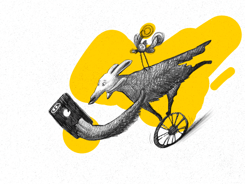
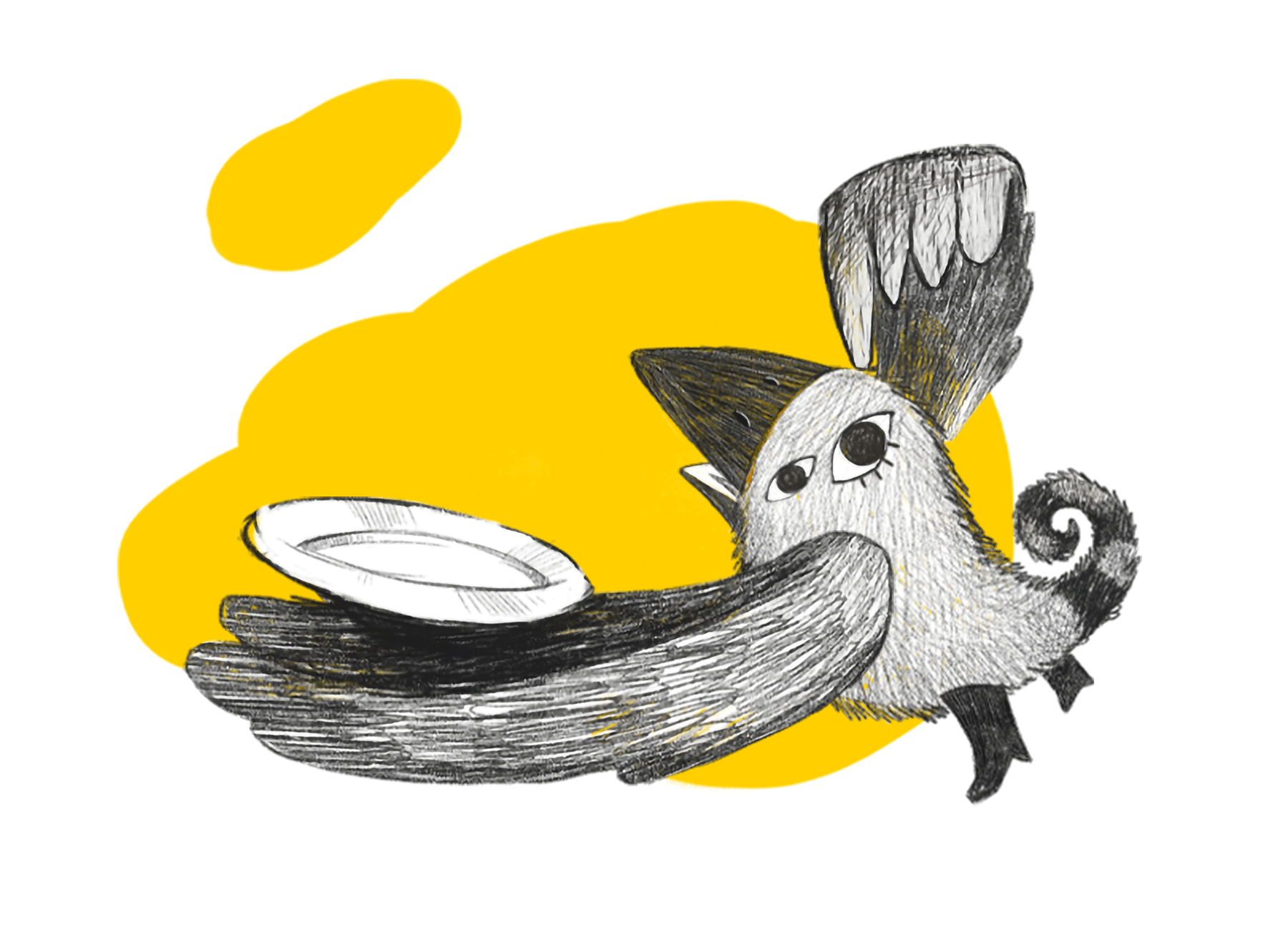
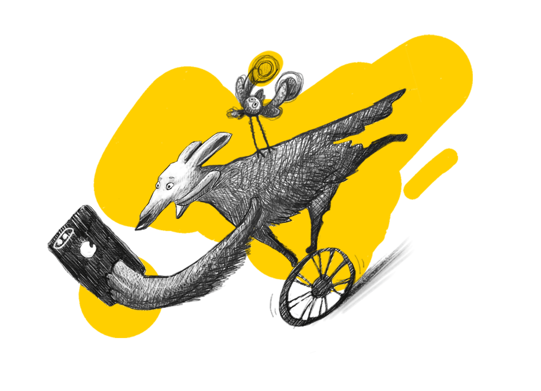
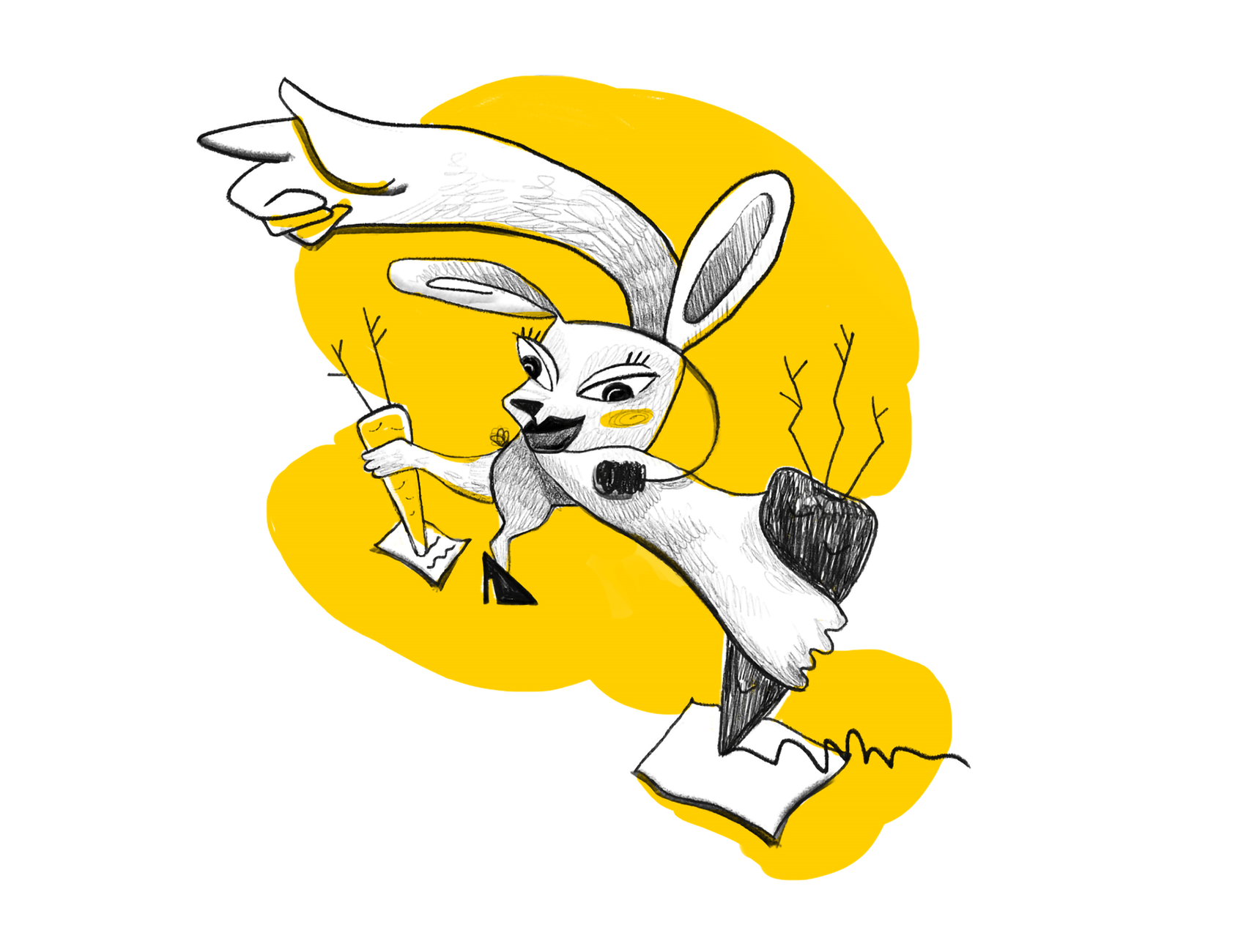
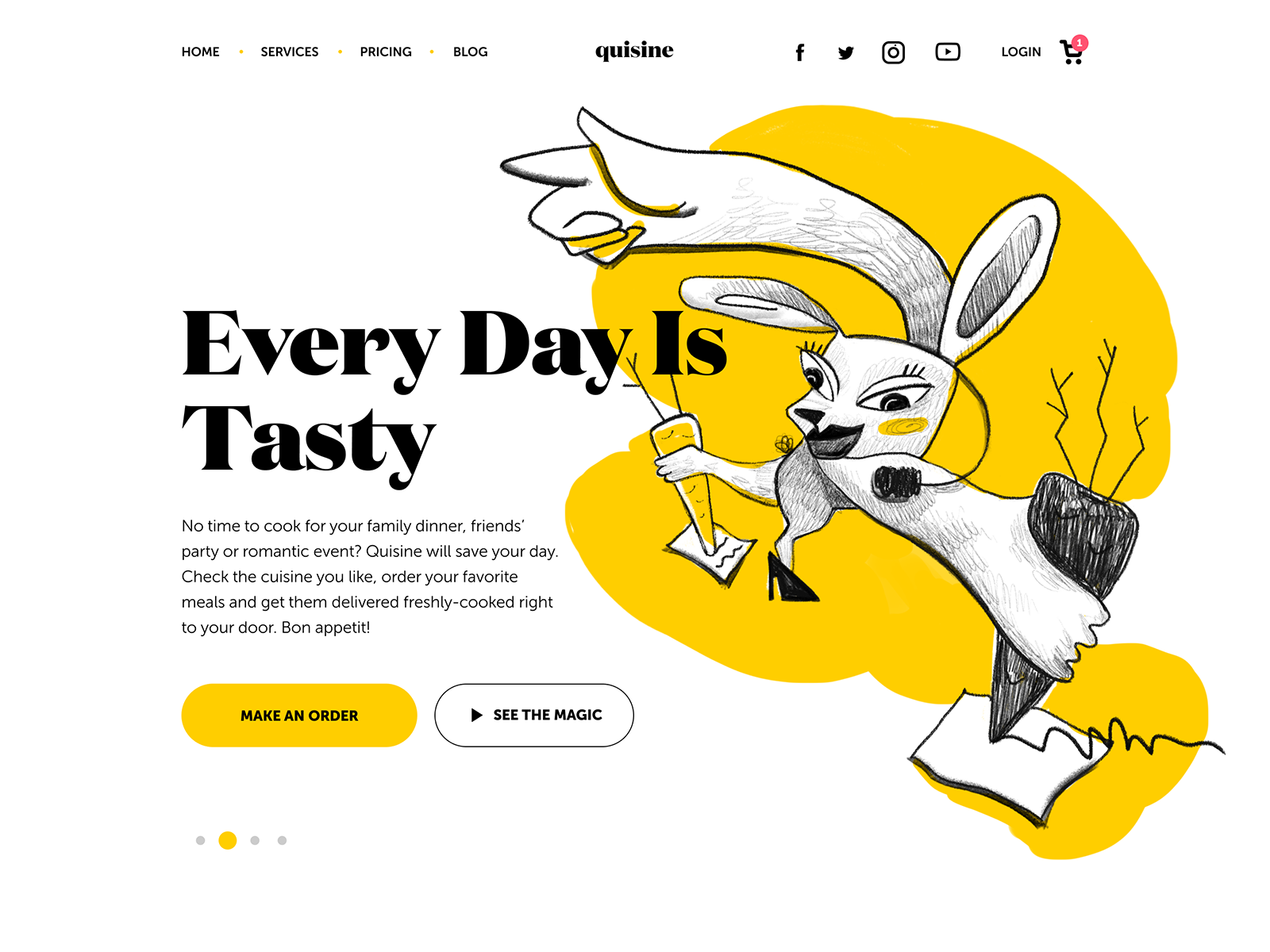
To make the brand catchy and memorable, original mascot characters were designed to feature connections with the main role models participating in the service. For example, a funny bird represents the chef, a dog looks like a courier always in a hurry to deliver the meals, and a bit futuristic rabbit may remind you of a manager having her hands full to accept all the orders.
Visual Consistency
The branding and promotion strategy of the service has to take into account both digital and physical communication with the user. The visual consistency is reached with several key elements: logo, colors, illustrations, and typography. From packaging design and uniforms to vehicle livery, website and social networks, all the channels of communication with the buyer look belonging to one system and grow brand awareness.
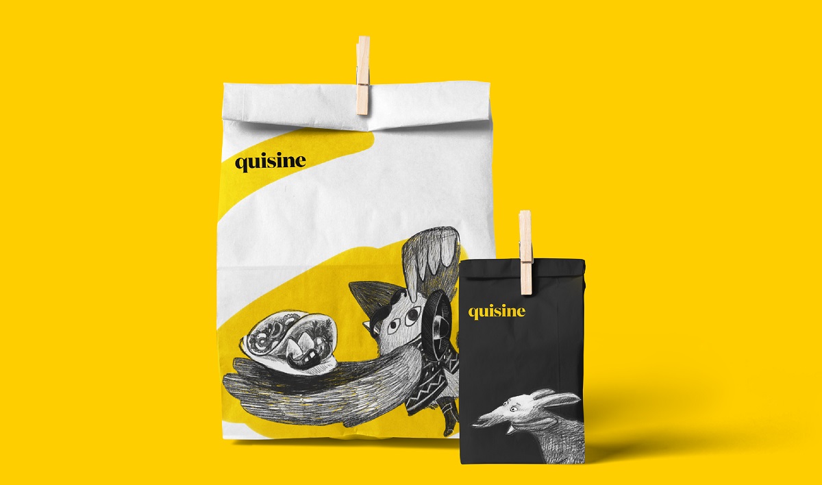
Packaging design options
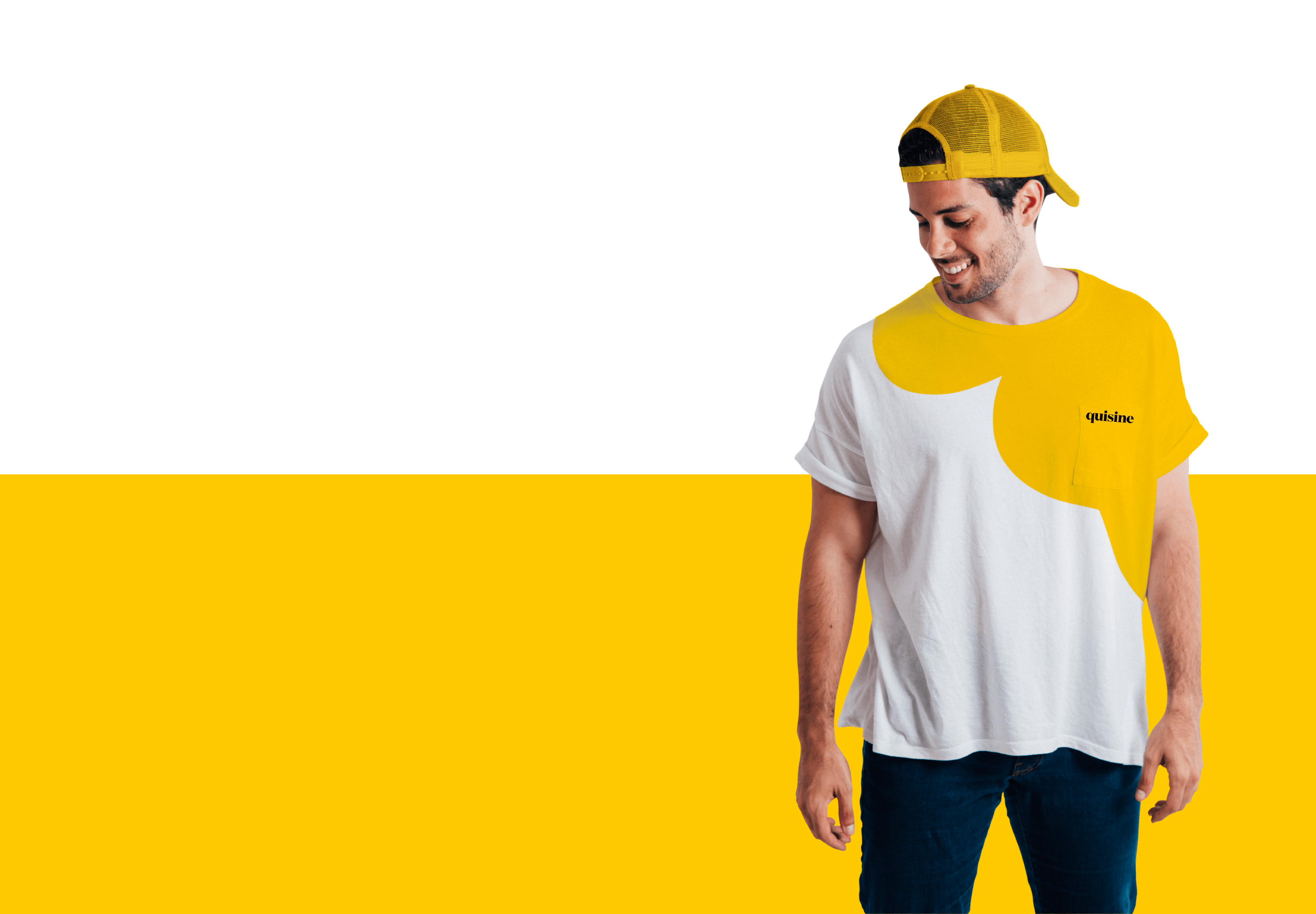
Branded T-shirt
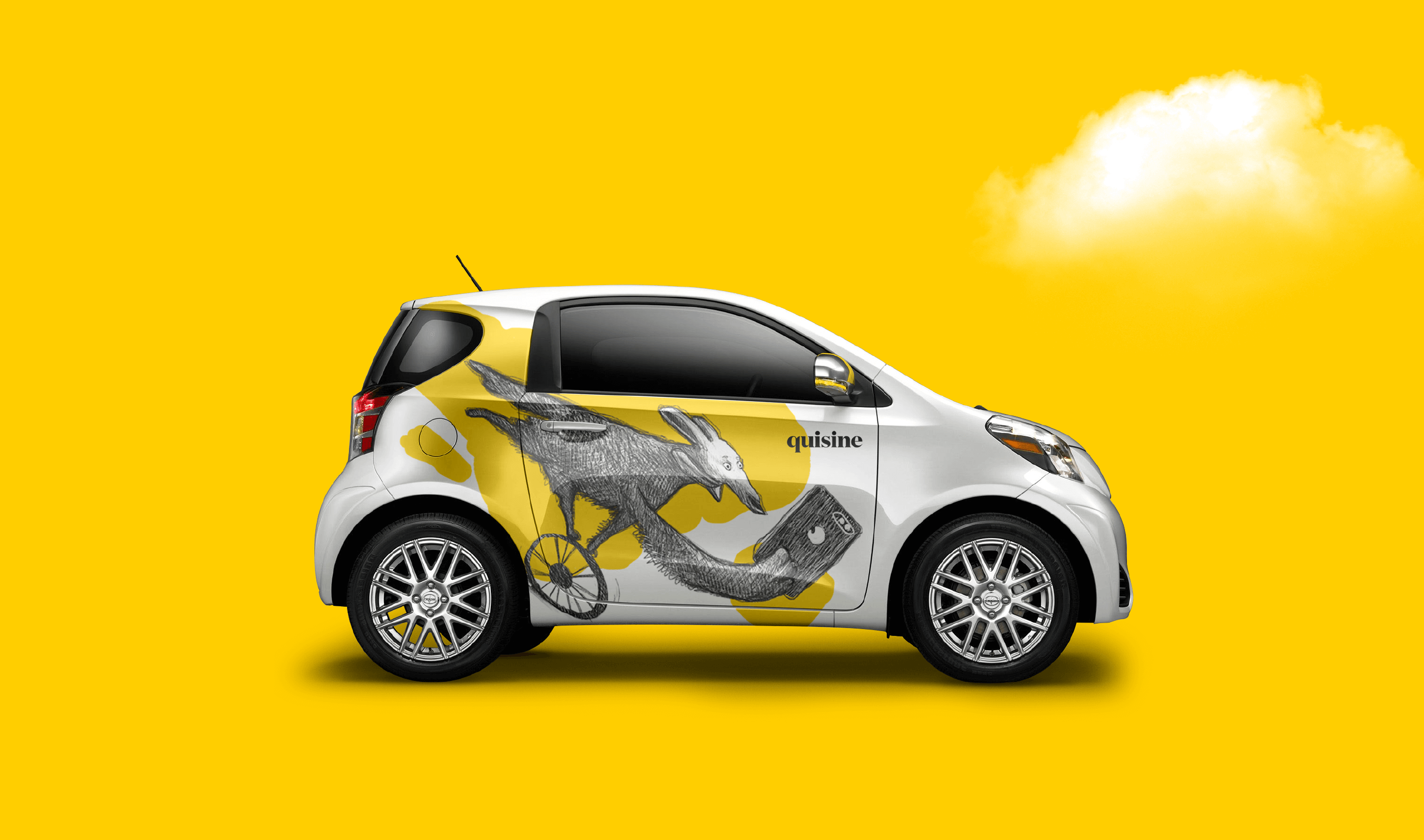
Vehicle livery design
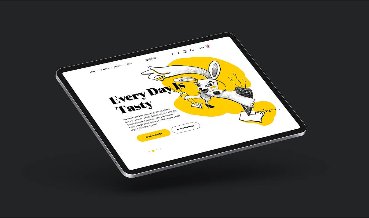
Website home page
Website Design
The user interface design of the website is based on simplicity. It’s full of air and uses a limited color palette that supports quick connection to the brand and helps visitors to avoid distraction and make the web pages scanned easily due to contrast colors and readable fonts. The original illustrations support positive user experience with the power of storytelling and give the layout original and trendy looks. Prominent CTA elements are seen instantly to focus users’ attention on the core interactive zones.
More Design Case Studies
Logo Design: Collection of Creative Logos for a Variety of Brands
Dicey. Logo and Mascot Design for Party Game
MYWONY. Storytelling with Brand Intro Design
Tasty Burger. UI Design for Food Ordering App
Florence App. Illustrations for Healthcare Service
Inspora. Brand and UI Design for Virtual Stylist
AppShack. Logo Design for a Digital Agency
LunnScape. Identity Design for a Landscape Company