There’s a particular kind of pressure that comes with designing for designers.
Not because they’re difficult clients—in our experience, people who care deeply about craft make the best ones. But because the margin for the ordinary is zero. You’re making something for an audience that notices everything: the tracking on a headline, a transition that’s 80ms too slow, a grid that almost works.
When Awwwards asked us to design their Annual website for 2020—the platform where the web design world gathers each year to vote for its best—we understood the stakes immediately.
This is the story of how we built it, and the one decision that changed everything.
Client and Project
Every year, Awwwards creates a dedicated website for their Annual awards: a place where the community votes across categories—best websites, studios, developers, mobile projects, e-commerce. The brief is always the same in structure and always different in execution, because each year a different Awwwards resident team takes it on.
In 2020, that team was us.
The creative team—Ernest Asanov, Kirill Erokhin, Andrey Drobovich, Alexander Petulko, and Polina Taran—started where we always start: with conversations. What did Awwwards want people to feel when they landed on this site? What had previous Annual sites done well, and where was there room? We spent time in the archive, studying the lineage, understanding what the community expected before we thought about how to surprise them.
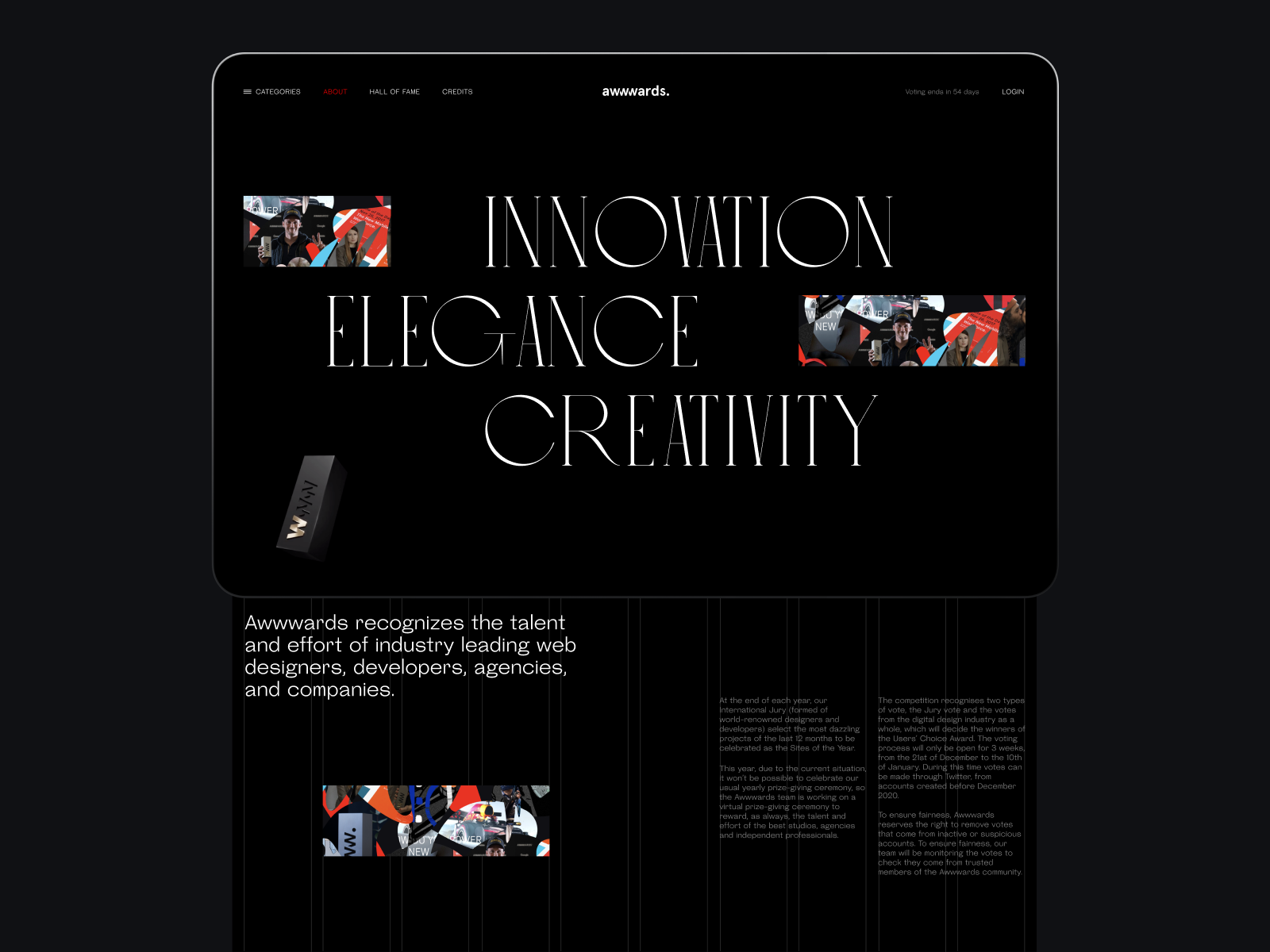
The mood boards from this phase tell their own story—a pull toward dark backgrounds and bold typography, a sense that this needed to feel like an event, not a utility.
The Search for a Visual Language
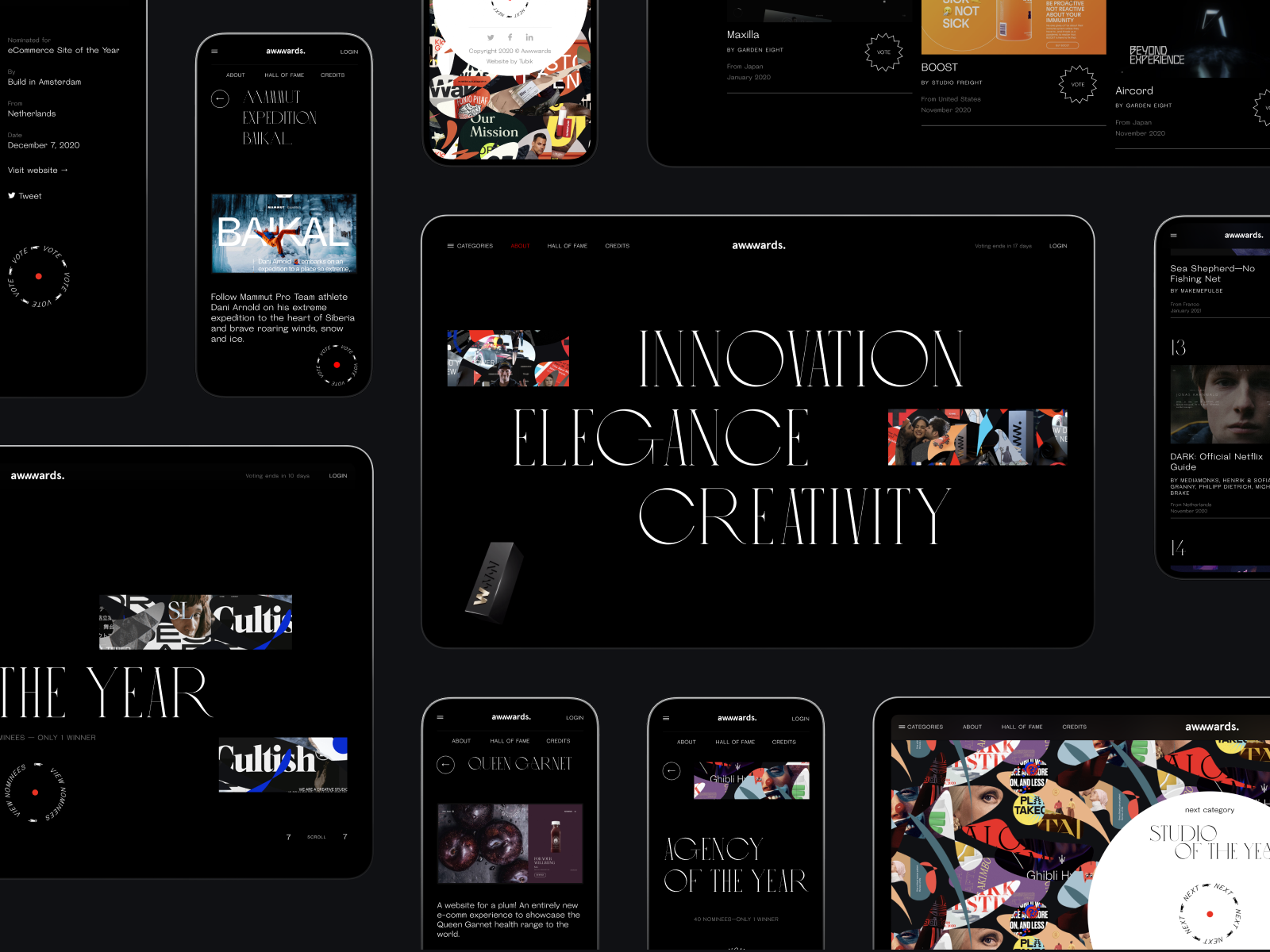
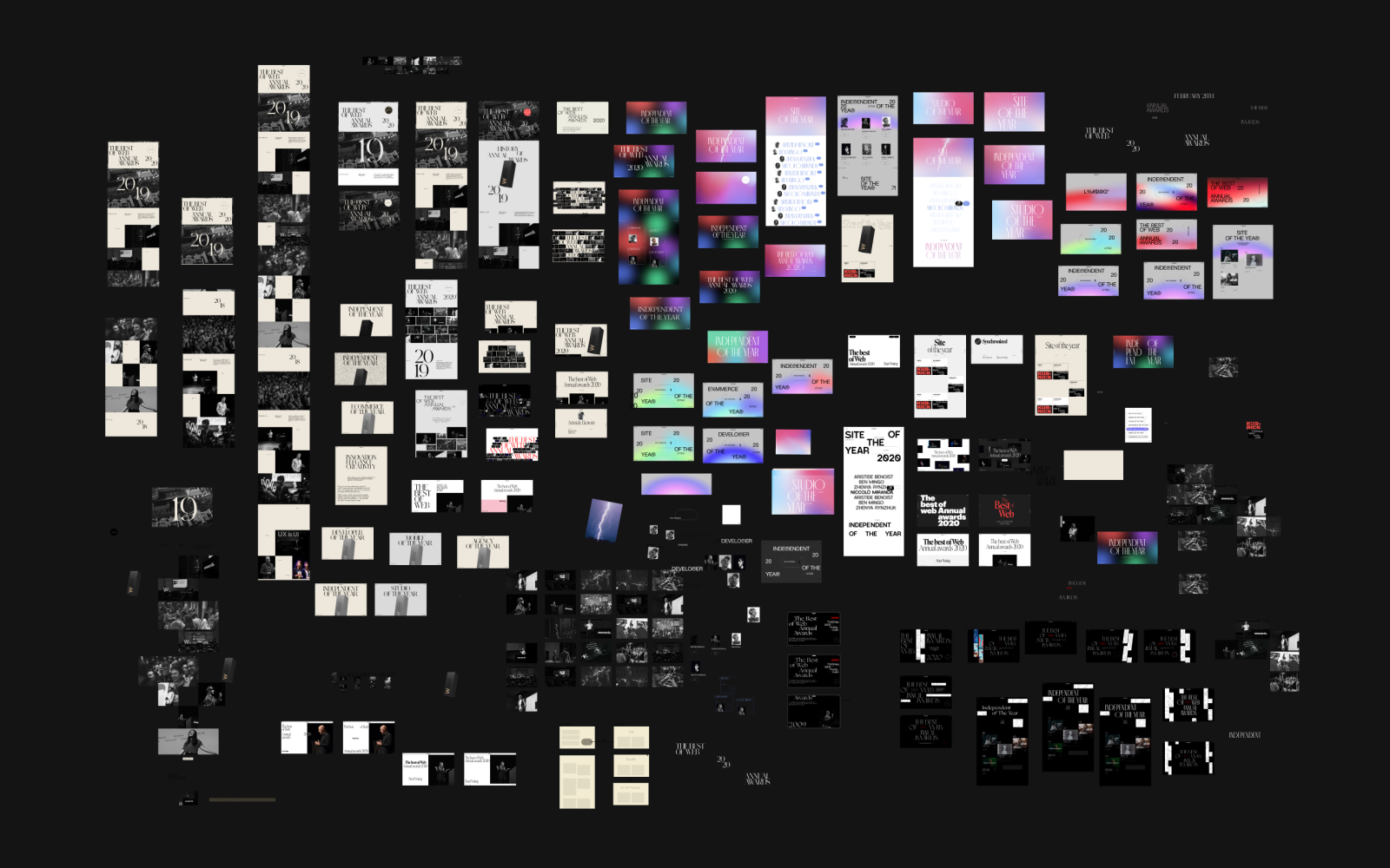
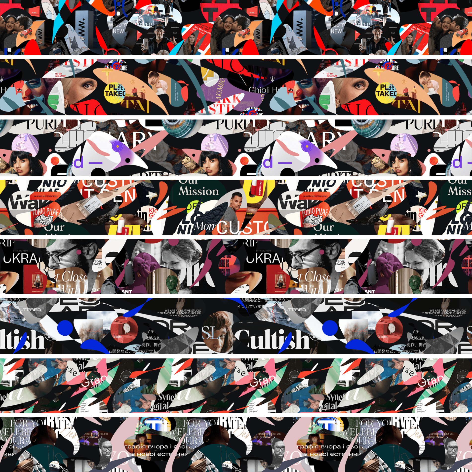
The first real design challenge was the pattern. Not the layout, not the typography—the background pattern that would run through every page, every category, the connective tissue of the whole experience.
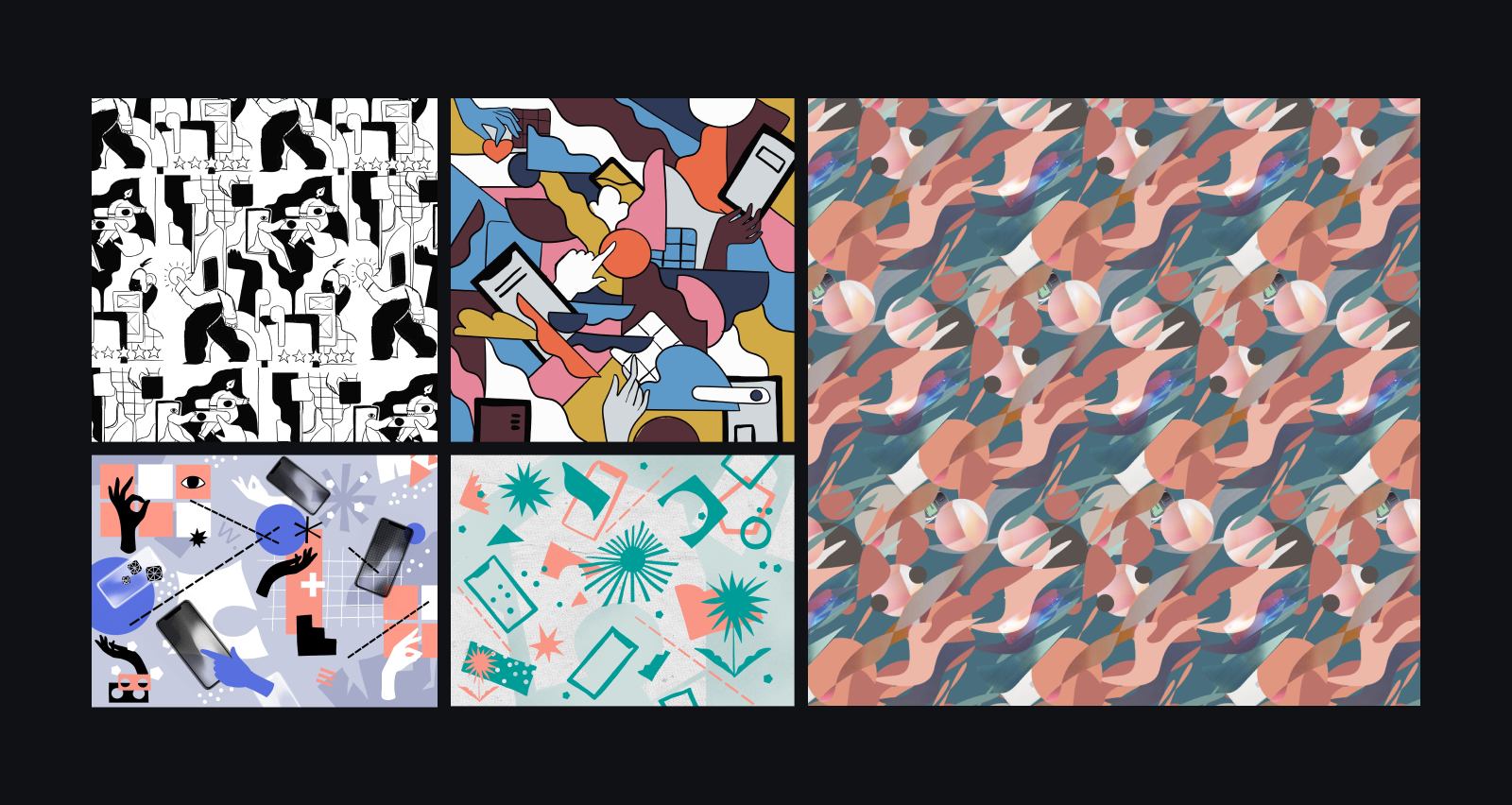
We tried illustration first. Tubik has always worked in a visual idiom where illustration and UI coexist—it’s central to how we think about design. So we developed several illustration concepts: different styles, different tones, some abstract and geometric, some more figurative. Each had genuine appeal in isolation.
Then we put them into the actual layout, and something important became clear: they looked beautiful, but they looked like us. And this website wasn’t about us. It was about a community too large, too diverse, too creatively varied to be faithfully represented by any single illustration style. Whatever visual language we chose needed to contain multitudes.
That realization is what led to the idea that made the project.
The Nominees Became the Design
One of our designers—staring at the problem of what image could possibly represent the entire range of Awwwards work—arrived at an answer that was obvious in retrospect and invisible until it wasn’t: use the work itself.
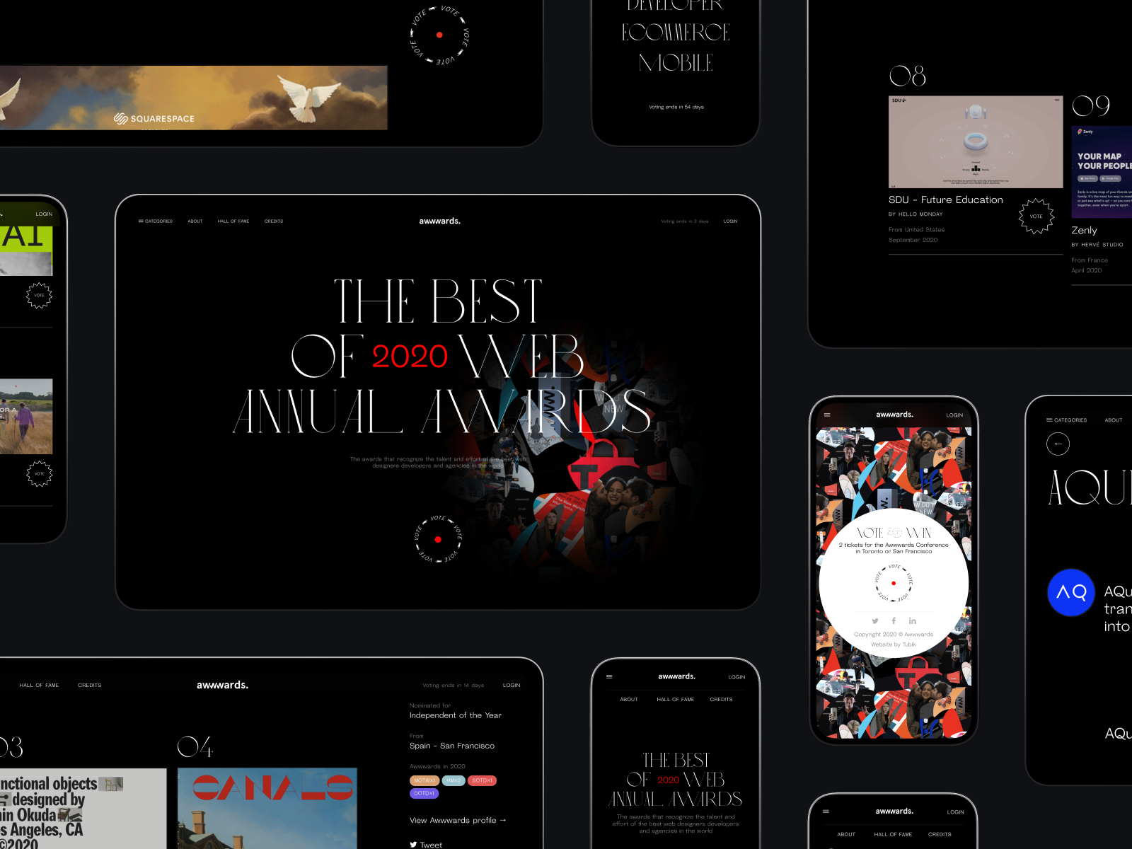
The background pattern was built from carefully extracted fragments of the actual projects nominated for 2020. Real screenshots. Real designs. Cropped, composed, and arranged into an abstract collage that, on first glance, reads as a rich, textured graphic system—and on second glance, reveals itself as a mosaic of the community’s own output.
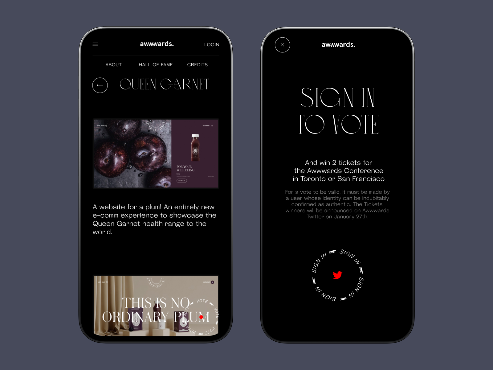
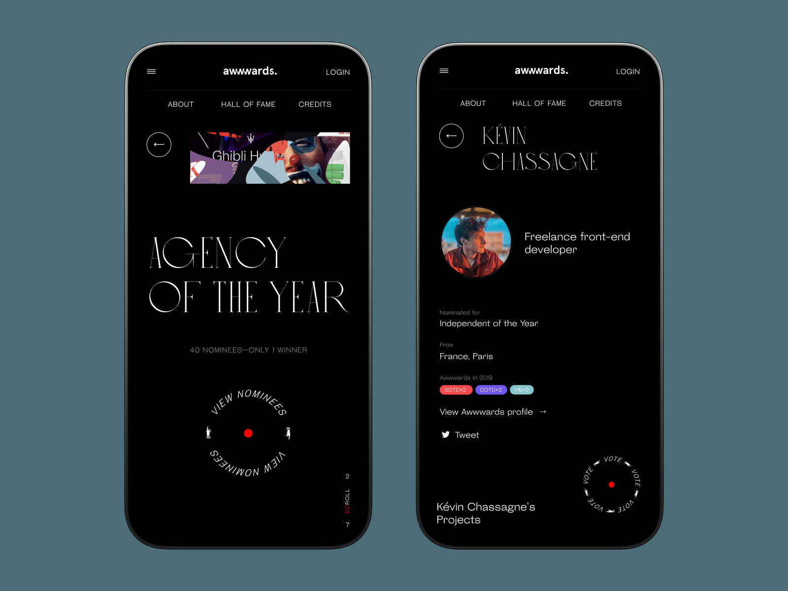
The effect was more than aesthetic. An Awwwards resident visiting the site could recognize a fragment of a project they submitted. Or one they’d admired on the platform. The pattern wasn’t decorating the voting website—it was the voting website’s subject. Form and content collapsed into one thing. Every category page was built from fragments of work nominated in that category, personalizing the background for each section without any sense of arbitrariness.
The Details That Made It Move
The homepage opens with a loading animation—a small circle capturing fragments of the pattern, expanding and resolving into the animated Vote button. It’s the kind of transition that people describe as “smooth” without knowing why, but what they’re responding to is narrative: the animation tells you something before you’ve read a word.
The torch effect on the homepage—where cursor movement reveals portions of the pattern, as if you’re lighting a dark space with your own attention—added a quality that the web rarely achieves: the feeling that a page is responding to you. Interaction design at its most literal and most effective.
The multilayered grid on the scroll, the category pages with their depth effect following the cursor, the typographic menu interactions that use scale and weight as theater—these weren’t ornaments added to a finished design. They were the design. We were working on a canvas where the audience would be bored by anything less.
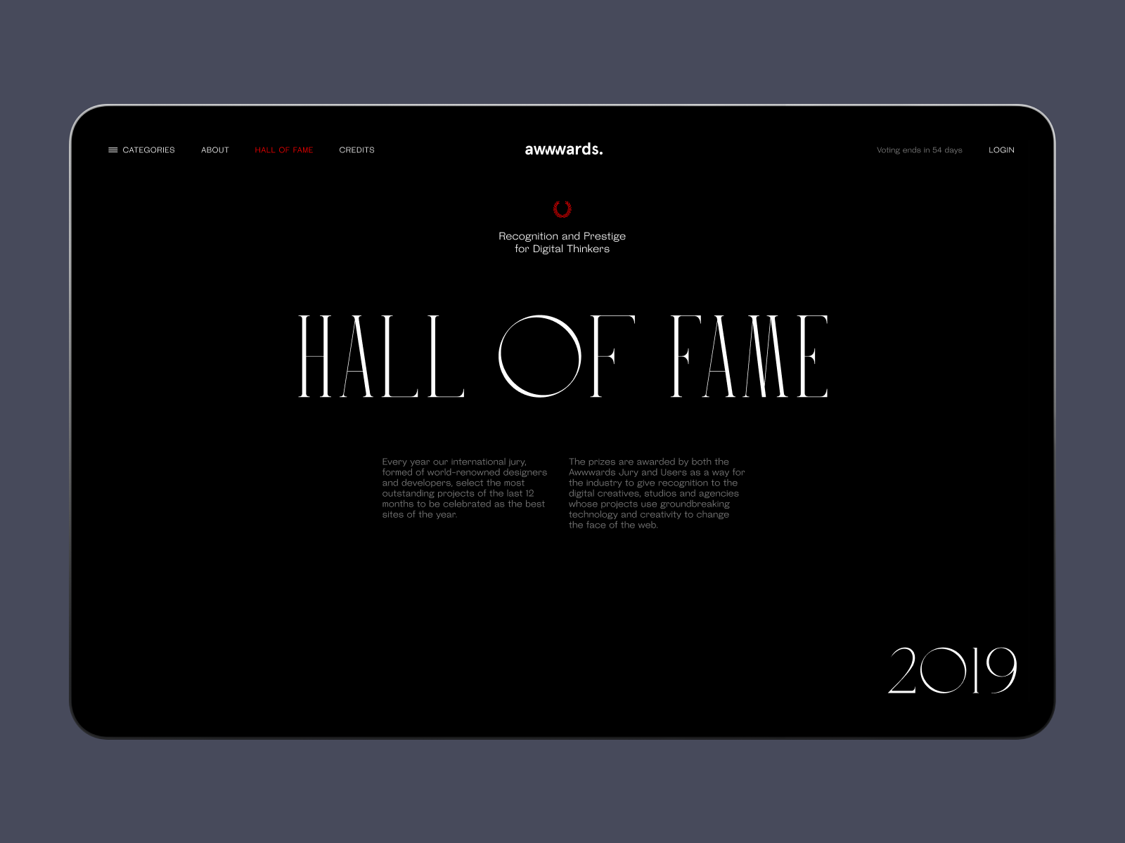
One addition distinguished this Annual from its predecessors: a Hall of Fame page for previous winners. Minimal, elegant, more archival than celebratory. It gave the website a sense of time—a reminder that the community it represents has a history worth honoring.
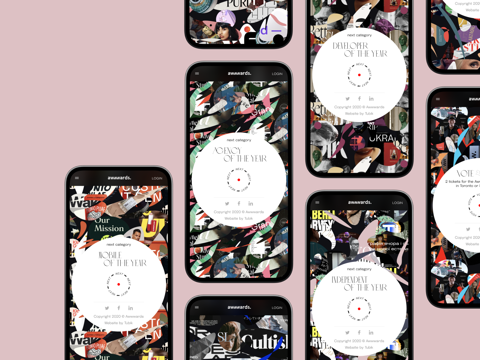
Mobile adaptation was treated with the same level of attention as desktop. On a project like this, it would be easy to rationalize mobile as secondary. It isn’t. The experience had to hold across every device without compromising the atmospheric quality of the design.
What We Took From It
Oscar Pérez, co-founder of Awwwards, said afterward that the team had pushed modern browsers to their limits while maintaining an experience that felt playful rather than labored. That balance—technically ambitious, humanly legible—is the goal in any project, and difficult in most. Here it was both necessary and achievable, because the subject matter and the audience demanded it.
The thing we return to, designing for design’s own community, is that the problem solved itself once we stopped trying to represent the community from the outside. The pattern built from nominees’ work wasn’t a clever concept. It was the honest answer to the honest question: whose work is this website actually about?
Theirs. It was always theirs.
The best design often works that way—not by imposing a voice, but by creating a space where the right voice is already there, waiting to be heard.
Recommended Reading
Enjoyed this read? Make sure you check other case studies by Tubik team:
Uplyfe. Identity Design for Health App
Devpost. Hero Illustrations for Hackathons Platform
ShipDaddy. Identity and Web Design for Shipping Service
Credentially. Website Creation with Webflow
Dicey. Logo and Mascot Design for Party Game
Branding Design Process in Tubik: FAQ from Clients
HUAWEI. Icon Design for EMUI 10
ABUK. Custom Book Cover Design for Audiobook App
Illuminating Radioactivity. Interactive Web Design for Education