
Whatever beautiful and elegant a website is, whatever useful content, services, or products it offers, all the benefits may easily be ruined by only one factor: poor navigation. In this article, we continue the theme of web usability, this time to discuss breadcrumbs as an element of web navigation. Let’s learn what this term means, explore the types of breadcrumbs and best UX practices to make them work effectively.
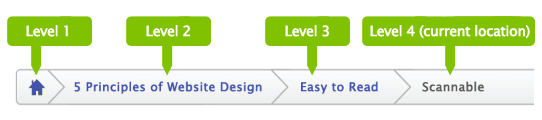
What Are Breadcrumbs
Breadcrumbs are navigation elements used mostly in web design and supporting users in a journey around the website. Due to breadcrumbs, users get aware of where they are on the website and can get used to the website structure easier, which means that breadcrumbs present a tool for better wayfinding. Yet, breadcrumbs don’t replace the primary navigation menu; they present the secondary level of navigation and increase website usability in case it has lots of pages.
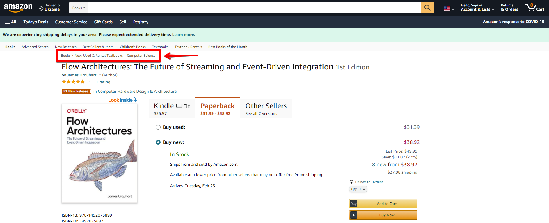
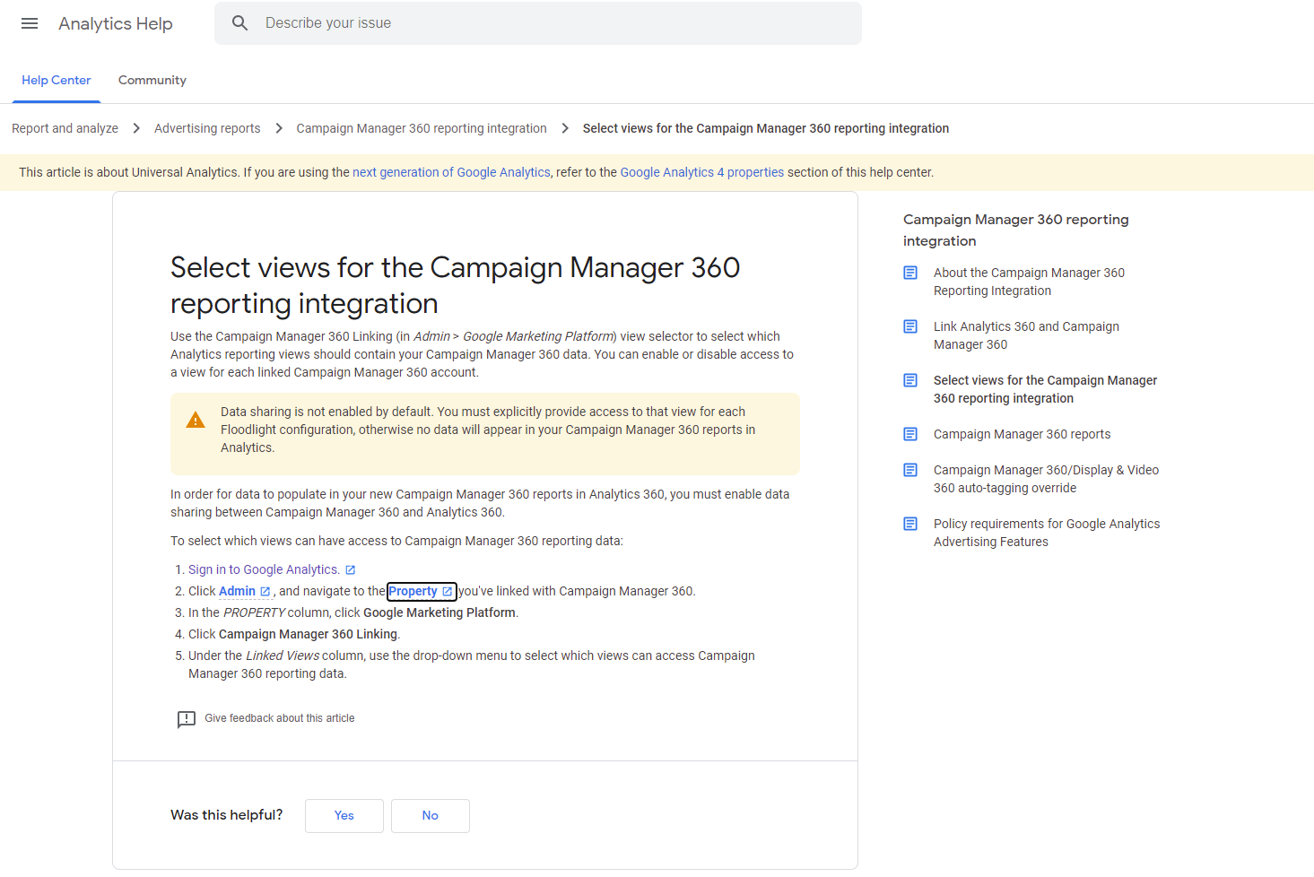
Breadcrumbs on the product page on Amazon
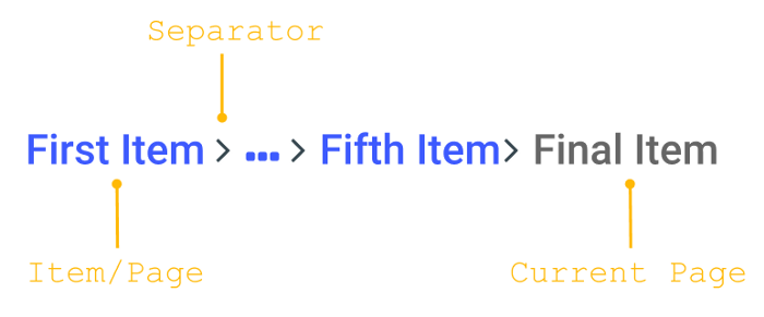
Why such a funny name is used for this interactive element? If you think it resembles something from a fairytale rather than from design terminology, you are right. The term echoes Grimm Brothers’ tale about Hansel and Gretel: in it, the characters used breadcrumbs to mark the way home and not get lost. On the web, it works the same way: breadcrumbs visualize the path or the users’ journey from the perspective of the website hierarchy. That’s why they are also called a breadcrumb trail.
Types of Breadcrumbs
As for classification, there are three basic types of breadcrumbs:
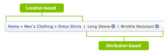
Location-based: they show the visitors where they are according to a website hierarchy, usually applied to websites with complex navigation schemes consisting of multiple levels.
Attribute-based: they show the visitors the trail of attributes of the page they are on.
Path-based: these show the visitors the trail of steps they took to arrive on the page they are on. This type is often referred to as less effective compared to previous ones and is not recommended to apply.
Why Use Breadcrumbs
Among the benefits of breadcrumbs as a navigation element, we would mention the following.
- increased findability: the more complex is the website architecture, the more content it has, the better organized it should be to be found quickly. Breadcrumbs give users another touchpoint to the content and help to understand the structure of the website easier
- fewer clicks needed: with breadcrumbs, website visitors can jump from one level of the hierarchy to any previous step with no effort and no need to take all the way back, which means it takes fewer clicks and transitions to reach the page they want
- effective use of screen space: crafted well, breadcrumbs take a narrow horizontal line with plain-looking text elements that don’t need much space, so users get navigated but designers have no need to overload the page
- no misinterpretation: breadcrumbs present the element which is hardly ever misunderstood by users: the behavior pattern for them has solidified through years and people rarely mistake this element for anything else
- lower bounce rate: breadcrumbs are great support for first-time visitors or people that have no everyday experience of dealing with complex websites, so the more confident they feel the slimmer are the chances of them bouncing the page. What’s more, it’s an effective way of engagement for the users directed to a particular landing page: seeing it as a part of the bigger structure shown via breadcrumbs, users can get interested in jumping to other pages and see more.
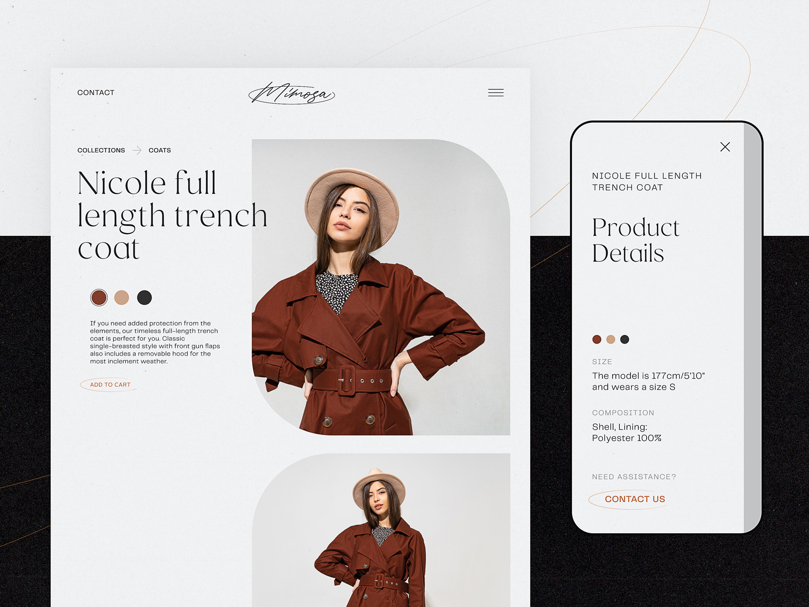
Minimalist product page by tubik for an e-commerce website uses breadcrumbs to follow the typical mental model users expect and help them with quick navigation.
Design Practices for Breadcrumbs
Here’s a bunch of UX design tips and practices that can help to master breadcrumbs as a supportive and handy element of web navigation. Bear in mind that none of these practices is a cure-all to apply for any website: the examples below show you how different products approach this navigation element to cover their priorities.
Don’t use breadcrumbs as the primary navigation
The key rule of thumb for breadcrumbs is using them as an addition to major navigation. They shouldn’t be seen and used as a replacement for global navigation, usually found in the website header or menu. Instead, they support and amplify primary navigation.
Place breadcrumbs above the H1 heading
The most common place where users expect to find breadcrumbs and where they work effectively as a part of the general layout is above the H1 heading. It may be the name of the category, the product, the article’s title, etc. Sure, not all the pages have visually defined H1 heading; in this case, designers find the most appropriate place, typically in the top part of the layout.
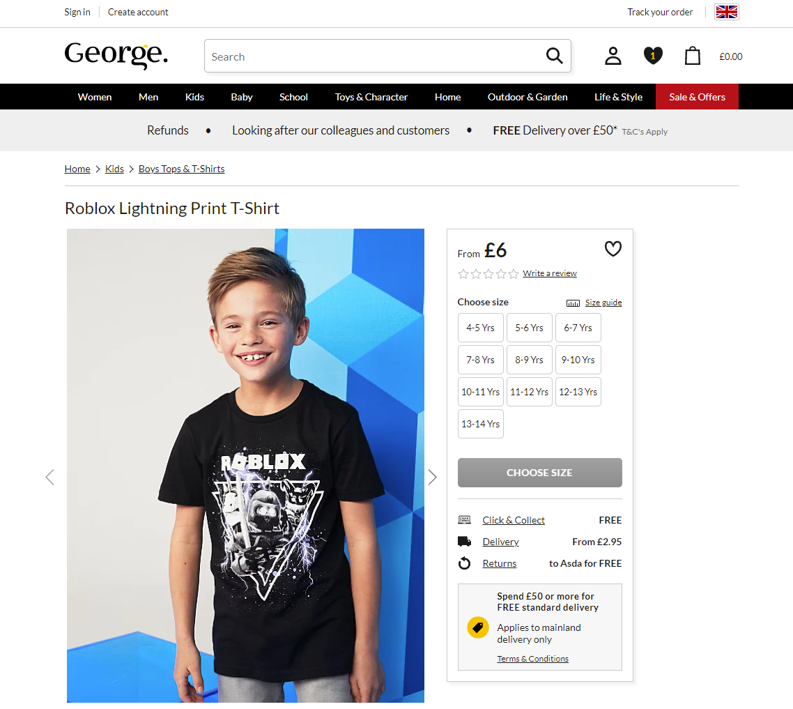
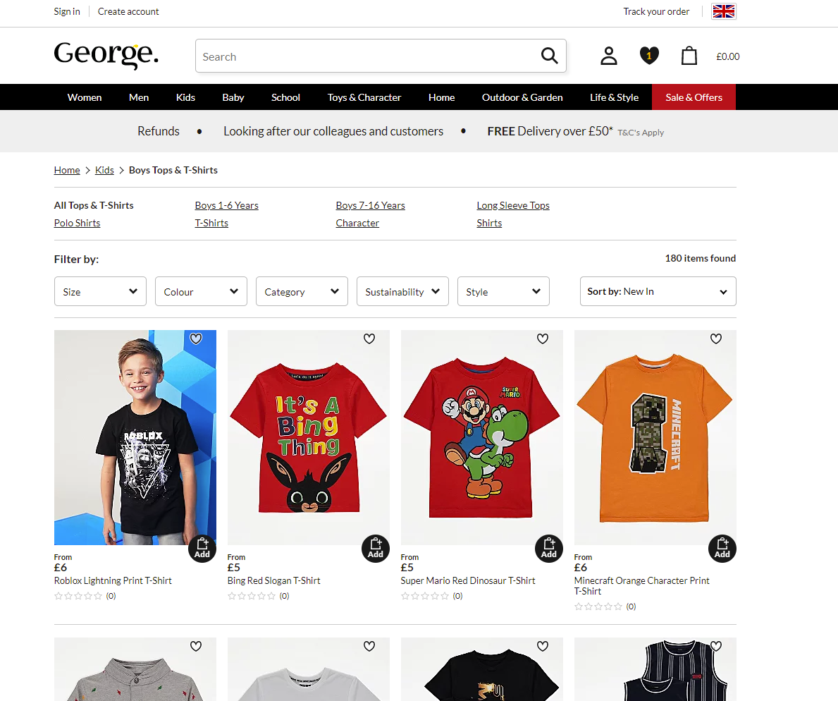
For instance, on the George website, the product page features the classic approach to the breadcrumbs: they are placed right above the H1 heading, with a slight line used as a visual divider between them. However, on the category page, which doesn’t have an obvious H1 title, the breadcrumbs just keep at the same position at the layout, below the top navigation, and visual dividers help to clearly separate the trail from other navigation elements and filters.
Consider starting a breadcrumb trail with a link to the home page
Noticeable and easy-to-reach link to the home page that allows the user to jump to the website’s main page from any point of the journey is still an essential part of web navigation. Although more and more users are getting used to the pattern when the logo featured in the website header is clickable and helps to jump to the home page, there are still many those for whom this flow is not obvious. As the breadcrumbs let users quickly define the website hierarchy and their current position in it, it’s logical to start the trail from the main page of the website.
However, if there is a text link to the home page in the primary navigation, for instance, in the header, you don’t need to double it in the breadcrumbs.
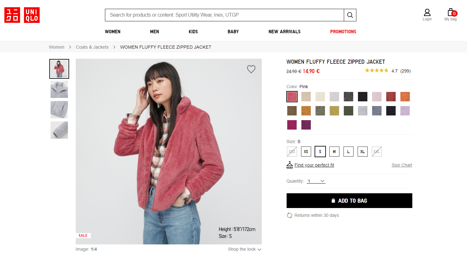
As well, in the case of a polyhierarchical website, you may want to concentrate users’ attention on a particular level or category instead of sending them to the home page. For example, Uniqlo starts the trail from the name of the major category user is browsing at the moment, letting the logo in the top left corner do the job of moving visitors to the home page.
Make current location look non-clickable (or don’t show it)
There are two different approaches to the last item of the breadcrumb trail: you may show the name of the current page or finish it with the previous step, which means that the current page’s name isn’t shown at all. Whatever is your choice, make sure that all the elements cover a particular goal and help users. If you suppose that adding the current location to the breadcrumbs is necessary to support usability, make it clear that it’s not clickable and thus looks different from the interactive elements. For mobile experience, it’s better not to show the current location at all as the screen space is very limited.
On the contrary, for all the other elements of the breadcrumb trail, make it obvious that they look clickable and are clickable.
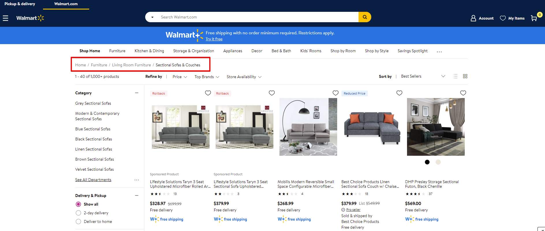
Example of a breadcrumb trail on the Walmart website
Clearly separate the elements
One of the most popular separating symbols for the elements of the breadcrumb trails is the symbol “greater than” (>), which typically defines hierarchy and features the movement from the parent category to the child category. Other frequently used symbols are slash (/), right-angle quotation mark (»), and arrow to the right (→). So, designers do have what to choose from, don’t they? Some also separate breadcrumbs with the color putting them into the colored tabs that imitate the line of elements, each colored in a different shade.
Mind readability and white space
As well as for any text element, the primary goal of breadcrumbs is to make the information packed in written form perceived and absorbed easily and in no time. So, take care of making them highly readable rather than decorative. And make sure there is enough space between the elements so that it was easy to read them, visually separate the pieces of text, and click.
A clear and unobtrusive breadcrumb trail on the Google Support website
Show the website hierarchy instead of the interaction history
Unlike the fairytale characters who used breadcrumbs to mark all their way, web designers would do much more effectively turning to show users the clear hierarchy of the pages instead of all the way they got through to reach this page. Such an approach will always look more logical and, furthermore, will clarify the clear and simple path back for the visitor who could get lost otherwise. What’s more, in this case, breadcrumbs don’t work at all for users who landed on a particular page and didn’t take any steps yet.
As Jacob Nielsen mentioned in his article, “a history trail can also be confusing: users often wander in circles or go to the wrong site sections. Having each point in a confusing progression at the top of the current page doesn’t offer much help.”
Don’t clutter the page with too many elements
What if the breadcrumb trail gets too long? Sure, it won’t be good to overload the page, especially at the secondary navigation level. In the case of the too long breadcrumb trail, some of them in the middle can be hidden behind the ellipsis. But never hide the first and the last element so as not to break the logic.
In his article about breadcrumbs, Alex Zlatkus recommends not to let breadcrumbs take more than half of the page and think about such a shortening with an ellipsis inside when the trails get more than 5 items.
Sure, the final decision is up to the designers of the particular project. It should be based on usability testing, as there can be different creative design solutions that allow for organizing longer breadcrumb trails effectively.
Don’t emphasize breadcrumbs visually in the webpage layout
If you feel the urge to find a super bright and catchy solution for the breadcrumbs, consider refocusing that on the other object of the web page layout. Breadcrumbs are not the primer violin in this show; that’s not the goal behind them, so keep them stylish but moderate. No need for bright accents, bigger size, impressive fonts – breadcrumbs should just provide the secondary level of wayfinding, not scream into users’ faces distracting them from more important things that solve users’ problems.
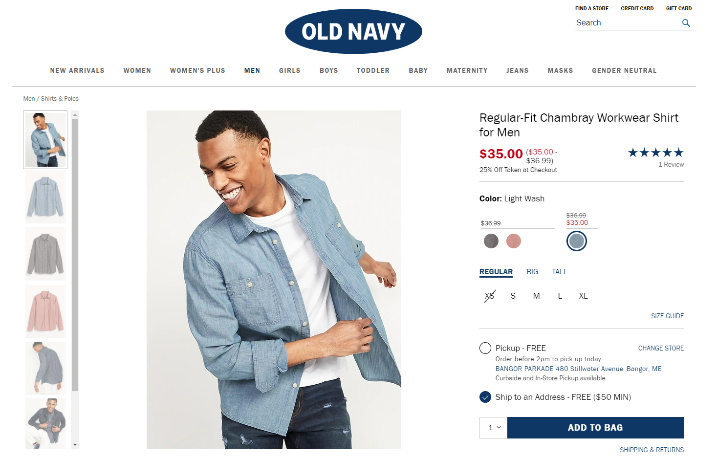
For example, the OldNavy website uses super minimalist and non-distractive breadcrumbs placed in the top left corner right below the header with primary navigation, this way sticking to a common left-to-right reading and scanning pattern. That makes breadcrumbs almost unnoticed when you don’t need them but easily found when needed.
Don’t use multiple lines of breadcrumbs on mobile
The most precious asset of any mobile app screen is space. So, optimizing your website for mobile, take special care about that aspect: if the breadcrumbs trail is just copied from the website to mobile, it may take several lines, and this way snips off the big part of the limited screen space. So, by that, you get into the higher risk that some critical elements, for example, the name of the product on the product page or the introductory text, won’t be seen at once just due to the lack of space.
Don’t apply breadcrumbs to the websites with a flat or simple hierarchy
As well as with internal website search, breadcrumbs are needed and helpful in cases when the website has multiple pages and a complex hierarchy consisting of multiple layers. Breadcrumbs are common – and expected by users – in big e-commerce websites and platforms, media and news websites, blogs, and magazines covering a wide range of topics, etc. If that’s not your case and your website has a simple hierarchy, primary navigation will be enough to let the users effectively interact with it.

Example of a breadcrumb trail on the California State University website
Breadcrumbs present the perfect example of how much details matter in user experience design for the web. Being far from primary and critical functionality but approached thoughtfully and crafted well, this interaction element can contribute much to making interactions easier and user-centered. Nevertheless, think twice and test twice before deciding upon them, as there may be more effective secondary navigation options to solve a particular task for a certain project.
Useful Articles
Here’s a bunch of articles to dive deeper into the theme of web usability and user experience design.
5 Basic Types of Images for Web Content
The Anatomy of a Web Page: 14 Basic Elements
UX Design: How to Make Web Interface Scannable
How to Design Effective Search
Web Design: 16 Basic Types of Web Pages
Directional Cues in User Interfaces
Negative Space in Design: Tips and Best Practices