What is design? In a nutshell, it’s the way to solve people’s problems and satisfy their wishes employing logic and beauty. In this article, we offer to discuss the role of beauty in user experience design: let’s check how it makes both users and businesses happy.
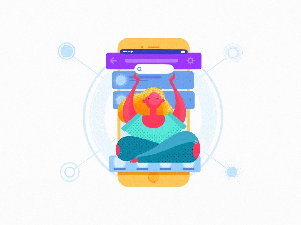
Cloud storage application concept
Why Beauty Is Important for Design
We often hear that the functionality of a digital product is a priority for users – and that’s true. The website or mobile application should solve their problem effectively, easily, and intuitively. But what happens next, when the product is not the only one, not something exclusive and unique anymore, and natural competition comes into play? People start to look deeper and strive for more. They add aesthetic pleasure and emotional appeal to the list of their wishes. And between two equally good functional products, in the vast majority of cases, the user will choose the beautiful one.
Based on the hierarchy of needs, the higher people get, the more sophisticated and intellectually driven their choices become. Education and income level engage them in thinking beyond functionality: except it, users strive for harmony and aesthetics. So, the role of beauty gets higher.
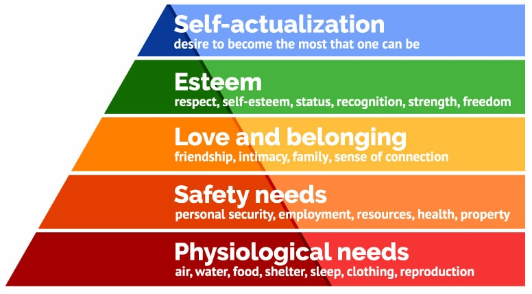
Maslow’s pyramid, demonstrating the hierarchy of needs
Here is a bunch of reasons why beauty works that way in user experience design:
- It makes design emotional, aka human-like
- It keeps the connection of digital things with the real world
- It supports usability
- It satisfies the aesthetic needs
- It unites different things with one style
- It lets the product stand out from the competition.
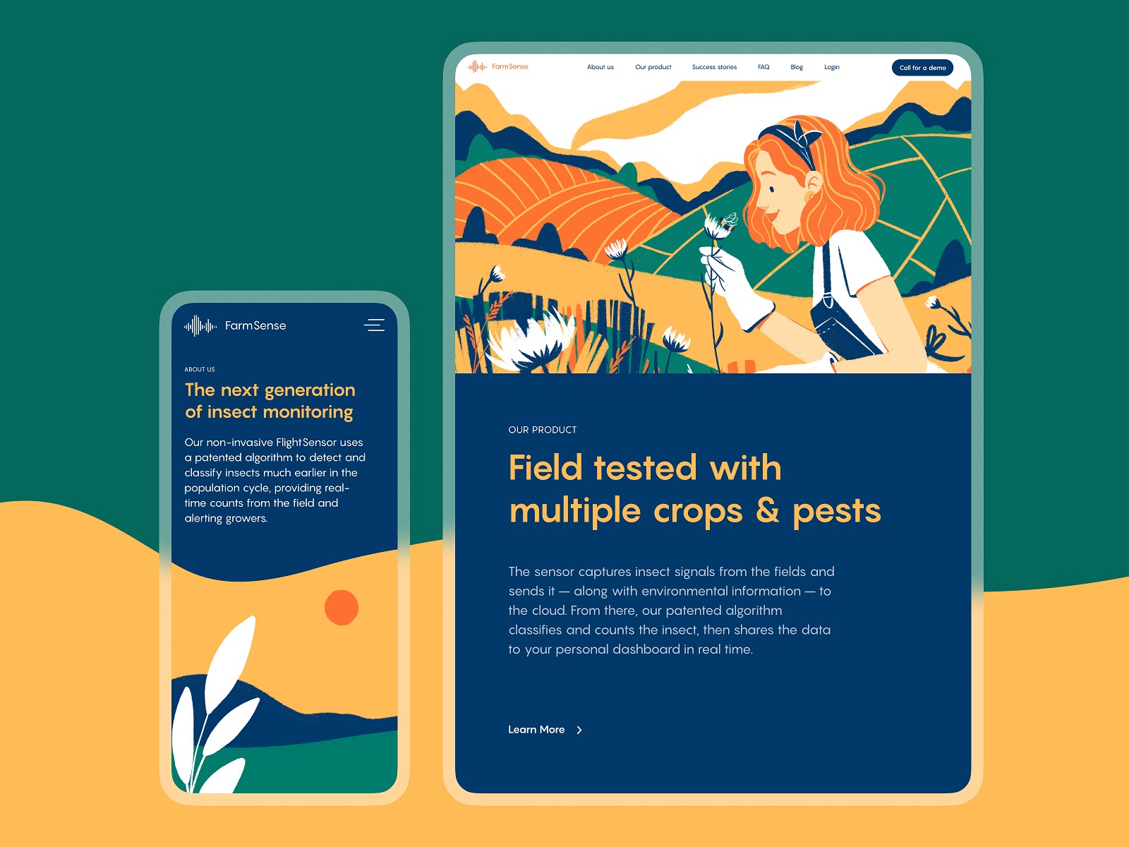
Website design for FarmSense, the innovative agricultural service
Beauty and aesthetics are the solid bridge between the past, present, and future of design. Today, new layouts and graphics are based on the rich heritage of the world culture collected for hundreds of years. Modern designers and artists rework it with a pinch of trends and innovations: building a new circle of cultural history, they preserve the work of the best artists of all generations. That’s when art and aesthetic appeal works for purpose in design. We aren’t reinventing the wheel – we are making it modern and letting it solve people’s problems.
Futuristic and captivating home page for Synthesized website
Daring and artistic design for the Nonconventional Show podcast website
However, we should think deeper. “When you start your next design project, keep this principle in mind: people will forgive shortcomings, follow your lead, and sing your praises if you reward them with positive emotion, “Aarron Walter mentioned in his book, and in his idea, we only get not only proof of the aesthetic and emotionality importance but also a hint of being reasonable with the limited nature of these effects. The beauty and emotional appeal of the digital product will definitely help users interact with it more straightforwardly, trust it faster, and be tolerant of minor issues. But they will not help with major problems if the product has them.
Aesthetic-Usability Effect
Gurus of user experience design Nielsen Norman Group describe it as a phenomenon of aesthetic-usability effect. It refers to users’ tendency to perceive attractive products as more usable. People tend to believe that things that look better will work better — even if they aren’t actually more effective or efficient. This effect is a significant reason why a good user experience can’t just be a functional UI — designing an interface that’s attractive, as well as functional, is worth the effort.
In the practice of human-computer interaction, it was first studied in 1995 by the Hitachi Design Center. Researchers Masaaki Kurosu and Kaori Kashimura tested 26 variations of an ATM UI, with 252 study participants, asking them to rate each design on ease of use and aesthetic appeal. Having analyzed the results, they discovered a correlation between the ratings of aesthetic appeal and perceived ease of use more evident than the correlation between the ratings of aesthetic appeal and real ease of use. Therefore, studies concluded that the powerful impact of the aesthetics of any interface is made on users, even when they try to evaluate the system’s functionality.
Based on that, let’s consider the influence of beauty on UX goals. There are 4 fundamental aspects of UX design, and attractive appearance and visual harmony present the factors that empower all the points.
Usability means that the product works and users understand how.
Otozen application design is thought-out in every detail to make interactions easy and intuitive for users.
Accessibility allows the interface to work for different people with different abilities and across various devices.
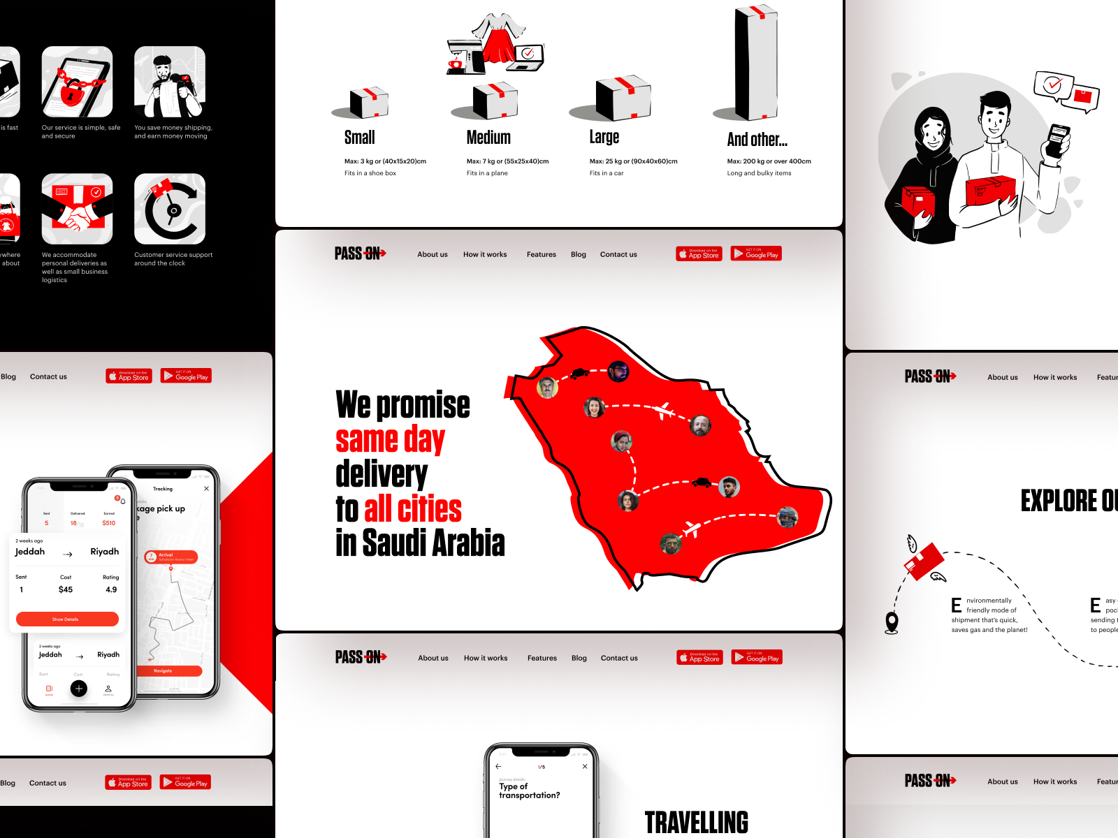
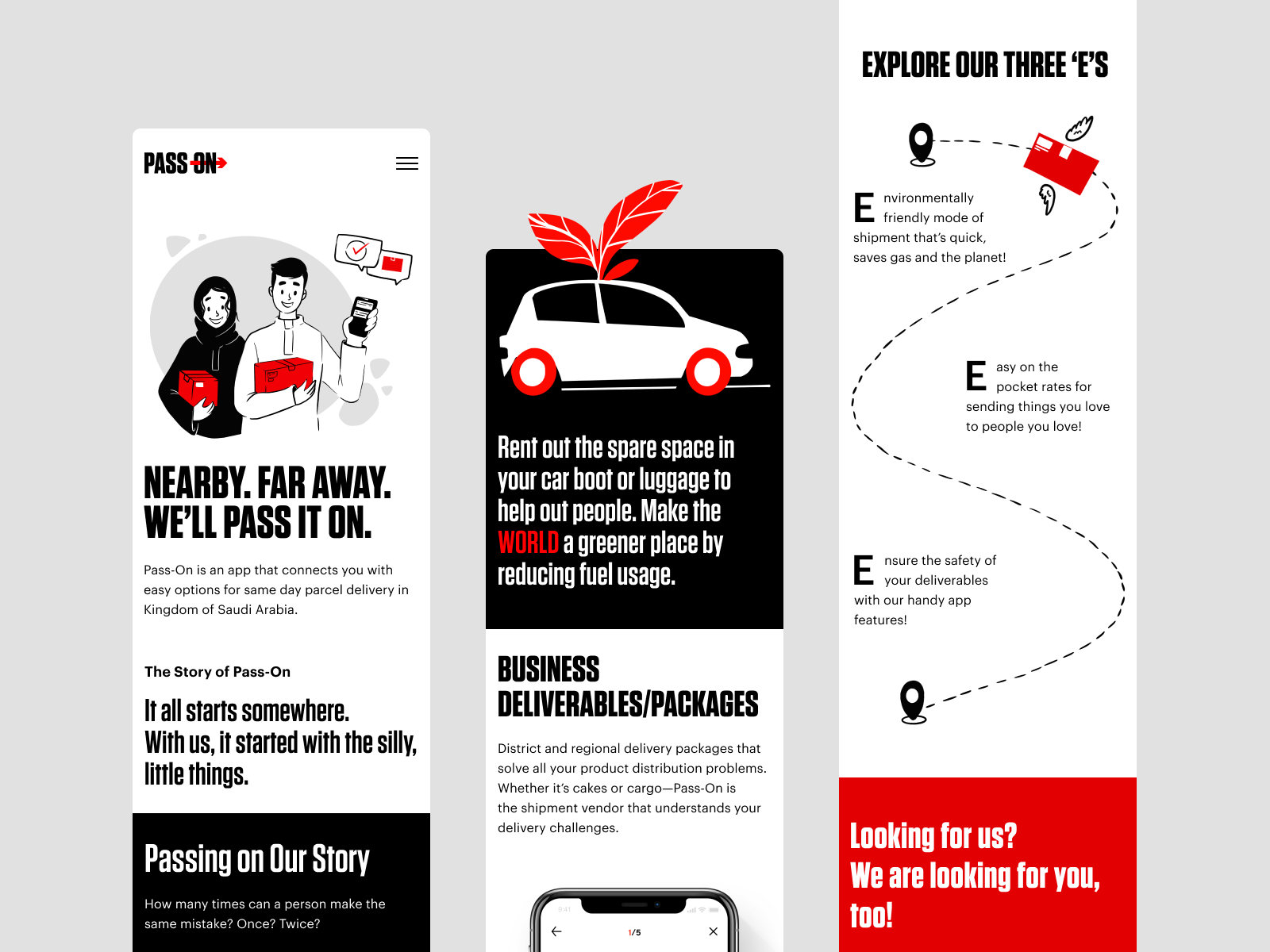
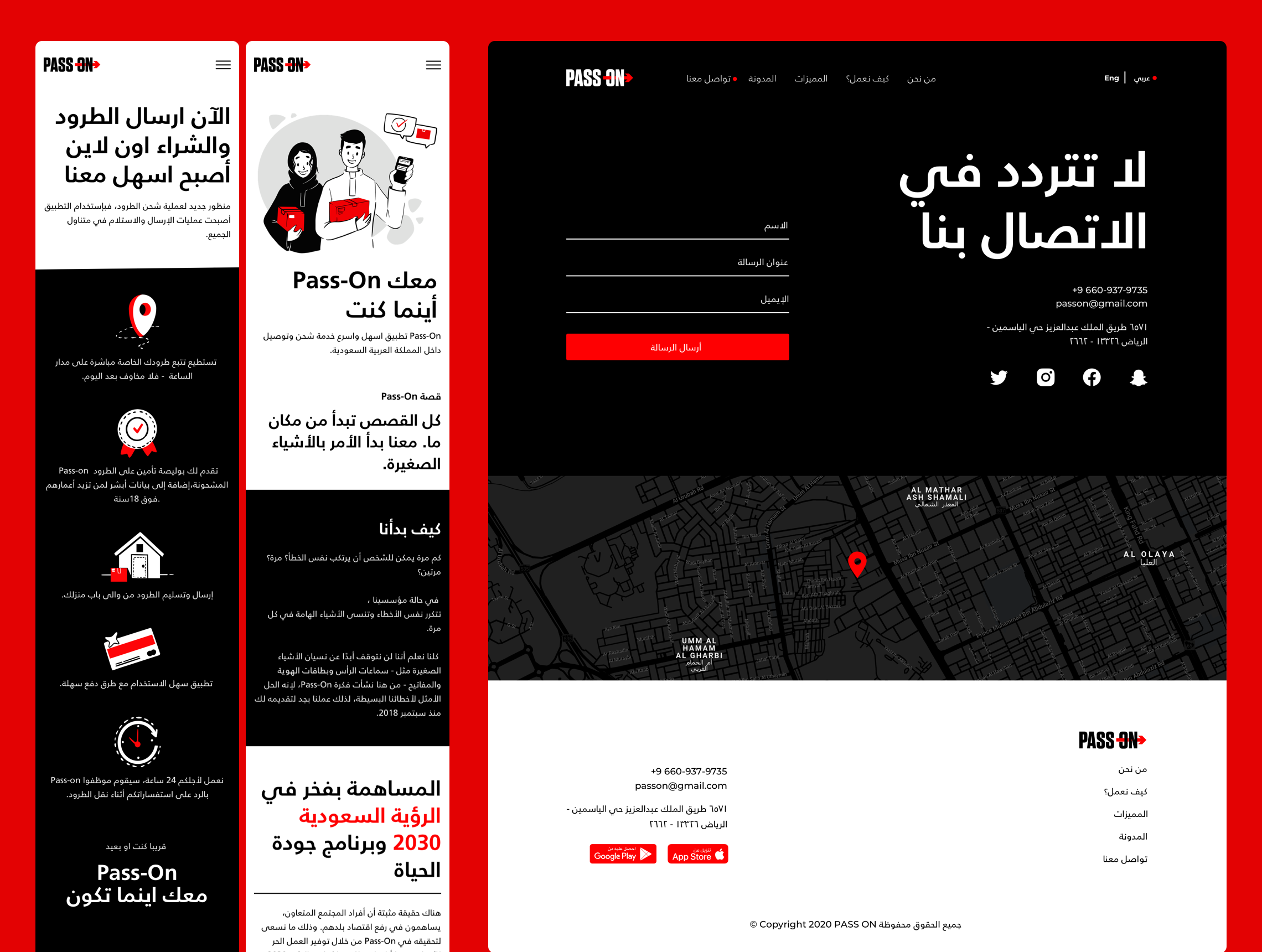
The landing page for the Pass-On application keeps visual consistency and is accessible to visitors speaking either English or Arabic, the languages that work in a totally different way and demand different design approaches, as well as keeps its beauty and functionality if used on mobile.
Music learning application accessible for users with various levels of tech literacy and across different devices
Utility means that it solves the problem.
In the Illuminating Radioactivity educational website, the consistent and thought-out design and custom graphics allowed us to organize tons of diverse content into one scannable, readable, and elegant educational resource and reach helpful data visualization vital for this type of project.
The event booking website gives clear insights into the types of services and events it offers, making the experience more dynamic and aesthetic due to animated geometric graphics.
Desirability means it’s pleasurable and makes users happy.
Habit builder application uses custom grid, bright and captivating color palette, and smooth motion to add aesthetics to even basic interactions.
Website design for illusion space sets the atmosphere and engages visitors building its own aesthetic via bright accents and hypnotic gradients, videos, custom graphics, and animated layout elements making the experience live and dynamic.
Business goals
However, companies that start new products or improve well-known ones also have to think from another perspective. It operates via various financial factors, conversions, sales, and all the other business stuff.
Does beauty on the screen influence their business goals? Yes, indeed. Color theory and psychology, harmony on the screen, readable text content, and attractive images are essential not only for making users happy. They also sell and make businesses happy too.
And here’s an example showing how aesthetics serves for the sales of the physical product: it’s a website for the tea brand Bennett. It applies an experimental color palette and typography as well as integrates the video on the web page to give the maximum connection to the actual experience. This way, the beautiful digital product helps to sell real stuff.
This ecommerce website for egg products uses a combination of custom typography, motion, and branded imagery to influence both emotionality and the aesthetics of product presentation and inform users about its benefits.
Elements of UX Aesthetics
Different elements allow beauty to get integrated into user interfaces and build its aesthetics, among them:
- Typography
- Layout
- Photos
- Illustrations
- 3D graphics
- Animation
- Video
- Characters
All these elements form the aesthetics of interactions and have a direct impact on a positive user experience. Let’s check some practical examples below.
Website museum concept playing with typographic elements as one of the essential tools to build both solid visual hierarchy and aesthetic appeal
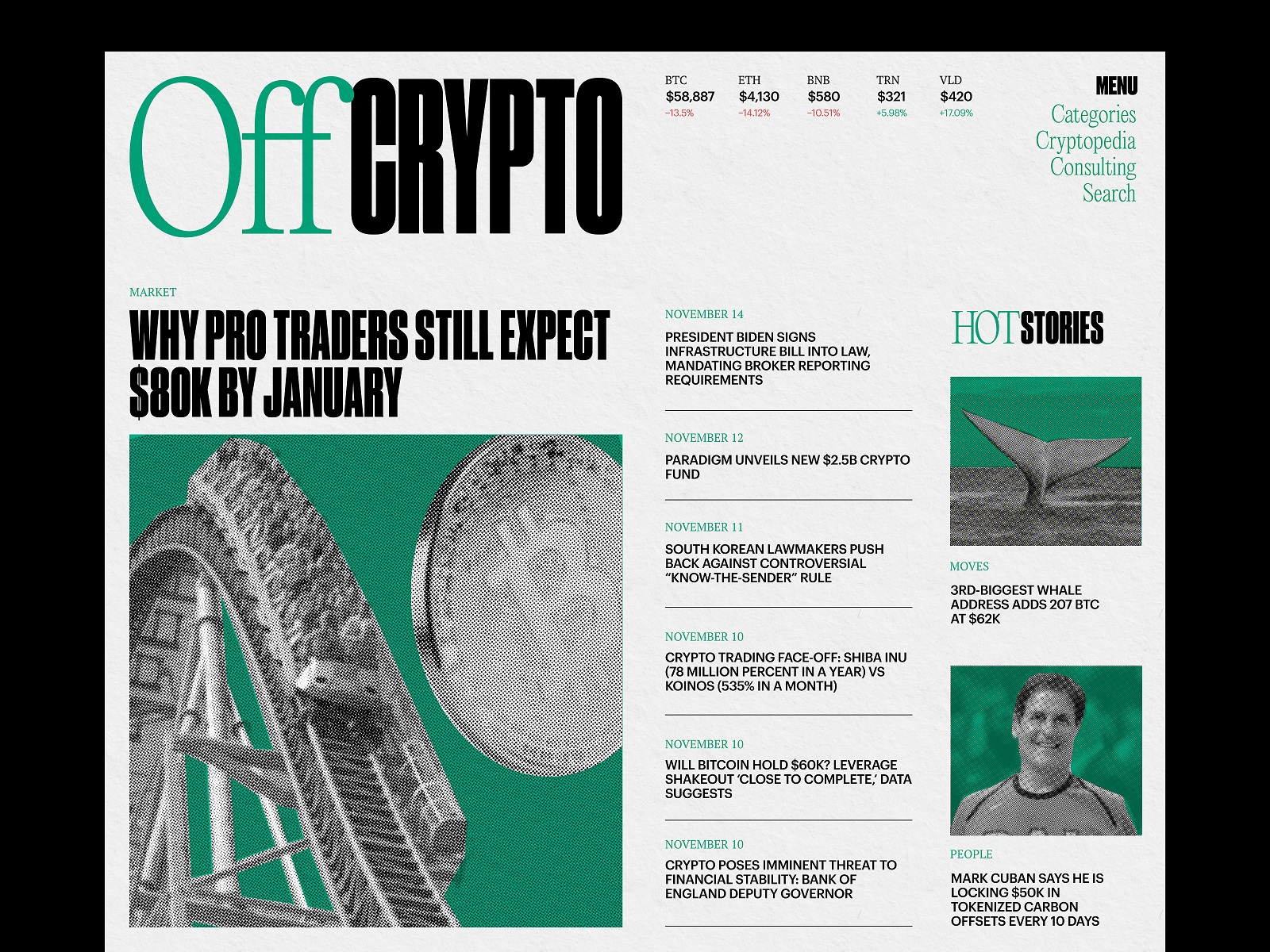
Crypto blog design uses a limited color palette to make it look serious but not dull, as well as echoes the traditional layout of the broadsheet to set strong aesthetics of printed media migrating to the digital world.
Landing page design for financial service Uni features captivating 3D animation used as a hero image to set the instant connection with the nature of the offered service.
The pet shop e-commerce website uses lovely video content to set a solid emotional connection with the buyers and enhance the decision-making process with an aesthetic demonstration of the items in a real-life environment.
This elegant e-commerce website for selling cosmetics appeals to visitors with sophisticated fonts, prominent photo content demonstrating the offered items, natural colors tenderly playing out the skin shades, and an airy minimalist layout supporting the beauty of images.
Consistency
Another core point to consider from the aesthetic-usability effect lies at the crossroad of UX and business – it is consistency. As Jacob Nielsen said, “Consistency is one of the most powerful usability principles: when things always behave the same, users don’t have to worry about what will happen.”
In fact, it goes much further than interactions. It also works in building up a strong brand. Logo and branded items, website, app, emails, and social networks – each and every touchpoint of the product with its user should follow one general idea and set of values as well as get packed in a consistent and integral style.
It works when you make a decision upon system, limitations, and rules, when you decide not only what can be done with a brand image but also, even more importantly, what can’t be done. For example, let’s take IBM design language or Material Design principles. They define how the elements should look, how the interactions should be built, and even how the interface copy should be written. What’s more, their principles answer the more profound question: why it should be done that way.
A consistent approach to identity design of the fintech service Crezco allows the brand to build an attractive, trustworthy, and solid image through various communication channels.
The example of a consistent approach to identity design and product design for the Glup delivery application
Globally, all the design solutions should answer one question – why? World-famous expert in leadership Simon Sinek says: People don’t buy what you do; they buy why you do it. And what you do simply proves what you believe. That’s what makes products and services consistent and inspiring. All the decisions we make should start with “Why,” which will form how to talk to the user, whatever is the source of communication. Whatever is the connection point with the brand, you should be sure of what communicates with you. That builds the feeling of trust and makes the brand stronger, and that is where beauty helps make the user experience more solid and helpful.
Useful Articles
Here’s a bunch of articles to dive deeper into the theme of usability and user experience design.
5 Basic Types of Images for Web Content
Types of Contrast in User Interface Design
5 Pillars of Effective Landing Page Design
How to Make Web Interface Scannable
The Anatomy of a Web Page: Basic Elements
How to Design Effective Search
Web Design: 16 Basic Types of Web Pages
Directional Cues in User Interfaces
Negative Space in Design: Tips and Best Practices