Some projects start with a client brief. Others start with a brick wall. This one started with both.
When Zealous came to us with a vision for an advocacy resource—something practical, ethical, and deeply human—they handed us a guide. Twenty-eight pages long. Dense, important, and written for people doing urgent, emotional work: public defenders, organizers, formerly incarcerated advocates. What they needed was a tool. A companion that listens, just as much as it informs.
This is how we built Advocacy Through Walls—an interactive digital guide that later earned a Webby Winner title in the Law category and a Webby Honoree mention for Diversity, Equity & Inclusion. Not because it tried to impress, but because it stayed focused on usefulness.
Here’s the story.
The Brief: How Do You Design for Seriousness Without Turning Somber?
Truth is, transforming a long, text-heavy advocacy guide into a user-friendly, beautifully crafted digital product is no small task. Especially when that guide includes complex topics like trauma-informed care, compensation ethics, consent, and power dynamics.
So we asked ourselves:
- How do we honor the gravity of the subject without overwhelming the user?
- How do we make a website feel intentional—without resorting to the sterile minimalism of law firm templates?
- How do we create something that looks like it belongs in 2020s, not 2000s?
We knew we needed something more than just clean UI and pretty colors.
We needed to design with emotion, through structure.
Editorial Meets Interactive: The Structure
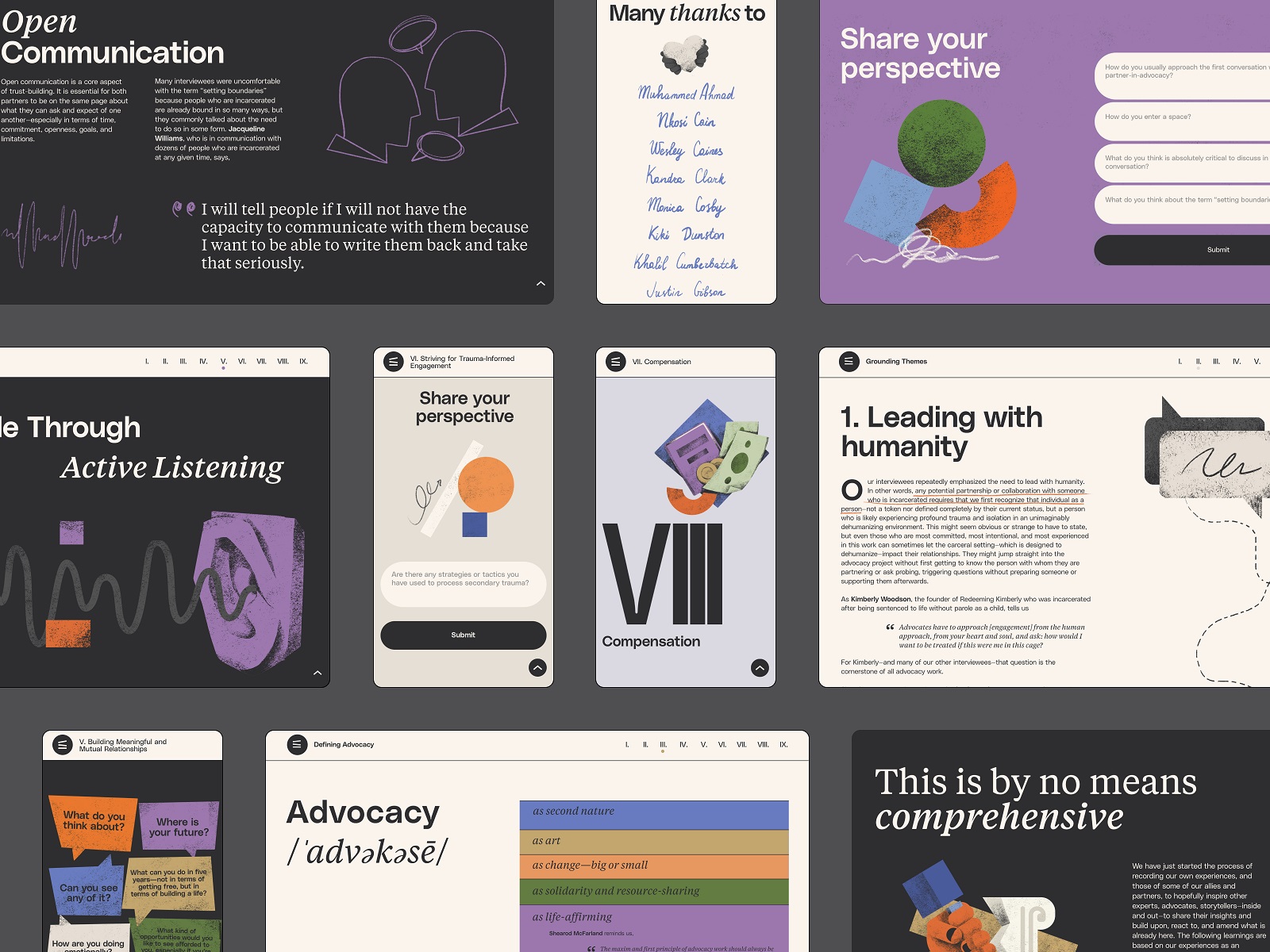
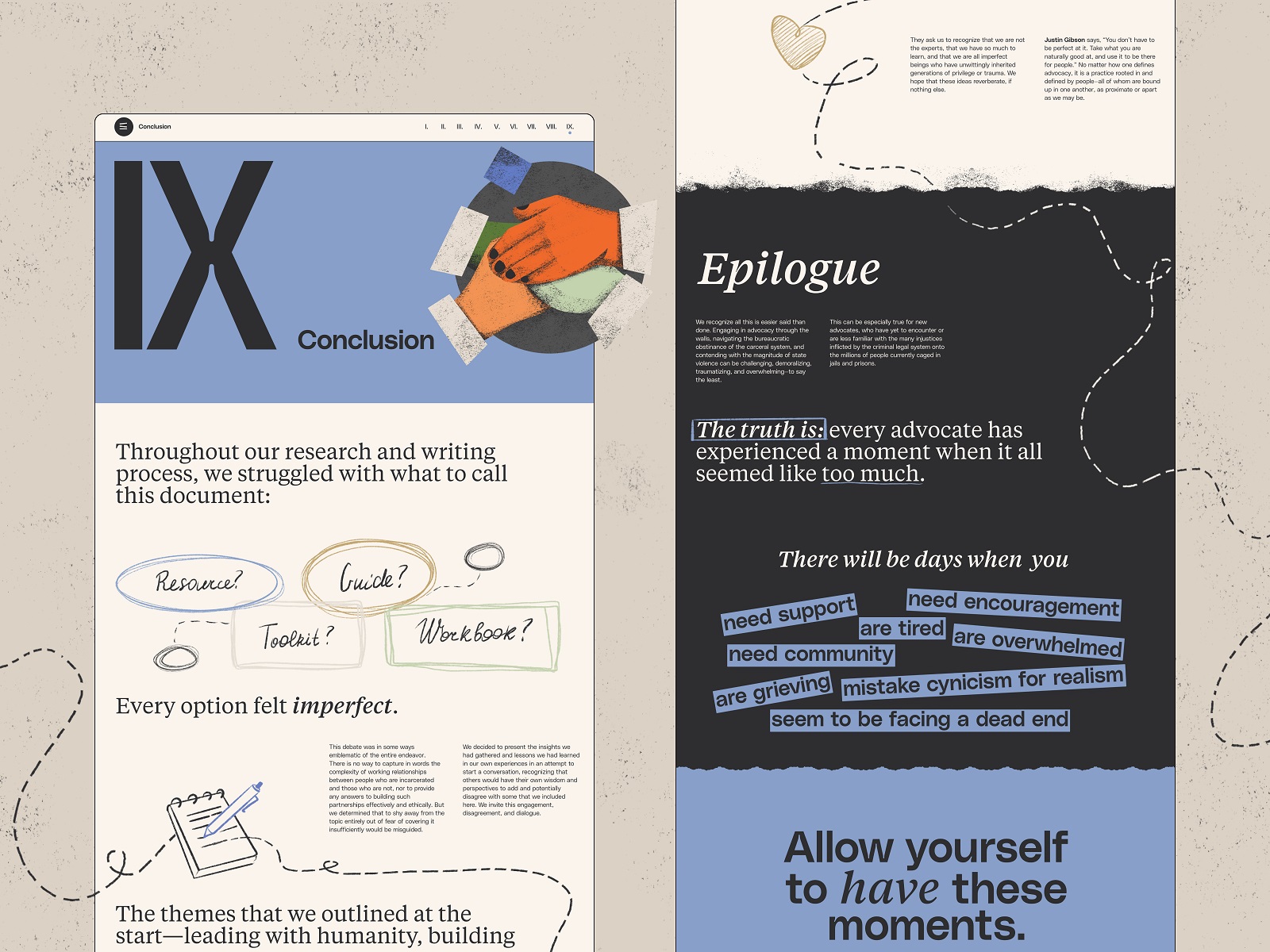
We approached the information architecture like we would a chapter book—because that’s what it was. But instead of turning it into a static PDF-on-a-screen situation (you know the kind), we leaned into editorial storytelling techniques.
Instead of one monolithic scroll, we added a series of visual anchor points. These “rest stops” help users retain focus and orient themselves in the text—especially in a space where attention might be strained by the emotional nature of the subject matter.
Think scrollable, skim-friendly, and sectioned—but still deeply immersive.
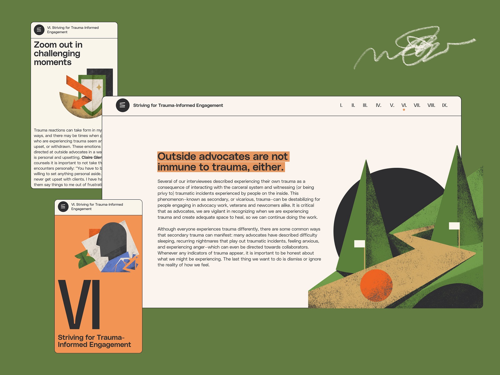
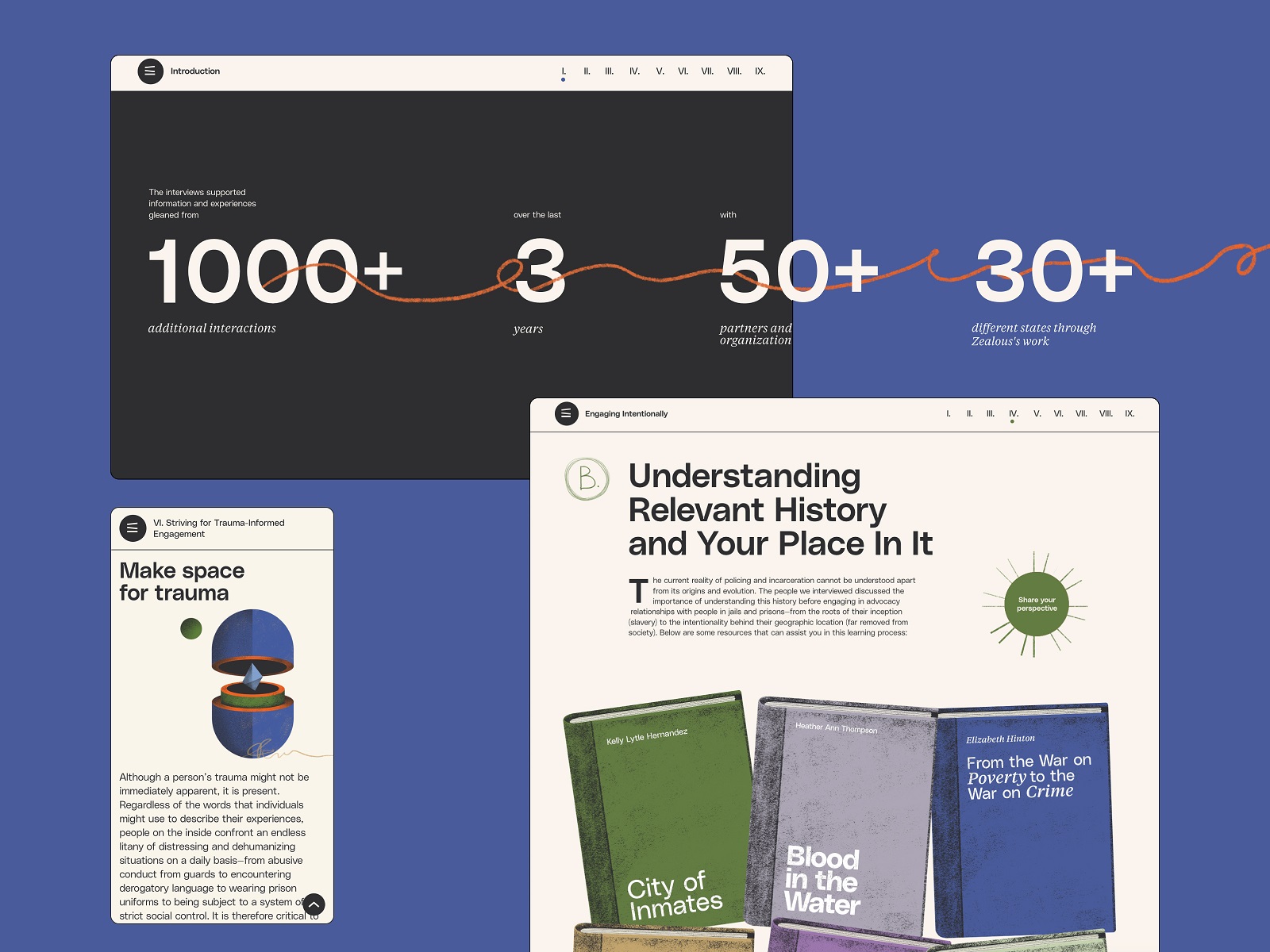
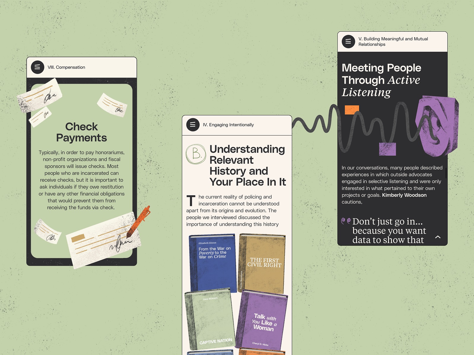
- Chapter-based navigation: Each section got its own “cover,” a visual anchor that gave it presence.
- Intuitive UI flow: From Zoomed-out trauma reactions to nuanced notes on consent, users can jump between sections or scroll through at their own pace.
- Digestible sections: No massive text dumps. We used hierarchy, chunking, and motion to pace the read like a thoughtful conversation.
All of it designed to feel calm, not clinical. Uncluttered, but not blank.
The Aesthetic: Kind, Clever, Confident
Let’s talk color. And type. And that gritty, grainy, handmade energy. We weren’t interested in polished sterility. We wanted texture. Humanity. So we built a color palette that holds tension quietly:
- Charcoal & Seashell as the structural backbone—modern, serious, accessible.
- Pops of orange (#F39454, #F06423) and green (#C3D4AD, #5CD33A) to mark interaction and warmth.
- Unexpected purples, muted yellows, and soft blues to inject tone and rhythm across chapters.
Typography followed suit. Two typefaces—both contemporary, both legible, but chosen for contrast in tone:
- Polly Sans (used for headings and navigation): wide, modern, and quietly assertive.
- Tiempos Text (used for body and pull quotes): warm, bookish, with a rhythm that suits reading at length.
The result was a system that could hold nuance—visually, semantically, and structurally.
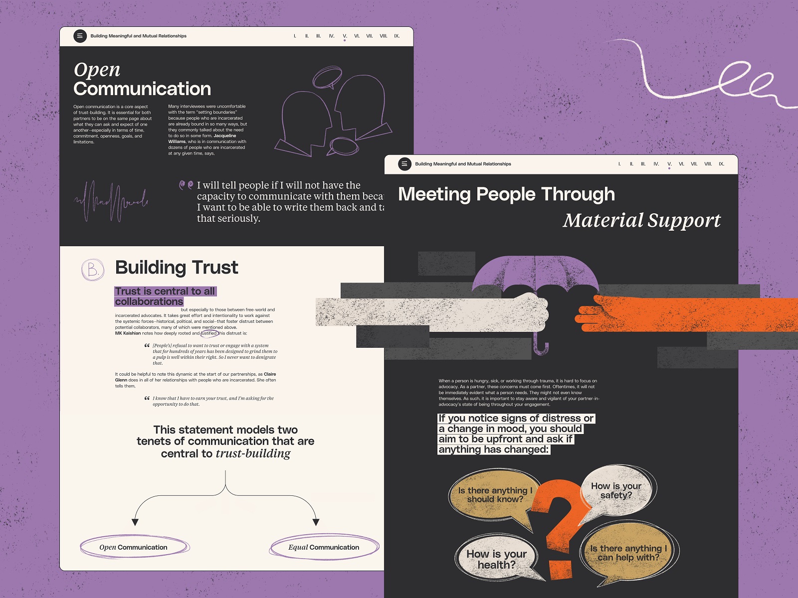
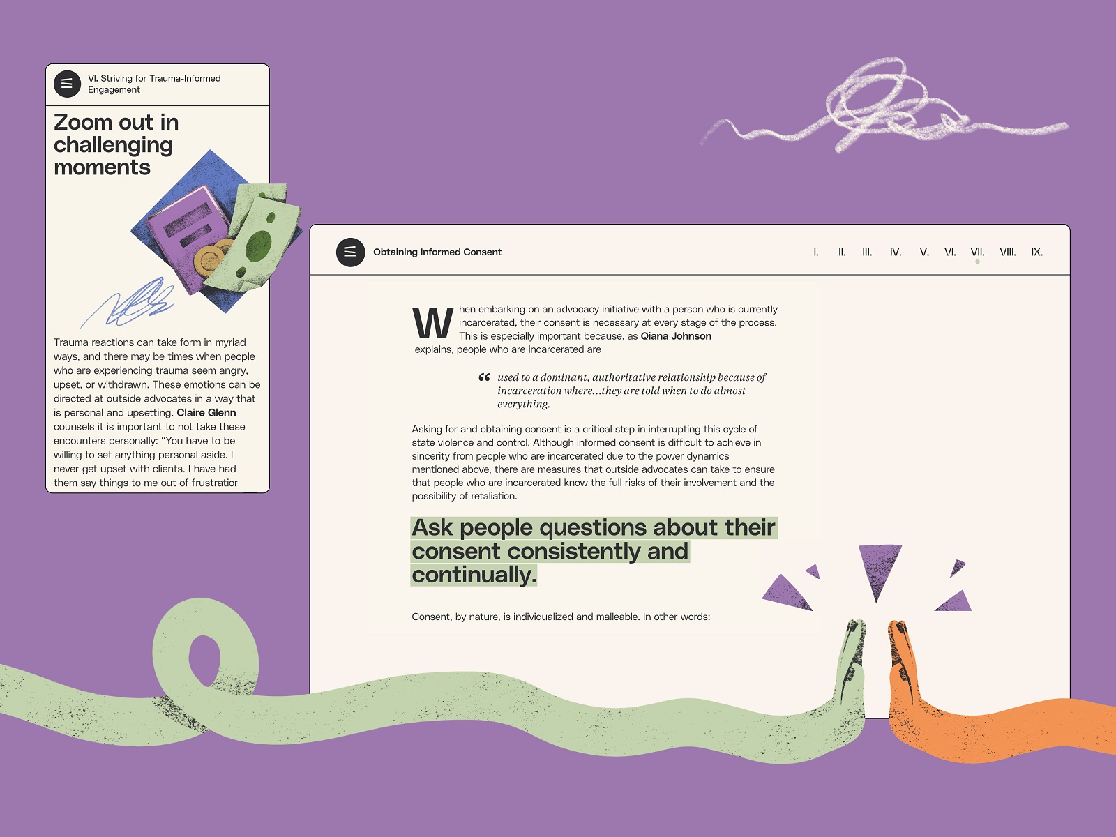
Custom Graphics: Because Clip Art Wasn’t Going to Cut It
We knew this project would live or die by its visuals—no one wants to read walls of advocacy text on a screen unless the experience respects their time and their eyes.
So we went all in.
- Custom illustrations for each chapter, combining flat fills, grainy textures, and organic lines. Some represent actions (listening, sharing resources), others embody abstract concepts (power dynamics, trauma).
- Smooth micro-animations to add breath between scrolls.
- Visual motifs like bricks, waves, and information bubbles that tie chapters together without forcing a theme.
We didn’t want to over-explain with graphics. We wanted to feel our way through them.
UX Challenges We Had to Unravel
Let’s not pretend everything was easy.
Here’s what we wrestled with:
- Too much content, too little context. We had the raw text, but not always the hierarchy. We had to reverse-engineer structure, intention, and emotion from the writing itself.
- Balancing emotion and function. Advocacy work is emotionally intense. The design had to support—not flatten—that intensity. Every element had to serve a purpose and a feeling.
- Accessibility without compromise. With so much visual storytelling, we had to be extra intentional with contrast ratios, text size, and navigation logic.
All the efforts resulted in a bright, informative, and attractive website, leading Zealous and Tubik teams to one more Webby!
Credits Where They’re Due
The Tubik team that brought it to life:
- Аnastasiia Zhyltsova – UX/UI Design
- Vlad Taran – Art Direction
- Maryna Solomennykova – Graphic Design
- Anastasiia Ostapenko – Project Management
And of course, the Zealous team for dreaming up the thing in the first place.
Want More Like This?
We don’t only do advocacy. We do identity. We do product. We do weird.
But we always start with people, purpose, and pixels that mean something.
Check out more of our design case studies:
Serra. Identity and Product Design for Financial App
MOVA Brewery. Ecommerce Website Design for Beer Producer
HP23. Website and 3D Animation for Prostheses Producer
FluxWear. Web Design and Development for Health Tech Product
UI Design Process for Web and Mobile: 3 Detailed Video Cases
Magma Math. Web Design for Educational Platform
Synthesized 2.0. Web Design for High-Quality Synthetic Data Platform
HotelCard. Brand Identity for Hotel Offers Service
Nibble Health. Identity and UX Design for Healthcare Fintech Service
Physica Magazine. Web Design and Graphics for Scientific Blog
ProAgenda. Identity and Website Design for Golf Management Service
Kaiten. Identity and Product Design for Food Marketplace
THT. Website Design for Electrical Engineering Service