Designing an e-commerce site for adult toys is an exercise in calibration. Push the visuals too far and the interface starts to feel tacky. Pull everything back and the brand dissolves into sterile minimalism. ToyJoy needed a middle ground—confident, elegant, and emotionally aware without slipping into spectacle.
The challenge was psychological as much as visual. Visitors arrive with curiosity, hesitation, excitement, sometimes a quiet sense of awkwardness. Good interface design acknowledges those emotions without turning them into a performance. The goal was simple: make browsing feel like discovery rather than confession.
Everything followed that principle. Typography, color, motion, layout—each decision tuned the same atmosphere.
Take a look at how the system came together.
About the Client
ToyJoy is an e-commerce platform selling a curated selection of adult toys. The category lives in private spaces. That reality shapes how people interact with it.
Customers rarely approach these products like they would headphones or sneakers. There’s curiosity involved. Sometimes uncertainty. Occasionally embarrassment. The interface has to respect that emotional context while staying visually refined.
Our work covered the full digital environment: website design, a cohesive visual identity, and Webflow development for the ToyJoy e-commerce platform.
Design Process
The project brought together a powerful team: Vladyslav Taran, Denys Koloskov, Andrey Drobovich, Vlad Radionov, Anton Morozov, Alexander Peteluko, and Olya Zakharyan.
Establishing the Mood
Adult e-commerce tends to swing between two visual stereotypes. Loud provocation or hyper-clean minimalism that pretends the products don’t exist. Both approaches break the emotional contract with the user. ToyJoy needed something calmer.
The team built an aesthetic that communicates intimacy through restraint. Sensual, but composed. Suggestive without theatrics.
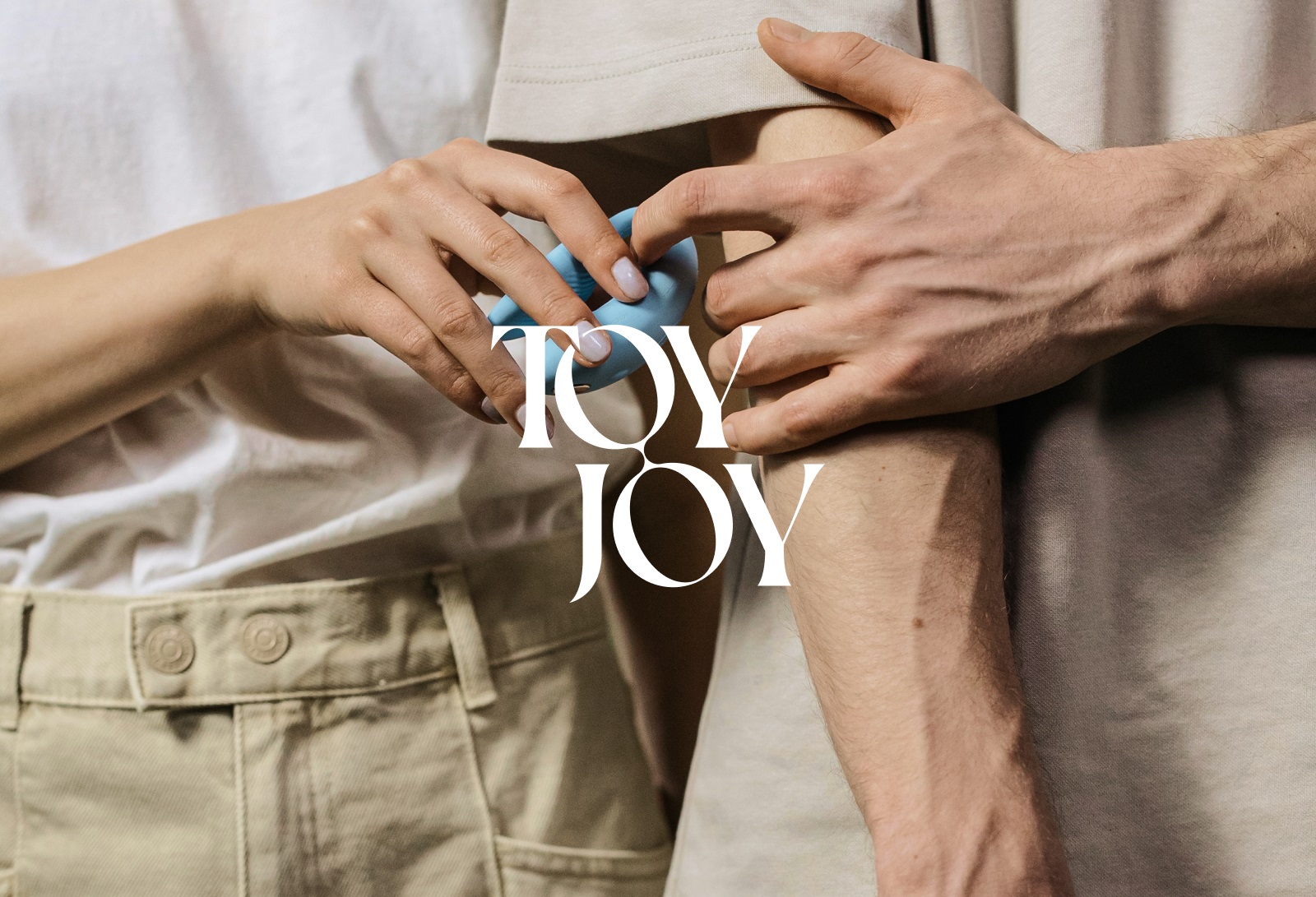
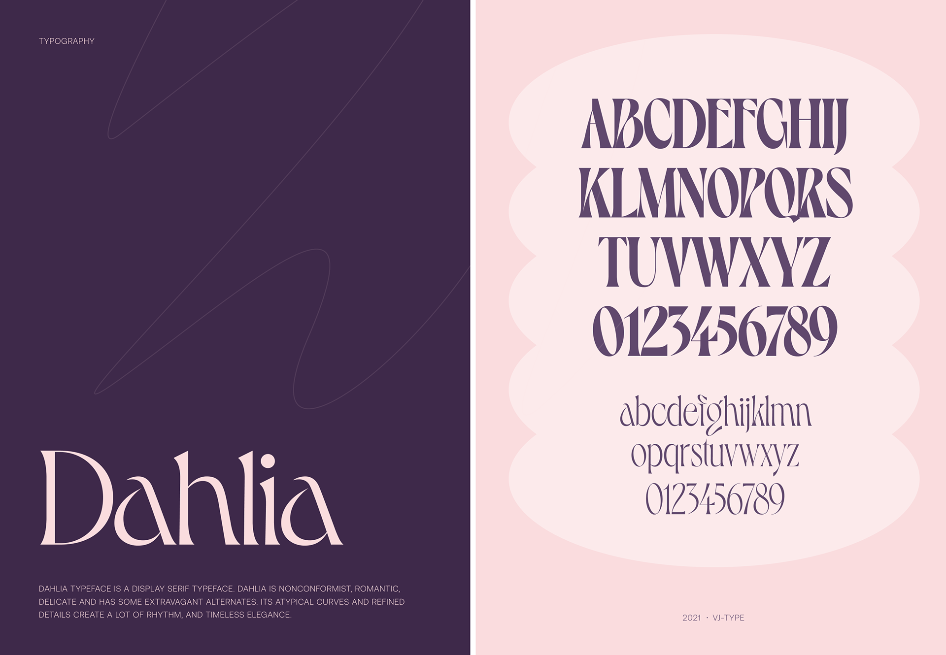
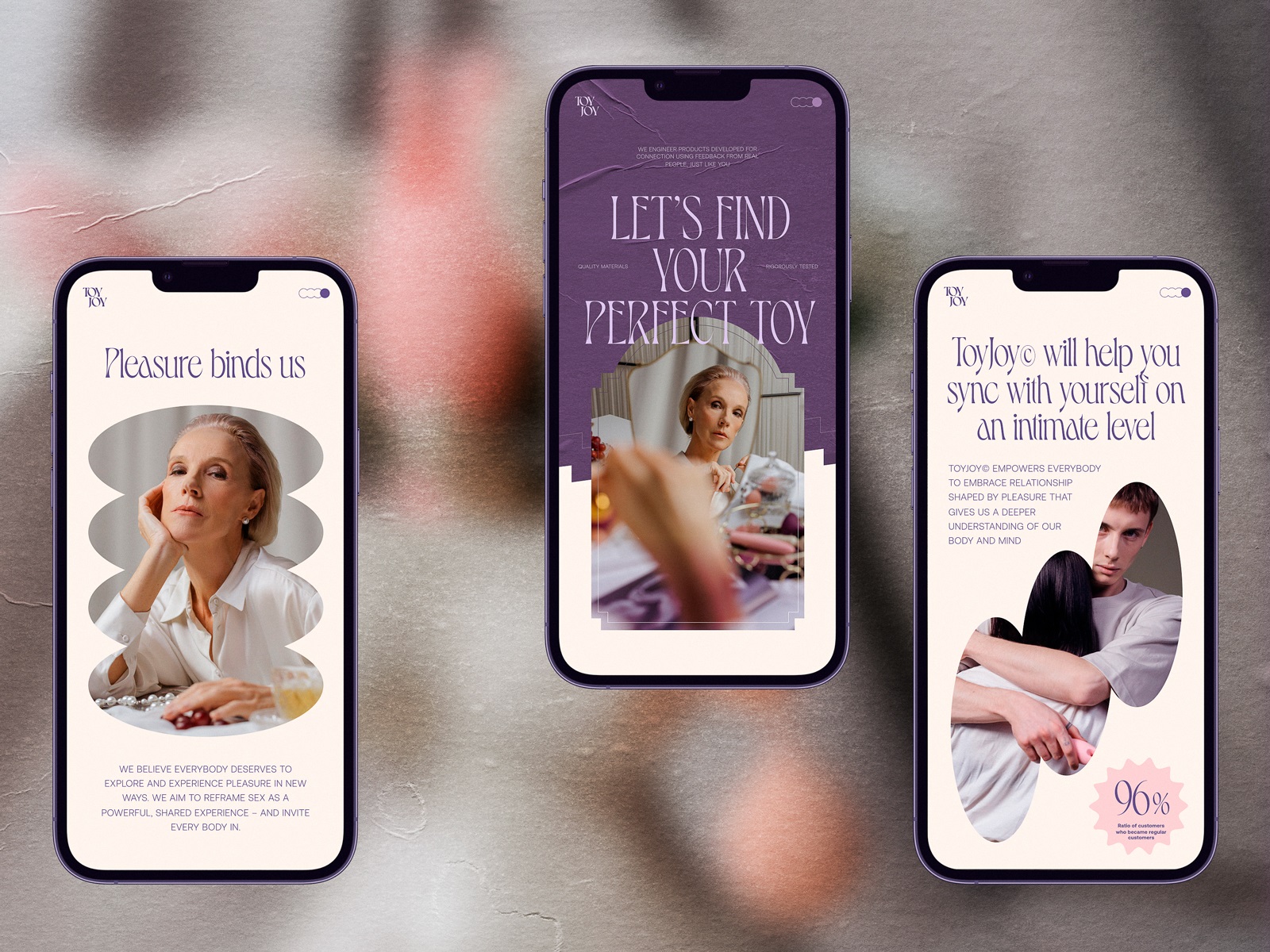
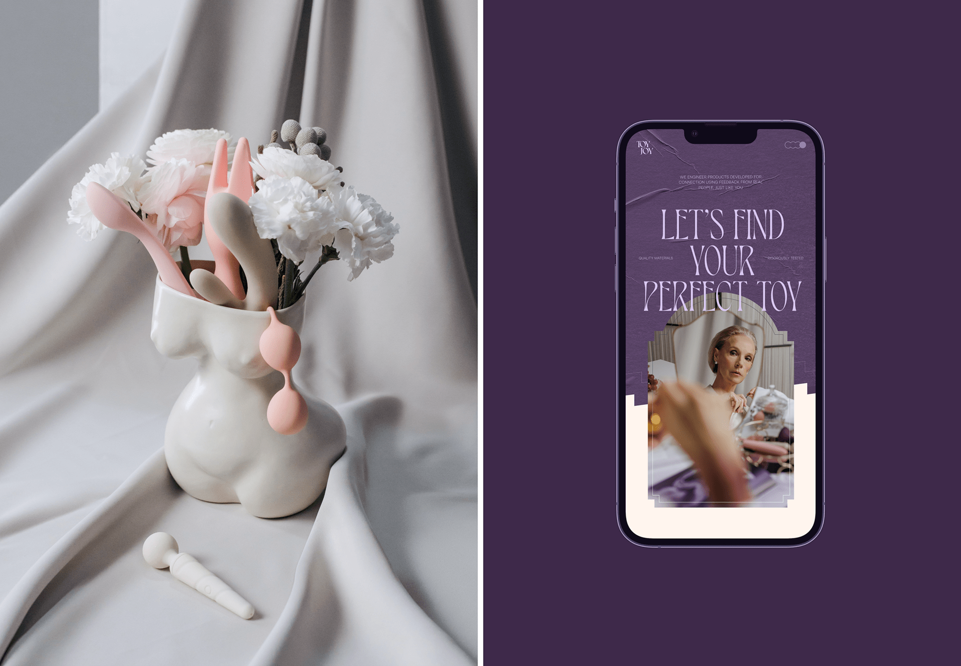
Two elements became the backbone of the interface: typography and color. The headline typeface, Dahlia, introduces soft curves and romantic proportions. It carries a quiet sensuality. Nothing exaggerated. Nothing loud.
Color does the rest. A palette built around purples and pinks creates warmth immediately. The tones feel inviting, playful, slightly mysterious. Before a user reads a word, the interface already signals the emotional register of the brand.
Building the Visual Ecosystem
Once the tone was locked in, the next challenge was sustaining engagement across the entire site. Instead of relying on one visual approach, the interface layers several media formats.
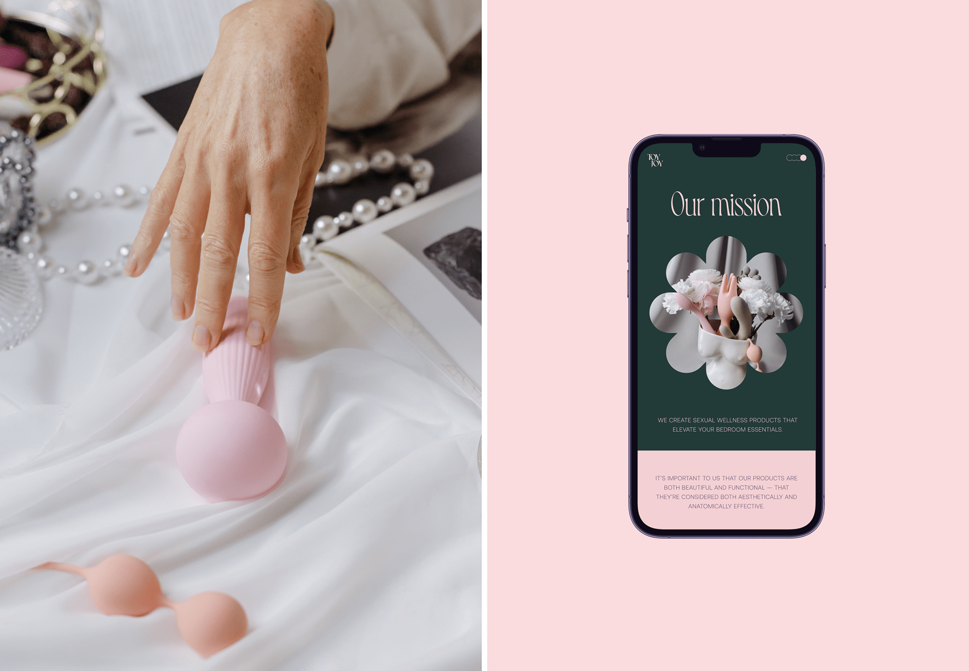
Photography introduces human context. People, environments, lived-in spaces. The products stop feeling abstract and start feeling relatable.
Video adds atmosphere. Subtle motion on the page slows the scroll and encourages a moment of attention.
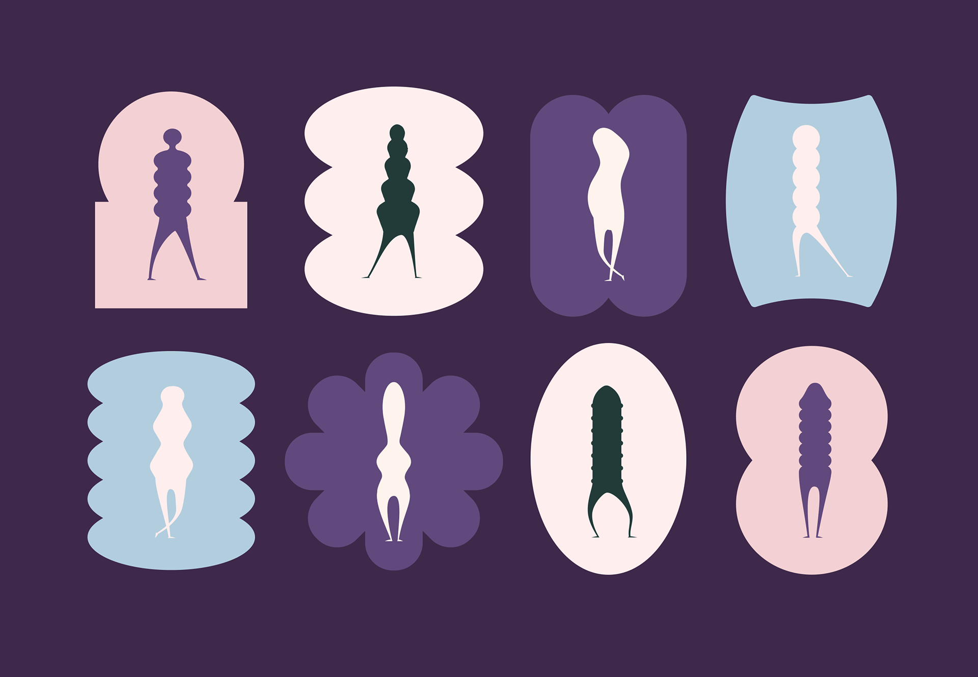
Custom illustrations provide lighter accents throughout the interface. Playful shapes, small visual jokes, tiny moments of personality that keep the experience from becoming clinical.
Motion brings energy into micro-interactions. Hover states. Section transitions. Small visual responses to user gestures.
And then there are the 3D product visualizations. In this category, shape matters. Ergonomics matter. Seeing the object clearly builds confidence. Clean, consistent product renders remove ambiguity and help the user understand what they’re actually buying.
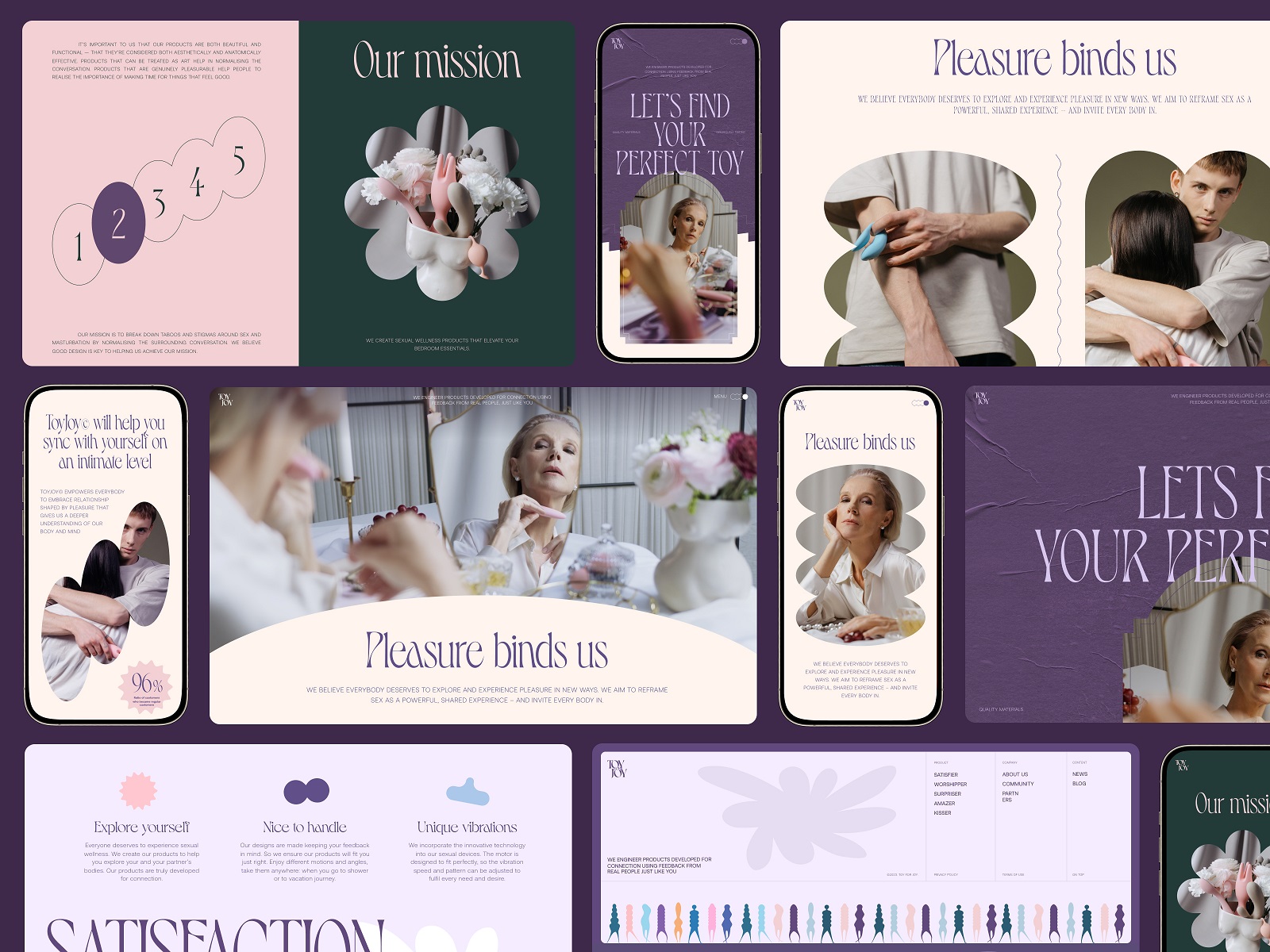
Layered together, these elements create a visual ecosystem that feels rich without becoming overwhelming.
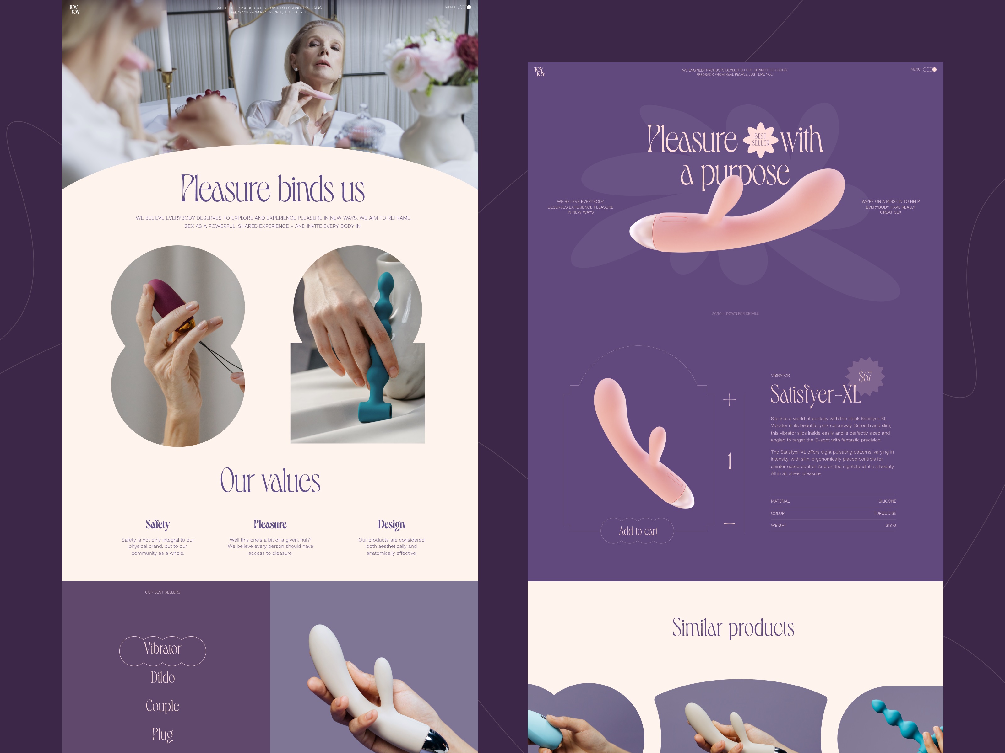
The Homepage Experience
The homepage establishes the mood immediately. A hero section combines atmospheric photography with a concise tagline that frames the brand philosophy. A recurring graphic system runs throughout the interface: soft geometric frames surrounding images and content blocks. These shapes introduce rhythm across the page and create visual continuity as the user scrolls.
Even transitional moments matter. The loading animation delivers a small playful beat before the content appears. A quiet signal that the brand doesn’t take itself too seriously. The header stays minimal. Logo, navigation, a brief mission statement. Generous spacing keeps attention on the content rather than the interface chrome.
Structuring the Interface
Across the site, the layout behaves like a carefully prepared canvas whose job is simple: let the product and brand personality do the talking. Background color shifts gently separate sections instead of relying on heavy dividers. The eye naturally travels downward through contrast, scale, and negative space.
Typography establishes hierarchy without shouting. Product images sit comfortably inside curved framing shapes that echo the brand language established earlier. Photos and videos remain the stars of the composition—large, breathing comfortably inside the layout. The user never has to decode how the page works. The structure stays predictable enough to feel intuitive, while the visual details keep the experience interesting.
Product Page Design
Product pages for this project present the object clearly while keeping the visitor emotionally comfortable enough to keep reading. Large imagery and 3D visuals give the product physical presence. Users can examine form, texture, proportions. Transparency builds trust.
Supporting text explains features and usage in a calm, reassuring tone. Many customers encounter these products for the first time. Clear language removes uncertainty without becoming clinical.
Interaction patterns also vary slightly. The similar products gallery uses horizontal scrolling—a small change in gesture that breaks the vertical rhythm of the page and encourages further browsing. Tiny variations like this keep the interface alive.
Mobile Experience
A large share of e-commerce traffic lives on mobile, so the entire interface had to adapt accordingly. Layouts compress without losing hierarchy. Navigation remains reachable with one hand. Product galleries respond naturally to swipe gestures. The goal was straightforward: preserve the elegance of the design while making the experience feel effortless on a phone.
Final Thoughts
Designing ToyJoy meant working with nuance rather than volume. Adult e-commerce doesn’t reward loudness; it rewards sensitivity to context. When the interface feels composed, users relax. When it feels awkward or performative, curiosity disappears instantly. The project showed how much emotional weight small decisions carry—type curves, color warmth, the pacing of motion, the clarity of product visuals. Together they shape an atmosphere where exploration feels natural.
That balance didn’t go unnoticed. The project earned Site of the Day on Awwwards and received a nomination for E-commerce of the Year 2023, a recognition that thoughtful, emotionally intelligent design can stand out even in the most saturated digital spaces.
Recommended Reading
Curious what else we’ve been crafting? Dive into more Tubik case studies exploring the design ideas, decisions, and experiments behind our recent projects.
Synthesized. Web Design for DataOps Platform
Mayple. Website Design for Marketing Marketplace
Carricare. Identity and UX Design for Safe Delivery Service
Annual Awwwards. Website Design
Uplyfe. Identity Design for Health App
ShipDaddy. Identity and Web Design for Shipping Service
Credentially. Website Creation with Webflow
Illuminating Radioactivity. Interactive Web Design for Education