
Food interfaces are strangely intimate pieces of design. They operate at moments of appetite, impulse, routine. The user might be hungry, distracted, tipsy, or cooking with one hand while the other tries to scroll through instructions. Precision matters. A button placed five pixels too low suddenly competes with a sticky ingredient on the screen.
Designing digital experiences around food and drinks means translating something sensory into interface logic. Taste, texture, smell—none of those are on the screen. What remains is structure: hierarchy, imagery, rhythm, and movement. A system of visual cues that convinces the brain the experience will be satisfying.
Tubik’s food-inspired projects explore that translation across multiple product types: e-commerce platforms, educational resources, recipe apps, restaurant websites, and delivery services. Each project solves a different interaction problem, yet they all revolve around the same quiet design task—turning appetite into action.
Let’s walk through a few of them the way a product designer would: observing the mechanics behind the visuals.
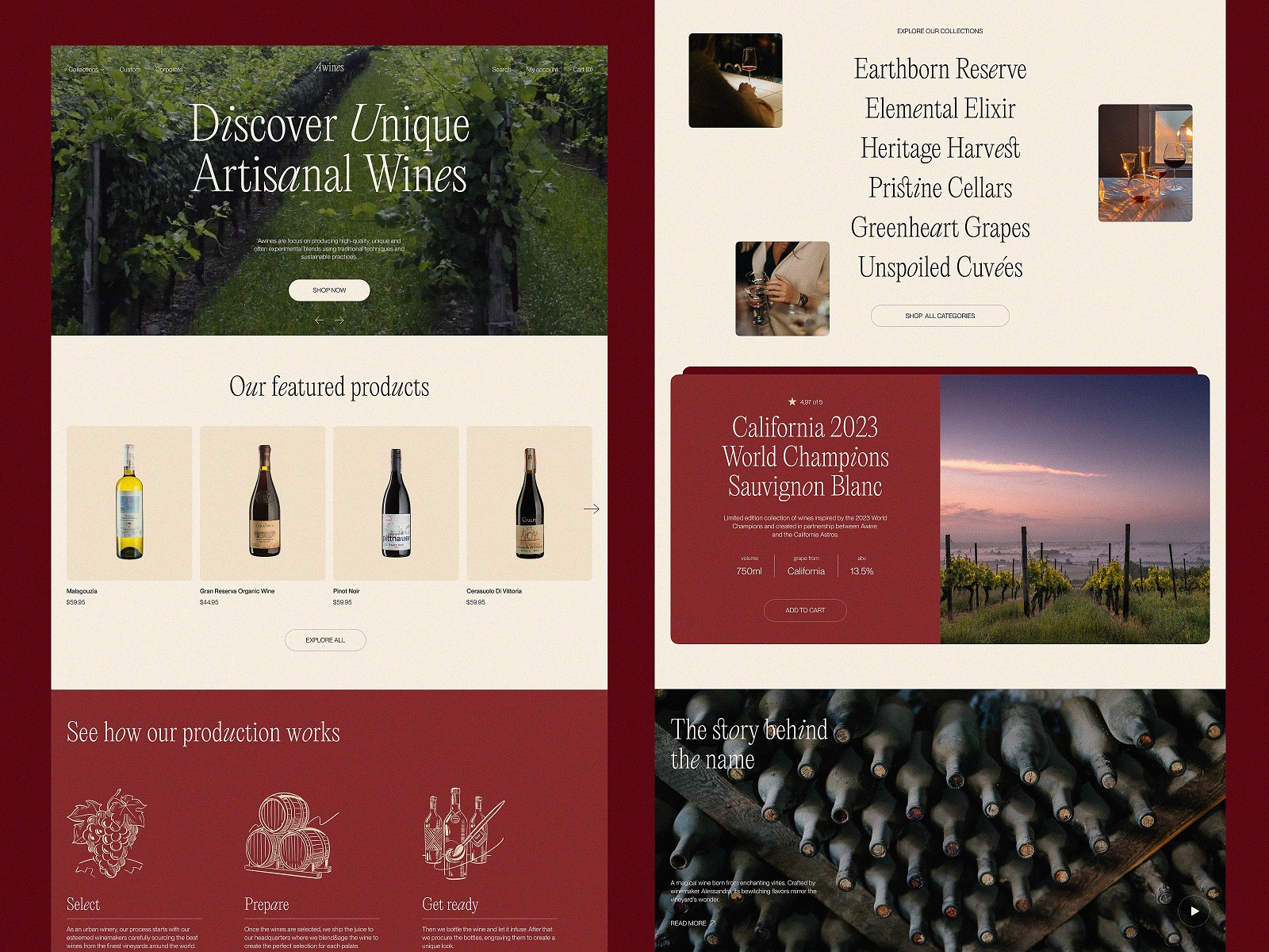
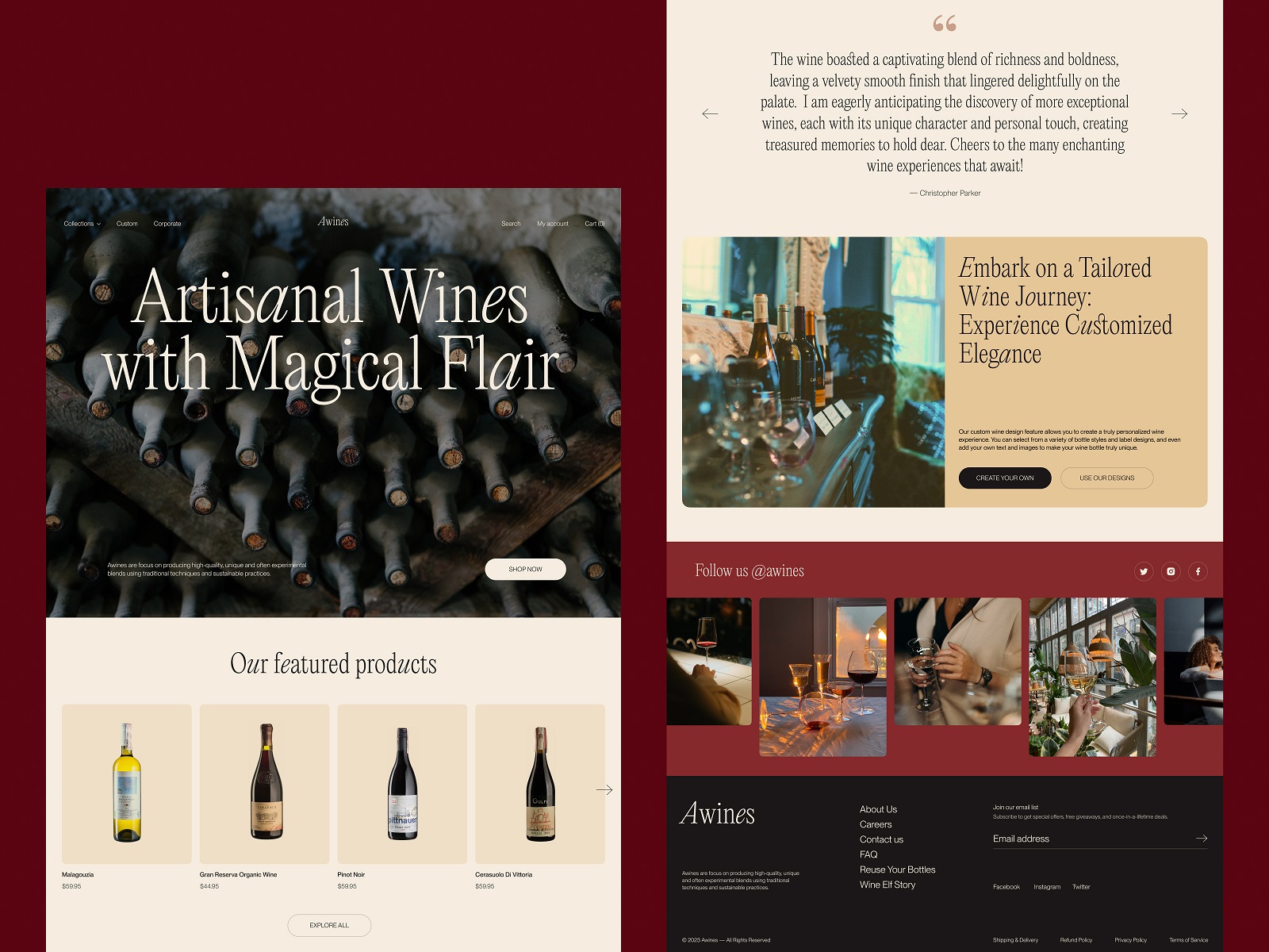
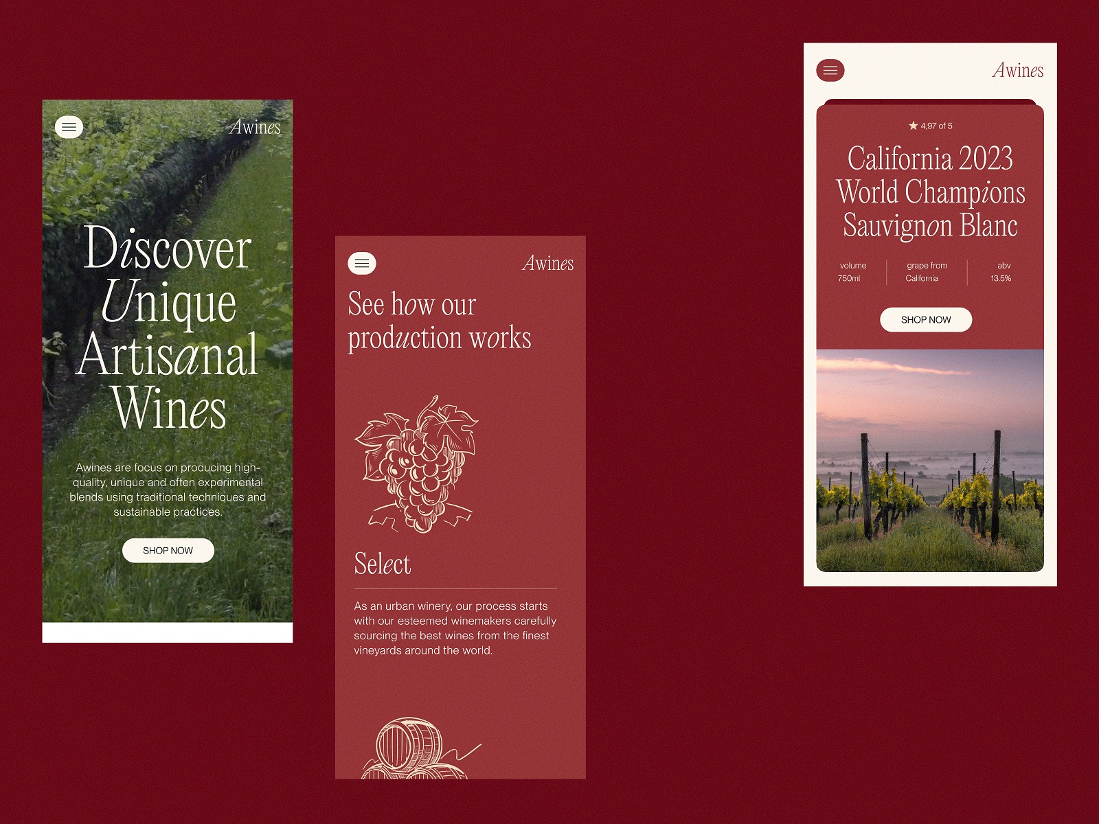
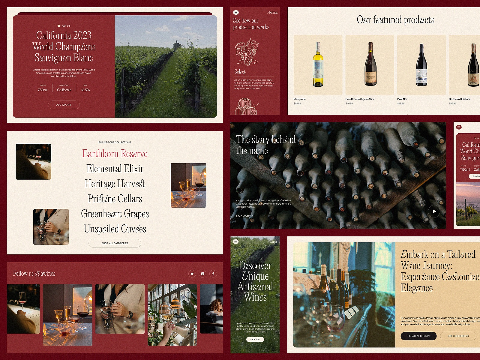
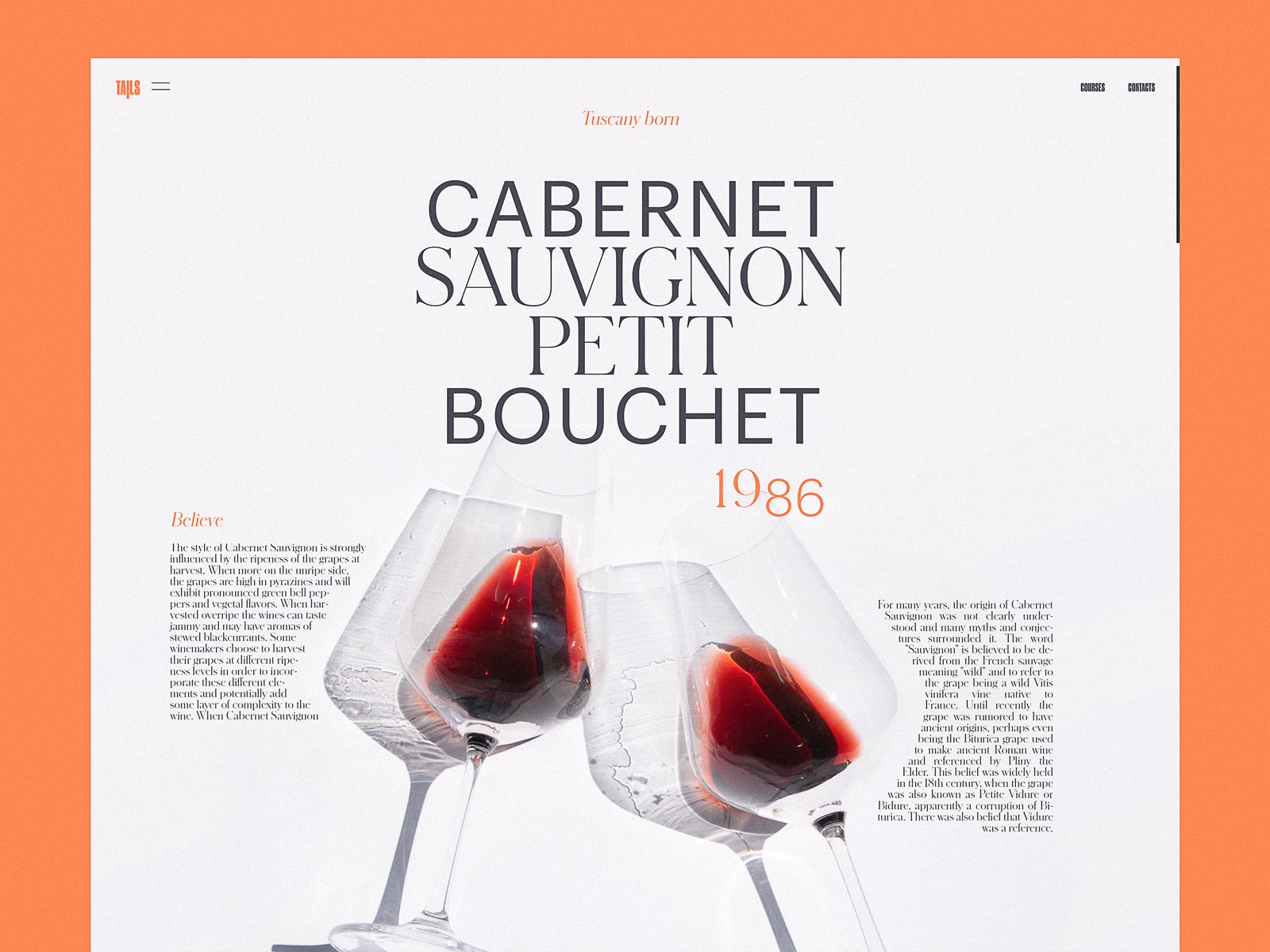
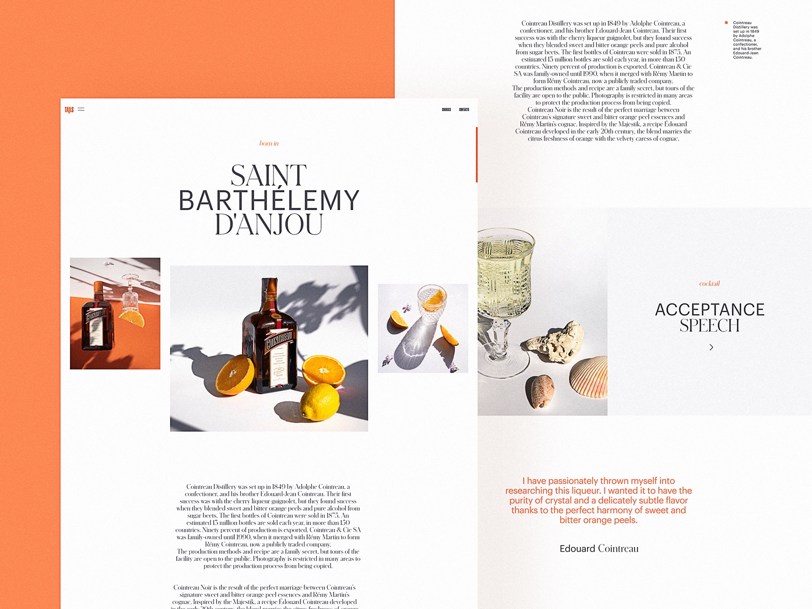
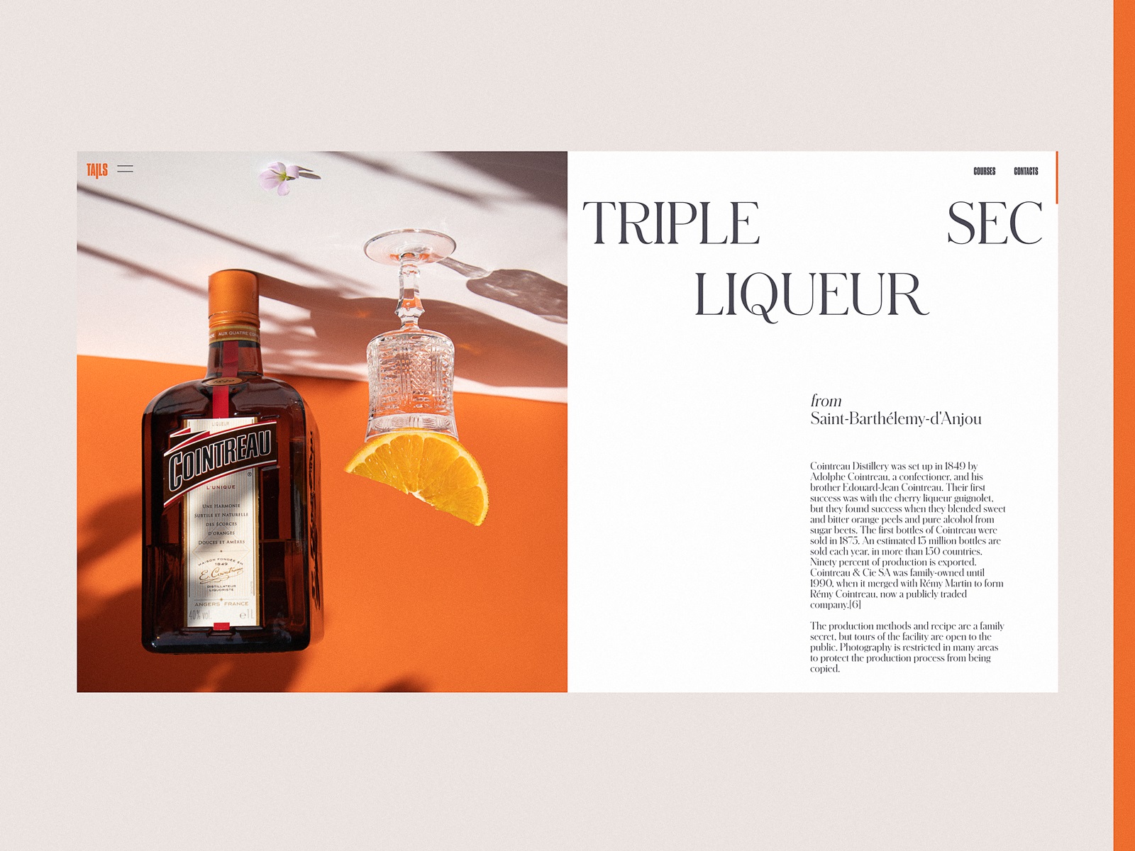
Wine Producer E-commerce Website
Wine brands operate in a strange tension between tradition and interface efficiency. The bottle may reference a vineyard founded in 1890. The user expects checkout to happen in twelve seconds.
This winery e-commerce design approaches the problem through controlled elegance. The layout uses generous vertical spacing and a restrained grid, allowing photography of bottles and vineyards to breathe. The typography leans refined but readable—serif accents supported by clean body text.
Users rarely arrive knowing exactly which wine they want. So the interface behaves like a guide rather than a catalog. Product descriptions, vineyard stories, and production insights sit within a clear hierarchy that encourages slow scanning rather than frantic clicking.
Large imagery anchors the emotional tone. Supporting line illustrations add texture without overwhelming the product photography. Together, they create a browsing rhythm that feels closer to walking through a tasting room than scrolling a typical store page.
The interaction logic stays simple: discover, compare, purchase. Nothing fights the gesture.
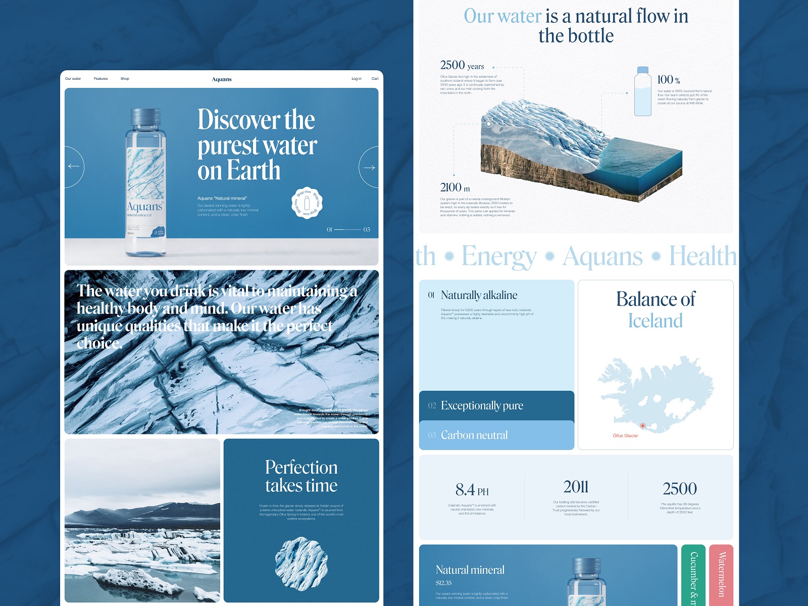
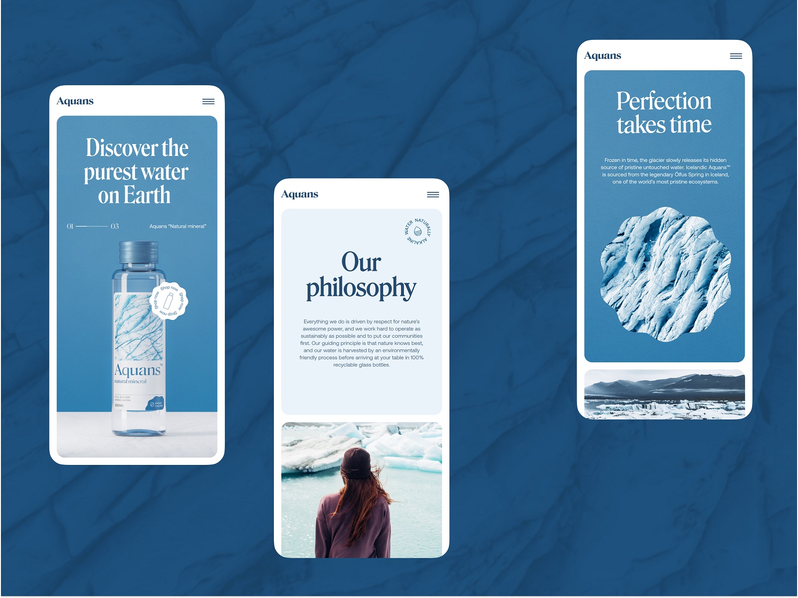
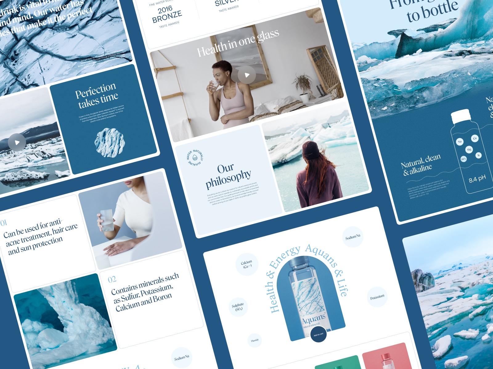
Water Brand Website
Designing for a water brand is a study in restraint. Water has no color, no flavor cues, no dramatic narrative. The interface must communicate purity without becoming visually empty.
This project leans heavily on spatial clarity. Wide margins. Limited color palette. A layout where every element feels carefully placed rather than densely packed.
Video and photography carry much of the emotional weight—slow moving water surfaces, light reflections, glass textures. Motion design stays subtle: gentle transitions rather than aggressive animation.
The result is an interface that feels almost breathable. Users move through the pages without cognitive friction, absorbing the brand atmosphere while exploring product details. Freshness becomes a design parameter rather than a marketing phrase.
Liquid Egg Product E-commerce Website
Liquid eggs are not an intuitive product category. Many users encounter the concept with mild confusion: eggs that come in a bottle?
That uncertainty shapes the entire interface strategy.
The design uses friendly color palettes and bold packaging visuals to reduce hesitation. Typography stays clear and approachable. Instead of long paragraphs explaining the product, information appears in structured chunks—infographics, labeled icons, short text blocks.
The layout encourages scanning. Nutritional benefits, cooking uses, storage advantages—each idea occupies its own visual container. Motion design plays a supporting role here. Small animations guide attention between sections, helping users absorb unfamiliar information without feeling overwhelmed.
It’s a good example of interface design functioning as product education.
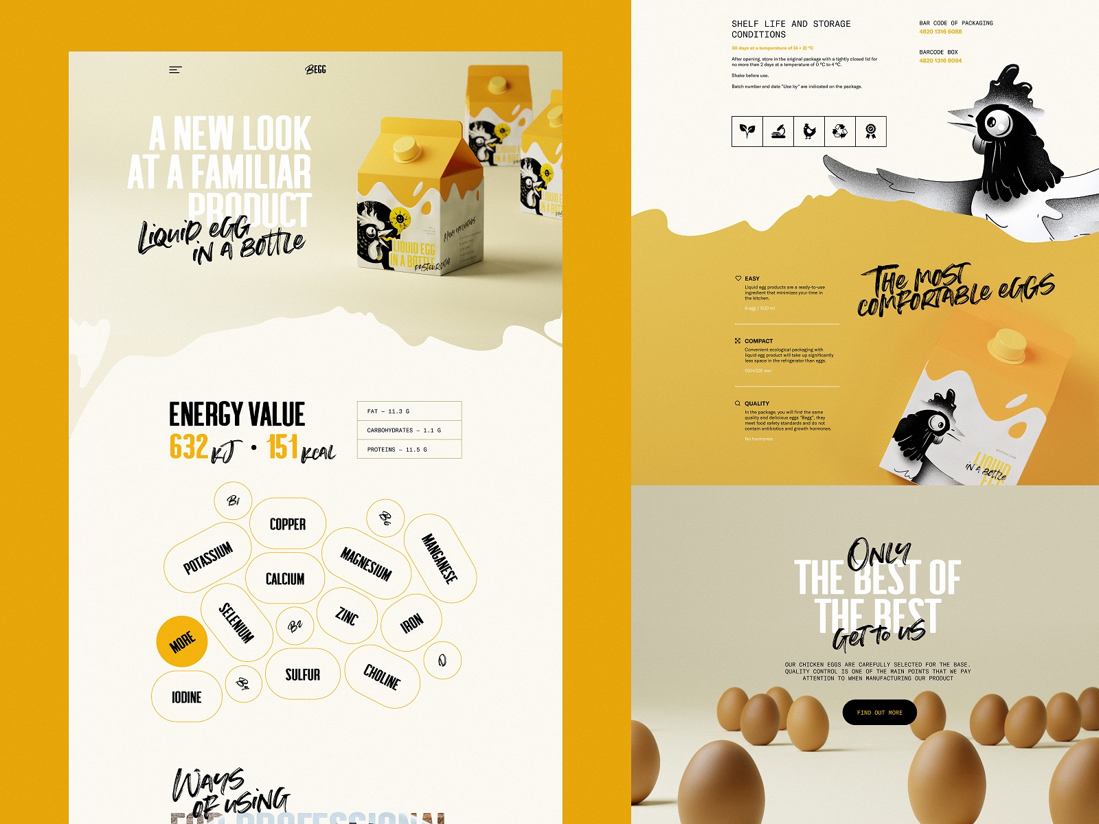
Learn more about the project in the case study on creating a niche food product e-commerce website.
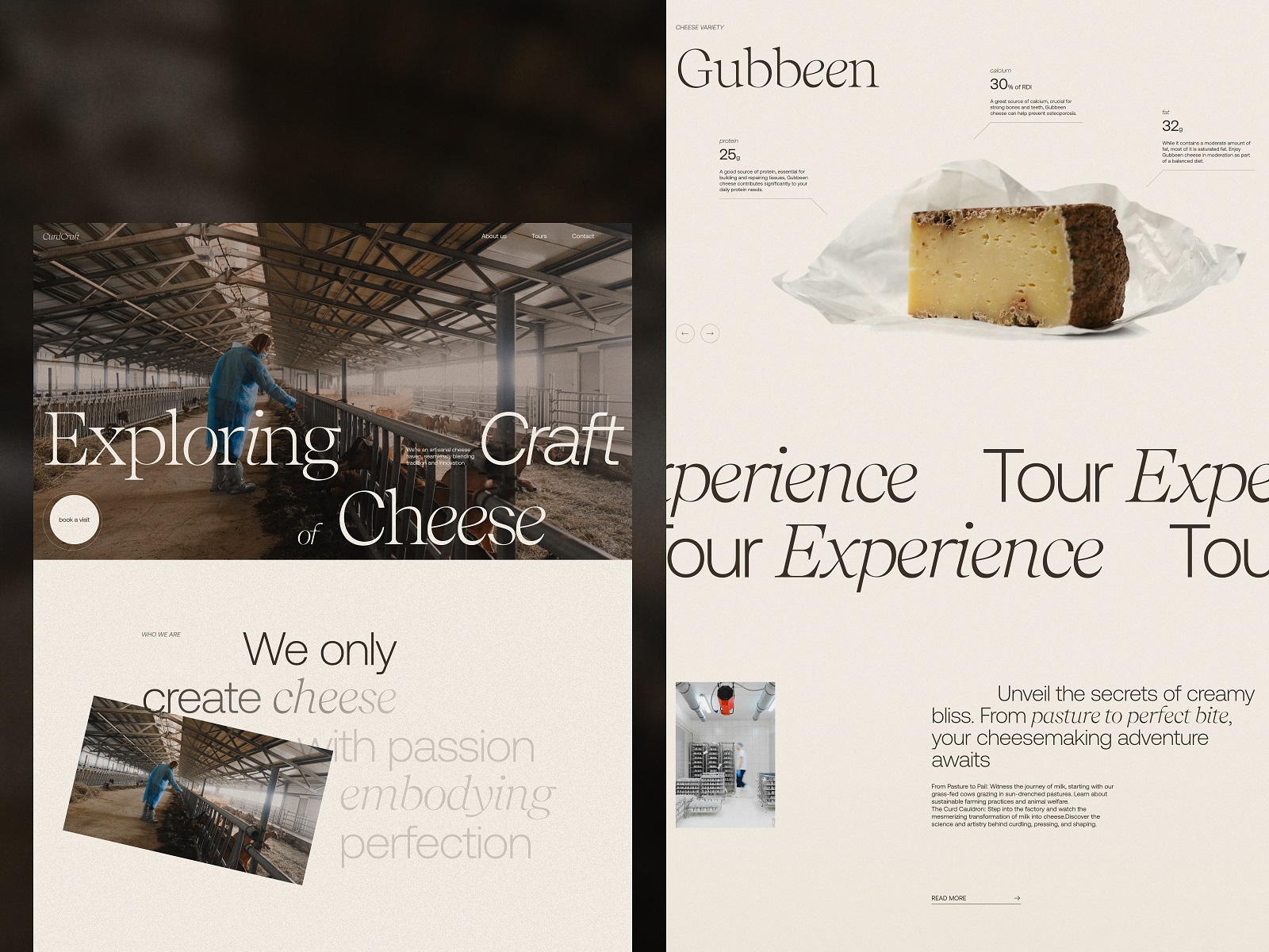
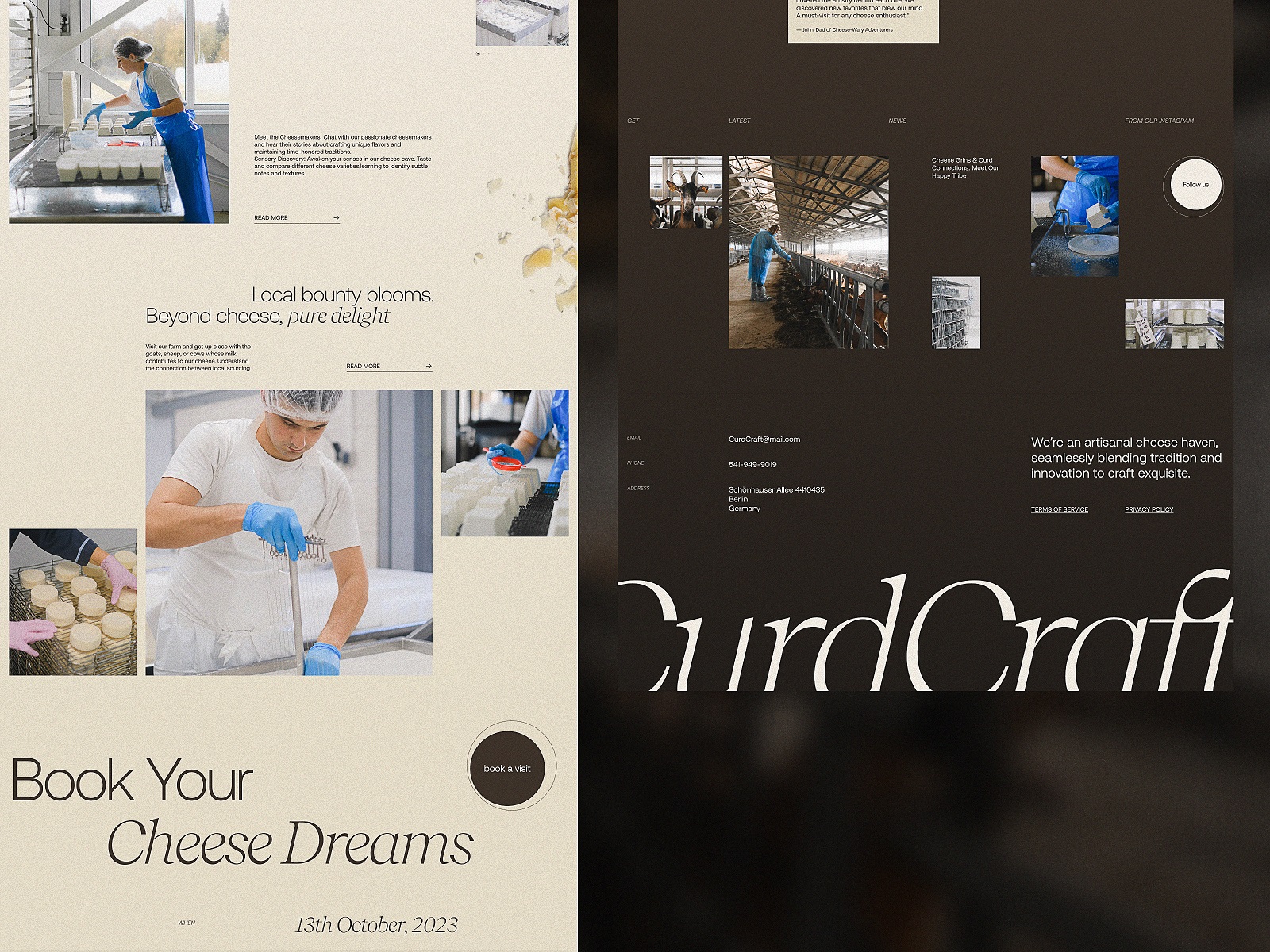
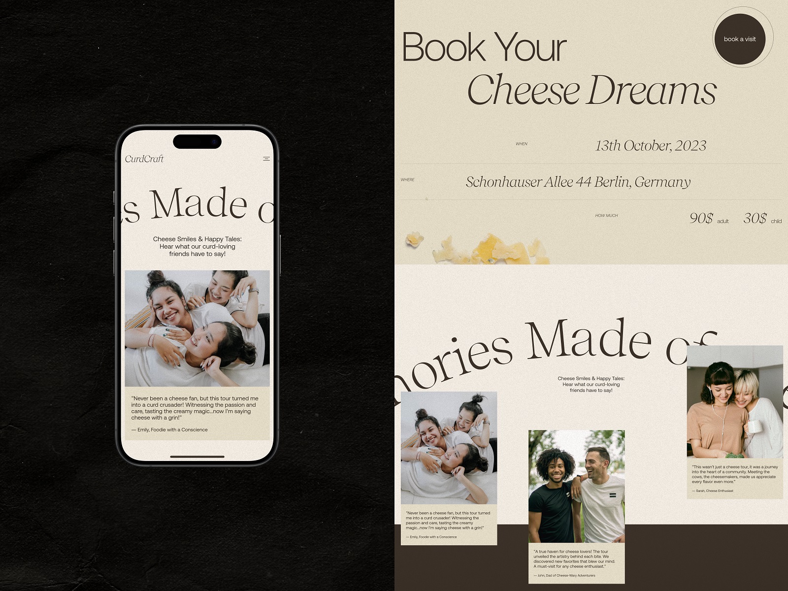
Cheese Producer Website
Some products benefit from atmosphere. Cheese is one of them. This website balances storytelling with navigational clarity. The color palette leans deep and earthy, echoing the textures of aging rooms and natural ingredients. Strong contrast ensures that text remains readable while maintaining the brand’s rustic tone.
Video content plays an important role. Instead of static product photos alone, visitors see glimpses of production processes—milk, aging racks, finished cheeses. These visual layers build credibility. The interface quietly communicates transparency: here’s how the product exists in the real world.
From a structural perspective, the navigation keeps everything predictable. Sections flow in a linear path: brand story, production process, product catalog, visitor experiences.
The design invites exploration without forcing it.
Drinks Delivery App
Delivery apps live under brutal usability expectations. A user standing at a party with an empty fridge will abandon your interface within seconds if something feels slow or confusing. That’s why Glup—the drinks delivery application we designed for Heineken Mexico—treats speed as the core design constraint.
The mobile interface relies on bright branding, large tappable elements, and direct navigation paths. Categories such as beer, snacks, and accessories appear immediately within the home screen hierarchy. Product cards use simple geometry and strong visual contrast, making them easy to scan even on smaller phone screens in less-than-ideal lighting conditions.
Checkout flows remain short. Each step exists for a reason: item selection, delivery details, confirmation. Behind the visuals sits a fundamental principle of mobile design—respect the user’s impatience.
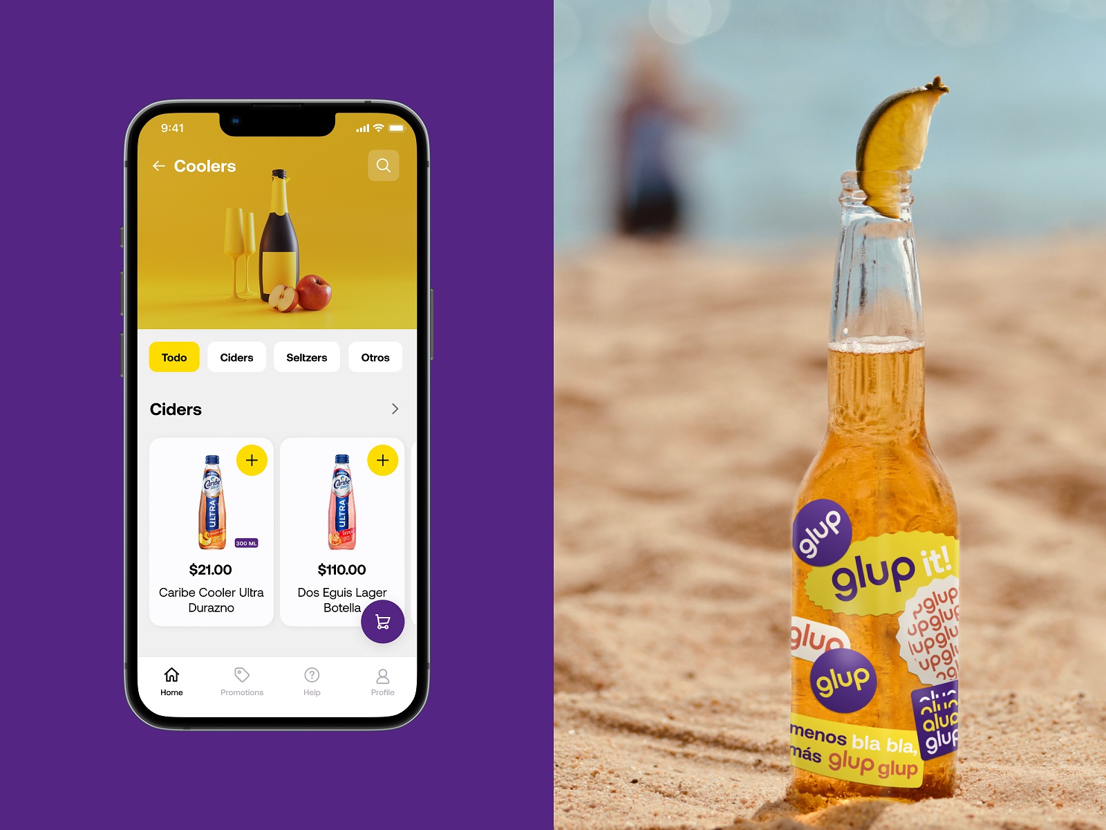
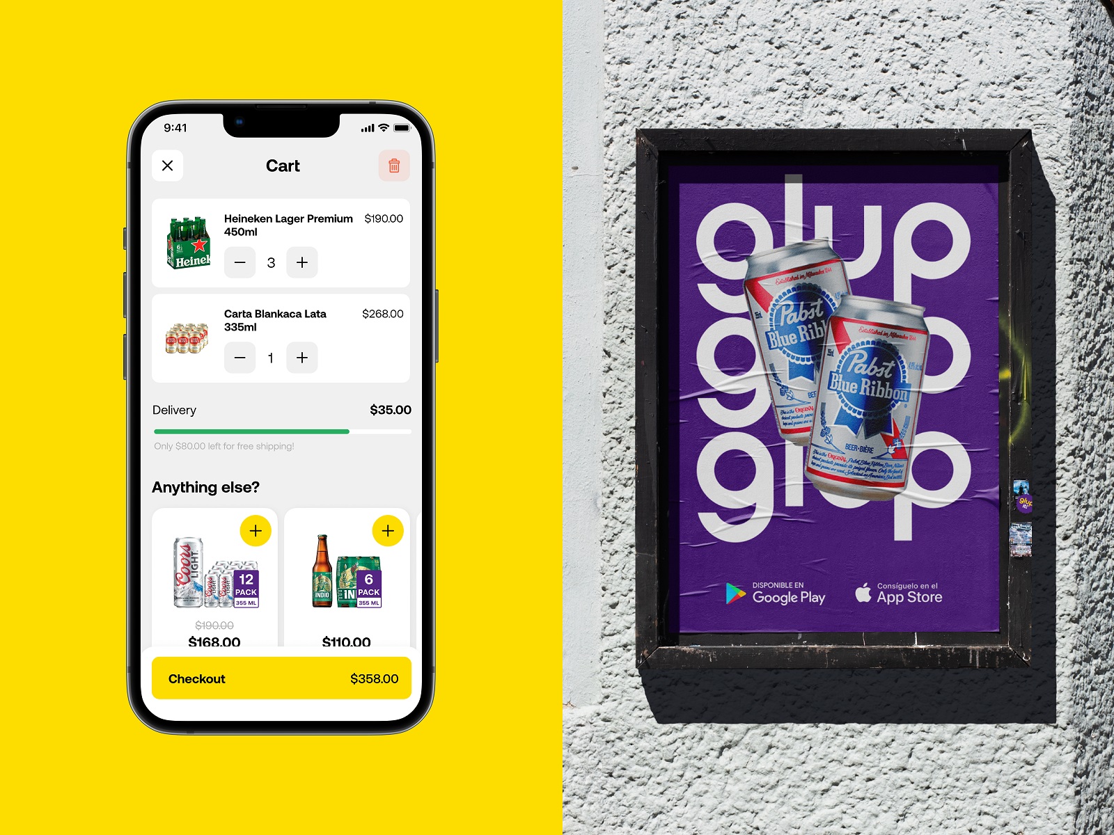
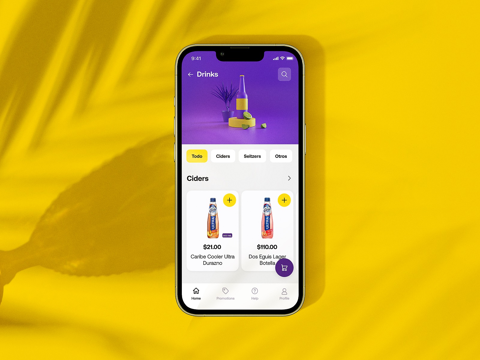
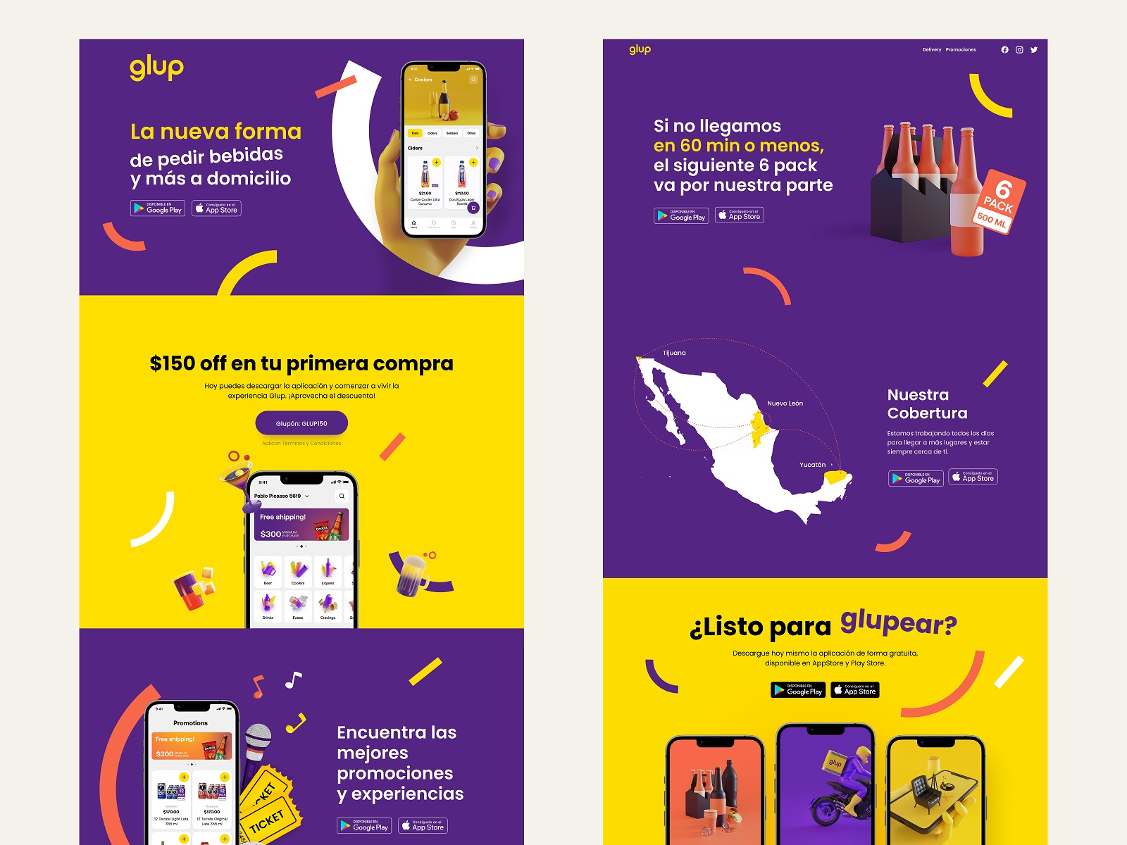
Learn more about the project in the detailed Glup design case study.
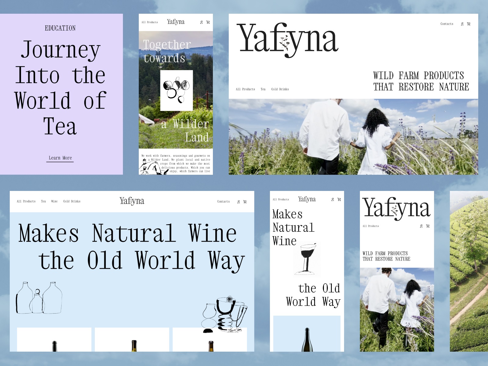
Wildfarm Drinks E-commerce Website
Some brands tell their story through place. Wildfarm produces beverages derived from plants and flowers grown in near-wild conditions. The interface reflects that narrative through imagery and typography rather than heavy explanatory text.
Pages feel airy. Large photographs of fields and plants stretch across the layout, creating a sense of environment. Decorative typography adds a touch of craft while staying legible. Navigation structures the product catalog logically, allowing visitors to explore teas and beverages without losing orientation.
The design doesn’t shout about sustainability or natural production. Instead, it lets the visuals carry that message quietly.
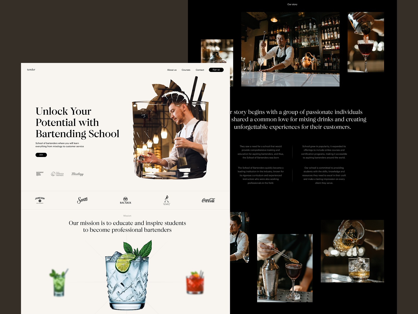
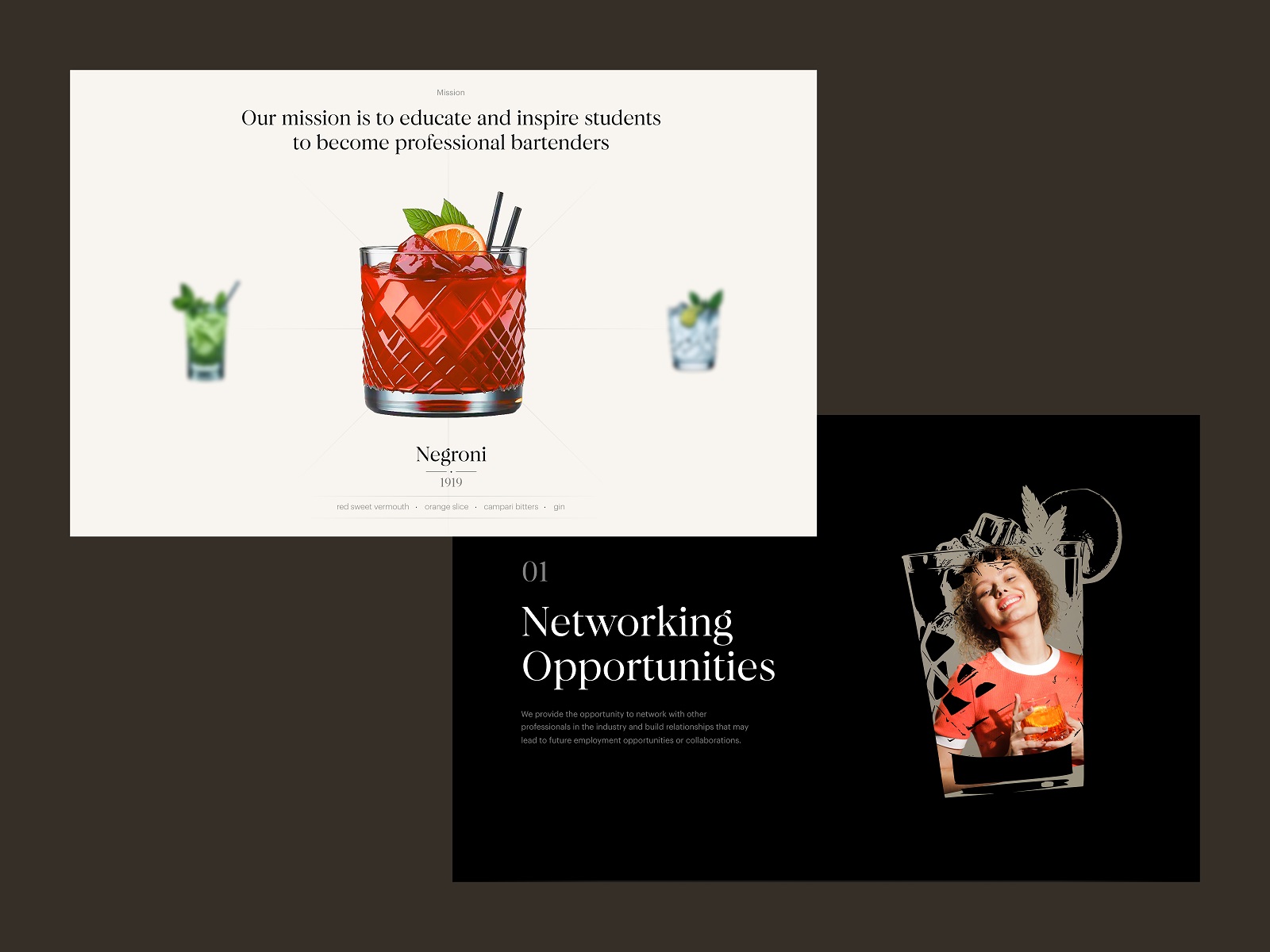
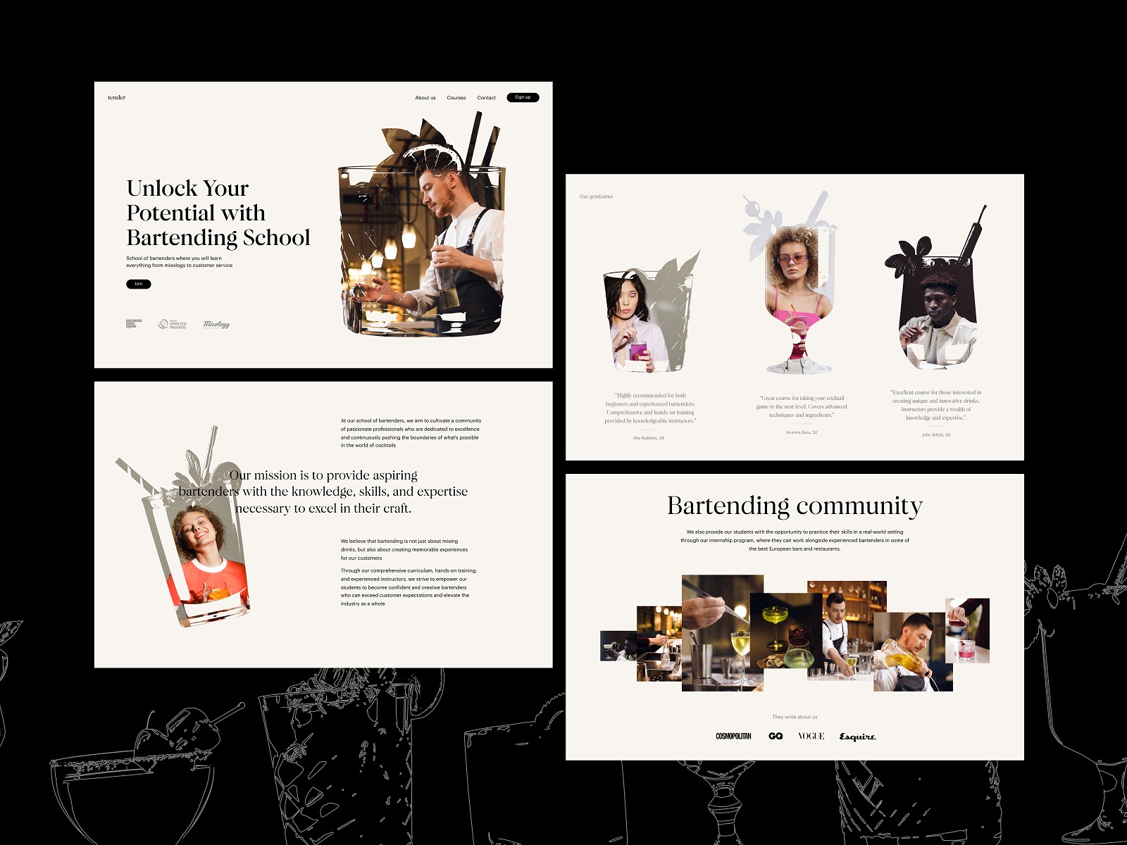
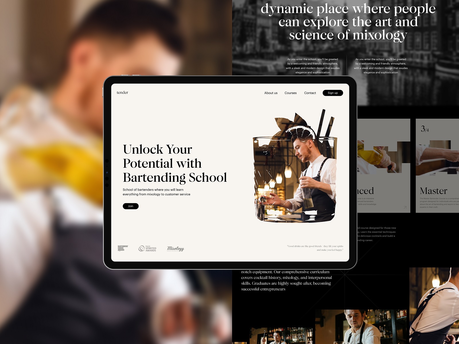
Bartending School Website
Educational platforms bring another layer of interface complexity: information density. A bartending school must communicate schedules, course descriptions, instructors, and enrollment paths—all while maintaining a sense of style appropriate for the craft.
This design plays with typographic hierarchy to guide the eye. Large headlines introduce sections. Supporting text blocks remain compact and readable. Negative space becomes a strategic tool. Instead of packing content tightly, the layout gives each topic breathing room, making the information easier to digest.
Custom mask shapes inspired by glass silhouettes appear throughout the interface, subtly reinforcing the theme without turning the layout into a novelty. The result feels both educational and atmospheric.
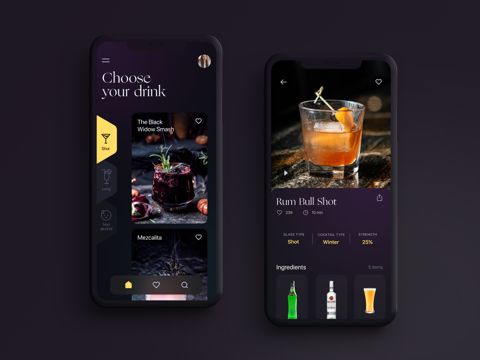
Drink Recipes App
Recipe interfaces live inside messy real-world contexts. Spices on the counter. Sticky fingers. A phone balanced against a cutting board. This drink recipes app focuses on clarity under imperfect conditions.
A dark background sets the tone—evoking bar interiors while also improving visual contrast for recipe photos and ingredient lists. Navigation stays simple: categories, favorites, search. Data visualization plays a practical role. Ingredient ratios, preparation steps, and drink variations appear in structured formats that users can read quickly while mixing.
The interface respects the environment in which it will actually be used.
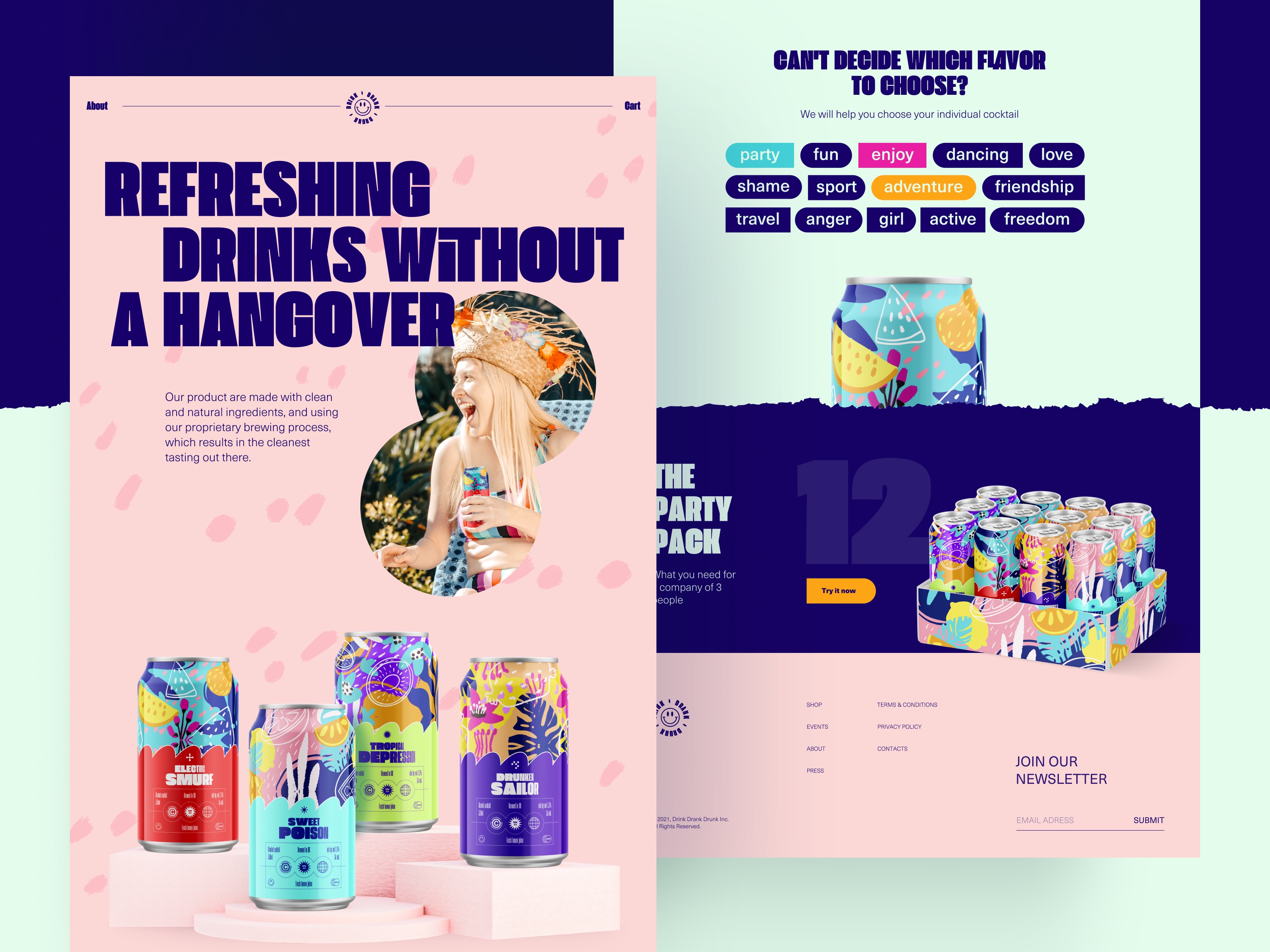
Party Drink Landing Page
Landing pages for beverage brands often chase energy. Bright colors. Motion graphics. Large product visuals. This concept embraces that energy while keeping composition disciplined.
Cans become the central layout anchors. Surrounding elements—tags, motion accents, typography—support rather than compete with them. Scrolling introduces new sections through smooth transitions, creating a sense of momentum without overwhelming the user.
The interaction model encourages exploration while keeping the primary goal clear: product discovery.
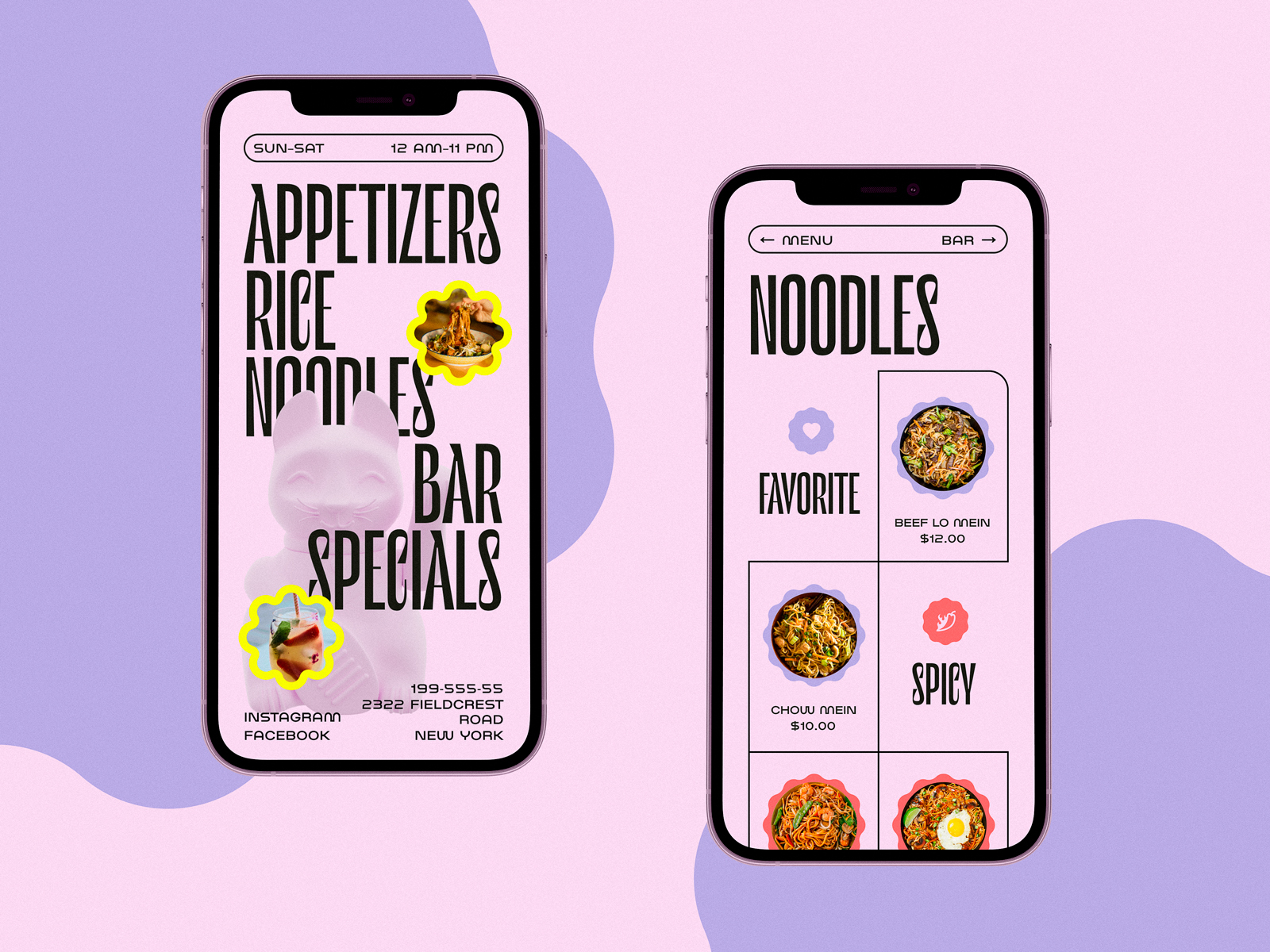
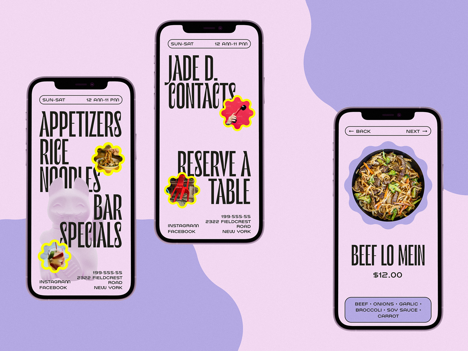
Chinese Restaurant Website
Restaurant websites often struggle with a familiar tension: atmosphere versus information. Visitors want to feel the place before deciding to visit it. They also want to find the menu quickly.
This interface resolves that tension through a split-screen structure. One side carries expressive photography—dishes, interiors, cultural textures. The other side hosts navigational elements and menu access. The grid remains consistent across pages, allowing users to build spatial memory as they explore.
It’s a simple mechanism with powerful behavioral impact. The eye understands instantly where to look for emotion and where to look for information.
Juice Brand Ecommerce Website
Juice branding thrives on color. The interface leans into that energy. Bright palettes echo the fruits themselves. Product imagery stays bold and saturated, while motion effects bring subtle liveliness to the page.
Underneath the vibrancy lies careful compositional control. Product cards align to a predictable grid. Text remains readable against colorful backgrounds. The interface delivers excitement without sacrificing usability—a balance that many brand-heavy websites fail to achieve.
Bartending Encyclopedia Website
Finally, there’s the encyclopedia format: an information-rich platform dedicated to drink culture.
The layout uses a split-screen structure combined with strong typography to organize large amounts of content. Articles about cocktails, ingredients, and techniques appear within a clear reading hierarchy.
Custom photography and visual accents maintain aesthetic consistency while preventing the interface from feeling academic or dry. It becomes a digital reference book with modern interaction patterns.
New web and mobile design collections and design case studies by our team are coming soon – don’t miss the updates!
The Quiet Logic of Food Interfaces
Across all these projects, a pattern emerges.
Food interfaces rarely succeed through spectacle alone. They work through alignment, hierarchy, and behavioral understanding. Through the way images sit inside grids. Through the spacing between recipe steps. Through the speed of a delivery button when someone taps it at midnight.
Design decisions accumulate.
A photograph that loads quickly invites exploration. A navigation bar placed one thumb’s reach higher saves a gesture. A recipe layout that separates ingredients from instructions prevents mistakes while cooking. Tiny interface mechanics shape everyday rituals.
A designer notices those mechanics the way a chef notices seasoning. Subtle adjustments change the entire experience. Food and drink may begin in the physical world. The moment they enter a screen, they become systems of geometry, timing, and perception.
Design translates appetite into interaction. And when the system works well, users never think about it.
They tap.
They scroll.
They order dinner.
Recommended Reading
Still hungry? Here are some more articles on UX design for web and mobile:
Web Design: 11 Diverse Functional and Awe-Inspiring Website Designs
10 Elegant and Handy User Interface Design Projects
App Design Ideas: 7 Nifty Mobile Application Design Projects
Product Page Design Inspiration: 17 Ecommerce Web Designs
Information Beautified: Media and Editorial Website Designs
UX Design for Traveling: Impressive Web Design Concepts
23 Impressive Web Design Concepts for Various Business Objectives
UX Design: Types of Interactive Content Amplifying Engagement
Motion in UX Design: 6 Effective Types of Web Animation