Not every screen is built to sell. Some are there to greet, to hold, to explain, or to listen. And if you’ve spent enough time on the internet—through Monday logins, late-night scrolls, and half-read FAQ tabs—you’ve seen these pages before.
Sixteen shapes. Familiar, but never quite the same.
They form the quiet structure behind nearly every website—from the ones that teach us to bake, to the ones that whisper breaking news while our coffee brews. With over 1.1 billion sites out there (and counting), variety is a given. But beneath the chaos lives a soft kind of order. A handful of page types that carry most of the web’s weight.
Here’s a closer look at the ones that matter. The way they move. The way they hold attention. And why, when they’re built right, you don’t even notice they’re there.
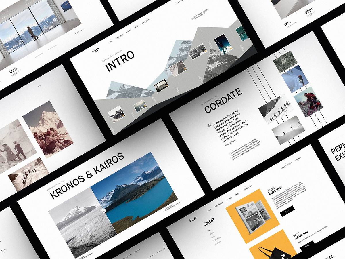
Webpages for Lumen Museum website
What Is a Home Page and Why Is It Important?
A home page is the main entry point of a website and sets the first impression for users and search engines alike. It doesn’t ask for attention—it earns it. It’s the doorway and the doormat. The place where first impressions settle like dust on a bookshelf. Quiet, but permanent.
Most visitors won’t remember the full path they took. But they’ll remember where it started. The shape of the logo in the top-left, the button they almost clicked, the headline that made them stay ten seconds longer than they meant to.
It’s not about cramming everything into one screen; it’s about setting the pace. Giving structure to curiosity. A welcome, a whisper, a choice: search here, scroll there, click this.
On product-heavy platforms, it might tease a sale. On social ones, it might open with a feed. Logged in or out, returning or brand new—the home page adapts. It learns when to speak, and when to stay out of the way.
Home page design for the website on eco-tourism
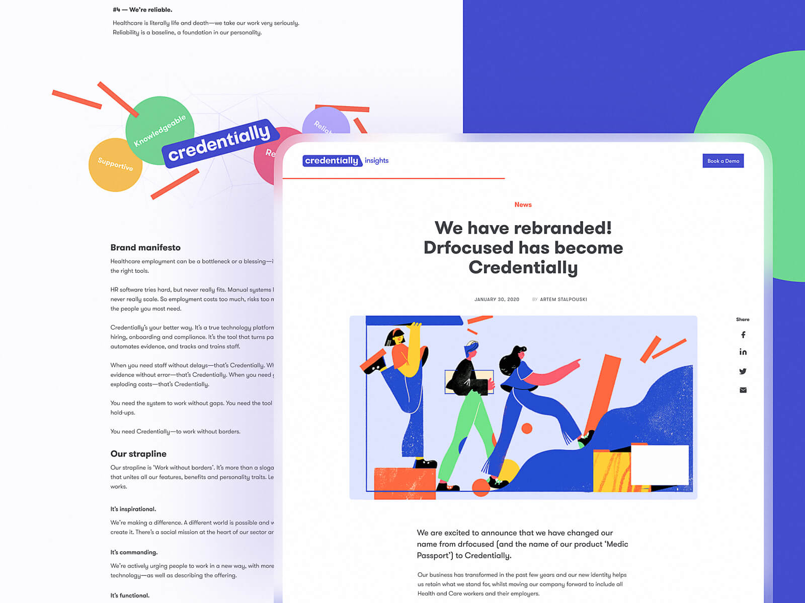
Home page for Credentially, the service on hiring in the healthcare sphere
Read about best design practices for home pages
What Is a Feed Page in Web Design?
A feed page in web design displays dynamic content updates and improves user engagement by encouraging continuous scrolling and interaction. It is a living archive—pulse of what’s new, what’s next, what you missed while making coffee. It’s the modern newspaper, fragmented and reimagined. Updates there stack like sediment, each post another layer of attention, each scroll a small act of seeking.
Whether you’re looking at an editorial stream, a product update log, or a photo grid of a life being lived, the logic holds: same shape, different stories. Repetition is the trick. It teaches the eye what to expect, and then rewards the thumb with micro-variation. A new thumbnail, a slightly longer headline, a fresh caption with teeth.
Feeds work because they don’t ask you to think. They invite you to notice. Every element supports scanability—image placement, font hierarchy, scroll rhythm. The best feed pages feel inevitable. As if the content didn’t load—it arrived.
How Does a Menu Page Improve Navigation?
A menu page helps users navigate a website by presenting a clear, structured overview of available pages and categories. A good menu disappears behind the choices it offers. But in a world of infinite tabs and twitchy scroll behavior, a full-screen menu page can do something special: it makes you stop. It holds the moment. By stripping away everything but the next possible paths, it gives weight to each decision, one click at a time.
This isn’t always necessary. For lightweight architectures—single-product sites, portfolios with tight scope—the menu can live inside the layout, folded into a corner icon or anchored quietly in the header. But when the structure gets dense—when there’s too much to hold in your head at once—a dedicated menu page becomes the spine.
Interactive menu page
Menu page for art galleries website
What Makes a Good Search Page Design?
A good search page improves user experience by offering clarity, speed, and relevance in presenting query results. Every search begins with a question—a half-typed phrase on a quiet Friday afternoon, brain half-scattered. And the interface has one job: don’t make that user think any harder than they already are.
At its core, a good search page does two things at once—it reassures and reveals. The query stays visible—not as a technical requirement, but as a cognitive anchor. When results disappoint (and sometimes they do), users shouldn’t have to reverse-engineer their own thoughts. It’s a simple detail. But it’s the kind that makes frustration evaporate before it starts.
Whether it’s card-based, list-based, or something in between, hierarchy matters. Titles should pop. Thumbnails should clarify, not clutter. The scan path should feel effortless, like flipping through a familiar book. The faster someone can parse what they’re seeing, the more they believe the system gets them.
This is how the search page looks on the Design4Users website: it opens the list of cards with catchy titles and images.
What Should an About Page Include?
An About page should include your mission, values, team or founder info, and brand story to build user trust. You don’t get a second chance at a first impression—but if you do, it’s usually this page. The About section is where curiosity lands when it needs a story. It’s not a CV. Not a sales pitch. It’s the part of the site that breathes.
We built it for the people who want context before commitment. The ones who check the footer before they check out. They’re not skimming for buzzwords—they’re looking for a pulse.
This page carries more weight than it looks like. It’s the brand’s voice, stripped down to eye level. A human introduction, wrapped in structure: mission, values, team, or sometimes just one person and a good reason. Some write it like a letter. Others like a manifesto. Either way, it’s how you know who you’re dealing with.
Placed quietly in the header. Or tucked into the footer like a business card slipped under a coffee cup. Clicked at 2AM, halfway through a rabbit hole. Because at some point, we all ask: who made this—and why does it feel this way?
That’s what the About page answers—without trying too hard. It speaks. Then steps back. Like any good host.
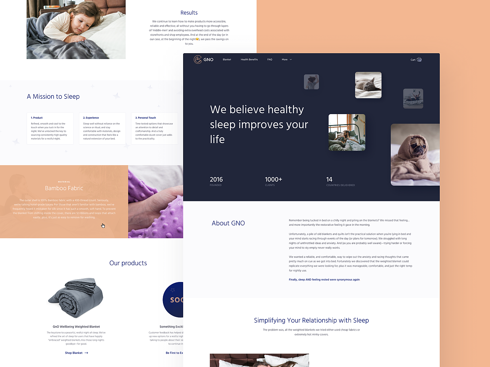
About page for GNO blankets website
About page for Synthesized website
Why Is the Registration Page Critical for Conversions?
A registration page is a key conversion point where user interest becomes commitment, and friction can cause drop-offs. It isn’t where the experience begins, but it’s where commitment does. One field too many, one click too far, and the user’s gone. We’ve all done it—swiped up, closed the tab, went back to scrolling.
That’s why onboarding design isn’t about asking. It’s about inviting. At its best, a sign-up page feels like a handshake. It’s fast and unintrusive. Ideally, the form lives in a single fold. Preferably with autofill. Always with fallback options—Google, Apple, socials. Lazy logins for fast minds.
First-time flows matter. What happens after “Create account” sets the tone. Whether it’s a warm onboarding or a cold dashboard, users remember their first steps, not your backend logic. Keep it short. Keep it quiet. Make it feel like a decision, not a task.
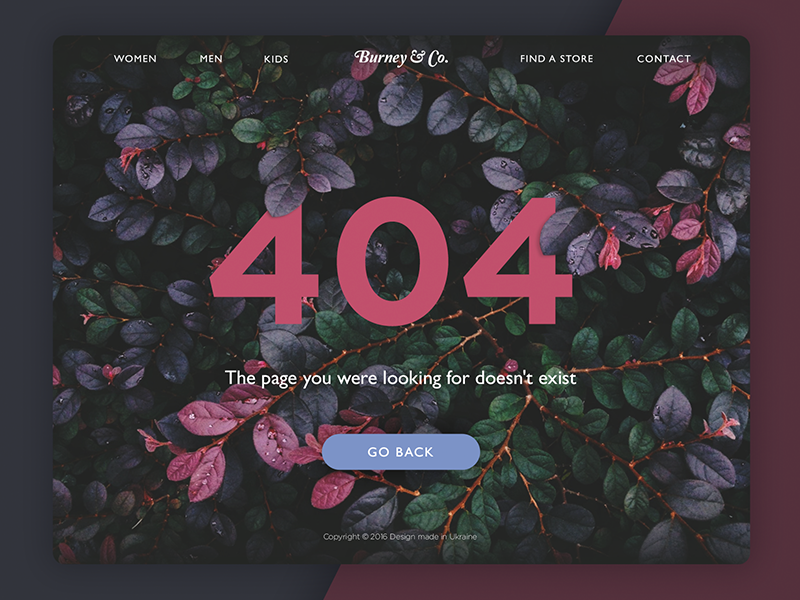
What Is a 404 Page and How Can It Add Value?
A 404 error page improves UX when it guides users back into the site instead of leaving them lost or frustrated. It starts with a broken link. Someone taps a button, expecting to arrive, and doesn’t. The address exists, but the content isn’t there. The server responds: “404—Not Found.” No tantrum, no drama. Just a digital shrug.
But here’s the thing about human behavior: even disappointment is an opportunity. When the page fails to load, the experience doesn’t have to. A 404 is still a surface. Still a moment. Still a part of the journey.
The worst thing it can be is empty. The best thing? Unexpected. A breadcrumb, a nudge toward somewhere else. Not everything needs to explain itself, but every element, even an error, should earn its place. Some sites leave it blank. Others make it a canvas.
A good 404 doesn’t apologize, it reorients. A better one slips in brand flavor without force. The best ones get remembered—not for what they said, but how they made you feel when the scroll hit a wall. Because in digital design, even dead ends can leave an aftertaste.
404 page design for an e-commerce website
Playful 404 page design for ShipDaddy website
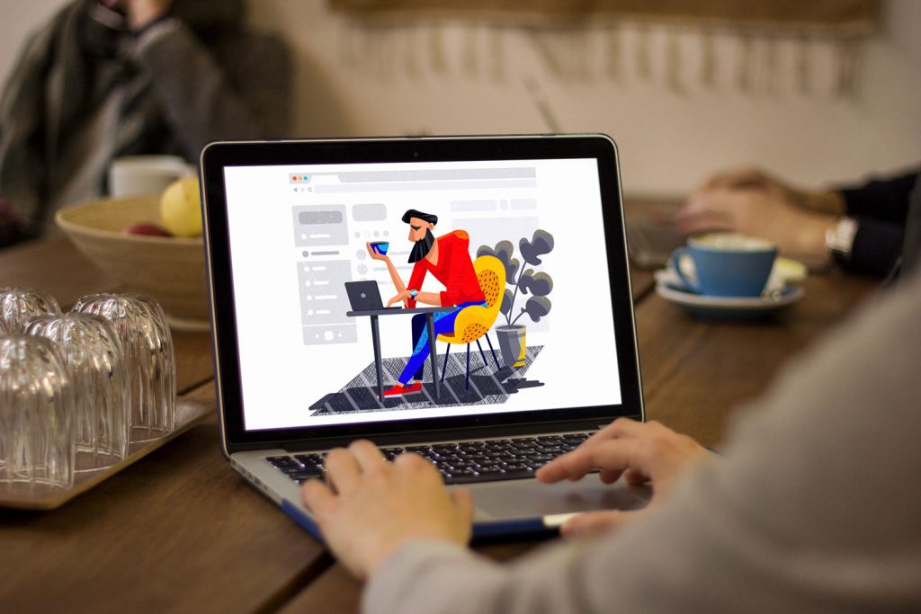
Why Do Websites Need a Blog Page?
A blog page provides ongoing content that supports SEO, builds trust, and keeps users engaged with fresh updates. Not every update deserves a billboard. Some stories need a quieter stage. The blog page is that space. A room off the main hall—less formal, more alive. It’s where brands think out loud, share what doesn’t fit into a landing page, and let their voice stretch out past the headline. Whether you call it a blog, journal, updates tab, or something cooler—it does one simple thing: it gives your website a pulse.
Sometimes, the blog is the site. Standalone, self-sustaining, built around one voice or mission. Posts come first, everything else supports. You scroll not to find, but to follow. Think Substack, early WordPress, Medium before the AI clutter.
But more often, the blog lives within something else—tucked behind a portfolio, riding shotgun on an e-commerce homepage, stitched into the footer of a SaaS dashboard. It’s no longer the star, it’s infrastructure. A scope of content designed to feed the engine—SEO, trust, returning users. A signal to both humans and crawlers: we’re active, we’re thinking, we’re here.
Design-wise, it’s a balance. Feed vs feature. Posts listed chronologically signal transparency. A highlighted section, meanwhile, whispers intention: This is what we want you to read. Some brands lean into cards and categories, others prefer a clean scroll. The best ones know why.
UX depends on tempo. How often do you publish? Who’s reading, and when? A user skimming headlines over coffee on a Tuesday doesn’t need pagination. But a researcher two hours deep into your archives? They’ll want filters, tags, and a breadcrumb home.
What matters most is this: the blog page must invite the reader in without asking too much. A glance should tell you what’s new. A scroll should reward curiosity. And somewhere between the first headline and the last sentence, the site should start to feel more human.
A blog is more than content—It’s proof of life.
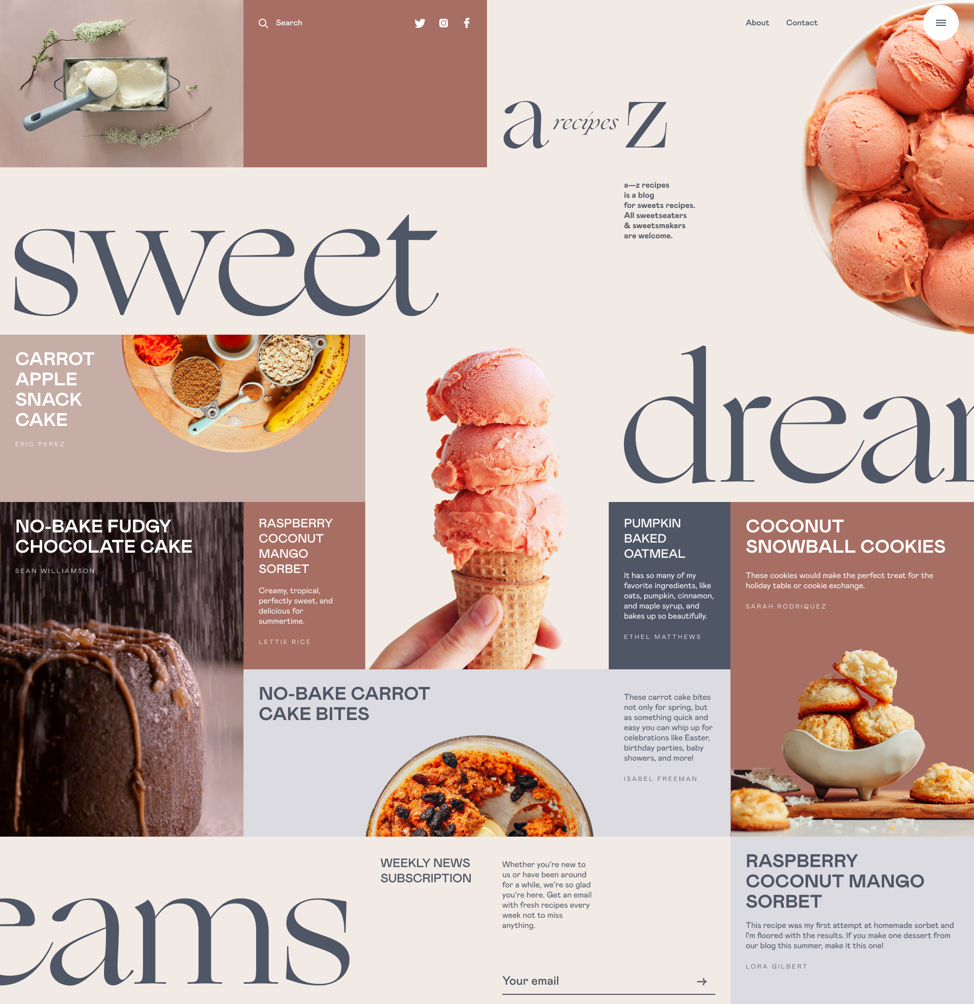
Dessert recipes blog page
How to Design an Article Page for Better Readability?
An article page should be designed with clear hierarchy, optimal line width, and intentional spacing to maximize readability and user retention. It is where reading turns into action. That’s why it’s one of the most unforgiving layouts to design.
The challenge isn’t the amount of text. It’s the rhythm of it—how it breaks and breathes. People don’t read articles the way they read labels or headlines—they scroll in diagonals. They skim like they’re looking for a reason to stop. So the job here is to hold their attention just long enough to make them forget they were trying to save time.
That starts with visual hierarchy. A headline isn’t just a larger font—it’s the first negotiation. The H1 sets the pace, the H2s guide the eye, and the paragraph width decides whether the brain stays or bails. The best article pages don’t feel designed; they feel organic. Typography flows with weight and contrast. Images punctuate meaning, not just decorate it. Related reads emerge right when curiosity peaks—not before, not after.
There’s psychology behind every line break. Every block of copy competes with the back button, the TikTok opened on your phone, the stove you left on. The article page wins not by shouting louder, but by feeling quieter than the rest of the internet. It’s not about keeping readers—it’s about letting them want to stay.
Article page for Credentially website
Article page featuring an interview in an online magazine
What Is a Portfolio Page and Why Is It Important?
A portfolio page showcases past work and builds credibility by visually proving expertise and creative range. It is where the work speaks first. No mission statements, no manifesto—just proof. It’s the kind of page that loads at 3AM on an art director’s phone with brightness still on full. If it doesn’t hold in that moment, it’s lost.
Good portfolios don’t show work. They stage it. Every scroll is a reveal, every margin is a breath. The eye follows order, not randomness—so the layout matters more than most realize. Grid or freeform, you’re still building trust in 0.3 seconds.
Photography. UI. Ceramics. Fonts. What matters isn’t what you made, but how it lives on the screen. Crisp images are table stakes. What you’re really designing is gravity—something that pulls a potential client deeper without needing to explain why.
Because the goal isn’t to tell them you’re good. It’s to make them feel it.
Portfolio page for a photographer’s personal website
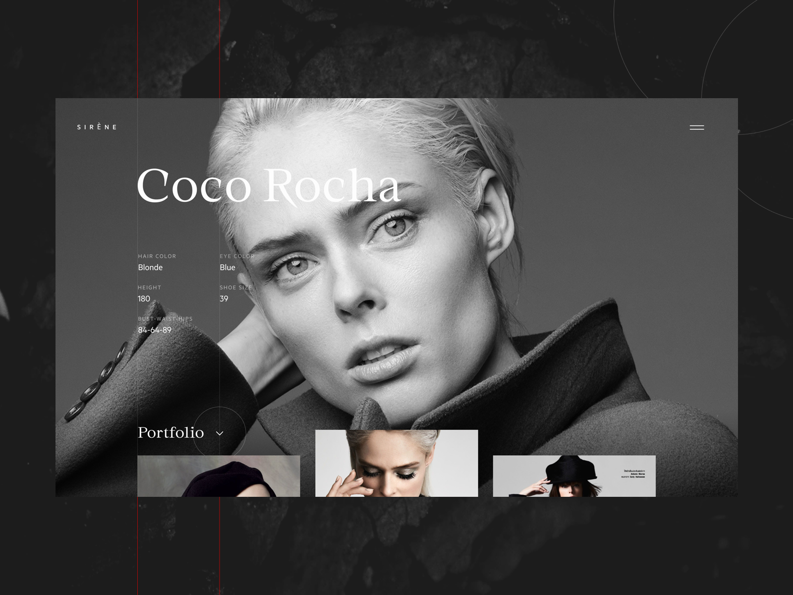
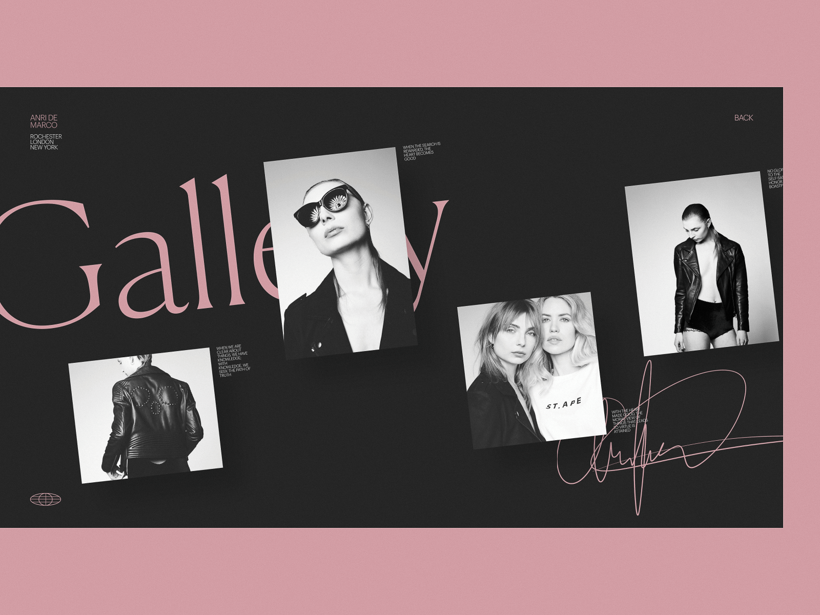
Fashion model portfolio page
How Should a Services Page Be Structured?
A services page should be structured with clear categories, bullet points, minimal jargon, and frictionless navigation to improve clarity and conversions. Just like a portfolio, a good services page doesn’t talk at you, it shows you what’s possible. It maps the offer to the need, like a hand to a glove.
People rarely linger here. They land, skim, decide. That means the work happens beneath the surface—tight pacing, soft guidance, frictionless flow. Bullet lists are your best friend, and so is white space—it’s clarity. You’re not here to impress; you’re here to inform without interruption.
Photos can set the mood. But services don’t always photograph well—so icons carry meaning, and illustrations do the heavy lifting. Whether you’re offering backend dev or brand strategy, the framing matters. No jargon, no overexplanations. Just an open door, held briefly, before the user moves on.
Because in the end, the best services page doesn’t sell—it orients. Like a well-placed sign on a long hallway. You only need to glance once to know which way to walk.
What Makes an Effective Product Page?
An effective product page clearly presents key information—images, pricing, CTAs—while minimizing distractions to support conversions. This is where it all happens. The moment of decision. A product page is less about showcasing and more about clearing a path—no noise, no friction, no doubt.
It holds the weight of everything that came before: the ad someone tapped on, the recommendation a friend swore by, the quiet lunchtime scroll. By the time a user lands here, they’re halfway convinced. Your job? Not to persuade. Just not to interrupt.
Every element earns its keep. Photos must load fast and hold still. Color swatches should snap with intention, not wiggle with uncertainty. Prices sit where the eye expects. CTA buttons? They shouldn’t ask. They should answer.
Clarity beats cleverness here. A good product page doesn’t try to sell—it lets the product speak. The layout helps it. The design holds the user’s focus long enough for trust to form. And if it fails, it breaks the entire funnel in silence. Because the user won’t complain. They’ll just close the tab.
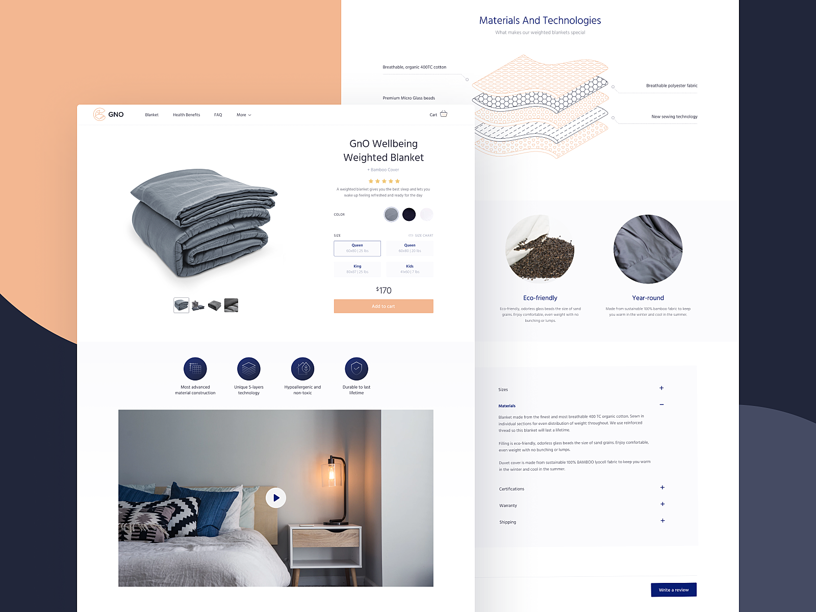
Product page for GNO website

Product page for the website devoted to zero-waste living
Product card for an ecommerce tea store
Interactions with product and menu page for an e-commerce website design in brutalism style
Read about best design practices for product pages
Why Is the Cart Page Crucial in E-Commerce?
The cart page is crucial because it acts as the final checkpoint before purchase—reinforcing choices and reducing hesitation. It’s where decisions crystallize. By the time users land here, they’ve already made a dozen micro-choices: scrolls, swipes, add-to-carts. What they need now is a clean list. A quick recap. A reminder of what they chose and why.
Every element must serve memory. Thumbnail images jog visual recall, short product titles confirm selection. Prices, totals, and delivery estimates reduce doubt and nudge commitment.
Good cart pages don’t make you think—they make you feel ready. Psychologically, this is a threshold. The brain moves from exploration to resolution. That means fewer distractions, no competing CTAs, no extra friction. It’s not the time to upsell—it’s time to let the user exhale, double-check, and proceed.
Interactions with a product page and cart page for bug store website
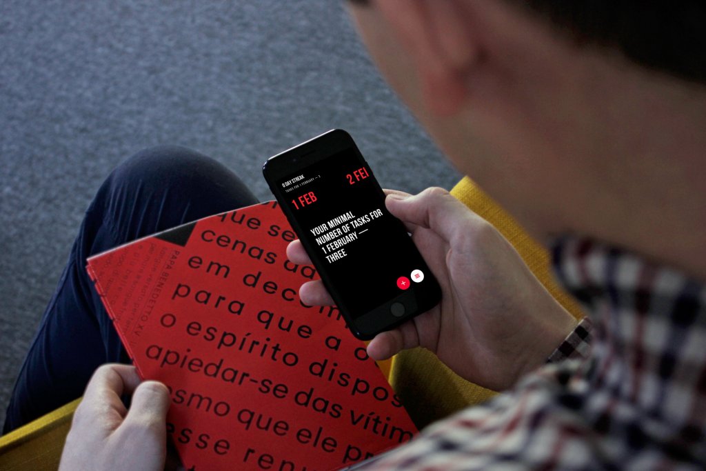
What Should a Statistics Page Include?
A statistics page should include intuitive data visualizations, comparative trends, and personal metrics that users can easily understand and act on. This is where data becomes personal. The hours they’ve spent, the peaks they’ve hit, the quiet days when nothing moved. When designed right, a stats page feels less like a report—and more like a mirror. Every graph, every gradient, is there to tell a story.
There’s a pattern. Green means growth, red means pullback. It’s not just convention—it’s conditioning. The brain learns faster when it doesn’t have to translate. Familiar colors, repeated hierarchies, predictable flows: they reduce friction, helping users scan complex data at a glance, even half-awake.
The real challenge is making it feel intuitive without feeling cold. Stats should invite, not overwhelm. A smart layout creates rhythm: headlines that anchor, typography that guides, whitespace that lets the eye rest before the next beat. You’re not designing a spreadsheet. You’re designing a heartbeat. And that heartbeat should belong to the user.
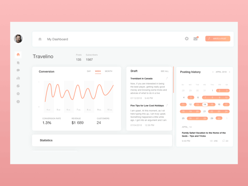
Blog dashboard page showing various statistics
What Is the Purpose of a Contact Page?
A contact page facilitates direct communication between users and the brand, reinforcing trust and accessibility. It sits at the end of a scroll or the corner of a nav bar, waiting patiently for intention. When a user lands here, they’re not browsing. They’re reaching out. And that shift in mindset is everything.
This isn’t the place for surprise, it’s where trust either clicks or crumbles. The load time should be instant. The layout—spare but direct. A name, an email, a form that actually works. No rabbit holes, no CAPTCHA puzzles from hell.
For brands, it’s a handshake. For people, a knock on the door. And for everyone else, it’s the quietest kind of CTA—one that says: yes, you’re welcome to reach out. The best contact pages don’t explain how to connect. They make you feel like someone’s already listening.
Contact page for art galleries website
How Are Landing Pages Designed for Conversions?
Landing pages are built to guide users toward one specific action by eliminating distractions and focusing on a single goal. They are the digital equivalent of stepping off a train and being exactly where you need to be. Not a terminal. Not a lobby. A point of arrival engineered to reduce friction, decision fatigue, and wandering eyes. In a world that runs on micro-moments—an Instagram swipe, a late-night impulse, a half-formed question typed with one thumb—a landing page gives that moment a place to… land.
Forget hierarchy. Forget navigation bars. This is about one message, one action, and zero distractions. Whether it’s buying a hoodie, downloading an app, or reserving a seat at an event, the best landing pages don’t introduce a product—they make a decision feel obvious.
The old meaning still lingers: a “landing page” once meant any page someone stumbled onto. But now it’s a precision tool. Especially in e-commerce, where a homepage is too much and too vague. The more options you give a tired user, the faster they’ll bounce.
This is design stripped of metaphor. The copy, the layout, the flow—all tuned to a single yes. And that yes can take any shape: “Buy now.” “Sign up.” “Learn more.” The goal is never the click—it’s the clarity before it. Because in the end, the most generous thing a landing page can do is respect your attention.
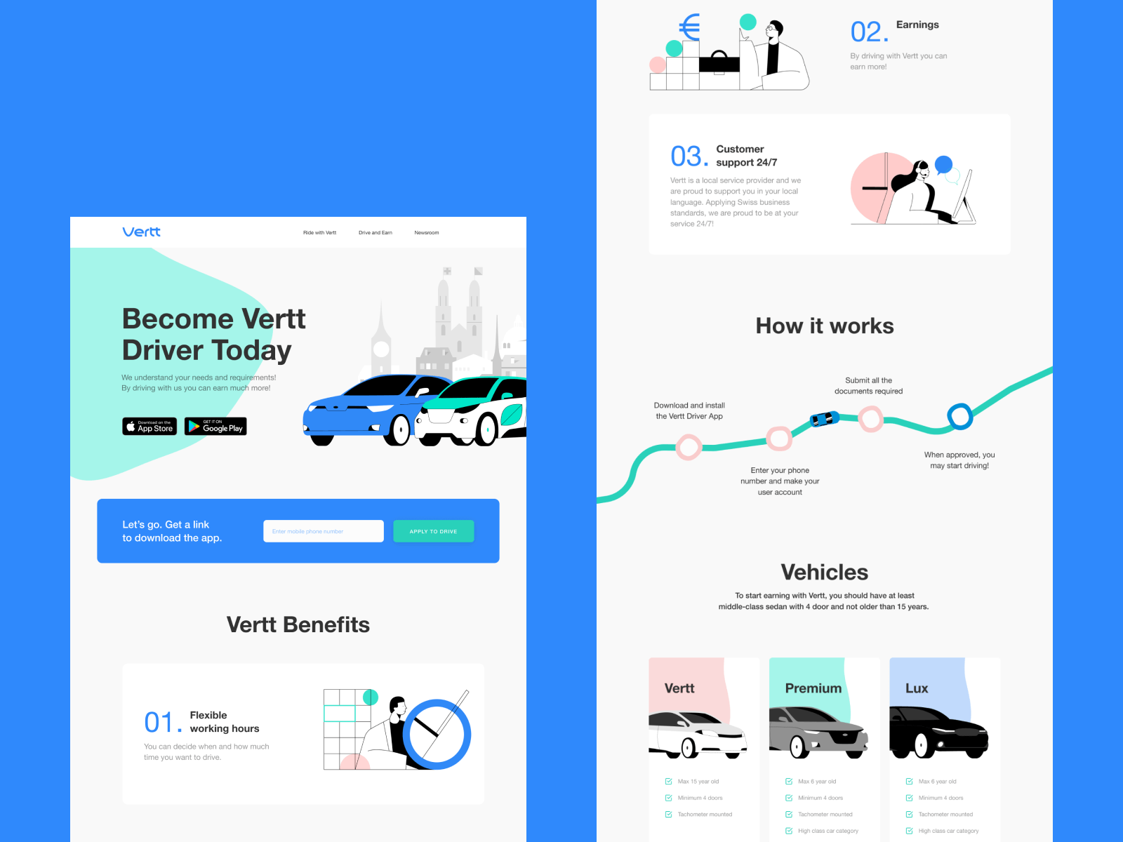
Landing page design to promote Vertt app
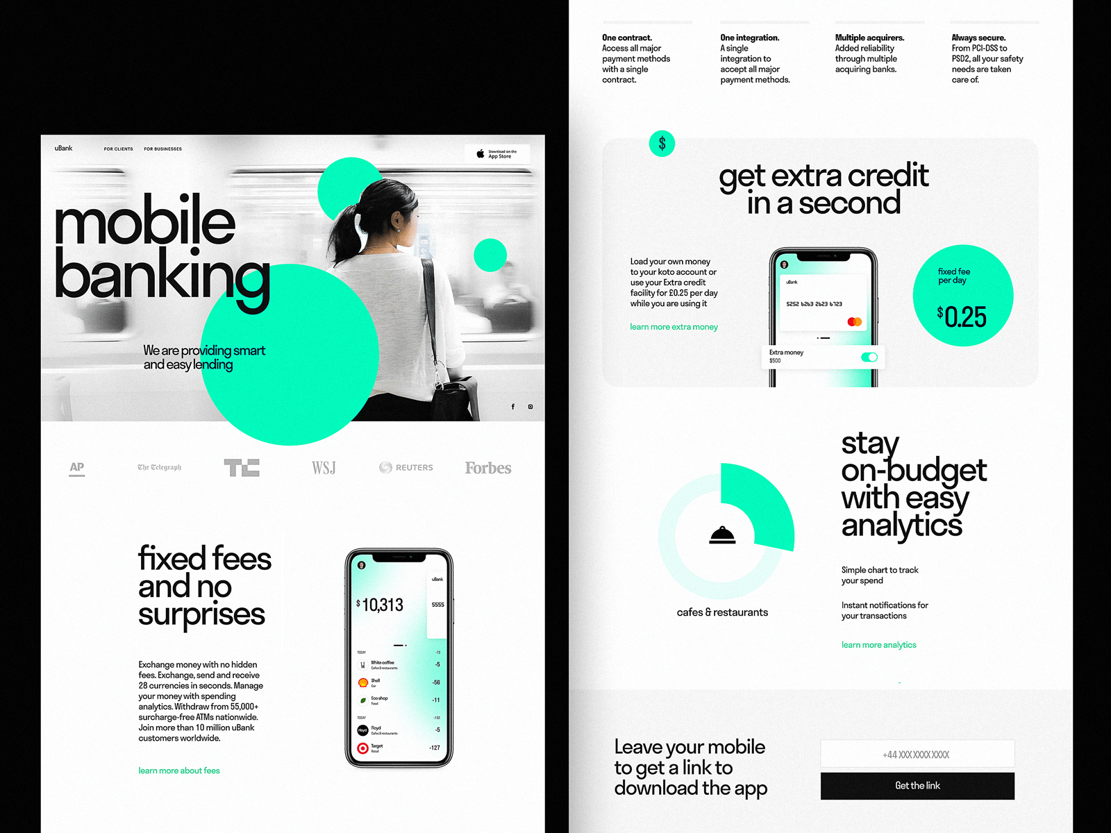
Landing page for a mobile banking service
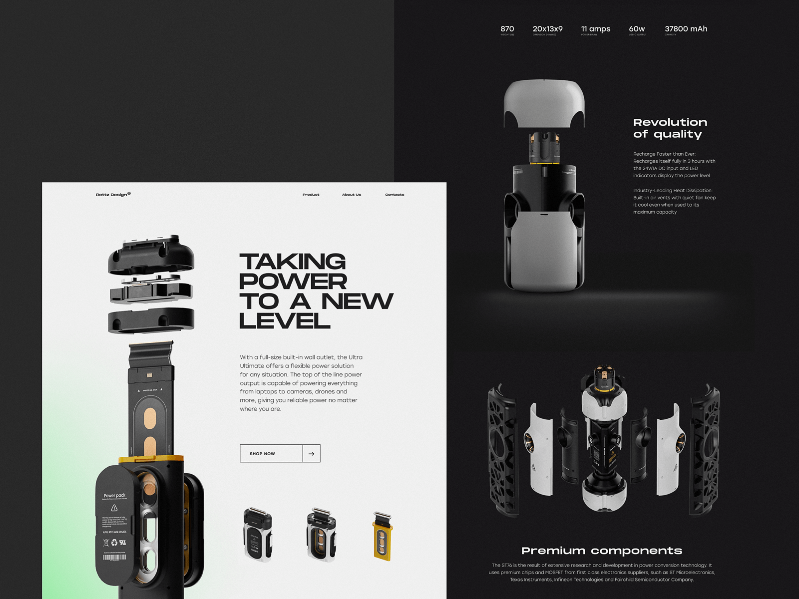
Landing page concept designed to present and promote an innovative charger
Read an article devoted to best practices of landing page design or review the big collection of landing page designs
Of course, there are other page types. Other flows. Other behaviors waiting to be mapped. And we’ll get to them, one structure at a time. But if this guide helps even one designer map out a smarter user journey—or one client ask better questions when shaping their brief—then it’s already doing its job.
Design, after all, isn’t just about making things look good. It’s about knowing what needs to be there. And what doesn’t.
Recommended Reads
For those who want to keep going, here’s where to look next:
The Big Guide to Different Types of Websites
5 Pillars of Effective Landing Page Design
The Anatomy of a Web Page: 14 Basic Elements
Mobile UI Design: 15 Basic Types of Screens
Big Guide to Types of Mobile Applications
How to Make User Interface Readable