Sometimes, with a small Pizza box comes great brand responsibility.
Open a delivery box at 9 PM, and you’ll see it immediately. Grease marks. Fold lines. A few seconds of attention before the first slice disappears. Packaging lives in that moment—on kitchen counters, in rideshare back seats, under dim apartment lighting where someone is debating whether to eat one more piece. If branding survives there, it survives anywhere.
Pizzatta began as a straightforward identity task: design a visual system for a pizza restaurant that would hold its personality across packaging and small branded materials. In practice, that meant solving a familiar problem designers know well. A pizza box is a square grid with brutal constraints—cardboard texture, cheap printing, limited color fidelity, and surfaces that wrinkle the second they get warm. Every decision has to carry weight.
The core identity started with the wordmark. Bold geometry. Stable proportions. The letters sit on a clean typographic rhythm that holds up even when printed fast and slightly misaligned—something every packaging designer quietly anticipates. One detail breaks the strict structure: the crossbar of an “A” subtly echoes the triangular geometry of a pizza slice. A small gesture, but it locks the logo into the product itself.
![]()
Color came next. Pizza brands have an unfair advantage here—food already owns the palette. Tomatoes, basil, olive oil, melted cheese. Instead of neutralizing that energy, the system leans into it: green, red, orange, yellow. High contrast. Saturated. The kind of colors that still read clearly when you snap a quick photo for Instagram.
Illustration became the emotional layer. A series of custom characters—one for each pizza variety—turned the packaging into something people might actually notice before tearing it open. Margherita, Pepperoni, Napoletana. Each box carries its own personality. The drawings sit comfortably inside the grid of the box surface, balanced against the logo and the negative space that keeps everything readable.
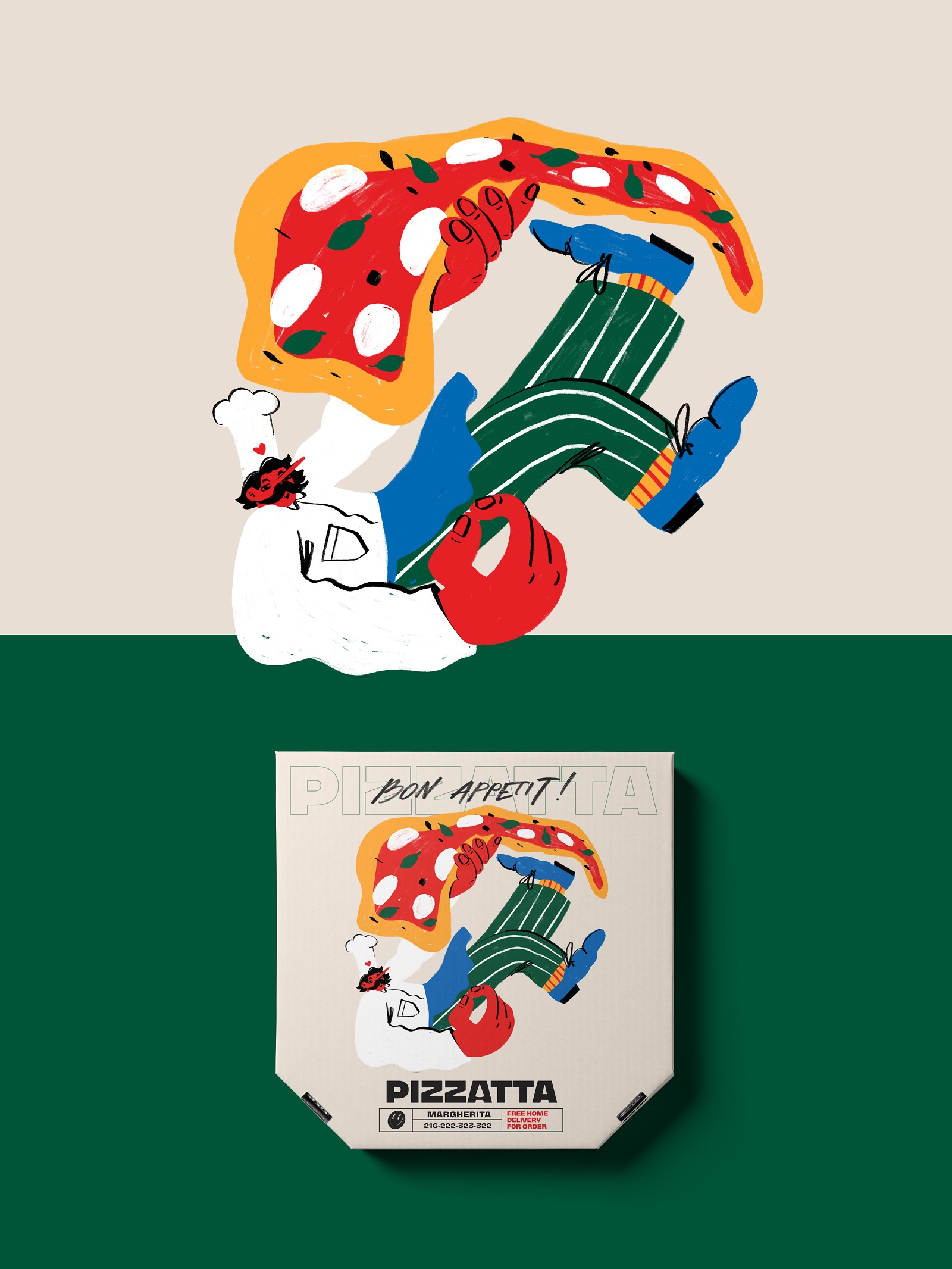
Margherita pizza illustration and packaging design
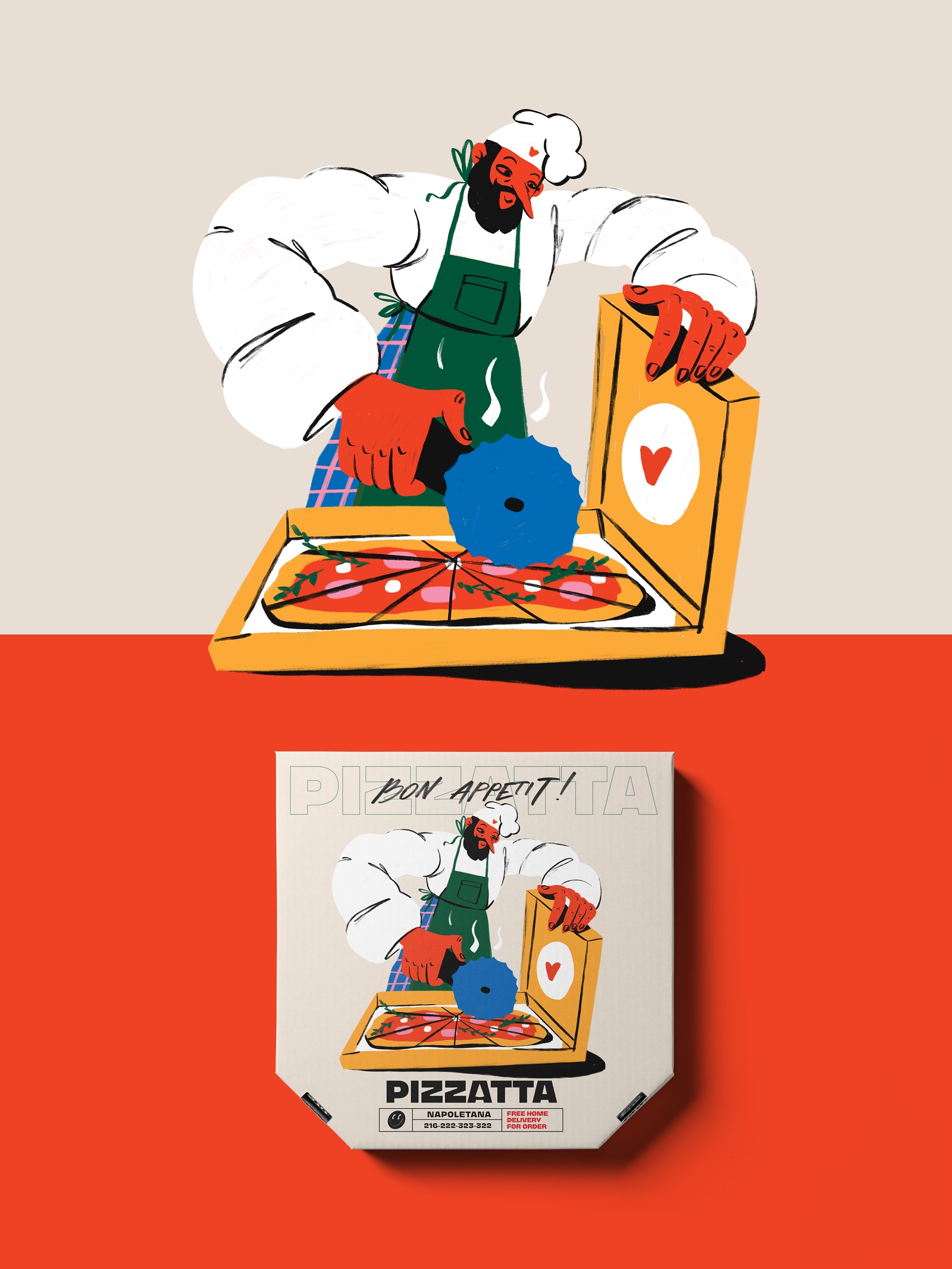
Napoletana pizza illustration and packaging design
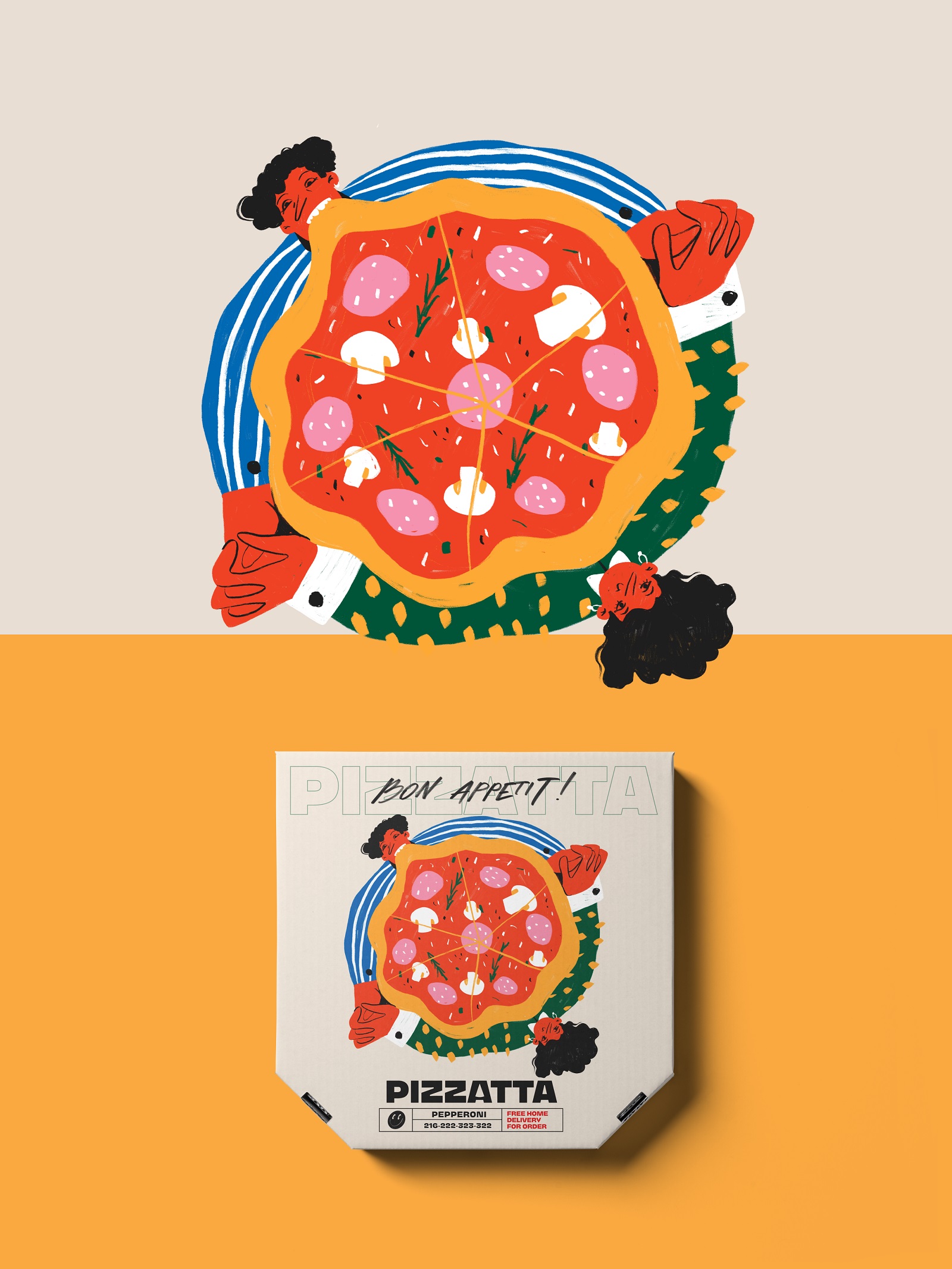
Pepperoni pizza illustration and packaging design
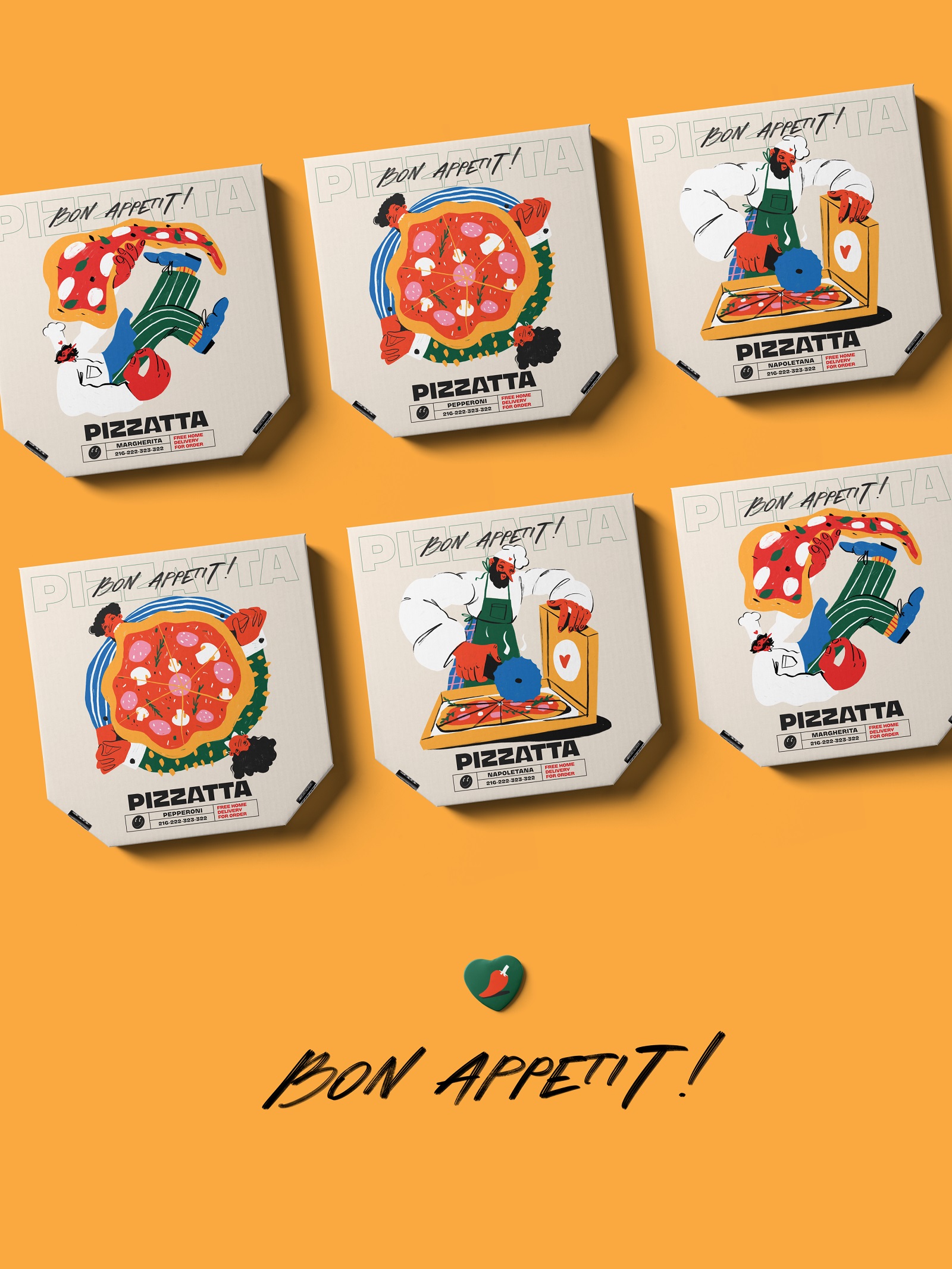
Typography does structural work underneath. Two versions of the logo—filled and outlined—create rhythm across the system. A handwritten “Bon Appetit” phrase adds a small human accent, the kind of detail that softens an otherwise graphic-heavy composition.
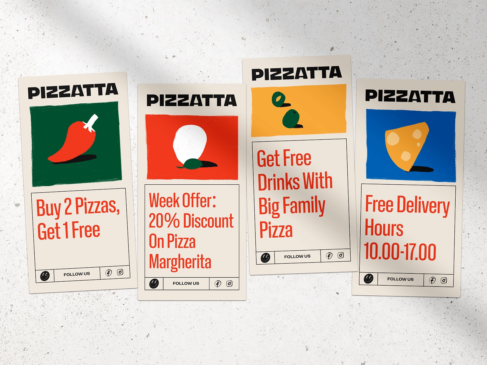
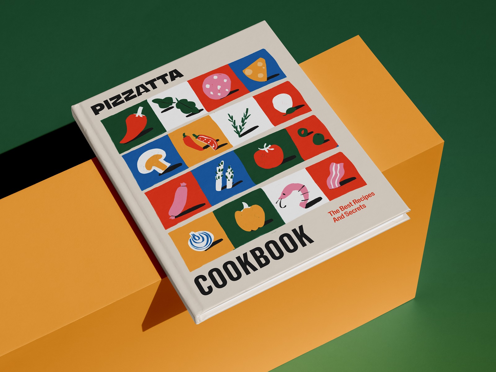
From there, the system expands outward. Ingredient illustrations appear as secondary graphics—tomatoes, herbs, slices of cheese. They work individually or as repeat patterns, which makes the identity flexible for collateral: promo cards, cookbook covers, and small branded items.
Seen together, the pieces behave like a real design system rather than a collection of visuals. The logo anchors recognition. Color carries energy. Illustrations inject personality. Typography maintains structure.
Pizza packaging rarely gets the luxury of long attention. A few seconds on a table, maybe a quick photo, and then it’s all grease and crumbs. That’s the real design environment.
Which leads to a simple rule: if a brand survives the chaos of a pizza box, the design is probably doing its job.
Recommended Reading
Still hungry? Check out our other case studies and design articles:
Page Turner. Identity and Packaging Design for Bookstore Chain
BlockStock. Brand Identity and Website for Minecraft Models Resource
SwitLuv. Theme Packaging Design About Love for Sweets Brand
Fulfill. Illustrations and Web Design for 3PLs Marketplace
Roebuck. Mobile Design and Illustrations for Educational App
Garden Gates. Identity and Packaging Design for Garden Center
Bikker. Identity Design and Illustrations for Biking Service
Kaiten. Identity and Product Design for Food Marketplace
Glup. Delivery App Branding and UX Design
BEGG. Brand Packaging and Web Design for Food Product Ecommerce
Crezco. Brand Identity and UI/UX Design for Fintech Service
FarmSense. Identity and Web Design for Agricultural Technology