Evolving with a rocketing speed over the last decade, this year e-commerce seems to have pushed the limits again, with more people willing to buy stuff right from their homes and thus, more businesses coming into play and enhancing customer experience. To share some practical stuff, we have collected a new bunch of our web and mobile UI design concepts aimed at marketing and e-commerce goals for different products and various target audiences.
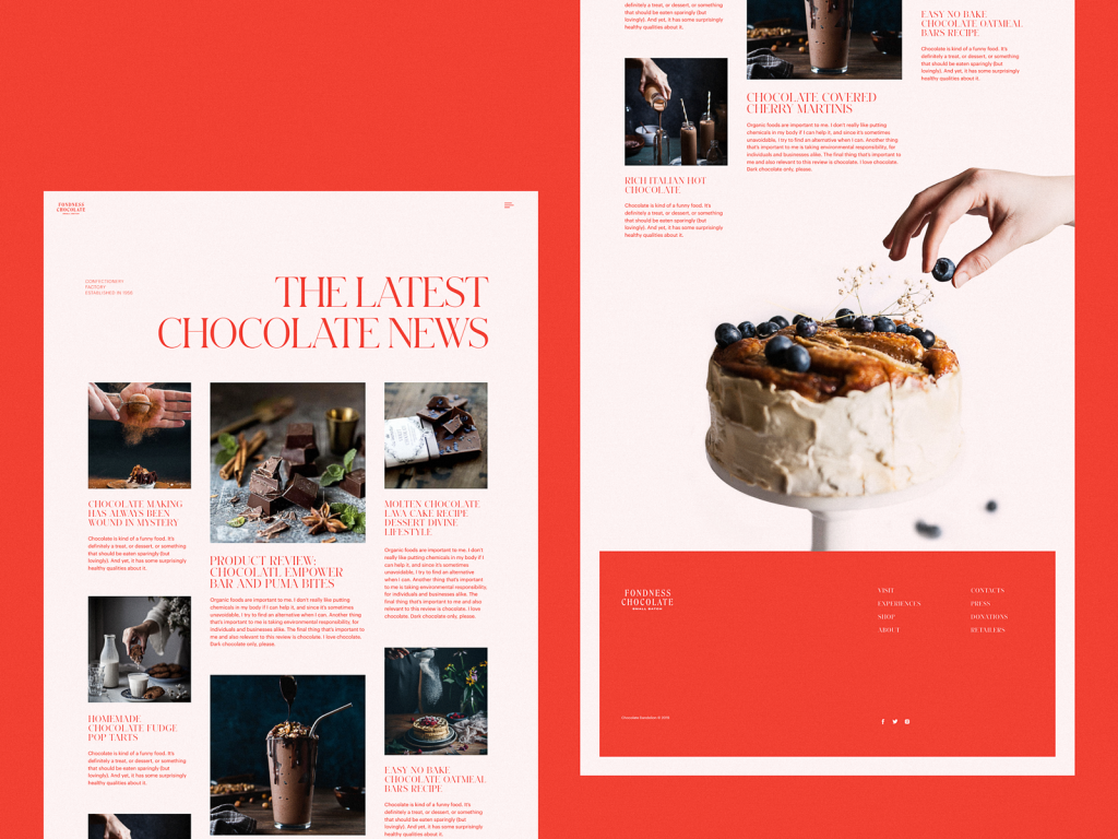
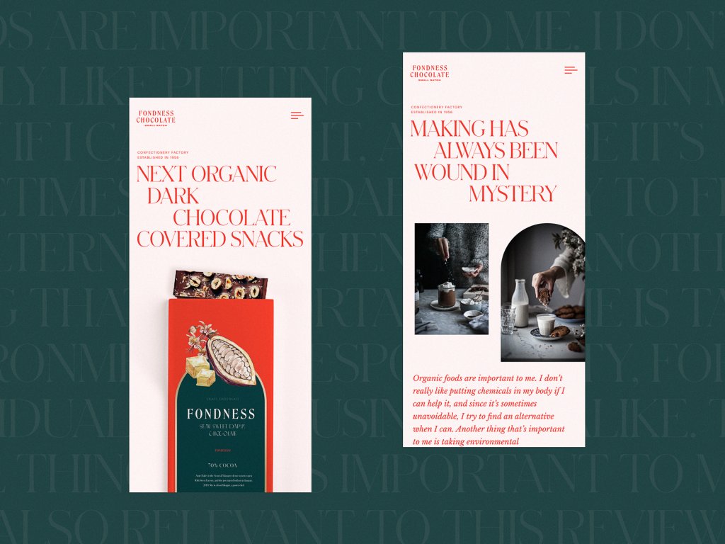
Confectionery Ecommerce Website Design
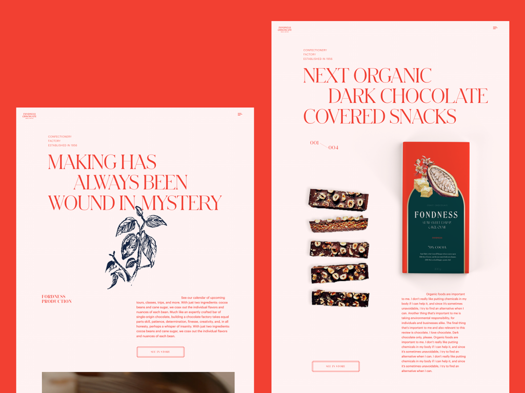
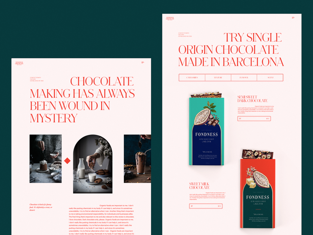
This e-commerce design project’s goal was to create an elegant and atmospheric website for confectionery. Sophisticated typography is based on a combination of a serif font for attractive headings and taglines and a sans-serif font for bigger text blocks to ensure readability. The hero section of the home page uses an atmospheric video setting the instant connection to the theme and essence of the offered products. The airy layout and prominent visuals such as photos, custom graphics, and packaging designs catch the visitors’ eyes and share the style and emotional appeal from the first seconds.
Ecommerce Website for the Brand of Heavy Blankets
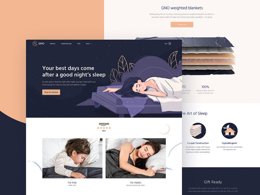
It’s not a secret that healthy sleeping plays a great role in people’s physical and mental health, productivity, and creativity. Here’s a website designed for GNO, the company that produces and sells weighted blankets that help people sleep better. The website design for the brand had to keep visual consistency and harmony with the identity concept, let users quickly catch the message, review the benefits of the product, and make a purchase.
The web pages feature a well-balanced combination of airy light and deep dark backgrounds, high-quality visual content demonstrating the product outside and inside, clear visual hierarchy, readable fonts, and digestible information blocks make the website scannable and eye-pleasing. The hero illustration on the home page features the peacefully sleeping woman and instantly setting the needed mood and atmosphere.
The product page gives all the details about the product, includes the video presentation, and allows for choosing the needed blanket and adding it to the cart. The light background, balanced and thoughtful use of negative space, instantly noticeable CTA button and highly readable font create the solid visual hierarchy of the page and make it easy to scan and interact with.
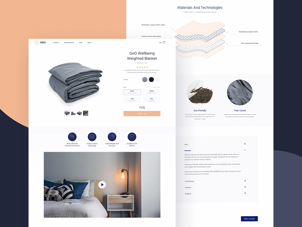
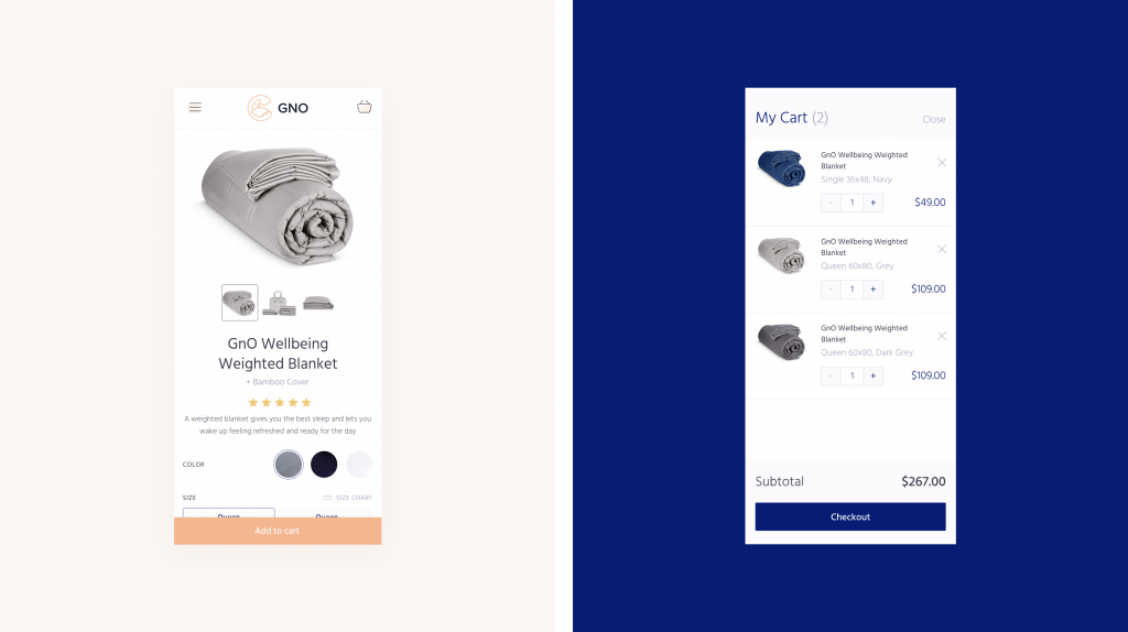
Also, the website uses the sticky header to make the core links and cart available from any point of interaction.
Ecommerce Application for Buying Exotic Fruit
This user interface design concept is full of juicy colors and tasty looks. That’s the UI design for the e-commerce mobile application allowing people to buy various exotic fruits. This is the case of a harmonic combination of different types of visuals – custom illustrations and photos – within one interface. Bold vibrant colors look juicy and set a strong emotional connection to the vibrancy of market stalls for them. The search screen allows for quick typing in the name of the fruit or choosing the one from the list of offered products organized by the alphabet.
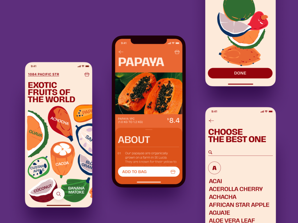
Product screens provide a big catchy image of the fruit, clear information about the offer and pricing, and an extended description of the fruit available by swiping the About tab up. Adding the fruit to the cart, users can use the convenient tab for clicking the needed number and shows the total sum of the purchase instantly on the CTA button.
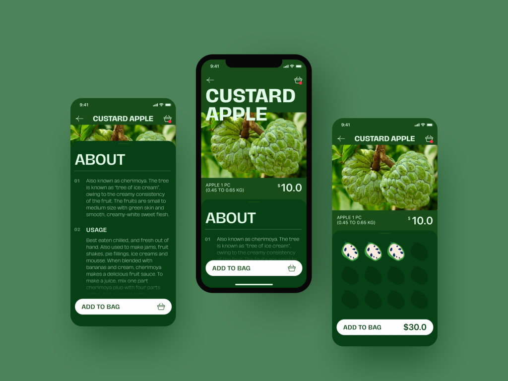
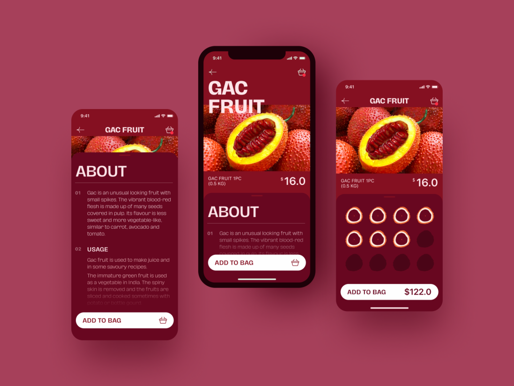
And here’s the screen where users can check the state of their order, choose the delivery date and pay for it.
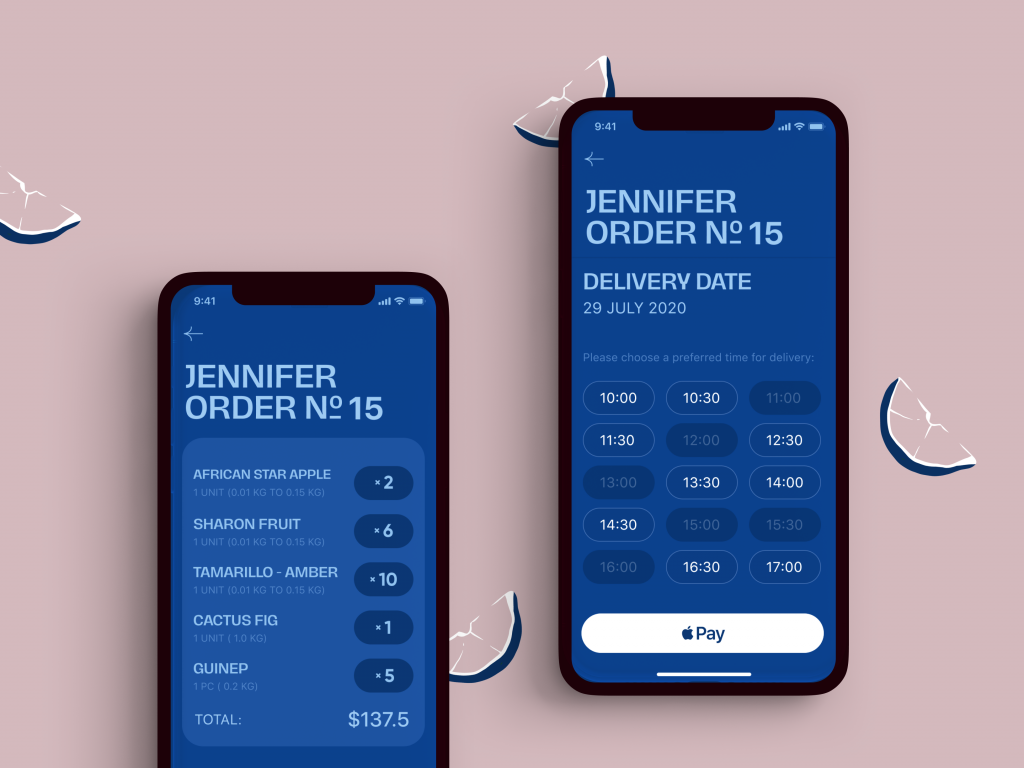
Here you can see the catchy main screen where all the bright fruit images featured there are interactive, so tapping a fruit the user moves to its product page.
Ecommerce Website for a Fashion Brand
Fashion is a great way to combine the best from history and the modern ages. This web design project also features that idea: take a look at an ecommerce website selling trendy accessories with a pinch of traditional art.
The choice of fonts is determined by the fashion theme. Although it’s quite original, the most informative copy blocks are given in quite a big size so it doesn’t hurt readability. Impressive photo and video content support the atmospheric presentation of the offered goods. The design mostly uses a dark background for imagery-heavy pages making them even deeper and more stunning.
It’s easy to see that all the e-commerce part made super obvious and easy-to-use. The pages can be scanned in short seconds and the pricing is highly noticeable. What’s more, the choice of the model and pattern on the product page also feels impressive with smooth animation of the neckerchiefs.
And here’s the mobile version of the website, ensuring a successful customer experience from any device.
Ecommerce Website for Zero-Waste Shoppers
“We abuse land because we regard it as a commodity belonging to us. When we see land as a community to which we belong, we may begin to use it with love and respect.” It’s hard to disagree with Aldo Leopold’s words, and luckily, that philosophy seems to inspire many people these days. This web design concept is also of that kind. Take a glance at an e-commerce part of the website devoted to the zero-waste lifestyle: here people can buy eco-friendly and reusable stuff. This elegant product page for a reusable eco cup, as well as all the website, is built based on minimalism principles, with a lot of white space, a prominent product image, simple and super readable typography, and scannable information about the product.
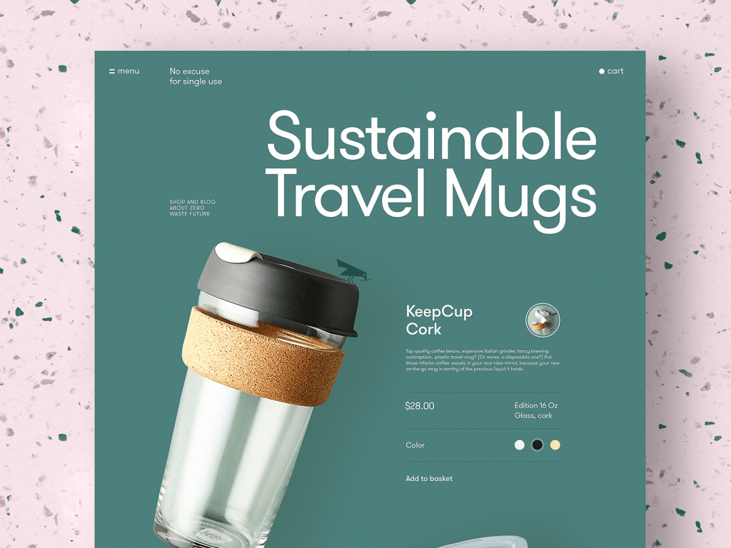
What’s more, a little bird illustration seen on the cup isn’t just decor. It is a mascot coming from one page to another and uniting user journey into one smooth flow, with the feeling of the integrity of all the steps, eye-pleasing motion, and strong connection to the theme of nature and environment protection. Here’s another product page showing how it works in animation.
Another creative use of motion here makes the interaction of color choice for the product more lively and dynamic, like on the page shown below.
Website Promoting a Brand of Healthy Snacks
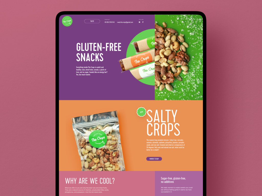
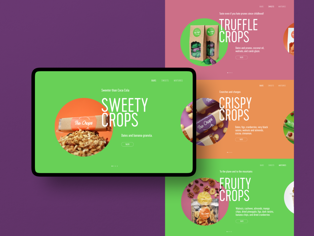
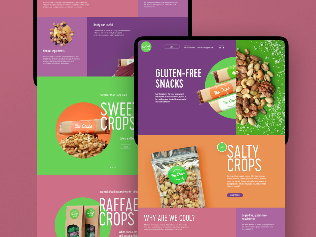
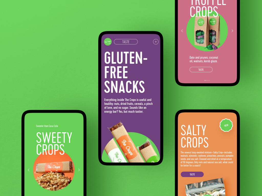
Here’s the website aimed at the web promotion of TheCrops, a brand of healthy snacks. The trendy and eye-pleasing color palette, elegant typography, and thoughtful integration of images demonstrating goods make the product presentation and web marketing both beautiful and effective. Well-crafted adaptation makes sure that the website will look beautiful and the experience will be positive whatever device the customer comes from.
Ecommerce Website for Reusable Bottles
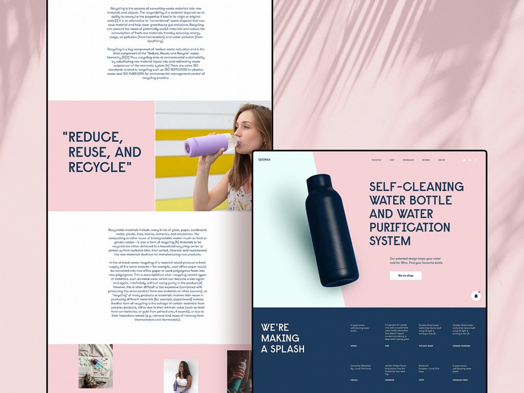
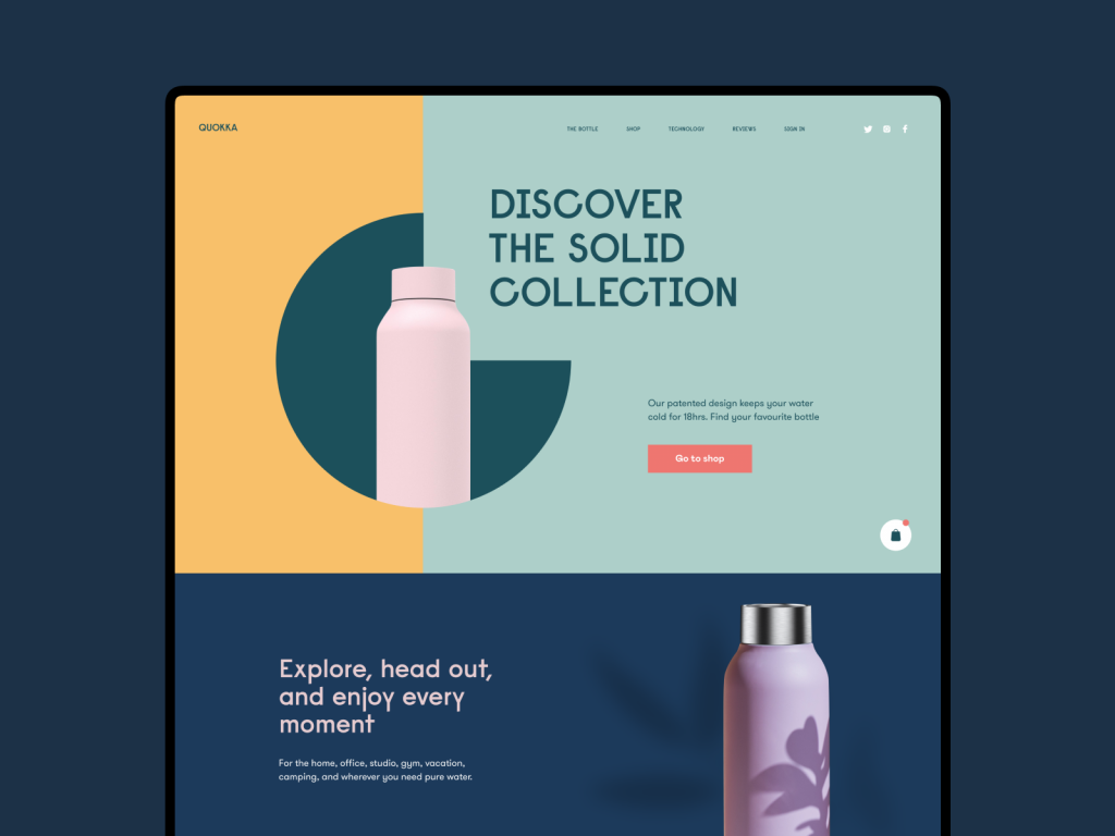
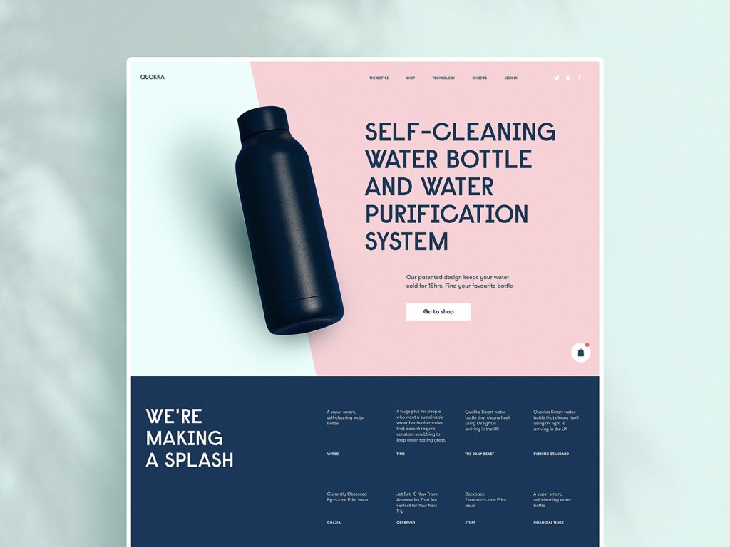
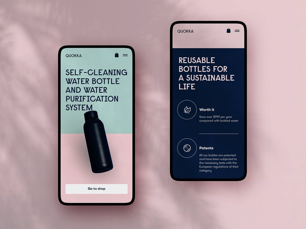
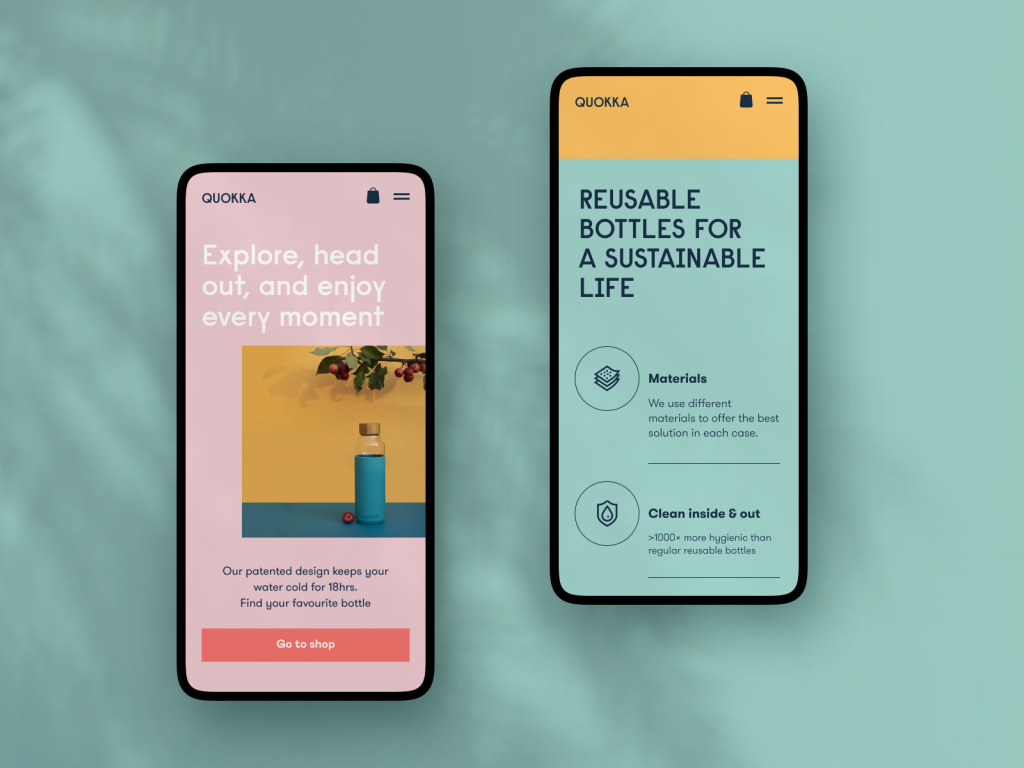
Here’s the ecommerce web design project that is eye-pleasingly colorful and geometrically balanced. It is a website promoting and selling reusable bottles. Clear and noticeable but not over-distractive call-to-actions, skillful use of color contrast, beautiful and readable typography, solid visual hierarchy, and catchy imagery demonstrating the product make the interface both beautiful and user-friendly.
Ecommerce Website Selling Glasses
The moment you put on your glasses makes them an integral part of your individual style. This design concept presents the website on ins and outs of selling glasses elegantly. That’s another example of the ecommerce website integrating catchy and quality photo and video content to set the communication with the visitor from the first seconds of interaction.
Ecommerce Website for a Collection of Watches and Accessories
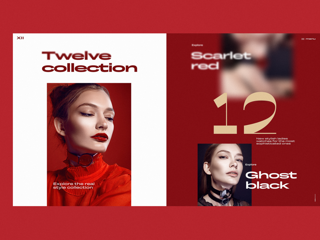
This web design concept is presenting an exclusive collection of watches and accessories. Limited color palette based on contrast, stylish and prominent photo content, trendy and readable typography and split screen work together to impress the visitor from first sight. The interactivity of the page makes the experience even more dynamic and emotional.
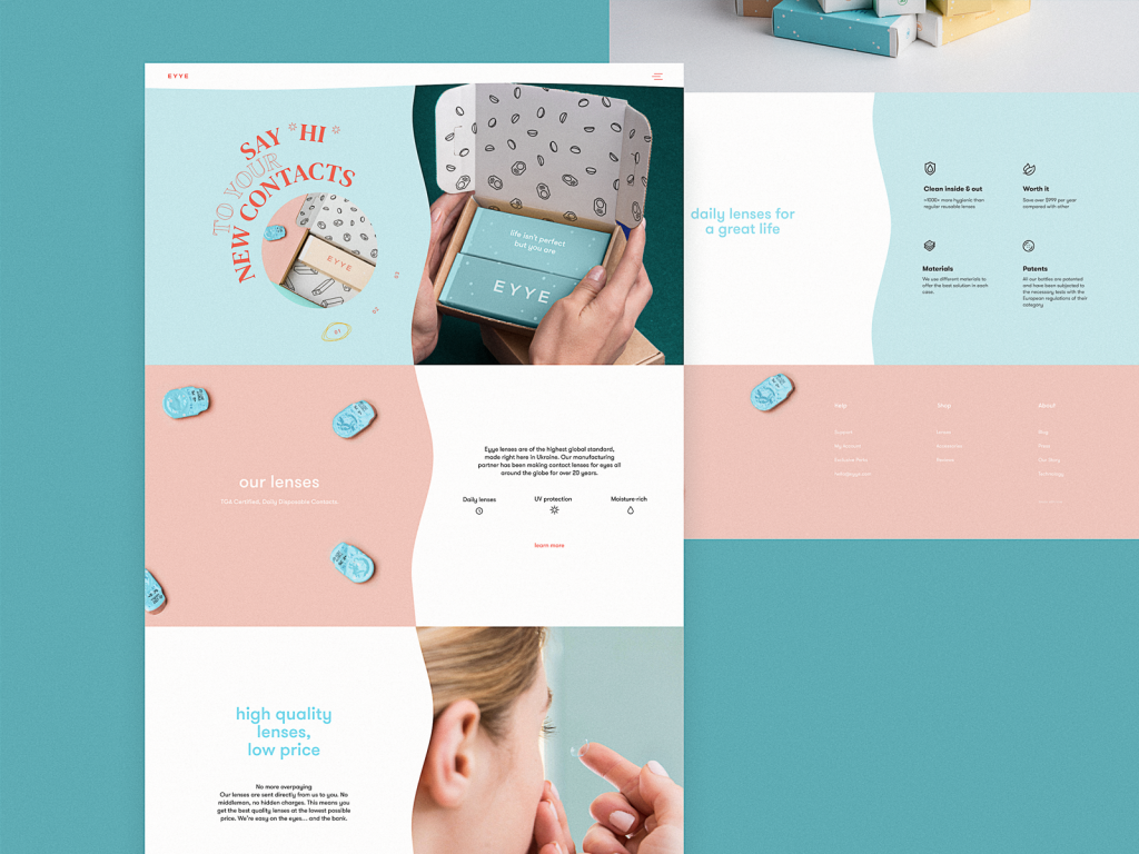
Website for Selling Contact Lenses
This design gives you a glance at the website selling and promoting contact lenses. The hero section features the split screen, and generally, the web layout is built on the eye-pleasing color palette, elegant typography employing the unusual text directions, and all that supported with a smooth motion to attract the user’s attention.
The ecommerce sphere grows, trends and fashion change, users want more, and designers broaden their horizons. Perhaps, that is how the design turnover could be described briefly. New concepts from our team are coming soon – don’t miss the updates!
Tubik Design Collections and Articles
If you want to check more creative sets of web and mobile design concepts as well as design tips and practices, here they are for you.
Steal the Show: Creative Web Design for Diverse Events
Web Design: 26 Examples of Creative Landing Pages
UI in Volume: 3D Graphics in Creative UI Design Concepts
Web Design: 5 Basic Types of Images for Web Content
9 Eye-Catching Web Interfaces with Bright Graphics
Web Design: 16 Basic Types of Web Pages
Motion for Mobile. 20 Creative Concepts of UI Animation
Web Design: 11 Diverse Functional and Awe-Inspiring Website Designs
App Design Ideas: 7 Nifty Mobile Application Design Projects
Product Page Design Inspiration: 17 Ecommerce Web Designs
Information Beautified: Media and Editorial Website Designs
23 Impressive Web Design Concepts for Various Business Objectives


