The scent of rice vinegar clings to memory. You unwrap the box, and it whispers—quietly, decisively—this wasn’t packed in a rush. Someone cared. Someone designed it to feel like it came from a place, not a chain. A hand, not a system.
That was the gut check we kept coming back to while working on the branding and packaging design for KOISI, a Japanese restaurant with a takeaway service. Not just “designing sushi boxes.” Translating an entire culinary culture into packaging that feels… felt. Personal.
This one Tubik Studio case was a collaboration between graphic designers Arthur Avakyan and Yaroslava Yatsuba, with Sergii Valiukh leading art direction. A study in restraint, fluency, and visual rhythm—with a side of pickled ginger.
Let’s dig in.
The Brief
When KOISI first reached out, it wasn’t with a full deck of brand guidelines or an exhaustive Pinterest board. It was more like: here’s who we are, and here’s what we believe.
They came to us with a clear ask: turn their visual identity into something cohesive, intentional, and deeply tied to Japanese aesthetics—without falling into cliché. No cherry blossoms or Mt. Fuji in a circle. The goal was food branding that felt local, not touristy. Contemporary, but not cold. Respectful, but not reverent.
Phase One: Setting the Flavor
We started with questions. What does hunger feel like—visually? What’s the difference between art and ornament? And what kind of brand makes you want to keep the sushi box?
KOISI wasn’t trying to be loud. Or nostalgic. Or “elevated,” whatever that means anymore. It wanted a visual identity rooted in presence—like a handwritten note on a porcelain plate. So we kept it simple and full of restraint.
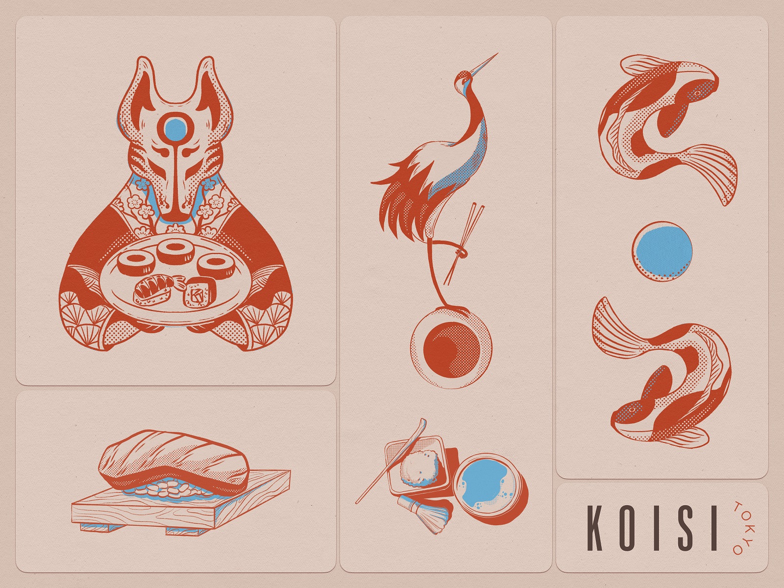
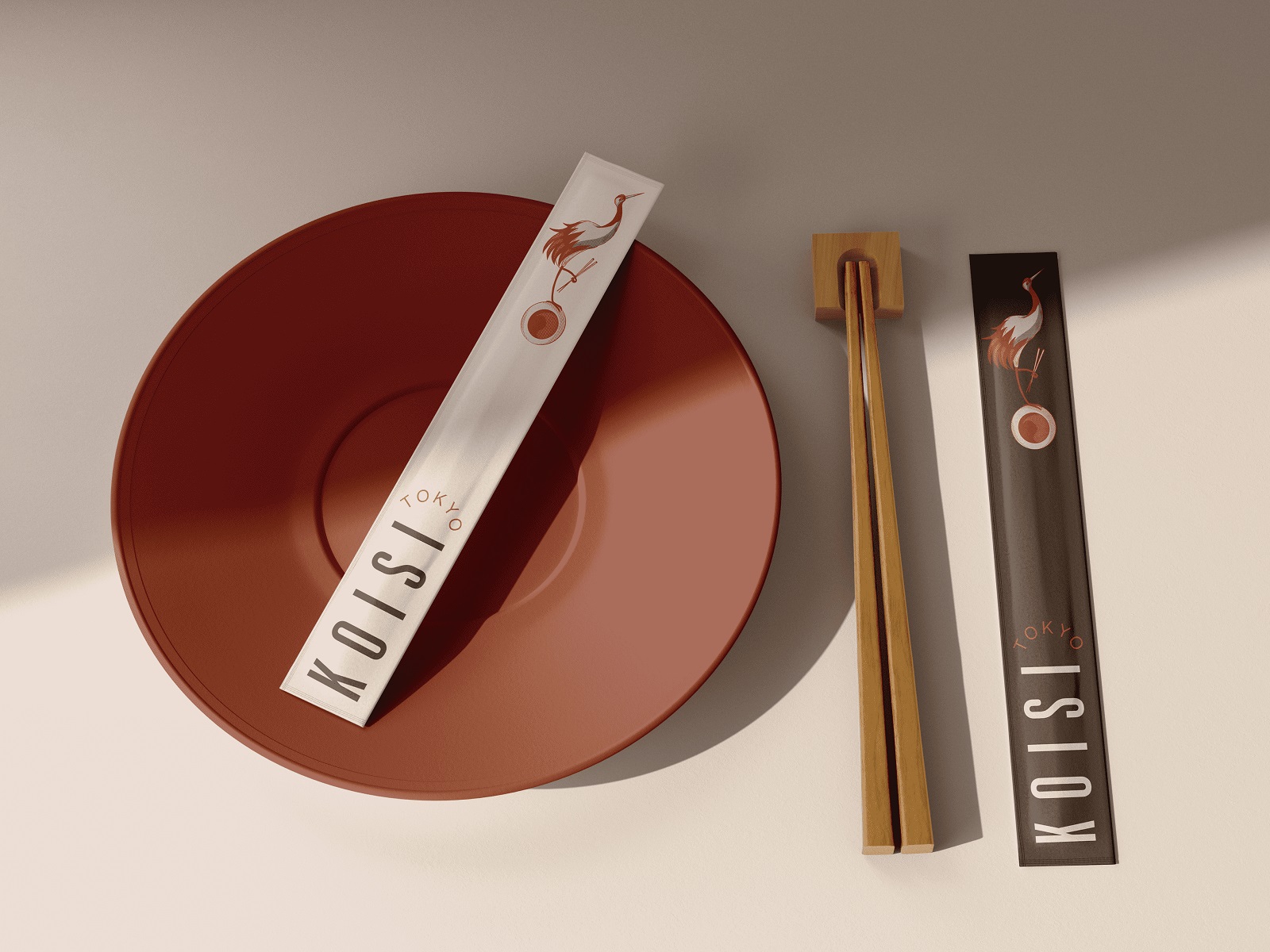
The color palette? Terracotta red, indigo blue, black ink, and cream. Organic and unexpected—somewhere between vintage matchbox labels and high-end tea packaging. It felt Japanese without being performatively so. Like a crane mid-bow. Like steam from a teacup. Bold, but soft. With just enough blue to surprise you.
We designed a full set of themed illustrations in that palette. Each one a gesture. A fox holding a sushi platter like an offering. Cranes with chopsticks. Koi swimming around moon-shaped sauces. Nothing literal. Nothing shouting “authenticity!” in all caps. Instead, a quiet surrealism—a kind of visual haiku.
Stylistically, they walked the line between folk art and editorial illustration. Not cartoony or mystical. Just graphic storytelling with enough space for the viewer to project their own mood onto it.
The illustrations were part of the codebase. A flexible graphic language that could scale across packaging, print, socials, stickers, sleeves, and screens. Like sushi itself: small, intentional, modular.
And yes, we geeked out over the line weight. That fine-tuned balance between illustration and typography. We matched our font strokes to the illustration strokes—not because anyone would notice, but because they’d feel it if we didn’t. We chose a thin, geometric sans-serif with just enough personality to hold its own next to a fox serving nigiri.
No gradients. No gold foil. No faux wabi-sabi. Just shape, space, and texture, rendered in a four-color system with more flavor than flash. Because when the food is this good, the design doesn’t need to perform. It just needs to hum in harmony.
Phase Two: Packaging the Ritual
Let’s be real: most takeout packaging is where good food goes to die. The sushi might be exquisite. The soba cooked just right. But then it arrives in a limp, generic box with a 3mm-thick logo and a font that screams corporate cafeteria, not Kyoto.
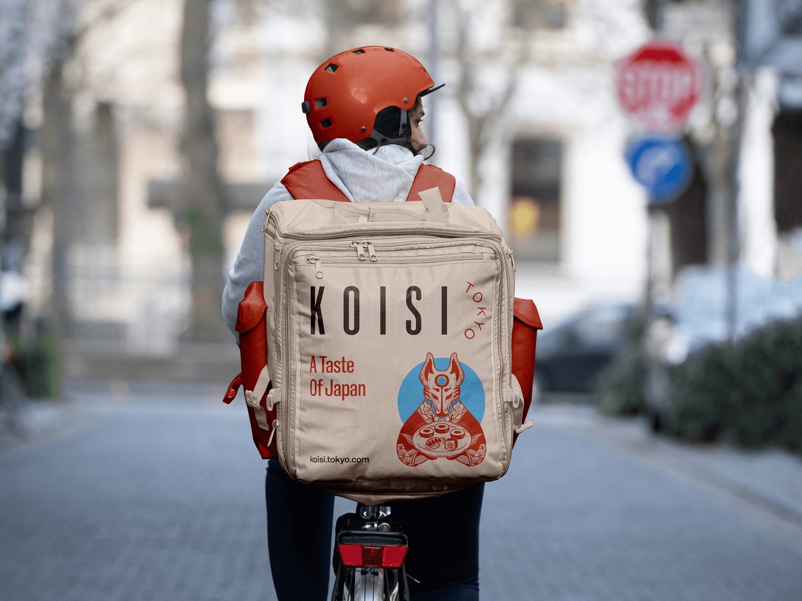
KOISI wasn’t going to be that. They came to us not asking for packaging—but for presence. A full visual ecosystem. Something that would carry their food and their philosophy. Something you could touch, turn, unpack, and maybe (just maybe) never throw away.
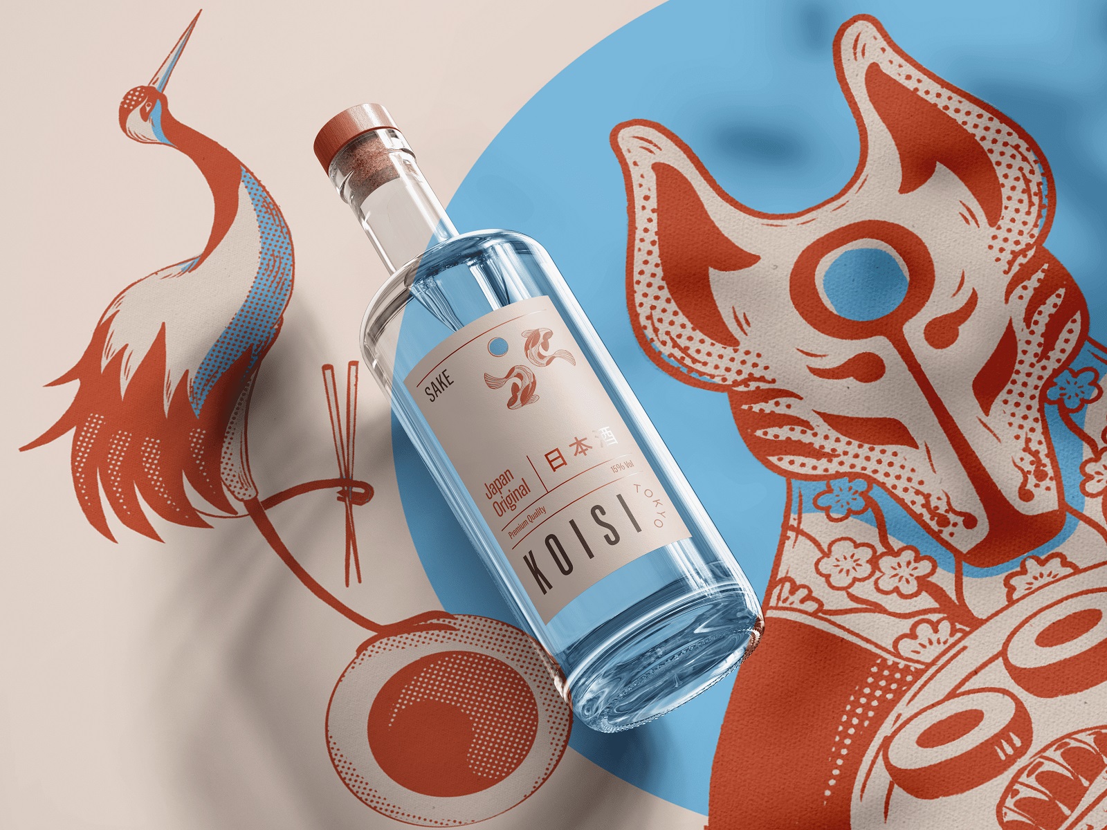
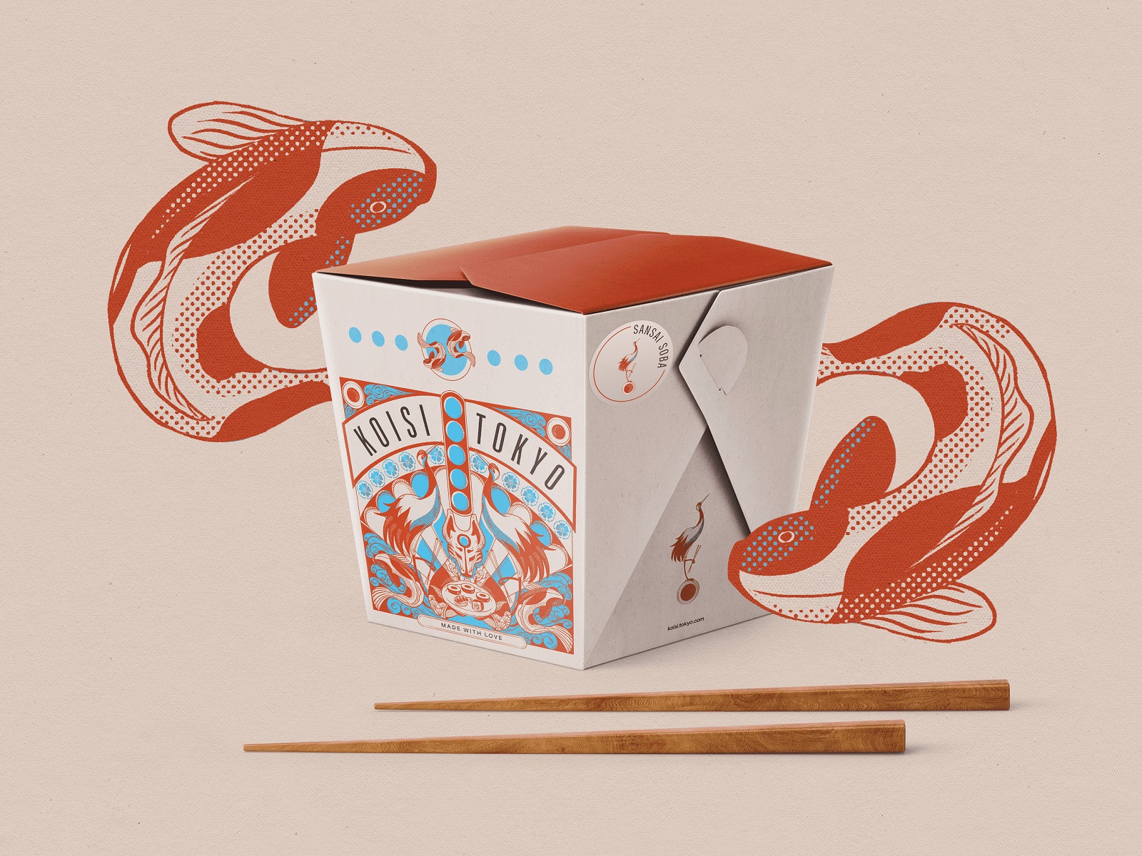
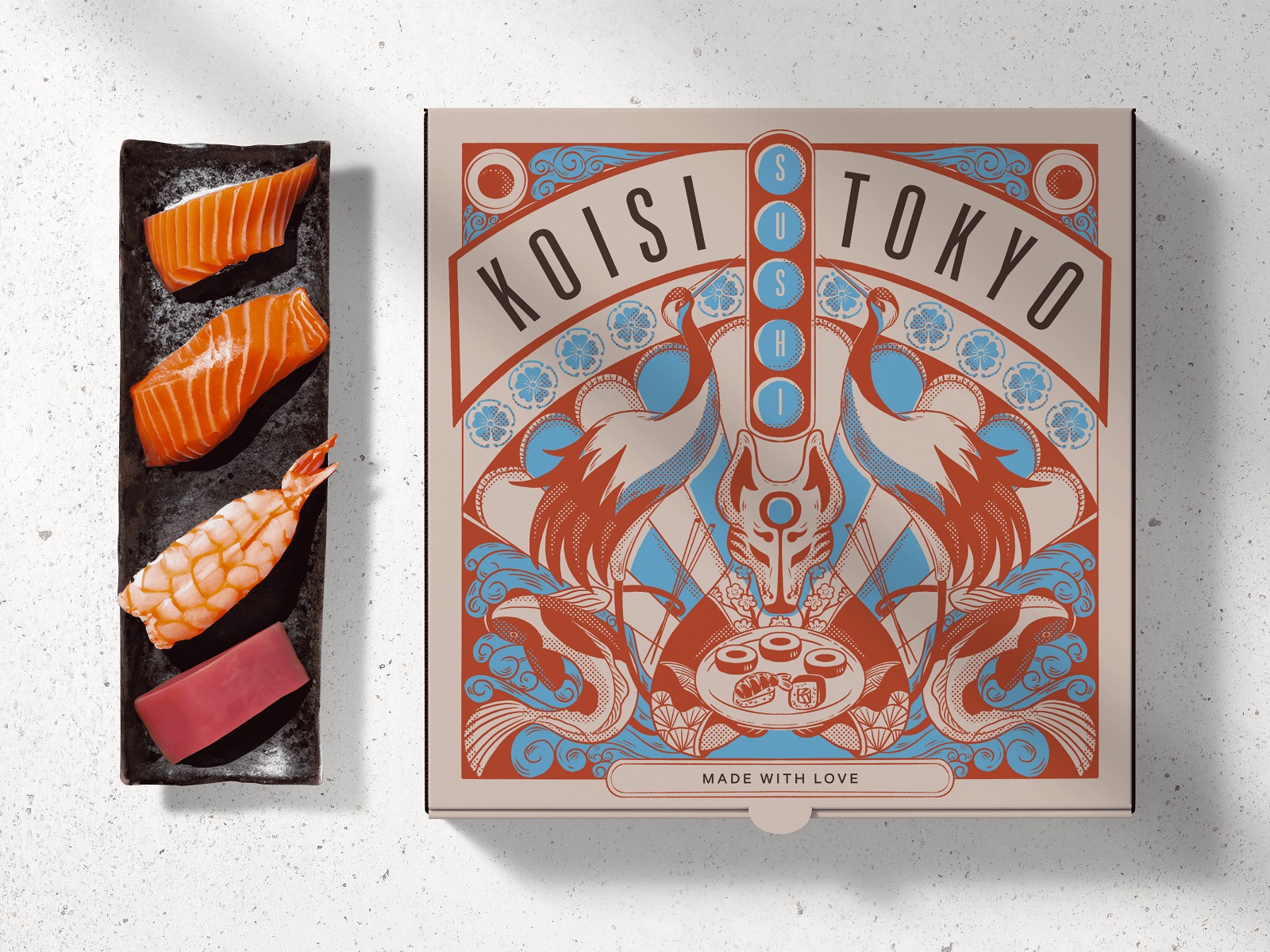
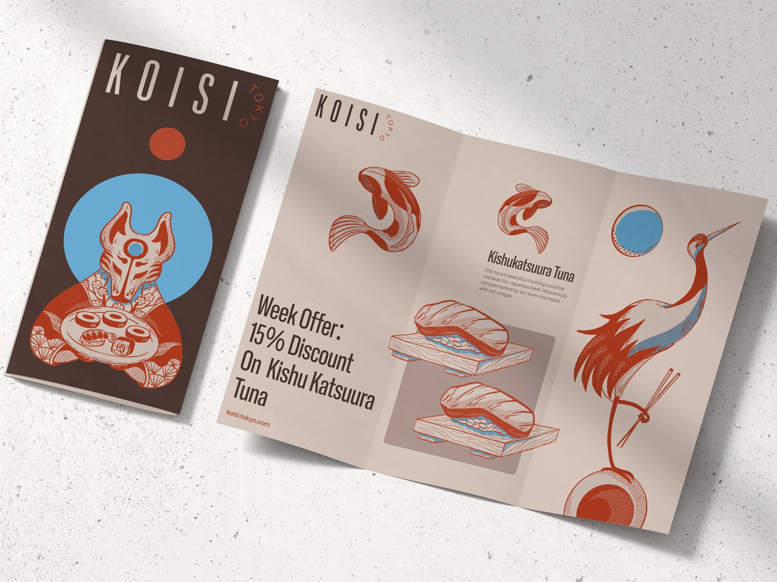
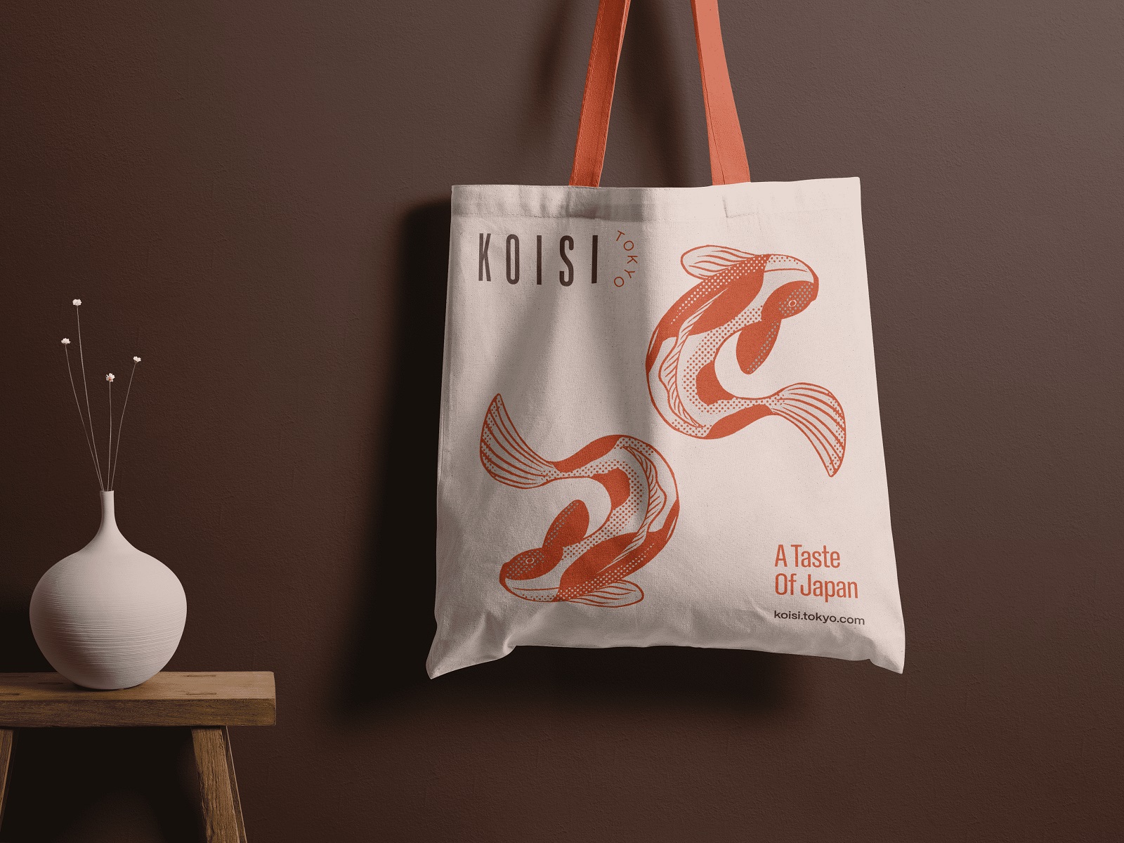
Sushi. Soba. Tea. Sake. Chopsticks. Condiment lids. Tote bags. Discount flyers. Every object got its own treatment. Not in a maximalist “let’s rebrand the spoon” way—but in a deliberate, tactile, systemic packaging design that made everything feel like it came from the same world. A world where illustration, typography, and texture worked together instead of yelling over each other.
The illustrations weren’t resized. They were rethought. The koi didn’t just land on the flyer and the box lid because they looked pretty there. They were redrawn, rebalanced, repositioned. Every curve mattered. The tails needed room to swim. The cranes needed space to perch. The fox? Always centered. Watching. Slightly unnerving. We love him.
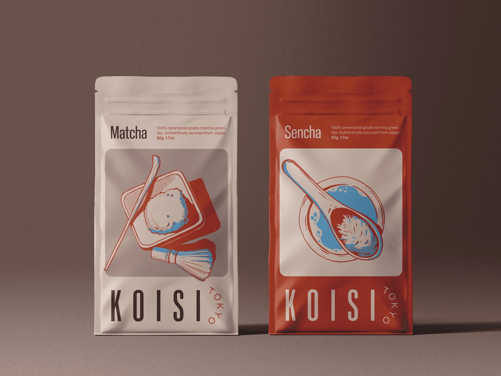
We wanted to let the art breathe. You can see it on the tea packaging: matcha and sencha, each with its own illustrated ritual. Or on the chopstick sleeves—white for lunch, black for dinner, because that’s how we imagine KOISI guests think.
 Even the takeout box was a canvas. A full mural. Cranes, koi, foxes, circular seals, and arcane symmetry—it looked like a woodblock print and a ramen cart had a beautiful baby.
Some Thoughts Along the Way
We’ve seen too many food brands try to be “premium” by making things boring. All white. All sans. All vibes, no flavor. KOISI wasn’t afraid of presence. It’s what made the process so satisfying.
Packaging, when done right, becomes memory. You remember the way it felt in your hands. You remember the box with the two koi circling a red sun. You remember that weird fox. You remember the name KOISI, even if you forget what you ordered.
Here’s what the packaging needed to do:
- Protect the food without looking like it came from a biomedical lab.
- Build brand identity with visuals you could spot across a crowded table.
- Feel intentional, even at 8:45pm when your hands are full and your screen is glowing.
The result was packaging design that holds the food—and the brand—with equal care. The box closes with a message: Made with love. And maybe that’s cheesy. But maybe, when it’s done like this, it earns its place.
Because if your sushi makes someone pause before they recycle the box… You surely did something right.
Recommended Reading
Curious how design works when it’s more than “just a box”? Here are some reads that go deeper into branding, systems, and food design thinking:
Sidra Vivo. Vibrant Packaging Design for Cider Brand
Black Friday. Graphic Design for Marketing Campaign
Aqua Dudes. Cartoonish Packaging Design for Fish Food Brand
Herteas. Packaging Design for Herbal Tea Brand
Nutribite. Tasty Packaging Design for Granola Bars
Milkimu. Packaging and Marketing Design for Dairy Brand
Dance Festival. Creating a Set of Event Poster Designs
Soaplanet. Soap Brand Packaging Design with Travel Spirit
Joosi. Packaging Design and Marketing Graphics for Juice Brand
Pizzatta. Artistic Pizza Packaging Design
Page Turner. Identity and Packaging Design for Bookstore Chain
Garden Gates. Identity and Packaging Design for Garden Center