Most dairy packaging still behaves like it’s afraid of joy—clinical blues, sans-serif fonts standing at attention, a cartoon cow bolted on as an afterthought. Milkimu, a packaging design and brand identity project our team built for a dairy company, bet on the opposite instinct: what if the milk carton on your counter looked like it escaped from a beloved children’s book?
This packaging design case study, led by designers Arthur Avakyan and Maryna Solomennykova with art direction from Sergii Valiukh, tackles a category—dairy packaging—that rarely gets to be this charming.
Logo Design as a Personality Test
The logo design here skips the safe wordmark move entirely. It’s cartoonish, a little wobbly, clearly drawn by a hand rather than optimized by a grid—a cartoon logo design choice that matters, because dairy is an emotional category dressed up as a functional one.
The brand mascot design, a cheerful cow, ties the whole system together without ever feeling bolted on. Pair a playful primary mark with a handwritten script for taglines and a clean sans-serif for nutritional facts, and you get a piece of brand identity design that can whisper and shout in the same breath.
A Color Palette Stolen From the Produce Aisle
The color palette leans earthy and warm: fruit, grass, sun, the kind of tones that photograph well on a farmers-market table rather than a fluorescent-lit shelf. Nothing here reads as manufactured. Building a brand color palette this way is the actual trick behind approachable dairy brand design—pull your tones from things people already trust, not from a trend report.
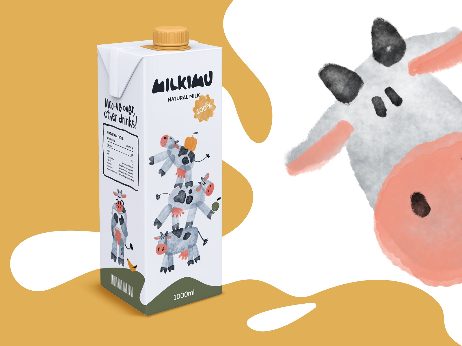
Big milk carton design
Packaging Design That Reads Like a Storybook
Every milk carton design, bottle, and yogurt packaging design shares one illustration style: loose, watercolor illustration design, unmistakably hand-made, echoing a children’s book illustration style rather than stock icon libraries. This is food packaging design that trusts a paintbrush over a vector tool.
The background stays airy and pale across the line, which does something smart logistically for product packaging design—it turns every item into a blank canvas new illustrations can rotate through seasonally. Delivery box design breaks the pattern on purpose, switching to bold yellow, so warehouse staff can sort by color across a room instead of squinting at labels.
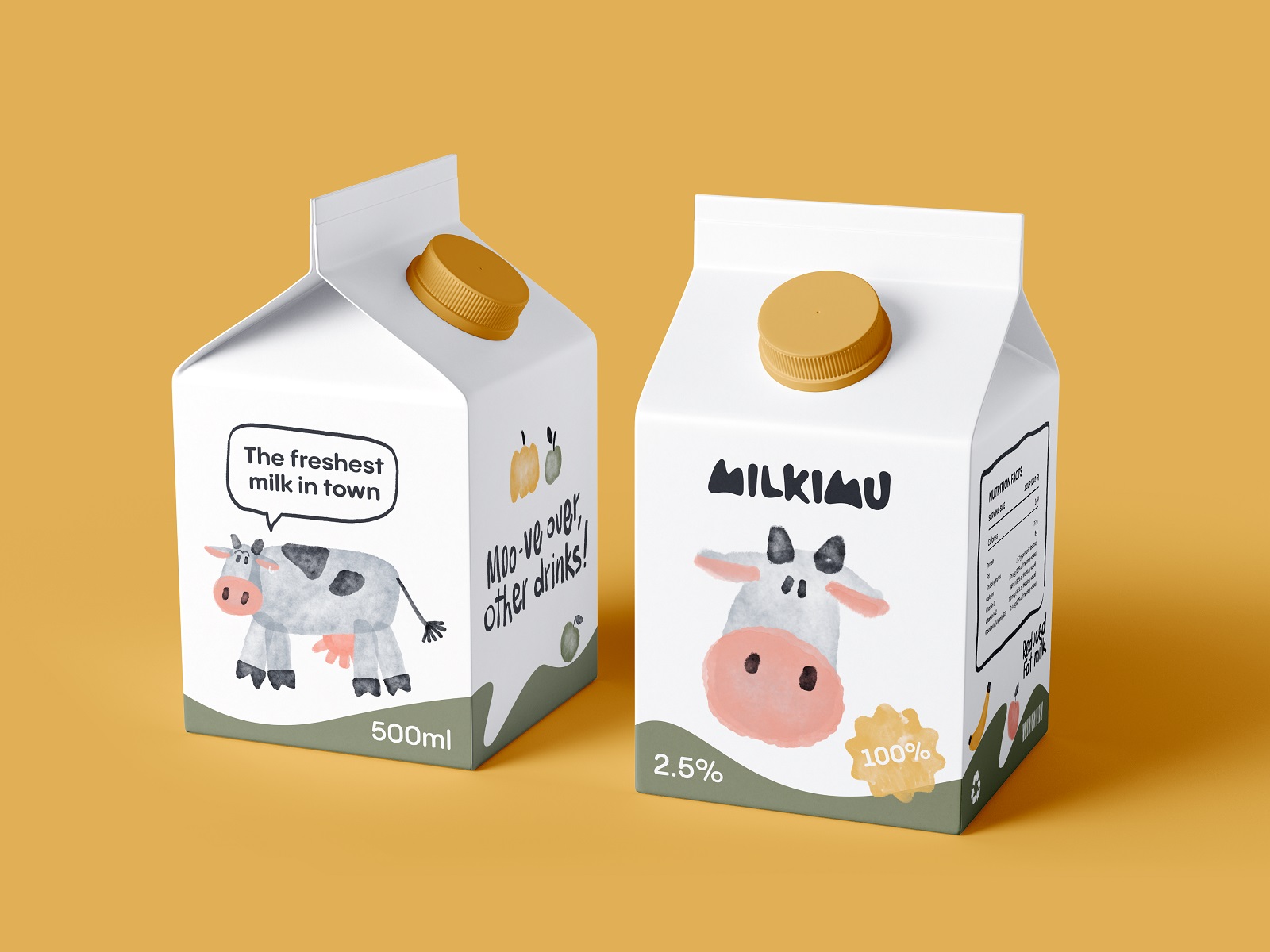
Small milk carton design
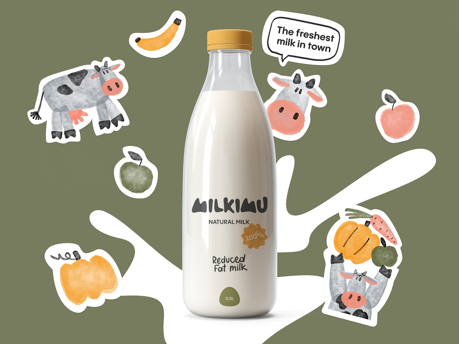
Glass bottle for milk and branded stickers
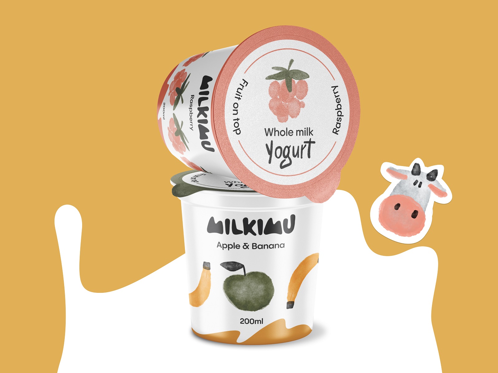
Yogurt packaging design
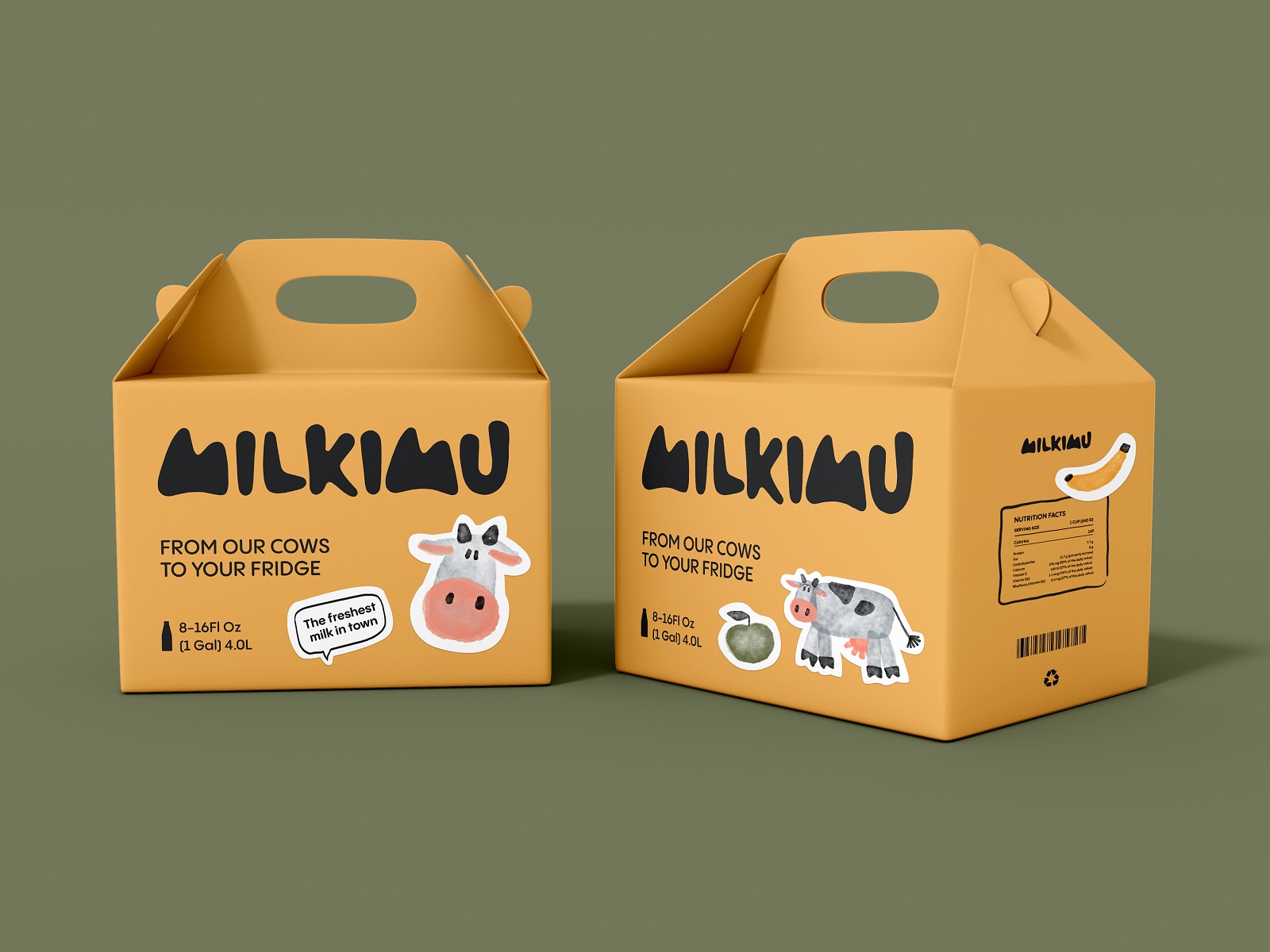
Big delivery boxes design
Marketing Graphics and Merch With a Job to Do
The marketing graphics extend the same illustrated world to posters, billboards, and a branded delivery truck functioning as a mobile point-of-sale. The branded merch—jigsaw-puzzle coasters, stickers, pacifiers, baby bottles—never feels like leftover swag, and this branded merchandise design keeps the same cows, the same palette, the same handwriting on every piece. That’s the actual flex of the whole system: recognizability that survives a jump from carton to coaster to truck door.
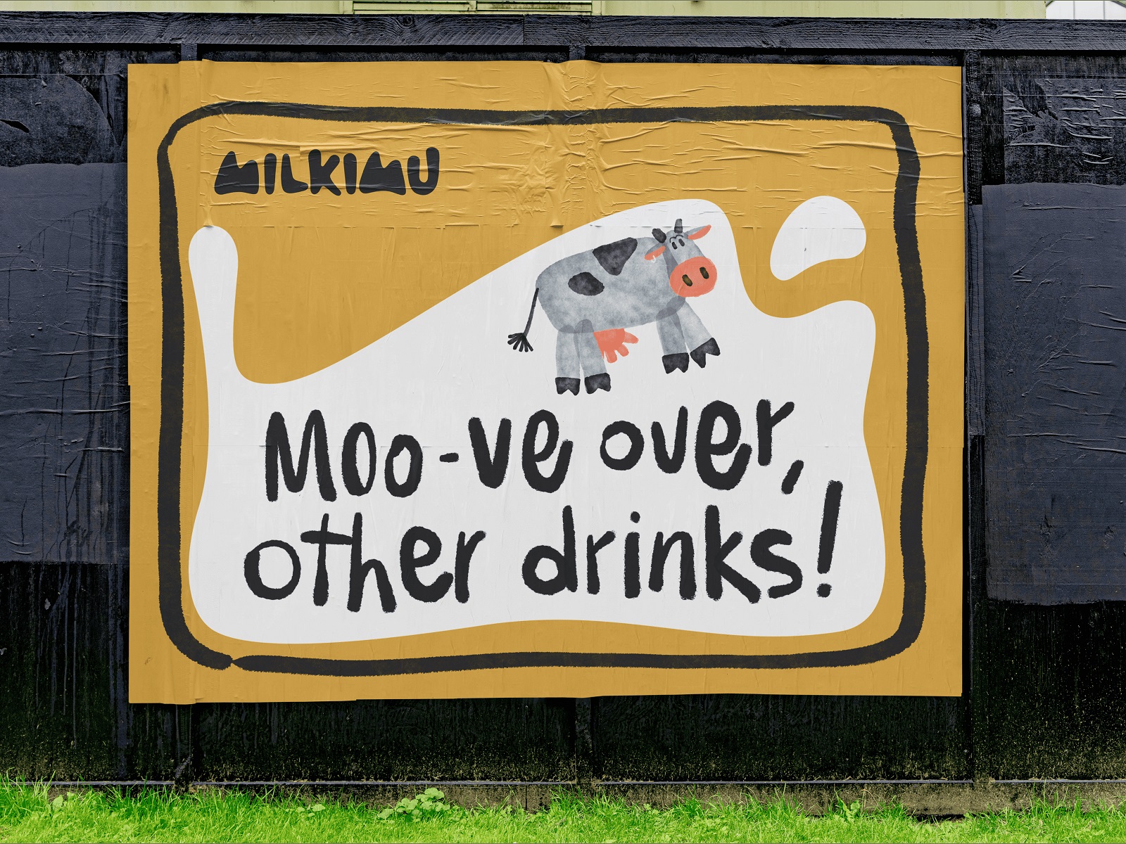
Outdoor advertising poster
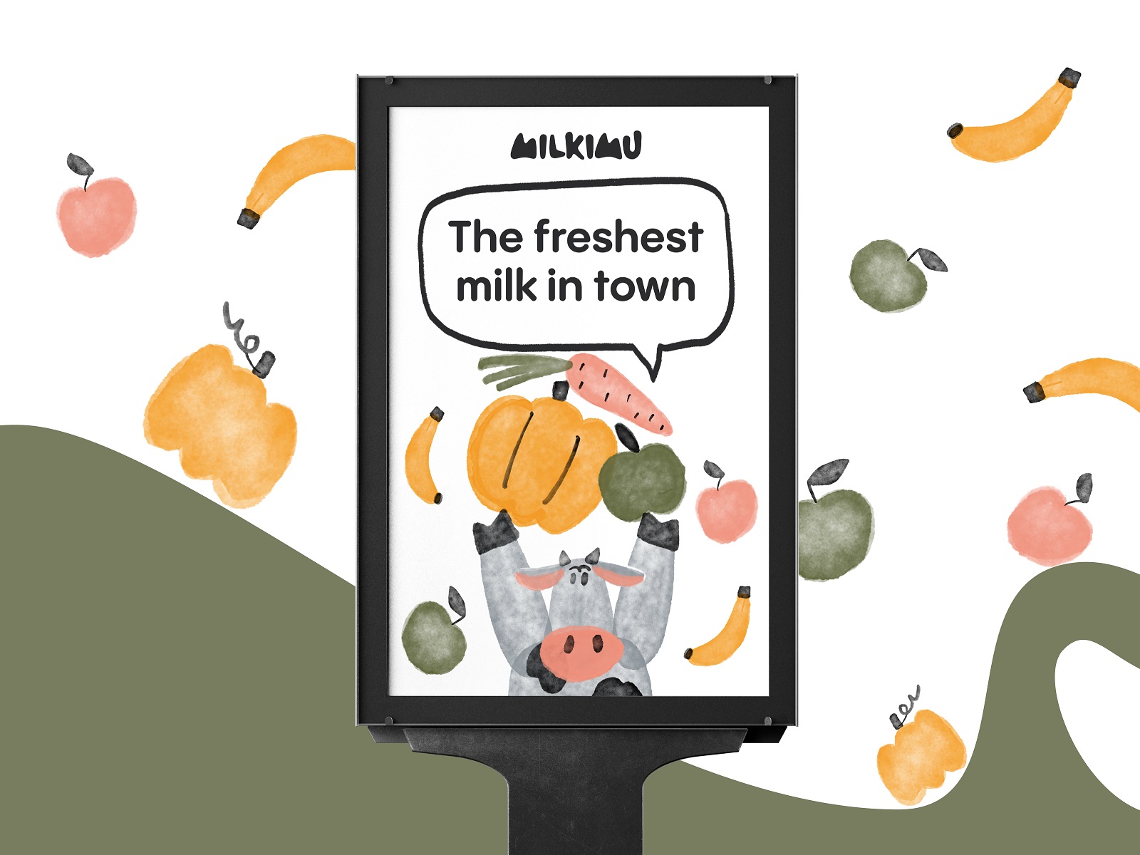
Advertising poster
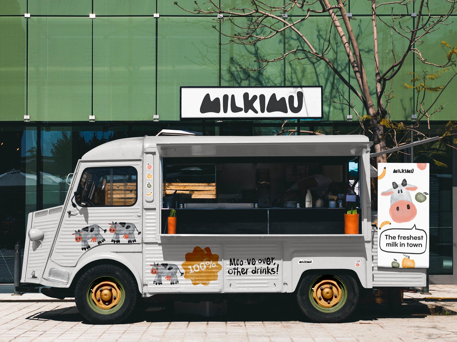
Branded truck livery design
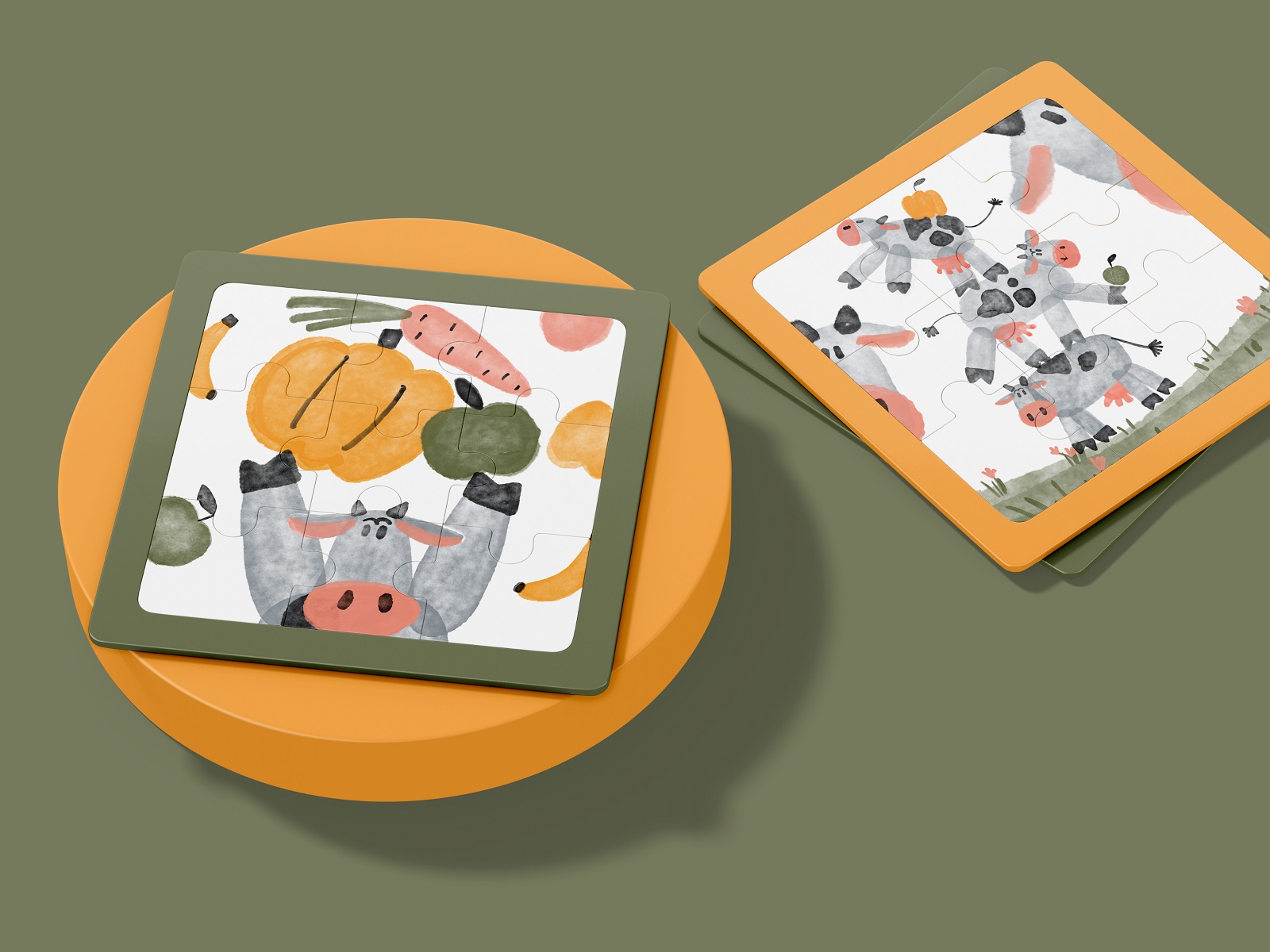
Jigsaw-puzzle coasters design
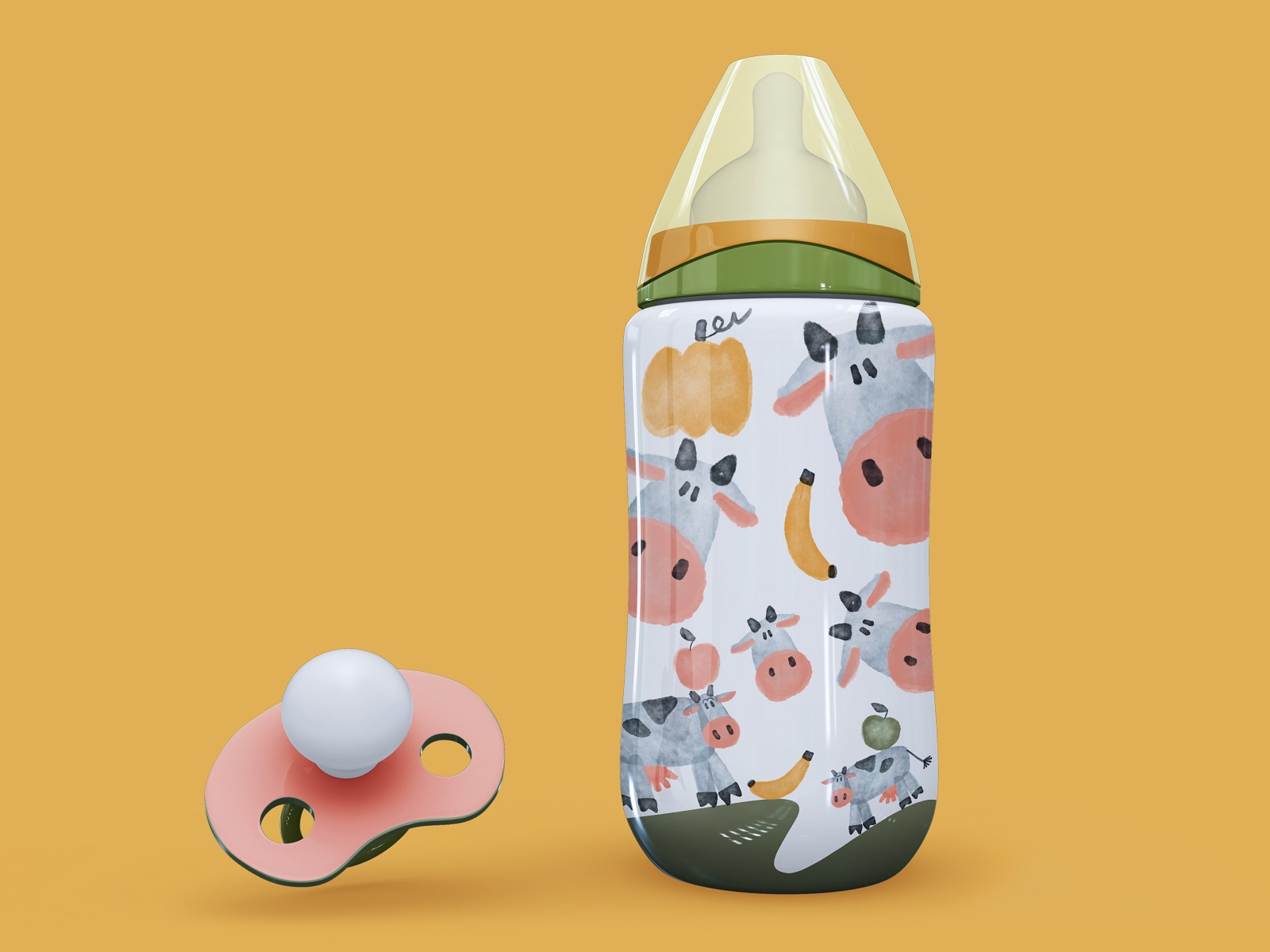
Branded baby bottle design
Recommended Reading
A single case study is a snack. For the full meal, browse the rest of our design work and the occasional rant on why the industry gets things wrong:
Soaplanet. Soap Brand Packaging Design with Travel Spirit
Joosi. Packaging Design and Marketing Graphics for Juice Brand
Ready Set Recover. Web Design and Illustrations for Surgery Recovery Platform
Pizzatta. Artistic Pizza Packaging Design
Page Turner. Identity and Packaging Design for Bookstore Chain
Nibble Health. Identity and UX Design for Healthcare Fintech Service
Fulfill. Illustrations and Web Design for 3PLs Marketplace
Roebuck. Mobile Design and Illustrations for Educational App
Garden Gates. Identity and Packaging Design for Garden Center
8 Bright Packaging Design Projects Employing Illustration Art
Bikker. Identity Design and Illustrations for Biking Service