Health and healthcare present the vital aspect of human happiness, productivity, and success, but let’s be honest, it may appear far from cheap. In our new case study, we’d like to unveil our collaboration with the service that helps employers make their staff happier and healthier by applying a fintech approach to healthcare issues. Welcome to check the creative story of brand identity and UX design for Nibble Health, a healthcare operating system that uses financial technology to drive better outcomes for its members and their organizations.
Client and Project
Nibble Health is a service set up at the crossroads of fintech and healthcare, effectively eliminating financial barriers to great care. It helps patients get the necessary care regardless of upfront costs and helps companies save money while increasing employee satisfaction.
Looking closer at the essence of the service, Nibble Health is BNPL (buy-now-pay-later) for out-of-pocket healthcare expenses as an employee benefit. It deals with a widespread problem: healthcare expenses in the US are super high, so many people bear the pain of it, and it’s not a metaphor when they cannot get medical care. In the early stage of communication, the clients shared the stats that two-thirds of all bankruptcies in the US happen due to medical debt, and one-third of Americans defer health care because they can’t afford it. Nibble Health helps people pay for out-of-pocket healthcare expenses at no cost to them, so they can live a happier and healthier life which definitely means much for employers getting healthy and productive personnel.
The major challenge set for our team for Nibble Health was to create the design system that translates the brand’s messages: employees should feel protected and encouraged to actually use the healthcare benefits that their companies provide. We worked on the brand identity design that reflected the brand values and supported effective and friendly brand communication. Also, we designed and implemented a neat, informative, and emotional website, uncovering the service’s benefits and providing a smooth and clear way to start enjoying it, as well as a product design approach for mobile applications.
So, generally, we covered the following set of tasks:
- running a deep competitor analysis and healthcare industry research
- design for the identity that translates the core idea of the brand
- developing a design system that can be applied to diverse brand items and channels of communication, from a physical card to a website and mobile application
- designing an informative and friendly website and implementing it on Webflow
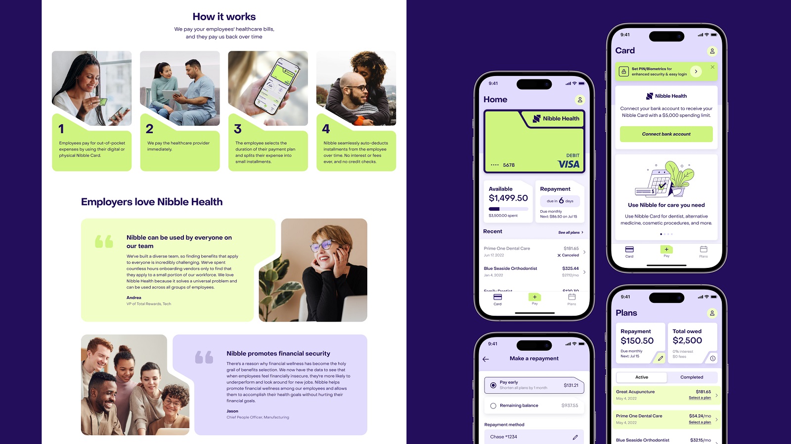
- designing mobile app interface with healthcare BNPL features, including virtual card management and payment schedule
The creative team for the project from the tubik side included Vlad Radionov, Mykyta Litinskyi, Anton Chyrskyi, Andriy Drobovych, Ladamyra Kunytsia, Yaroslava Yatsuba, Olya Zakharyan, Natalka Mamchur, and Yana Potapovych.
Brand Identity Design
Nibble Health project was the case when the client came to us not just super motivated with an idea but also excellently prepared, with a lot of information about the business sphere, a deep understanding of what and how they are going to do, what target audience and what objectives they want to reach. So, multiplying the obtained information with our expertise and a deeper look, we got the research and analysis phase dynamic and highly productive for all sides of the process. Based on that, we built up a general understanding of the brand model and approach to brand communication with its clients; the primary objective was to help the brand look and sound welcoming, friendly, reliable, and helpful.
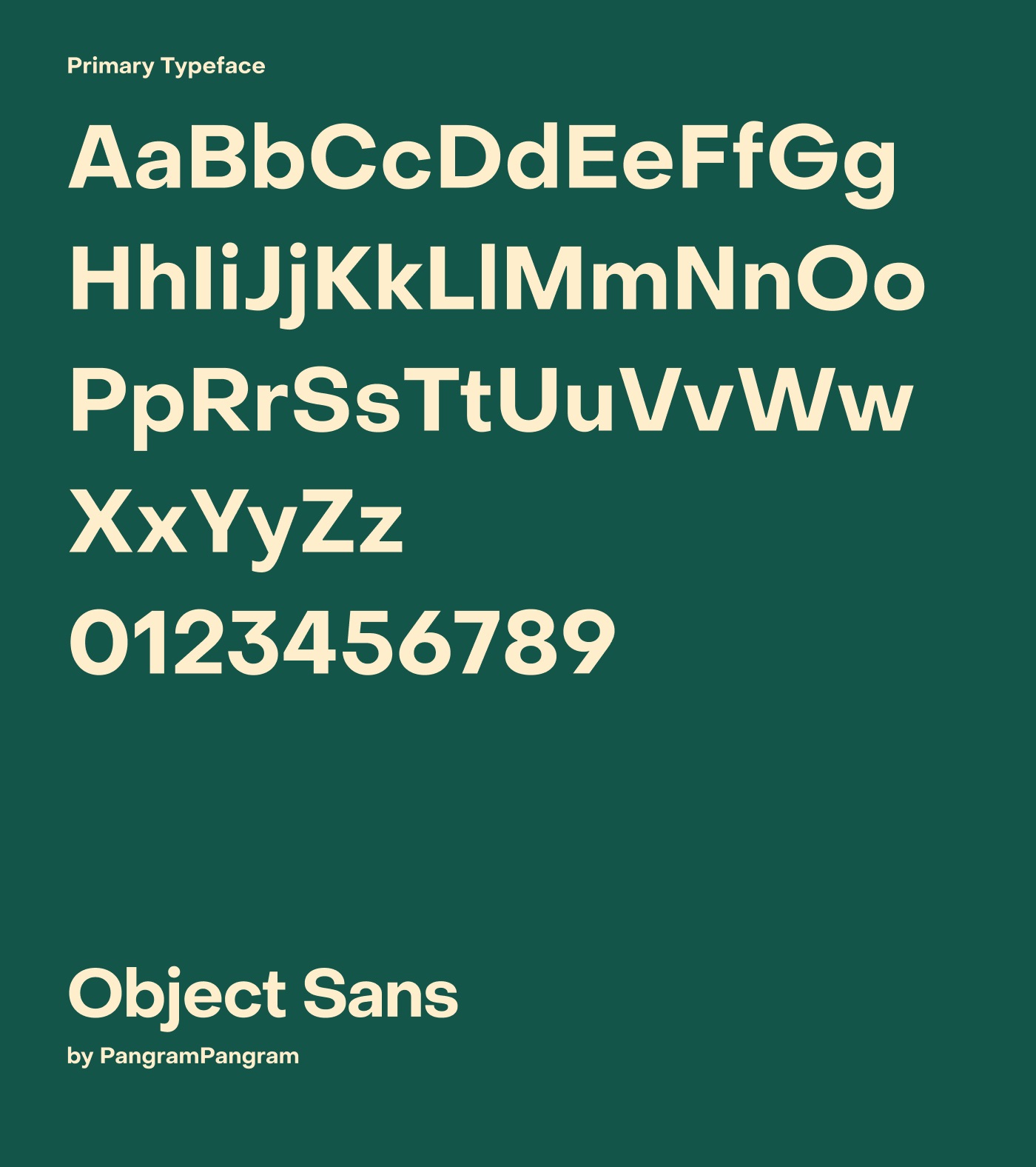
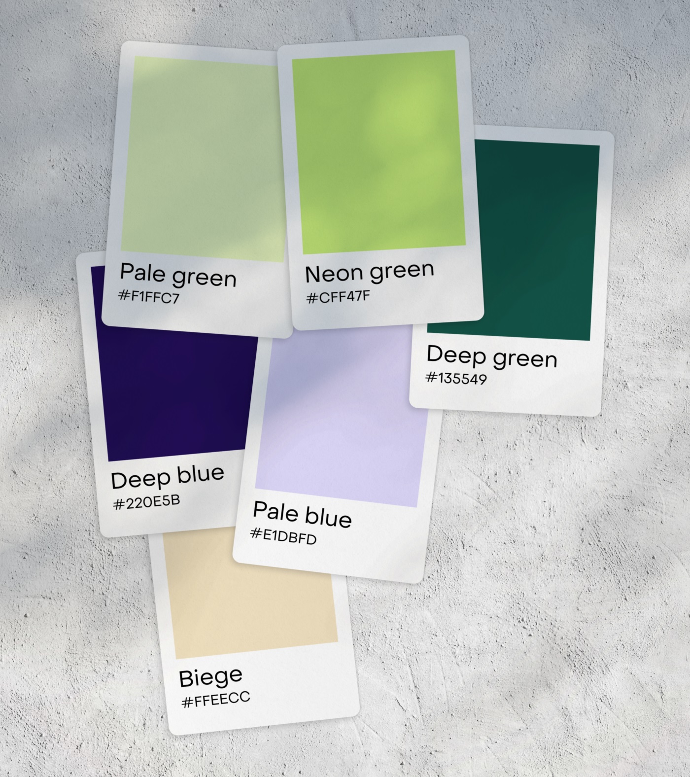
The typography choice fell on Object Sans, a contemporary type family that combines the best qualities of Swiss neo-Grotesk and geometric fonts; it’s multifunctional and proved to work effectively in printed and on-screen contexts and is also well-tuned for small-sized body text. The color palette is based on various shades of green, from pale to deep and neon, combined with shades of blue and neutral beige to balance them all.
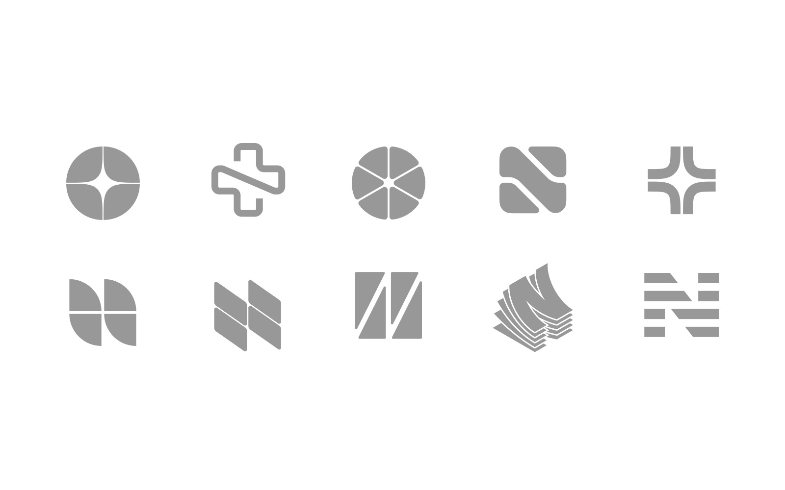
The design process for the brand sign and general visual identity approach started from the phase of creative search in which the graphic designer played with the ideas around the whole divided into parts (nibbles), the well-recognized image of the cross as the symbol of medical help, and N letter as the initial of the brand name. Below you can see some of the multiple ideas that were worked out at that stage.
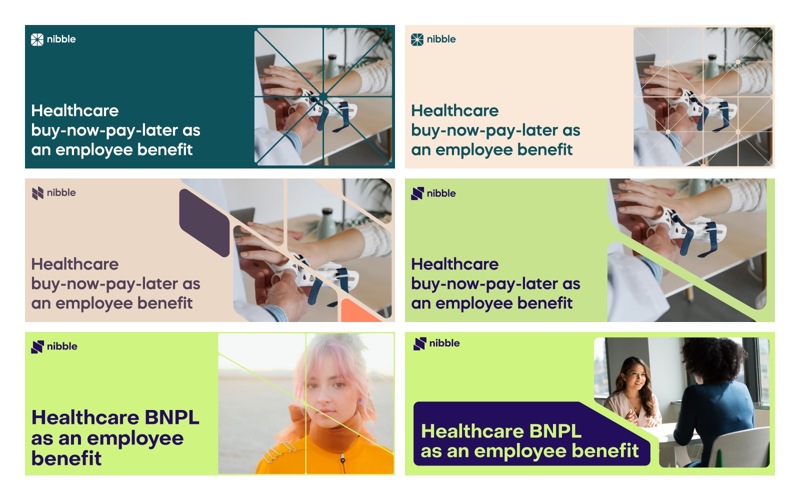
And here’s how the idea of nibbles and different logo options were stretched on the brand graphic approach so that it could be used for advertising, web pages, or mobile screens to keep the consistent identity style everywhere.
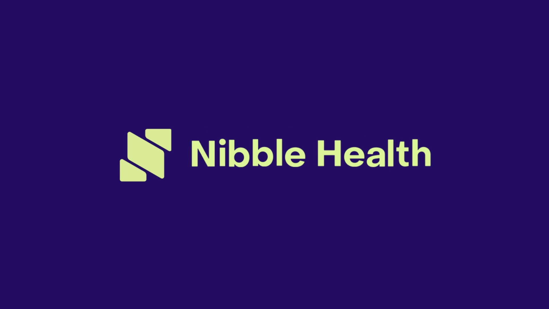
The final version of the logo presents a combination mark with a solid, readable brand name and a symbol covering the idea of nibble parts and using the diagonal slant, which is applied as a consistent element to all the visual tools of brand communication. The logo is flexible to be used in different color combinations within the brand color palette.
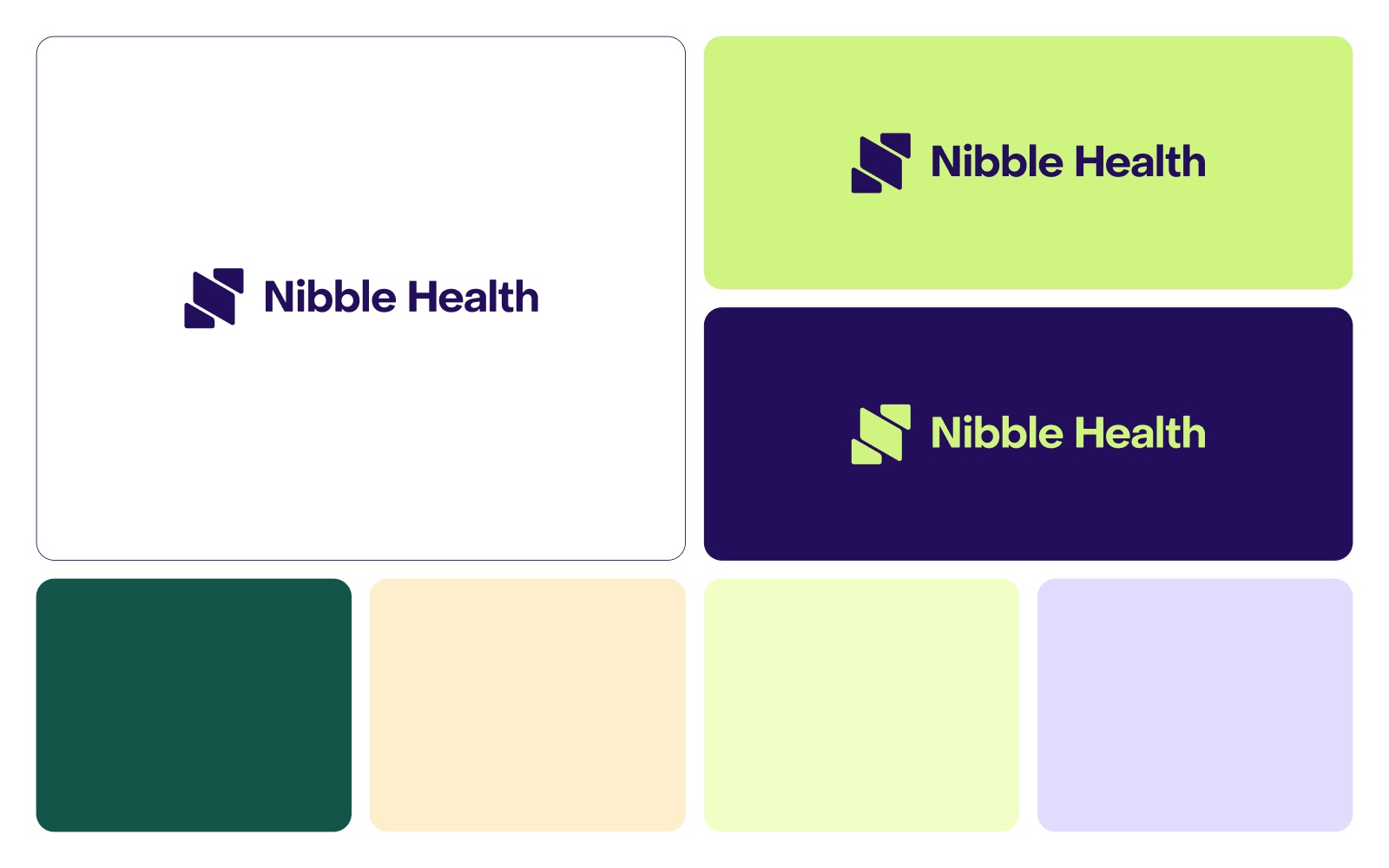
We also worked on an animated version of the logo for digital communication, which could be used on web pages, mobile screens, loading animation, video advertising, and for other marketing goals. Also, to enhance the brand recognizability and usability on the web and mobile presence, the favicon for the website and the app icon for the mobile application were designed based on the logo symbol.
![]()
Here’s a look at the color palette choice process for social marketing communication.
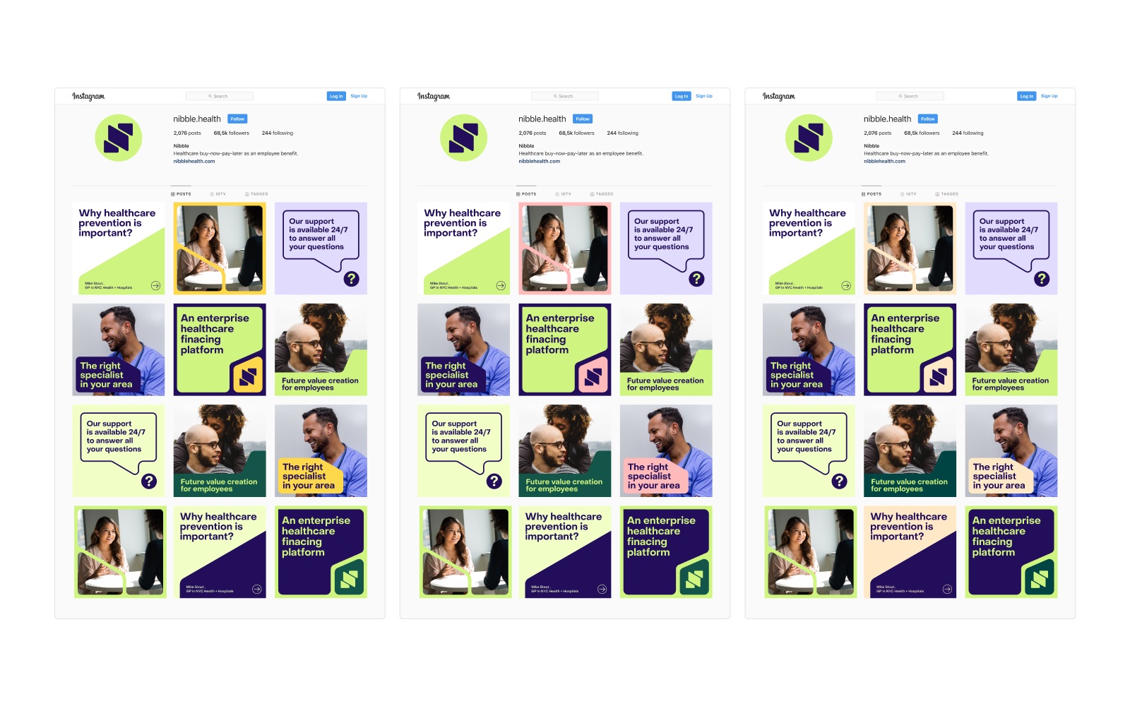
When the general identity approach and significant visual branding elements were agreed upon, the team moved to the next stage to apply these solutions to the set of branded items and marketing design stuff. One of the most important tasks was to develop a visual style of the bank card, which would be well-recognized as belonging to the brand and, at the same time, would correspond to all the requirements of bank card design. Here’s the result, minimalist and elegant.
Branded bank card design
Also, a bunch of consistent branded elements for business communication can be observed below, from stylish business cards to indoor and outdoor advertising graphics, templates for social media marketing, and some merch.
Business cards design
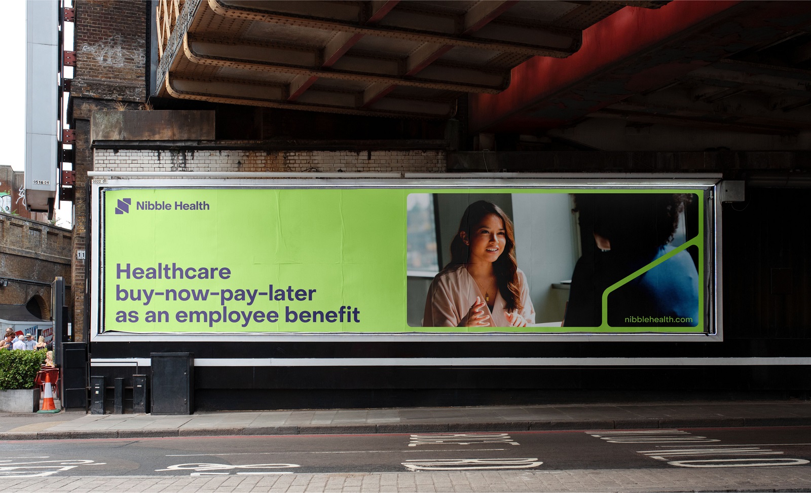
Outdoor advertising billboard design
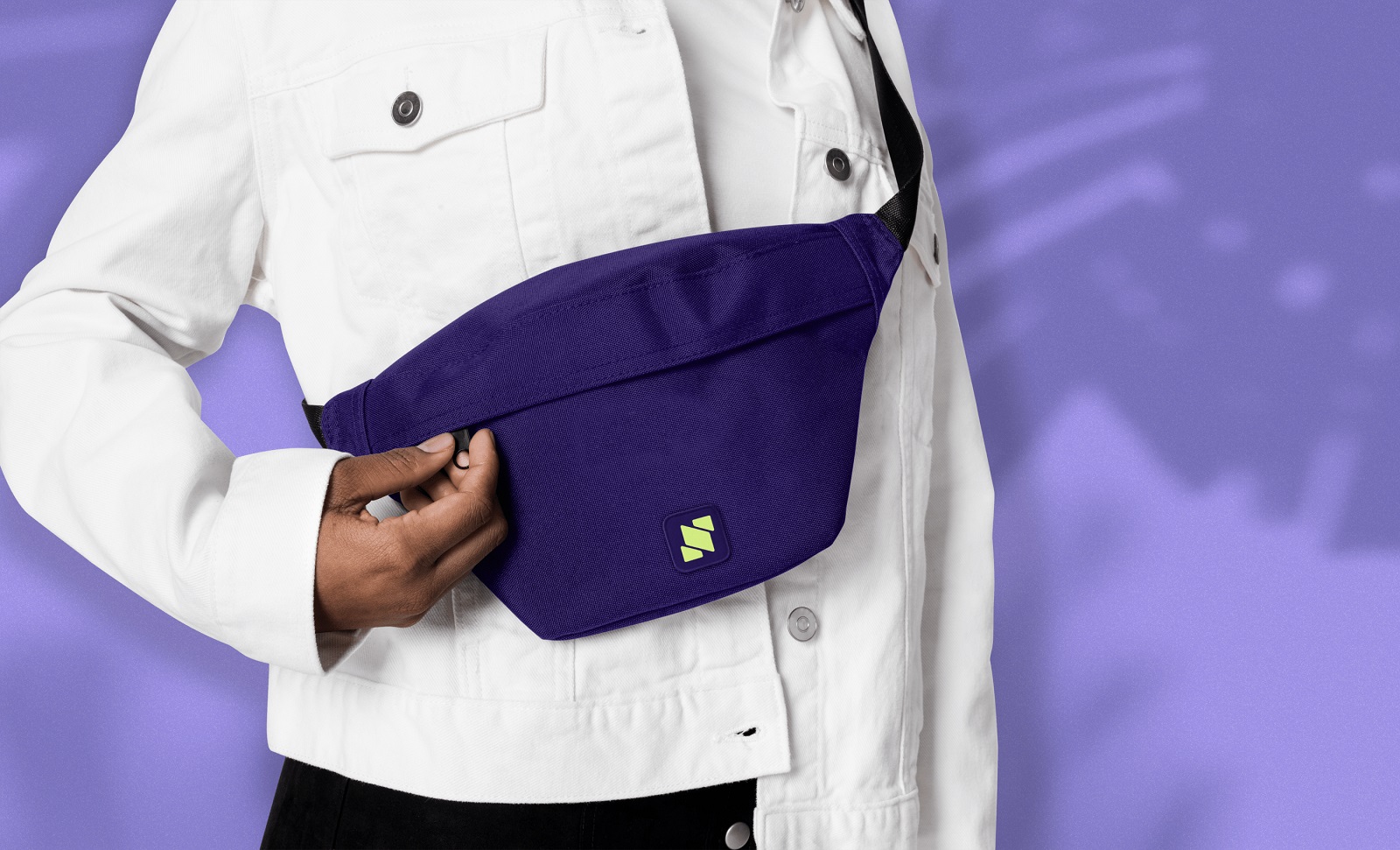
Branded bag design
Social media posts and banners
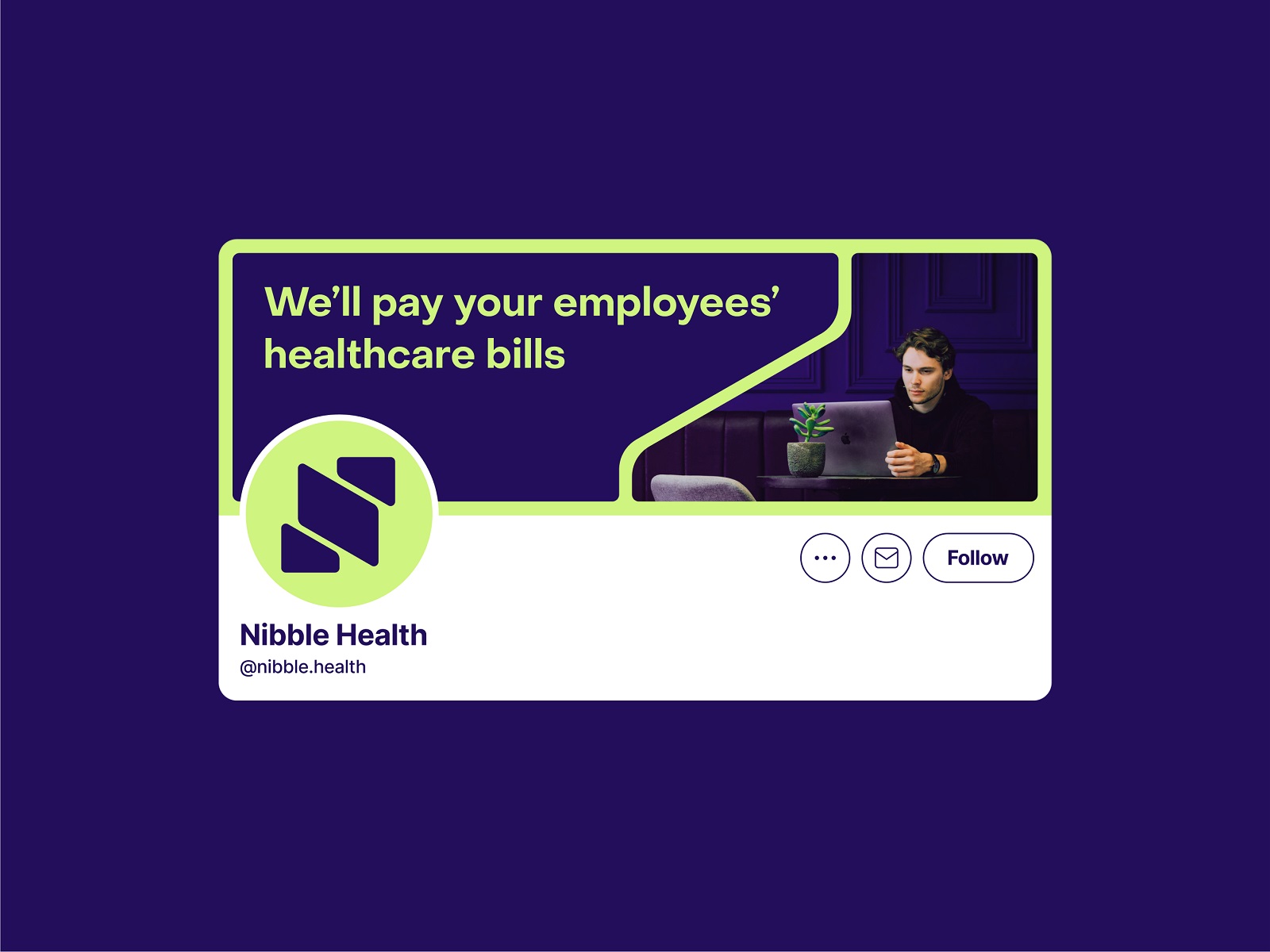
Social media header image design
From the marketing design elements shown above, it’s also easy to see that high-quality photos featuring people present the primary type of images in the brand identity. They add a strong human element to brand communication, set the atmosphere of friendliness, and share the vibes of healthy and active life. In addition, the set of custom illustrations, mainly reflecting different human characters and sticking to the brand color palette, was created for the communication and onboarding goals of the service.
UX Design
The user experience design process for Nibble Health included two main tasks: website design and product design approach to be applied to the mobile application.
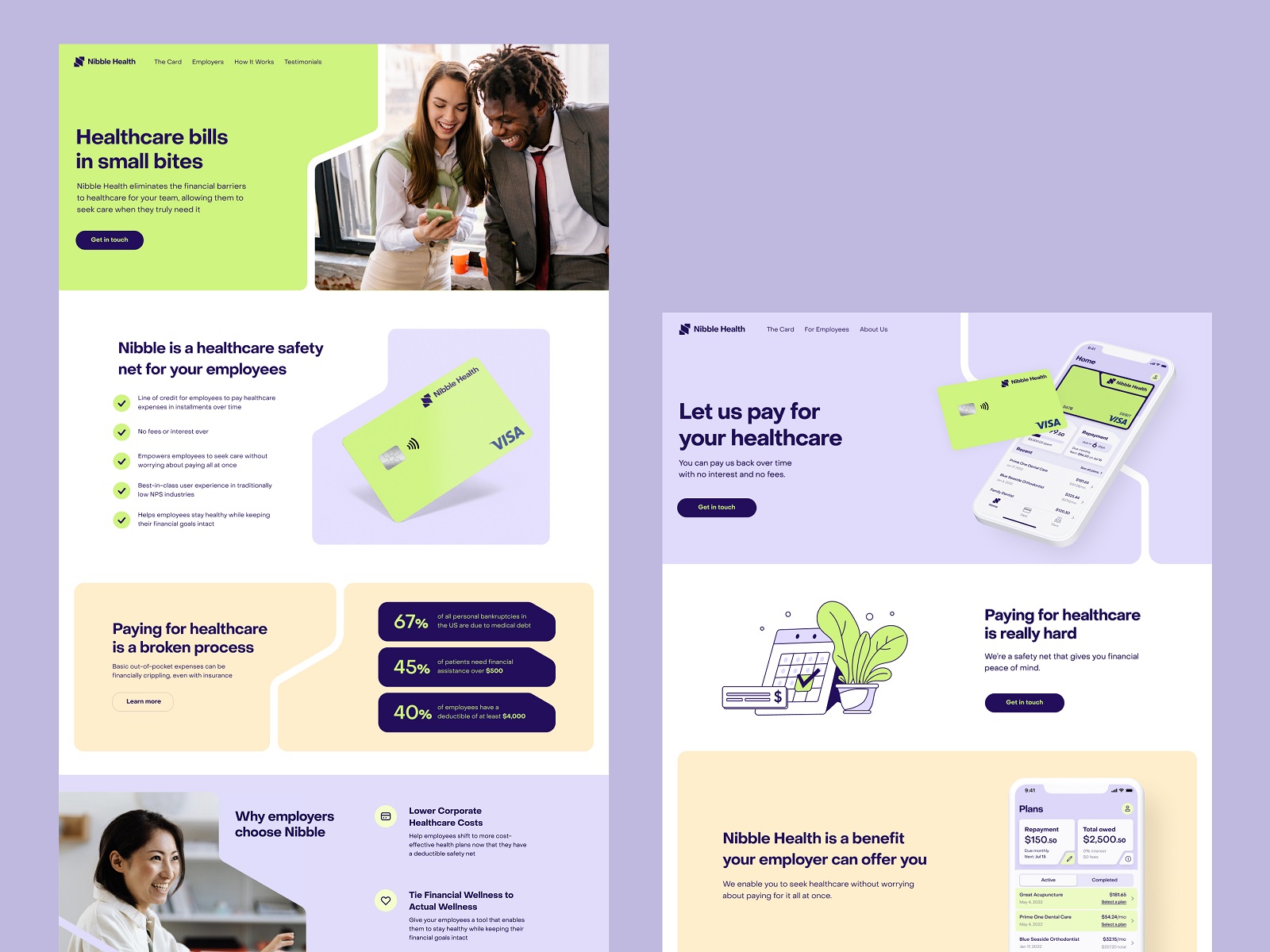
Here’s a look at the website home page, designed following the brand visual approach and applying the slanted cut effects in different sections as an element giving all the experience a united and integral look. The well-arranged content presentation on the page sticks to the inverted pyramid principle of uncovering the information about the process, going from what’s needed to know to what’s nice to know, from the core message to the details. It is especially effective in presenting such a service that is more virtual than tangible and demands quite a lot of text content to be convincing, explain the essence, and uncover the benefits.
The website design shows a thoughtfully balanced combination of images: photos, product interface screens, and illustrations. Together, not only do they support the informativeness of the pages and cover the demonstration goals, but they also make the user experience emotional and welcoming.
And here’s the concept of the dynamic animation for the section featuring partners or clients of the service, increasing the level of trust and engaging visitors to know more about the service.
Having agreed on all the details of web design with the client, we made it live, having implemented the website on Webflow. The same consistent visual approach was transferred to user interface design for the mobile application, which is straightforward, intuitive, and covering different user scenarios.
The Nibble Health project was a great experience of working on an innovative product established at the crossroads of different industries and involving a broad scope of creative tasks. Also, it proved the efficiency of the way from the well-thought brand identity and communication approach to the digital products and user experience design, which increases the productivity of the UI/UX design stage and supports the integrity of all the channels and tools with which the brand communicates to its customers and sells its products.
New design case studies from our team are coming soon. Stay tuned!
More Design Case Studies
Here’s a set of more case studies sharing the design solutions and approaches for some of the design projects done by the Tubik team.
ProAgenda. Identity and Website Design for Golf Management Service
BlockStock. Brand Identity and Website for Minecraft Models Resource
Kaiten. Identity and Product Design for Food Marketplace
THT. Website Design for Electrical Engineering Service
Komuso. Website Design for Wellness Tool
Nonconventional Show. Website Design for Podcast
Fulfill. Illustrations and Web Design for 3PLs Marketplace
Glup. Delivery App Branding and UX Design
BEGG. Brand Packaging and Web Design for Food Product Ecommerce
Crezco. Brand Identity and UI/UX Design for Fintech Service
FarmSense. Identity and Web Design for Agricultural Technology


