In this case study, let’s unveil another impressive award-winning web project called Drug Test Innocence. It got Webby People’s Choice 2024 in the Law category, so let’s go through the idea and creative process that led to this result.
Project
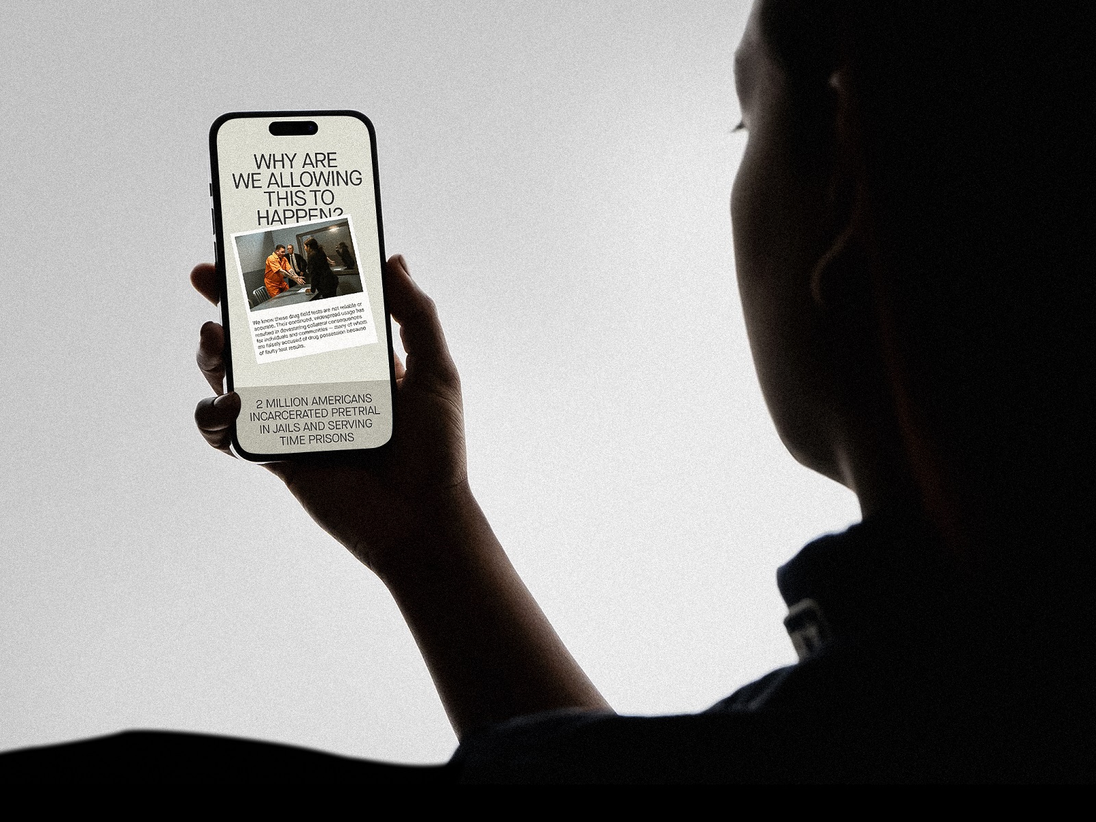
Drug Test Innocence is an online resource that uncovers the devastating impact of inaccurate field drug tests, which today are the largest source of wrongful arrests and convictions in the United States. The website provides a detailed presentation of the issue based on research and real cases and offers considerations and solutions on how to limit that impact.
This website is one more project we made in collaboration with Zealous, an organization challenging injustice through media, storytelling, and the arts. The team standing behind this initiative is The Roadside Drug Test Innocence Alliance, which is dedicated to reducing the harm done by inaccurate field test kits.
The primary task for tubik was to do the things we are really experienced at. With the thoughtful arrangement and the power of visual storytelling, we had to turn the massive content about the problem into a resource that would get people interested in the topic and let them obtain valuable information conveniently.
The creative team from the tubik side included Vladyslav Taran, Denys Koloskov, Andriy Drobovych, and Anastasiia Ostapenko.
Website
The starting point for the website creative was tons of text content. So, we started working on a visual style concept that would present such a serious theme and organize a great deal of data in a way that wouldn’t be either boring or overwhelming for the readers.
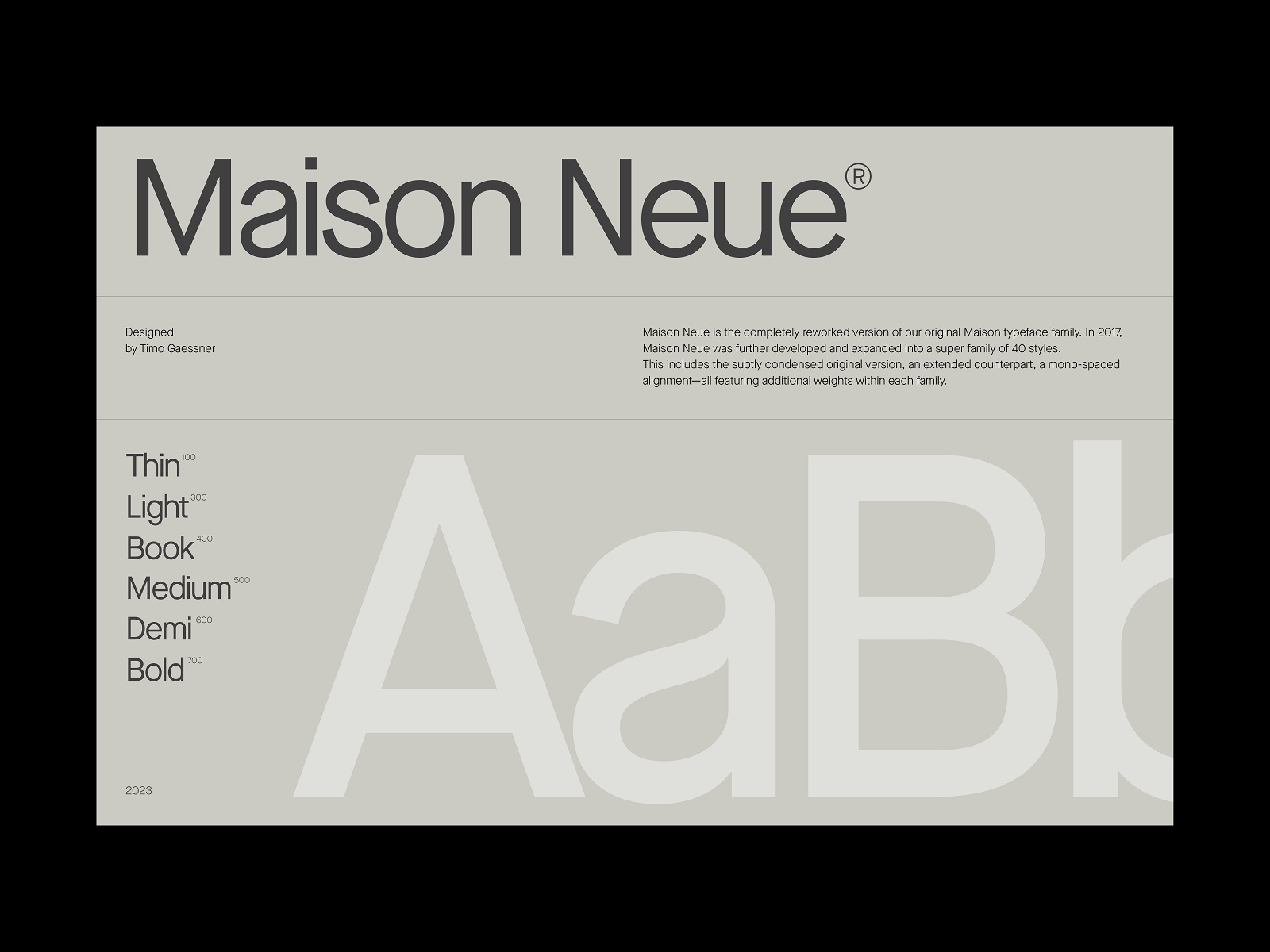
After thinking over different directions, the team chose the one that used neat and simple typography and a limited color palette. These core elements of any website are the designers’ primary helpers in setting the needed mood and atmosphere, and this case wasn’t an exception.

The typeface and color choice, as well as thoughtfully organized page layouts, set up an efficient canvas for all the massive content the resource had to connect with the reader.
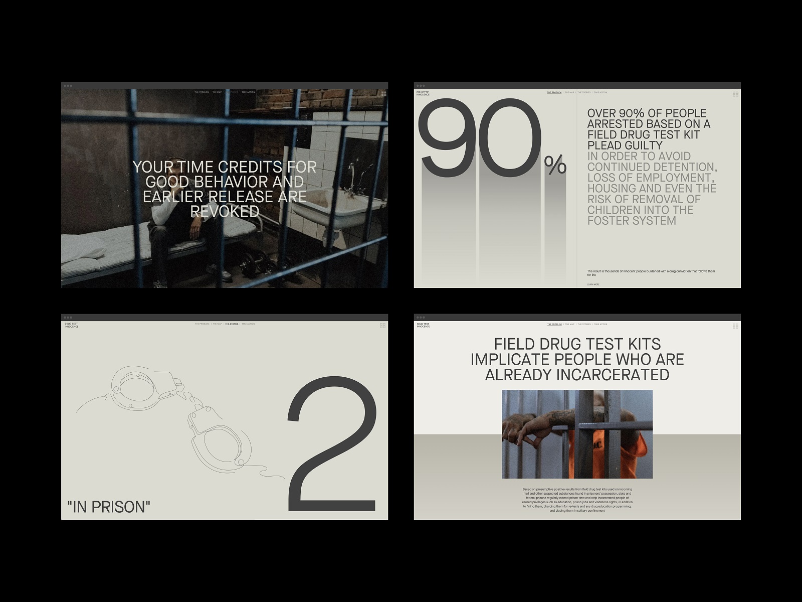
The website’s structure is based on four content-heavy major pages.
The main page, named the Problem page, provides an extended introduction to the problem.
The Map page features an interactive map that gives access to cases that happened in particular states.
The Stories page shares specific stories connected to incorrect drug testing.
And finally, the Take Action page offers ways to spread the word or join those who fight this problem.
Graphics and Visuals
Another challenge was to find a way that would make all the mentioned pages emotional, engaging, and impressive. And that was achieved with different tools and techniques of visual communication applied to them.
Drug Test Innocence website uses all popular types of visual web content wisely united in one elegant and consistent system. As visitors read the content and scroll the pages, they encounter photos and photo collages, artistic line illustrations, and sophisticated 3D graphics. For example, we created a custom realistic 3D model of the field drug test to give readers a visual connection to what it is.

One more essential factor of user retaining and engagement is diverse web animation, from text and transitions to animated visuals and captivating parallax. Motion is smoothly integrated into all the pages to make the user experience more lively and emotional. What’s more, it sets a good contrast with massive texts and helps arrange the content in a way that’s easier to perceive and, therefore, more convincing.
All those solutions were implemented with Webflow, resulting in an impressive website that effectively and influentially addressed the problem of incorrect drug testing and ways to reduce its negative impact on American society.

New design case studies from our team are coming soon. Stay tuned!
More Design Case Studies
Here’s a set of more case studies sharing the design solutions and approaches for some of the design projects done by the tubik team.
Opera Browser Explainer Videos. Animated Video Production
Web Design Case Studies: 4 Smart Websites for Various Business Goals
Advocacy Through Walls. Website Creation for Advocacy Guide
Serra. Identity and Product Design for Financial App
MOVA Brewery. Ecommerce Website Design for Beer Producer
HP23. Website and 3D Animation for Prostheses Producer
FluxWear. Web Design and Development for Health Tech Product
UI Design Process for Web and Mobile: 3 Detailed Video Cases
Magma Math. Web Design for Educational Platform
Synthesized 2.0. Web Design for High-Quality Synthetic Data Platform
HotelCard. Brand Identity for Hotel Offers Service
Nibble Health. Identity and UX Design for Healthcare Fintech Service
Physica Magazine. Web Design and Graphics for Scientific Blog
ProAgenda. Identity and Website Design for Golf Management Service


