This case study unveils our experimental graphic design project devoted to flea markets’ special mood and magic, transferred through the art of daring, brutal, and artistic collages. Enjoy and have fun!
Project
Brand identity design for the modern online flea market.
Idea
A flea market is a place of surprises and unexpected findings; it is a comeback to the nostalgic past, with its quirks and peculiarities. That’s things that got reborn, possessing a completely new value and significance. A flea market as a cultural junction of different times connects the incompatible.
That set of ideas determined the basis of the stylistic approach. The combination and joint of fundamentally different essences and contexts resulted in the visual concept of the whole online flea market.
Identity Design
The design approach to the brand image of the flea market was based on the aesthetics of brutalism. Rooting in architecture and blossoming in web design, graphic design, and digital art of the recent decade, brutalism is often described as a style that aims at breaking standards and predictable design techniques. The posters and graphics, websites and apps created in this manner are a sort of rebellion to sophisticated designs with thought-out symmetry and harmony, complex layouts, and accents of aesthetic visual performance. In contrast, brutalism is based on simple and raw appearance, in most cases not loaded with many visual details, often plain, employing catchy exaggerations and mixing diverse contrasting techniques. From its architectural roots, it took blocky heavy appearance, simple graphic lines, minimal ornamentation, limited palettes, rough textures, and modular elements. Used thoughtfully for the appropriate goals and audience, it features a high level of originality, stimulates interest, and gives a unique look to the interface. You may like it or not, but you’ll never leave it unnoticed. That’s what the identity of the online flea market needed at the core of its identity.
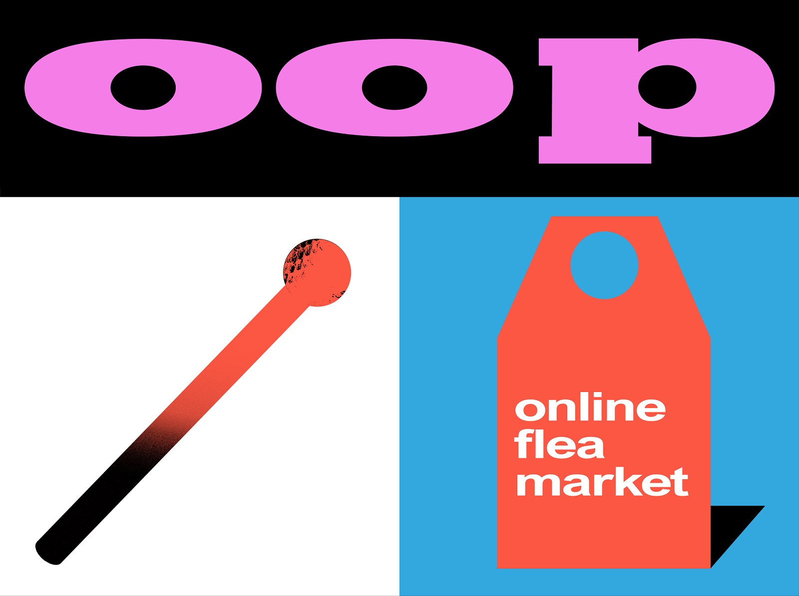
The logo presents the typographic sign wrapping the brand name in heavy bold letters. It is supported with another identity element, whose shape echoes the price tag while the text explains the nature of the e-commerce service.
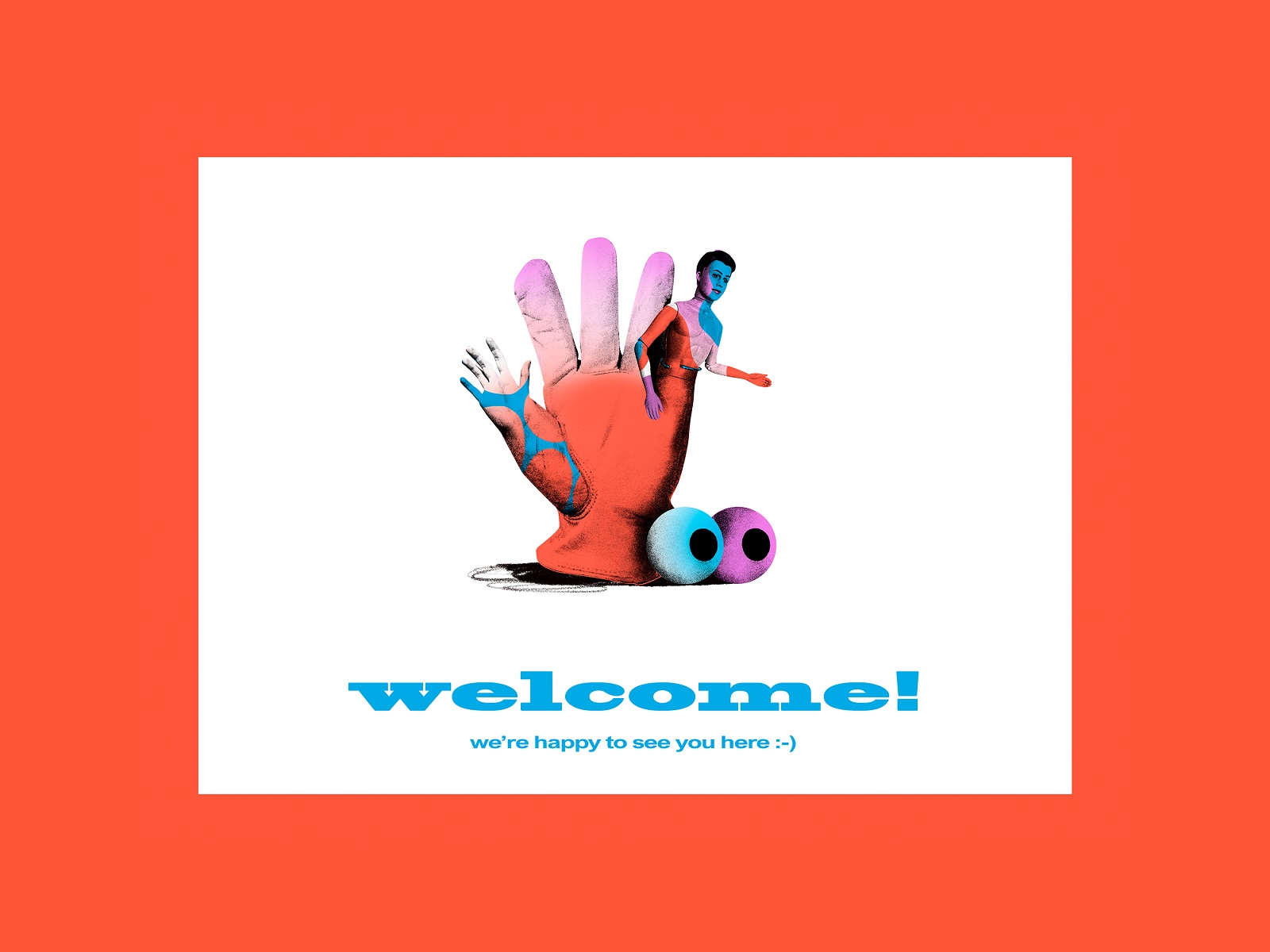
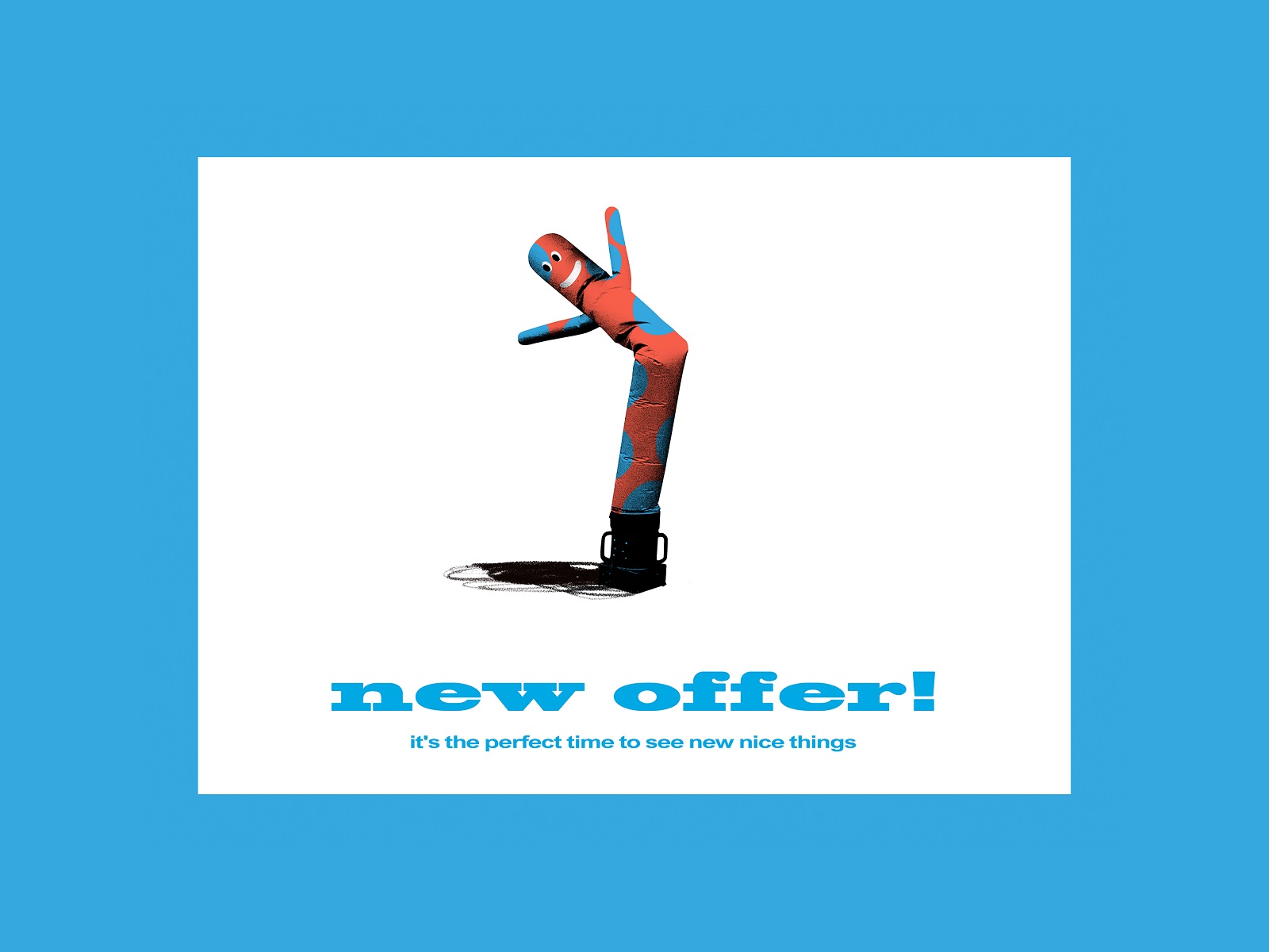
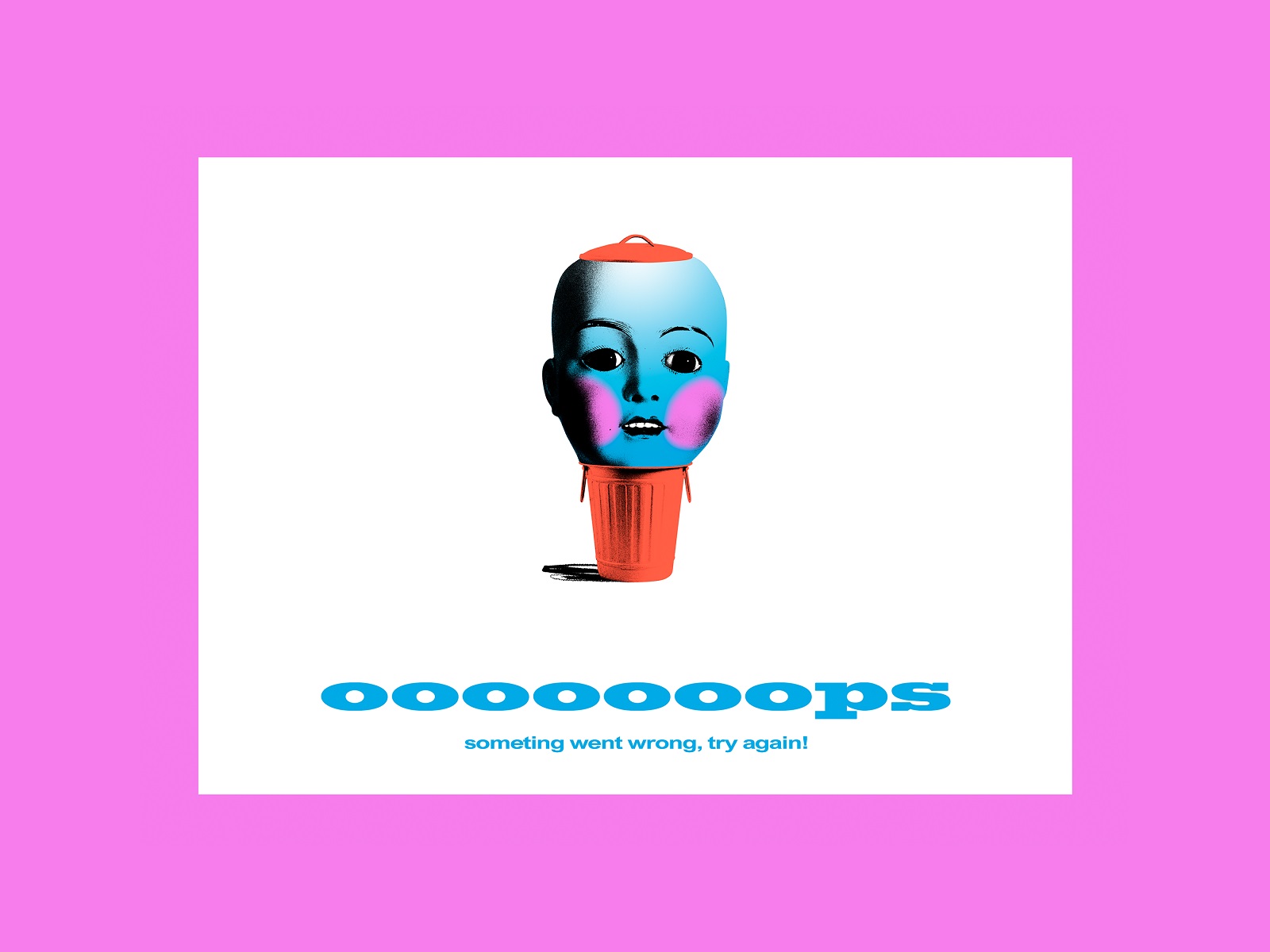
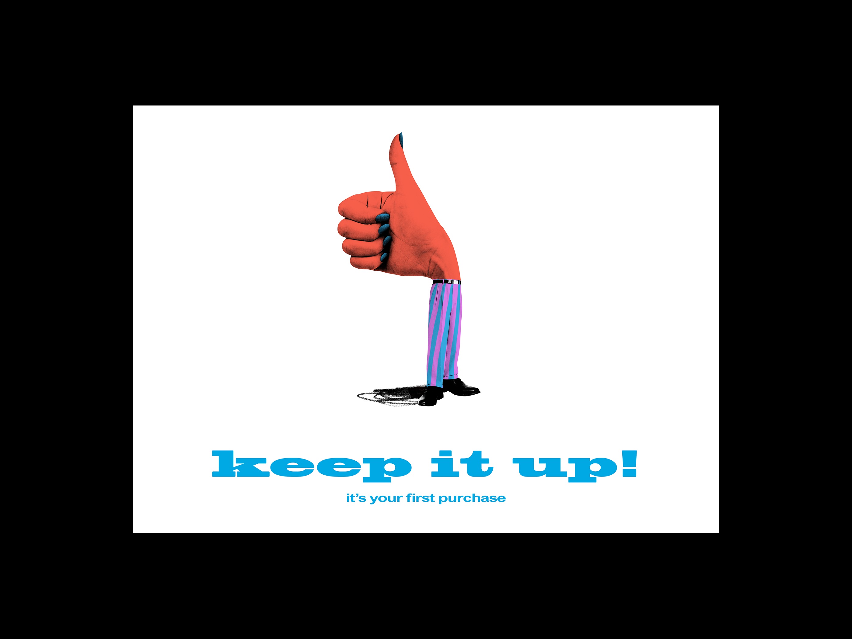
Another step in the development of the recognizable and memorable brand image was creating a consistent set of artistic and trendy illustrative collages, featuring some vintage objects people can typically find on flea markets as well as some daring visual metaphors attracting attention and setting the special mood. This pack was flexible to be used for any branding and promotional goals, both online and offline. As well, they set the foundation for the design system that could be effectively used as visuals marking various categories of items on the website or the mobile application. Uncommon color combinations and gradients, elements of different styles combined in one image, visual noise in combination with flat filled-up shapes – these and other techniques play a significant part in making the pictures look original and atmospheric, brutally transferring the idea of the flea market.
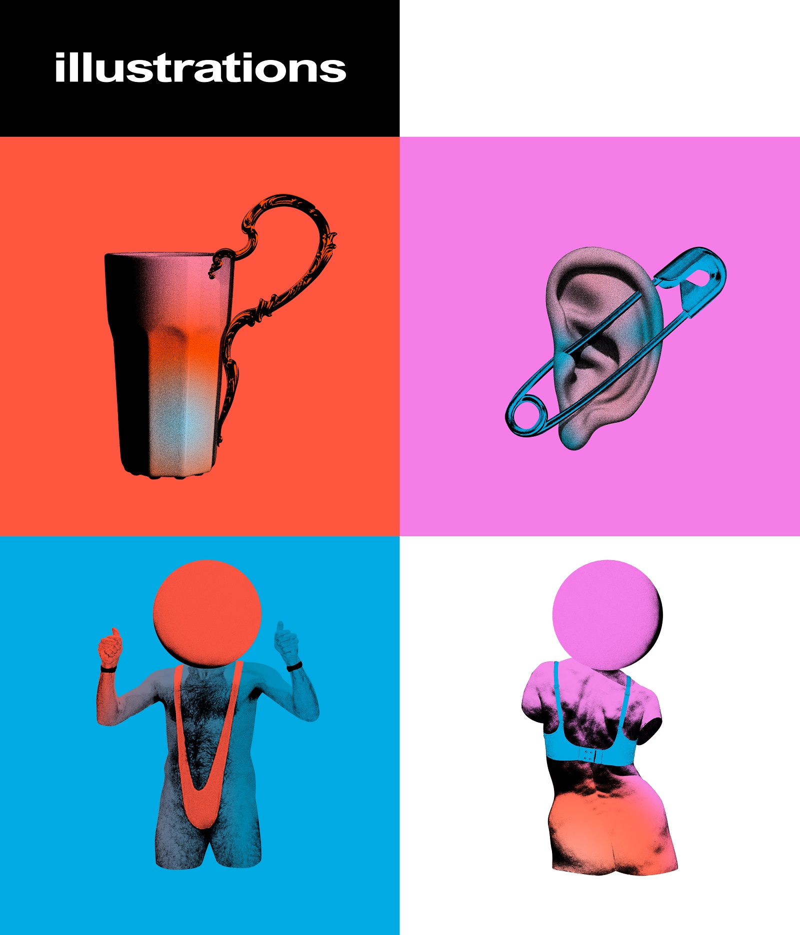
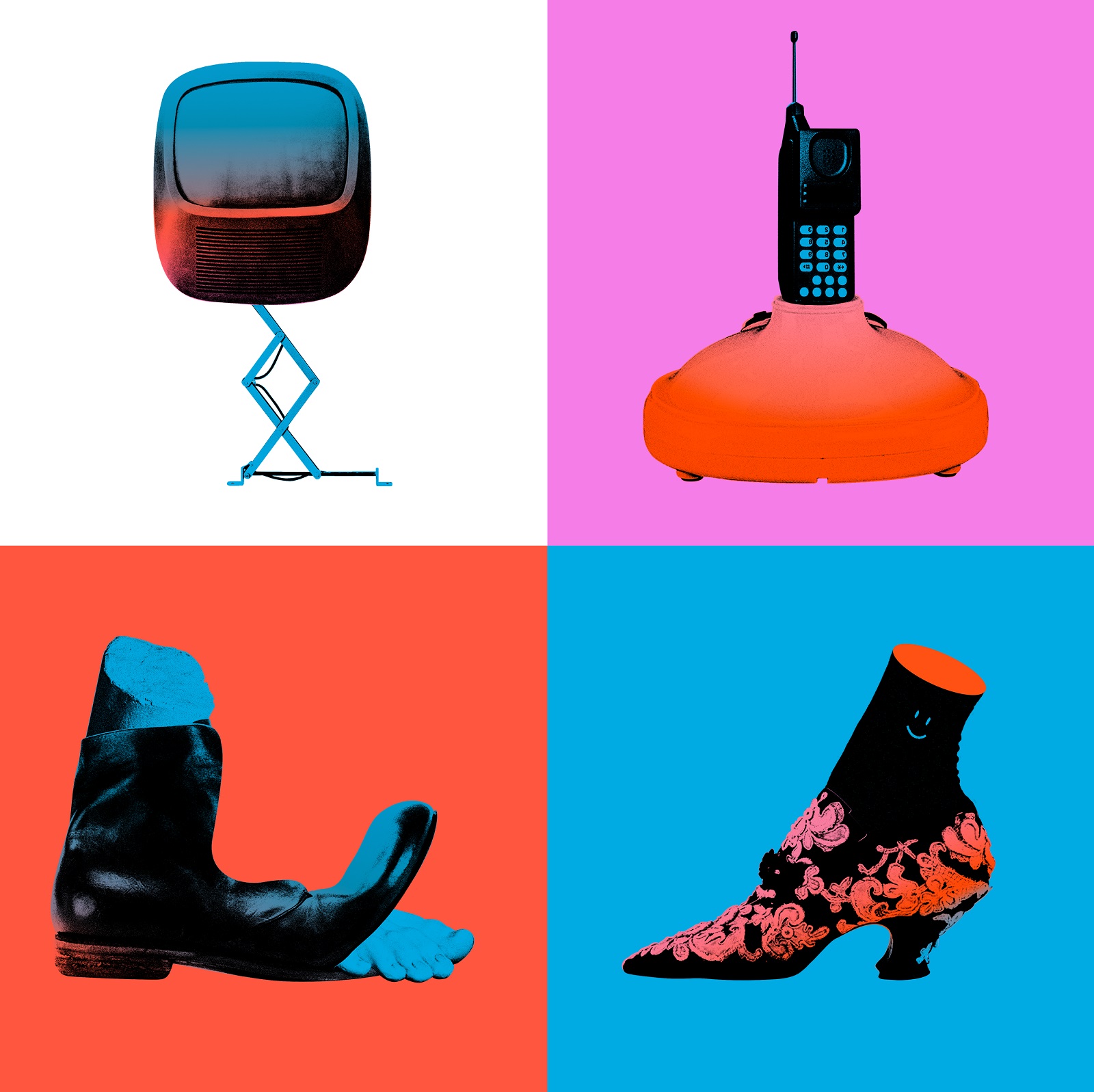
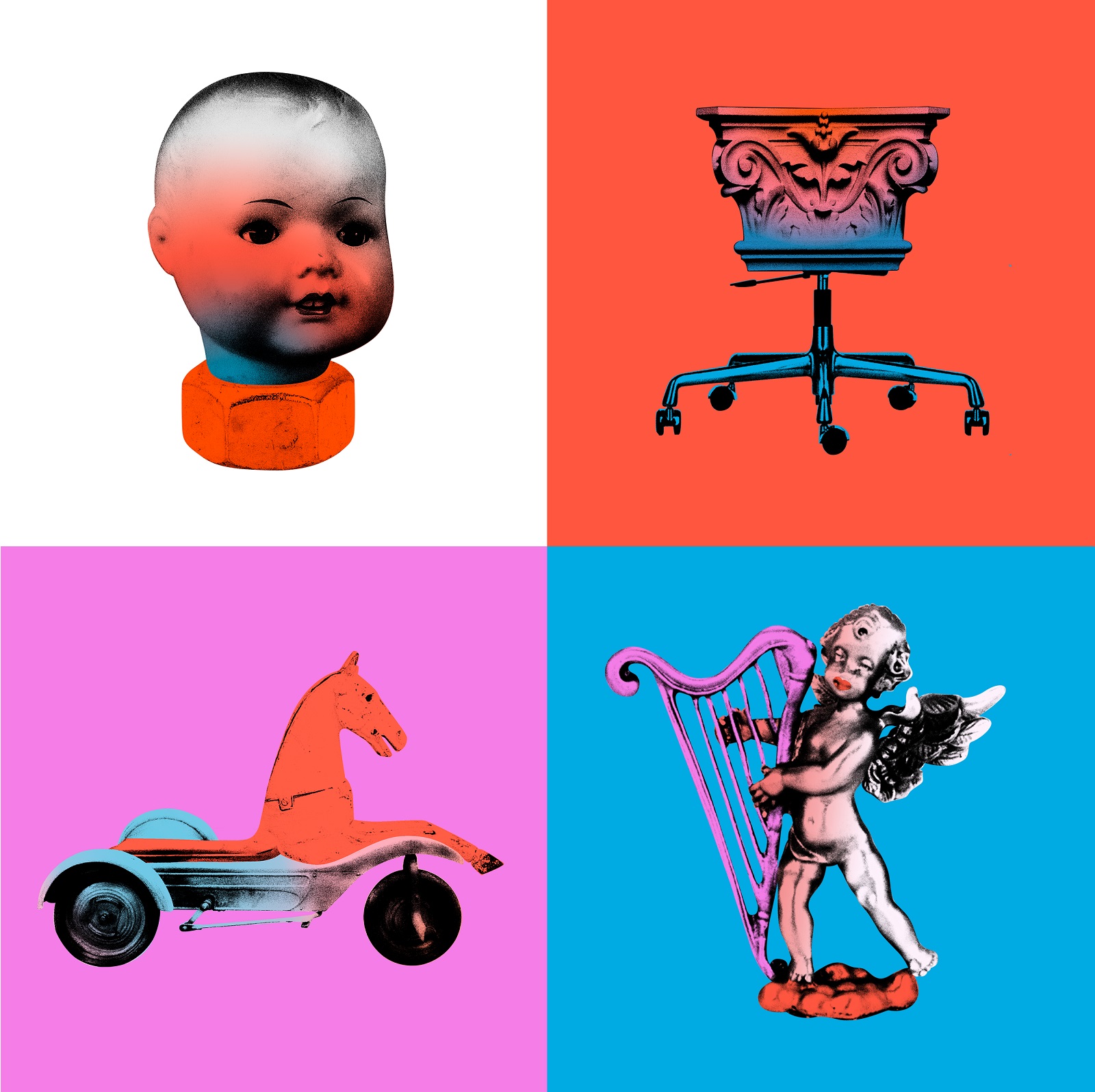
Here’s how the collages and illustrations following that design approach work in real-life branding.
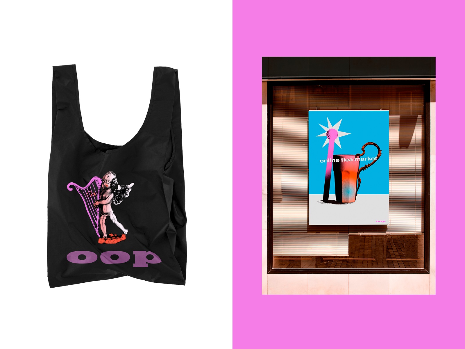
Branded bag and poster designs
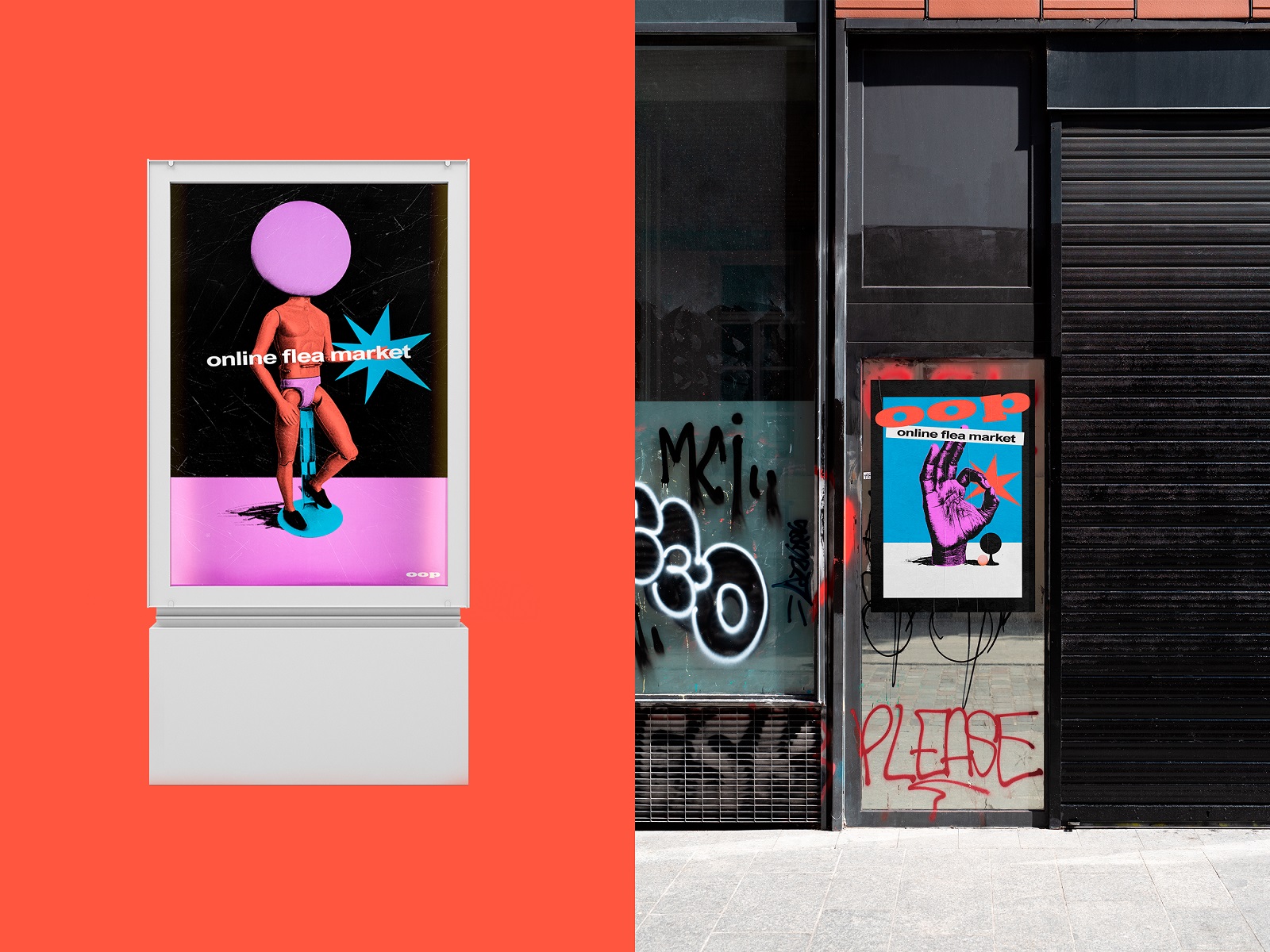
Posters design
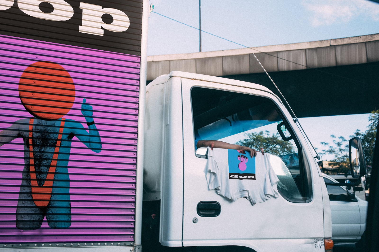
Branded truck livery and T-shirt design
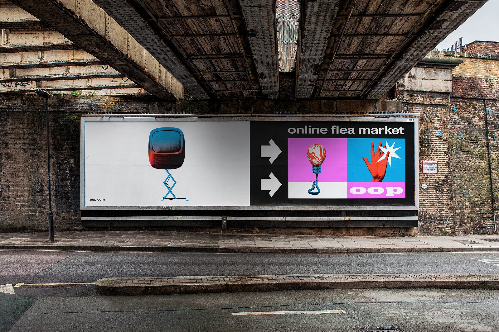
Outdoor advertising billboard design
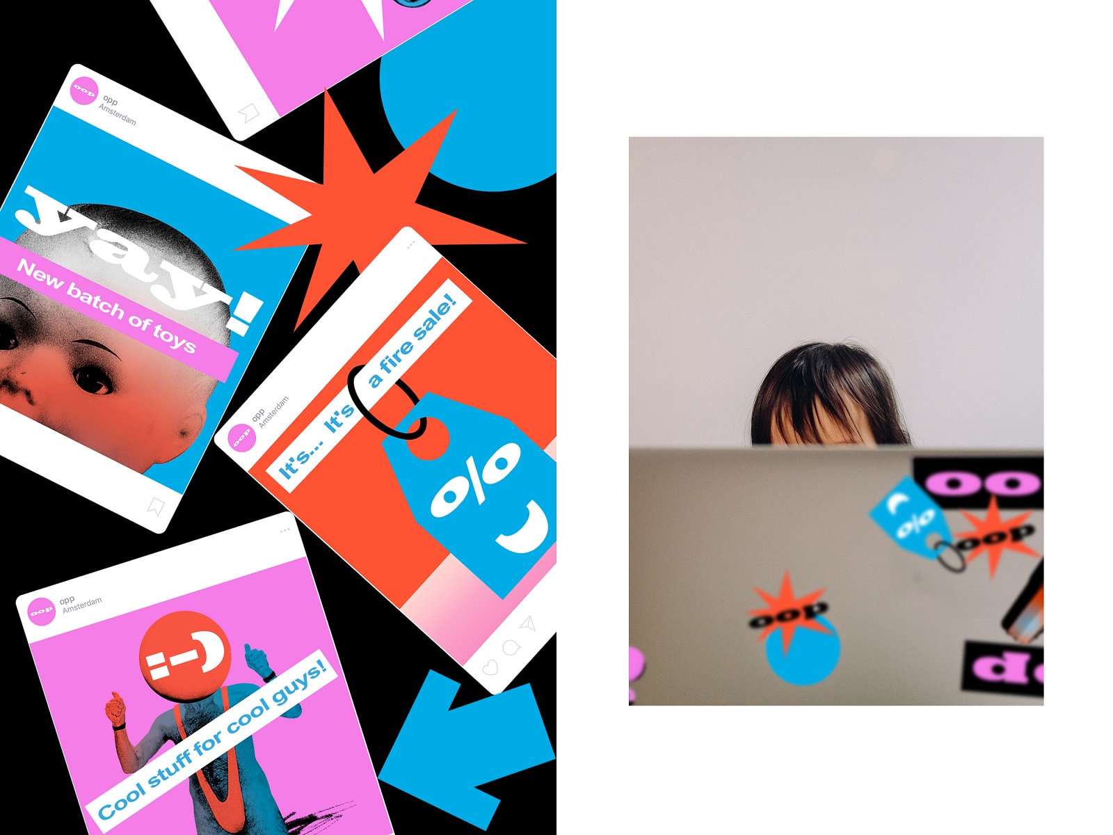
Stickers and the consistent design system for the social media posting
Identity Integration in User Experience Design
Another aspect to consider was the effective and consistent integration of the developed brand identity into web and mobile design. Take a look at some of the ideas developed for basic web pages and banners, for example, those that welcome or thank the visitor, inform about the 404 error, or present new offers.
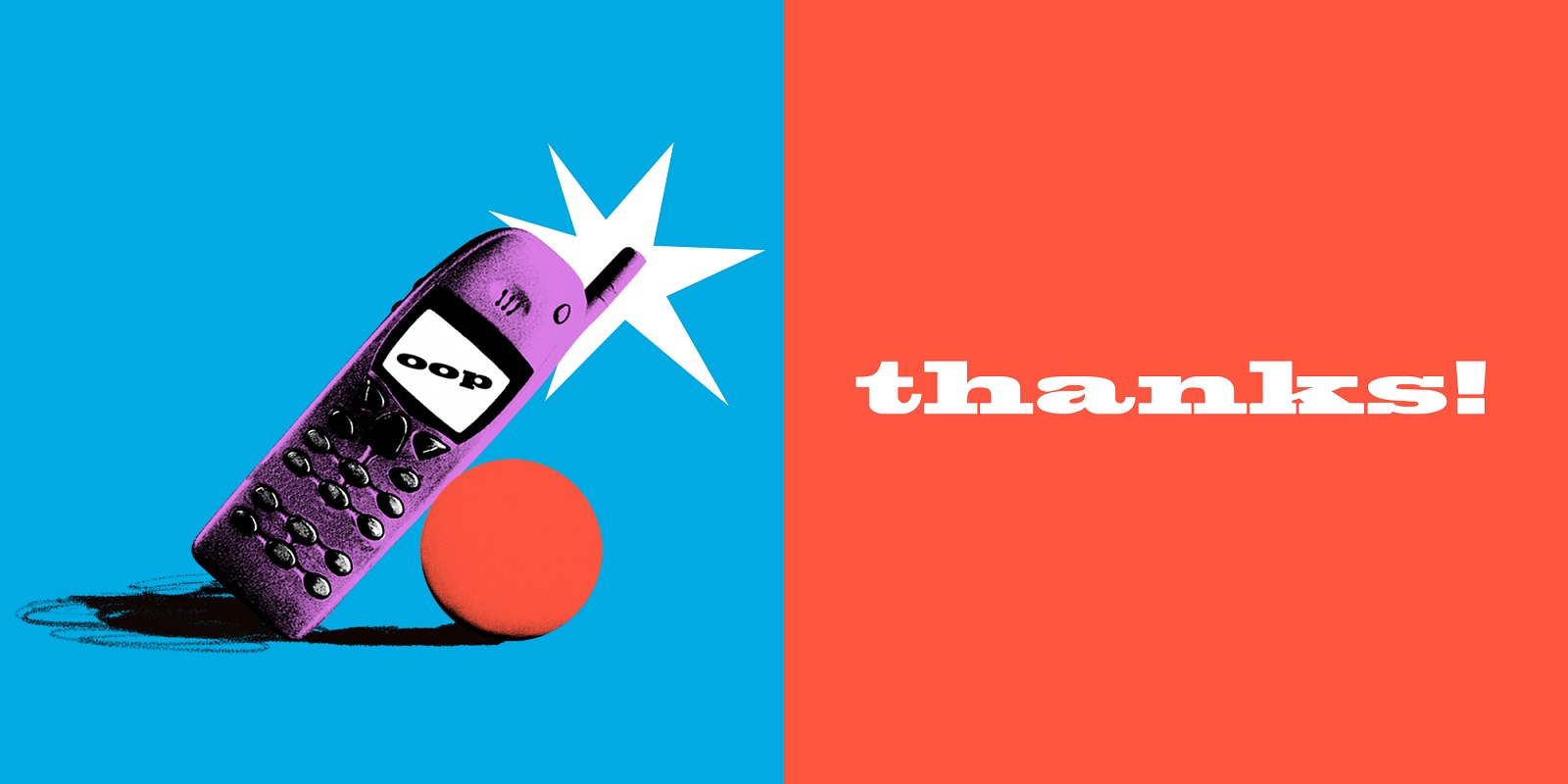
In addition, the design approach to making app user interface design work shoulder to shoulder was also thought out.
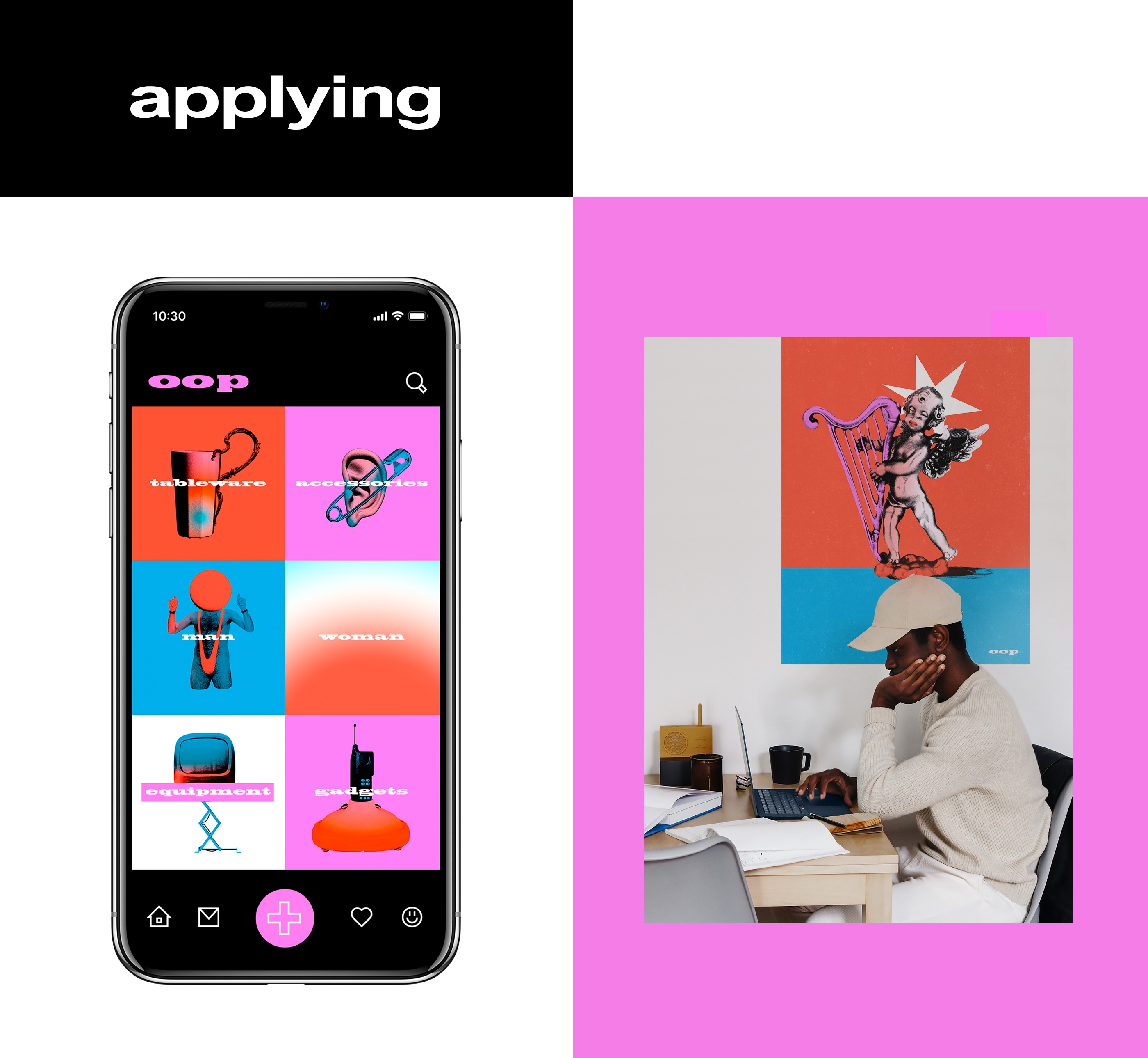
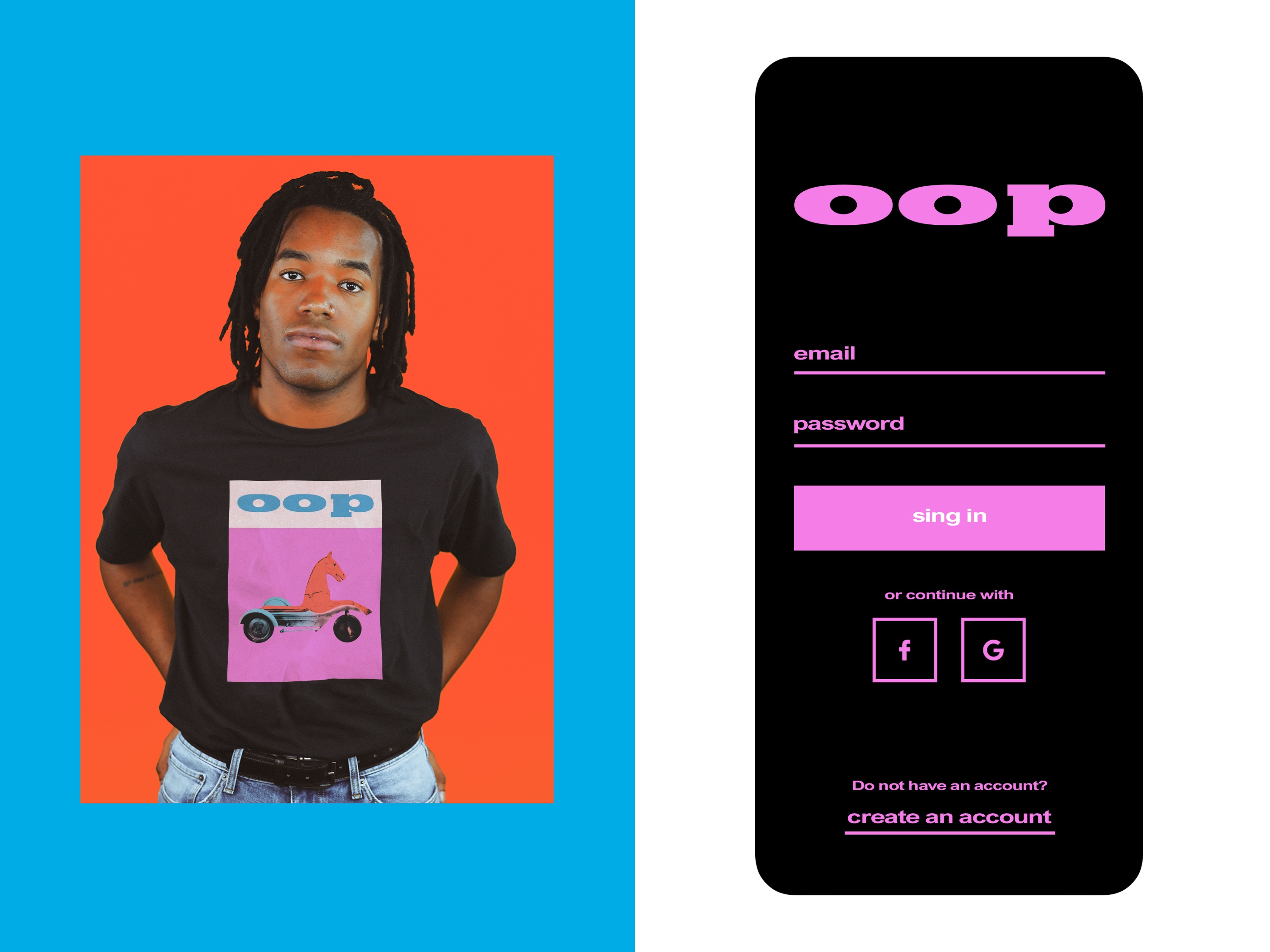
This project, for sure, was a great chance to open the way to artistic experiments and let the creative energy fly high, which resulted in the cool, practical, and original brand identity being easy to use and adjust for a diversity of business goals.
New design case studies from our team are coming soon. Stay tuned!
More Design Case Studies
Here’s a set of more case studies sharing the design solutions and approaches for some of the design projects done by the Tubik team.
Carricare. Identity and UX Design for Safe Delivery Service
Otozen. Mobile App Design for Safe Driving
Uni. Landing Page Design for Fintech Service
Uplyfe. Identity Design for Health App
Real Bitcoin. Creating Website Illustrations
Devpost. Hero Illustrations for Hackathons Platform
Vinaty. Website Illustrations for Wine Service
Bennett. Identity and Website Design for Tea Brand
Pass-On. Landing Page Design for Delivery App


