You know the feeling. That late-November rush when your inbox is a battlefield of ALL CAPS emails screaming “50% OFF” and websites start looking like digital boxing rings. That’s the chaos we were asked to design for—and we said yes. Not to add to the noise, but to make ours look cooler.
This is the story of how we crafted a punchy, flexible, and slightly unhinged graphic design system for a full-scale Black Friday campaign promoting massive discounts on clothes and accessories. Think posters, landing pages, stickers, and everything in between. Design that works online, offline, and somewhere in your brain where “shopping” triggers dopamine.
The Brief
The goal was a consistent yet playful visual identity that could stretch across formats—from web design and illustration to promo printouts and social media. Instead of designing a homepage banner, we were building an entire visual system that could shout “SALE!” in a hundred different ways without losing its voice.
The project was led by our illustrator, Maryna Solomennykova, with art direction by Sergii Valiukh. And it had one golden rule: nothing boring.
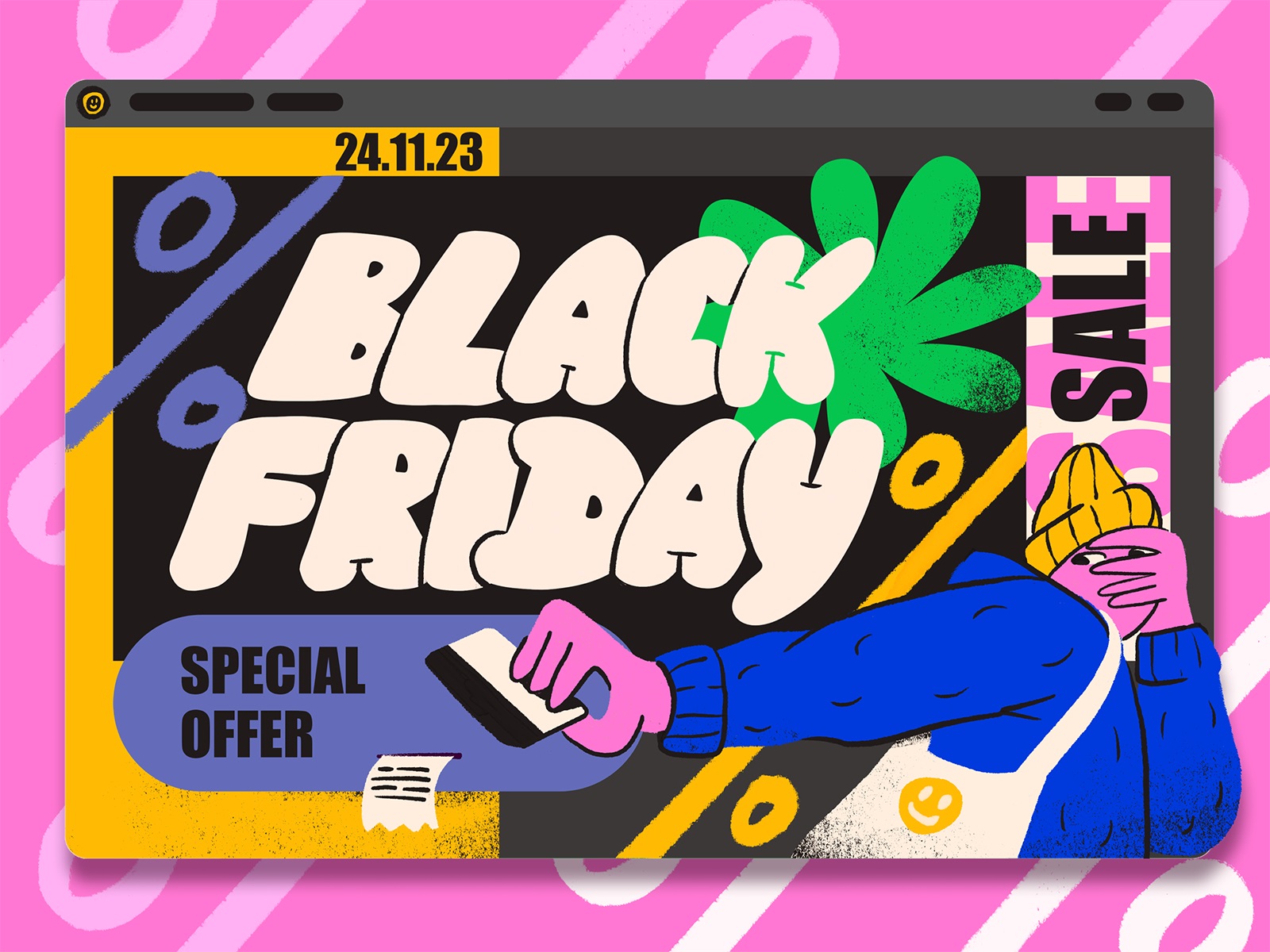
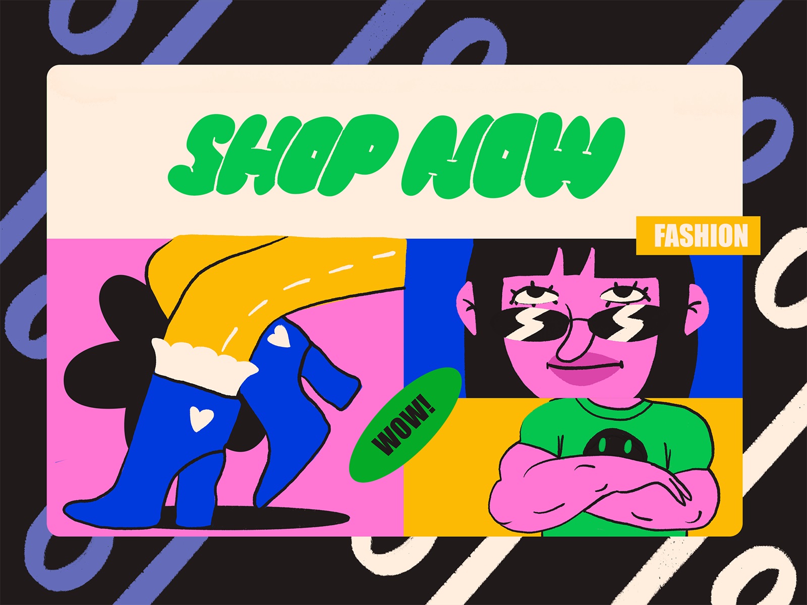
Hero image for the website or landing page
The Style: Cartoons, Chaos, and Color
We leaned into a bright, expressive illustration style with intentionally rough lines and a youthful, slightly rebellious energy. Why? Because we weren’t talking to minimalist tech bros or luxury skincare moms. This campaign was for the TikTok generation—the kind that can spot a template from a mile away and will scroll past anything that feels too polished.
So we gave them texture. Imperfections. Bold color combinations that should clash, but somehow don’t. Think vibrant purples crashing into neon yellows, layered with funny little creatures trying on sunglasses or shoes. We wanted personality. We wanted chaos. We wanted relatable shopping anxiety—but make it cute.
Illustrative banner design giving visual connection to the fashion theme
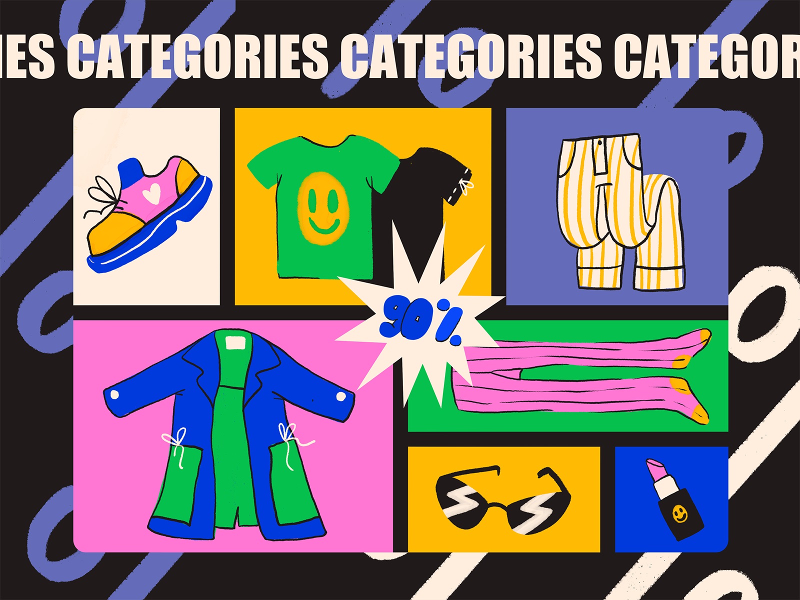
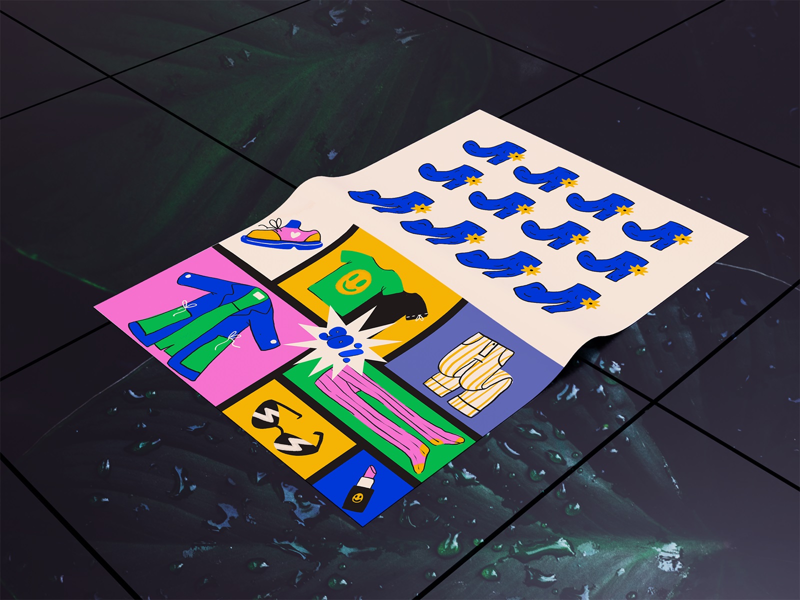
Original pack of graphics illustrating categories of items on sale
Typography: Puffy Letters and Punchy Sans Serifs
Let’s talk fonts—because nothing screams “this is for fun people” louder than oversized, cartoonish bubble letters paired with thick, confident sans-serif caps. The contrast makes it playful without going full comic strip. And visually, it helped frame the messaging in a way that was both scroll-stopping and easy to read at speed (or panic).
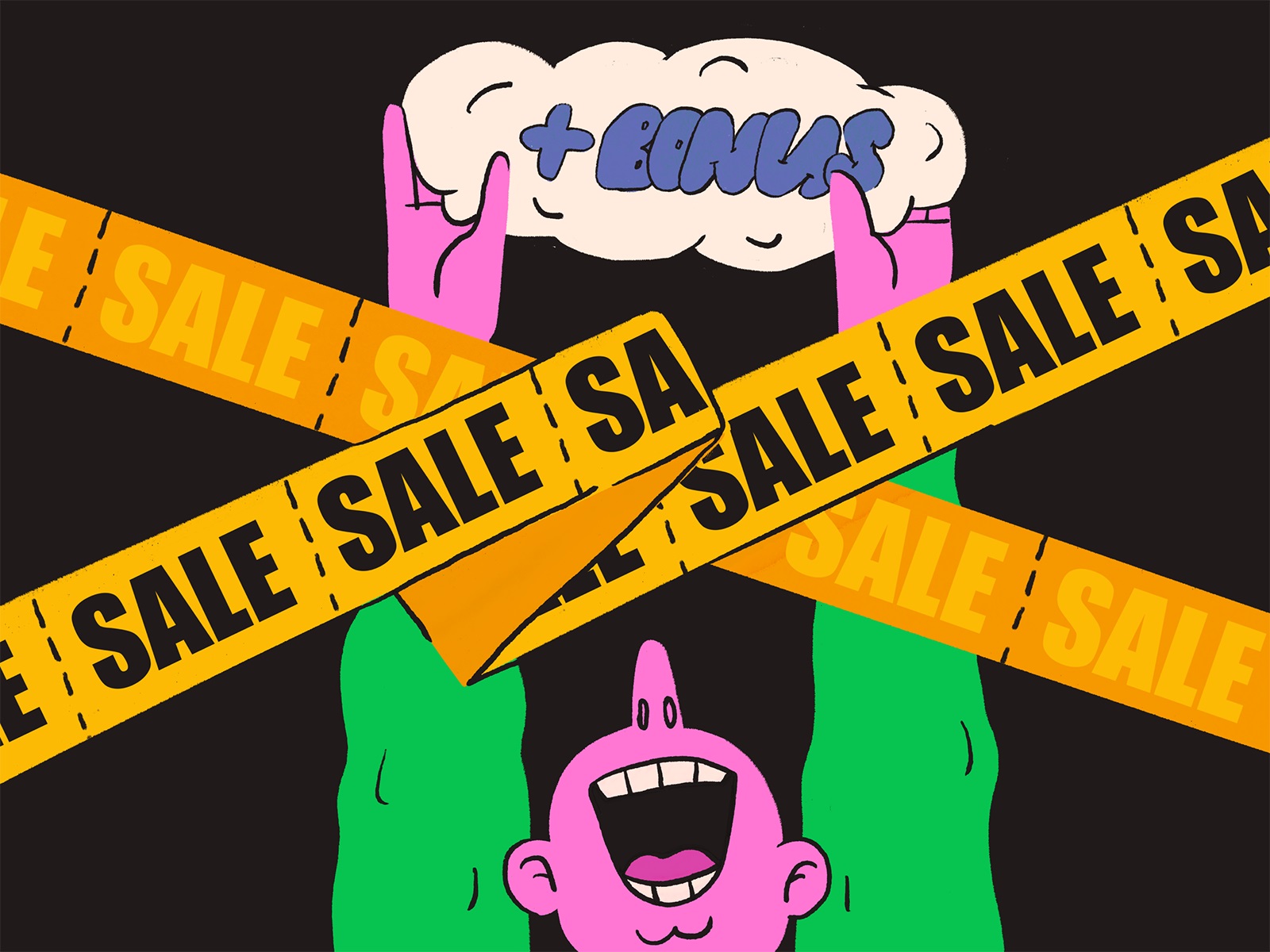
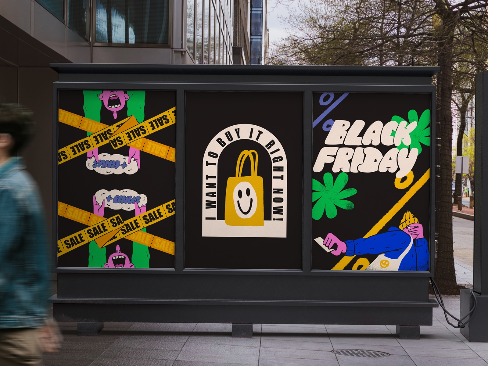
Advertising banner announcing sales and bonuses
Visual Assets: Designed to Multiply
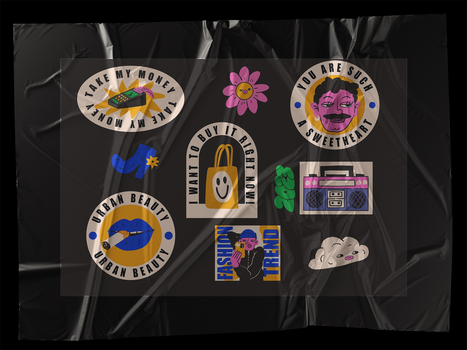
From the start, we designed a modular illustration system—characters, icons, patterns, backgrounds—that could live comfortably on landing pages, mobile screens, printed posters, or even tiny stickers. The whole thing was built to stretch, adapt, and still look good after the 17th crop.
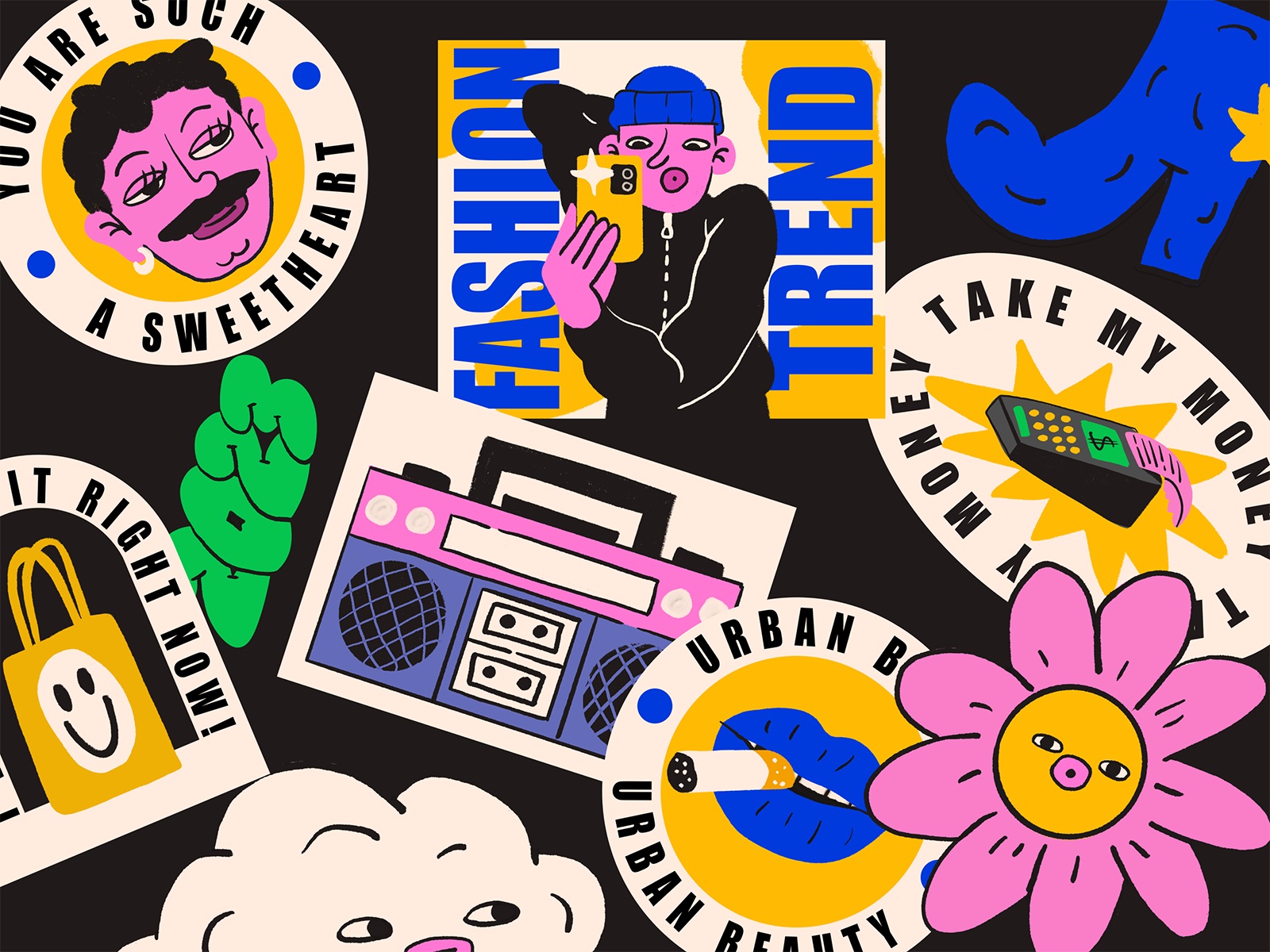
Need a sticker for a box? Done. A billboard in a mall? Still works. A set of highlight covers on Instagram? Got you.
Here’s a peek at how it came to life across web and print:
What’s Next?
This was one of those projects that reminded us why we love branding for marketing campaigns: high energy, short timelines, and a real chance to get weird (strategically weird, but still). New case studies are always brewing in our Figma tabs—so keep an eye on our blog if you’re into colorful chaos and smart design.
Recommended Reading
Curious how we handle other visual identity projects and creative marketing campaigns? Check out these case studies:
Sidra Vivo. Vibrant Packaging Design for Cider Brand
Aqua Dudes. Cartoonish Packaging Design for Fish Food Brand
Herteas. Packaging Design for Herbal Tea Brand
Nutribite. Tasty Packaging Design for Granola Bars
Milkimu. Packaging and Marketing Design for Dairy Brand
Dance Festival. Creating a Set of Event Poster Designs
Soaplanet. Soap Brand Packaging Design with Travel Spirit
Joosi. Packaging Design and Marketing Graphics for Juice Brand
Pizzatta. Artistic Pizza Packaging Design
Page Turner. Identity and Packaging Design for Bookstore Chain
Garden Gates. Identity and Packaging Design for Garden Center
8 Bright Packaging Design Projects Employing Illustration Art