Somewhere between the algorithmic doomscroll and your 12th open Figma file, you remember: books are patient. They don’t buzz. They wait. And designing for a bookstore, especially a chain with enough scale to need packaging SKUs, means designing for something slower, quieter, and probably more durable than most SaaS startups.
That was the brief—unspoken, but deeply felt—behind Page Turner, a visual identity and packaging system for a modern bookstore chain that knows its audience still dog-ears pages. The project was led by graphic designers Arthur Avakyan and Yaroslava Yatsuba, with art direction by Sergii Valiukh.
We weren’t trying to reinvent the alphabet. The goal was to give form to that warm, inexplicable feeling you get when you walk into a bookstore “for just one thing” and leave with six.
Logo & Color Palette
Designing a logo for a bookstore is a bit like writing the first line of a novel—you don’t want to give it all away, but it has to pull you in, immediately and with style. The Page Turner logo echoes the silhouette of an open book—no metaphors needed, it’s right there in the shape. The wordmark follows suit: bold, geometric typography with subtle callbacks to the book form.
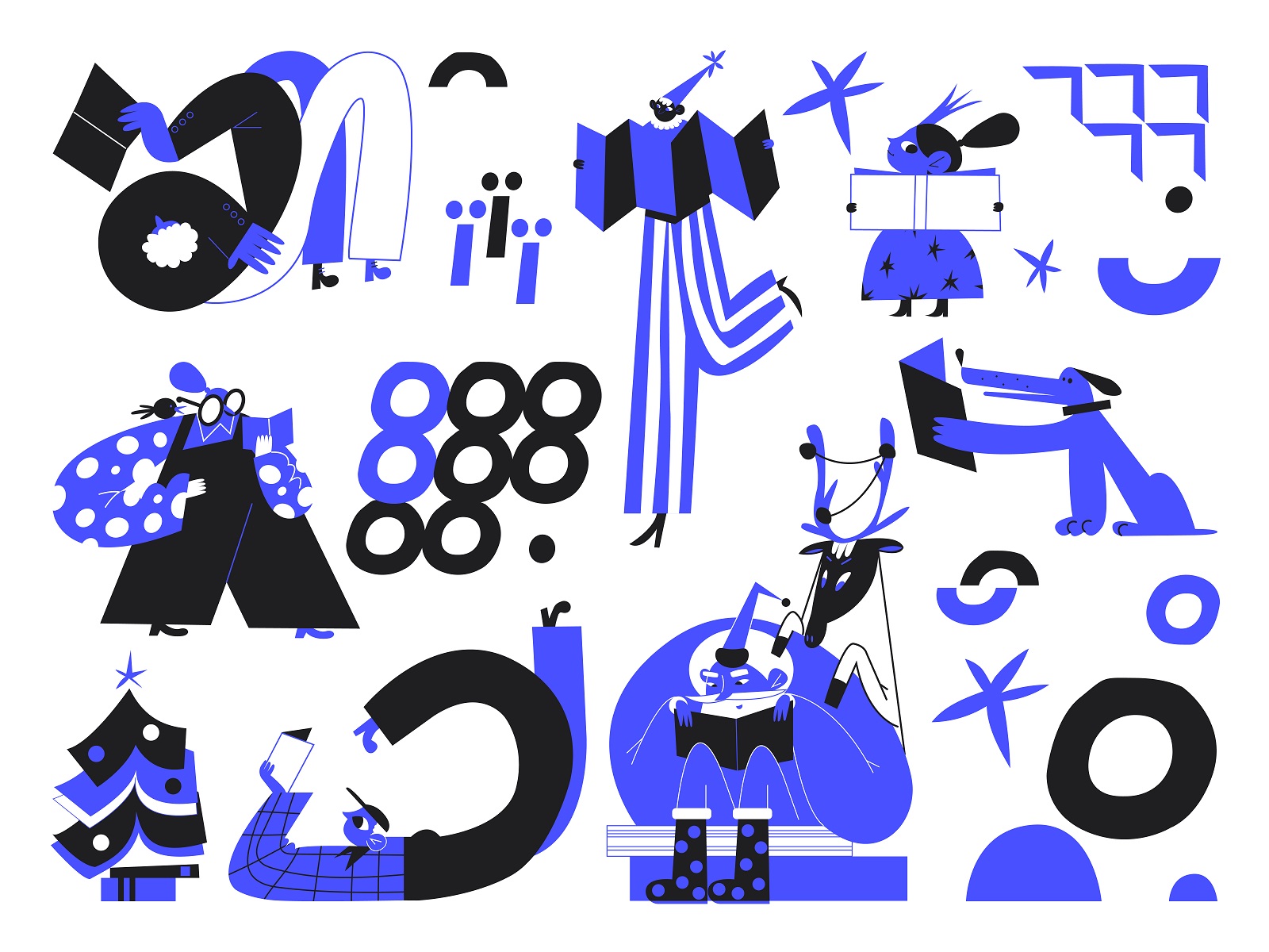
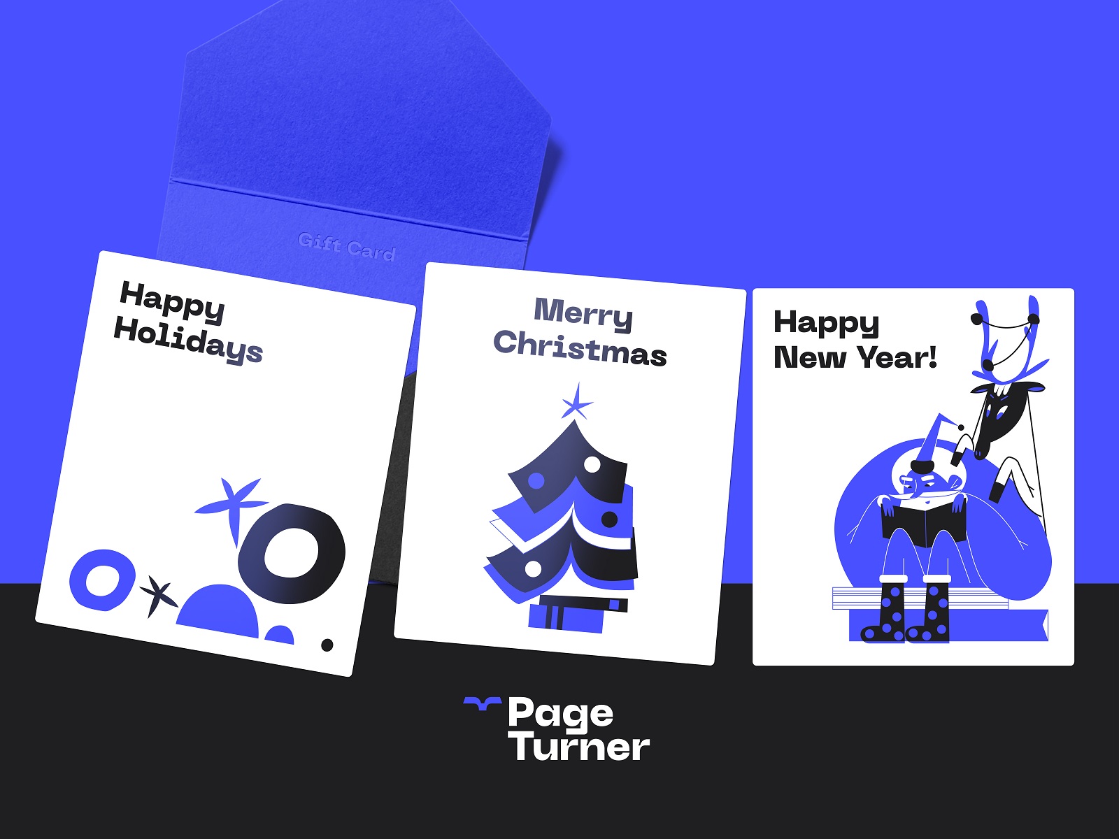
The palette is monochrome with a twist: black, white, and one electric, unforgettable blue. Blue for trust. Blue for thought. Blue for the sticker you’ll keep on your laptop long after you forget where you bought that Murakami. It’s a deliberate limitation that makes everything else punch harder—a lesson more visual identities should learn.
![]()
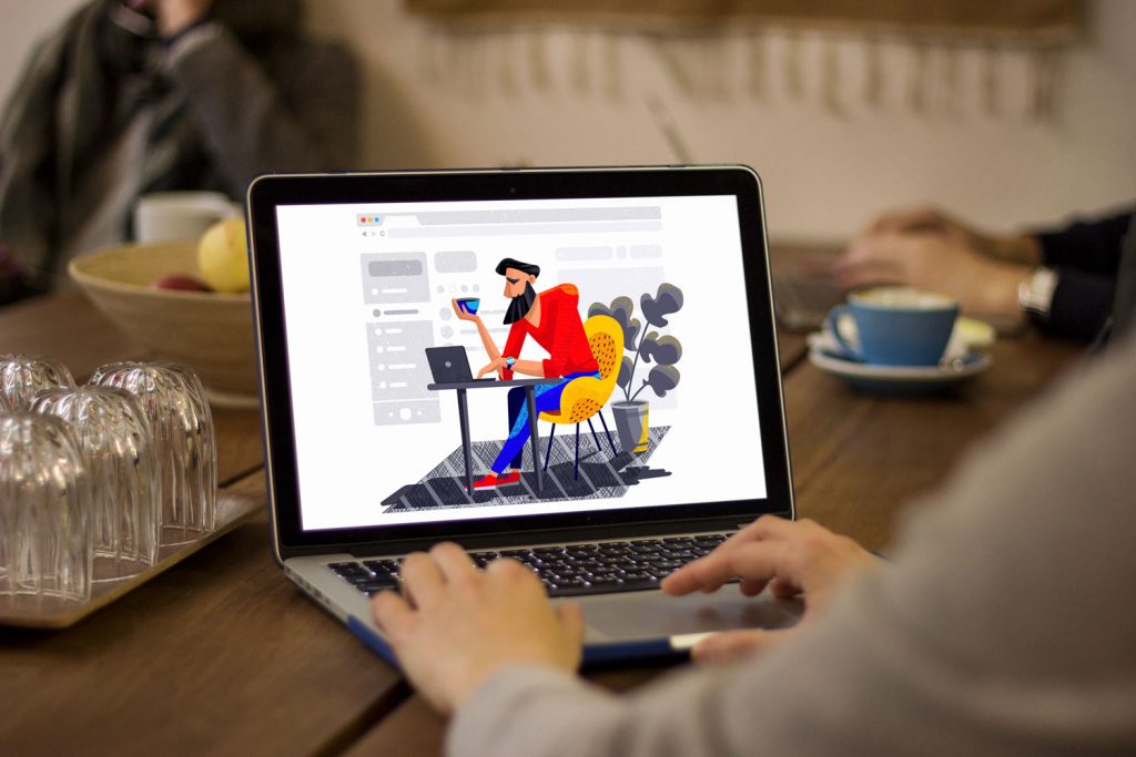
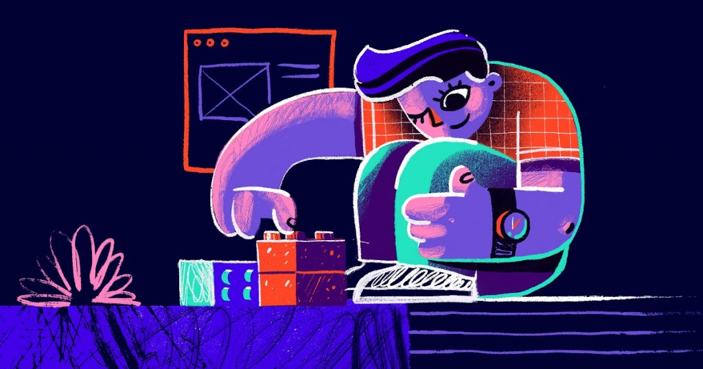
Illustration Style
The illustration system avoids the squeaky-clean vector aesthetic you’ve seen on 10,000 fintech landing pages. Instead, it’s alive with linework. Loose, textured, slightly chaotic—like the doodles in the margins of a well-loved novel.
The scenes are delightfully human: people curled in chairs, sprawled on the floor, squinting at pages. These aren’t stock-reading poses. They’re real ones, the kind of postures every reader knows. The style dances between sketch and fill, giving you just enough structure without pinning anything down too tightly.
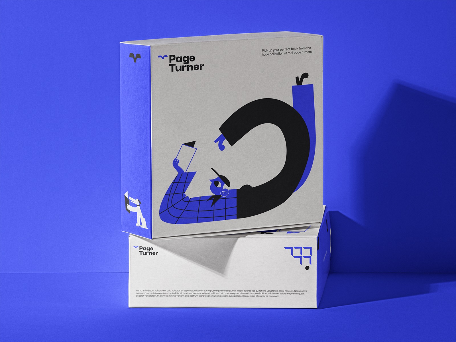
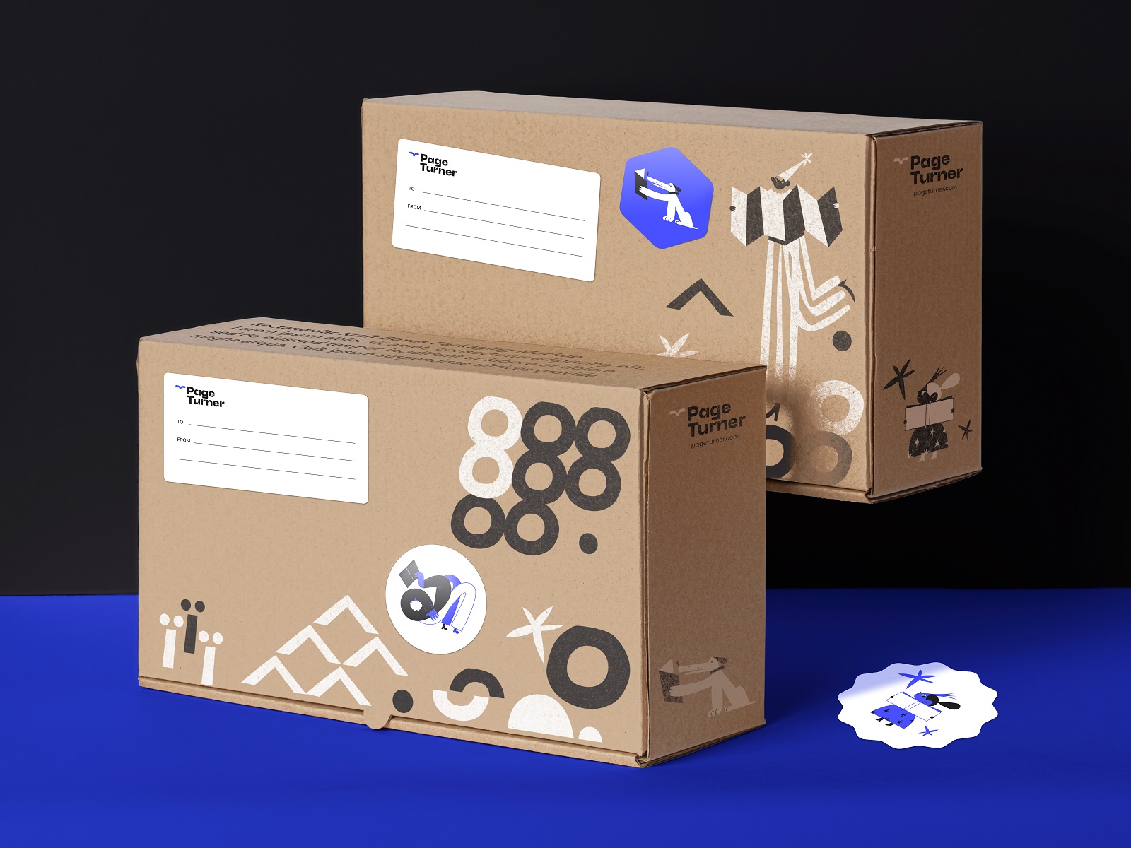
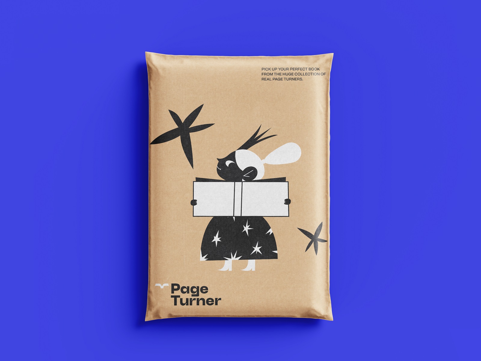
Packaging System
Let’s talk logistics—yes, logistics. Because designing packaging for a bookstore means accepting the reality that sometimes it’s a single paperback, and sometimes it’s a hardback haul someone will explain to their partner later. (“It was a sale.” Sure.)
So the system had to flex. The design team created boxes and envelopes in multiple sizes, optimized for different book quantities—light enough for handling, sturdy enough for transit, pretty enough to be gifted without extra wrapping.
Some were printed in full brand colors; others leaned into a tactile, nostalgic vibe with brown kraft paper and minimalist stamps. Think: indie-press sensibility meets scalable logistics.
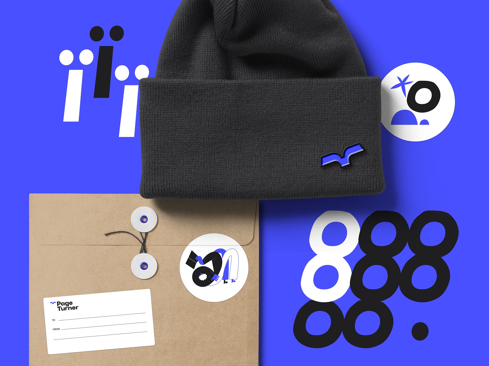
Merch Design
If a brand doesn’t exist on a sticker, did it really launch?
To round out the identity system—and give the brand touchpoints that live beyond the store—the team designed merch: illustrated bookmarks, witty seasonal gift cards, enamel pins, and badges that quietly say “yes, I alphabetize my shelves.”
These pieces do more than promote. They extend the visual language, giving readers artifacts to collect, share, or slip into a borrowed book like a calling card.
Final Thoughts: Designing for What Lingers
Page Turner isn’t trying to make books cool again. It assumes they never stopped being cool. The identity system reflects that quiet confidence—never shouting, but always recognizable.
It’s branding that doesn’t expire with the trend cycle. Design that holds up on a box, a badge, or the corner of a browser tab. A system built to respect the stories it wraps.
And maybe, like a good book, you’ll come back to it.
Recommended Reading
Still curious? Explore more case studies from the Tubik team:
Garden Gates. Identity and Packaging Design for Garden Center
BlockStock. Brand Identity and Website for Minecraft Models Resource
SwitLuv. Theme Packaging Design About Love for Sweets Brand
Fulfill. Illustrations and Web Design for 3PLs Marketplace
Roebuck. Mobile Design and Illustrations for Educational App
Bikker. Identity Design and Illustrations for Biking Service
Kaiten. Identity and Product Design for Food Marketplace
Glup. Delivery App Branding and UX Design
BEGG. Brand Packaging and Web Design for Food Product Ecommerce
Crezco. Brand Identity and UI/UX Design for Fintech Service
FarmSense. Identity and Web Design for Agricultural Technology