“Life is like riding a bicycle. In order to keep your balance, you must keep moving,” Albert Einstein once said, philosophically comparing life to cycling, one of the sports and outdoor activities that has been popular all over the world for many good decades. The graphic design project we want to uncover in this brief case study is also inspired by the amazing and refreshing power of riding a bike: welcome to take a glance at the identity design concept and a set of elegant illustrations we created for the service aimed at improving the biking experience and performance.
The project was accomplished by tubik designers Arthur Avakyan and Ladamira Kunitsa, with art direction by Sergii Valiukh.
The design process for the project included three creative tasks:
- logo design and brand color palette
- motion design: logo animation and promo animation concept
- illustration set for marketing graphics
In this brand identity design concept, the team strived to combine dynamics and openness, making it solid and vibrant simultaneously to transfer the essence and nature of cycling, the activity combining balance and motion. So, the color choice fell upon the contrastive combination of deep dark Coarse Wool color with a set of earthy pastel colors, energetic but not overwhelming, refreshing and poised.
The logo presents the combination mark, the parts of which can effectively work either together or separately, depending on the marketing task and promotional material. The typographic part is bold and dynamic, the symbol echoes the shape of a bike, and the bike frame overlaps the form of the letter k in the typographic part of the logo, this way making them perceived like one integral sign.
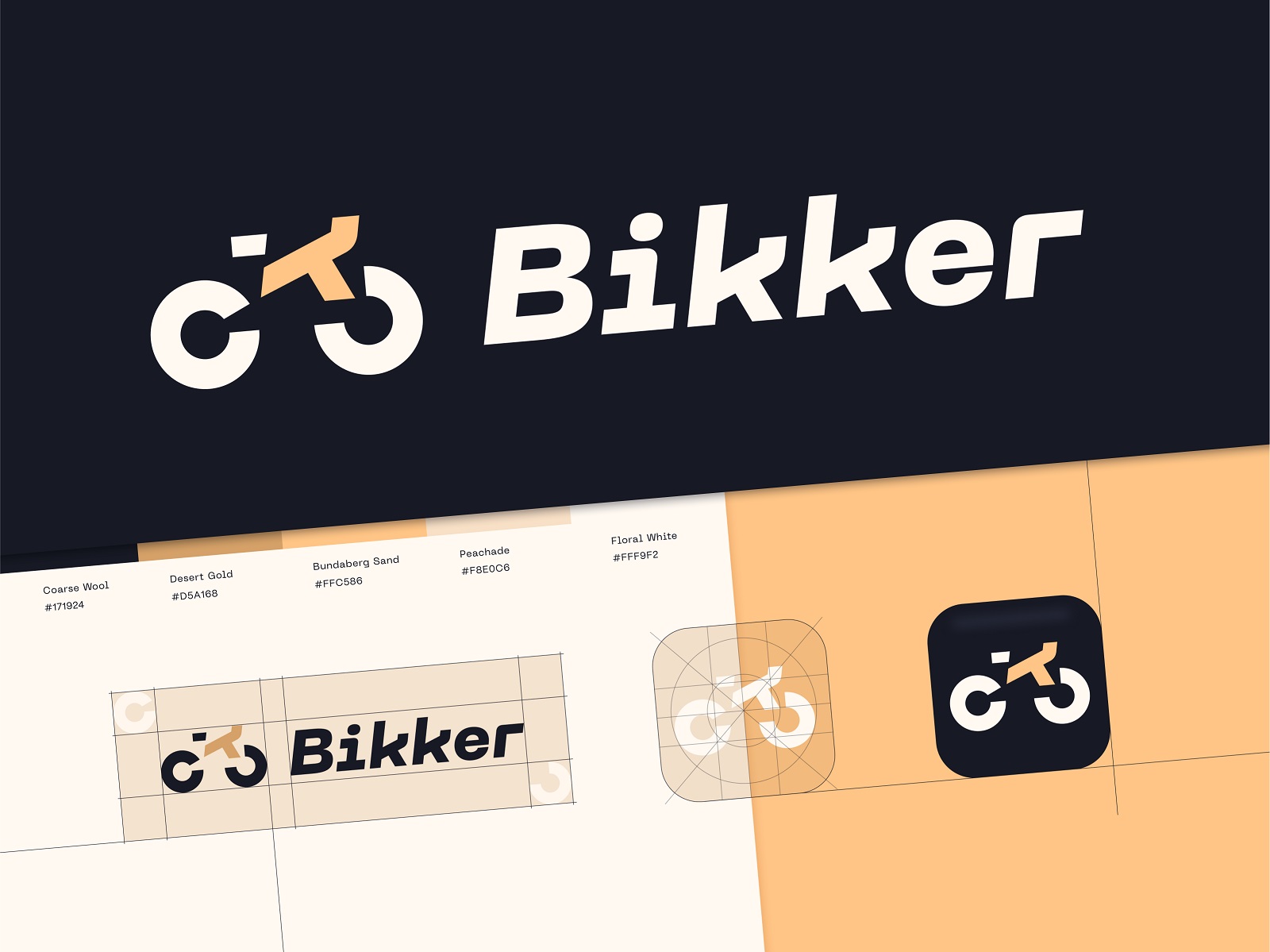
The next step was breathing life into the logo with the motion to make the animated version that could be used for various branding goals, for example, as a loading animation for the splash screen of the application, website, or landing page, as a part of the animated promo video, and the like. The lively and playful logo animation amplified the visual connection between the symbol and the works connecting them via the kk-letterform.
And here’s a look at the piece of 3D animation, extending the idea of how the style could be applied to merch and promotional videos.
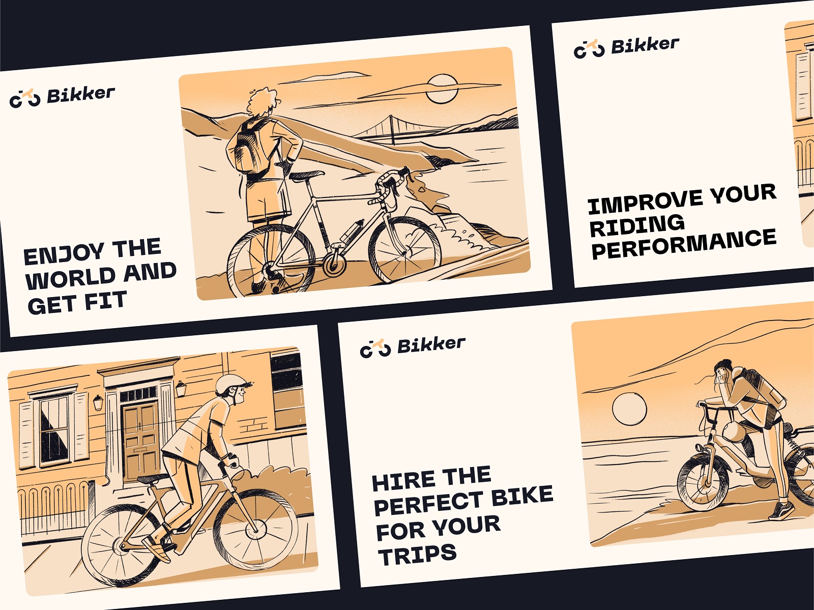
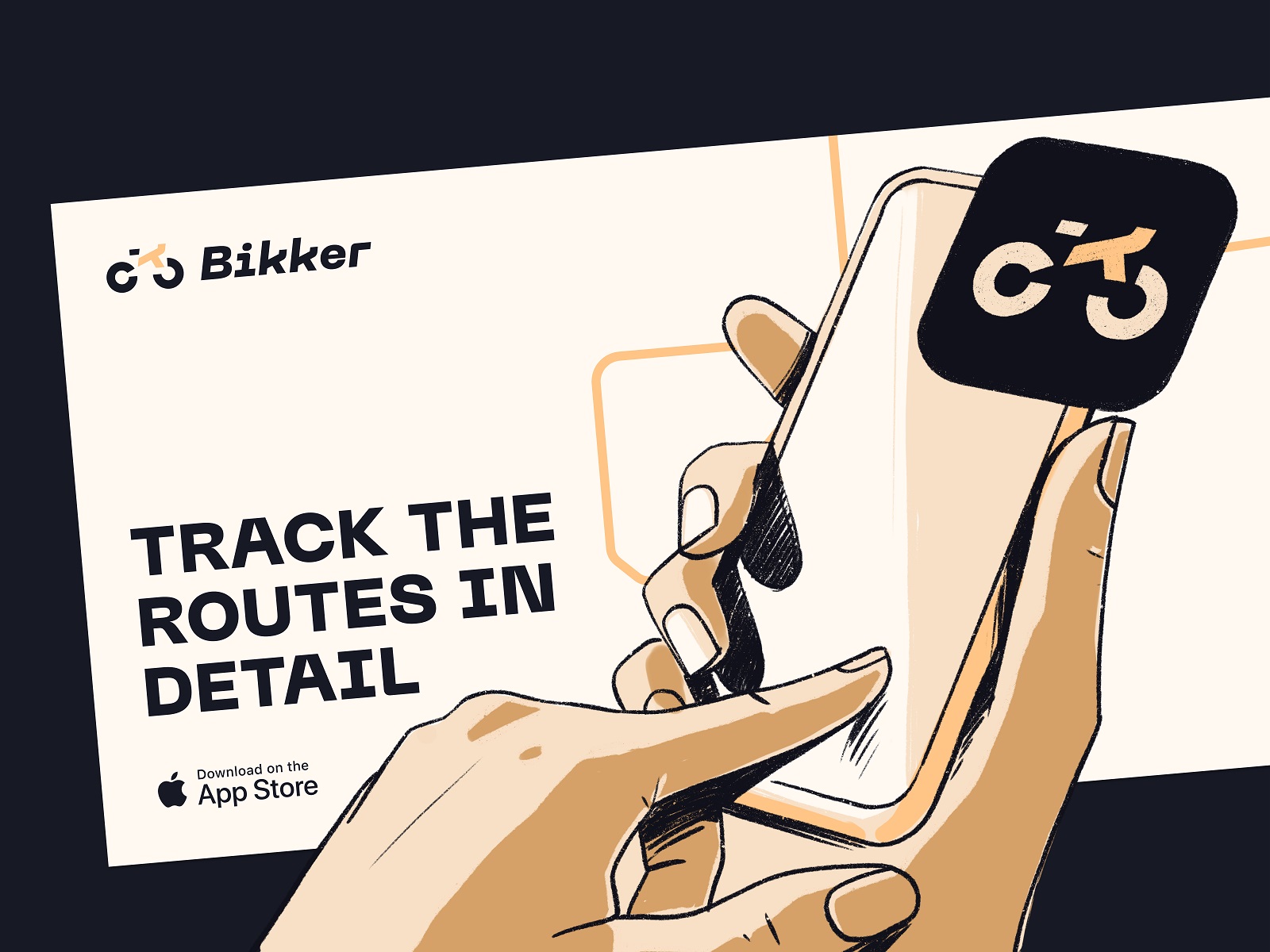
Another task for the project was creating a set of illustrations that captured the diversity of biker characters which could be used for various online or offline materials letting customers learn about the service and engaging to use it, such as posters, banners, cards, landing pages, and the like. The visual sketch-like style is artistic and dynamic, using the same limited color palette and elegant lines to create the atmosphere.
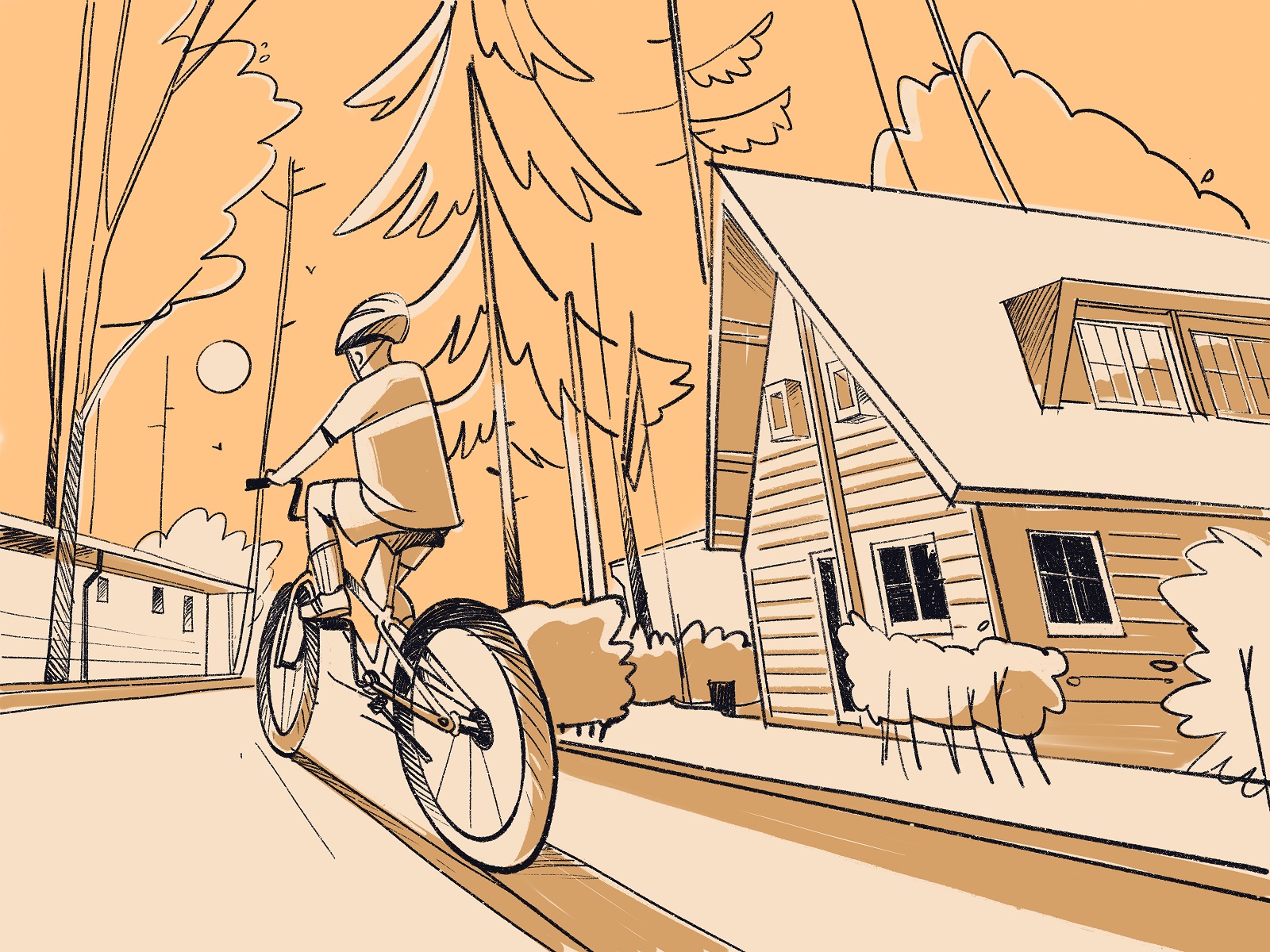
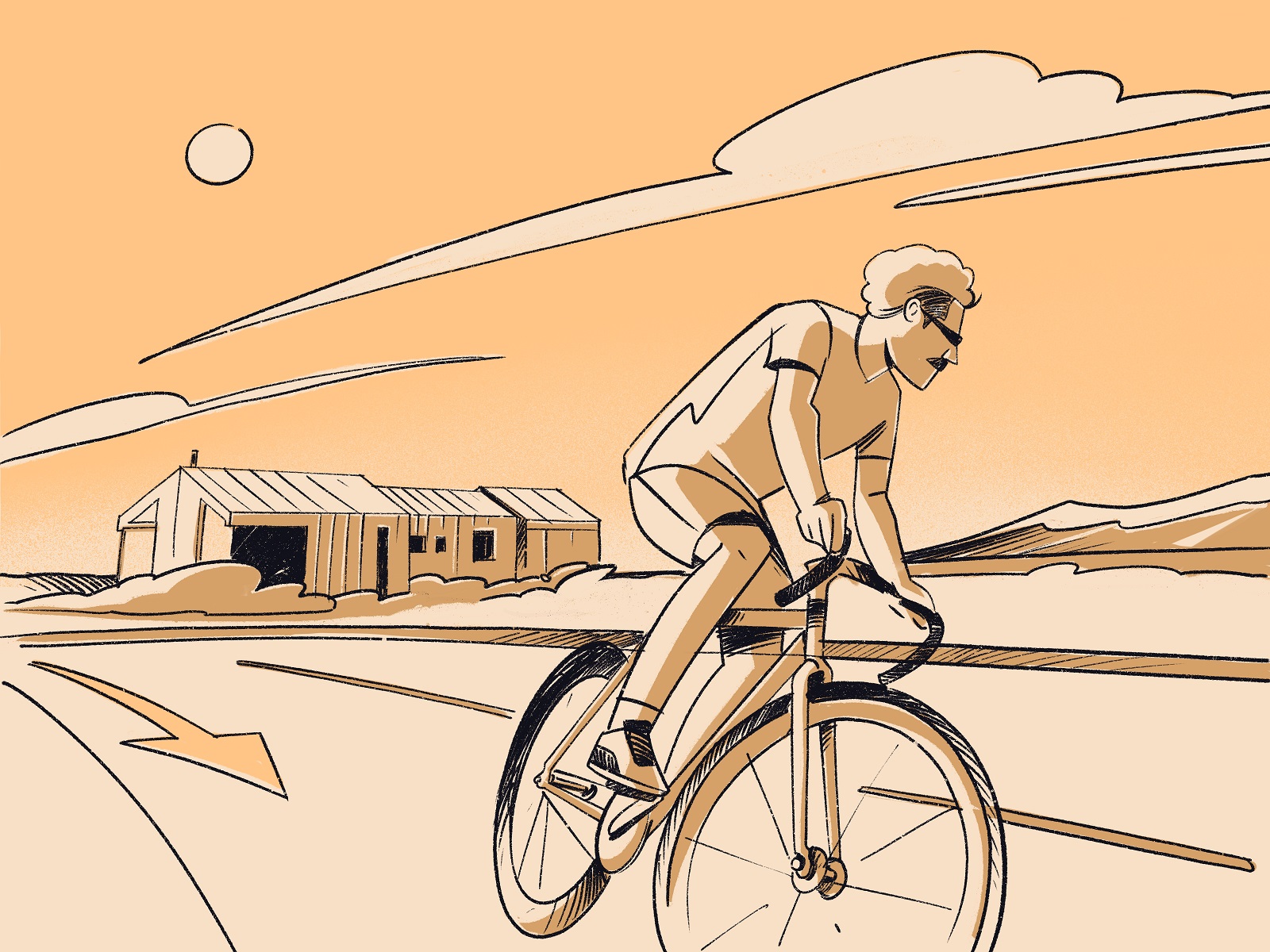
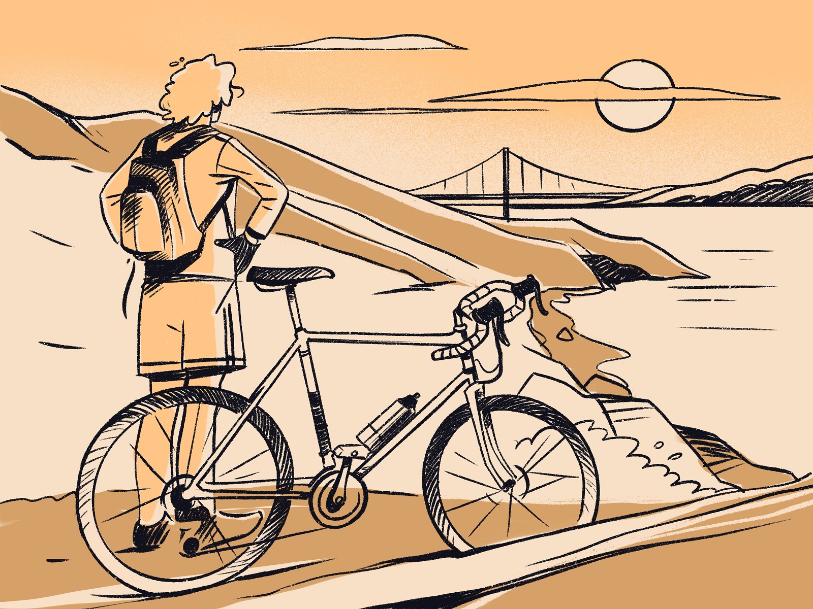
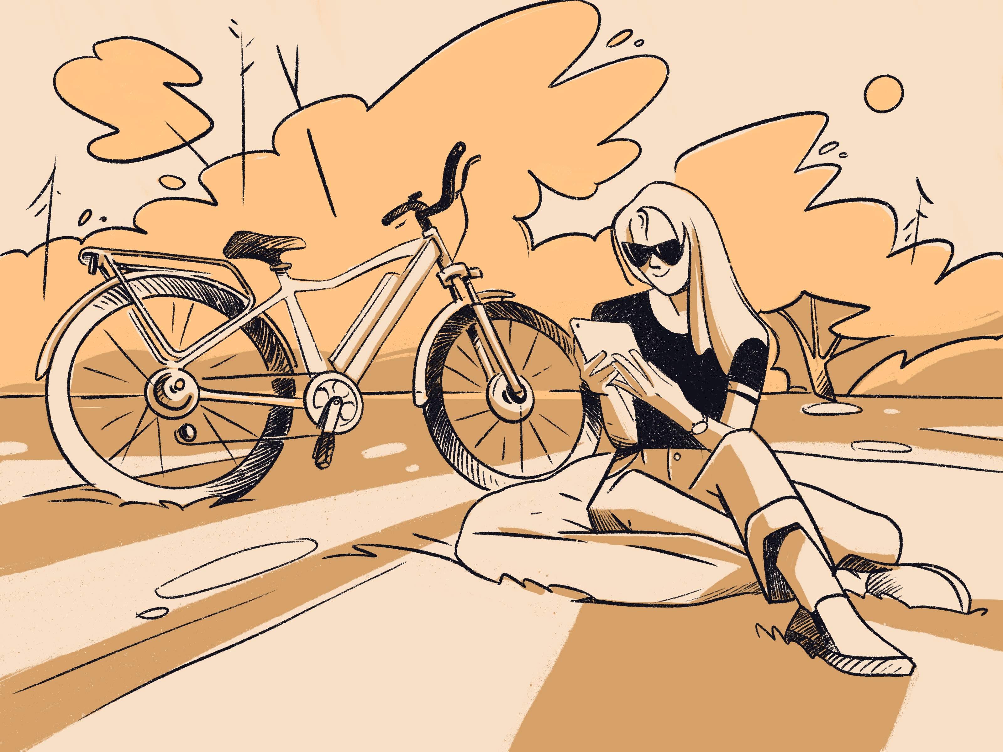
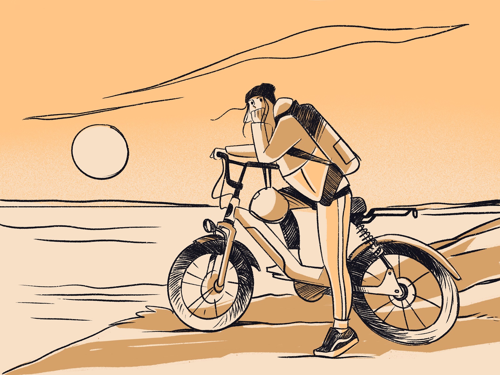
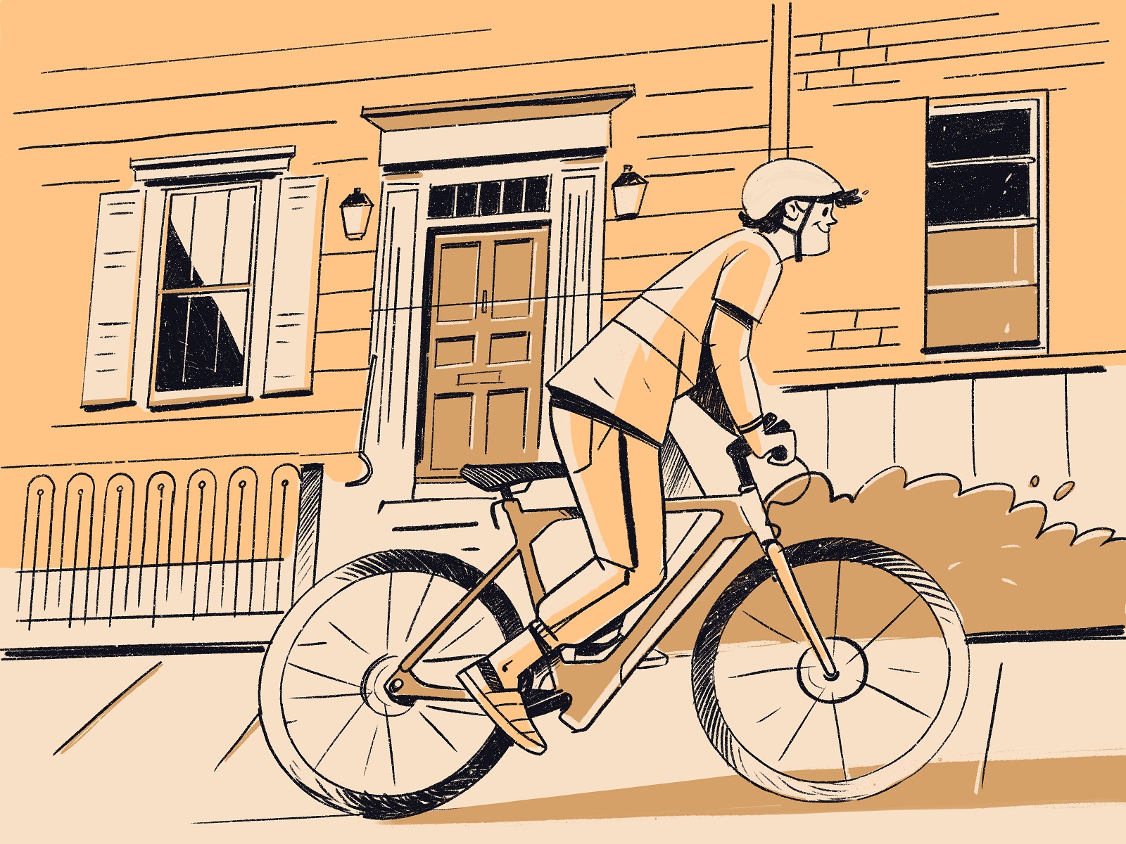
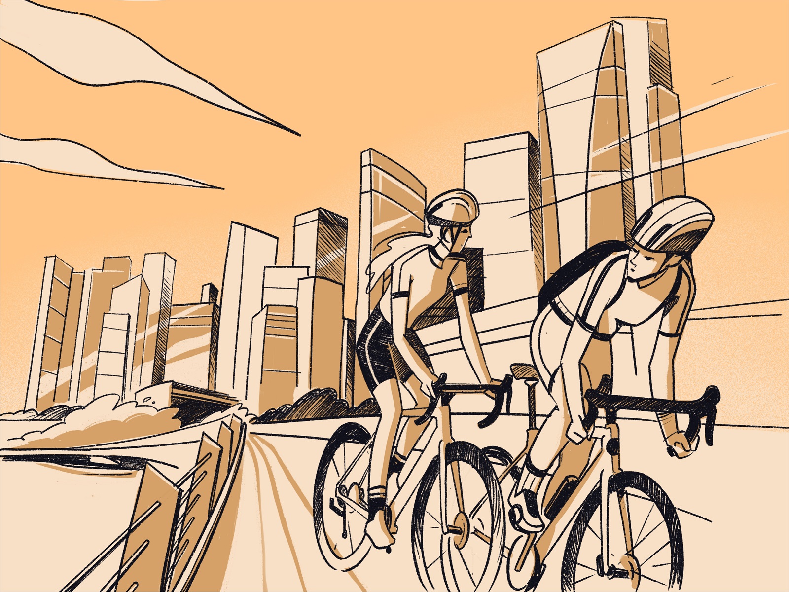
And here’s a look at testing the illustration style applied to advertising posters and banners, which could be used both in printed versions and in social media or web marketing.
New design case studies from our team are coming soon. Stay tuned!
More Design Case Studies
Here’s a set of more case studies sharing the design solutions and approaches for some of the design projects done by the Tubik team.
CSConnect. Website Design for Immersive Experience Marketing Platform
Fulfill. Illustrations and Web Design for 3PLs Marketplace
Roebuck. Mobile Design and Illustrations for Educational App
World Humanitarian Day. Illustrations and Video for United Nations
Kaiten. Identity and Product Design for Food Marketplace
Glup. Delivery App Branding and UX Design
Komuso. Website Design for Wellness Tool
PointZero25. Identity and Website Design for Event Agency
Nonconventional Show. Website Design for Podcast
uMake. Branding and Website for 3D Design Tool
BEGG. Brand Packaging and Web Design for Food Product Ecommerce
Crezco. Brand Identity and UI/UX Design for Fintech Service
FarmSense. Identity and Web Design for Agricultural Technology


