With constantly growing and diversifying competition both offline and online, these days, businesses have to be even more inventive and ingenious than before to let their customers notice their offers and engage in buying. So, together with different marketing techniques, new trailblazing technologies and tools help significantly in this way. In our new case study, we will give you a glance at our collaboration with one of them: welcome to check the creative story of website design for CSConnect, the service of immersive visual experiences for marketing.
Project and Client
CSConnect is the SaaS mobile marketing solution for consumer brands. It presents the immersive experience marketing platform allowing its clients to create and launch augmented reality and shoppertainment campaigns with zero coding. This way, it helps diverse consumer brands adapt to the conditions of e-commerce, with its inability to cover live contact with a product as it can be done at the point of sails, so brands can communicate with their customers more convincingly and engagingly, presenting their products.
The clients approached the tubik team with the request to create an attractive, informative, engaging, and converting website that would help to uncover the benefits of the service efficiently and emotionally. The creative team from the tubik side included Anastasia Zhyltzova, Vladyslav Taran, Yaroslava Yatsuba, Andriy Drobovych, Natalka Mamchur, and Ira Shaposhnik.
Web Design
Having discussed the client’s vision and preferences and having done extensive research and analysis of the market and the target audience, the team has come to a set of general basic points to be applied to the CSConnect website:
- variable font styles to create a clear and solid typography hierarchy
- strong, recognizable branding that will stand out from the competition
- colors distinguishing the website and brand from the competitors
- clear demonstration of product features
- illustrations and graphics, allowing the brand to create and highlight its own individual style
- web animation that is not widely used in this market segment and would become one more way to impress visitors and support brand recognizability
- intuitive and straightforward navigation and interaction that would be effortless for visitors of different tech-literacy level
- clean, airy, and uncluttered layout with instantly noticeable CTA elements to support effective conversion
Traditionally, among the most influential decisions to make about the website or app design is the choice of colors and fonts that would both support functionality and set the mood and impression the brand strives to transfer about itself.
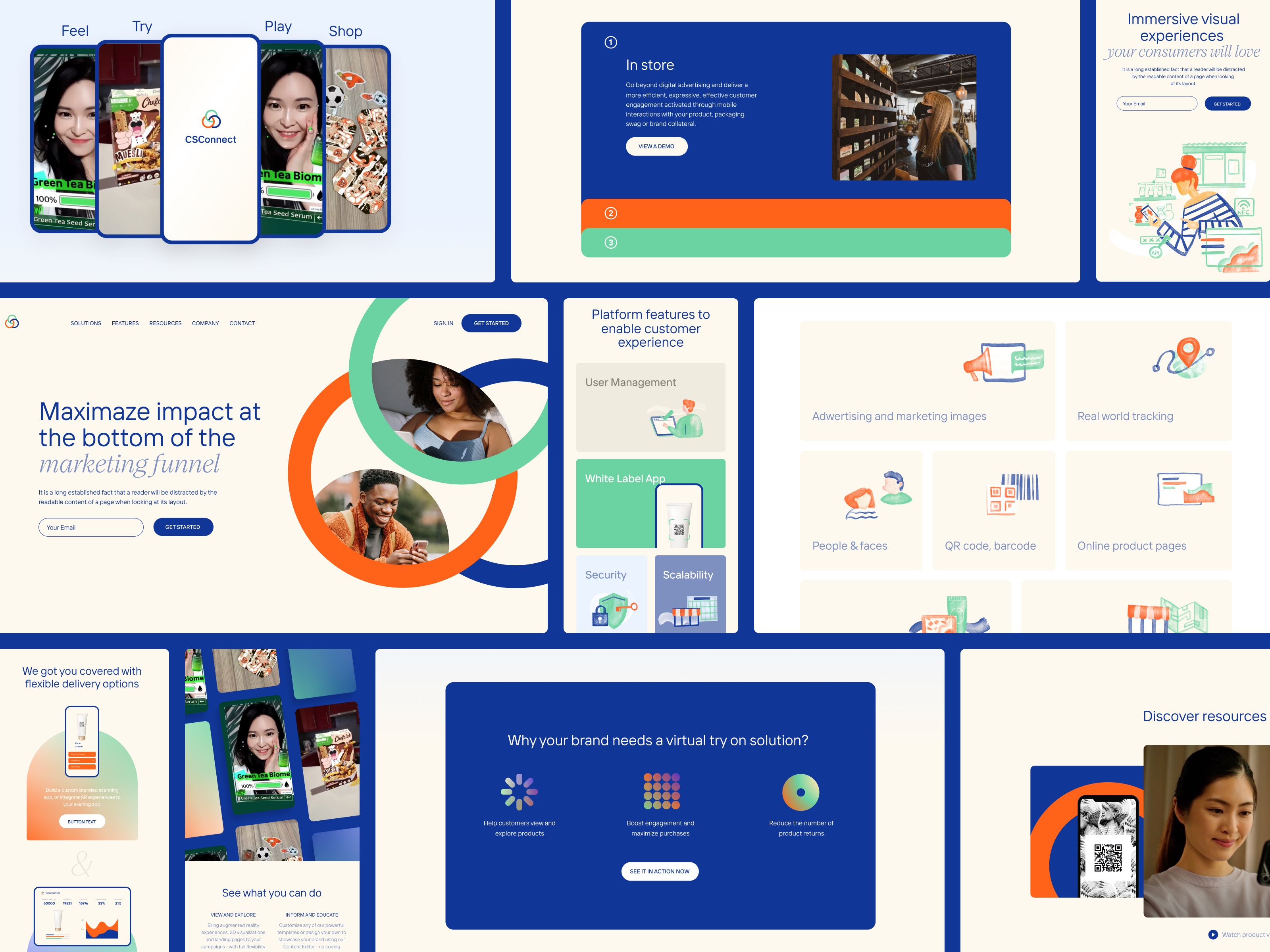
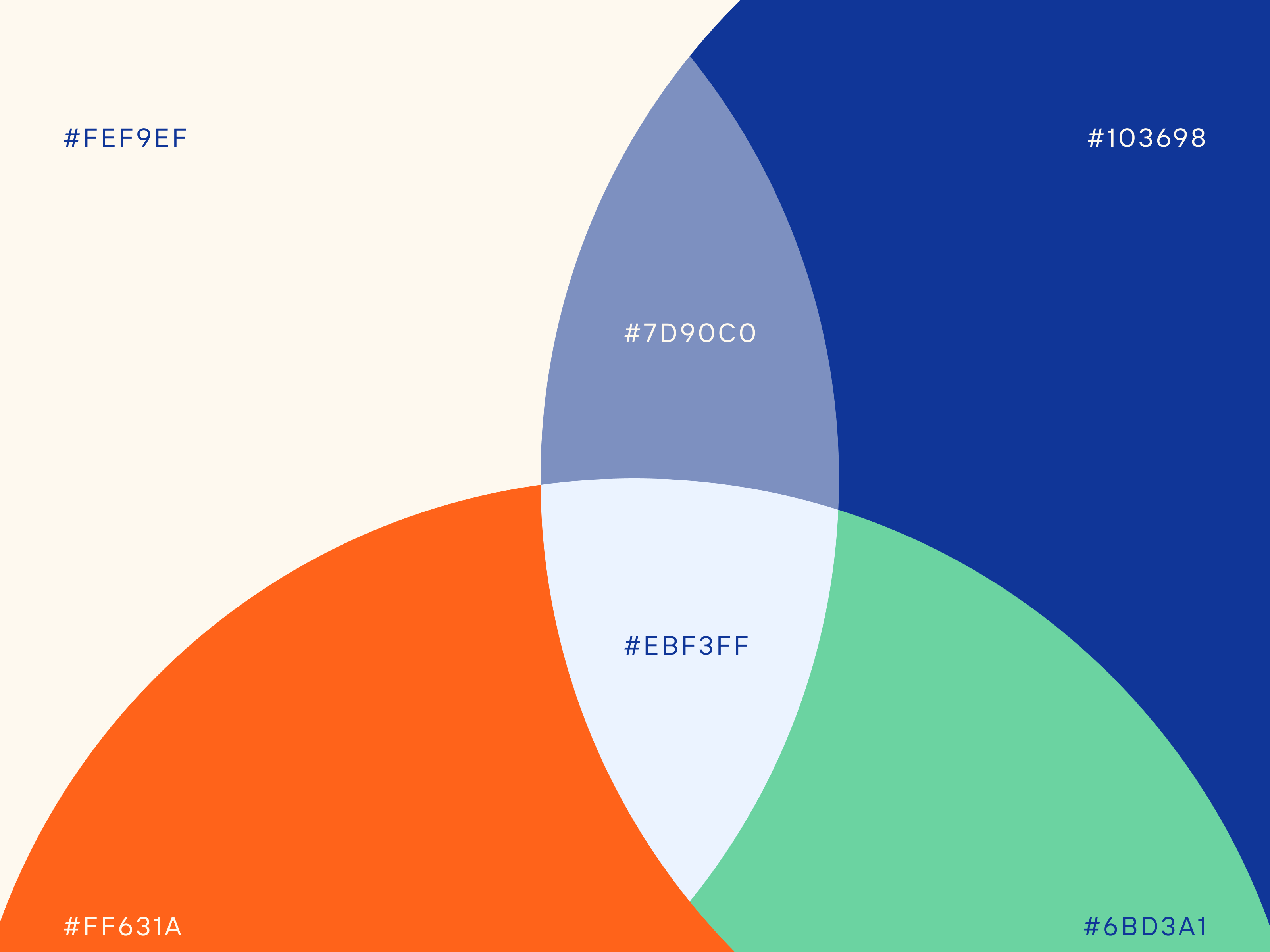
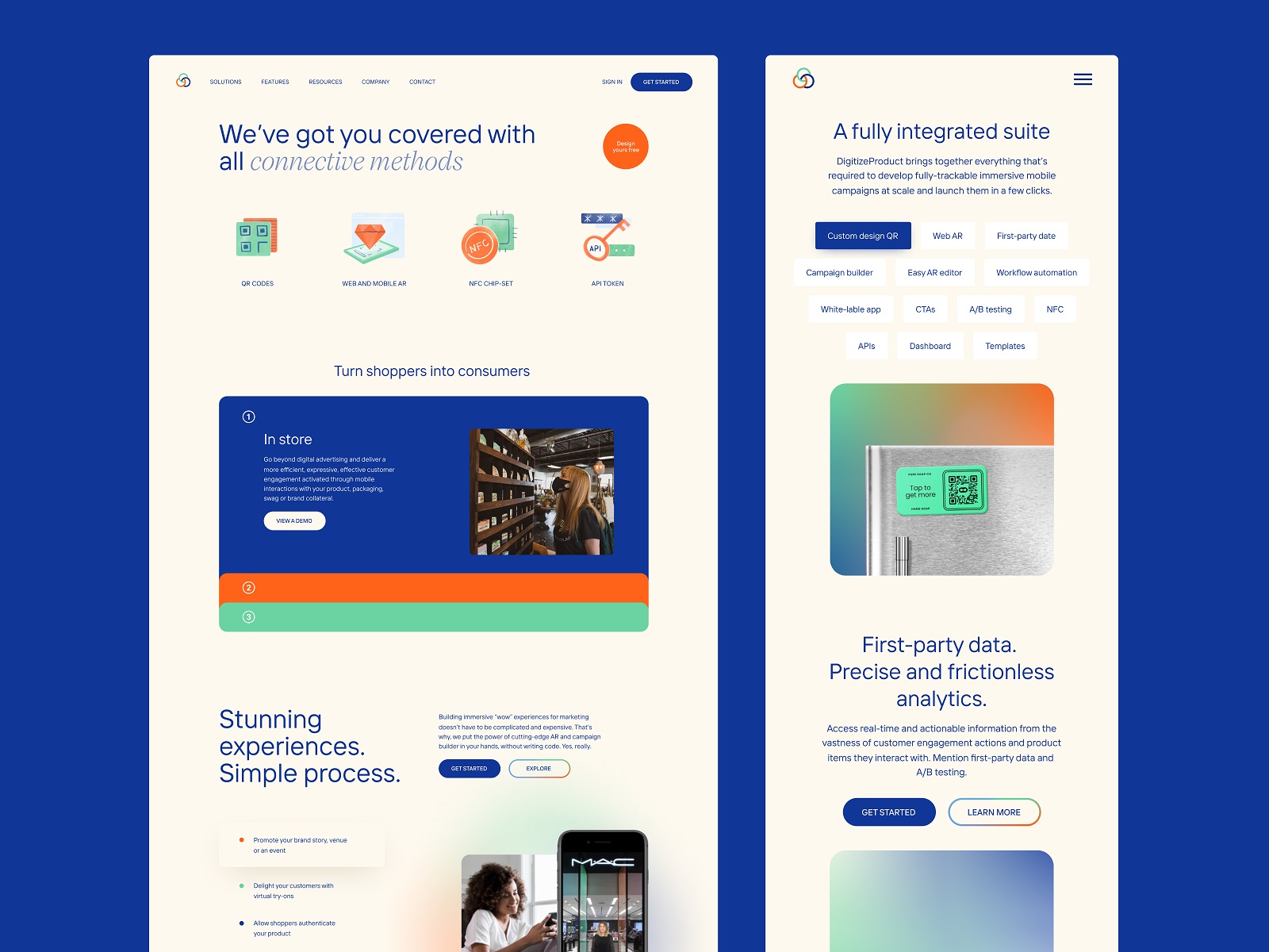
For CSConnect website, after testing different options and combinations, the decision was made upon the warm neutral tones for the background to make it airy and enjoyable, blue shades for text and CTA elements, and orange and green as accent colors to set the mood and focus attention to needed zones or elements on the page. Together, the combination made the web pages look attractive and user-friendly.
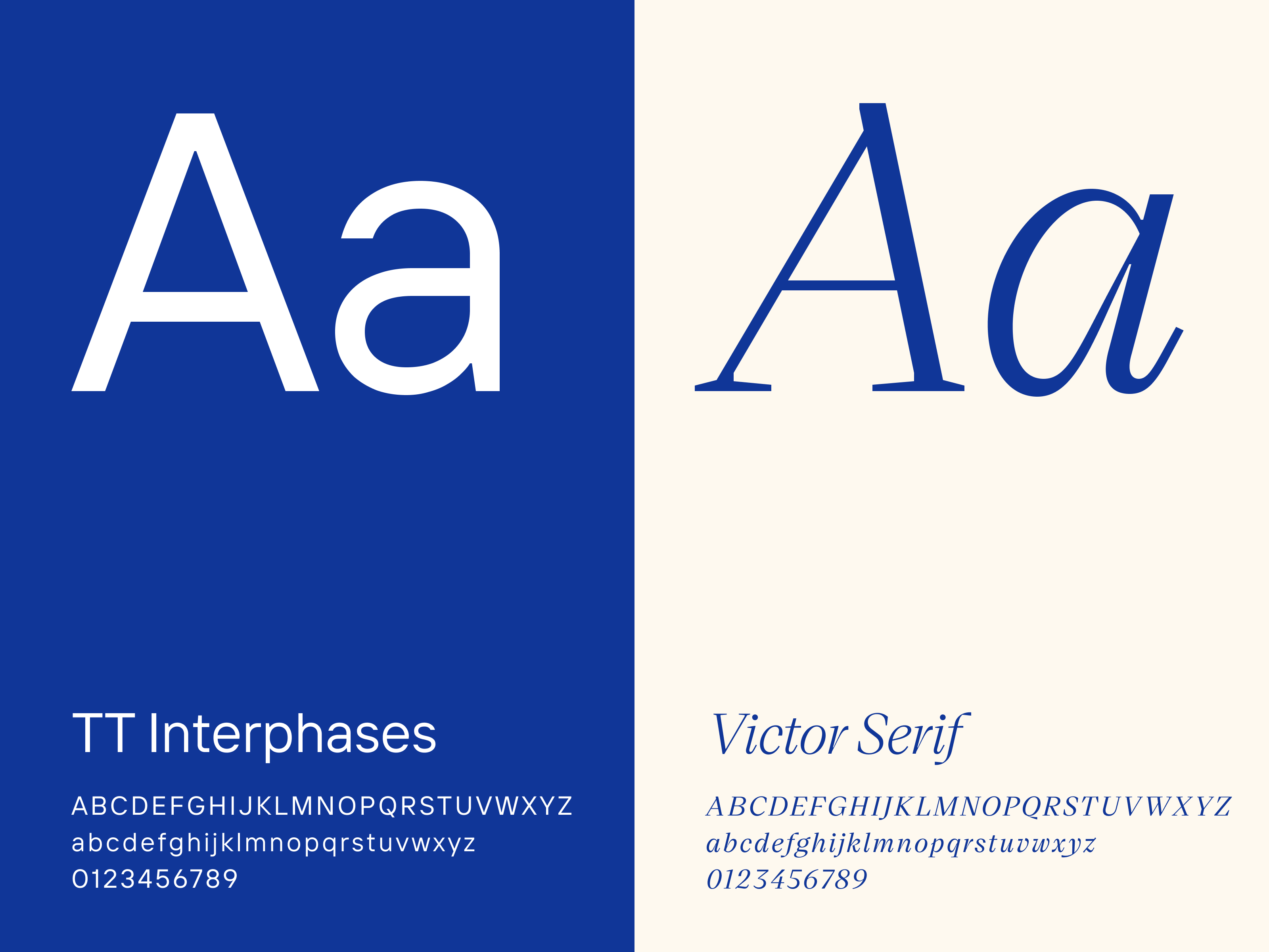
As for the typography, the choice was made upon the pairing of Victor Serif and TT Interphases. TT Interphases is a universal typeface, readable and applicable to different types of text: it looks modern, beautiful, and elegant but also invisible and neutral. Victor Serif is a serif typeface, a sort of contemporary revival of Times New Roman, which features a range of lighter and heavier weights, which give new flavor to the classic typeface.
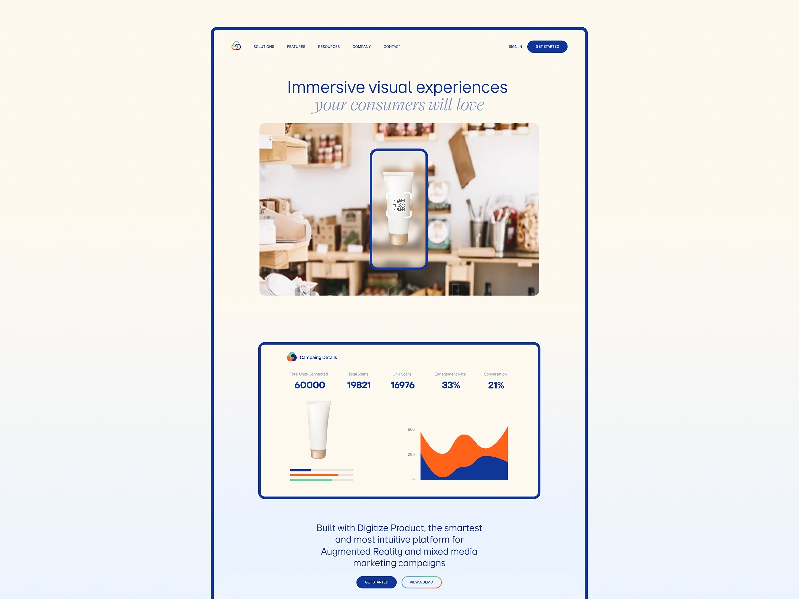
Welcome to take a closer look at the home page. In the above-the-fold area of the page, the main focus is on the visual content presenting the service. Combining the mentioned typefaces in one tagline creates emotional and catchy typographic contrast. All the needed navigation links and the main CTA button are easily found in the website header, visitors’ primary zone of page scanning.
Here’s a closer glance at how the color palette works on the page, from background and primary colors to minor but bright accents. The central focus is made on the media and visual content helping the visitors to dive into the advantages of the different services more quickly.
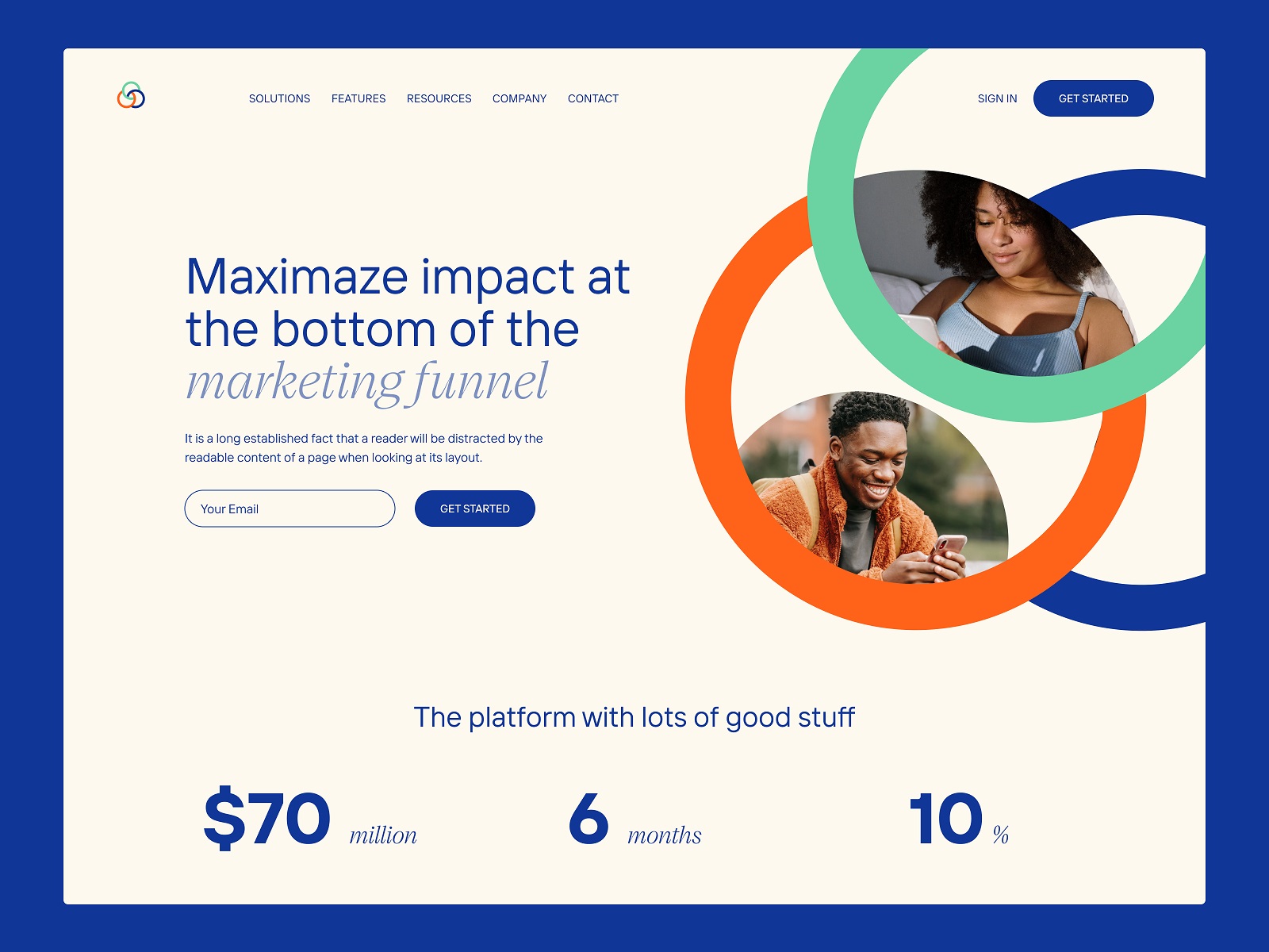
This section shows how branding is smartly expanded on the web page, beautifully integrated into the layout, and originally playing with emotional photo content setting the mood.
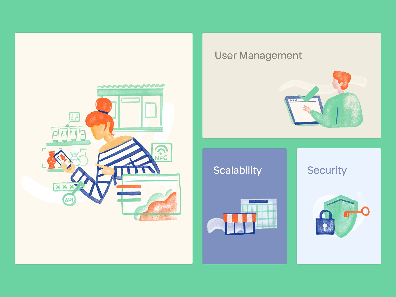
And here’s a closer look at how custom illustrations contribute to general visual style, amplify the essence of the offer, and help to illustrate different options and benefits to make them more noticeable and emotional than just text labels. The chosen style reminds simplified hand-drawn illustrations, which also plays an integral part in making the website more emotional, friendly, and welcoming.
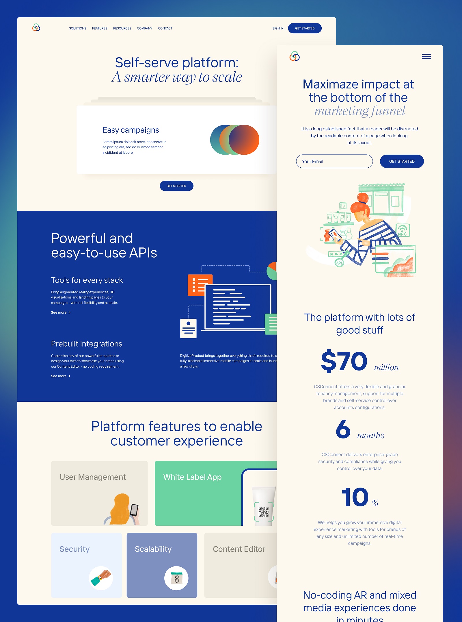
Also, the technique of cards laying one on the other helps to separate different blocks of information and organize content dynamically and engagingly.
Another way to arrange content is using different background colors for some sections to separate different information blocks. Also, the design features the approach of prominent infographic-style numbers. As we mentioned in the article about web scannability, readers subconsciously associate numbers with facts, stats, sizes, and distance — potentially valuable data. So numbers included in copy catch the reader’s attention, while words representing numerals can be missed in the bulk of copy. Moreover, numbers are more compact, making the content more concise and time-saving for scanning. The applied approach means making the numbers prominent and more noticeable than the text, as it’s often done in infographics.
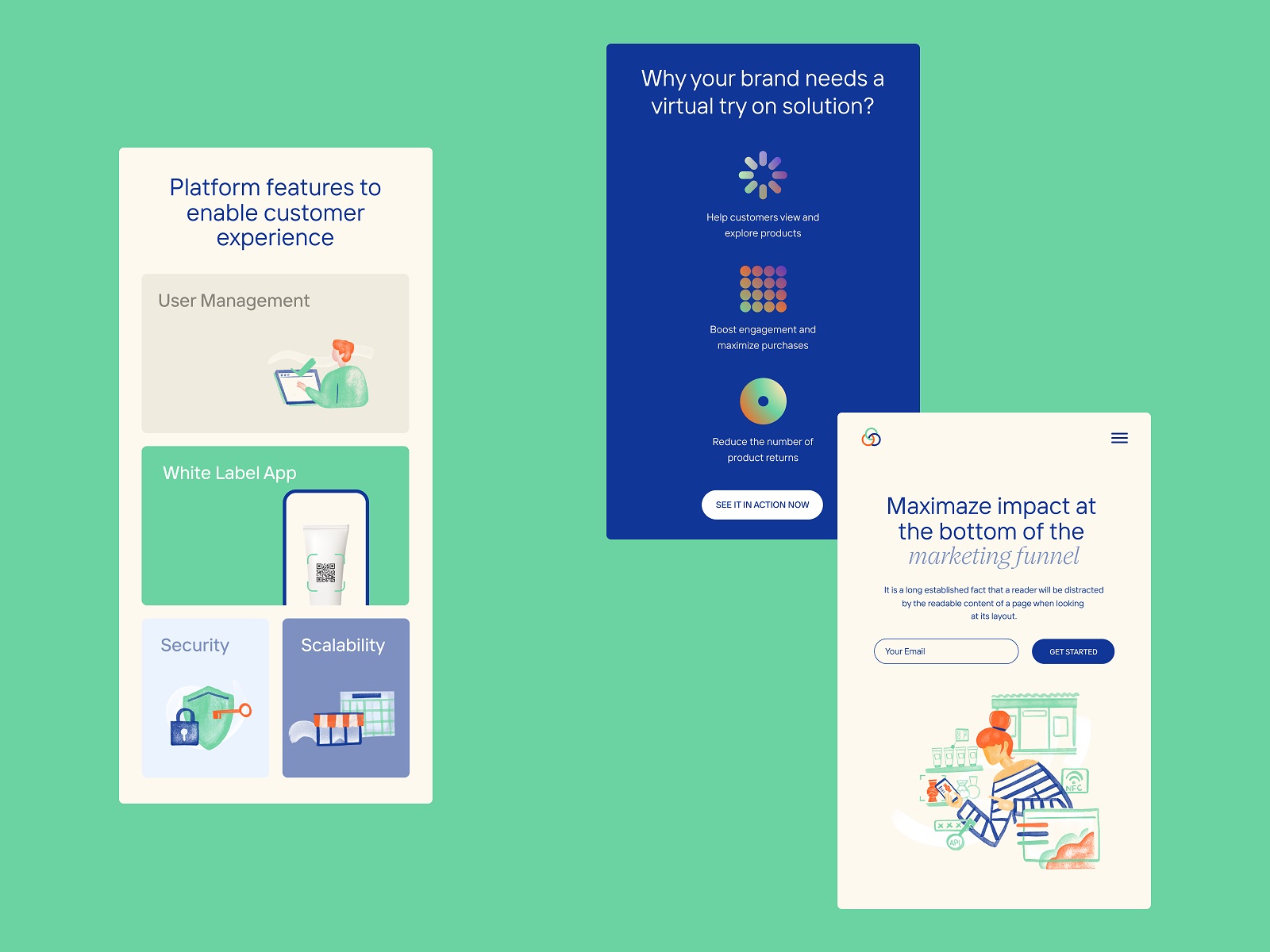
To make the website easy to use from any device, it was also important to wisely adapt it to mobile screens to keep everything needed for a positive user experience.
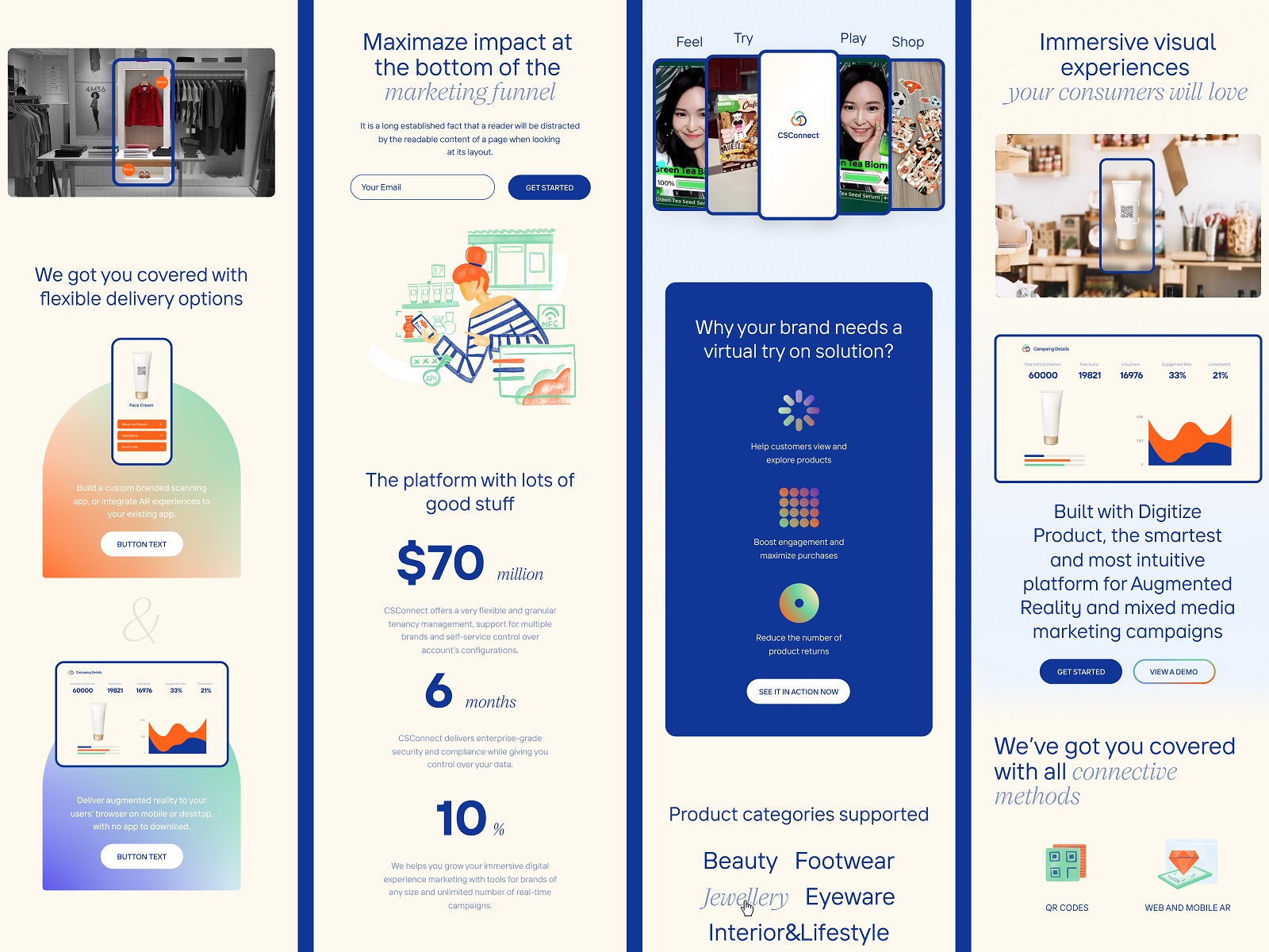
For our team, the CSConnect website design process was a great case of fruitful collaboration and design for web marketing, diving deeper into the evolving technological solutions in that sphere.
New design case studies from our team are coming soon. Stay tuned!
More Design Case Studies
Here’s a set of more case studies sharing the design solutions and approaches for some of the design projects done by the Tubik team.
Fulfill. Illustrations and Web Design for 3PLs Marketplace
Roebuck. Mobile Design and Illustrations for Educational App
Kaiten. Identity and Product Design for Food Marketplace
Glup. Delivery App Branding and UX Design
THT. Website Design for Electrical Engineering Service
Komuso. Website Design for Wellness Tool
PointZero25. Identity and Website Design for Event Agency
Nonconventional Show. Website Design for Podcast
uMake. Branding and Website for 3D Design Tool
BEGG. Brand Packaging and Web Design for Food Product Ecommerce
Crezco. Brand Identity and UI/UX Design for Fintech Service
FarmSense. Identity and Web Design for Agricultural Technology


