Welcome to take a glance at one of our recent projects, created at the crossroads of the practical and creative, design and engineering. In this case study, we unveil the story of website design for THT, the company making electronics that breathe life into innovative products.
Client and Project
THT is a USA-based team that offers electrical engineering and firmware development and services that span from proof-of-concept prototyping to designs for mass production. As they describe themselves, they are committed to producing reliable technology that performs at the highest standard, with honest, well-organized, clearly documented, and trustworthy work. They back clients who they believe in and whose goals they can achieve.
The THT team approached us with the request for their website design to amplify their online presence, highlight the benefits of the service, tell about the projects that were already accomplished, and enhance communication with their customers. As well, we implemented the website on Webflow.
The creative team for the project from the tubik side included Sergii Kucherenko, Daria Tsehelna, Maryna Solomennikova, Kirill Erokhin, Anton Chirskii, and Nick Zhuravlov.
Website Design
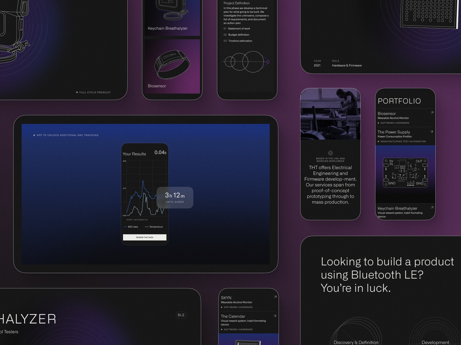
The general visual and interaction design for the THT website is based on the following points:
- the solid visual hierarchy that makes the web pages highly scannable and allows website visitors to quickly get into the essence of the service
- simple, elegant, and readable typography corresponding to the theme and not distracting visitors with decorative elements
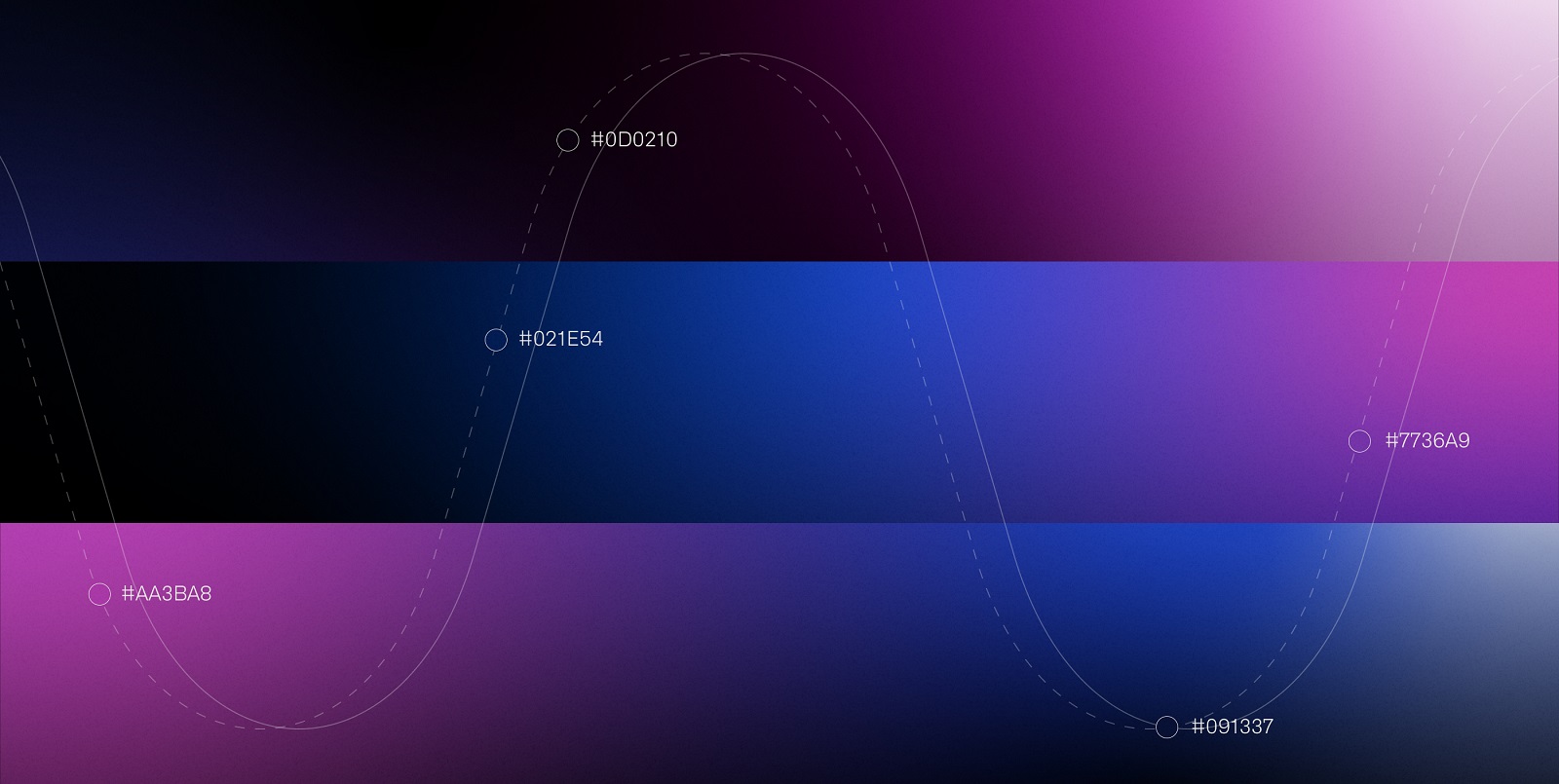
- the deep dark color palette and the balanced usage of stylish gradients
- well-arranged content allowing for quick skimming and uniting different sections into the integral user experience
- effective and consistent graphics performance and custom visual elements for the original presentation
- smooth, catchy web motion effects
Altogether, those factors do their best for the website to make it present the essence and benefits of the service, engage visitors, and set a quick and strong emotional connection.
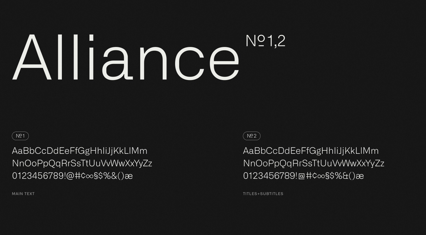
The typography choice fell on Alliance, the sans serif typeface flexible for various goals and providing good legibility in both short and large texts.
And here’s a glance at the colors used for the website, deep, eye-pleasing, and providing a good background for various visuals and text blocks.
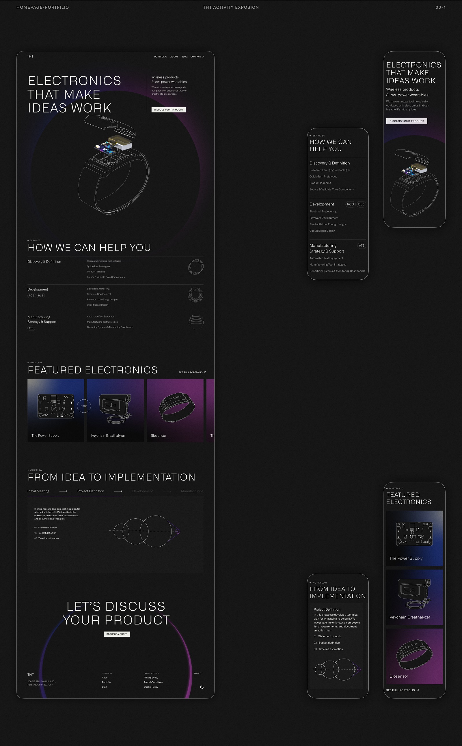
The home page of the website presents an overview of the services the company provides and the portfolio of completed projects. The hero section features a prominent custom illustration our team made to set the topic and activate instant visual connection to the theme of electronics, devices, and digital technologies even before the visitor reads the text. The image is supported with the blog tagline, a short, concise text block unveiling the main idea of the company activity, and a noticeable call-to-action button for those who want to connect the team right from the point.
Scrolling the page down, the visitors can learn more about what the company can help with; all the services are well-organized in a clear, digestible list supported with neat line graphics. The following Portfolio section shows up the cards with project previews. All preview cards are endowed with special custom illustrations in one style, which helps to reach visual consistency and integrity.
And here’s how web animation helps make the experience even more dynamic and impressive on the home page of the THT website.
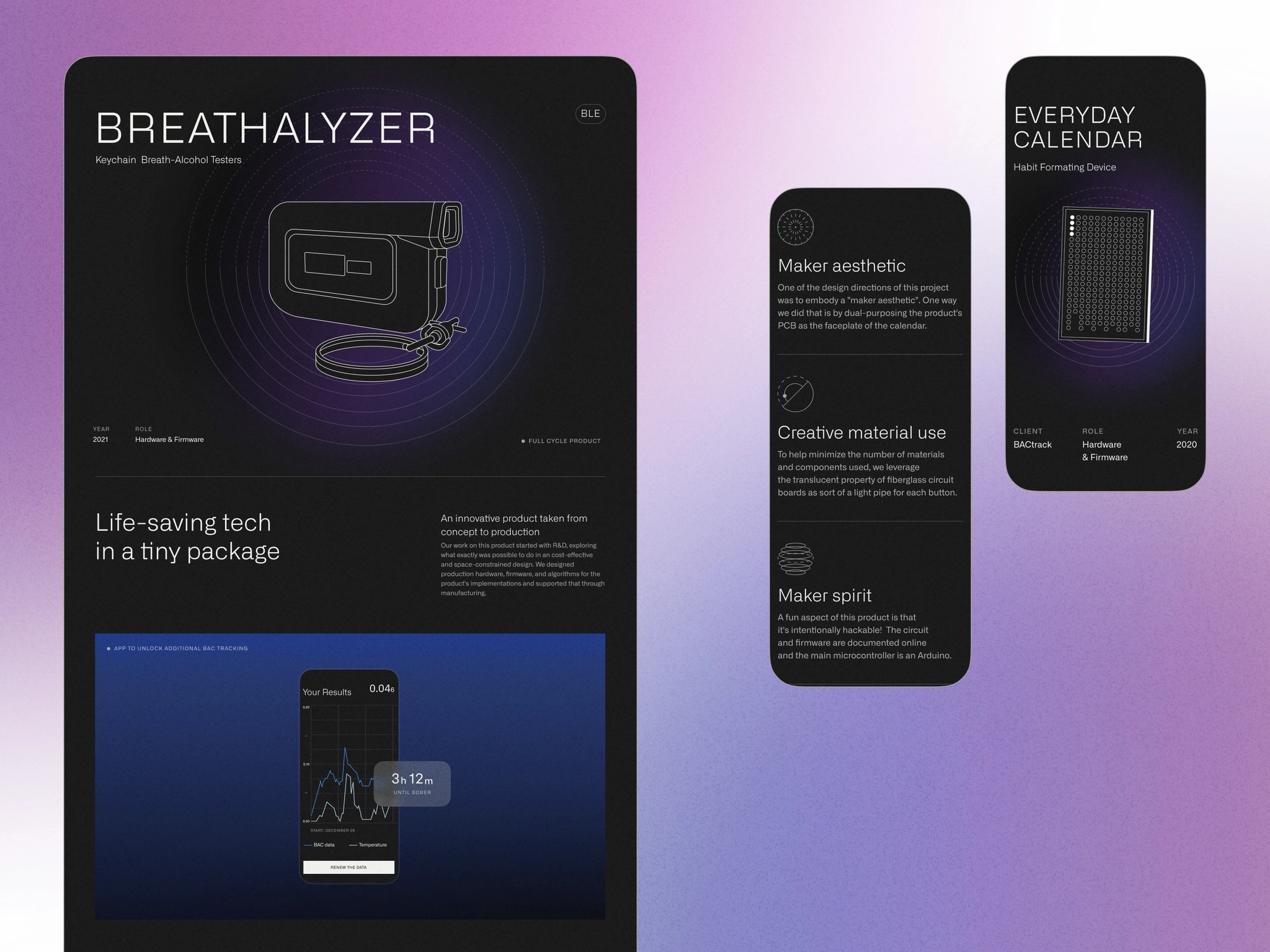
Here’s a glance at the particular project page in the portfolio. It echoes the visual style set on the home page, with neatly arranged, hierarchic text blocks, illustrative and photo content, and supportive line graphics.
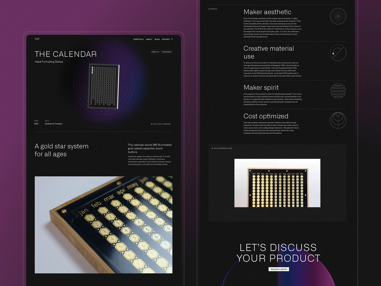
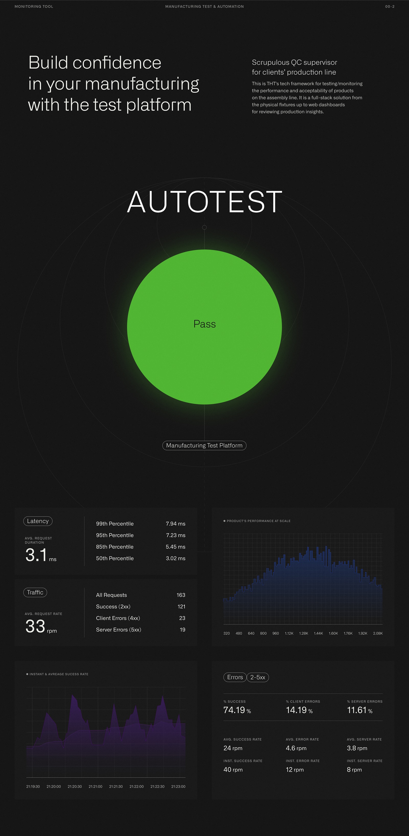
Here’s an example of the page presenting the tool dealing with different data. For the design here, we had to consider various types of infographics and stats that would look clear and consistent.
Another interesting design point to mention is the animation of the interactions with the tabs of different projects, imitating a sort of curtain moving up and opening an extensive preview of the project.
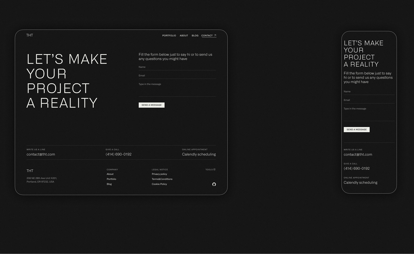
In the structure of the company website, a contact page is usually quite simple. Still, it has great importance as it sets the direct communication with the potential customer, so it’s crucial not to overdesign it to make the page fast to load, informative, and functional. That’s also the idea behind the contact page for the THT website: a contact form is added to the page to let the visitor quickly send the message right from there, or they could choose from other convenient methods like writing an email, giving a call, or arranging an online meeting.
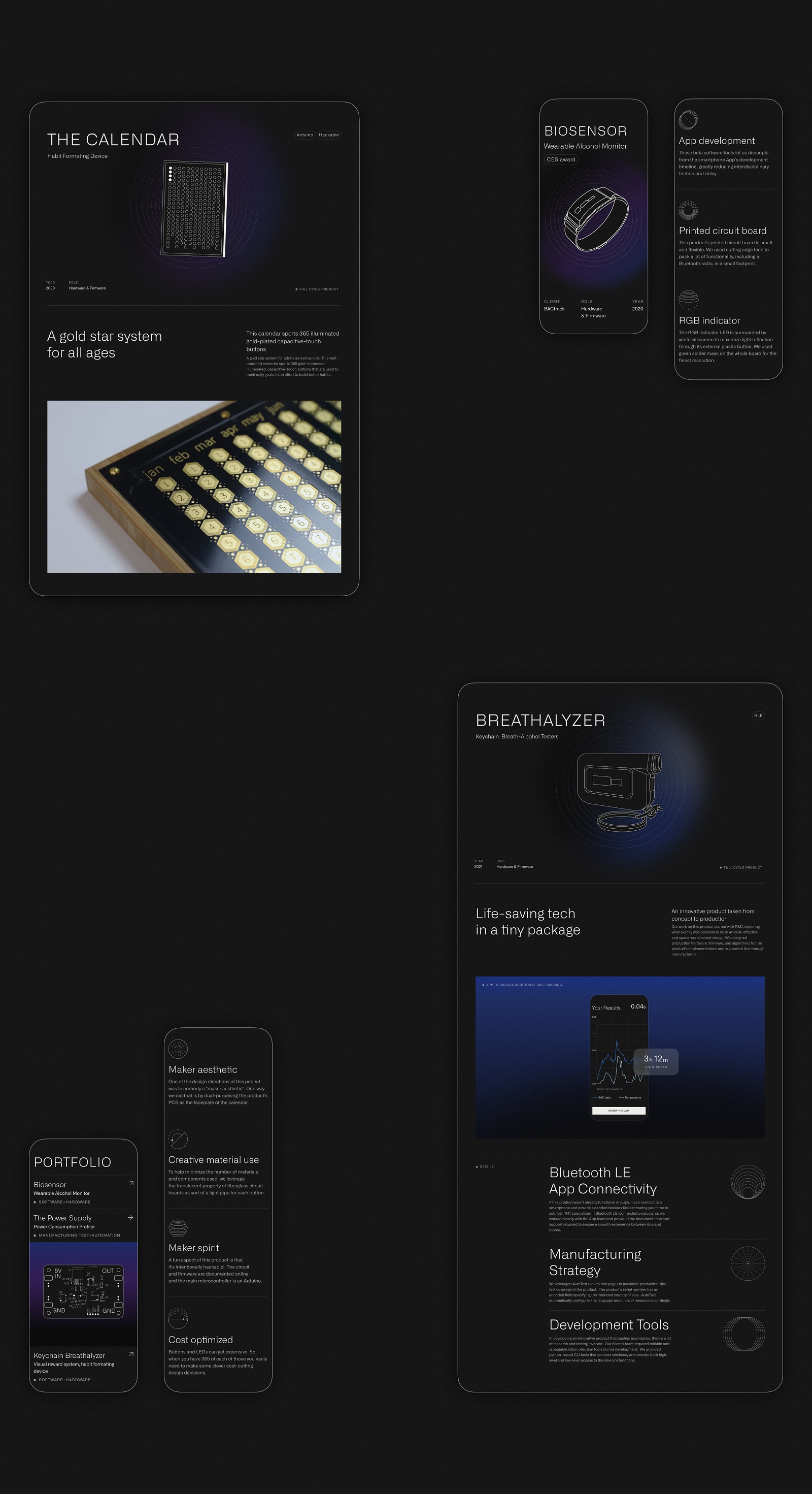
All website pages are adapted to the efficient mobile experience to make the design work at its full and let the brand communicate successfully on any device.
All the design solutions were implemented by our team with the help of Webflow, which ensured that designers kept their eye on the slightest details of the development process.
New design case studies from our team are coming soon. Stay tuned!
More Design Case Studies
Here’s a set of more case studies sharing the design solutions and approaches for some of the design projects done by the Tubik team.
Glup. Delivery App Branding and UX Design
Komuso. Website Design for Wellness Tool
PointZero25. Identity and Website Design for Event Agency
Nonconventional Show. Website Design for Podcast
uMake. Branding and Website for 3D Design Tool
BEGG. Brand Packaging and Web Design for Food Product Ecommerce
Crezco. Brand Identity and UI/UX Design for Fintech Service
FarmSense. Identity and Web Design for Agricultural Technology
Carricare. Identity and UX Design for Safe Delivery Service


