“One’s destination is never a place, but a new way of seeing things,” Henry Miller once said, and thousands of keen travelers around the world would definitely confirm that. Our new case study features a brand that has also been inspired by the neverending brightness of the travel spirit. Welcome to check our fresh artistic graphic design project for a modern soap brand identity and marketing.
The project was accomplished by tubik designers Arthur Avakyan and Yaroslava Yatsuba, with art direction by Sergii Valiukh.
The design process for the soap brand identity and packaging project included the following creative tasks:
- logo design and brand color palette
- a consistent set of illustrations and graphic elements
- packaging design for different fragrances of soap and types of packaging
- design for marketing visuals and branded items
The primary idea behind the brand is that it shares the feeling of traveling around the world and diving into the atmosphere and flavors of different countries. Our team worked on the general approach to the brand visual style concept and the extended packaging design set, with varying types of boxes, bags, wrapping, and marketing graphics.
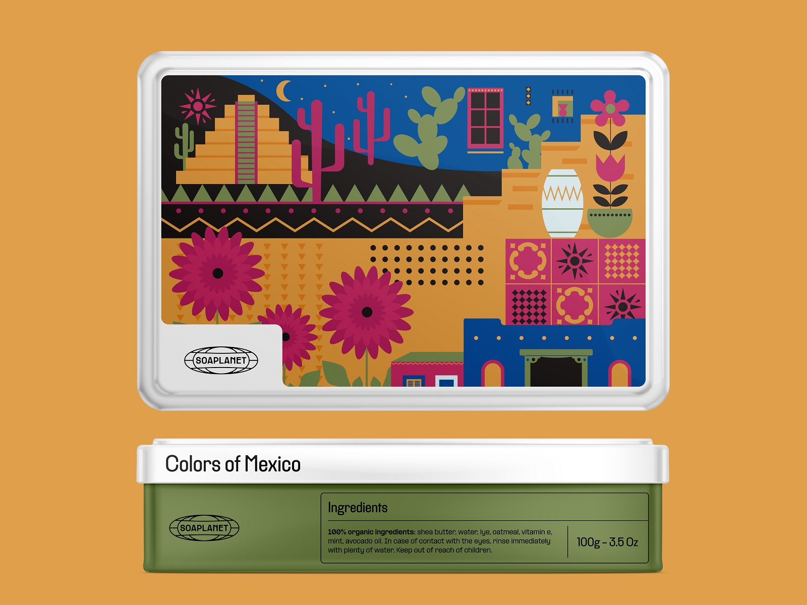
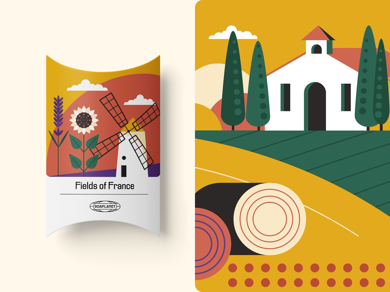
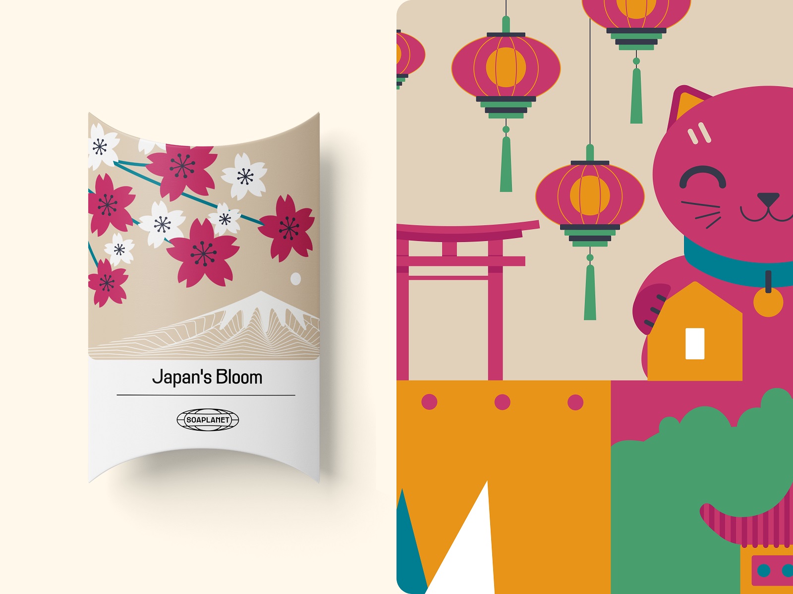
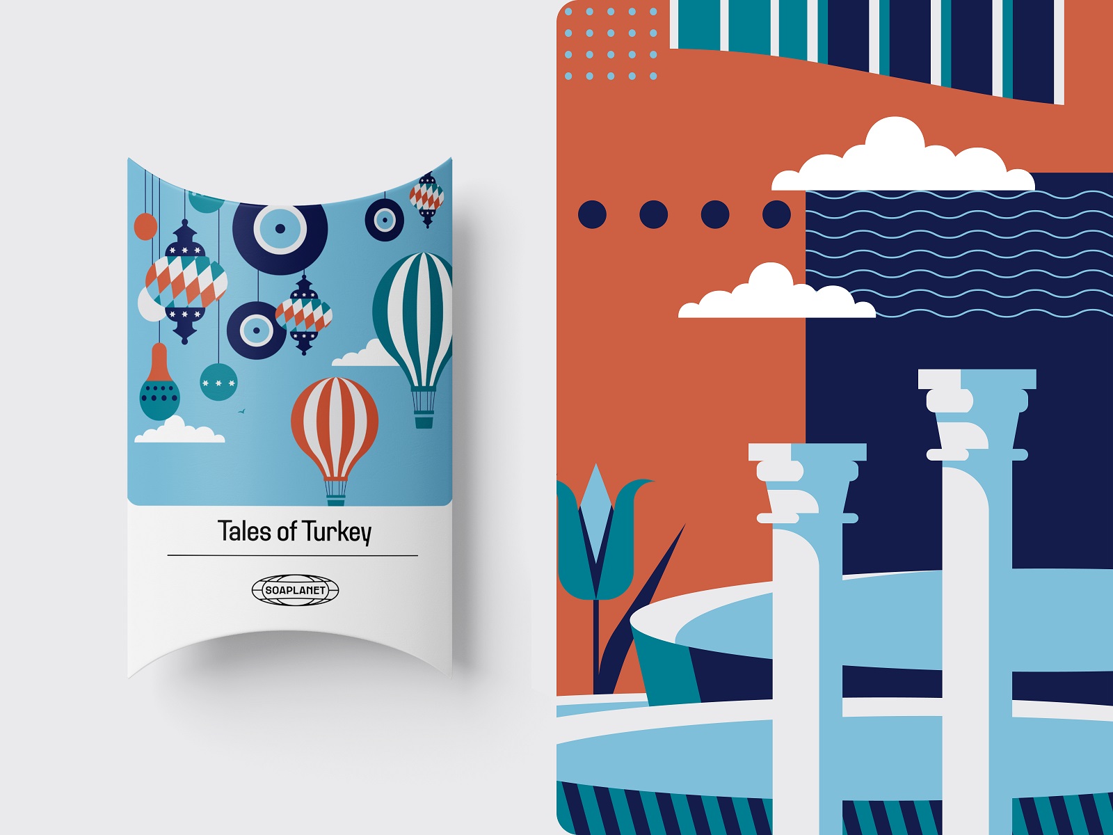
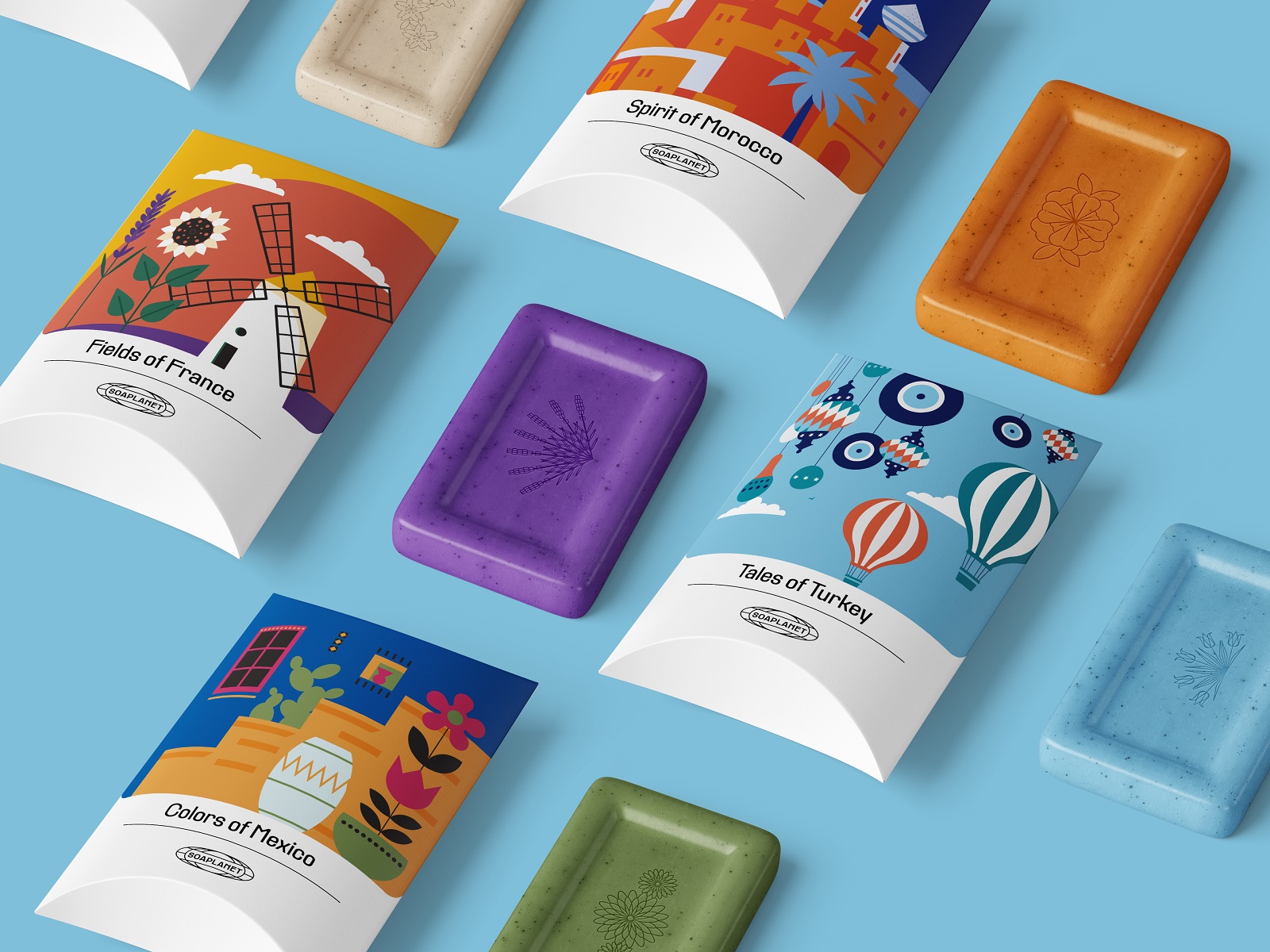
The logo design presents a neat line symbol based on the idea of a globe and the brand name inscribed into it. All types of branded packaging are built around original 2D illustrations which feature various countries and share the emotion of seeing new places and opening new horizons. The illustrator tried to capture the recognizable details, shapes, landmarks, or natural features typical for a particular country. She also thoroughly thought about color combinations that would strengthen the atmosphere of a place.
Here’s a glance at the set of metal boxes for the soap bars featuring the full-scale illustration on the lid and the elegant typography that matches the logo design style.
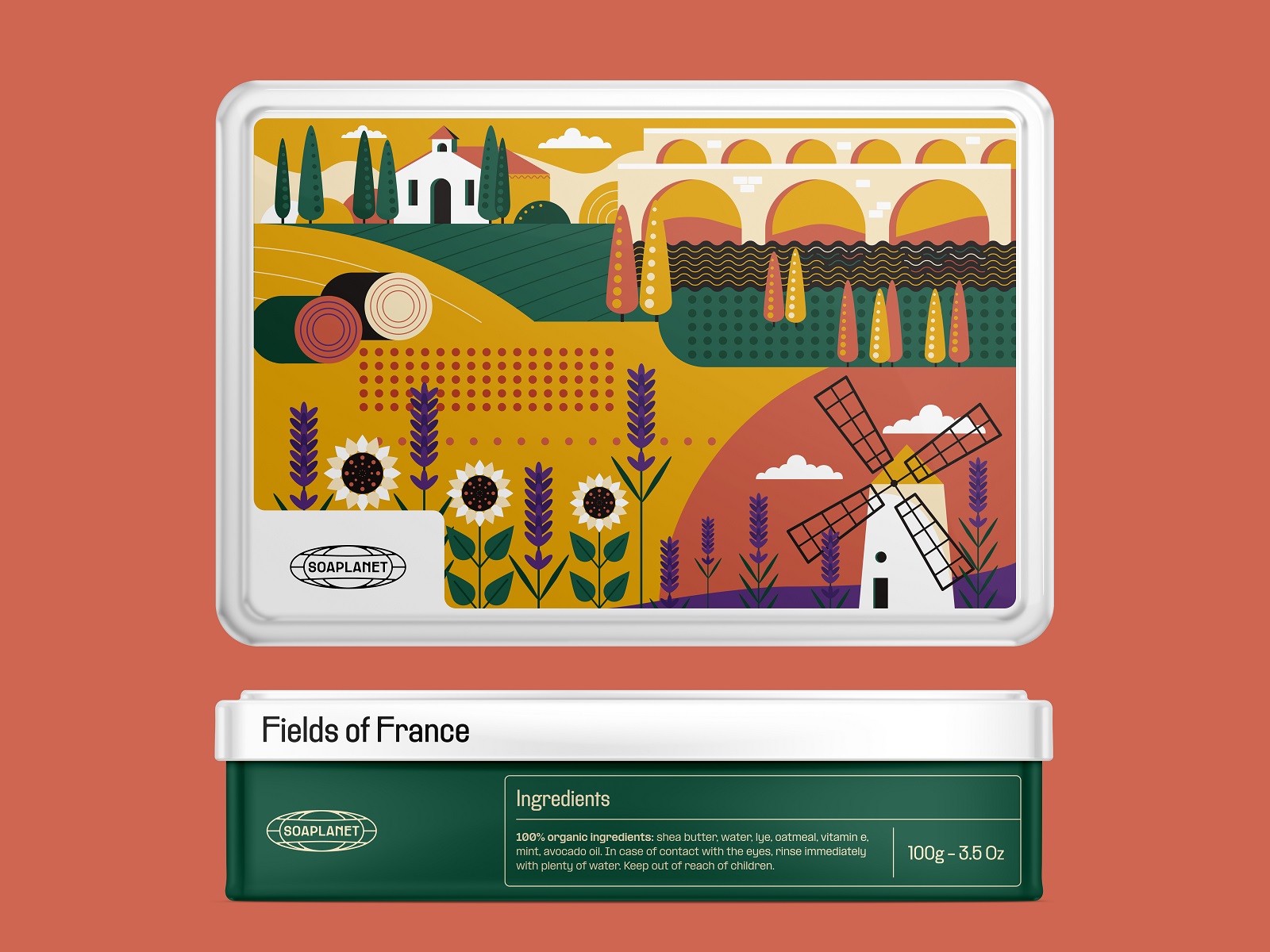
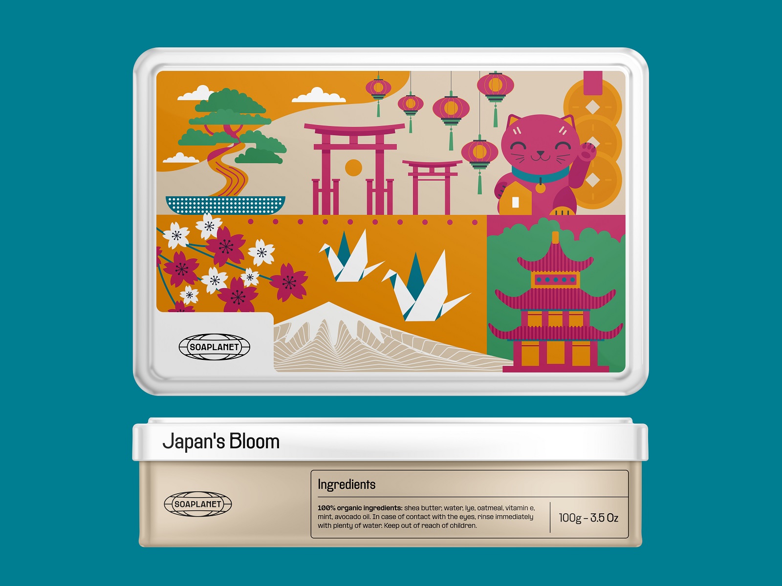
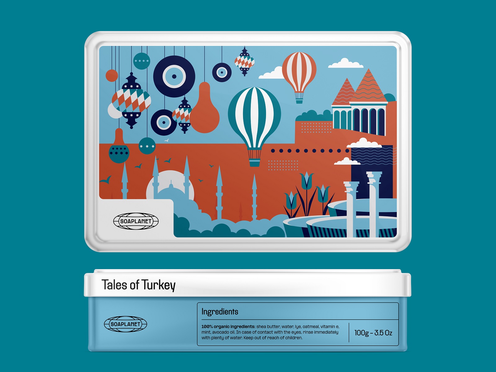
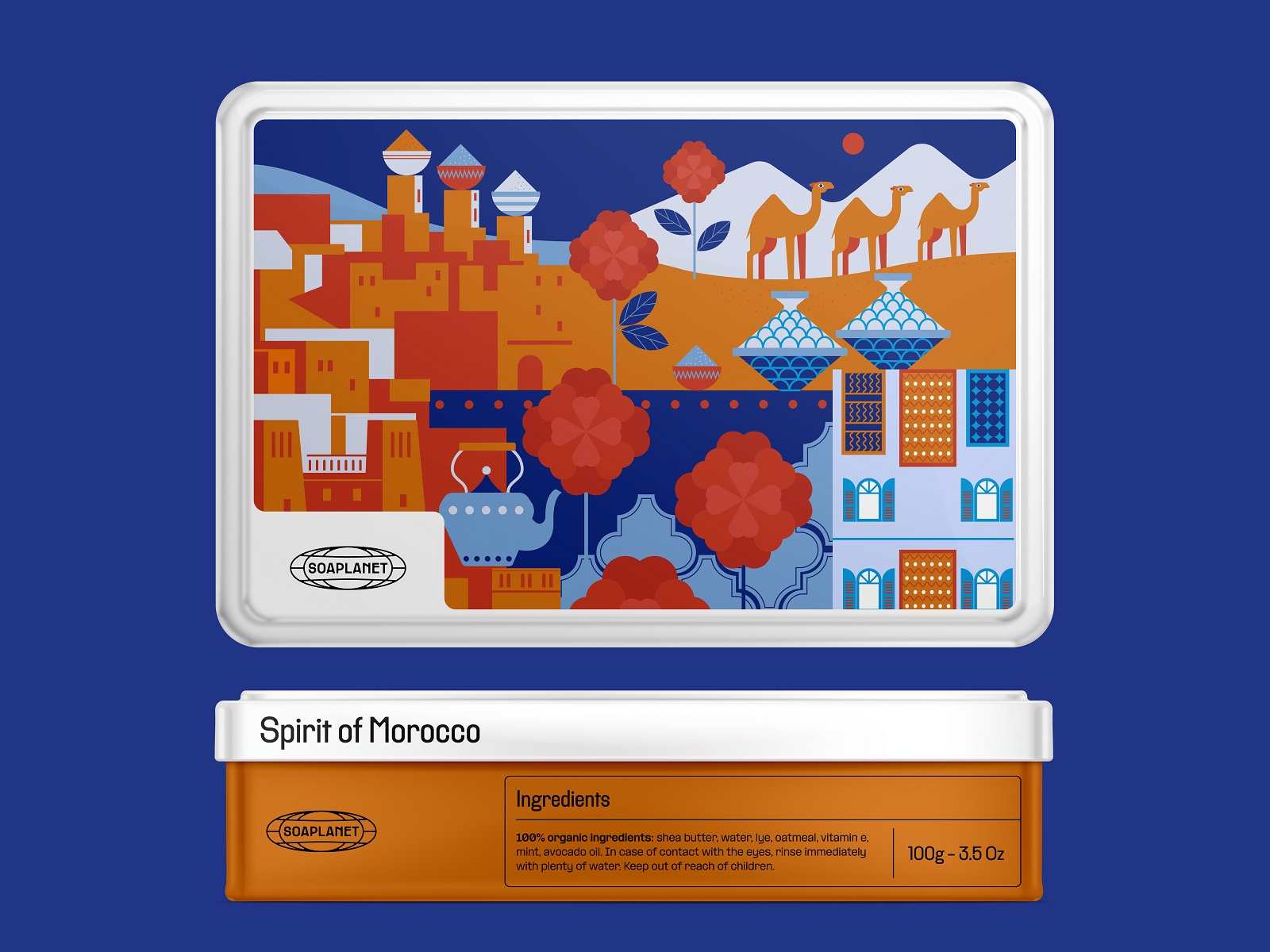
The paper packaging for individual soap bars keeps the same style. Yet, due to the smaller size, it uses the illustration, which is more concise and focused on fewer graphic details, with the clean and airy bottom part for the text content.
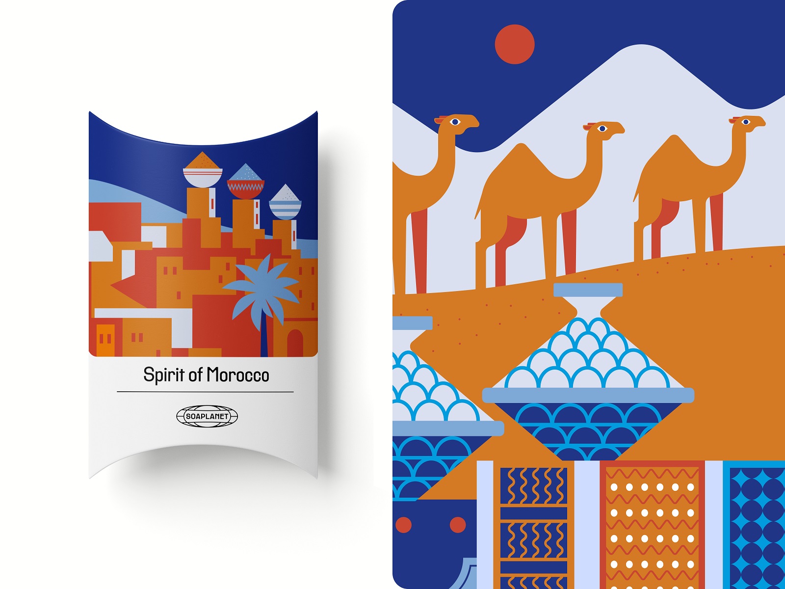
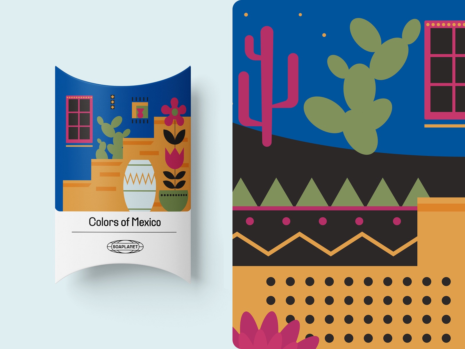
Also, we worked on other branded items presentation; for example, here’s a glance at the vibrant branded tote bag, a discount card, and minor graphics put on the soap bars.
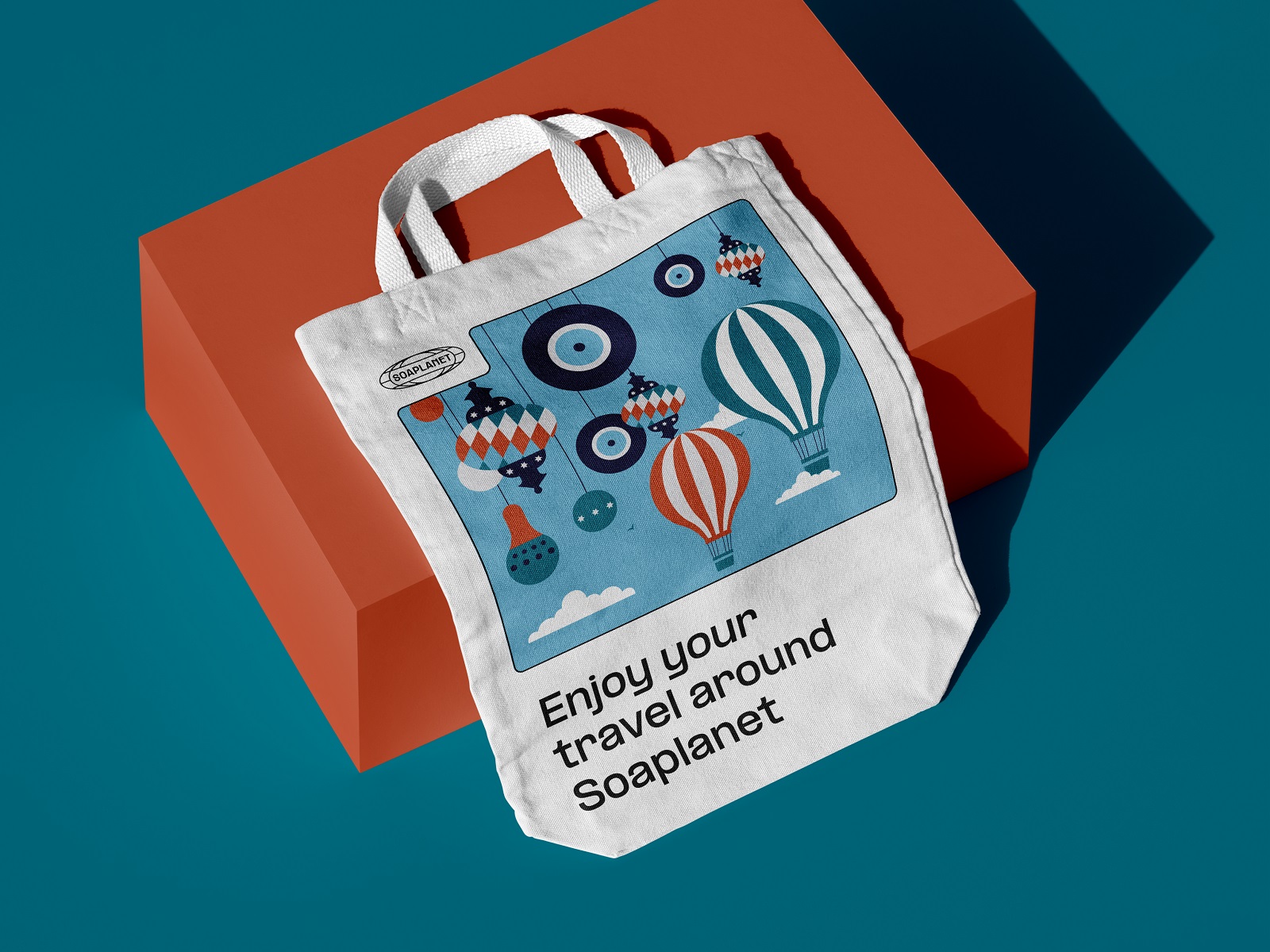
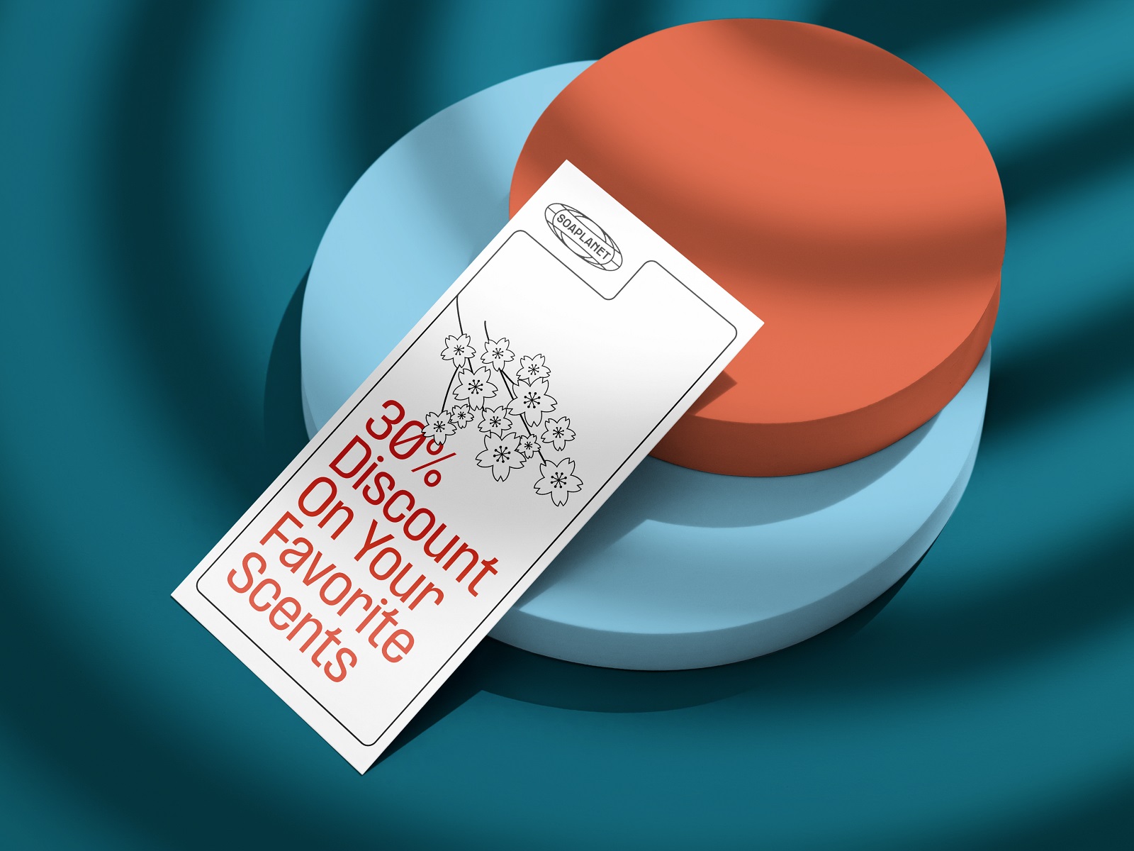
New design case studies from our team are coming soon. Stay tuned!
More Design Case Studies
Here’s a set of more case studies sharing the design solutions and approaches for some of the design projects done by the Tubik team.
Joosi. Packaging Design and Marketing Graphics for Juice Brand
Ready Set Recover. Web Design and Illustrations for Surgery Recovery Platform
Pizzatta. Artistic Pizza Packaging Design
Page Turner. Identity and Packaging Design for Bookstore Chain
Nibble Health. Identity and UX Design for Healthcare Fintech Service
SwitLuv. Theme Packaging Design About Love for Sweets Brand
Fulfill. Illustrations and Web Design for 3PLs Marketplace
Roebuck. Mobile Design and Illustrations for Educational App
Garden Gates. Identity and Packaging Design for Garden Center
8 Bright Packaging Design Projects Employing Illustration Art
Bikker. Identity Design and Illustrations for Biking Service


