Another design year is almost over, so nodding to our tradition, let’s take a look back together and recollect what was popular and demanded in UI/UX design for websites and mobile applications in 2021. Here’s our annual review of design trends, as usual, packed with tons of web and mobile UI design examples by our team. Join in!
Diversity of shapes
Definitely, one of the hottest trends this year has been a great variety of shapes we both applied and observed in different designs. Shapes help to add playfulness and originality to the layout. What’s more, in many cases, they play the role of visual accents, attracting attention to particular elements or zones on the screen.
Various shapes applied to the design of the toy store website set the visual connection with kids toys like sorters and building blocks and help organize some of the interactive elements in a playful and catchy manner
Neat and curvy shapes as a part of elegant design for cosmetics e-commerce website
Shapes as a part of the design approach for the ToyJoy e-commerce website
Video integrations
Using videos as an integral part of user experience design for websites and apps has been going from trend to solid tendency this year. Background videos and explainers, video tutorials, product videos, hero section video crops, testimonials, showreels, showcases, and screencasts – the diversity of video materials helps designers make interfaces more dynamic and engaging as well as allows users to get their experience more informative and emotional.
Awesome video background for the webpages of the e-commerce website selling niche perfumes
Atmospheric full-screen bird-view background video for the design of the website telling about mountain resorts
Lovely videos used for products demonstration on the e-commerce website for the pet shop
Airy and windy home page video for the yacht hiring website sets the atmosphere in split seconds
Accent line elements
One more trend rising in popularity is the smart usage of unobtrusive line graphics to provide visual accents in the blocks of text or support the integrity of different sections. Sometimes, they also work as directional cues attracting users’ eyes to particular elements.
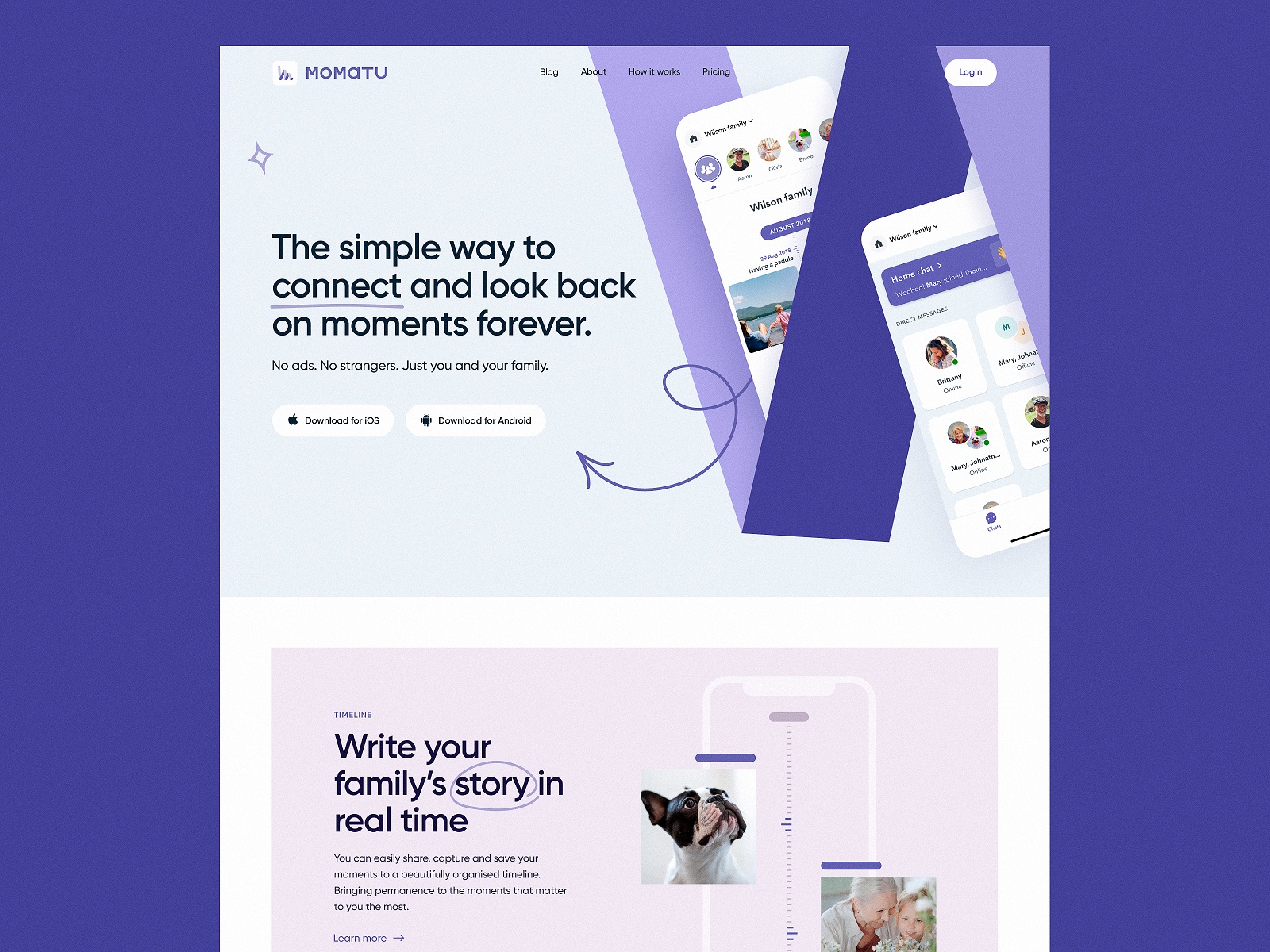
The website design concept for the Momatu app uses line graphic accents to attract attention to some keywords or work as directional cues.
Illusion Space website uses animated graphic accents adding dynamics to the pages
Headline underlayer
This year, the trend that showed itself brightly in web interfaces was applying bold, sometimes even enormous, headline or tagline text with a graphic or video underlayer, making it bright and attractive.
The home page for the ballet company website uses a prominent headline with a video underlayer in combination with an animated CTA element.
The prominent text block on the e-commerce website selling egg products uses the underlayer photo
Engaging motion graphics
Year by year, UI and motion designers push the limits of their own creativity when it comes to animation in user interfaces. This year was not an exception, bringing up new examples of impressive loading animation that makes waiting easy and fun, animated hints that make important interactions clear and buttons noticeable at once, hero illustrations livened up with motion, and many more types of motion elements that contribute to both usability and emotionality of web pages and mobile screens.
Lovely loading animation for the e-commerce website of a juice brand
Elegantly animated interactions for the page presenting a set of events for the art galleries website
Catchy animated elements and the background Maneki-Neko animation add uniqueness, fun, and mood to the Chinese restaurant website
Creative motion graphics for the website of Illusion Space
Typographic experiments
Another area for endless design experiments is typography, of course, as it is one of the crucial design elements influencing all the sides of user experience design. This year highlighted the following popular design solutions:
- combinations of different fonts or styles of the same typeface in one piece of text
- applying original fonts to highlight some text elements
- playing out different text directions
- impressive typography-based motion graphics integrated into the UI
The original combination of typefaces used consistently in the brand packaging and website design for egg products
Original typography-based home page design and product pages for the Bennett tea website
Impressive manipulations with typographic elements as a part of design approach for the website of editorial about insomnia
Web page design for the website promoting mountain resorts plays with typographic contrast and uses the prominent cut-off typographic part at the top of the page
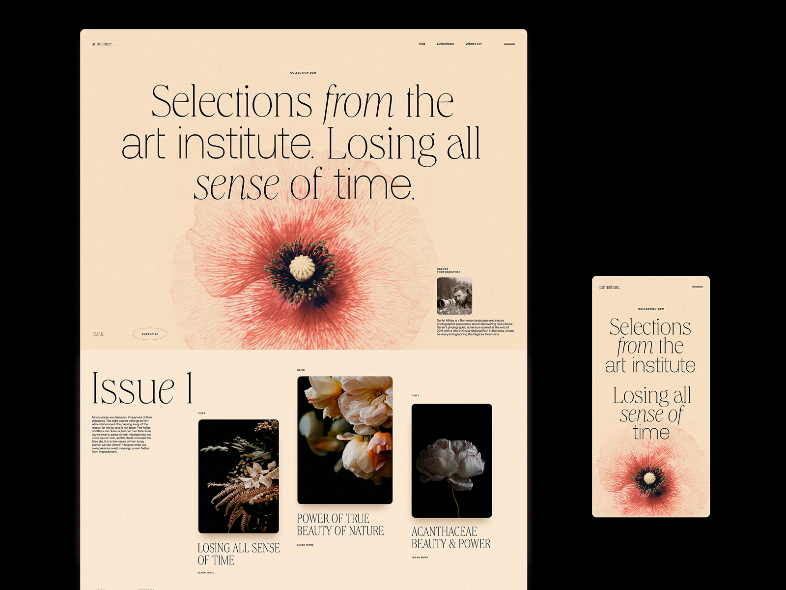
Elegant and sophisticated website of art institute editorial plays with fonts and typefaces to enhance the beauty of visual presentation
Interactive pages
Interactivity as a way to impress, engage and retain users also presented an area of design experiments pushing this trend to the next level.
Interactive web page background for Annual Awwwards website
Interactive scroll at the home page of the toy e-commerce website
Interactive map page for the website of the shipping company
Horizontal galleries
One more trendy design solution for web interfaces of different kinds is applying animated horizontal galleries of photos to set the emotional connection and make the experience dynamic without scrolling.
Horizontal photo gallery on the About Us page for the Synthesized website
Horizontal photo gallery instantly setting the mood and atmosphere for the home page of the website presenting information about various art galleries
Horizontal gallery for the home page of the booking service website
Creative menus
Such a core part of navigation as menu this year got itself even more creative than ever before. Vertical menus, colored tabs, graphic elements, hover animations, and many other design solutions seem to have set the goal to captivate users even at the basic navigation levels.
Interactions with creative menu page of the website devoted to insomnia
Creative menu page for the Awwwards Annual website, literally playing with fonts
Interactive menu page for the egg product e-commerce website
Menu interactions with animated shapes for the website of the booking service
Creative menu with colored vertical tabs for art galleries website
3D Graphics and Animation
Another trend growing into the steady tendency is using 3D graphics in user interfaces, mostly animated to enhance the wow-effect. From massive hero images to product presentations in 3D or minor layout elements, they go beyond the limits and add aesthetic vibes to web and mobile screens.
Catchy and atmospheric 3D hero animation for the e-commerce website selling stationery and office supplies
3D graphics used for a stunning product demonstration on yacht hiring website
Futuristic 3D animation for the NFT page of the Crypto Blog design
3D animation for the hero section of the Uni landing page design
Prominent animated hero image for the website of the shipping company
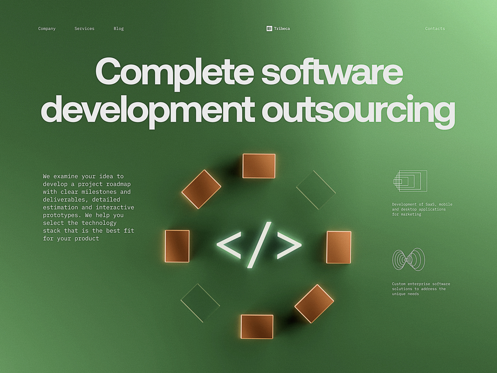
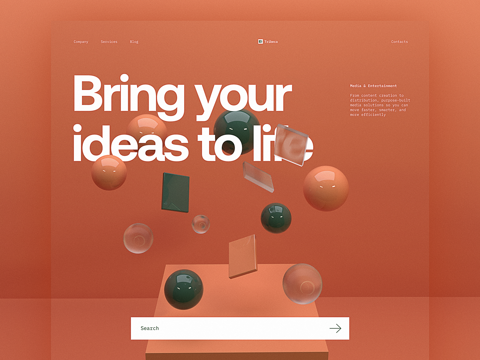
Website for the web development company, applying a variety of 3D graphics on different web pages
Uncommon grids
Applying unusual grids as the way to organize the content in an original and good-looking way also set itself as another interesting creative trend, presented with numerous interface designs.
Habit builder app design and its landing page feature the original grid
Product page design for Bennett Tea website organizes information about the product in the set of boxes forming the original sort of grid
Chinese restaurant website features the original grid for the menu
This museum website concept uses atmospheric video content and an uncommon grid to present the interactive photo tabs telling more about the place
Custom illustrations
Although the number of resources with different ready-made and customizable vector graphics has grown much, it didn’t influence the high demand and steady popularity of creating unique illustrations for web and mobile projects. No wonder, as custom graphics crafted according to the goals and needs of the particular project present the powerful tool of user experience design, giving websites and mobile applications the original dress to impress as well as supporting their usability and desirability.
Custom illustrations for the Mayple website design
Elegant pencil-sketch-like custom illustrations in the mobile version of the website for furniture producing company
Custom illustrations for the pet shop website
Animated hero illustration for the Energizou website
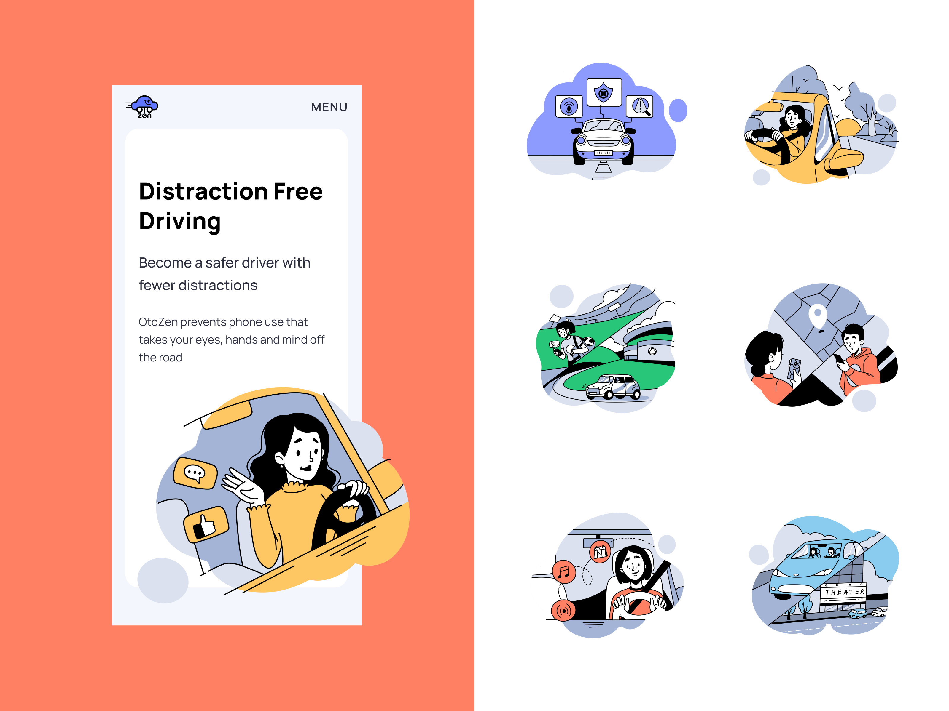
Custom illustrations for Otozen application website
Certainly, that’s only a tiny part of the design trends in user experience design, evolving and developing day by day. Looking forward to seeing what’s next, we are totally ready for new creative challenges and out-of-the-box solutions for web and mobile interfaces.
Wishing you another bright design year!
Your Tubik team
Tubik Design Collections and Articles
If you want to check more creative sets of UX design concepts and articles on best design practices, here they are for you.
22 Impressive Web Design Concepts for Various Business Objectives
Mobile Design: 14 Stylish and User-Friendly App Design Concepts
The Anatomy of a Web Page: 14 Basic Elements
Photo Content in User Interfaces: 7 Basic Ways to Use
Take My Money: UX Practices on Product Page Design
Save the Planet: Web Designs on Environment and Ecological Issues
5 Pillars of Effective Landing Page Design


