Welcome to review a fresh case study about the design process for another service helping businesses work more efficiently. In today’s case study, we unveil the creative story behind website design and custom illustration set for Fulfill, the marketplace where brands can find perfect 3PL partners.
Client and Project
Fulfill is a matchmaking service to help direct-to-consumer brands find good 3PL (third-party logistics) partners and 3PLs to find more direct-to-consumer brands to ship for. It was set up by serial entrepreneur Joe Spisak with whom our team has collaborated on multiple projects. Built by experts in ecommerce and shipping, the Fulfill marketplace enables businesses to save time and money by helping them find a good 3PL as well as help 3PLs fill their warehouses with customers. Due to that, D2C brands do not have to shop around multiple fulfillment companies to find someone to ship for them, as Fulfill finds the best solution to meet their shipping and logistics needs, while 3PLs get qualified leads.
The client approached us with a request for website design and Webflow implementation. Also, we worked on custom graphics and an extensive and diverse pack of custom illustrations.
The creative team from the tubik side included Vladyslav Taran, Ivan Shvindin, Marina Solomennykova, Arthur Avakyan, and Anastasia Ostapenko.
Illustrations
Let’s take a closer glance at the digital artworks. Among the different types of visuals that can be used as visual support in web design, illustrations were chosen as the most flexible, informative, and effective for the goals behind this project. The images crafted with the specific objectives in mind had to set a solid foundation for welcoming and straightforward visual storytelling. What’s more, illustrations harmonically integrated into web pages had great potential in establishing a welcoming mood and emotional appeal, as well as uniting different pages into one integral and consistent user experience. So, our team worked on an extensive set of illustrations reflecting the benefits of the service and contributing to effective brand communication with the users.
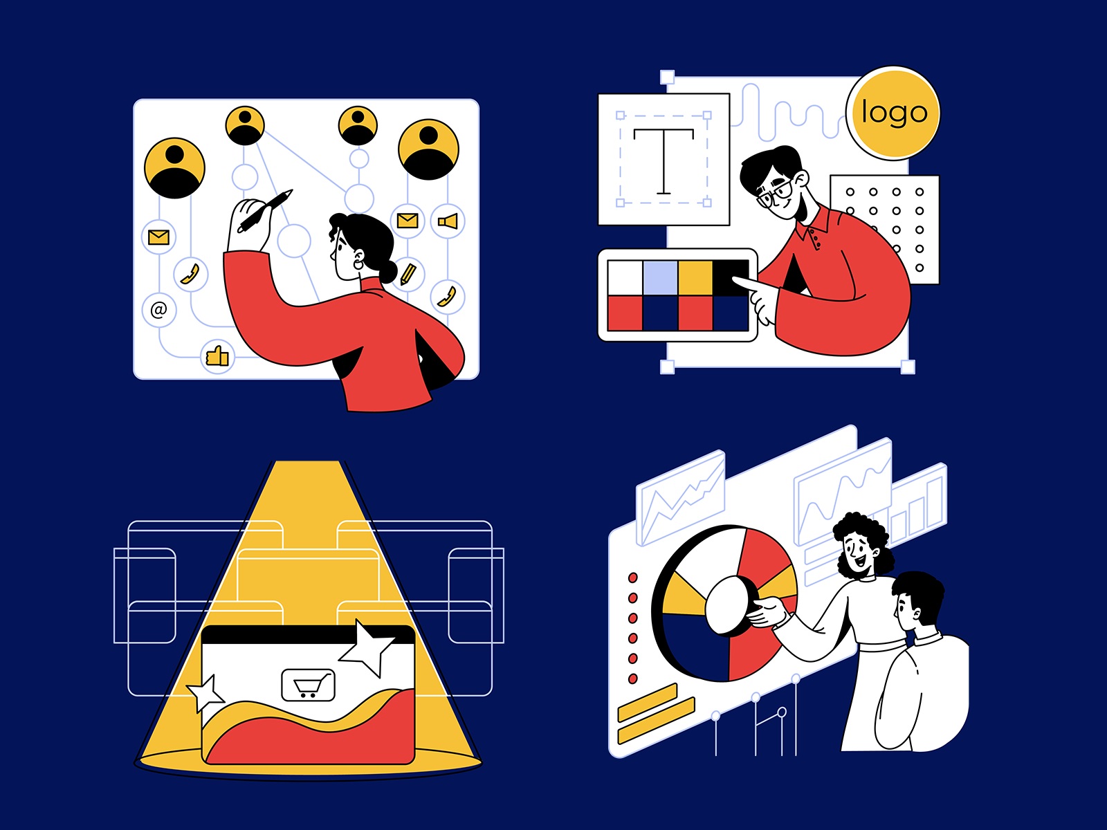
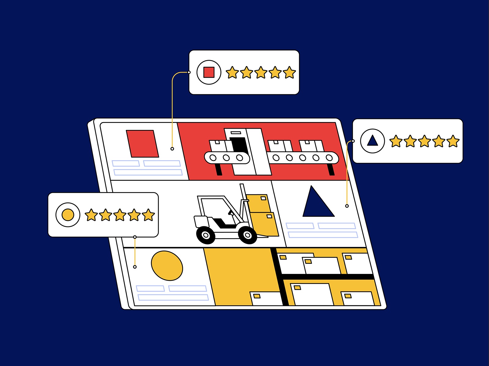
The digital illustrations for the Fulfill website and marketing make an effective combination of monochrome basis and bright color accents, as well as use the full power of line art. They reflect a variety of people characters adding a powerful and emotional human element to brand communication, and also feature cartoonish mascot characters, such as a parcel or a globe having faces and reflecting emotions.
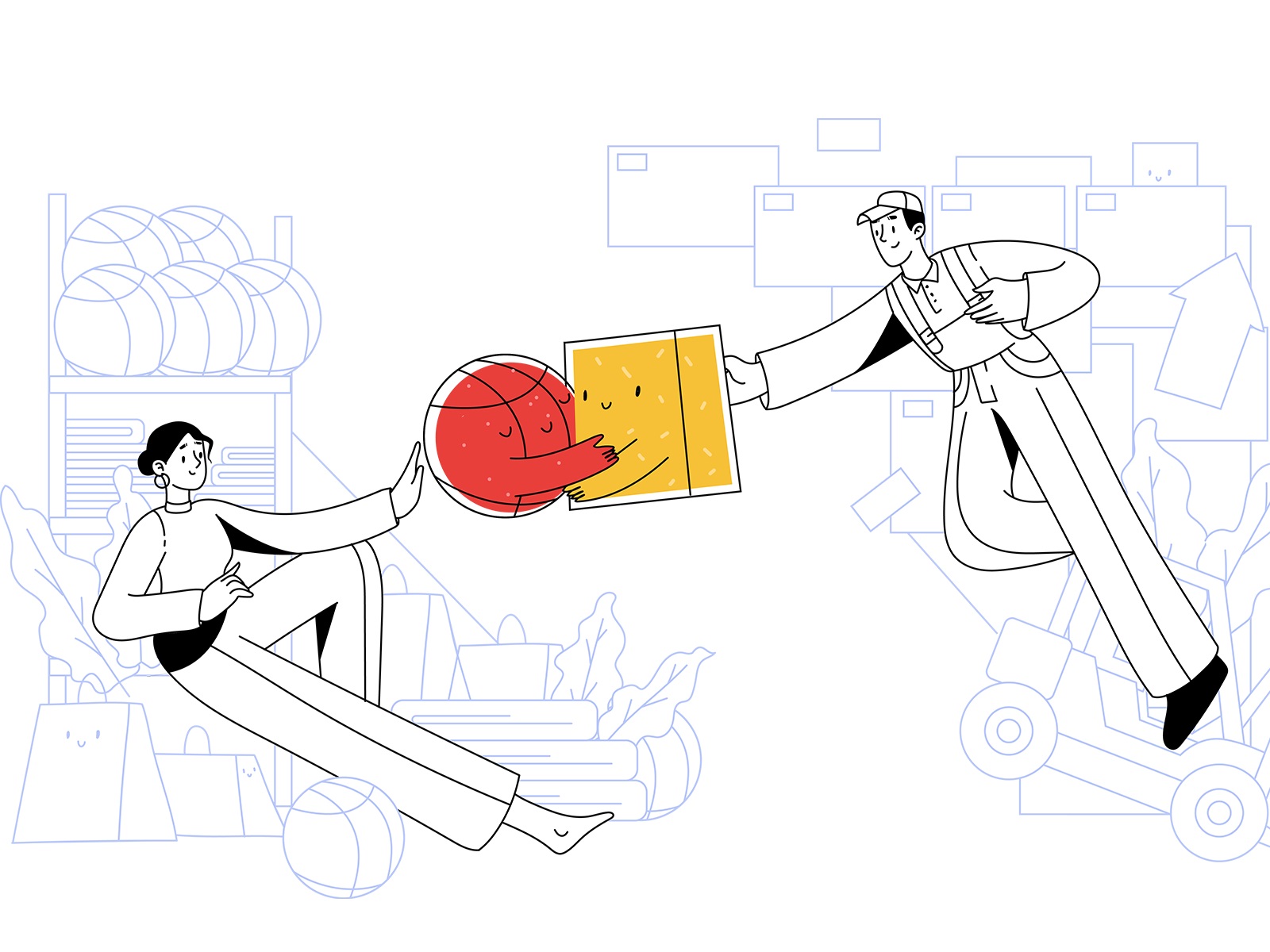
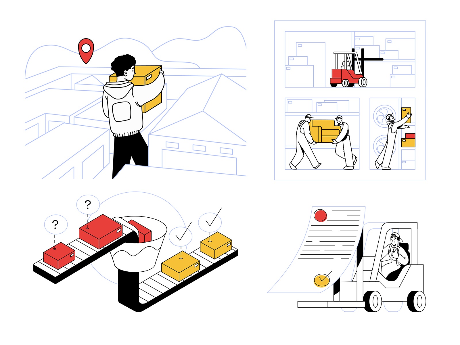
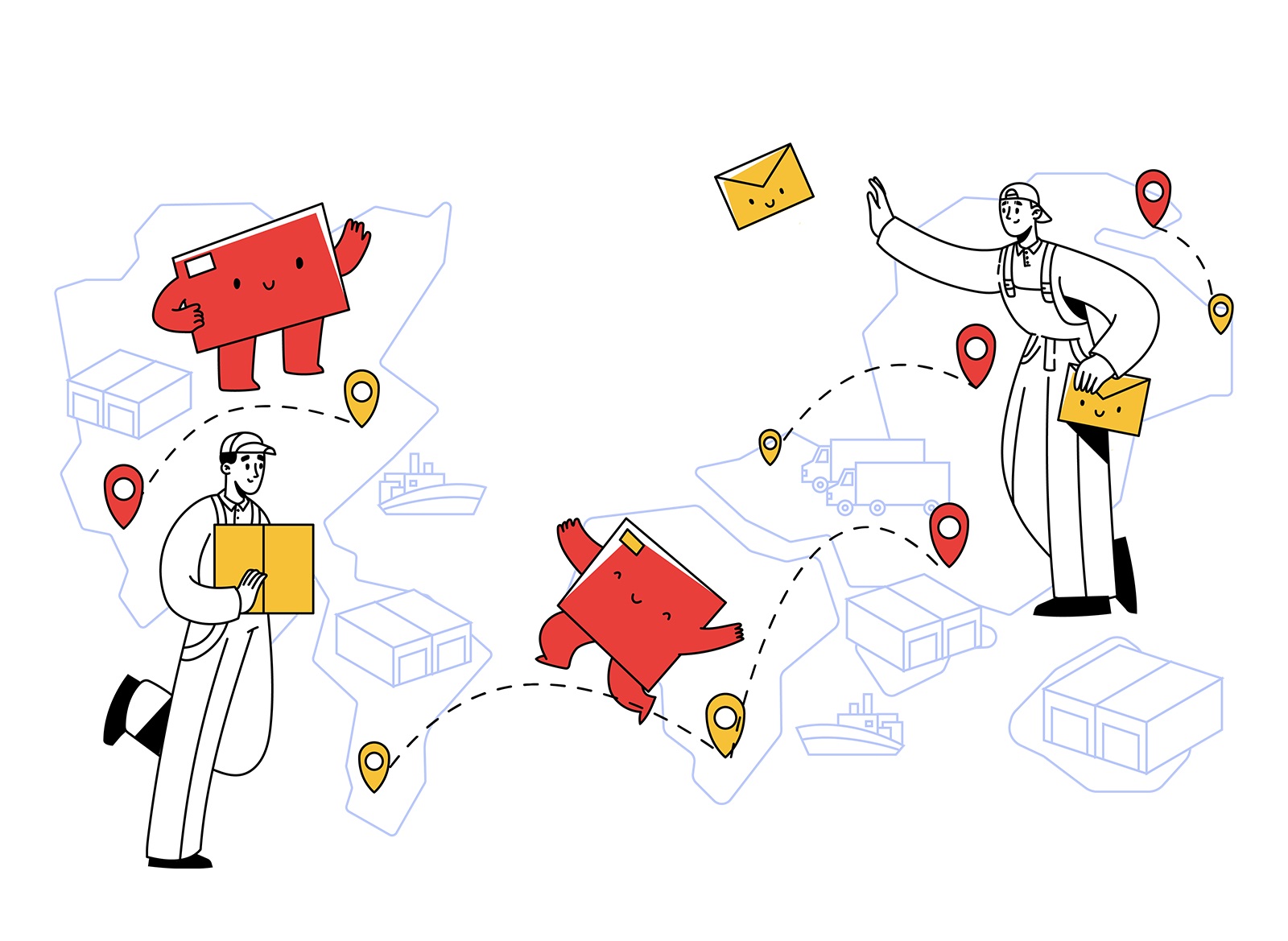

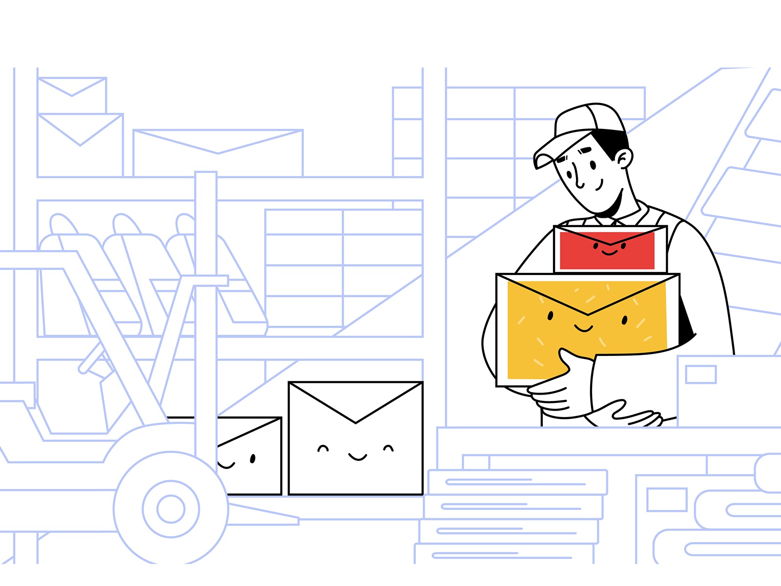
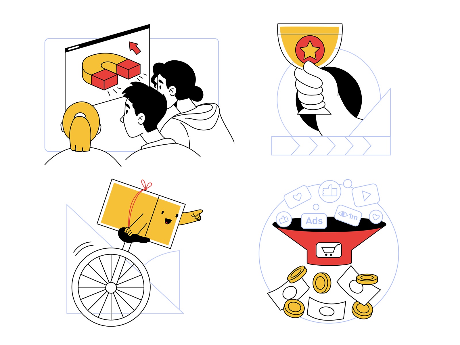
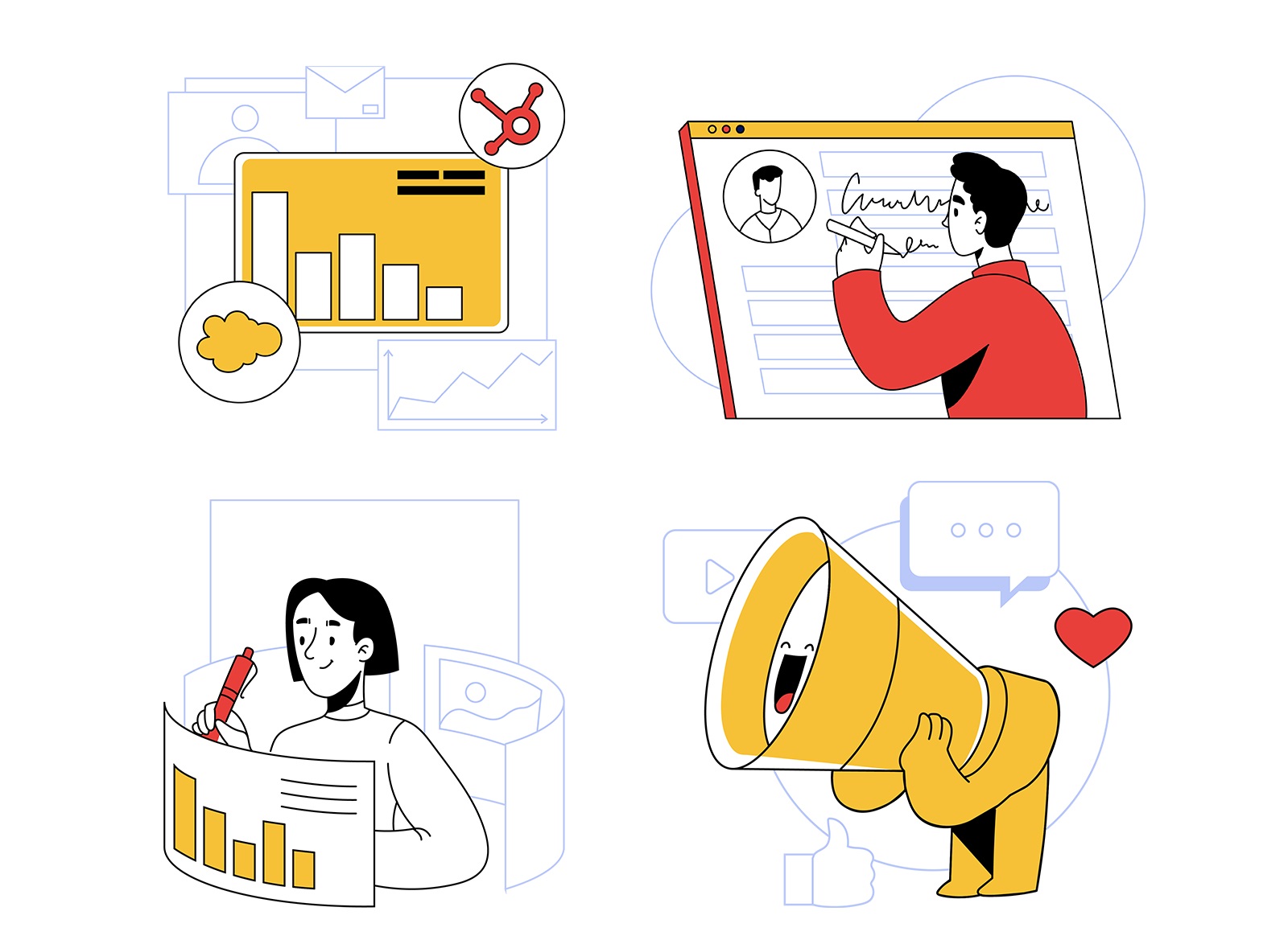
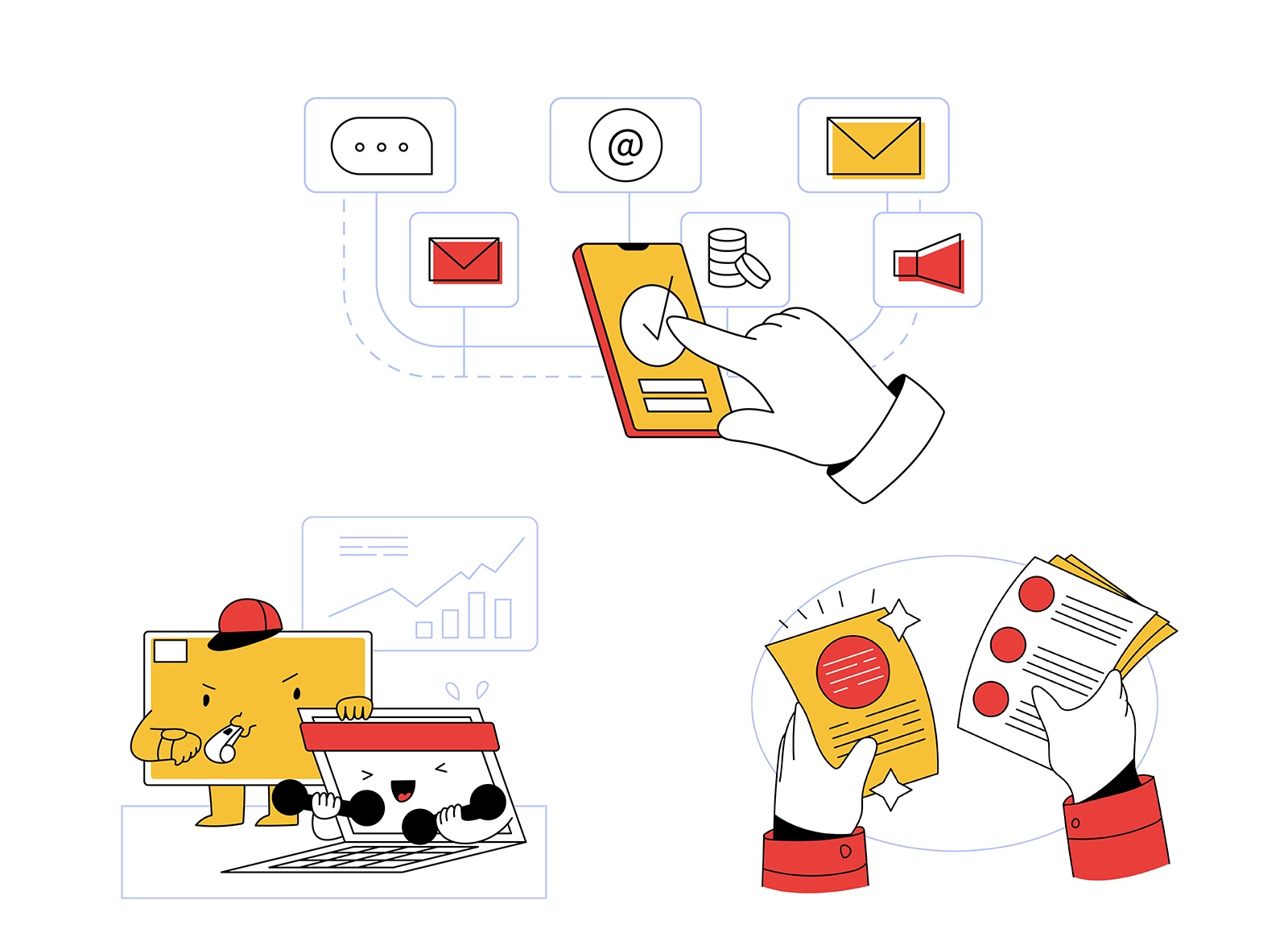


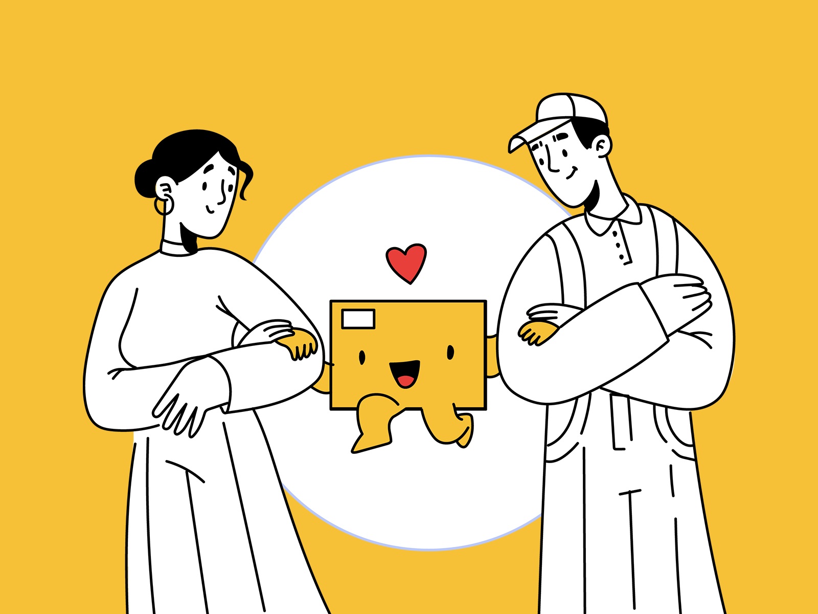


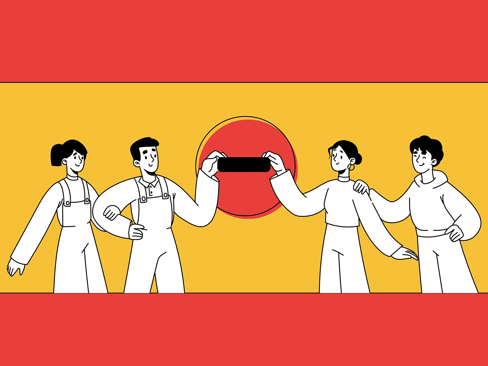
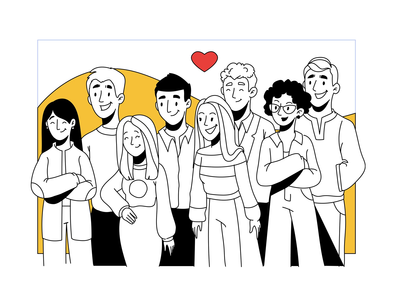
Illustrations created for the Fulfill project present a great example of how graphics help visually demonstrate complex or abstract processes, unveil the benefits of intangible stuff, and amplify text explanations.
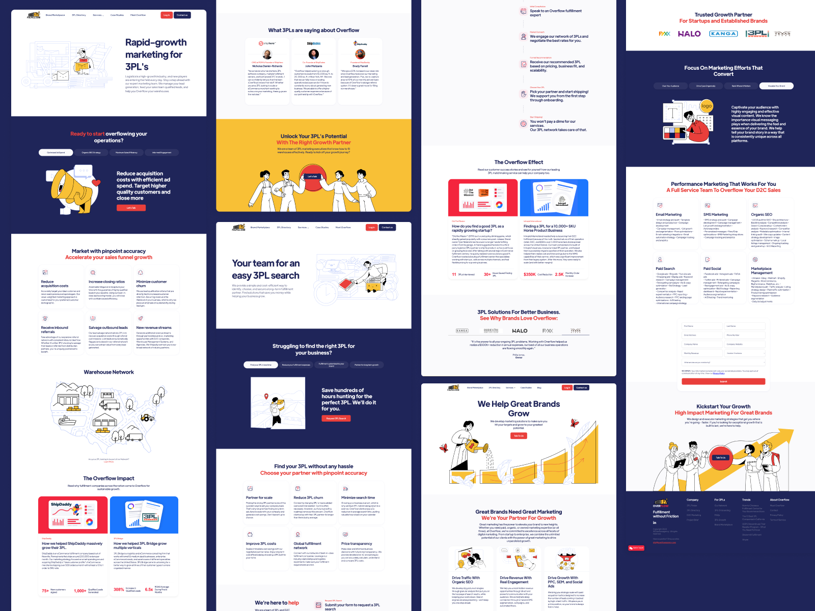
Now, let’s check how they worked integrated into the website design.
Web Design
Working on the website, it was essential to consider several factors:
- easy navigation
- eye-pleasing and clear layout
- solid typography with bold taglines and high readability as considerable amounts of text content were the primary sources of information
- neatly integrated informative hero images and illustrations
- emotional, engaging, and friendly communication with the visitor from the first seconds
- the recognizable and consistent visual style
- fast loading and mobile adaptability
Although the web pages are mostly light and airy, the designers also employ the power of color contrast, making some sections intensely dark and, in this way, distinguishing some blocks of information.
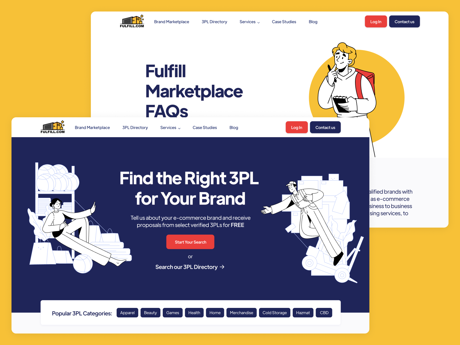
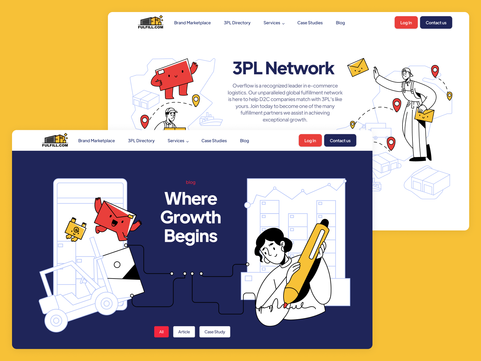
The web pages are based on a balance of visual and text content to make them happily married to support each other effectively and present the information in a digestible way. From any point of communication, it’s easy for the website visitor to start interacting with the service due to noticeable CTA elements.
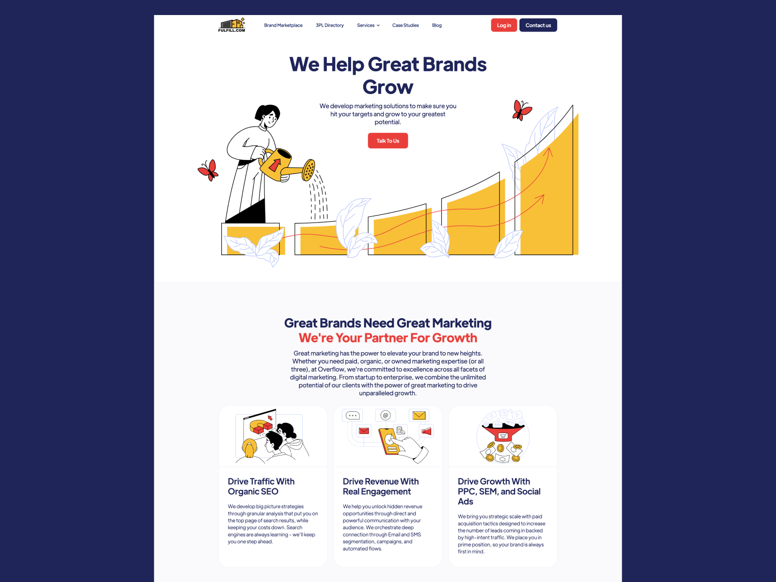
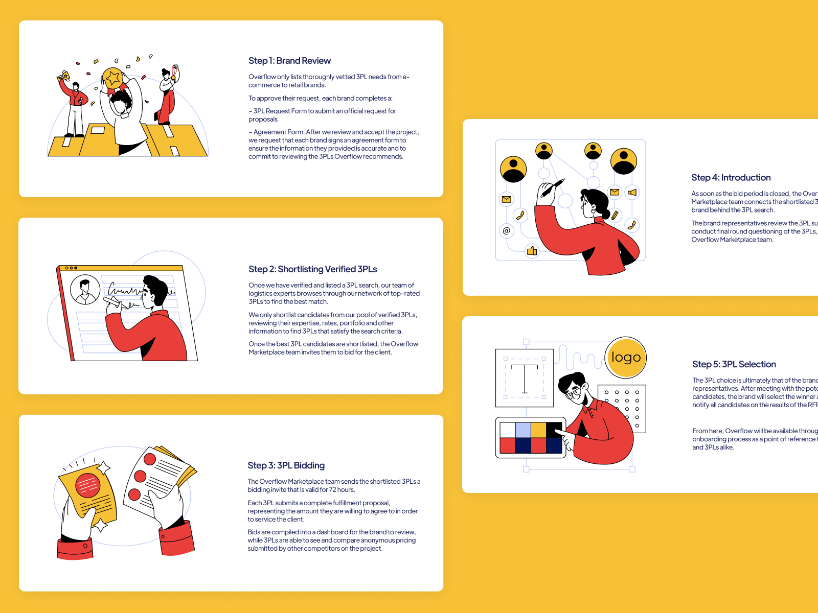
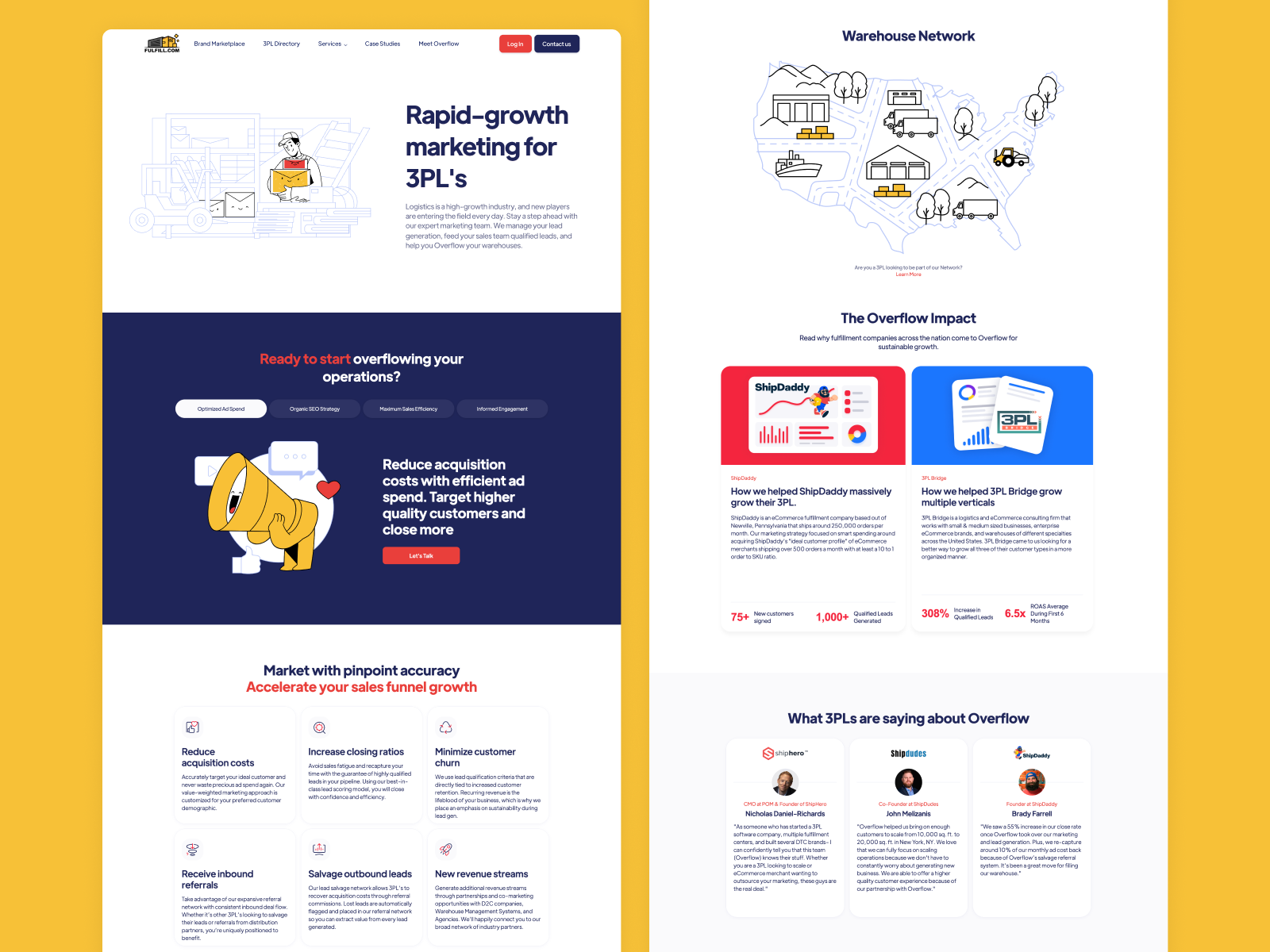
Although illustrations play first fiddle, other ways to visualize data and functions are also involved, for example, neat and consistent icons, noticeable infographic-like numbers for important information, and the like. What’s more, in some cases, interactive elements and CTA buttons are well-integrated right into the illustrations making a united and balanced composition.
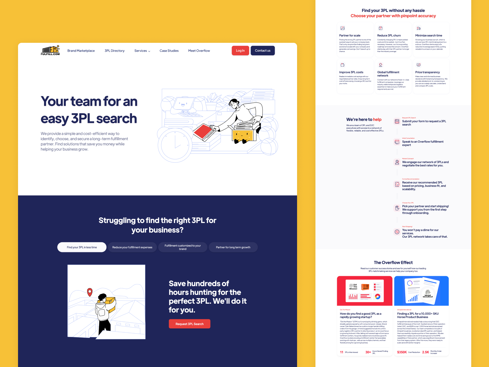
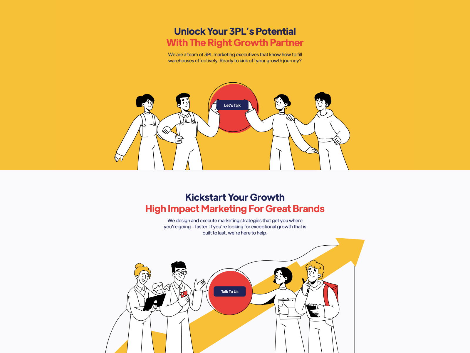
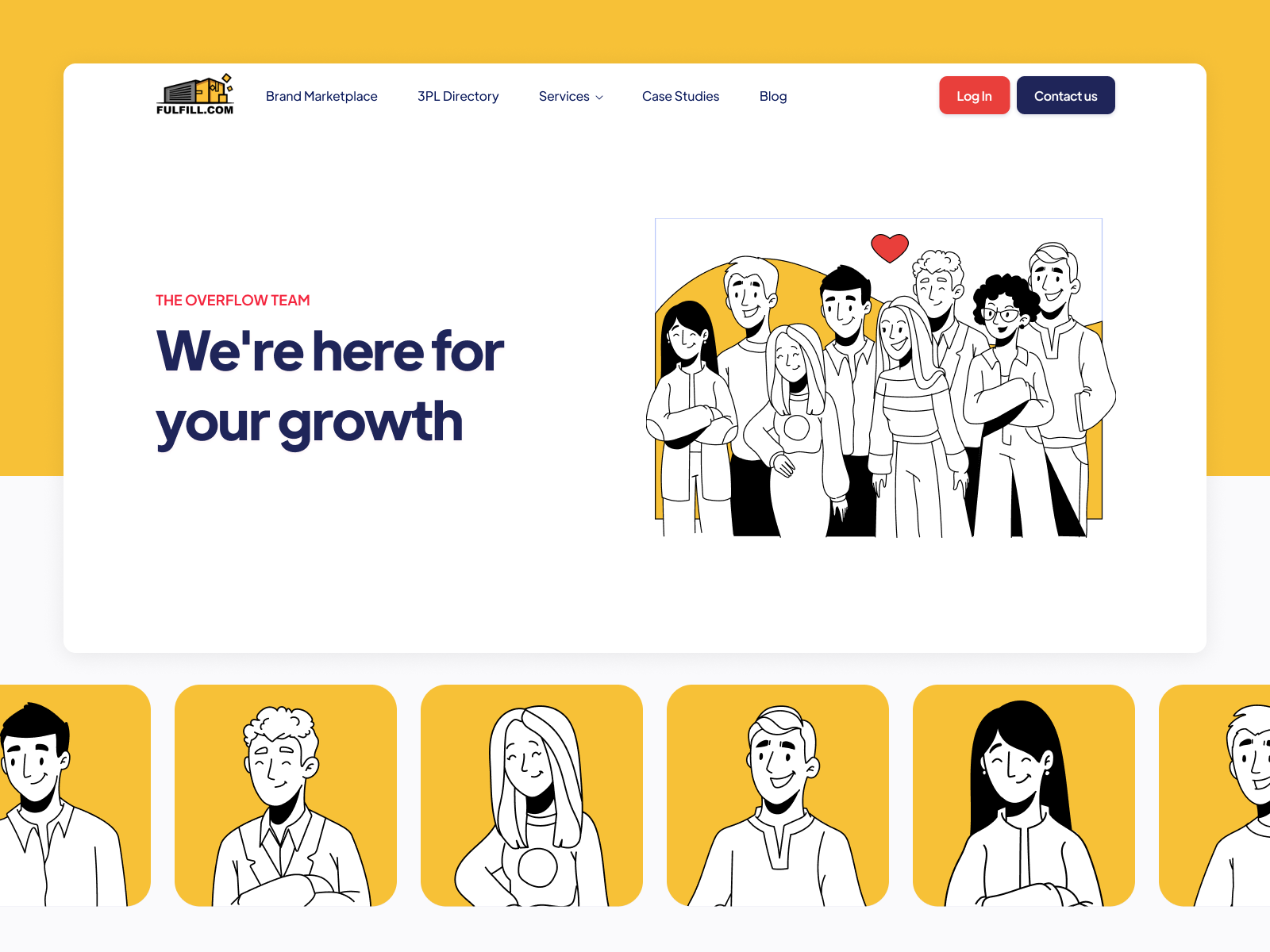
And here’s what the team page looks like, using the same illustrative style to set the team’s contact with the website visitor.
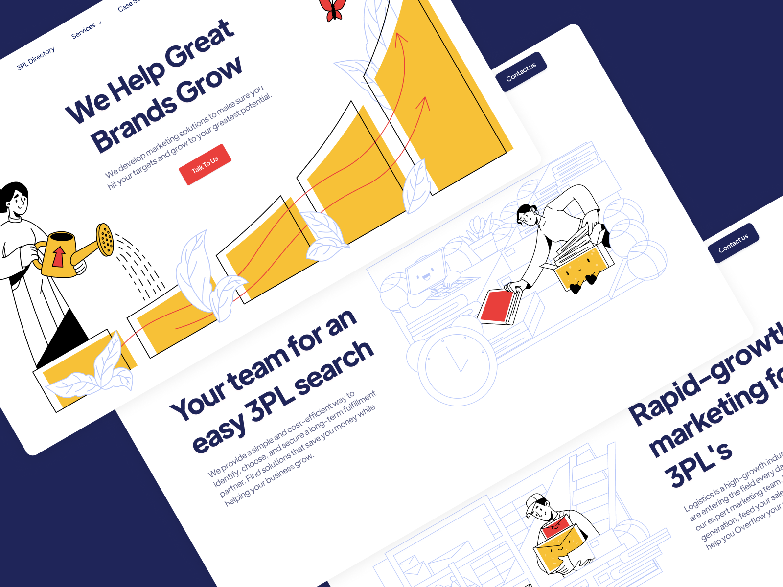
After agreeing on the design, we implemented the website on Webflow, which allowed us to make the process fast and effective and breathe life into the slightest details behind design solutions.
New design case studies from our team are coming soon. Stay tuned!
More Design Case Studies
Here’s a set of more case studies sharing the design solutions and approaches for some of the design projects done by the Tubik team.
Roebuck. Mobile Design and Illustrations for Educational App
World Humanitarian Day. Illustrations and Video for United Nations
Kaiten. Identity and Product Design for Food Marketplace
Glup. Delivery App Branding and UX Design
THT. Website Design for Electrical Engineering Service
Komuso. Website Design for Wellness Tool
PointZero25. Identity and Website Design for Event Agency
Nonconventional Show. Website Design for Podcast
uMake. Branding and Website for 3D Design Tool
BEGG. Brand Packaging and Web Design for Food Product Ecommerce
Crezco. Brand Identity and UI/UX Design for Fintech Service
FarmSense. Identity and Web Design for Agricultural Technology


