Let us show you the project that dives deeply into the innovations created with the wish to support the disabled and give them more opportunities to live full lives, no matter what happens to them. In this case study, we uncover web design and development for the company producing bionic prostheses and also glance at the process of creating a detailed 3D model of a product.
Project
For several decades, we have witnessed multiple collaborative attempts of doctors and engineers to facilitate the people who lost their limbs with prosthetic ones and, therefore, help them get through the issue and get more abilities for everyday operations. The sphere has shown incredible progress in approaches and technologies, making bionic hands, arms, and legs more and more functional and helpful for their users and contributing plenty of positive changes to the lives of people going through hard times.
So, in this project, our team also touched on that domain, considering how this type of health tech product could be presented from the perspective of web design and user experience design to connect the producers and the users of prosthetics effectively. We worked on website design and Webflow development for HP23, the company producing bionic prostheses and providing therapy and training for their users, pushing innovations and evolution of the prosthetics sphere.
The creative team for this project included Anton Morozov, Vladyslav Taran, Kirill Erokhin, Lada Kunytsia, and Olya Zakharyan.
3D Model
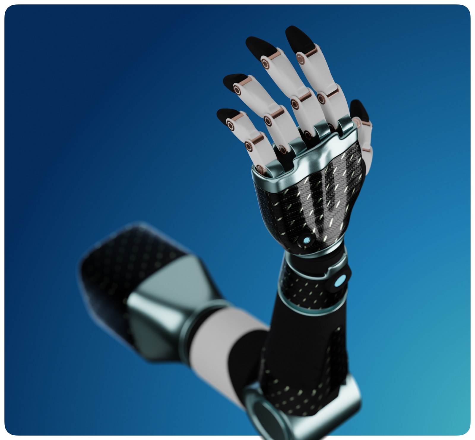
Besides telling about the activity of the company in general, the website mainly concentrated on the goal of presenting a specific product the company produces, the bionic prosthetic arm, so it was important to find a way of showing the product that would be both informative and attractive. In this case, the 3D model supported with complex animation was found to be the best choice for the visual content. Therefore, we created a realistic and detailed 3D model of a prosthetic arm in Blender and animated it for an effective product presentation.
The graphic inspiration for the project was the artwork from the illustration set about technologies for the disabled.
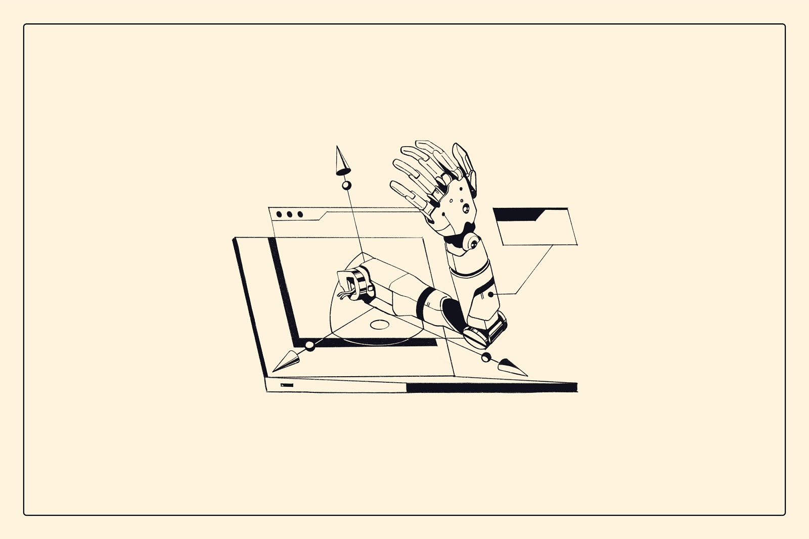
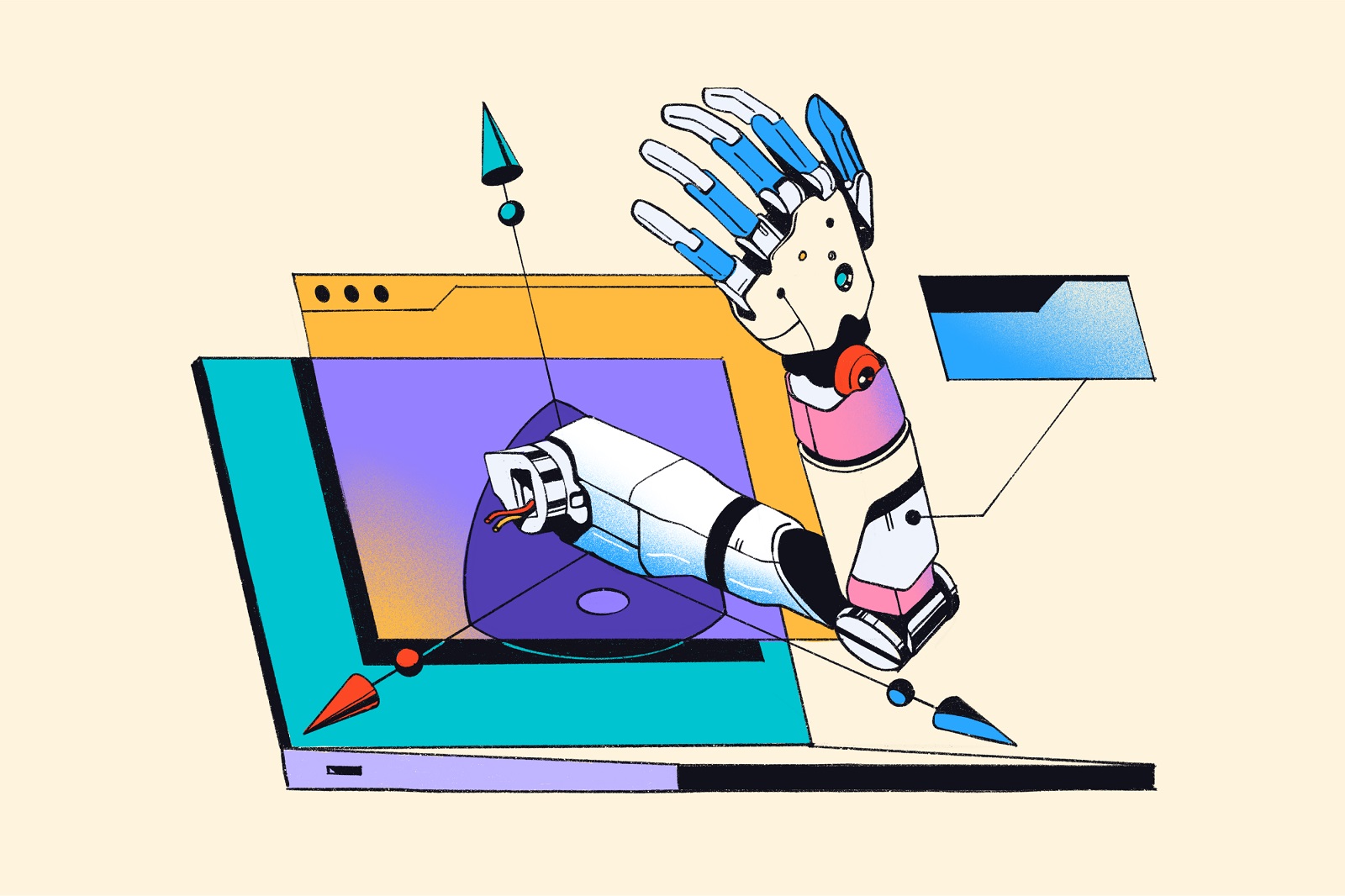
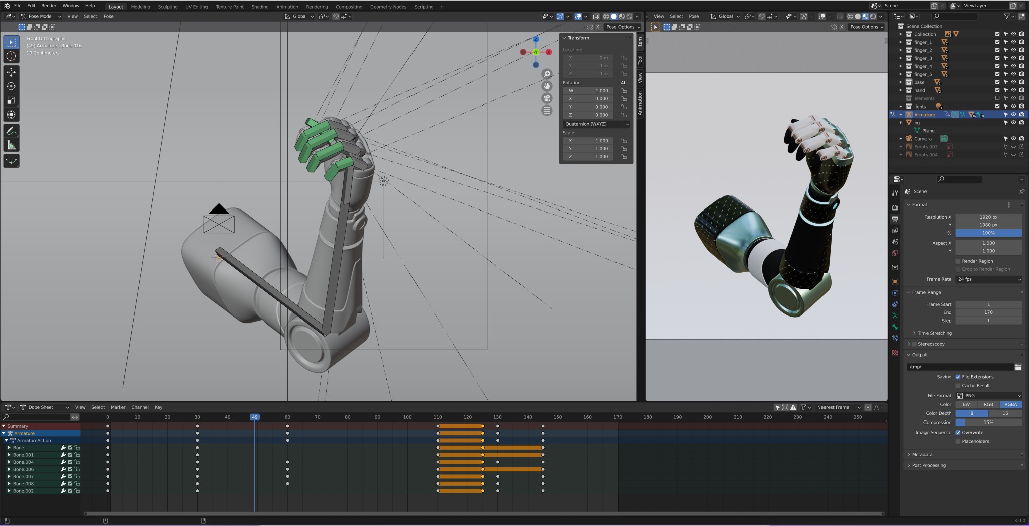
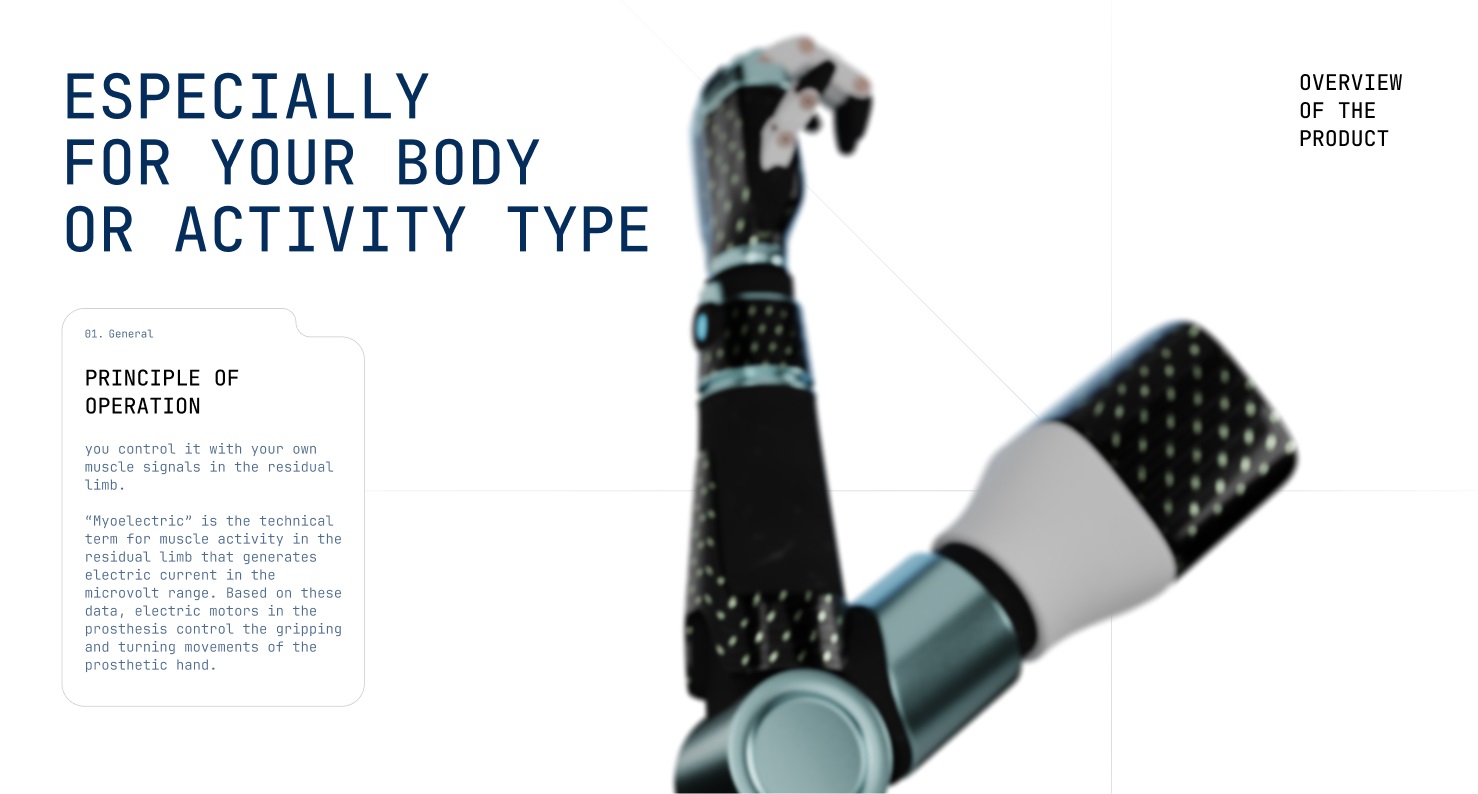
First, the designer made the structure of the arm, hand, joints, fingers, and other details.
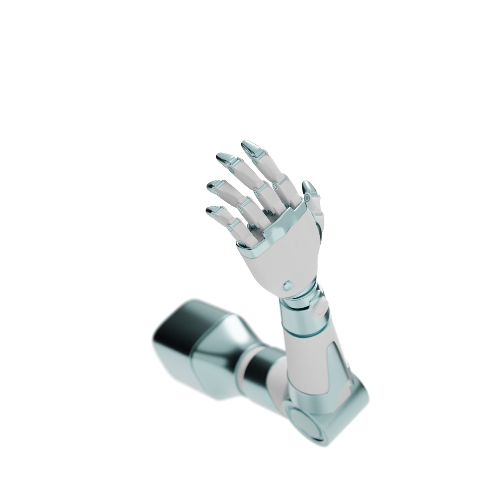
Then, there was the work on finding proper colors, lighting, and textures.
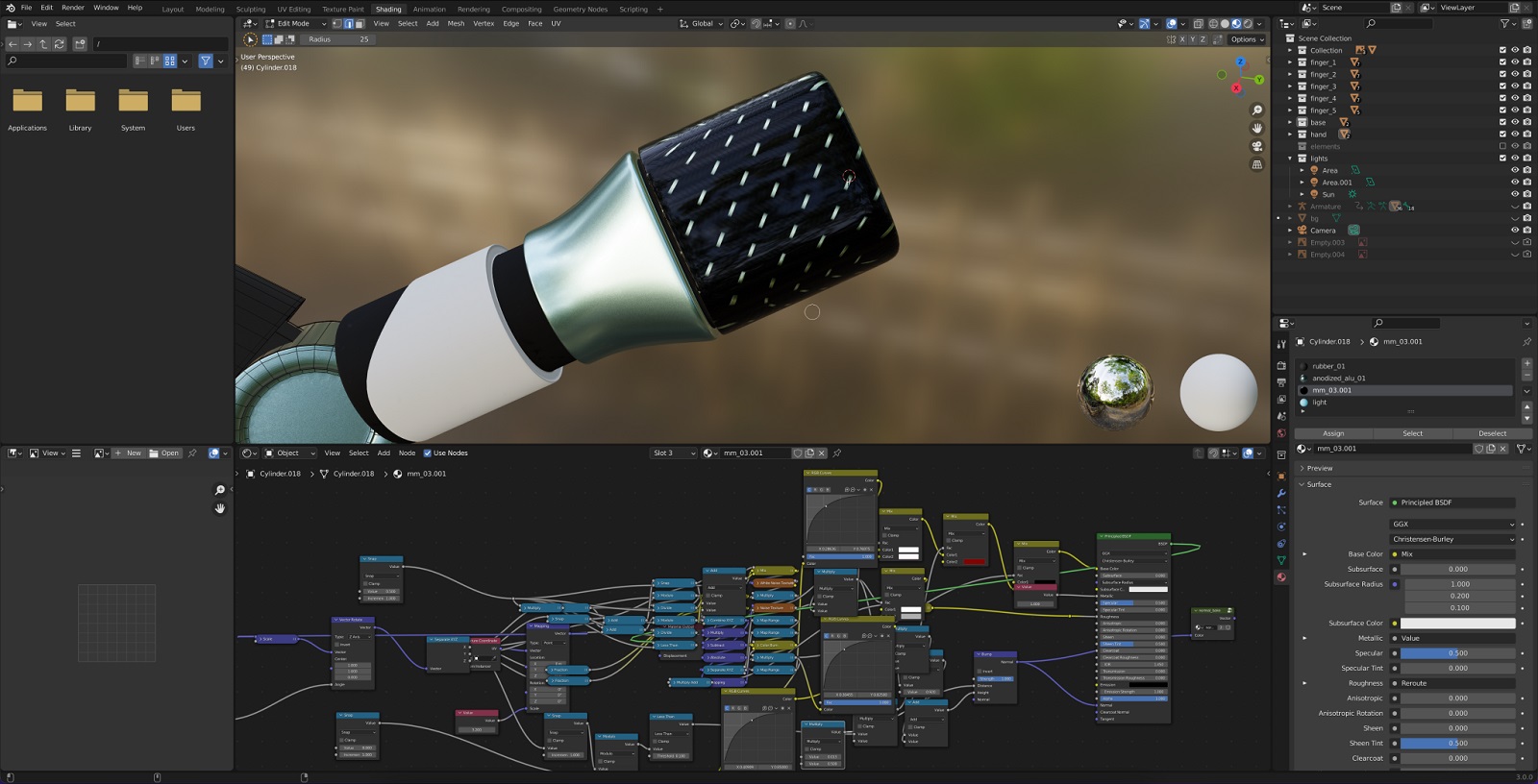
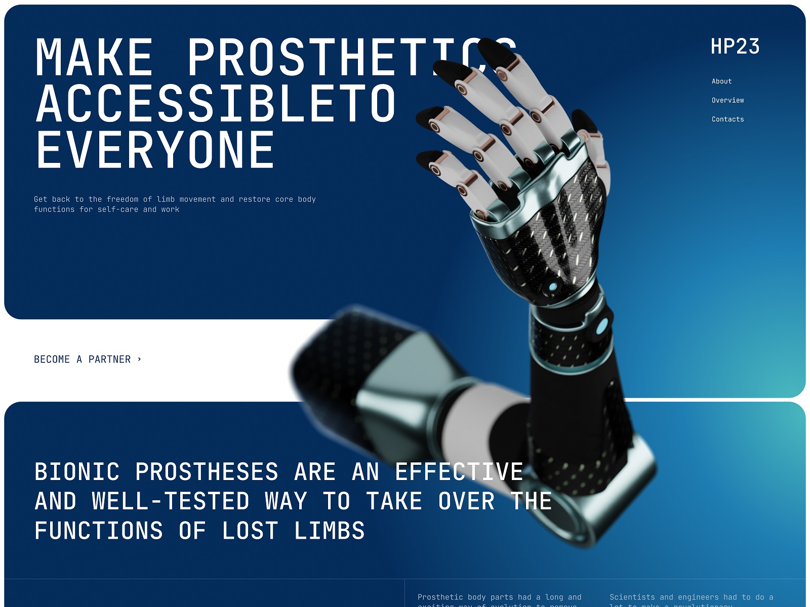
This is what the prosthetic arm model looked like in the starting position for the motion presentation on the website’s home page. It laid the foundation for the hero animation on the main screen.
From this starting point, a sequence of positions was thought out and animated to give website visitors an overview of the device.
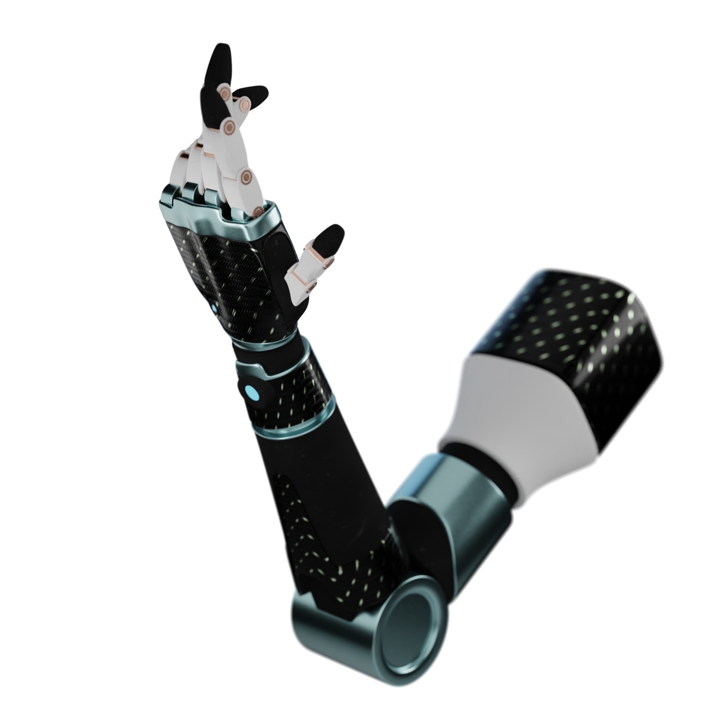
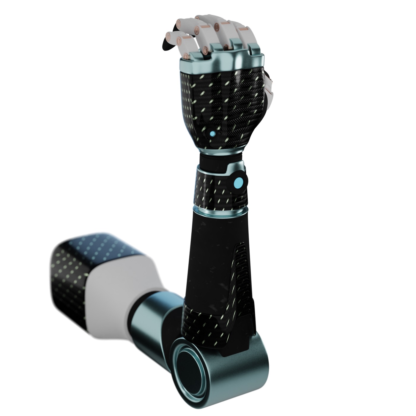
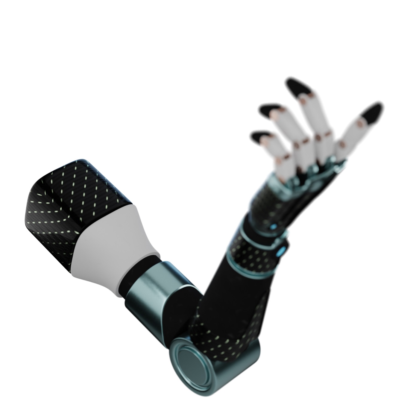
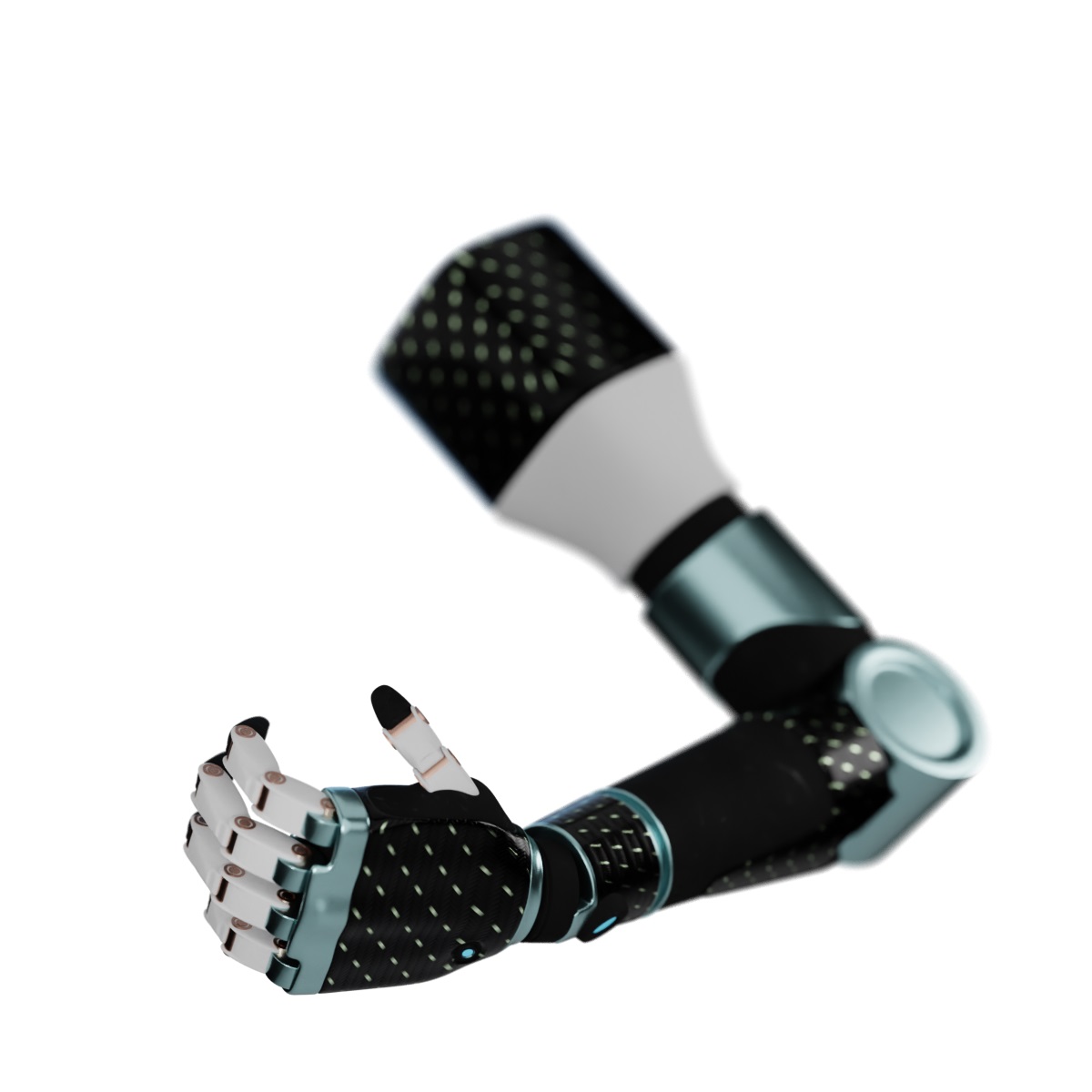
This work resulted in a solid basis for the diverse experiments with complex 3D animation.
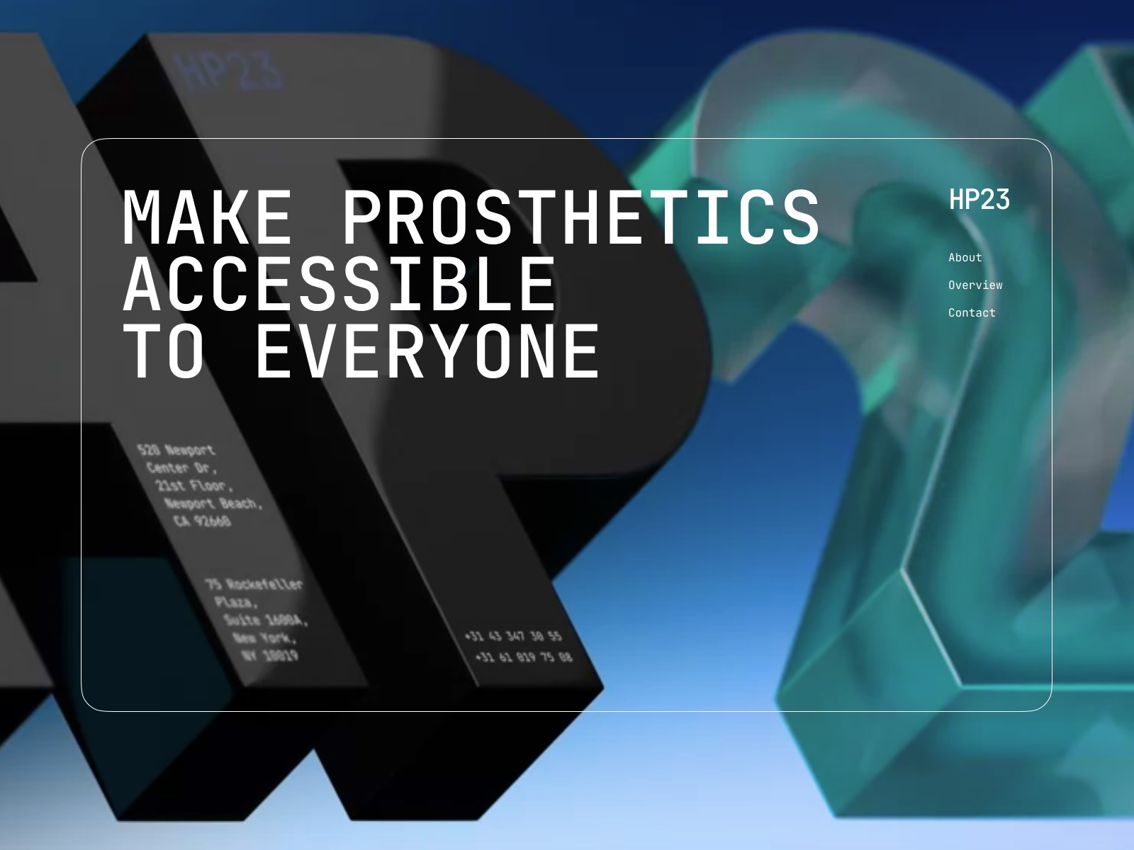
One more task for 3D design was to make the voluminous model of the company logo to make it work in visual consistency with the 3D images of prostheses.
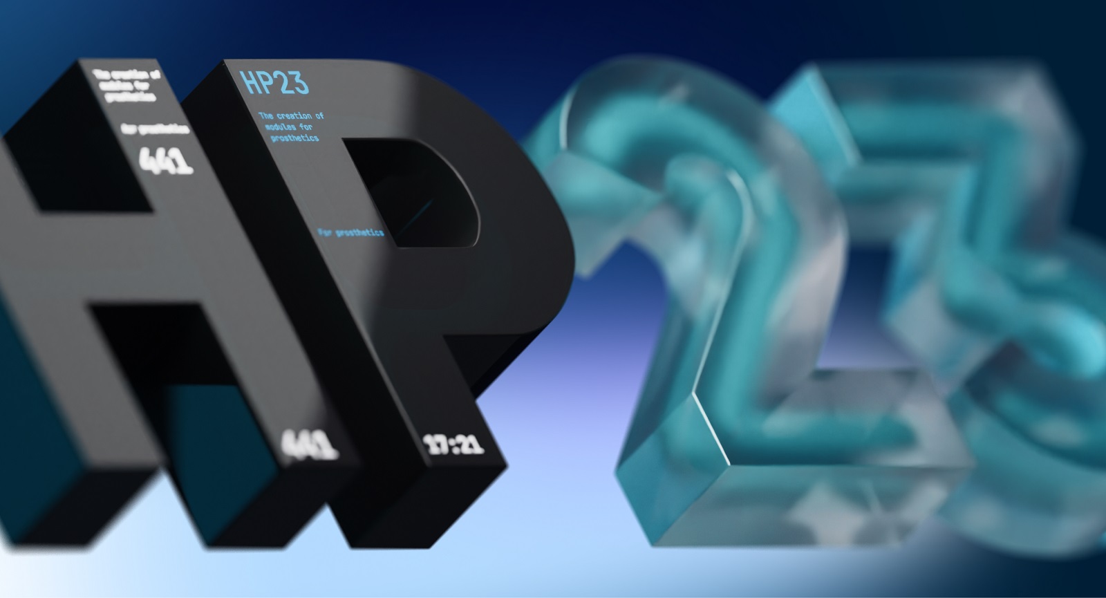
After finding the needed style, the stage of integrating these 3D visuals into web design started.
Website Design
As the website is devoted to technological innovations in prostheses and modern health technologies for the disabled, the major challenge was finding a way of presentation that would be informative but not overwhelm the visitors with too specific or technical information. Obviously, the visualization of the product played the first fiddle. Hence, the designer had to think out and find the color scheme, layout, and typography that wouldn’t conflict with the 3D model and effectively work together without clutter or unnecessary distraction.
The color palette for the website is based on the elegant and reserved combination of different shades of deep blue with white and black for text and accents, which plays well with the colors of the 3D model. The choice of fonts provides a high readability level and gives an instant visual connection to the theme of innovations and digital technologies.
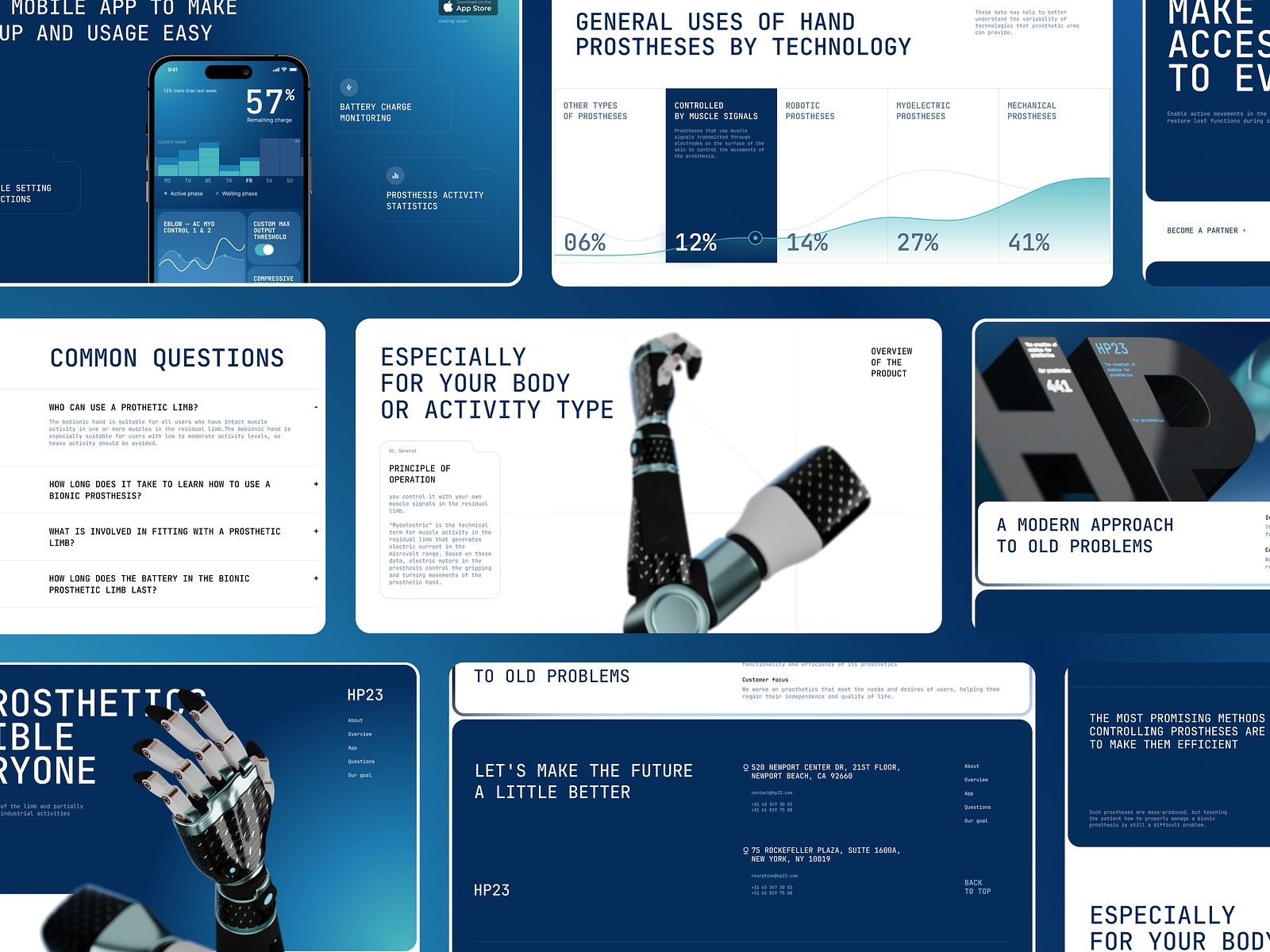
Here’s how all that approach worked for the home page. The hero section gives a prominent product demonstration and briefly introduces its essence and mission. The core navigation is accessible in the top right corner, and the stylish animation of the typographic parts makes the first contact with the website even more lively and dynamic.
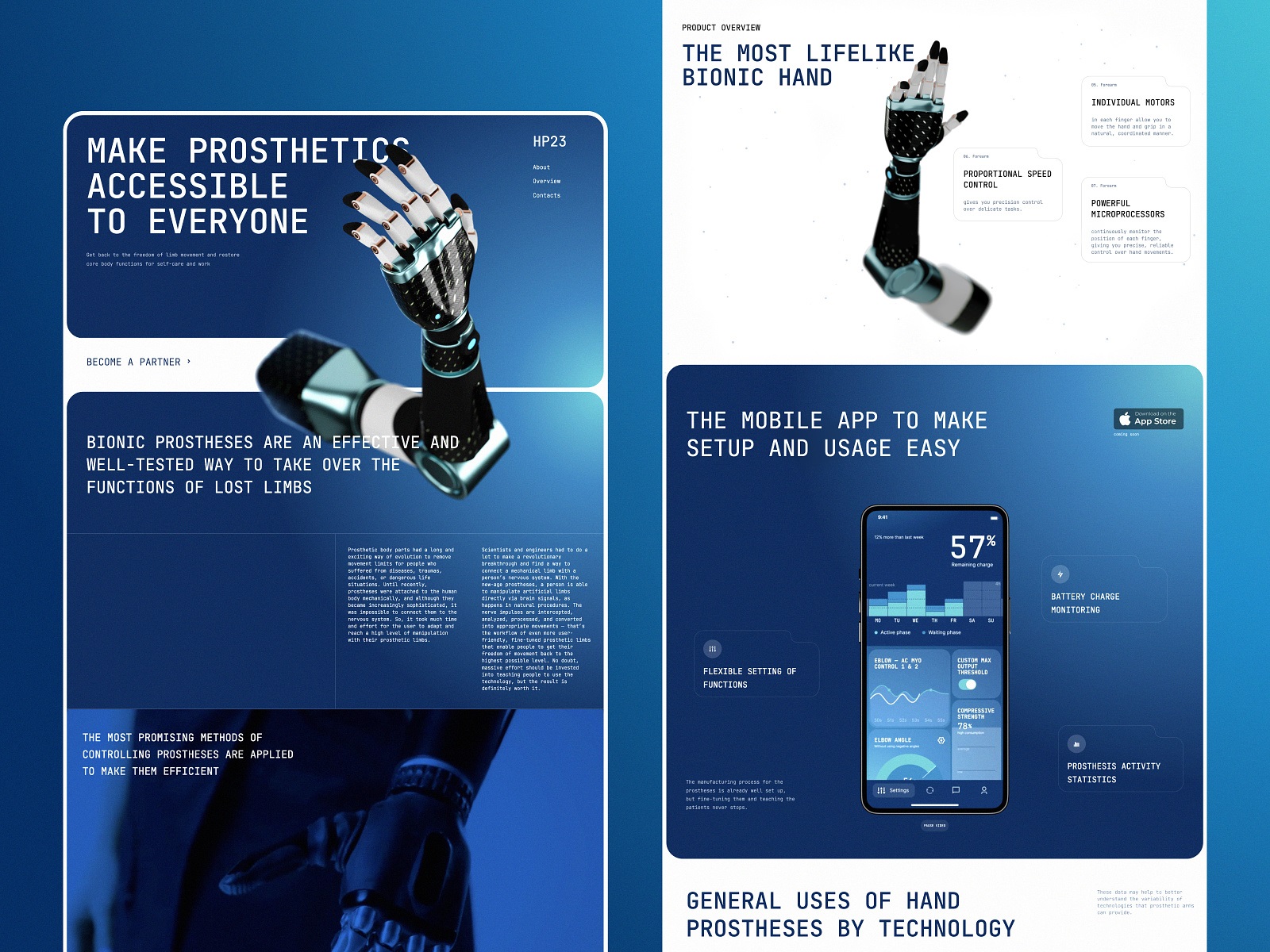
The web page layout organizes various information about the product into informative sections supported with relevant visual and video content. Although the animated 3D model works as a significant visual element, the page also features a video demonstration setting the real-life association and mobile application screens in the section devoted to it.
Home page layout
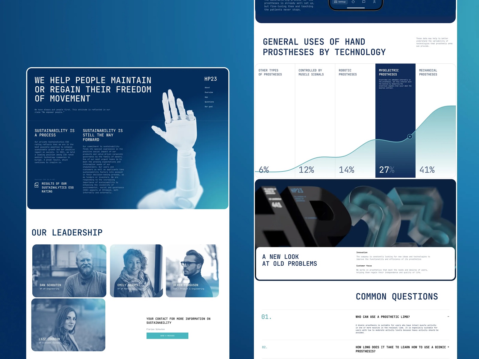
About company page and more sections of the home page
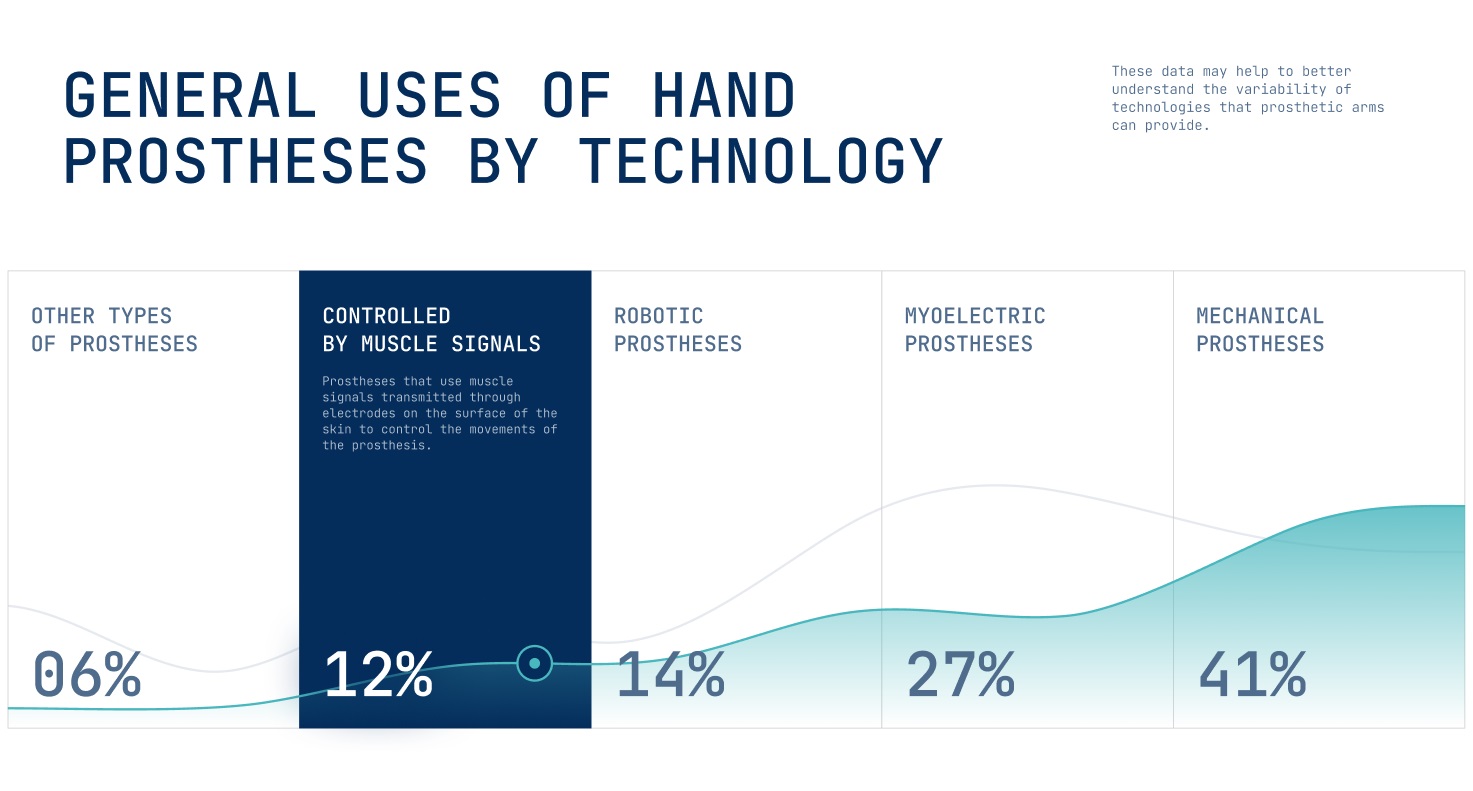
Statistics and data visualization approach
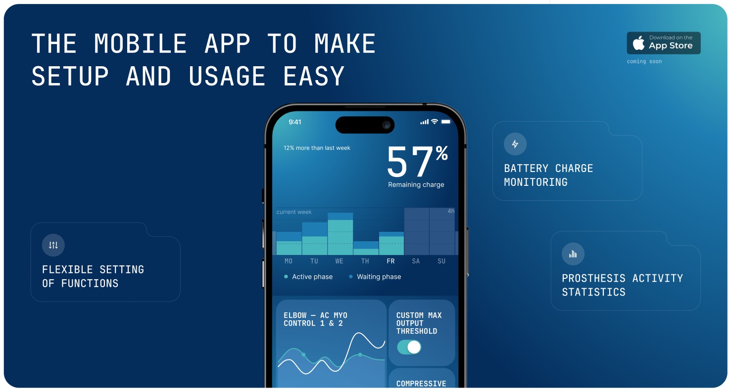
Section announcing the mobile application for better prostheses management features the app’s user interface consistently echoing the general visual brand style.
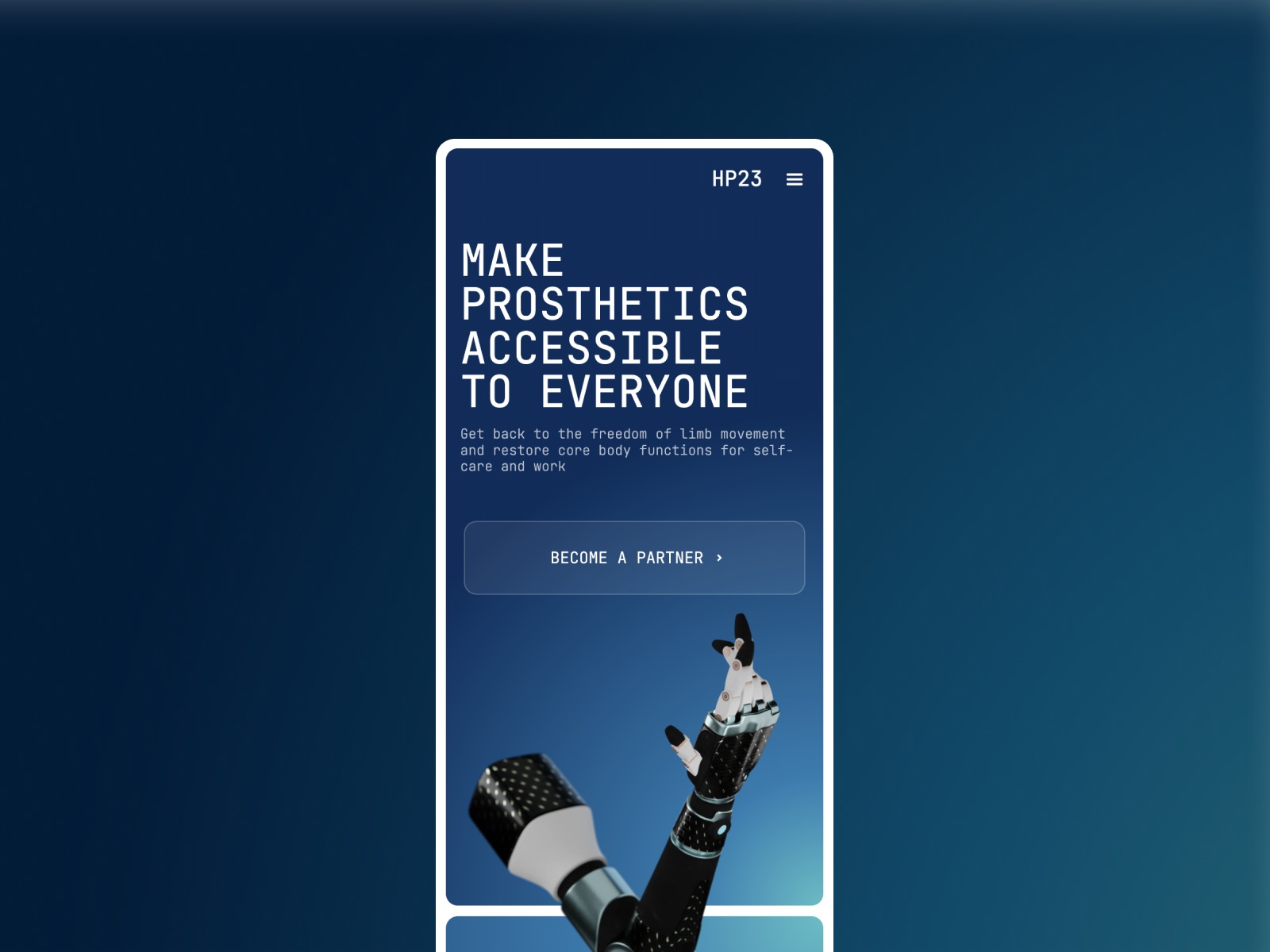
The mobile adaptation of the website
Solid visual hierarchy of the website pages, together with functional and smooth web animation, make the user experience positive, dynamic, and eye-pleasing for website visitors.
And here’s how the 3D logo was integrated into the page telling about the producer company.
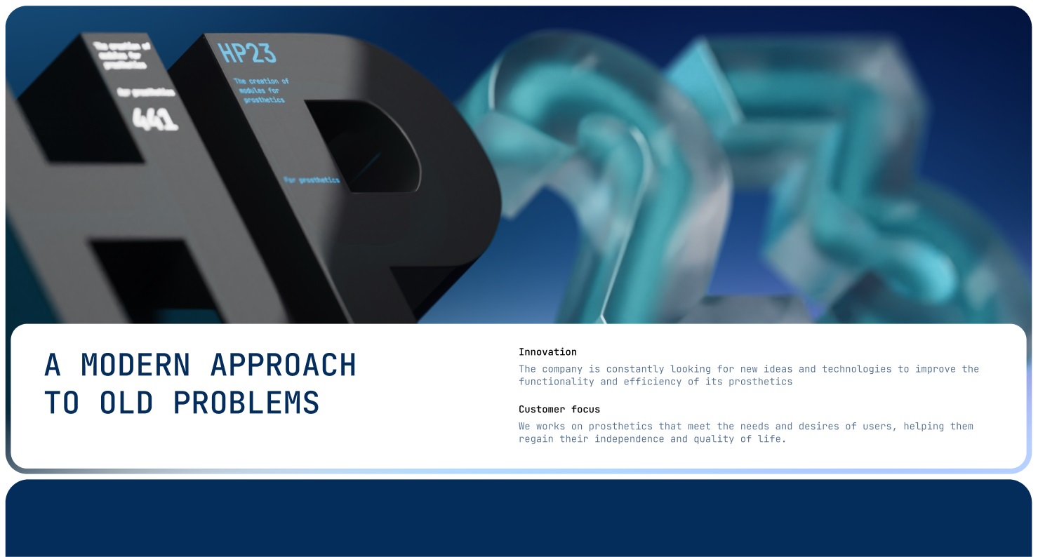
After the web design was polished, the team breathed life into it, implementing all the design solutions with Webflow. So, welcome to see how the live HP23 website works and review more details integrated into pages. The website design got the Honourable Mention on Awwwards.
Also, we worked on the product design concept for the mobile application, which will help the users of the bionic prostheses to manage it better and conveniently get personalized information and statistics.
This project was an excellent chance for the creative team to touch on a human-centered, innovative, and highly technological sphere and try the potential of 3D modeling and animation for such an objective.
New design case studies from our team are coming soon. Stay tuned!
More Design Case Studies
Here’s a set of more case studies sharing the design solutions and approaches for some of the design projects done by the Tubik team.
FluxWear. Web Design and Development for Health Tech Product
Magma Math. Web Design for Educational Platform
Synthesized 2.0. Web Design for High-Quality Synthetic Data Platform
HotelCard. Brand Identity for Hotel Offers Service
Nibble Health. Identity and UX Design for Healthcare Fintech Service
Physica Magazine. Web Design and Graphics for Scientific Blog
CSConnect. Website Design for Immersive Experience Marketing Platform
ProAgenda. Identity and Website Design for Golf Management Service
BlockStock. Brand Identity and Website for Minecraft Models Resource
Kaiten. Identity and Product Design for Food Marketplace
THT. Website Design for Electrical Engineering Service


