This design case study overviews the project at the crossroads of highly technological and innovative industries, such as Information Technology, DevOps, Machine Learning, and Data Science and Management. Let us unveil the creative process for the new website of Synthesized, the platform for creating and managing high-quality synthetic data.
Client and Project
Synthesized is a platform that allows users to create high-quality synthetic data for machine learning, application development, and testing with easy-to-use config files. Since 2018, Synthesized has been on a mission to empower data scientists by making the creation and access of high-quality synthetic data fast and easy, enabling collaboration and innovation. Founded by PhD researchers from leading UK universities, Synthesized has pioneered the generation of production-like data for machine learning and application development across all structured data formats within one platform. What’s more, they pioneered generative modeling in 2018, commonly referred to as Generative AI, for all structured data — tabular data, time series, event-based data, databases, and semi-structured domains.
The tubik team worked on the first version of the Synthesized website, and so this time, we collaborated again on the redesigned website for them, marking the company’s growth and evolution and making interaction with the service and tons of helpful content they share on the website straightforward and effortless.
The project’s scope covered different design tasks, such as UI/UX design, graphic design, and motion design. Also, we implemented the website with Webflow.
The big creative team from tubik side for this project included Oksana Lashko, Diana Krupa, Anastasia Gurinenko, Roma Chornyi, Yaroslav Manzheliy, Kyrylo Yerokhin, Ladamyra Kunytsia, Maryna Solomennykova, Oleksandra Mykhalyk, Olha Krasnokutska, Nick Zhuravlov, and Natalka Mamchur.
Web Design
Synthesized is a successful startup, and as it scaled and evolved, it changed the focus to a different target audience and required an updated website with a new visual style to stand out. The new content and functionality generated within the years of service development needed new design elements that were not included in the previous design. As well, a more extended and optimized CMS was required at that stage.
Let’s remember briefly what the first website version looked like.
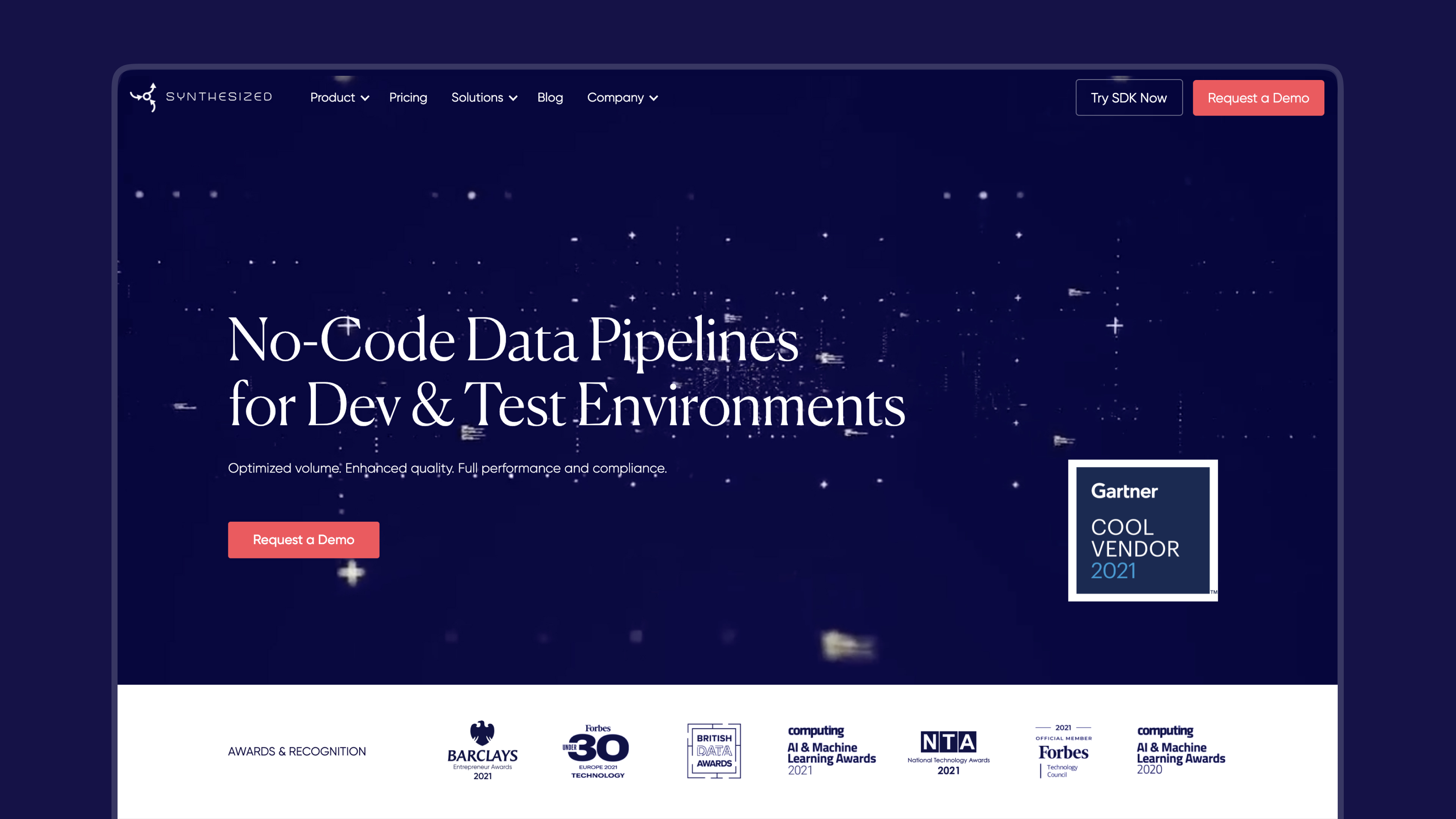
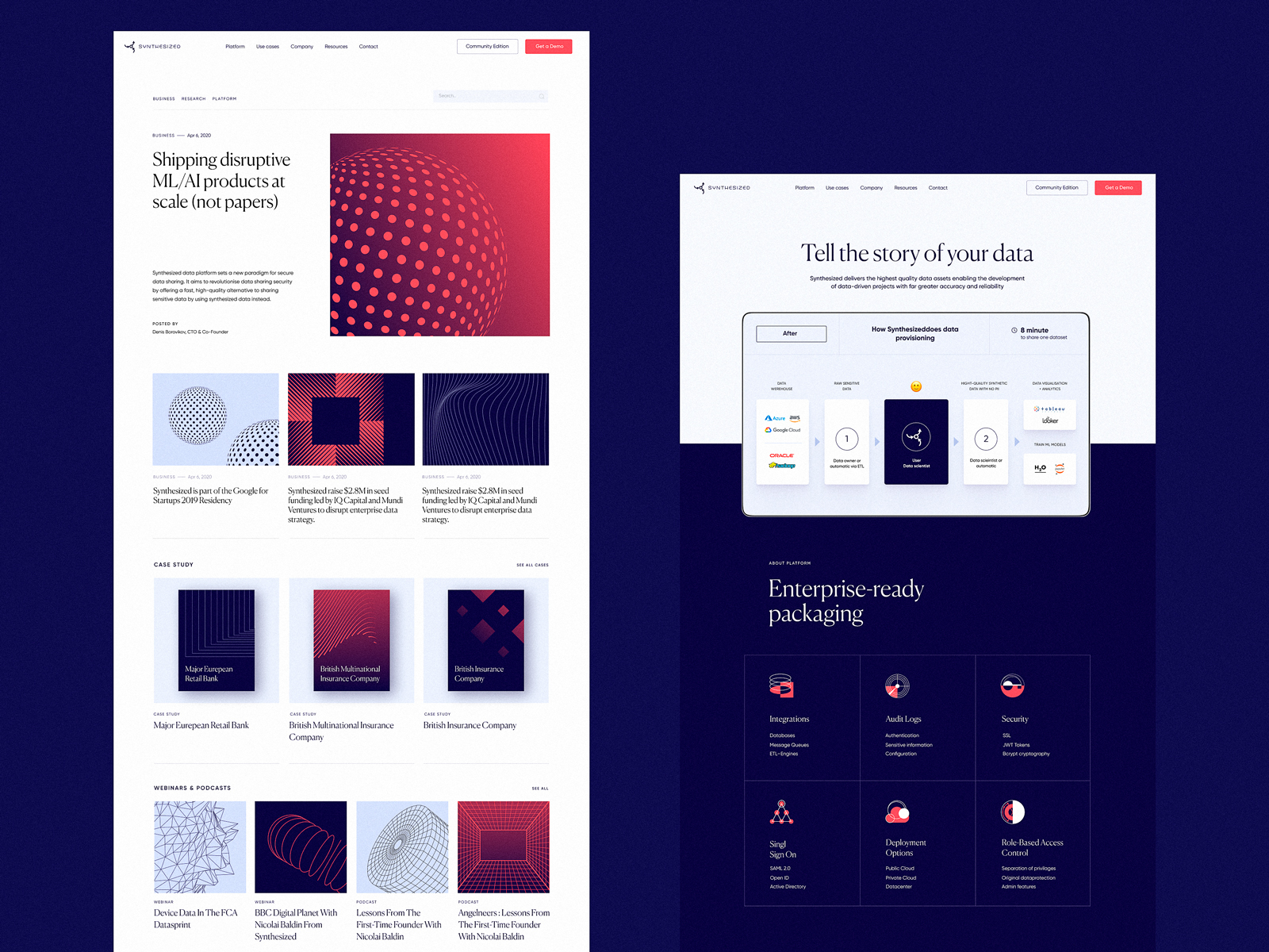
The previous version of the Synthesized website, see and read more about it in the case study
We had to rework the visual presentation that would make the company stand out from the competition and reflect its progress through the years. Also, it was essential to transfer and organize all the existing content and combine it with newly created stuff into one integral and efficient user experience.
The creative process for this project included the following steps:
- deep competitor analysis and market research
- rethinking the general visual style approach for the company’s online presence and giving a technology-centric look and feel
- design for a user-friendly and intuitive website with the reconsidered and extended structure
- creating custom graphics and motion design, in particular, for the visual demonstration clarifying abstract processes and complex phenomena
- website implementation
The thorough and detailed research of the market and the other digital products or services the potential audience of Synthesized typically uses allowed us and the stakeholders to better understand what visual style approach will help the service look original and enhance its brand communication. Also, the research and ideation phases and analysis of the actual user experience and interaction with the initial website version laid the solid basis for renewing information architecture and content arrangement.
So, after a couple of iterations and an intensive creative search, we came up with a fresh look for the Synthesized website and created a new design system for it: minimalist, practical, and stylish. The improved website structure and reconsidered layouts arranged all the existing and new content into an integral user experience.
The color palette was mainly based on the combination of dark and light backgrounds used in a way to give the best performance to the pieces of the graphic and text content, and the bright accent color for attracting visitors’ attention to noticeable interactive details, CTA elements, and important details.
The combination of light and dark backgrounds, neat typography, and supportive graphic elements help build a system of effective content arrangement that is easy to move through and perceive.
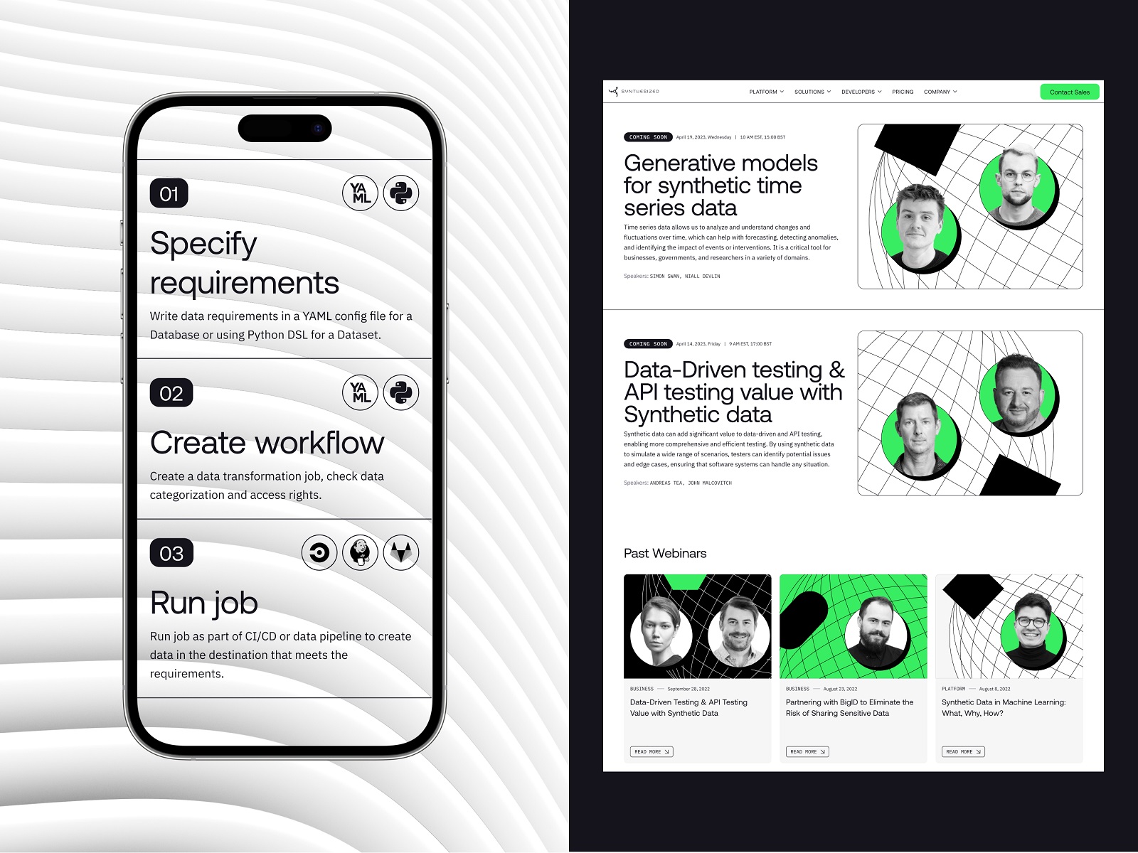
The tablet and mobile versions were also thoroughly thought about to make the website accessible and easy to use from any device and not miss any essential details.
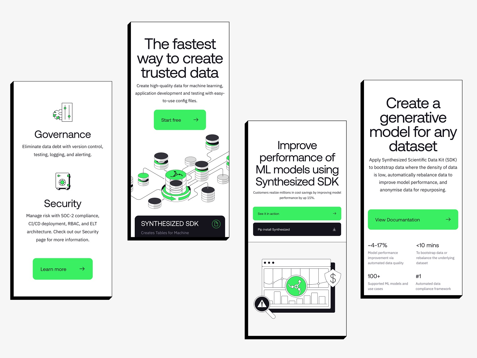
Having agreed upon design solutions, we implemented the new Synthesized website with Webflow to make the design live and working. So, in the end, the client got everything, from idea and style to a functional and attractive website meeting their business goals.
Custom Graphics
Many digital businesses face the problem of showing something complex and virtual and making it clear to their users. Synthesized was the case, so we developed a set of custom illustrations, icons, and motion graphics that helped visualize complex and technical processes and services.
New design case studies from our team are coming soon. Stay tuned!
More Design Case Studies
Here’s a set of more case studies sharing the design solutions and approaches for some of the design projects done by the Tubik team.
Magma Math. Web Design for Educational Platform
HotelCard. Brand Identity for Hotel Offers Service
Nova Post Advent Calendar. UI/UX Design and Christmas 3D Art
Nibble Health. Identity and UX Design for Healthcare Fintech Service
Physica Magazine. Web Design and Graphics for Scientific Blog
CSConnect. Website Design for Immersive Experience Marketing Platform
ProAgenda. Identity and Website Design for Golf Management Service
BlockStock. Brand Identity and Website for Minecraft Models Resource
Kaiten. Identity and Product Design for Food Marketplace
THT. Website Design for Electrical Engineering Service


