Let us share a fresh big bunch of practical app design ideas by the tubik design team, which is never tired of trying new approaches and experimenting with design techniques. This collection shares the app design examples showing how mobile user experience can work to help users solve their problems elegantly. The app design cases also feature landing pages as a tool for boosting mobile app branding and promotion. Have fun and get inspired!
Flower Store Application
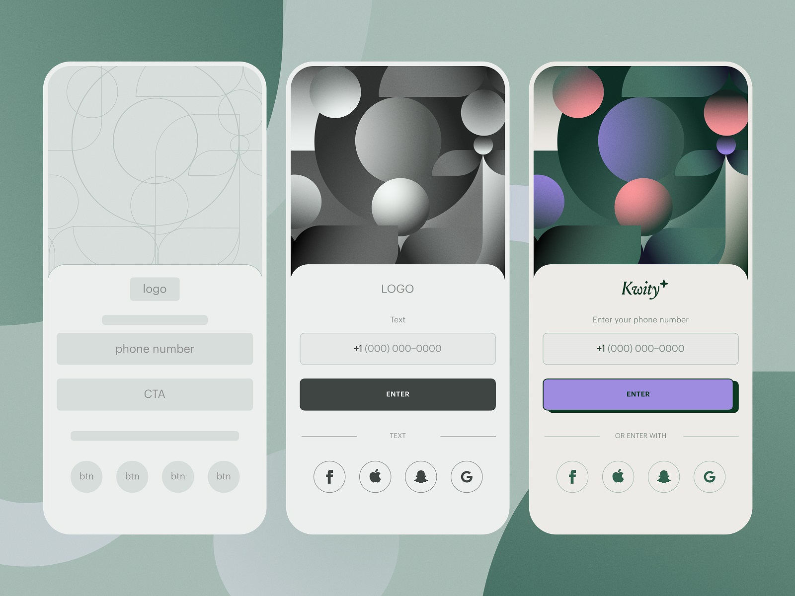
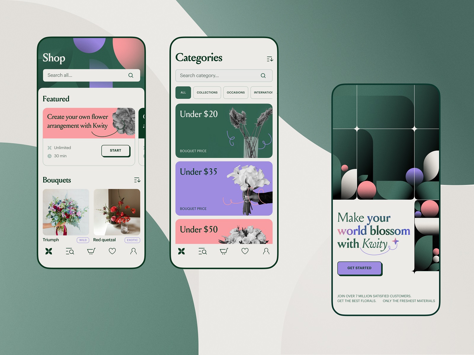
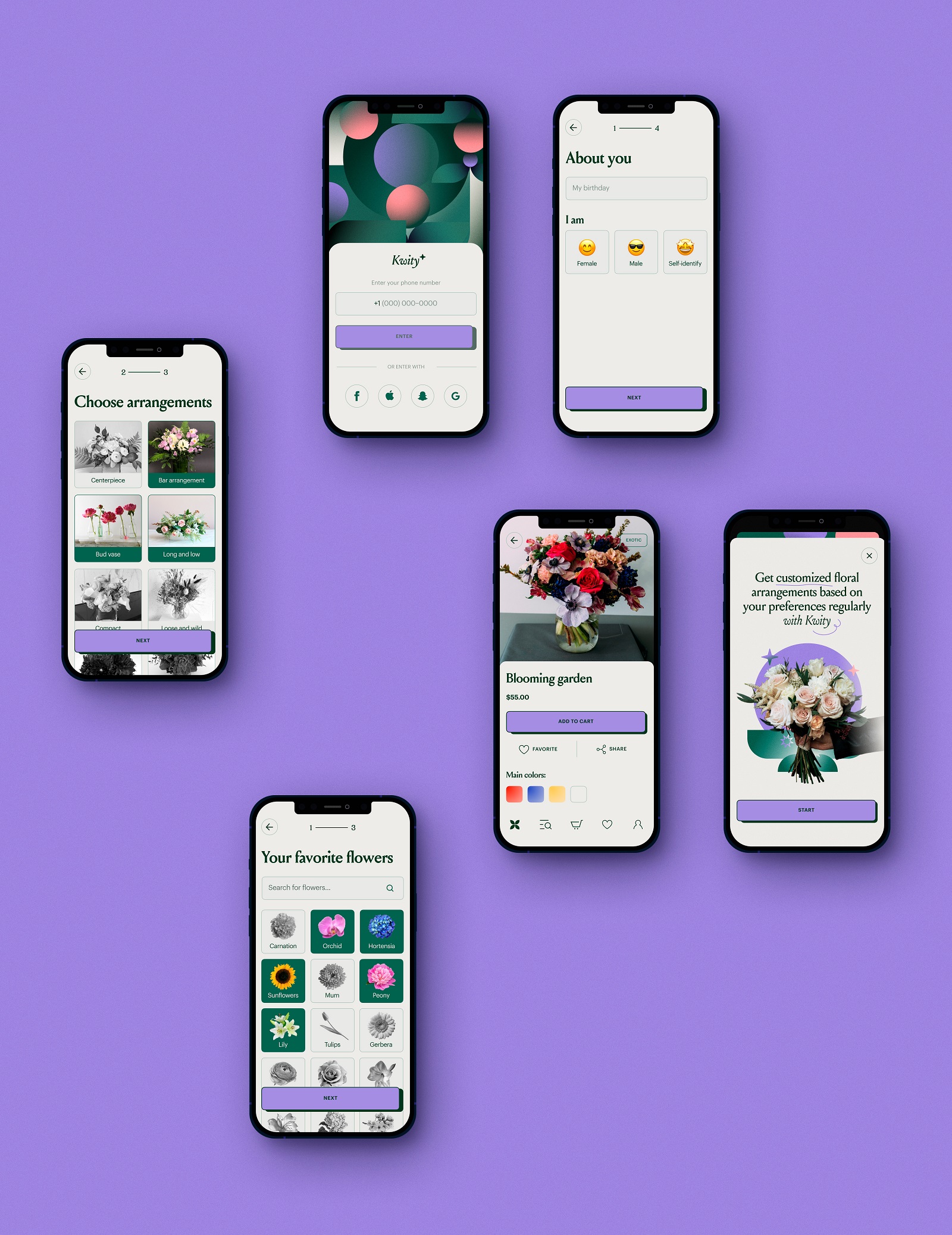
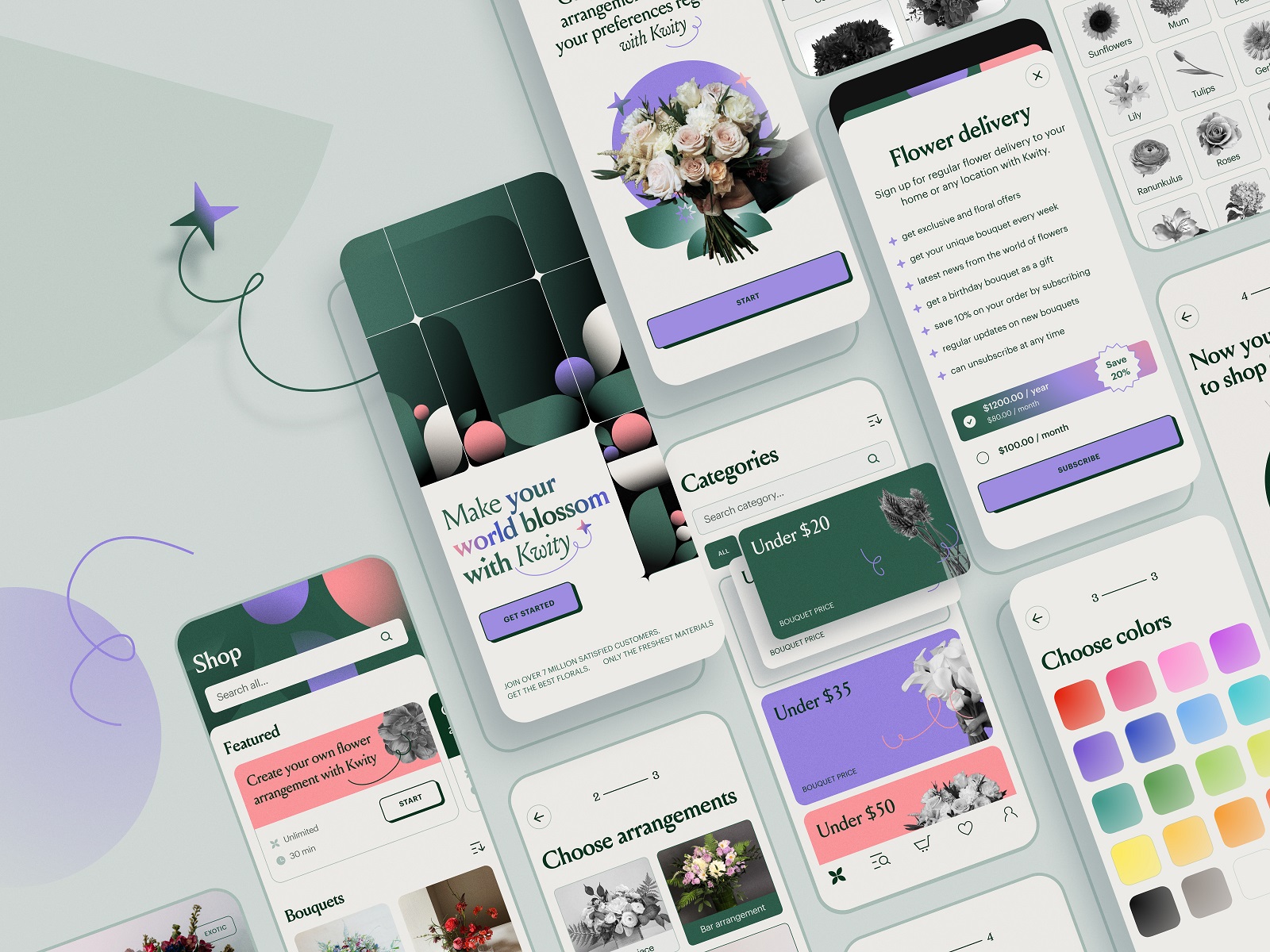
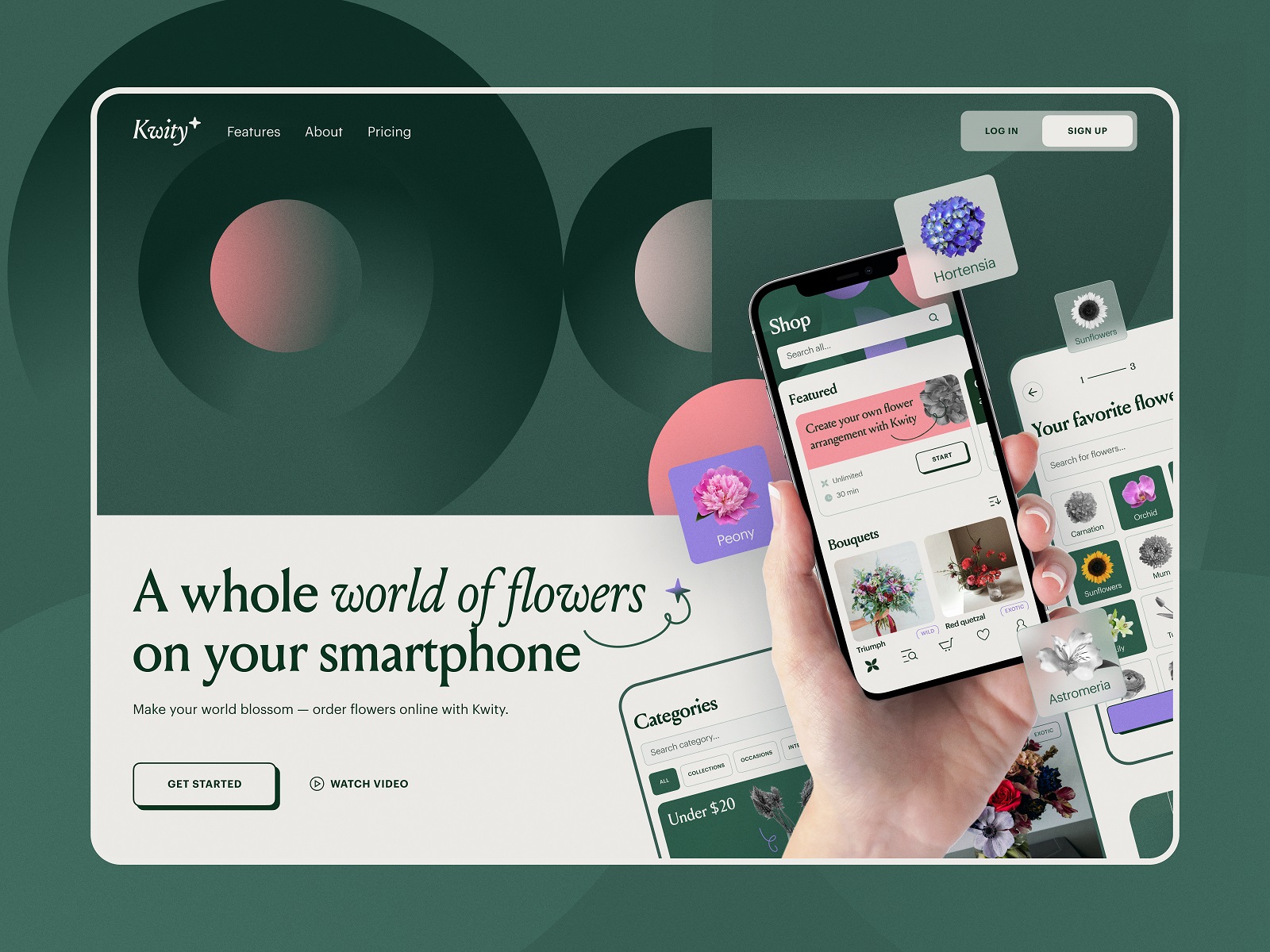
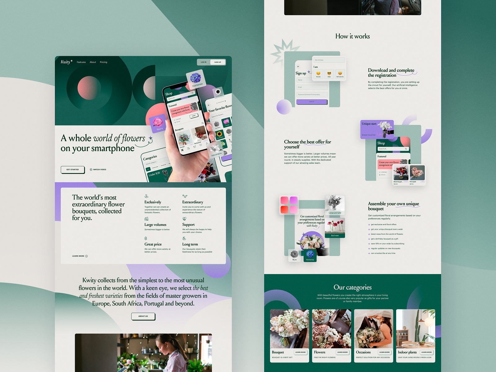
“If you look the right way, you can see that the whole world is a garden,” Frances Hodgson Burnett once said, and her words share the inspiration behind our design project spirited with the beauty and power of flowers and plants. Check the design solutions for a mobile application of an ecommerce flower store, allowing customers to choose and combine perfect bouquets for any occasion and a landing page promoting the service and amplifying its online presence.
Drinks Delivery App
Welcome to dive into vibes of fun and party with the bright project we worked on for Heineken Mexico. Meet Glup, a bright and functional mobile application that allows users to buy beer and associated stuff like snacks, cups, and the like and get the orders delivered quickly.
The task for the tubik team was to develop the branding and user experience design for the Glup mobile app, consistently reflecting brand identity and aesthetics, making the customer experience integral, engaging, and smooth.
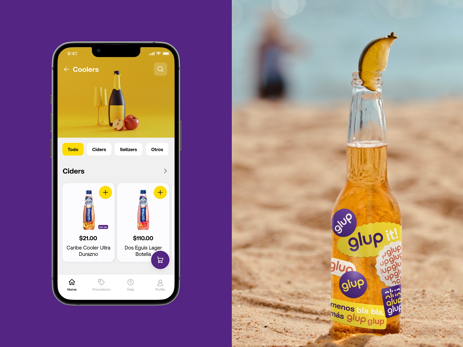
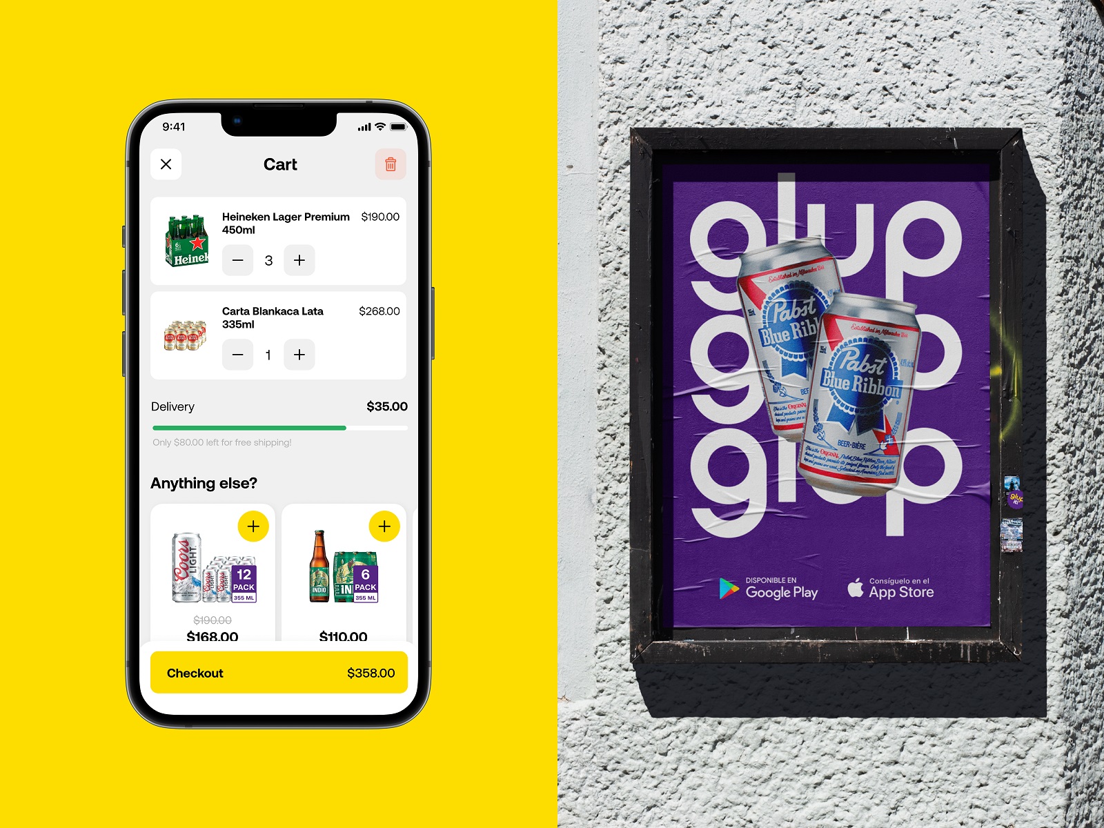
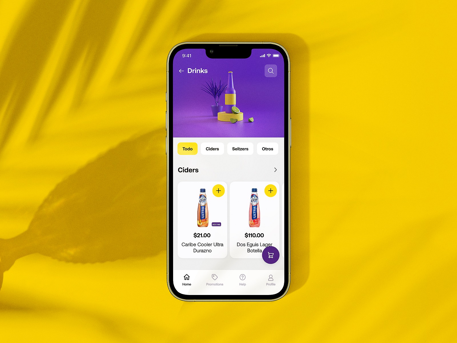
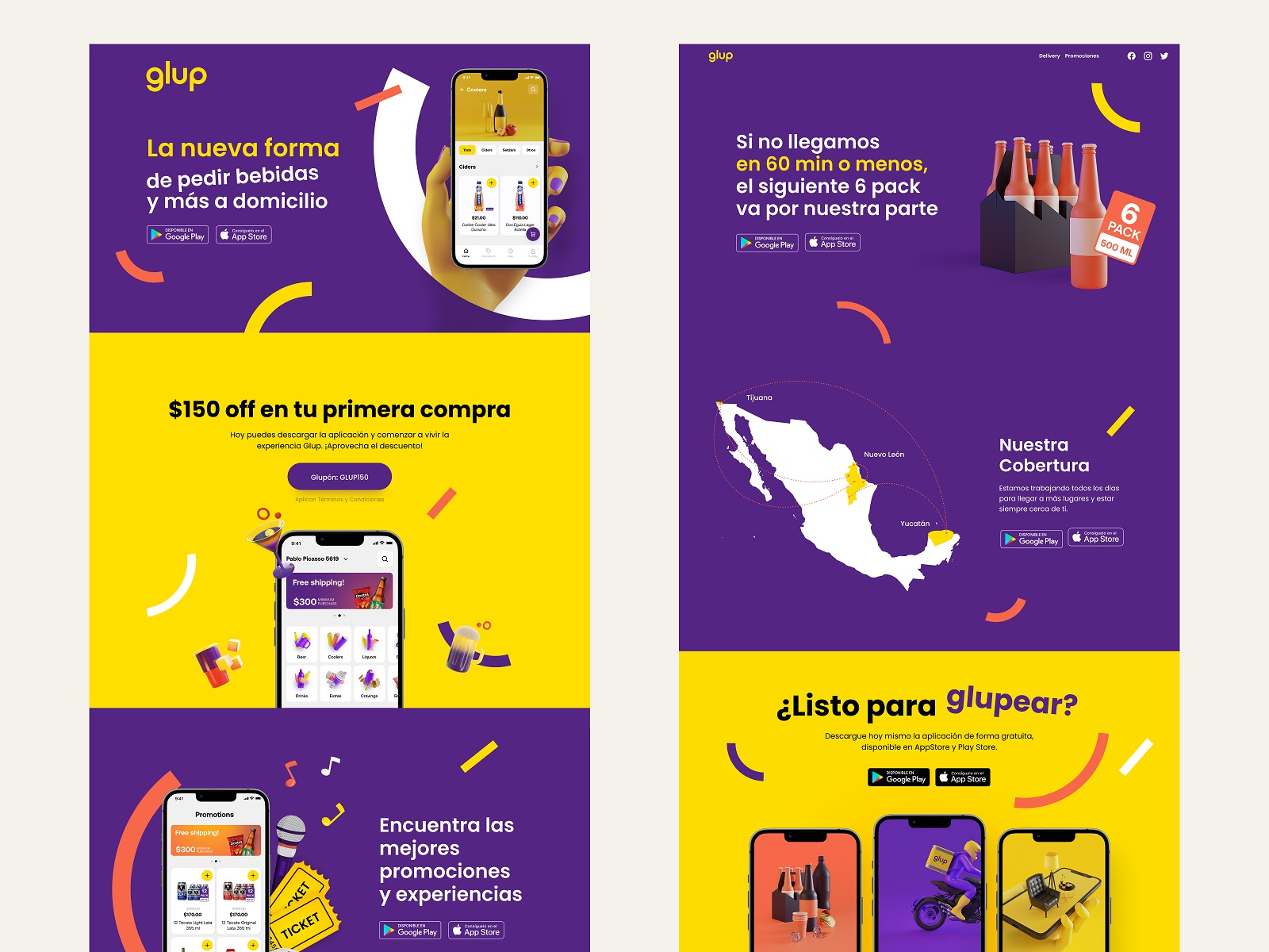
Learn more about the project in the Glup design case study.
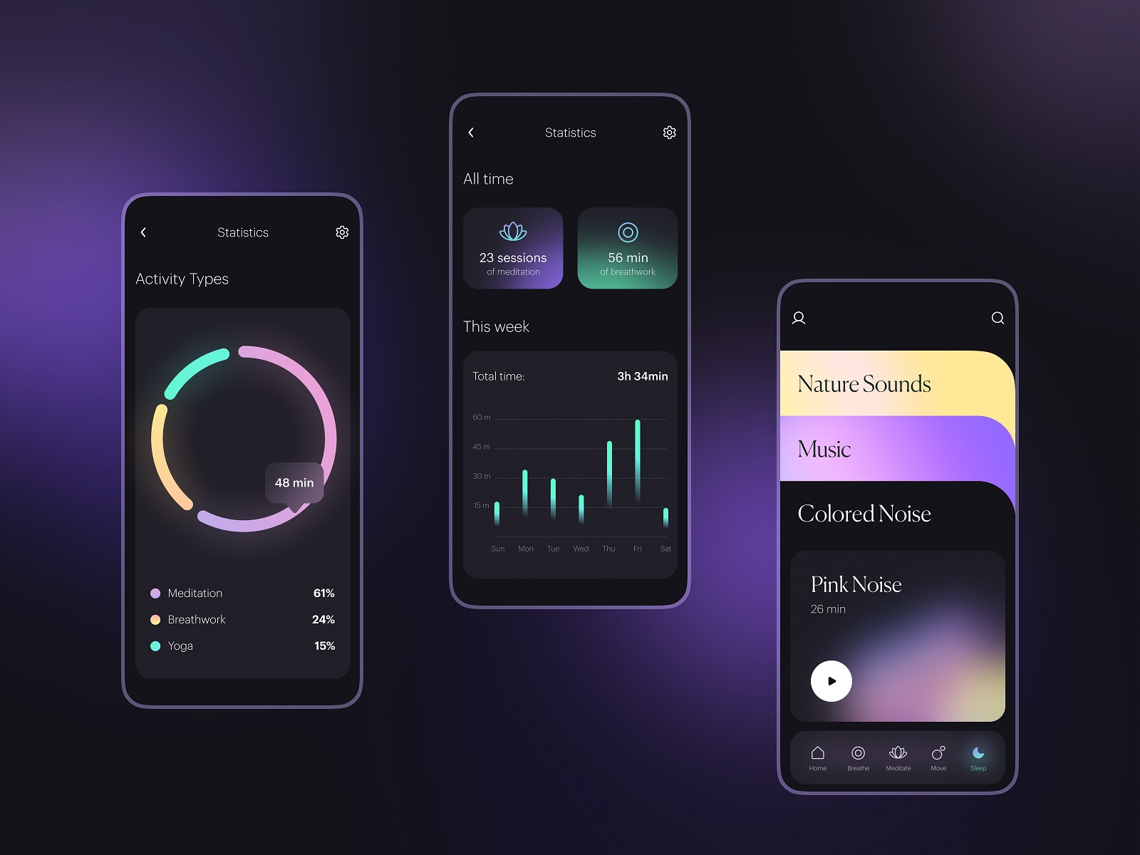
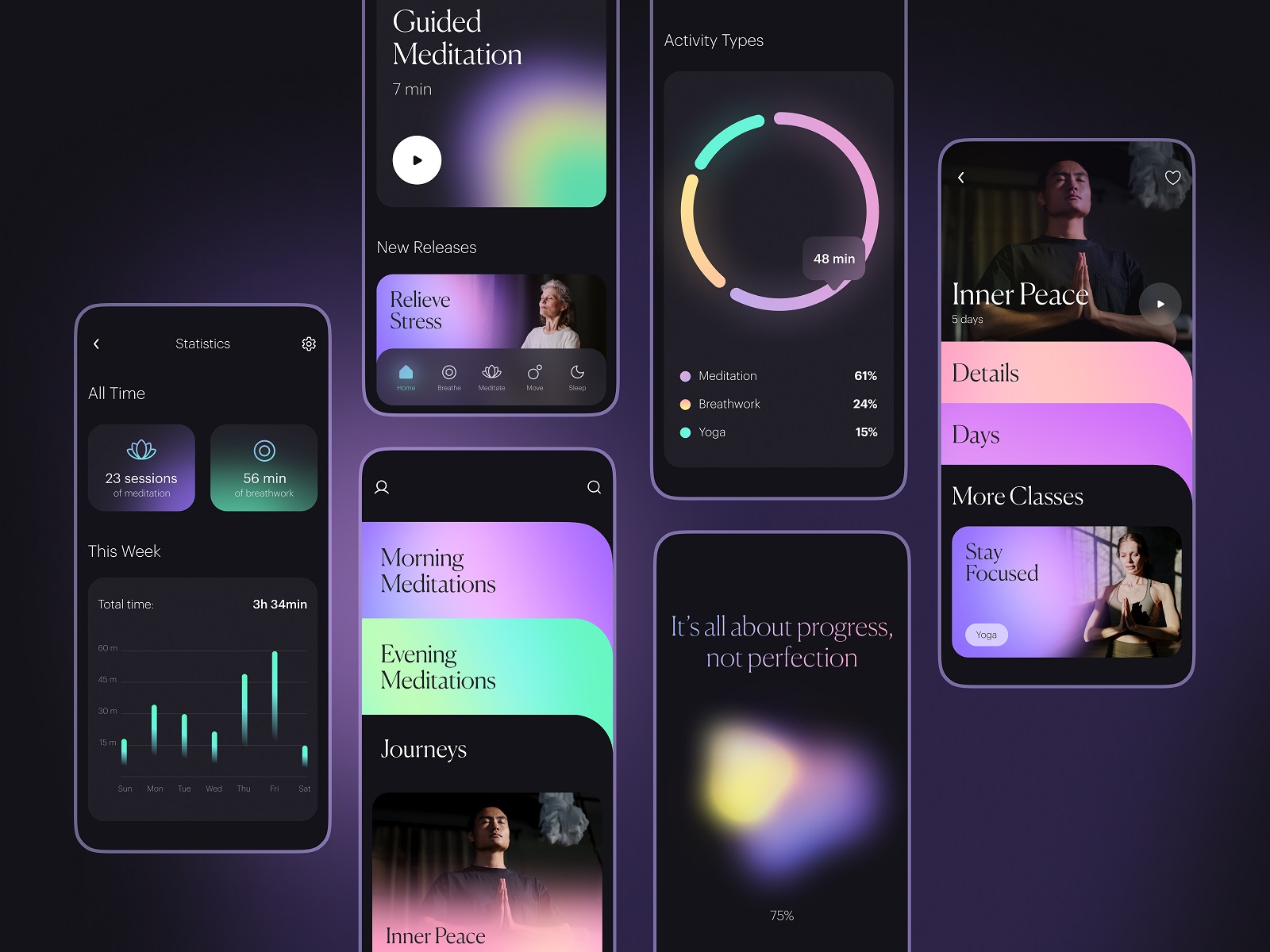
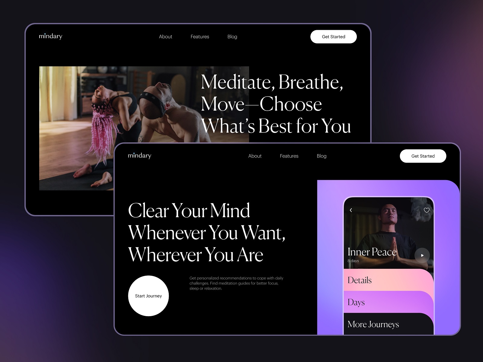
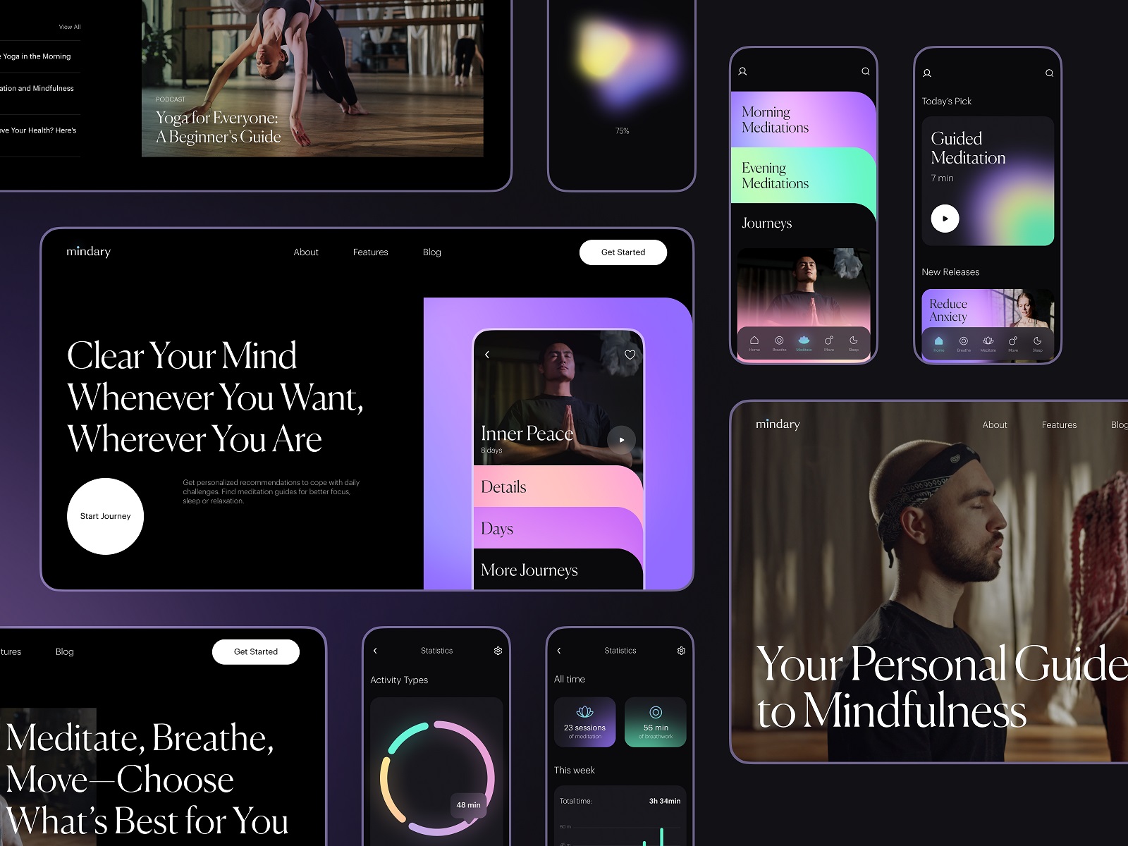
Mindfulness App
Here’s the mindfulness application helping people to dive into the peace and energy of yoga and meditation to stay focused and unleash their inner power. Deep and thoughtful work on colors, minimalist interface, harmonious video and photo content integration, and smooth atmospheric motion effects and graphics make it intuitive, attractive, and user-friendly.
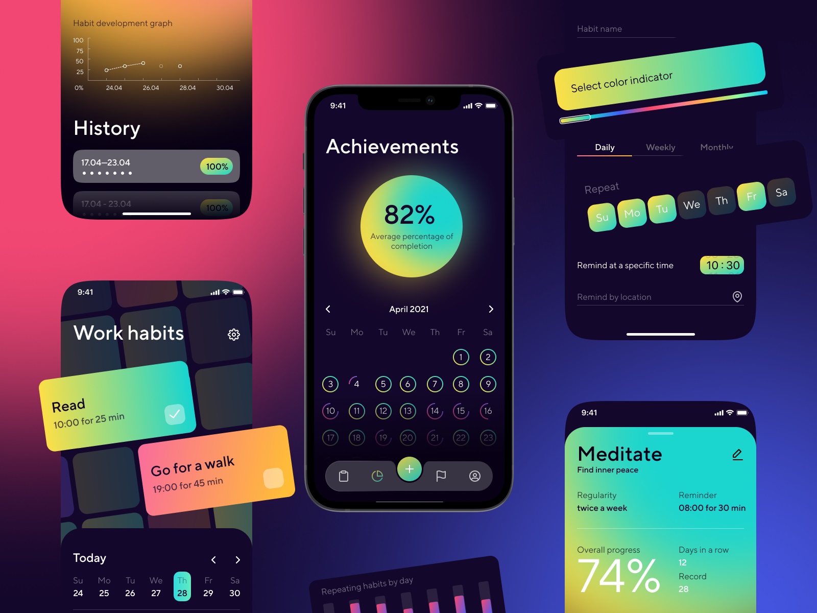
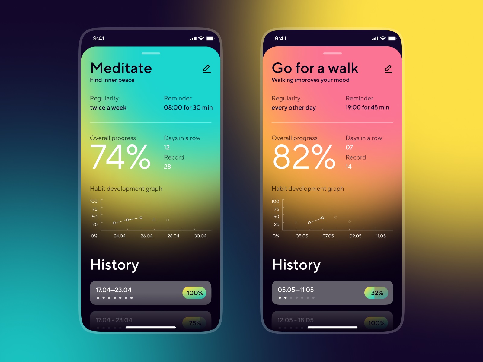
Habit Tracker
it’s a mobile application helping users to build new habits and supporting their consistency which is crucial for success in this case. Stylish interface in the dark theme, with solid visual hierarchy and intuitive navigation for users of any age – that’s what we aimed at.
Music Learning App
“Music is the universal language of mankind,” Henry Wadsworth Longfellow once said, and hundreds of years later, we still share the same feeling. Take the overview of our design concept that also supports that theme: this is the user interface and some interactions for the music learning app that helps users practice playing different musical instruments.
Dance Learning App
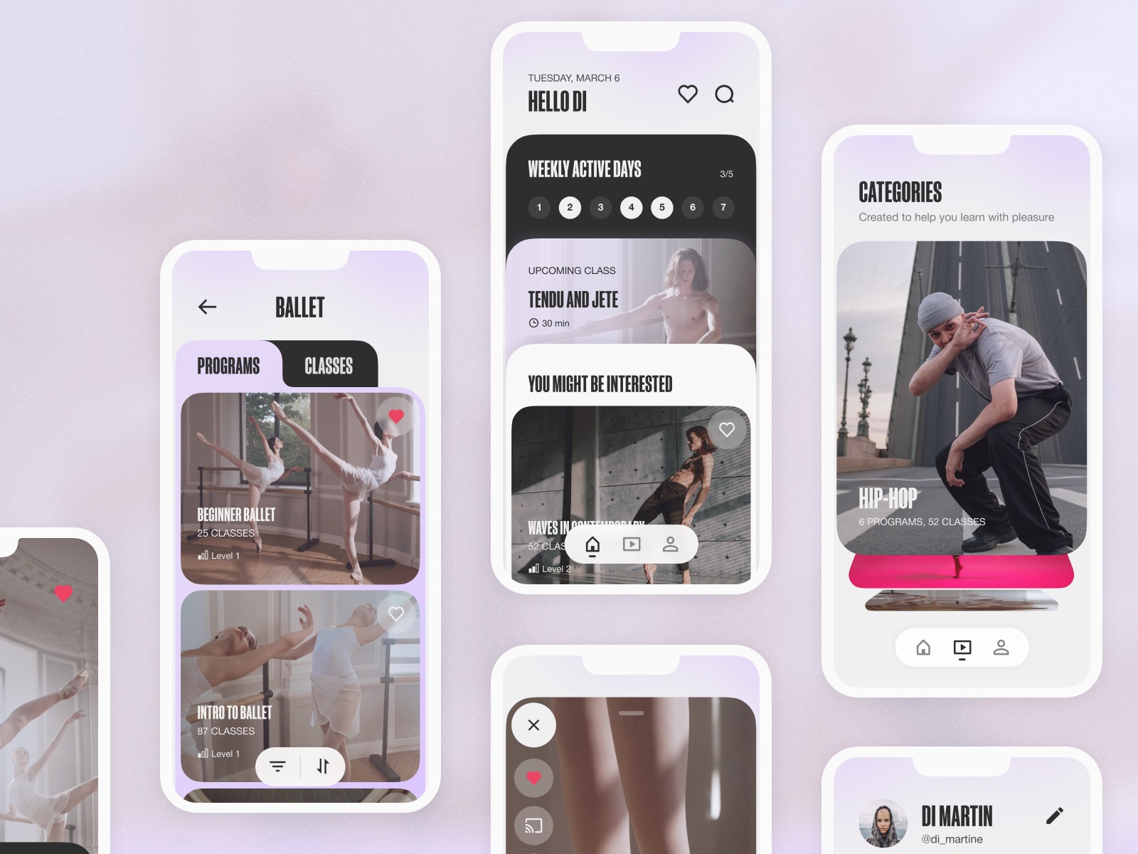
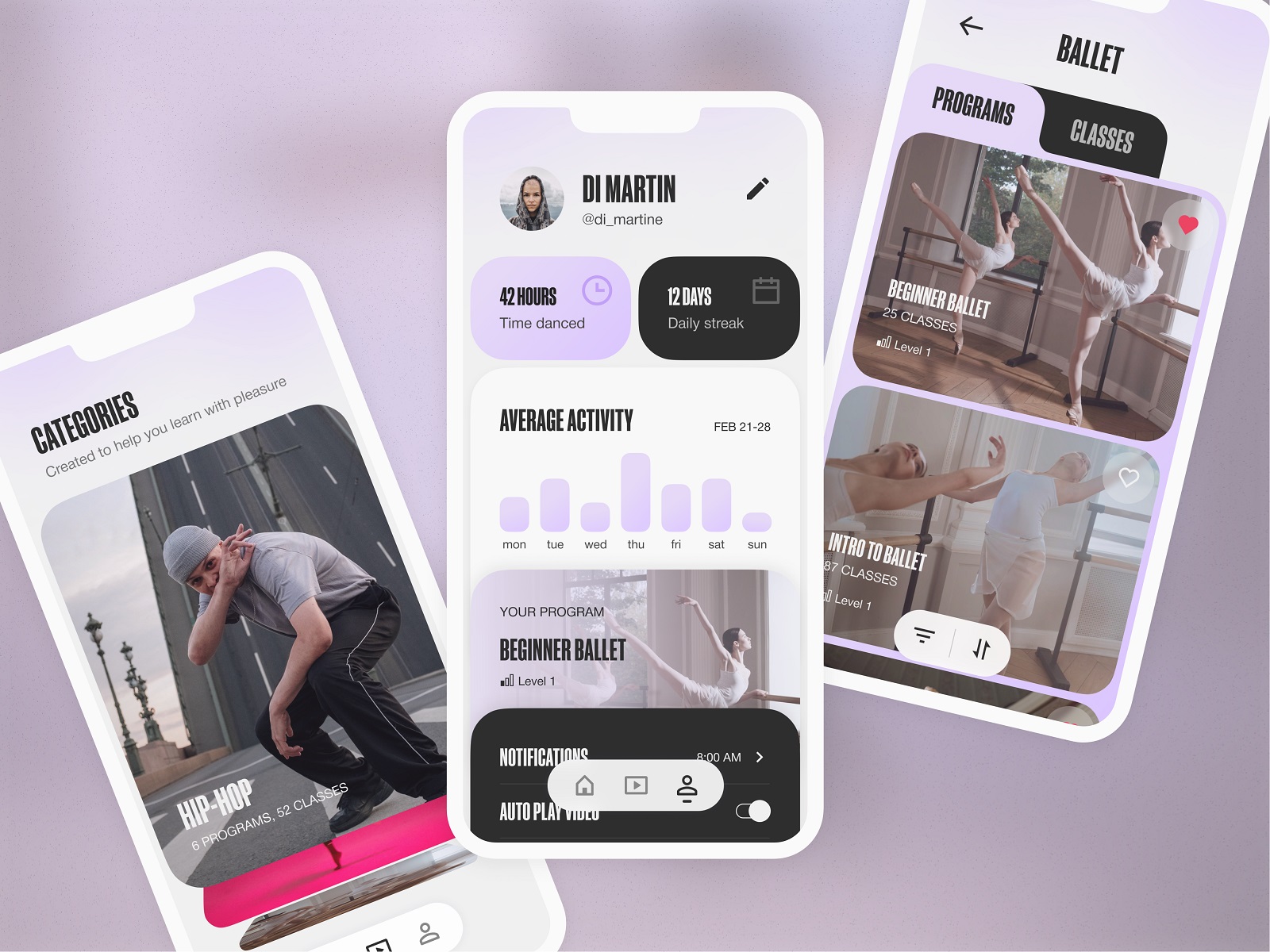
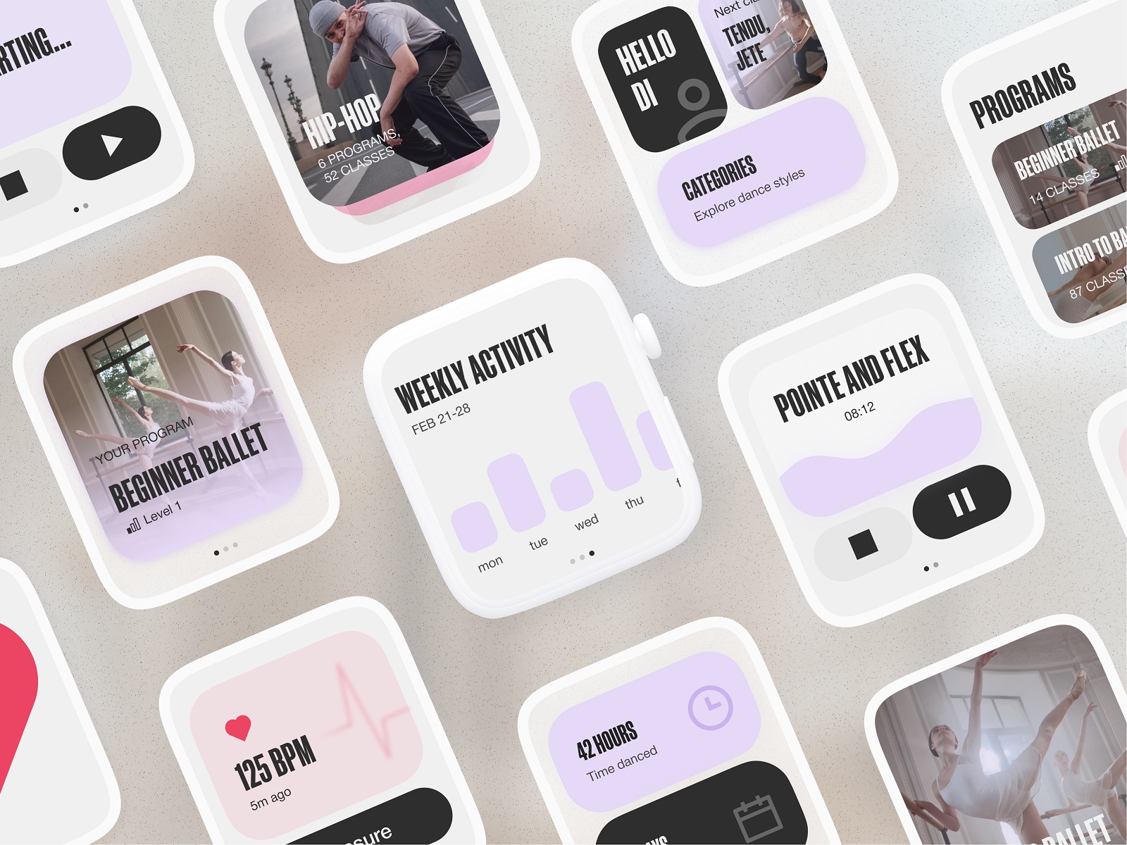
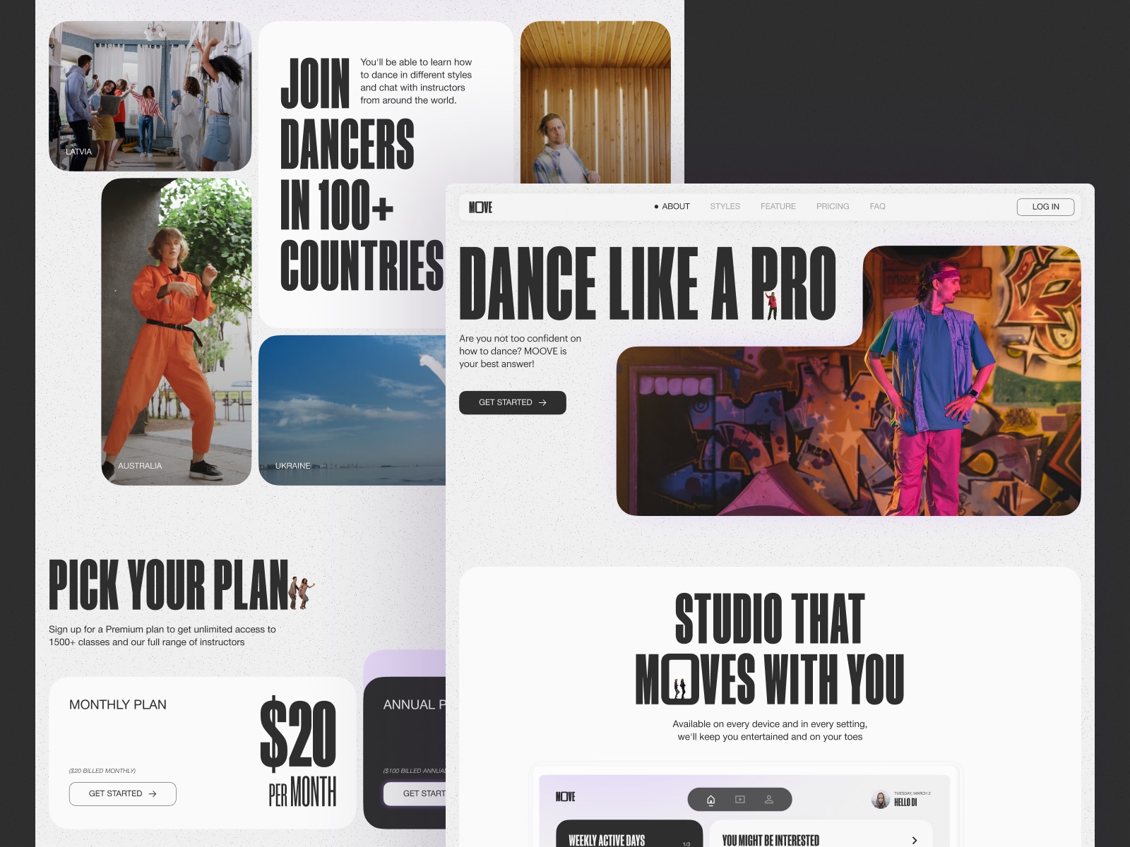
“Dance is your pulse, your heartbeat, your breathing. It’s the rhythm of your life. It’s the expression in time and movement, in happiness, joy, sadness, and envy,” Jacques d’Amboise, the American ballet dancer and choreographer, once said. Here’s the design concept echoing the idea: the online platform and mobile application that offers users to take dance classes and participate in programs on various styles and kinds of dancing.
Uncluttered and informative layout, atmospheric photo and video content, smooth motion, well-balanced hierarchy, and solid consistency of web and mobile products make the user experience design eye-pleasing, emotional and engaging.
Safe Driving App
Here’s a glance at the app design for OtoZen, innovative technology for safe driving, operating via the hardware device connected with a mobile application. It helps users to turn any car into a smart, distraction-free vehicle. It is the all-in-one safe driving assistant that keeps drivers focused, organized, and connected to friends and family. Users can quickly pair the OtoZen device with their Apple or Android phones via Bluetooth and install the OtoZen Pod in split seconds, with no tools, wiring, or professional installation required.
In this project, tubik specialists were involved in auditing and improving UI and UX design for the mobile application, as well as creating custom graphics and a website that would strengthen the product’s web presence.
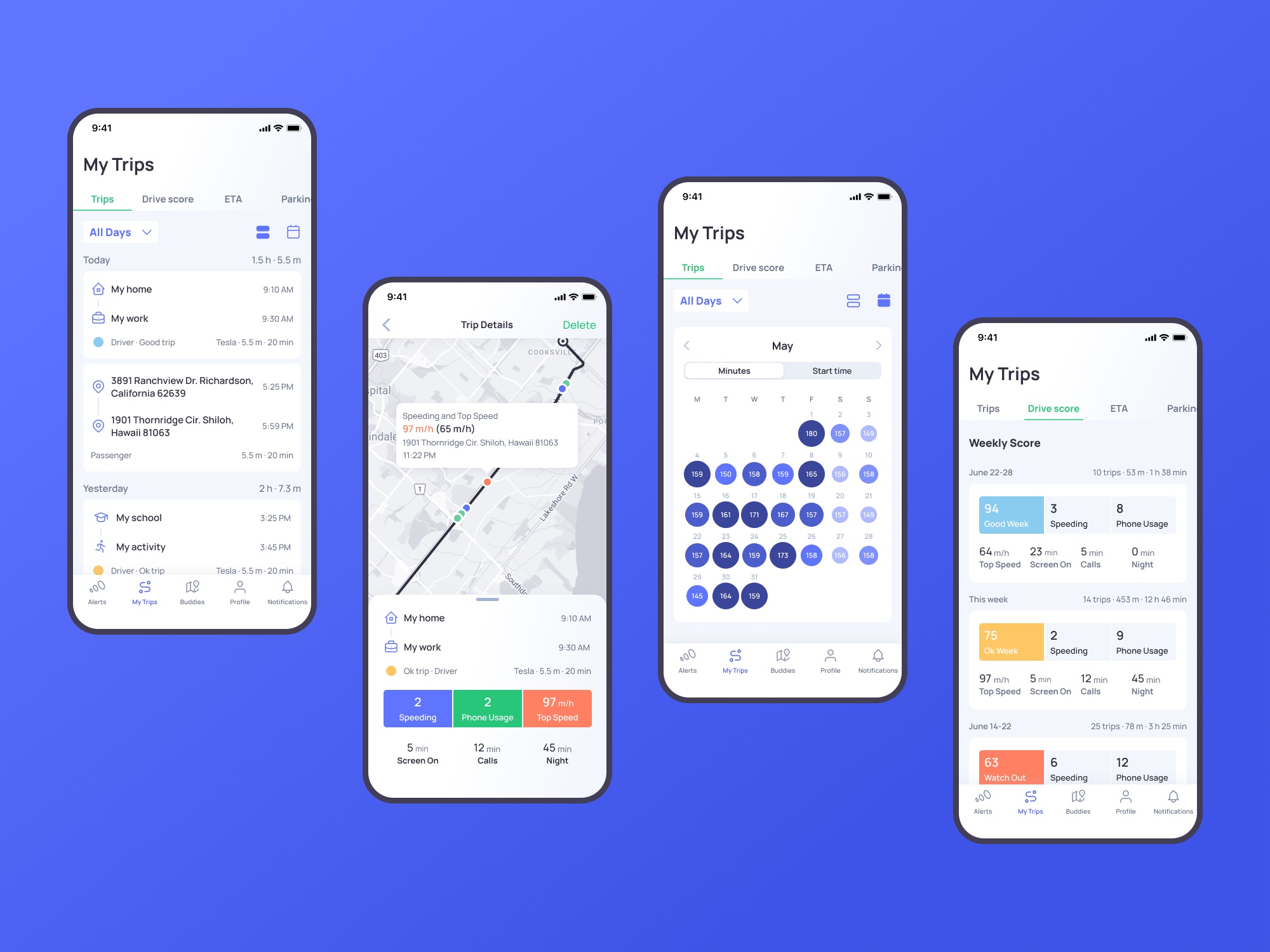
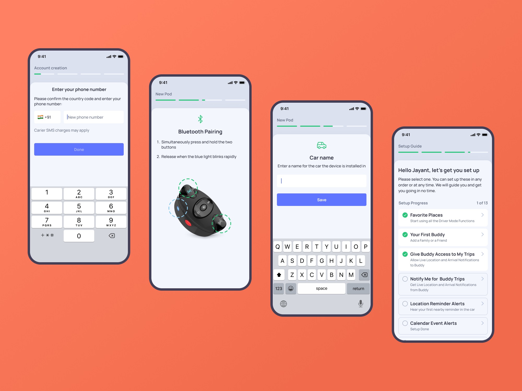
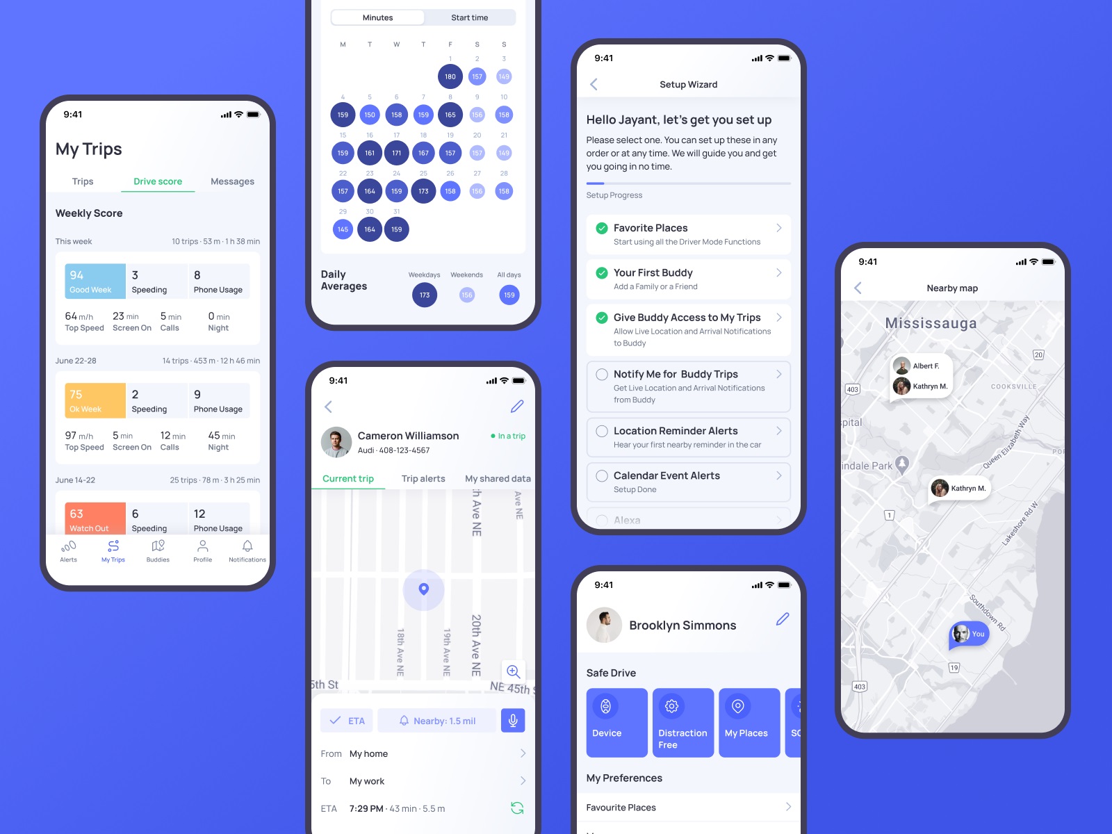
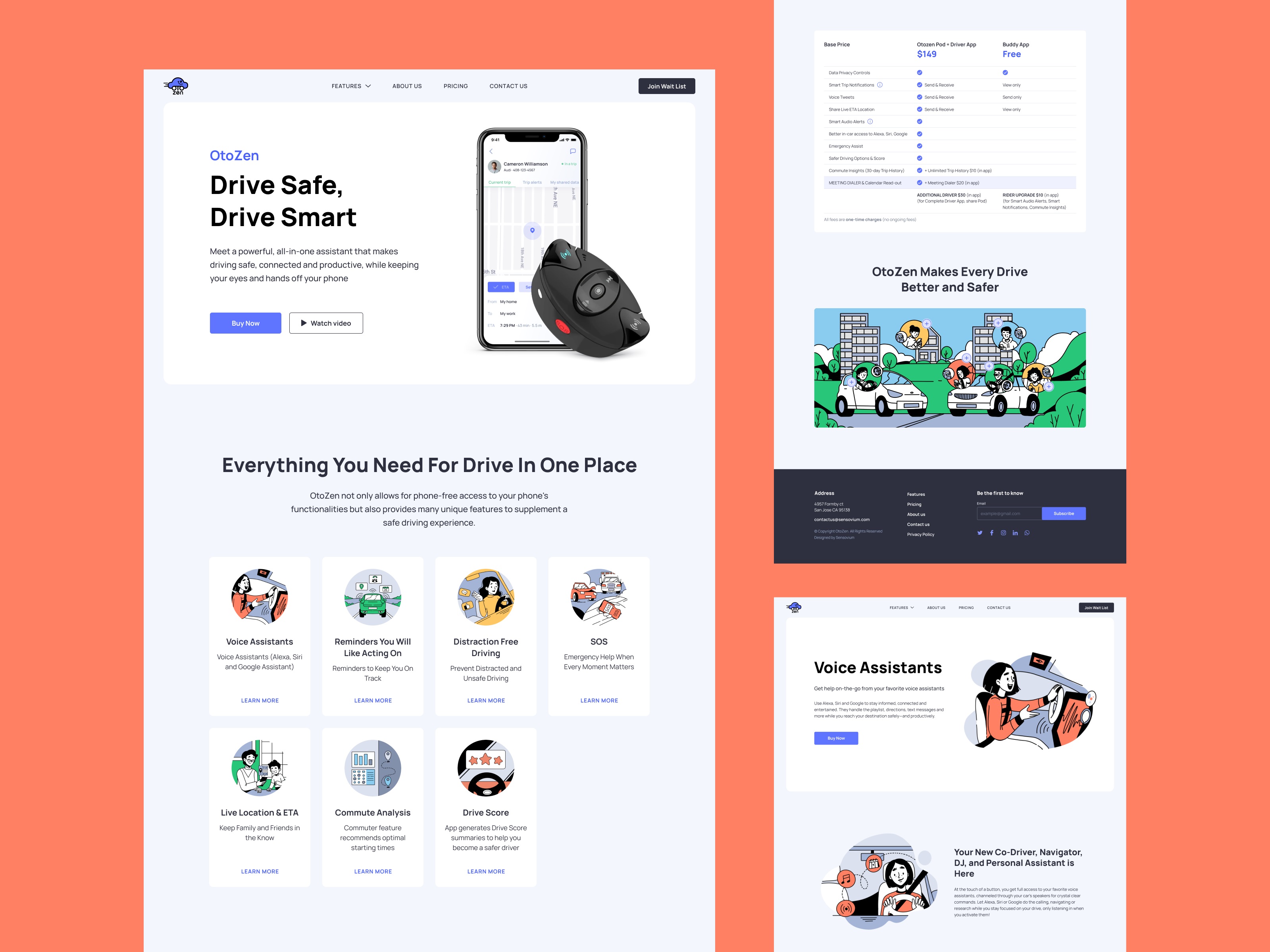
Learn more about the design process and solutions and check more mobile screens for this project in the OtoZen app design case study.
Education App
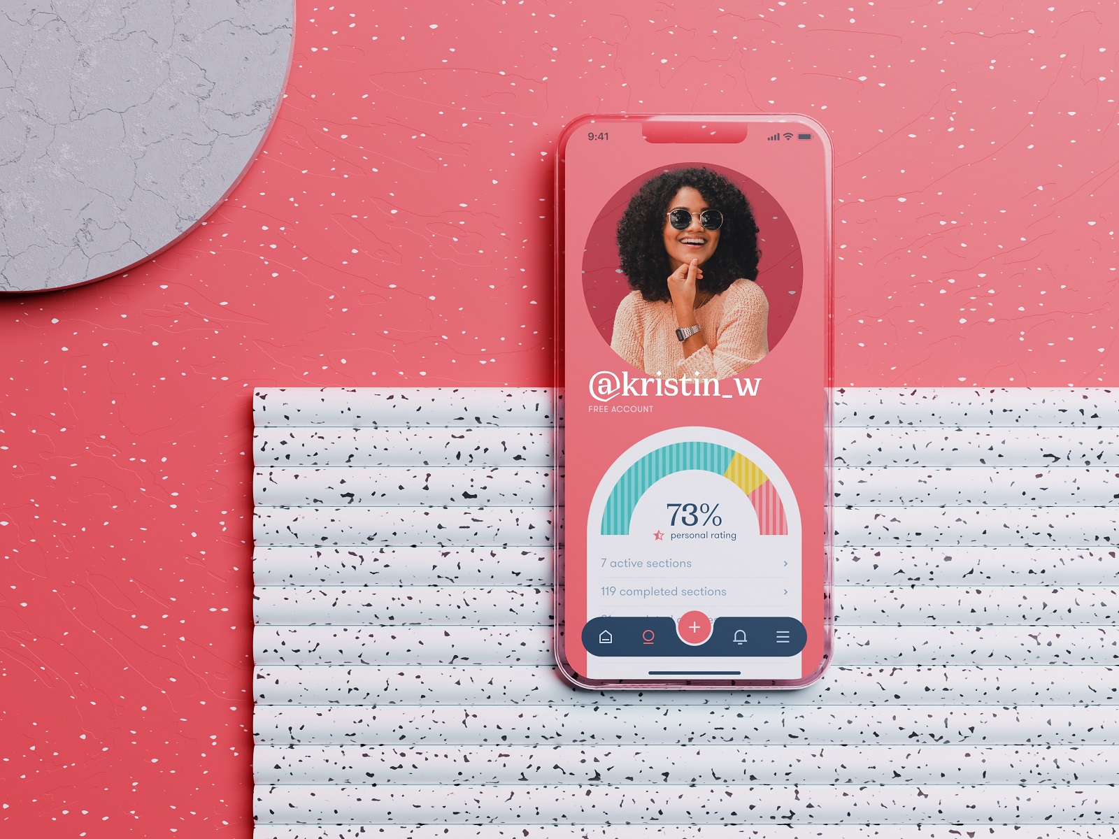
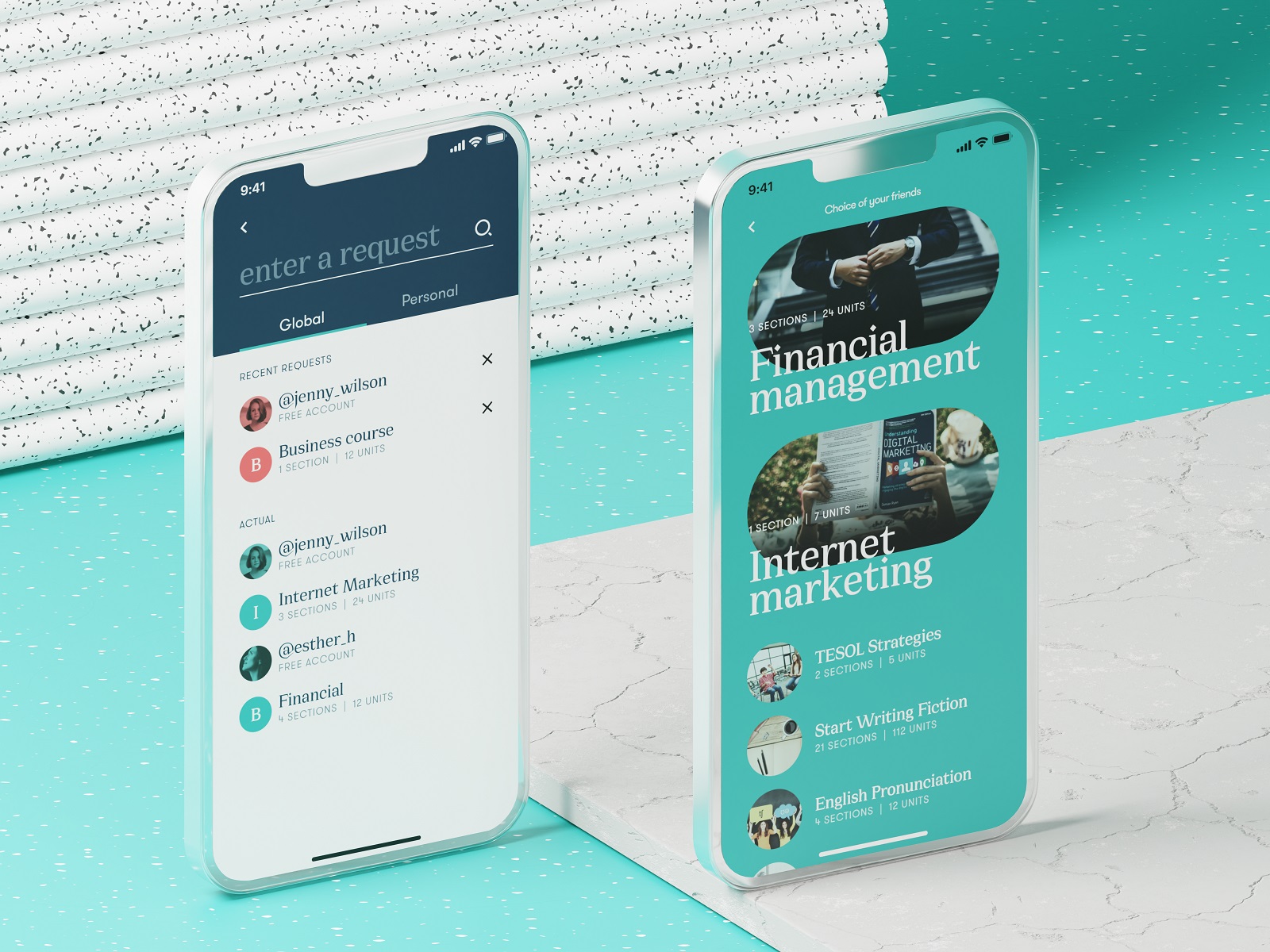
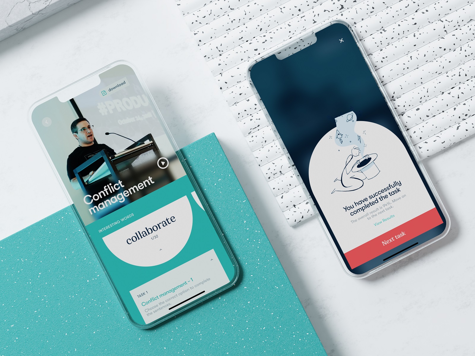
“An investment in knowledge pays the best interest,” Benjamin Franklin once mentioned, stating the idea that has never lost its relevance. This mobile design project also touches on that topic: take a glance at the mobile application that allows users to access the vast diversity of various education courses, from general to narrow-focused, from professional to those that develop a broader outlook and deeper understanding of yourself. Functional, readable, and solid, using the power of negative space, effective color combinations, and different types of contrast, focused on intuitive navigation and compelling content presentation, it helps users invest much in their knowledge.
New web and mobile design collections from our team are coming soon – don’t miss the updates!
Tubik Design Collections
If you want to check more creative sets of web, app, and graphic design examples, here are some of them.
Information Beautified: Media and Editorial Website Designs
UX Design for Traveling: Impressive Web Design Concepts
22 Impressive Web Design Concepts for Various Business Objectives
Mobile Design: 14 Stylish and User-Friendly App Design Concepts
Design for Sales: 10 Creative UI Designs for Ecommerce
Save the Planet: Web Designs on Environment and Ecological Issues
Steal the Show: Creative Web Design for Diverse Events
Web Design: 26 Examples of Creative Landing Pages
UI in Volume: 3D Graphics in Creative UI Design Concepts


