In our previous case study, we told you the story of UI and UX design for SwiftyBeaver describing the design process in detail and supporting it with the visual variants of different stages. Today we want to continue unveiling the logo design process.
Task
Design of a logo for the logging platform uniting the efforts of Swift and Objective-C developers, UX designers, app analytics experts, and product owners.
Tools
Pencil sketching, Adobe Illustrator, Adobe After Effects
Process
As we mentioned in the case study on UI and UX design, SwiftyBeaver is a native Mac application presenting the integrated logging platform for Apple’s Swift programming language. It is aiming at developers as its basic target audience. The product supports all the devices belonging to the Apple device family.
The design practice of previous projects accomplished by studio designers, such as Saily App or Passfold, proved that tight interconnection of design solutions on branding and user interface for the same product features a higher level of efficiency. Both mentioned cases showed that in brand positioning and promotion, using the concept of strong corporate style and applying the elements of branding such as logo, lettering, and illustrations consistently was an effective strategy. It is also important to remember that the user interface of an application or a website is not just a sort of static or moving image — it is the field of active interaction. Interaction with the product via the interface enhances much higher memorability potential of brand elements as well as general stylistic concepts. Following this approach for the SwiftyBeaver project, user interface designer Ludmila Shevchenko and logo designer Arthur Avakyan worked in tight collaboration to get the design solutions that will effectively support each other.
Naturally, the initial stage of the general concept search tried the variants of the mascot. As the name of the product includes “Beaver”, in the first sketching set, the designer presented variants of this animal as a key mascot. There was also a variant of the original presentation of “S” and “B” as two basic letters of the product name. In addition, this first set included a bit more abstract version based on the set of lines featuring the movement of the beaver’s tail.
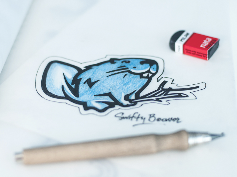
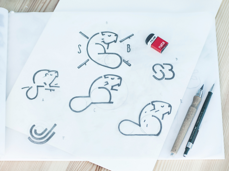
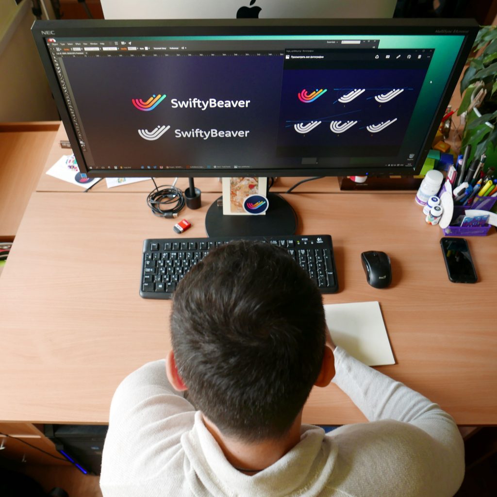
The variant based on lines was accepted as the basic concept practically at once. Although mascots can be a powerful tool for branding, this time, the strategy was different. The target audience, as well as the nature of the product, is quite specific, so the more abstract version of the logo could show more flexibility in its expressive potential. Founder and CEO of SwiftyBeaver Sebastian Kreutzberger was very attentive to details and open to discussions. He decided upon the variant with stripes because it made a logo meaningful as logs the app is based on, like the logs of trees are stripes, so it presented a strong visual metaphor. Additionally, he liked the colored stripes of famous 70s and 80s logos, so he wanted to have a logo that would look vintage and at the same time super modern. So, this direction was developed further.
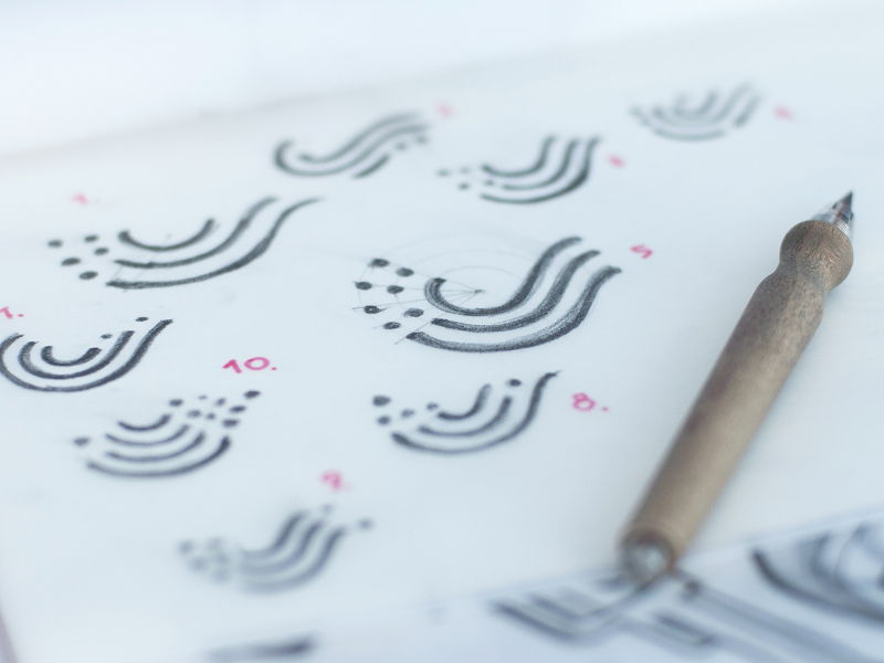
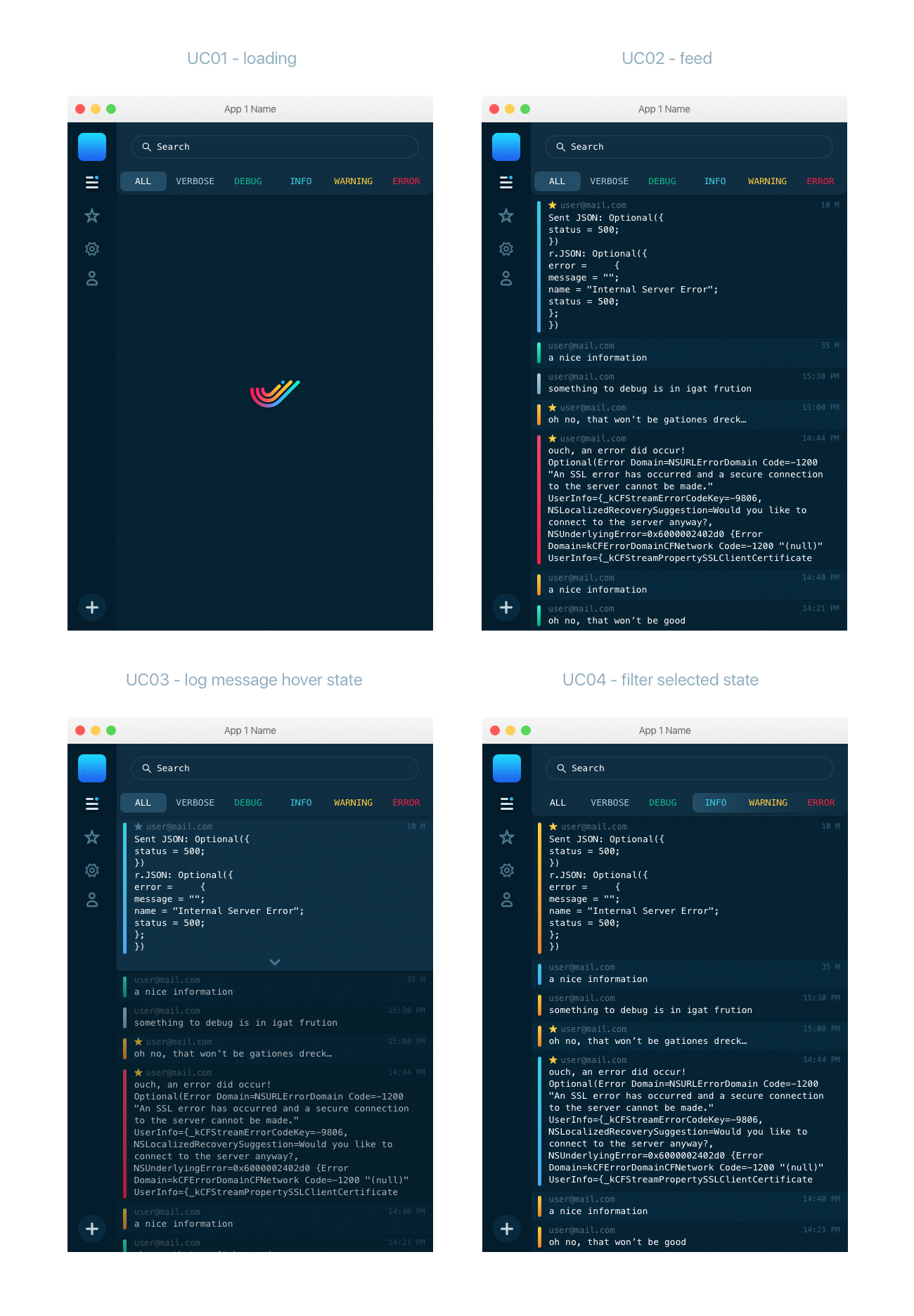
Moreover, this version got closer to the general visual design of the user interface for the application. As it was described in the previous case study, UI design widely used color lines as markers for categories of log entries, and the chosen concept of logo provided a strong connection between UI design and branding. Therefore, the next stage of the design process of elaborate and thorough work on the slightest nuances. Different versions of curves and lengths of the lines were tried and discussed in search of the most harmonic variant.
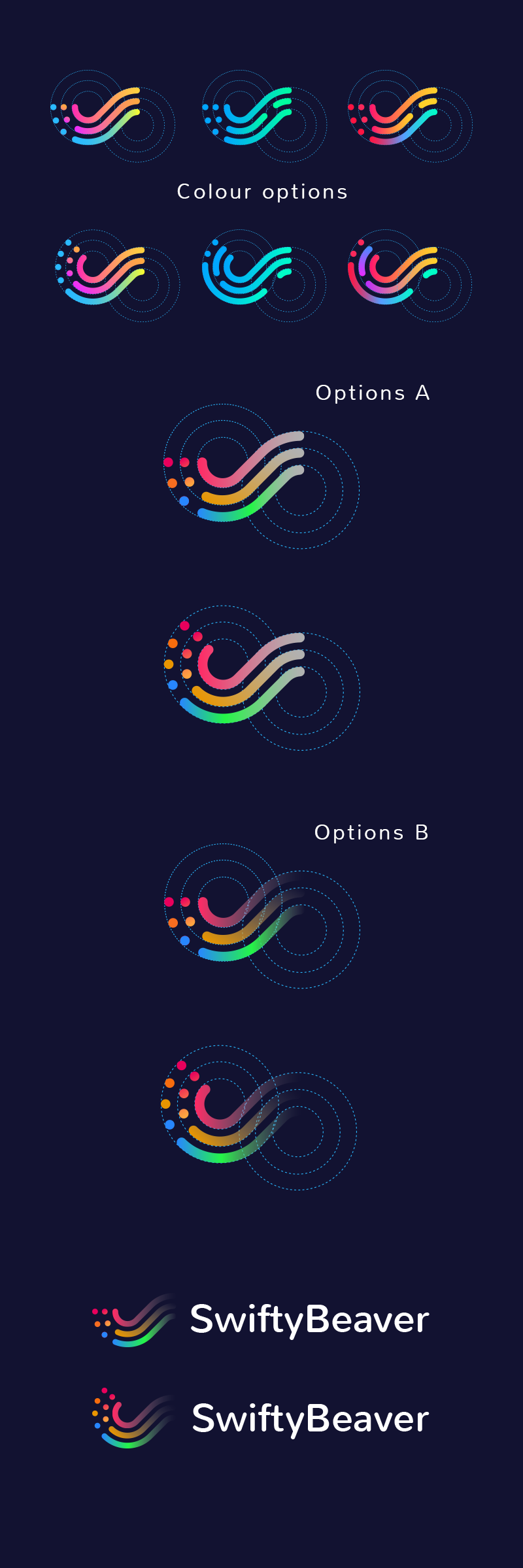
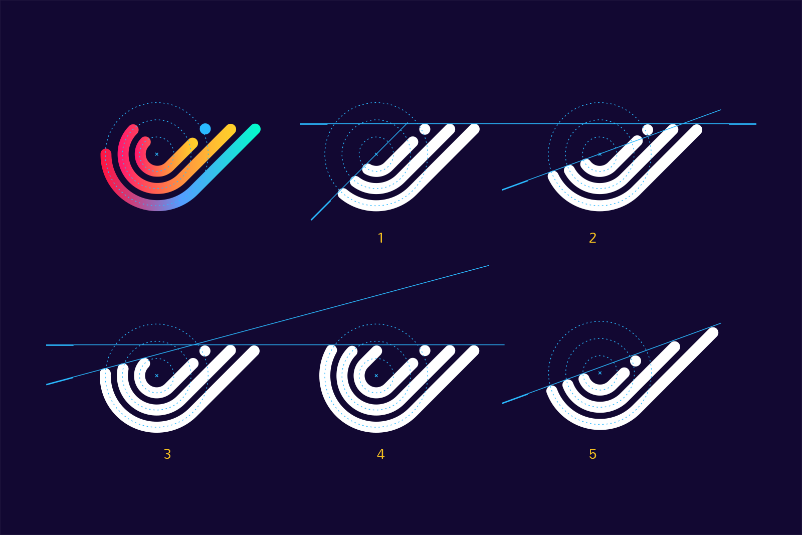
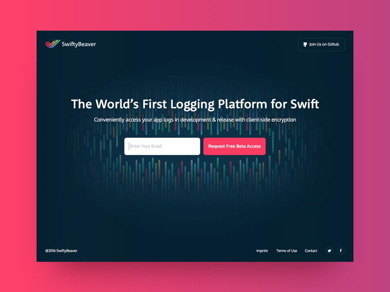
The color palette also echoed the colors chosen for UI design and supported them with smooth gradients. So, the user interface of the platform, landing page, and logo were conjoint via colored elements.
The original version of the logo was colorful, but the monochromatic version was also accomplished and tested to provide branding solutions with a high level of flexibility.
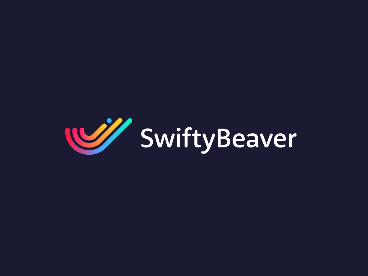
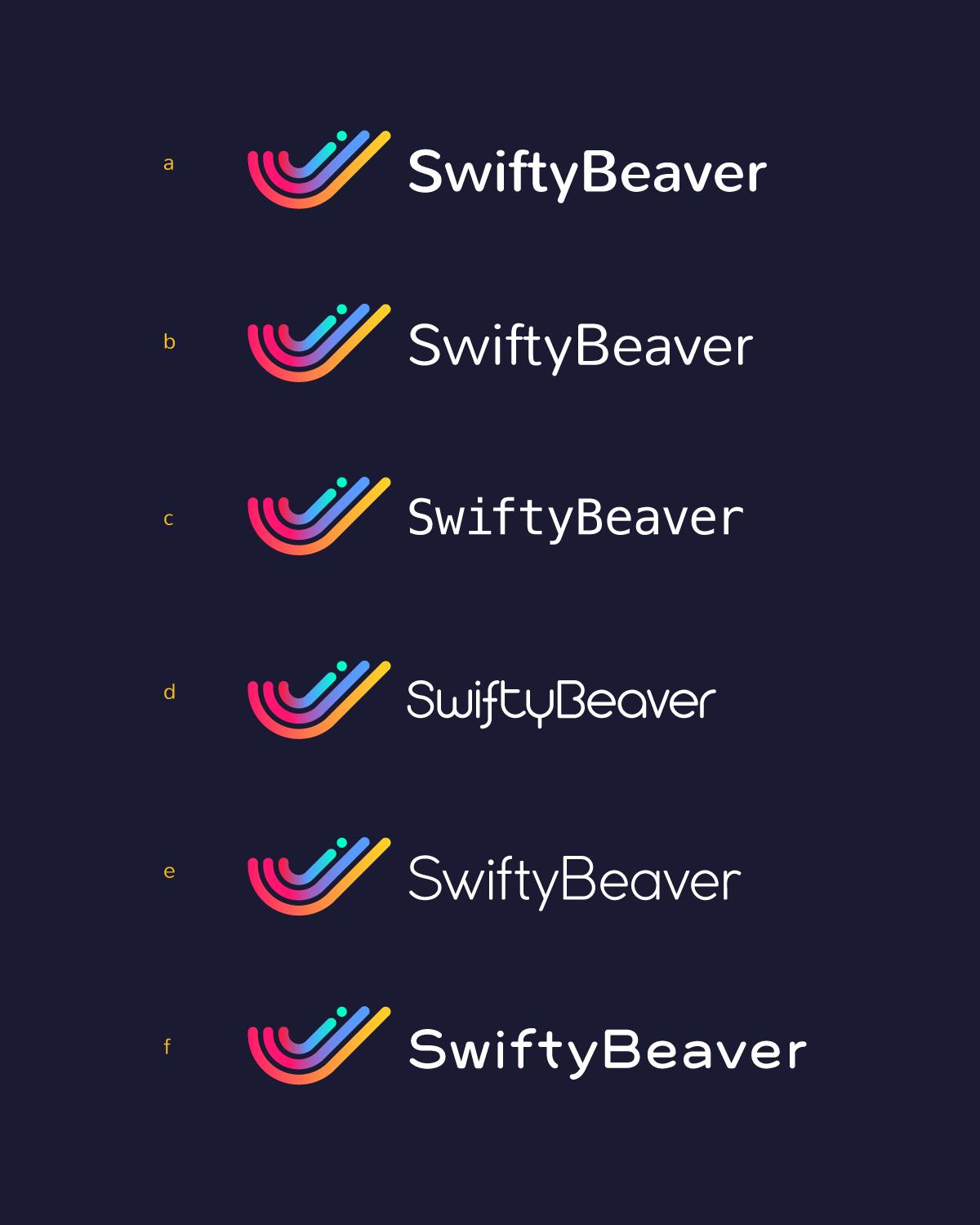
Another issue to consider was the choice of font for company name lettering featured with the logo image. Several options that could work effectively with the logo and correspond with the nature and general design of the product were offered and discussed. The set of potential variants included diverse variants from strict and straight to smooth and curvy. Finally, the font was chosen to provide a good combination with the fonts of the app interface. The client chose that particular font because he found it appropriately curved and perfectly matching the curves in the logo.
The approved variant of the logo image and lettering was also supplied with the design of the animated version. It was accomplished with the help of Tubik Studio motion designer Kirill. The designer and the client took a considerable amount of time and discussion optimizing the physics of the ball to look and feel as natural as possible.

And one more important task to move on with was the design of an app icon. To prove its efficiency, designers tested it on different devices and in different sizes to ensure that it didn’t lose its recognizability or didn’t get dirty in a smaller size.
![]()
The logo design for SwiftyBeaver was one more case proving that there are no unimportant details in branding. It was one more project full of elaborate sketching, thorough work on the slightest hues and gradients, and numerous variants with different lengths, widths, and placement of the elements to make a catchy, harmonic, and stylish logo that will represent the nature of its product.
Useful Case Studies
For those, who are interested to see more practical case studies with creative flows for the logo and identity design, here is the set of them.
AppShack. Logo Design for a Digital Agency
LunnScape. Identity Design for a Landscape Company
Binned. Brand Identity Design for Cleaning Service
Reborn. Identity Design for a Restaurant
Andre. Logo Redesign for Landscape Firm
Andre. Corporate Identity Design for Landscape Firm
Saily. Logo for Local C2C E-commerce Application
PassFold. Logo for a Mobile App
Ribbet. Logo for an Online Photo Editor
Welcome to read or download our free e-book “Logo Design”


