Most projects we work on focus on business and commercial goals, but today’s story is about changing society and improving the world rather than making money or promoting brands. In this case study, let’s uncover how the award-winning website Decriminalize Poverty in Tennessee was created by our team for Zealous. That’s the web project that emerged from a Vera Institute of Justice and Free Hearts report and turned into an engaging storytelling experience, awarded by two Webbys, Awwwards Site of the Day, and other signs of recognition from the international creative community.
Here’s the video telling the case step by step. What makes it special is that the client tells the story about this project together with us. Welcome to watch.
Now, let’s take a closer look and dive into the design solutions for the website.
Client and Project
The project was initiated by Zealous, a team of professionals who challenge injustice through media, storytelling, and the arts.
Decriminalize Poverty is a story about existing injustice issues, and the task for our team was to make it compelling and engaging. Based on the report by Vera Institute of Justice and Free Hearts, a local organization led by formerly incarcerated women, this narrative experience explores how poverty has been criminalized across Tennessee, what this means for people who live in communities in the state, and practical steps to build a better future. It also features a massive digital archive of impacted voices and a campaign hub for the fight against criminalization.
The creative team from the tubik side included Vladyslav Taran, Denys Koloskov, Maryna Solomennykova, and Anastasiia Ostapenko.
Scrollytelling and Visual Content
So, we were introduced to the project’s mission and goal, took all that information, and started looking for ways to amplify it with the power of scrollytelling.
In digital design, scrollytelling is turning the process of scrolling the page into a captivating story with the right balance of visuals, motion, interactions, and text design. Its primary advantage is meeting the eternal love people have for stories. This approach allows creative teams to effectively transform enormous amounts of information into a smooth, well-arranged flow, making it memorable and interesting.
We already used it in our earlier projects, the brightest one of which was the biographic website about Stanley Kubrick. It brought us not only RedDot and Webby but also this collaboration with Zealous. As their founder and CEO, Scott Hechinger, mentioned, that project impressed and encouraged them to connect with us.
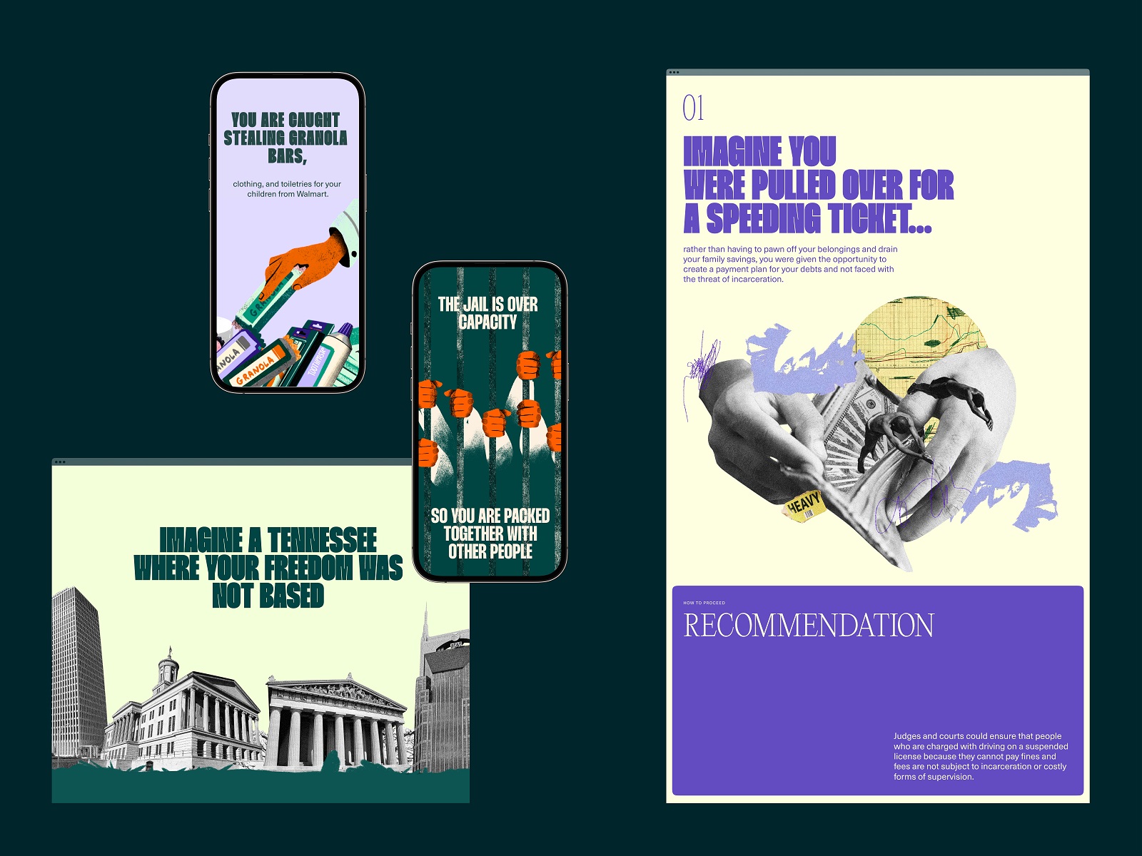
One of the biggest challenges in this project was creating something engaging and impressive when we had a lot of data but no visual content. After exploring all the provided information, the creative team decided on the most effective and emotionally appealing way to present it. So, the visual part presents a mix of text blocks, illustrations, graphic elements, animations, and collages, all united in one emotional and informative integral story.
The process of creating images was a big deal. First, the keywords were chosen for the theme presented in a specific section. Then, we tried to find a visual metaphor in each illustration that would make it clear to a reader what the section is about before reading its text. The motion made this effect even more powerful and dynamic.
One more challenge was finding ways to avoid some points. For example, how to set the idea of prison without showing it directly and making graphic content that wouldn’t offend anyone.
Website Design
The project uncovers the dominant narrative around crime and poverty and offers a path to achieving true community safety and healthy relations. The scrollytelling format pairs the narrative with an easily searchable and filterable database so users can learn from individual stories, themes, or issues. As for typography, we chose Thunder font for taglines and headlines and paired it with Neue Haas Unica.
Working on the website, we had to combine two objectives.
On the one hand, it had to be impressive and emotionally engaging from the first seconds. It had to stand out from the crowd to attract visitors’ attention among the tons of web content they deal with. What’s more, it had to motivate the reader to go through all the story up to the end to get the whole picture.
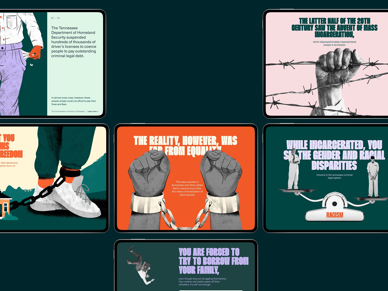
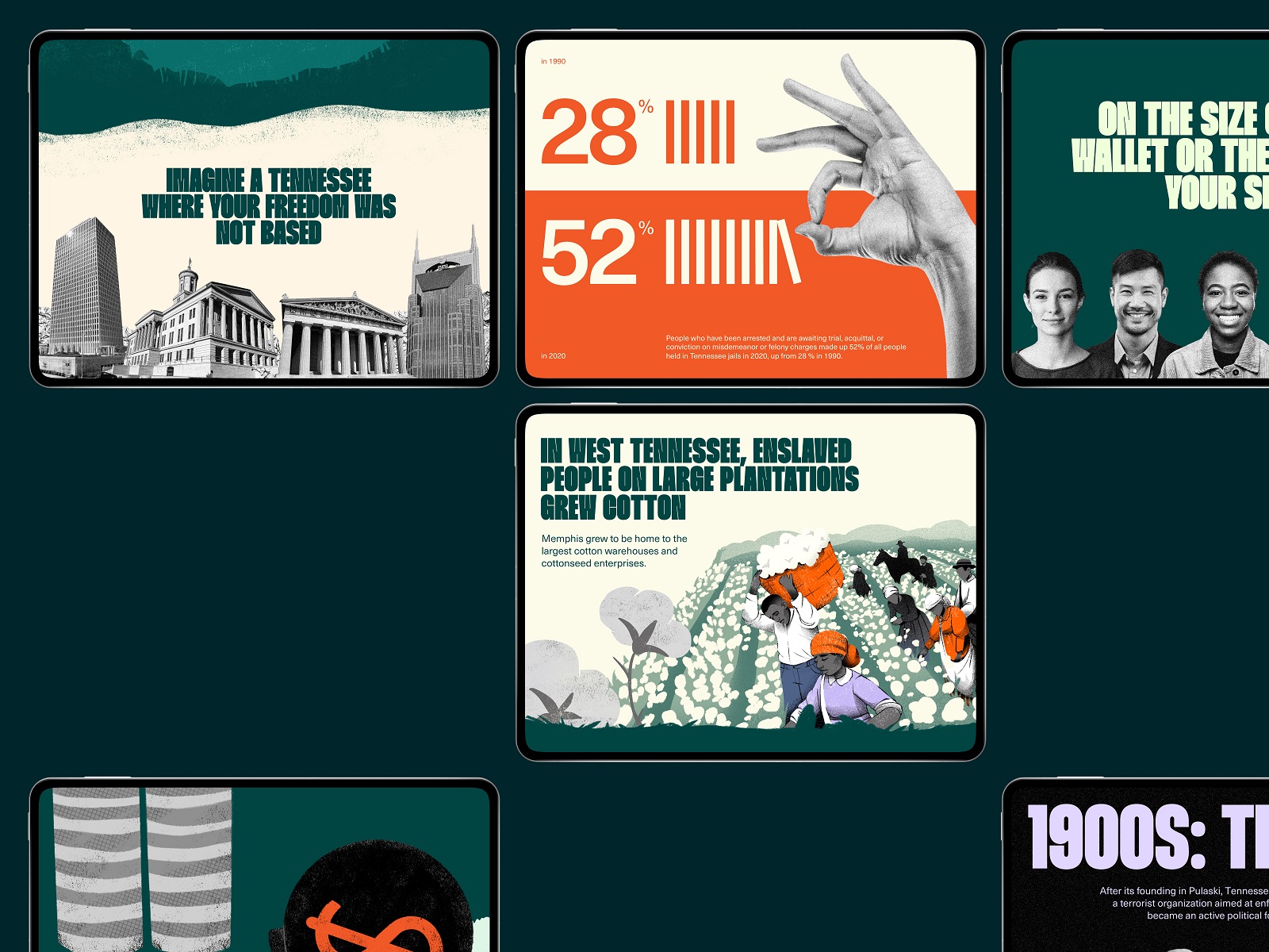
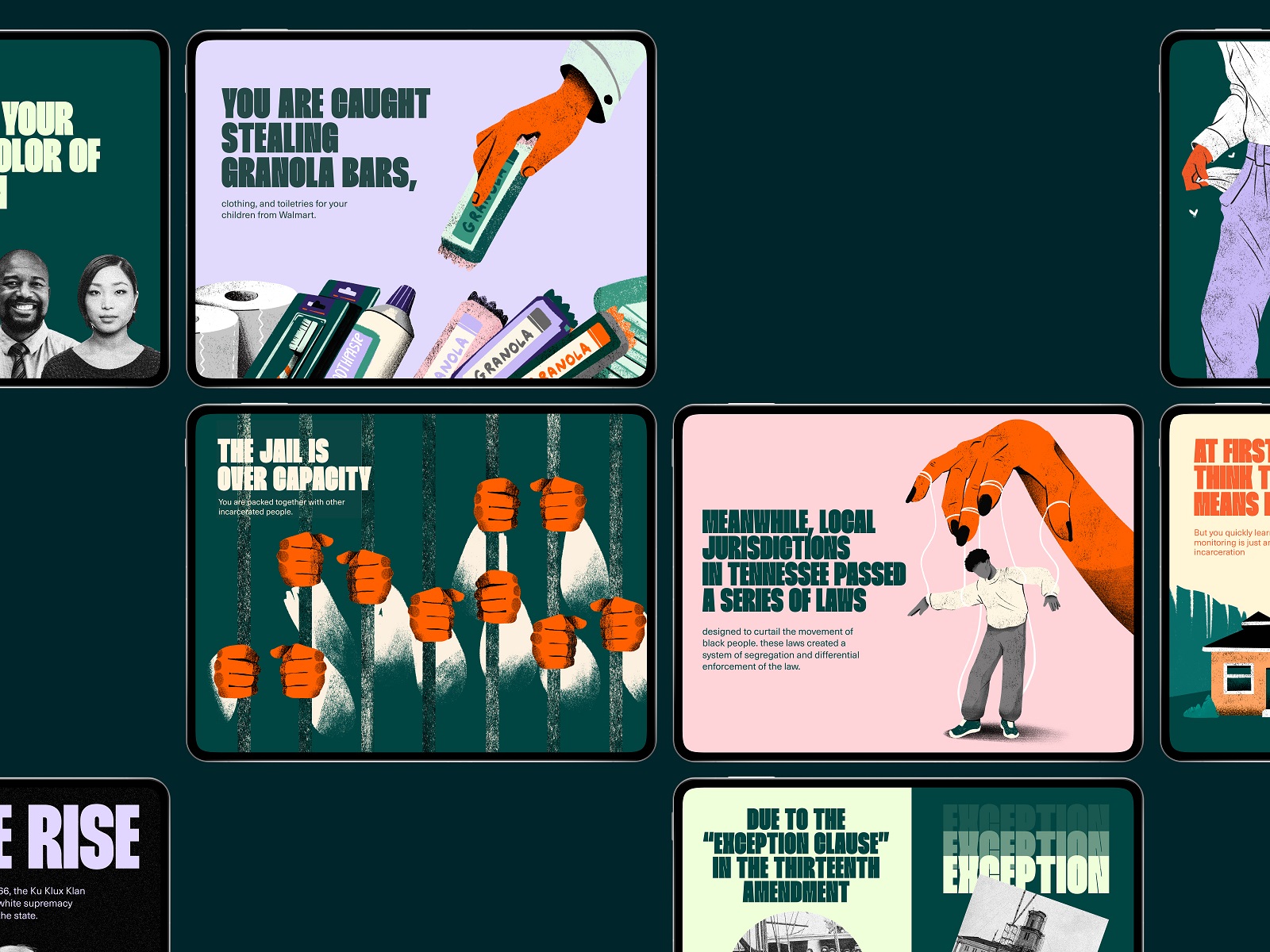
On the other hand, the website had to be super intuitive so that people belonging to different age groups and with varying levels of tech literacy could use it without much effort. So, the web design was based on a solid visual hierarchy and common mental patterns of interacting with web resources. It had to be a canvas for the story that would amplify its message. All the decisions regarding the elements of visual style, from the color palette and fonts to images, were made to work as one integral system, setting the appropriate mood and feelings and making them easily readable and perceivable.
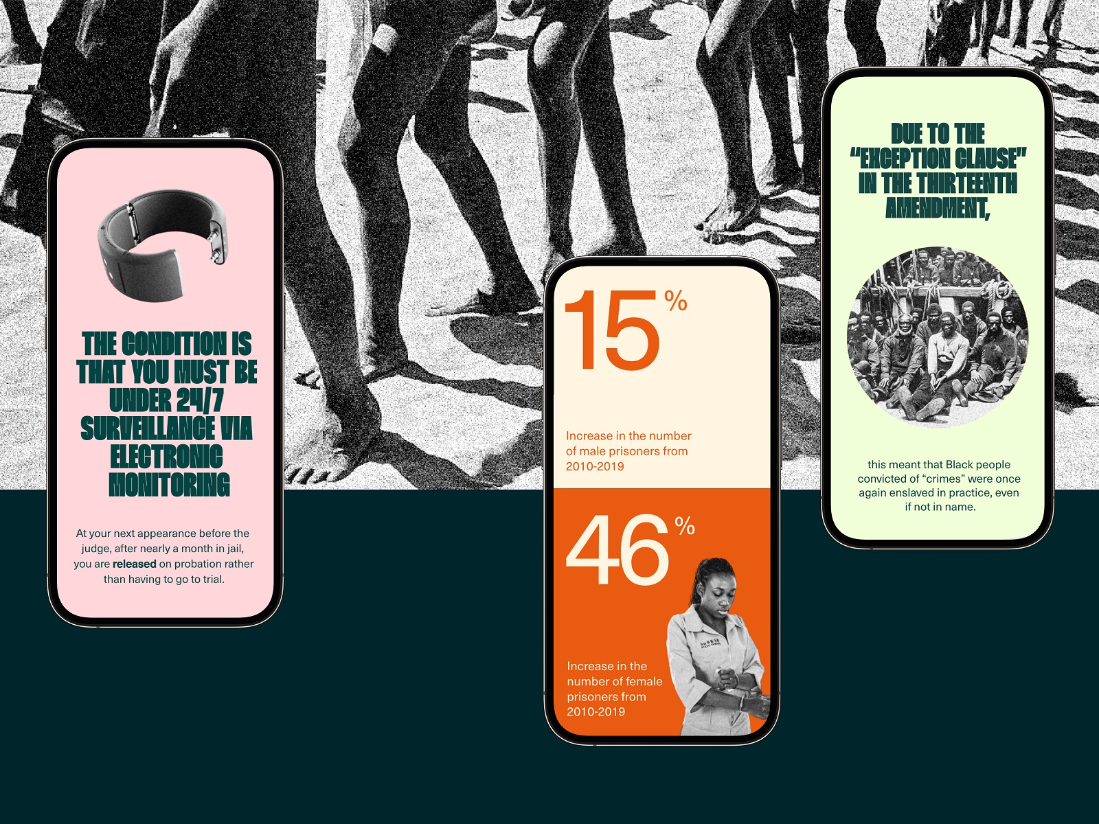
Working with the vast archive of impacted voices, we carefully analyzed each message. This allowed us to consider what kind of visuals and interactions would strengthen them and what part of the general story they fit best. For example, readers can find them integrated in the form of text blocks that are short notices supporting each chapter with messages from real people. Also, there is a particular page called Stories. There, you can read the voices wrapped in short speech fragments shown by hovering over the name. At some stage of storytelling, the readers are offered to go to this page and engaged to check the stories if they want to do that.
Our creative efforts resulted in a vibrant, color-forward, and optimistic treatment of the topic. First-person storytelling paired with reaction animation has opened up new possibilities to breathe life into these issues. All that equipped Free Hearts and other advocates with a powerful new tool to shift the public narrative around punishment, poverty, and safety in Tennessee.
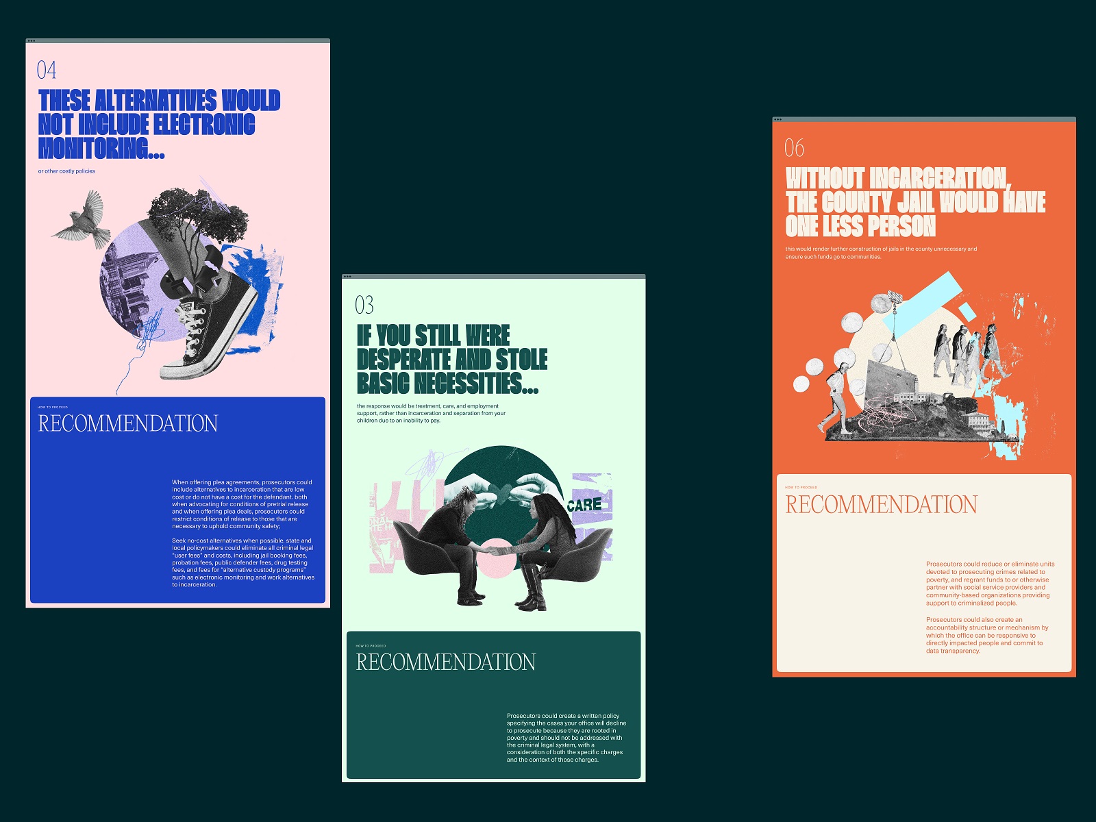
Not only did this project become a success for the objective set behind it, but it also set the start for our long-term collaboration with Zealous for their next ideas to share with the world. One more web project we made together, Advocacy Through Walls, is already live and working; we will show it to you in one of our following case studies. And new ones are coming, as the world is full of knowledge to be learned and stories to be told, seen, and heard.
New design case studies from our team are coming soon. Stay tuned!
More Design Case Studies
Here’s a set of more case studies sharing the design solutions and approaches for some of the design projects done by the Tubik team.
MOVA Brewery. Ecommerce Website Design for Beer Producer
HP23. Website and 3D Animation for Prostheses Producer
FluxWear. Web Design and Development for Health Tech Product
UI Design Process for Web and Mobile: 3 Detailed Video Cases
Magma Math. Web Design for Educational Platform
Synthesized 2.0. Web Design for High-Quality Synthetic Data Platform
HotelCard. Brand Identity for Hotel Offers Service
Nibble Health. Identity and UX Design for Healthcare Fintech Service
Physica Magazine. Web Design and Graphics for Scientific Blog
CSConnect. Website Design for Immersive Experience Marketing Platform
ProAgenda. Identity and Website Design for Golf Management Service
Kaiten. Identity and Product Design for Food Marketplace
THT. Website Design for Electrical Engineering Service


