Sometimes, a project doesn’t ask for reinvention. It asks for fluency. Familiarity. A visual accent that sounds like the brand, even when the sound is off.
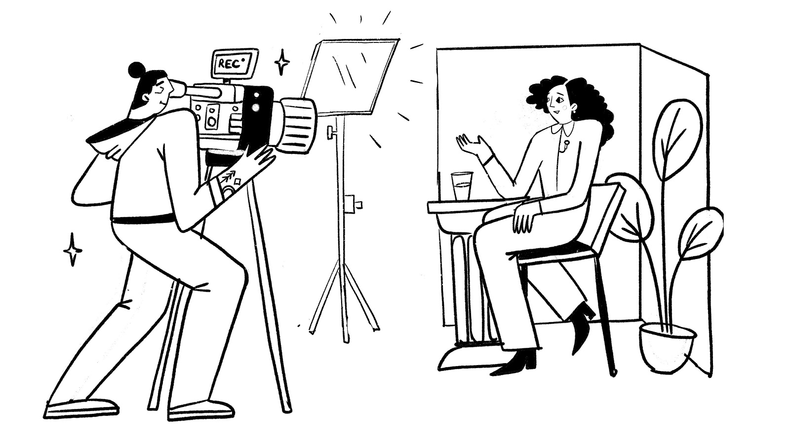
That was the ask from CUBE—a video production company fluent in movement, tech, and human nuance. They already had a sharp visual identity and a site that held its own. What they needed was illustration—not to decorate, but to explain. Not to impress, but to connect. They wanted us to make it personal. Make it feel like them. Oh, and include the dog.
The Brief
CUBE handles everything from live-action shoots to 2D animation, 3D visuals, and metahumans. They know how to tell stories. But even storytellers need a few visuals that don’t move, especially when it comes to content for blogs, social, or landing pages.
When they reached out to us, they were looking for… rhythm. A visual throughline. Something to bridge the gap between their crisp, tech-savvy presence and the messy, creative magic behind it.
We knew it had to be:
- Brand-cohesive (not brand-prison)
- Emotionally warm, without veering into stock-illustration hell
- Modular, scalable, and readable at multiple sizes
So we said yes. And made sure to give the dog a cameo.
Sketch, Rinse, Repeat
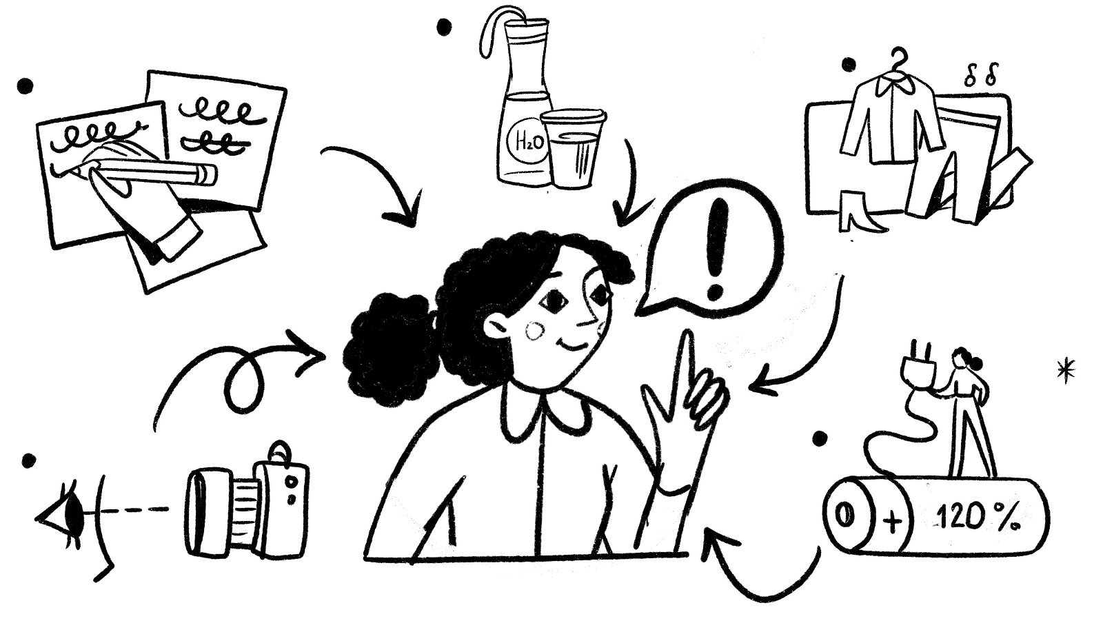
Our illustrator on this one was Yaroslava Yatsuba. The process kicked off the way most good ones do: with low-stakes sketches and high-stakes overthinking.
She started in pencil—or rather, stylus—working fast, loose, and quiet. Using CUBE’s own site as a reference, borrowing its tone, its angles, and logic. Yaroslava leaned into a flat magazine-style look, tapping into a muted, brand-aligned palette. Nothing too slick. Nothing trying too hard.
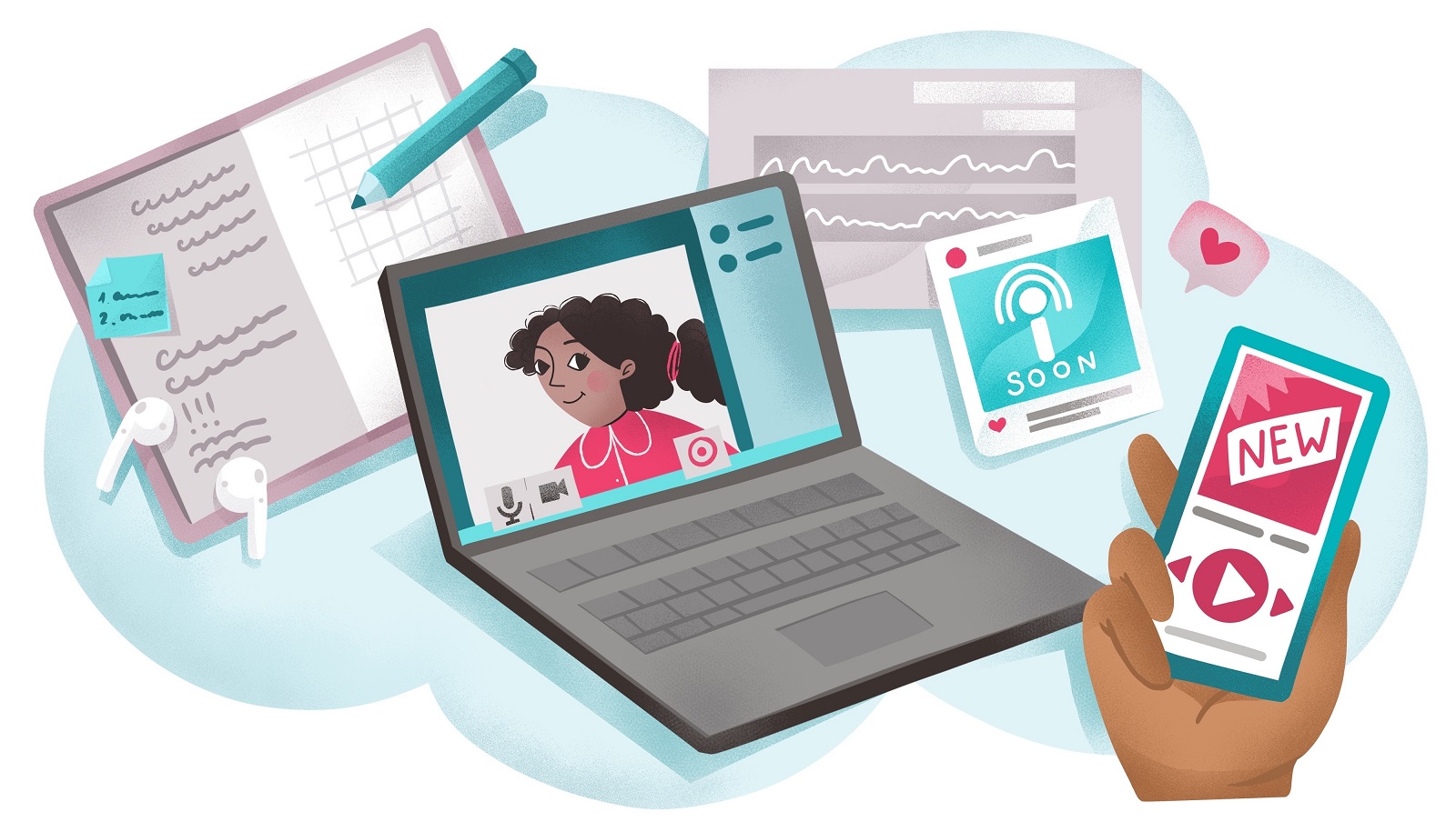
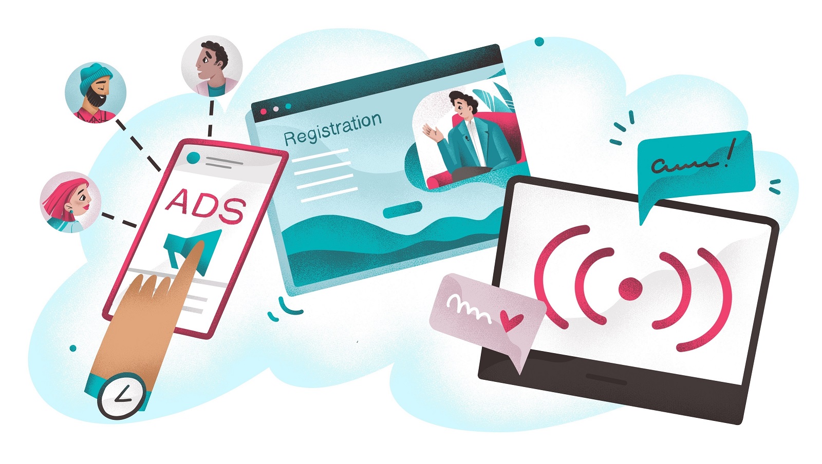
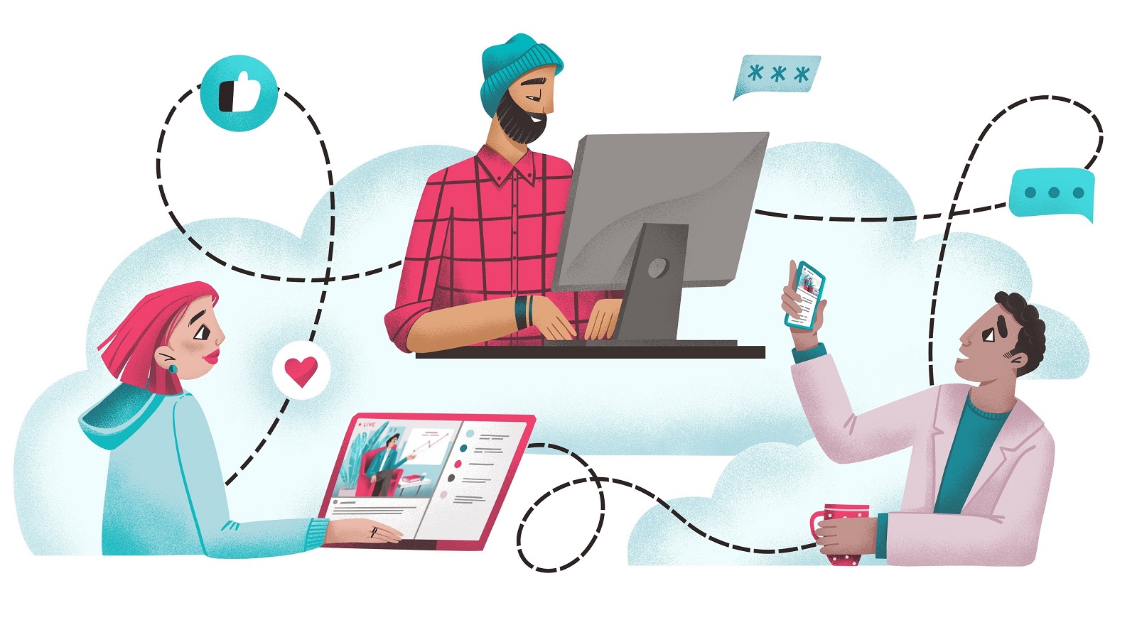
Each article set followed a familiar structure:
- One hero illustration with background narrative and character interaction
- Two supporting pieces with isolated characters and contextual objects
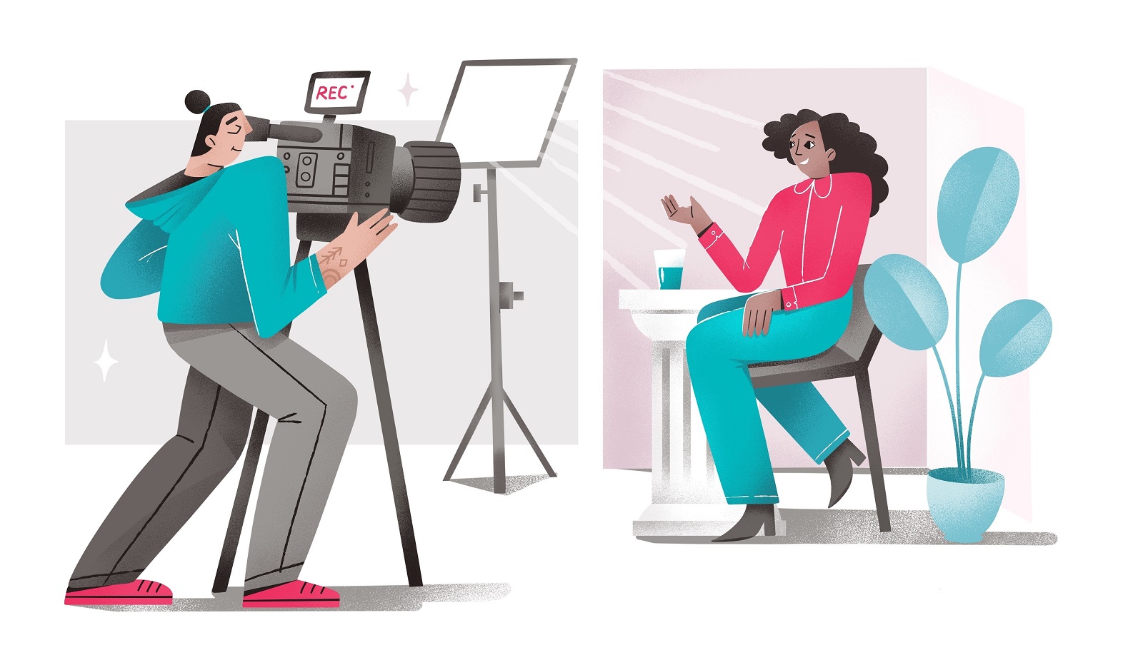
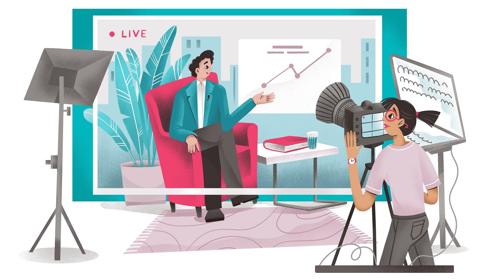
Think of it like film stills: the hero shot sets the mood, the others fill in the context.
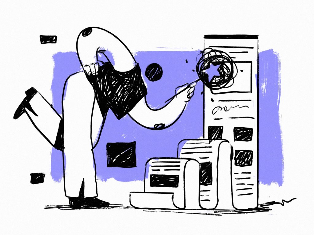
The Style Is the Story
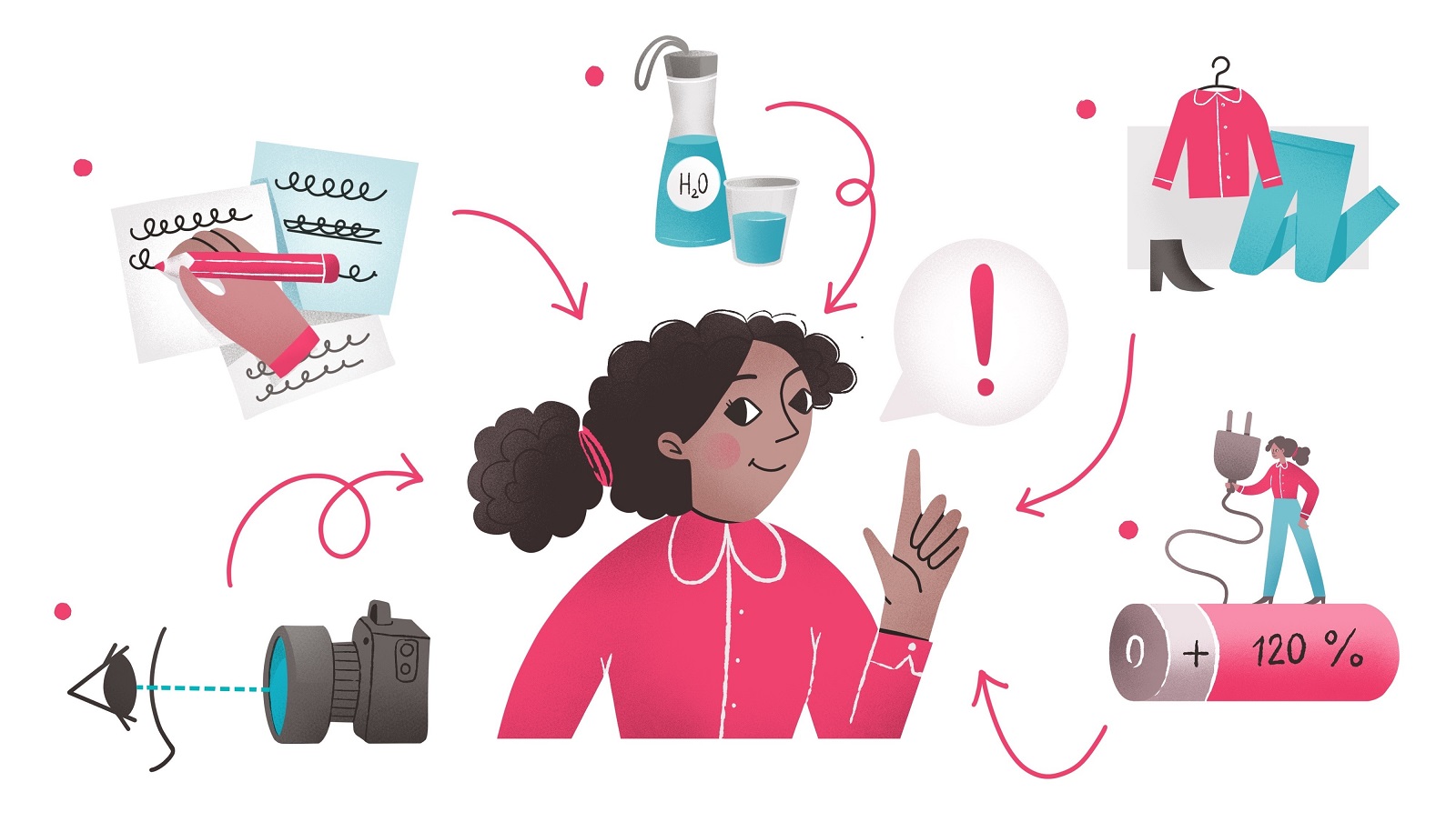
The challenge with flat illustration is restraint. You don’t get to hide behind gradients or trick the eye with depth. Every line has to mean something, and every color has to earn its spot. We worked in a limited palette tied tightly to CUBE’s identity. It was a weirdly liberating constraint, and it worked. The visuals started to speak the same language as the brand—clean, clear, and just a little self-aware.
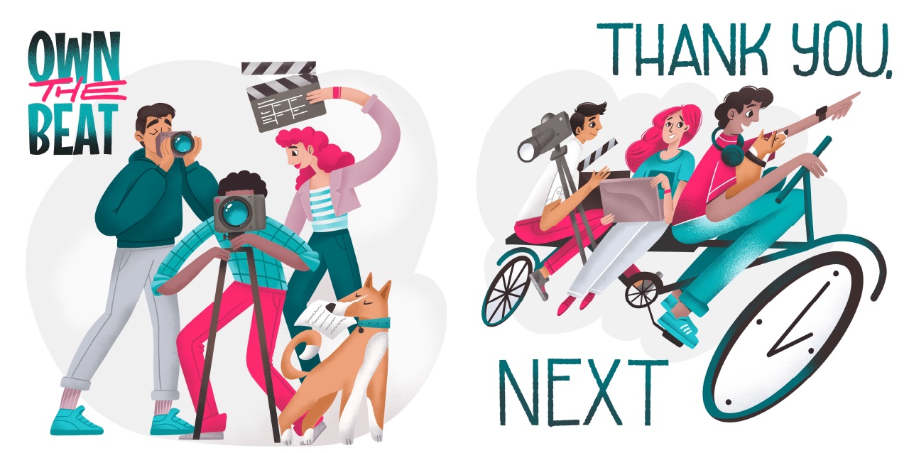
One of the illustrations showed a director mid-shoot, another an editor elbow-deep in timelines. The backgrounds weren’t ornamental—they were structural. They showed creative chaos in a way that still read as professional. A storyboard on the wall. A glass of something fizzy half-finished on the desk. You know, the usual.
Take a peak at the illustration process in the video below:
The Dog Is Part of the Team
CUBE has a dog. It’s in their welcome video, their Instagram posts, and probably in a Slack thread titled “mood.” It made sense to include it in the illustrations—not as a mascot, but as a character.
So we did.
Not front and center, but there. In the corner of the frame. Tucked between frames. Watching over the creative process like a fluffy little executive producer.
It’s a subtle nod, but that’s the point. These visuals weren’t about reintroducing CUBE to their audience. They were about deepening the familiarity. Reminding people that there are actual humans—and one dog—behind the camera.
The Outcome
The final result was a set of illustrations that walk the line: structured but human, simple but never bland. They helped CUBE add depth to their articles, visual warmth to their brand, and yes—some dog energy to their static content.
We don’t always talk about illustration this way. But maybe we should.
Because when it’s done right, it’s not a style. It’s a voice. And a good voice doesn’t need special effects to be heard.
More Design Case Studies
Curious how we approach motion-heavy branding? Or what happens when we try to make a scroll feel like a soundtrack?
Here’s a lineup of other case studies that go behind the scenes of our messiest, weirdest, most rewarding design projects:
FarmSense. Identity and Web Design for Agricultural Technology
Real Bitcoin. Creating Website Illustrations
Devpost. Hero Illustrations for Hackathons Platform
Carricare. Identity and UX Design for Safe Delivery Service
OOP. Brand Identity Design for Online Flea Market
Otozen. Mobile App Design for Safe Driving
Uplyfe. Identity Design for Health App
Vinaty. Website Illustrations for Wine Service