In the era of information technology and communication, the ability to process, protect, and organize vast bulks of data becomes one of the key points empowering tons of processes and covering multiple goals. Our new case study is devoted to the product fitting the times. Here, we will unveil a bit of the web design and implementation for the innovative DataOps platform called Synthesized.
Project
Synthesized is the all-in-one DataOps platform which is helping to solve one of the most challenging problems we face as a society—the use of personal information. Synthesized makes it easy for organizations that want to collaborate on sensitive data. It enables enterprises to monetize and innovate through their data and speeds up the development of data-driven products. In as little as ten minutes, as opposed to months or years, Synthesized’s AI-based platform provides data practitioners with secure and compliant, ready-to-use, high-volume, high-quality data sets.
Telling about the product’s mission and origins, founders mention that from their time as Machine Learning (ML) researchers at the University of Cambridge, they struggled to obtain sufficient clean and regularised data fundamental to building predictive models or testing a hypothesis. With ML projects becoming more advanced, the complications were also growing in the attempts to get high-quality, clean data sets. What’s more, they found a gap between the developments of the scientific community caused by the lack of infrastructure to share data safely. So, they started Synthesized with a mission to empower data scientists with the highest quality datasets for collaboration and innovation.
The task for Tubik was to create a user-friendly and attractive website that would present and promote the service, uncover its benefits, and set a quick, easy connection to its users. The creative team from the Tubik side included Vladyslav Taran, Denys Koloskov, Kirill Erokhin, and Olya Zakharyan.
Web Design
Traditionally, the design process started from the discussions with the client to dive into the nature of the service, the business goals, and the expectations about the functions the website should cover. After that, the team went through the stages of research and analysis that gave food for thought on how to create effective design solutions for the objectives set behind the website. And then, the stages of UX wireframing and design approach started to let all the sides of the process be on the same page.
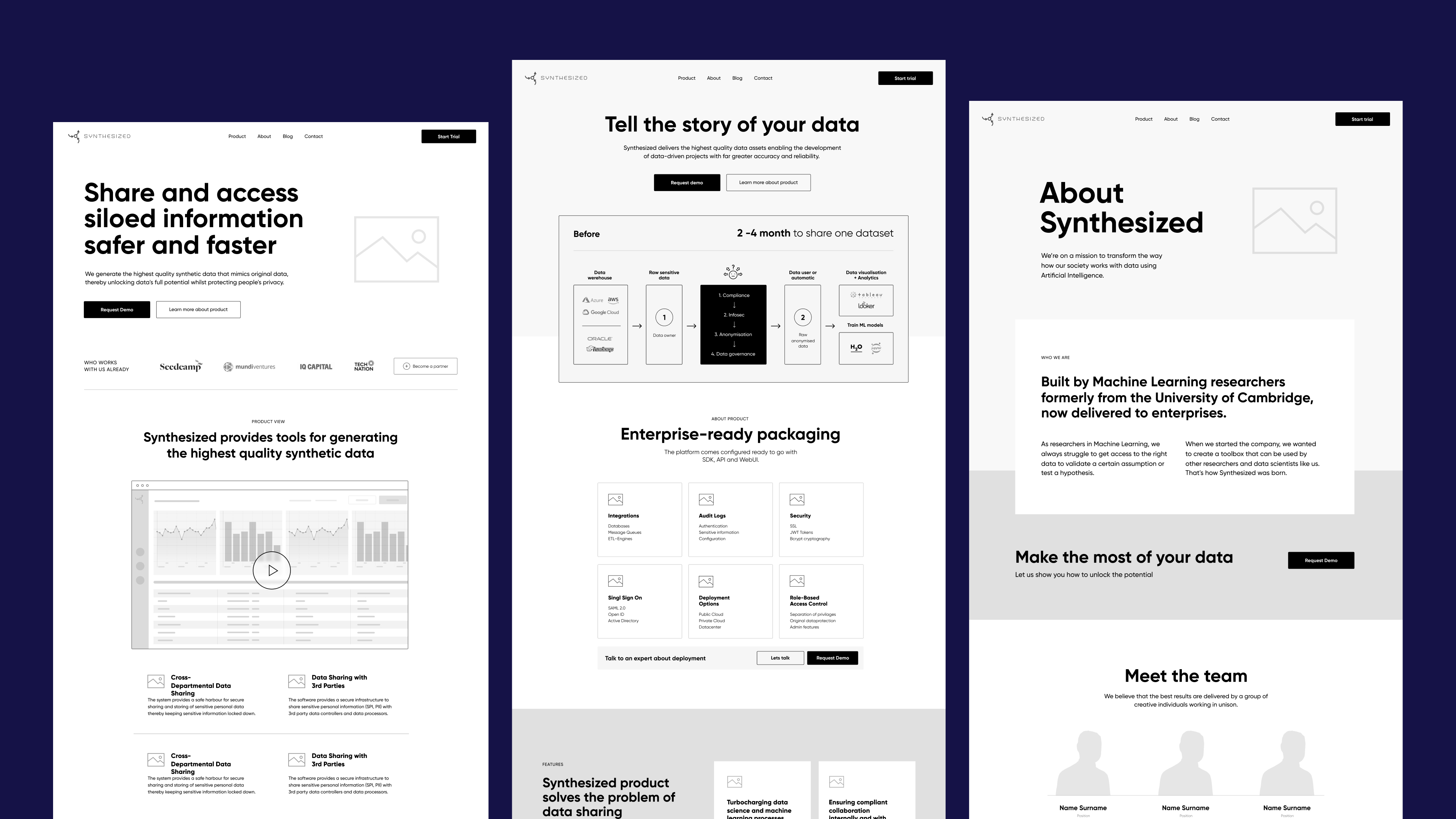
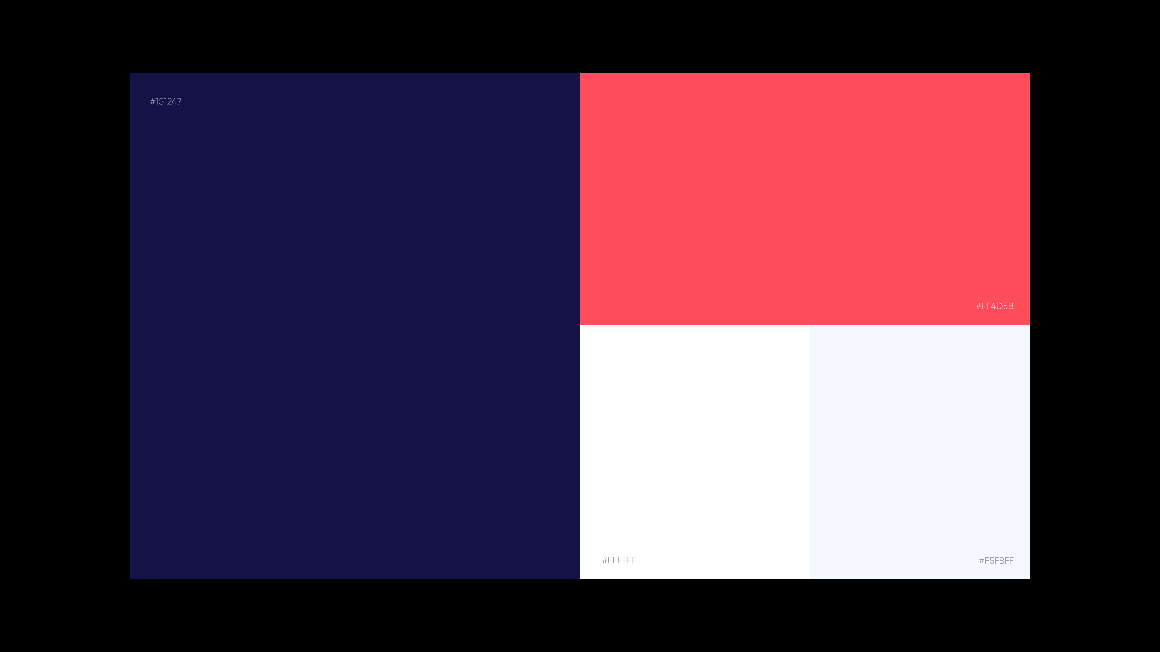
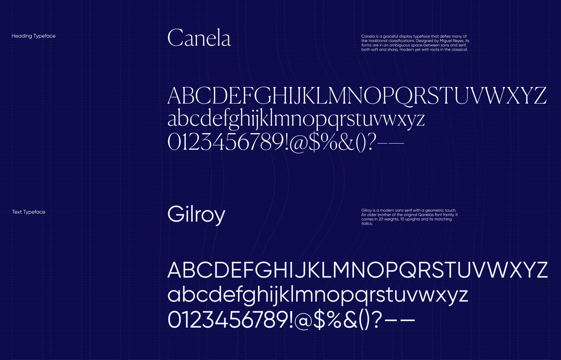
Let’s take a look at the general design concept via some of the pages designed for the website. The search for a color palette that would be effective and set the proper mood resulted in a bold and contrast combination flexible for various design needs. Another key choice to make was the choice of fonts which gave the elegant and stylish combination of graceful Canela as a heading typeface and neat geometric Gilroy as a text typeface.
As the dress-to-impress rule still works, especially on the Web overloaded with pages and sites competing for people’s attention, the above-the-fold part of the home page moved through several iterations to find the visual way to reflect the connection to the world of synthesized data. This way, we came up with an animated full-screen background with abstract patterns adding depth and dynamics to the visual experience. The minimalist layout of this part of the page is scanned in no time and features the core navigation in the header, prominent tagline and small description text to give a short and concise message about the nature of the product, and a CTA button whose noticeability is supported with bold color contrast to make it seen at once.
Background color contrast is used as the primary type of visual divider, helping to separate various web page sections and this way make the content perception easier. The pages look information-packed but not overloaded due to mastering the power of negative space and well-thought-out data visualization. It is a highly essential aspect to consider in user experience design for the products that are non-tangible and innovative, so demand a lot of explanation which is challenging to imagine and hard to show.
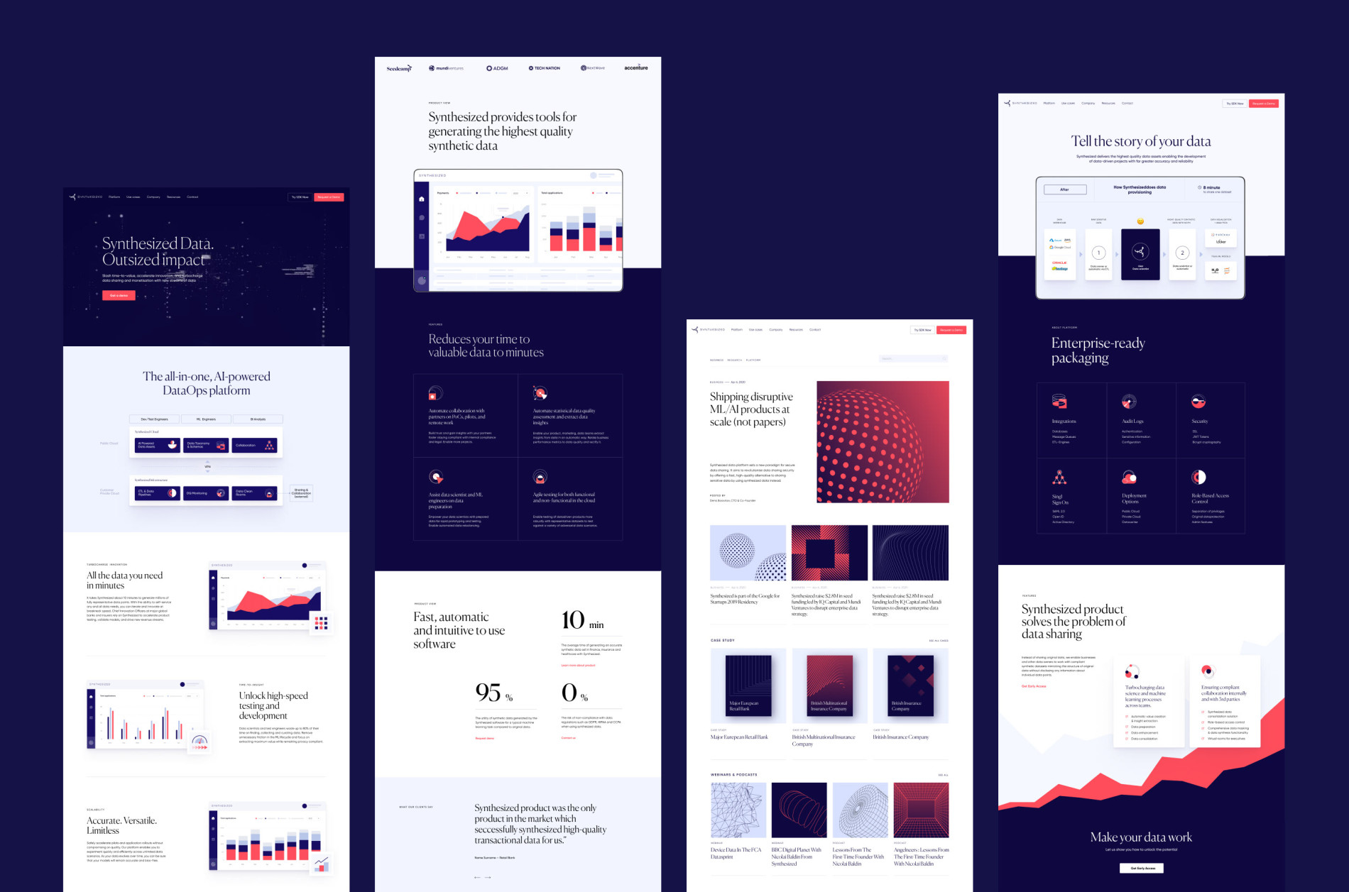
This page uses neat tabs with bulleted lists to present information about different features in a straightforward manner that is easy to skim and remember. The abstract background pattern reflects the idea of growth and gets animated to make the experience more engaging.
It’s easy to see from the pages above that one more aspect to consider in the design process was visual elements that would support text blocks. So, the custom icons were designed to support the consistency and integrity of the layout with informative graphics. Making them animated, we could also employ motion to attract visitors’ attention to particular elements and interactive zone, as well as add a pinch of liveliness to the web pages.
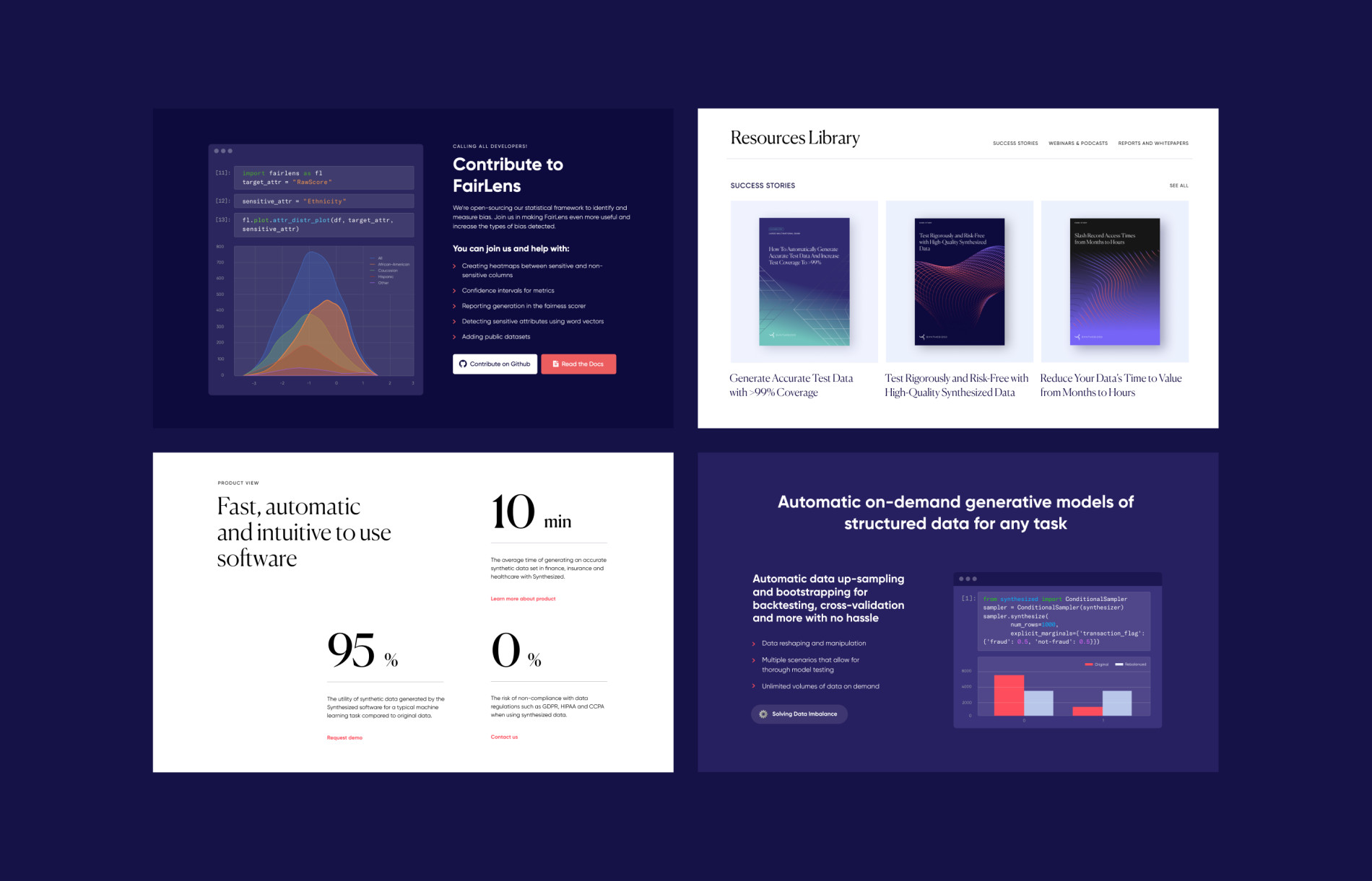
As mentioned above, balanced and attractive data visualization was one of the priorities in a project of such a nature, so this aspect was thoroughly thought-out, resulting in a range of techniques from graphs and code snippets brought to the common style to prominent infographic-like numbers presenting essential benefits.
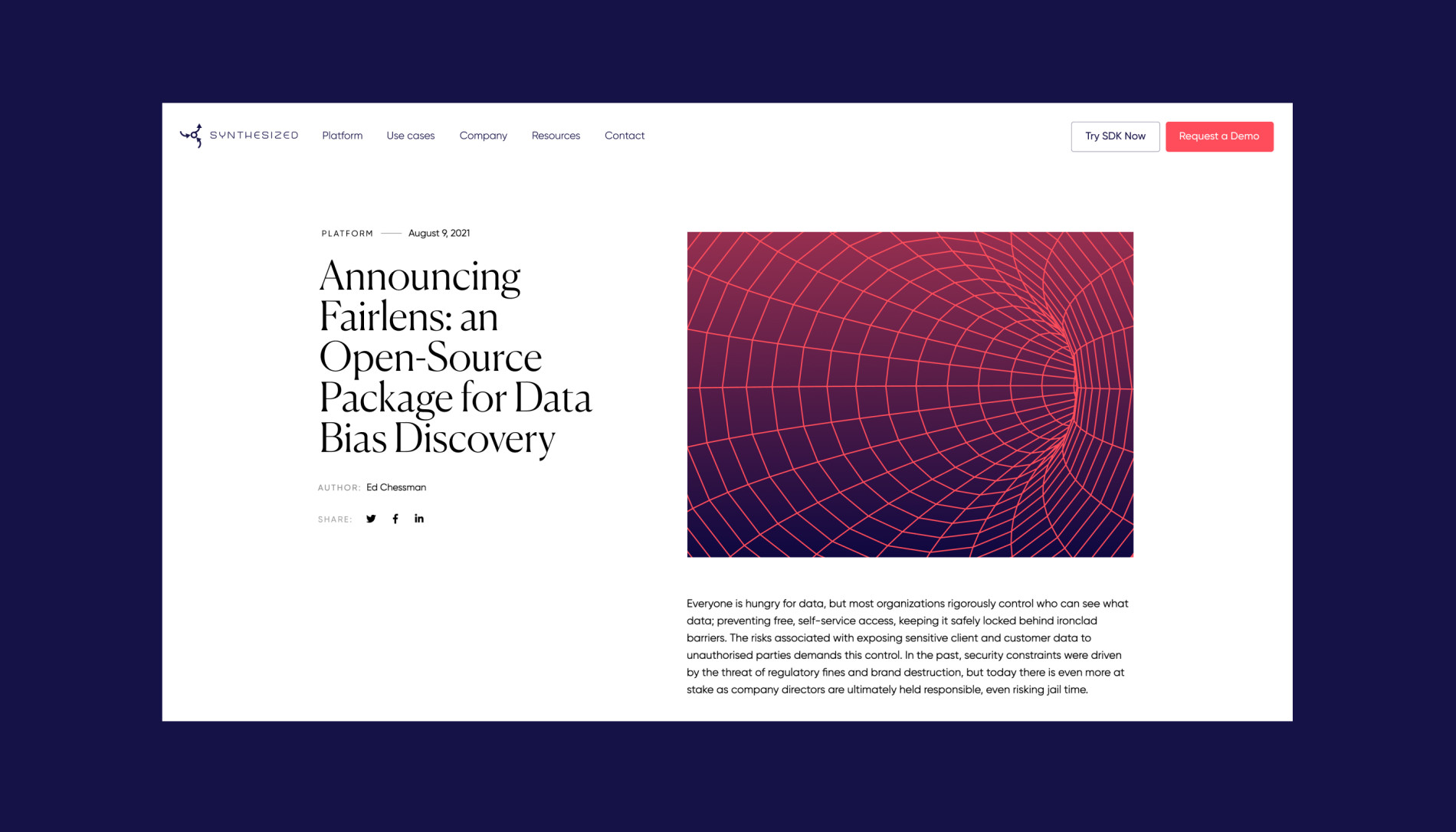
The blog page design uses the uncluttered regular grid with one featured post on top. We also thought out and offered the design system for covers of the articles and resources, designed in a futuristic manner and satisfying both consistency and diversity needs.
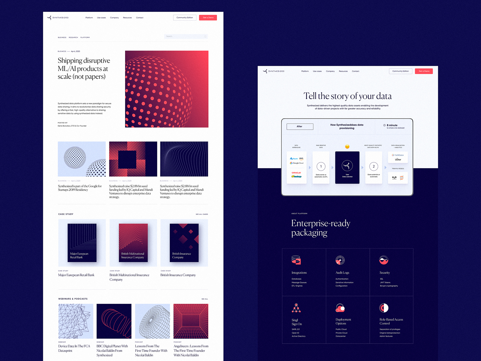
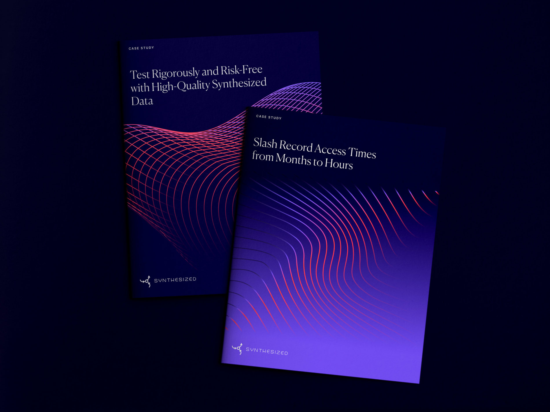
Here’s the system of cover images designed for whitepapers and downloadable resources to be presented in style echoing the web platform’s visual identity.
The Company page is built around the animated photo gallery, which sets the emotional connection and adds a powerful human element to the presentation of the product.
As a number of our earlier projects, for example, Credentially or ShipDaddy websites, the Synthesized website was also implemented on Webflow. It enables both designers and the client’s team to effectively update the website in live mode and keep up with the speed of the company’s growth.
Mobile Adaptation
For any web project these days, the well-crafted mobile adaptation is not a privilege anymore but a must-have that makes the website look good and work well on any device convenient for the visitor, as well as has a significant impact on search ranking. Here’s a glance at how some pages of the Synthesized website look on mobile.
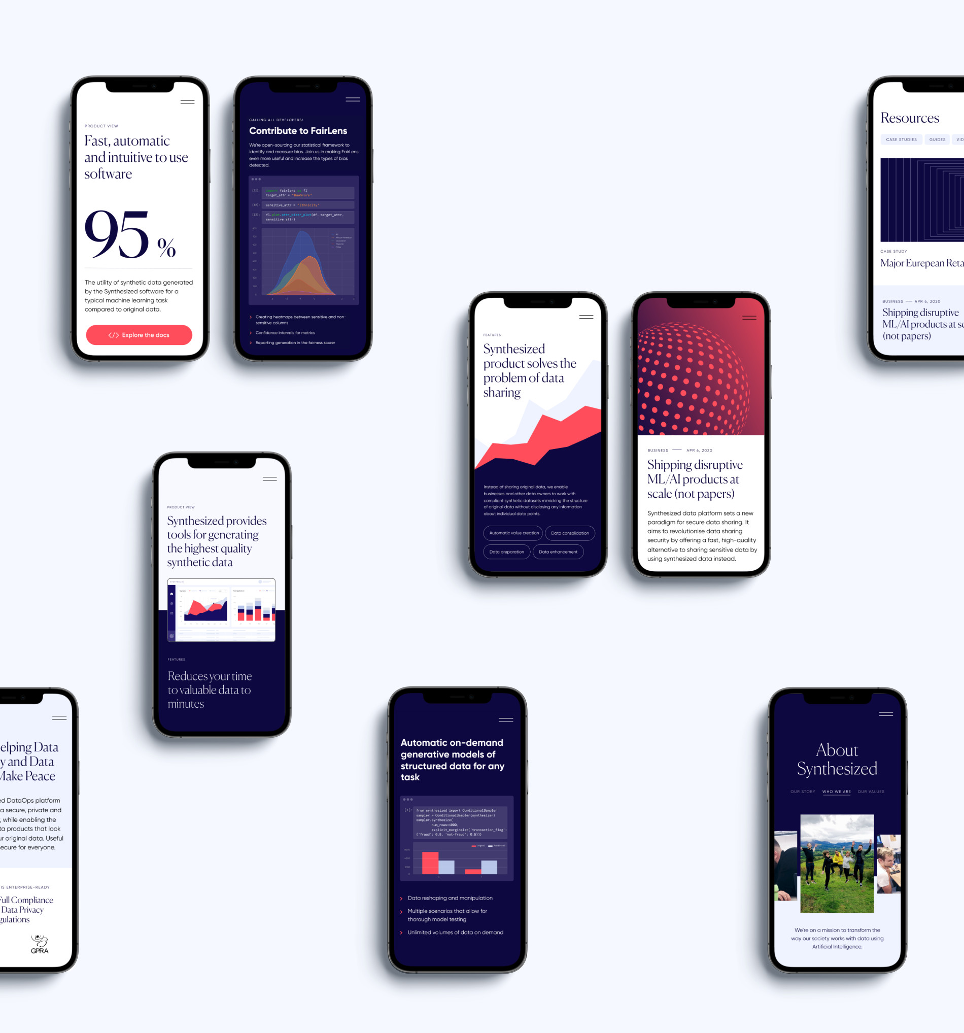
Synthesized is the company we’ve still been collaborating with, so it’s not the complete story: new design tasks are being covered, new challenges are being faced, and that’s the amazing experience to go through the different growth and scaling stages together with the client, from the basic website to the diversity of pages, content, and functions.
Stay tuned; new case studies are coming soon!
More Design Case Studies
Here’s a set of more case studies sharing the design solutions and approaches for some of the design projects done by the Tubik team.
Mayple. Website Design for Marketing Marketplace
Carricare. Identity and UX Design for Safe Delivery Service
Annual Awwwards. Website Design
Uplyfe. Identity Design for Health App
ShipDaddy. Identity and Web Design for Shipping Service
Credentially. Website Creation with Webflow
HUAWEI. Icon Design for EMUI 10
Illuminating Radioactivity. Interactive Web Design for Education


