
There’s a thin line between clarity and chaos. And sometimes, that line is literal.
Visual dividers are the quiet heroes of interface design. They guide the eye, separate content, and make sense of even the most crowded layouts—especially in dense screens like settings, lists, dashboards, product pages, and forms.
The best part: dividers don’t have to be literal lines. They can be spacing, color contrast, shadows, or even imagery—anything that creates a clear boundary. If you’re searching for UI divider best practices, types of dividers in user interfaces, or how to separate content in UI, you’re in the right place.
Let’s talk about them.
What Is a Visual Divider in UI, and What Does It Actually Do?
A visual divider is any layout element (or deliberate absence of one) that separates content into understandable chunks. It signals: this belongs together and that belongs somewhere else.
It does three jobs at once:
- Creates structure: turns a scroll into chapters instead of a wall of content
- Builds visual hierarchy: makes “primary vs secondary” obvious without shouting
- Improves scannability: helps users find the thing they came for in three seconds, not ten
And yes, it also affects interaction. In mobile UI design, a divider can make a row feel tappable, a section feel contained, a list feel sortable. A user doesn’t say “nice divider.” They say, “This website/app feels easy.” That’s the compliment you want to get.
What Are the Main Types of Visual Dividers in User Interfaces?
If you Google “types of UI dividers,” you’ll see the same basic set repeated, because it’s true: most divider styles come down to a handful of visual mechanisms. The interesting part is how you choose them.
Lines: When a Divider Line Is the Right Kind of Obvious
A line divider is the classic. It’s also the one designers overuse when they’re nervous.
Use lines when:
- the content is dense (tables, settings, specs, receipts)
- items are similar and repeat in a list (so separation prevents accidental taps)
- you need a “hard boundary” users recognize instantly
Avoid lines when:
- the page already has lots of edges (cards, grids, bordered inputs)
- the layout needs air more than it needs fences
- your lines start to look like spreadsheet mode
The trick with a UI divider line is restraint. Thin, low contrast, aligned to your grid. If it becomes the most visible thing on the screen, it’s not dividing content—it’s competing with it.
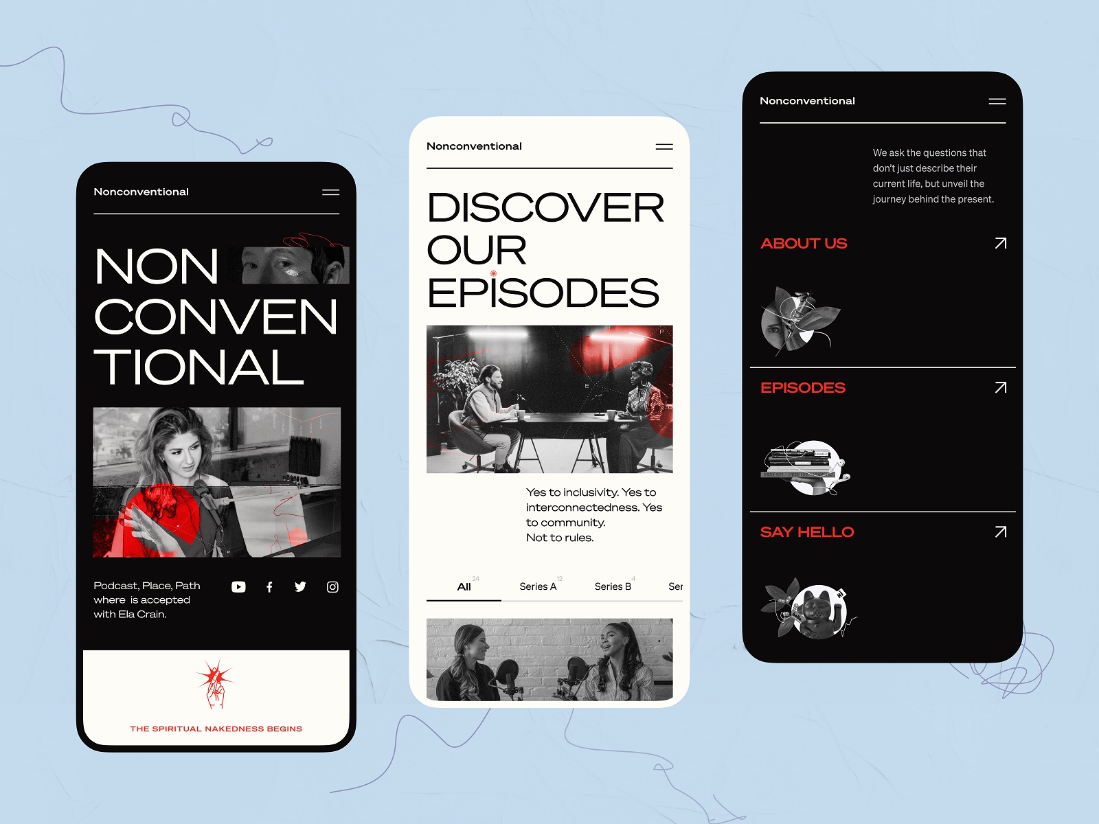
The mobile version of the Nonconventional Show website uses lines to divide different sections in the menu.
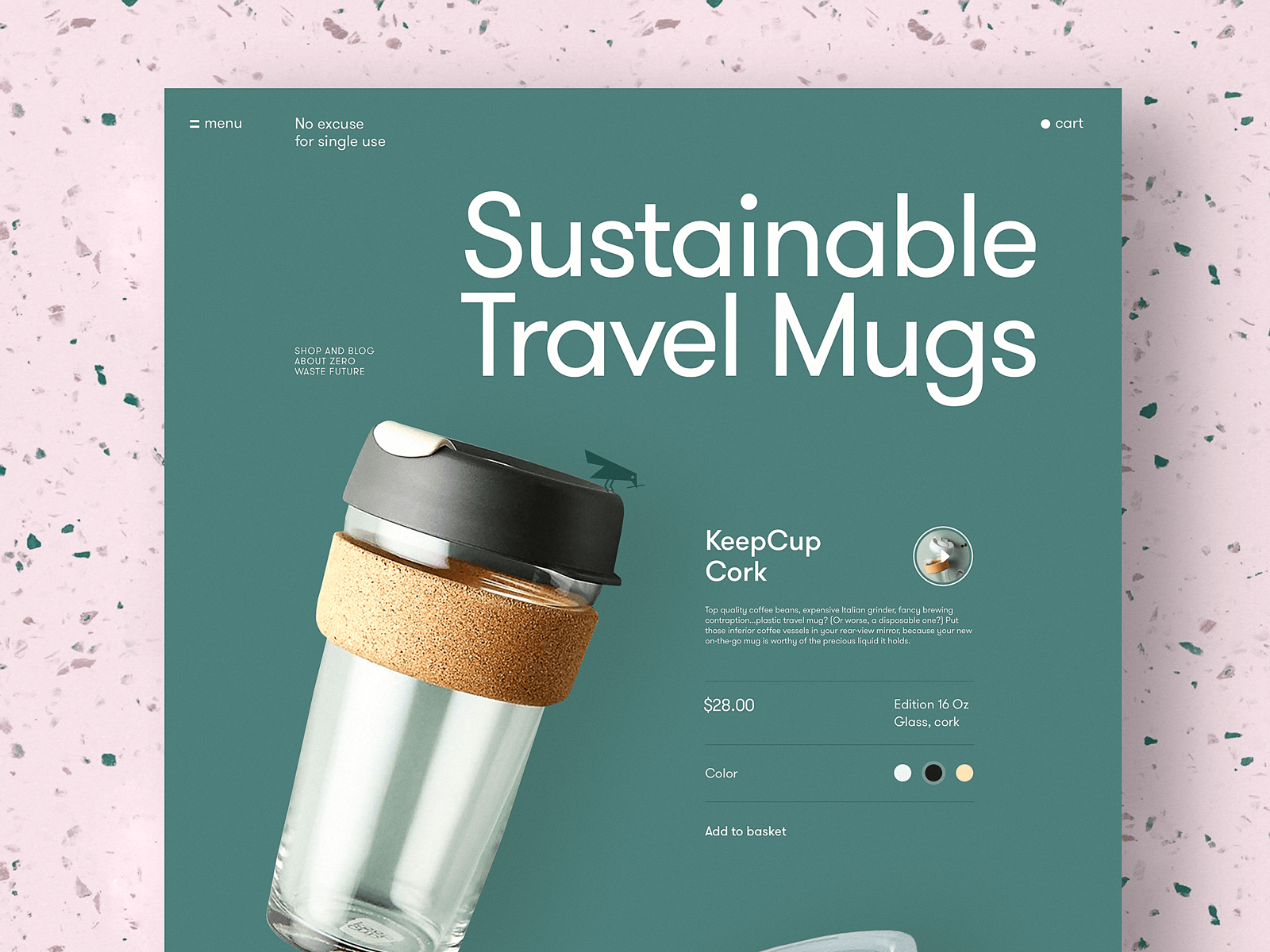
The product page for a website devoted to zero-waste living uses horizontal lines as visual dividers to clearly organize different information about the item.
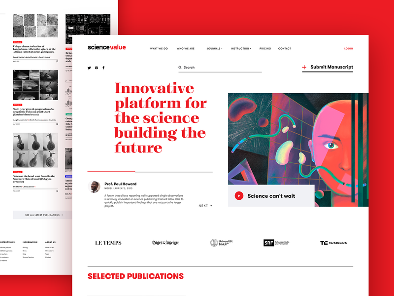
The webpage of the scientific platform uses horizontal lines to separate different content blocks and make their structure easily scanned.
This ecommerce website of a tea brand uses different levels of visual separation of the content
Negative Space: The Divider You Don’t “See,” but Your Brain Loves
White space (negative space) is the cleanest answer to “how to separate content in UI design” because it doesn’t add new objects. It’s a structural pause.
Spacing works best when:
- you’re building a minimal UI layout
- you want sections to feel calm and readable
- you’re relying on Gestalt principles (proximity, similarity, continuation)
It’s also the most forgiving divider in responsive design. Your spacing scales. You don’t end up with awkward lines cutting through components when the screen size changes.
Education app design demonstrates the elegant approach to unit arrangement via a well-balanced negative space.
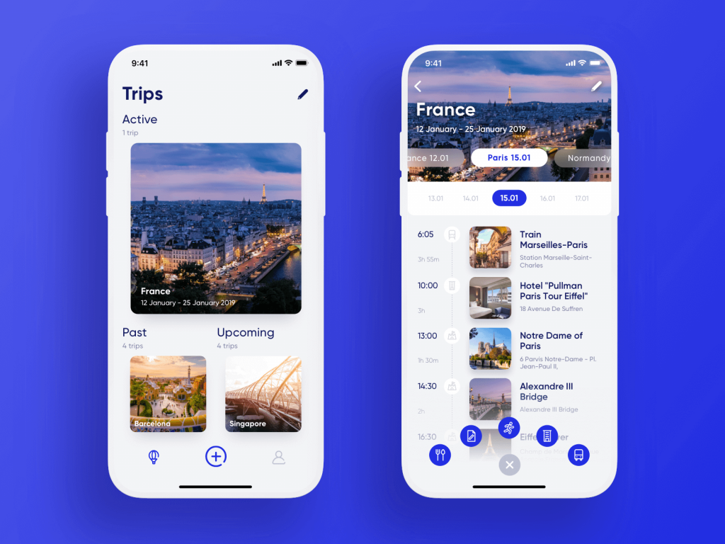
The travel planner app separates the items in the list without any additional visual elements, just with white space.
The Health Blog list of articles is based on typographic hierarchy and negative space to make them look like a clear set of items without stealing the air from the layout.
Color Contrast: How to Split Sections Without Drawing Borders
Color contrast dividers show up everywhere in modern web design: alternating section backgrounds, split-screen layouts, landing page blocks. They’re popular for a reason. They separate big pieces of content fast.
A few grounded rules:
- use contrast to separate sections, not individual rows (unless you want zebra-strip chaos)
- keep text contrast accessible (yes, WCAG matters here, not as a buzzword, as basic decency)
- avoid “random background color syndrome” where every section gets a new vibe
Color is powerful, but it’s also emotional. A soft neutral section feels like a breath. A harsh contrast may feel like a slap. Choose based on pacing, not trend.
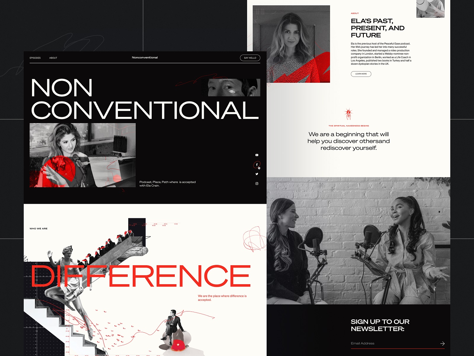
The Nonconventional Show website design employs bold color contrast to arrange the content more engagingly and dynamically.
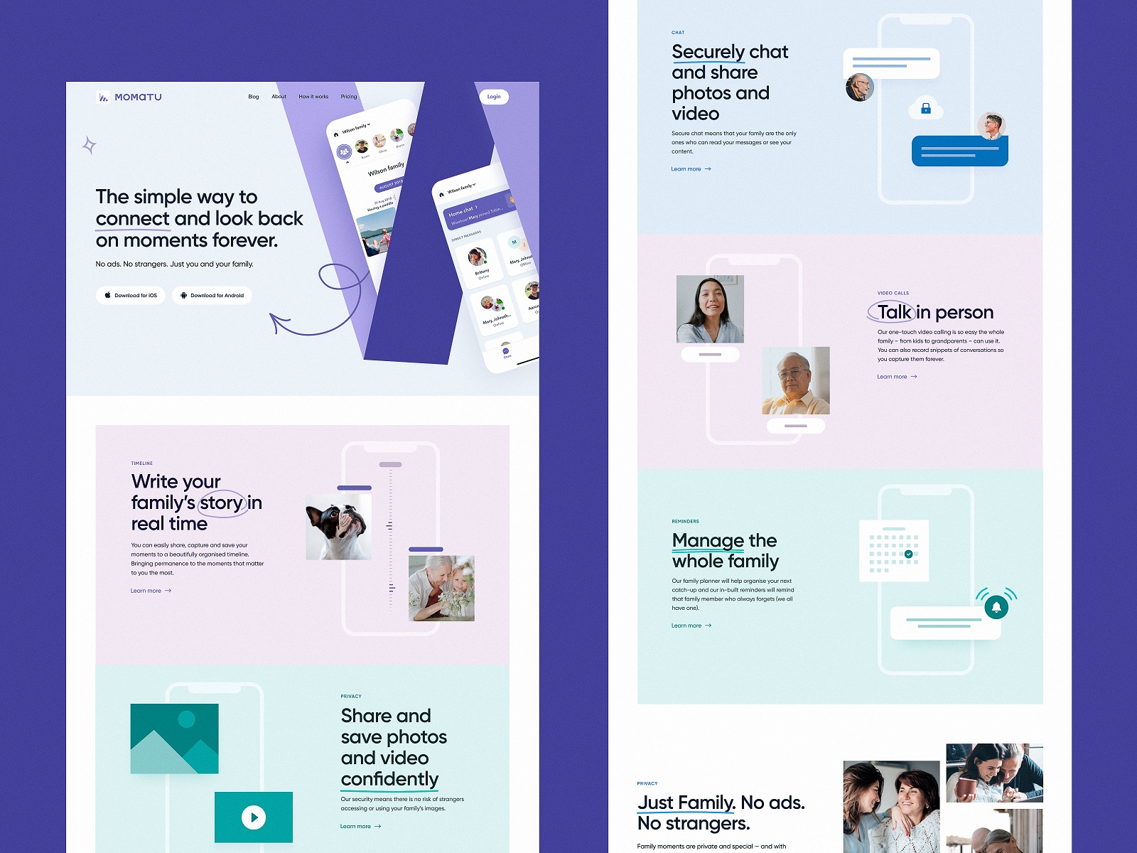
The landing page concept for Momatu divides content with different color backgrounds.
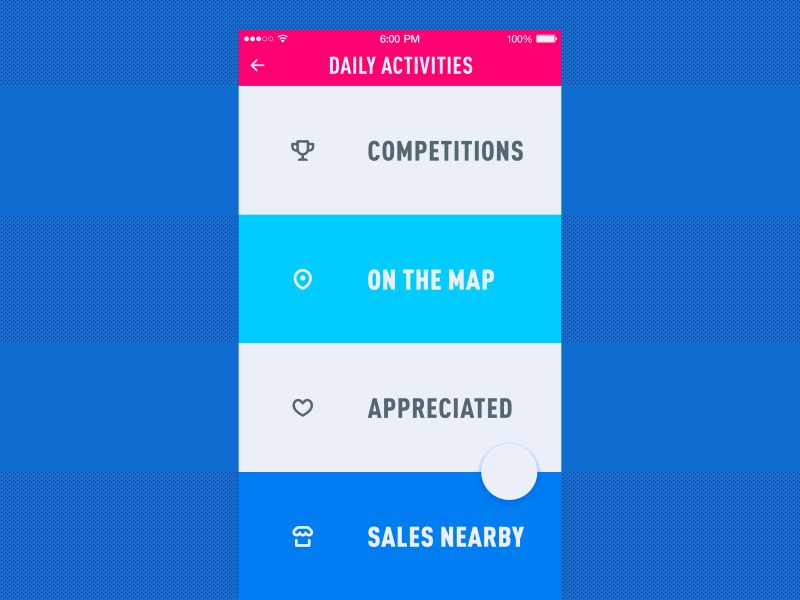
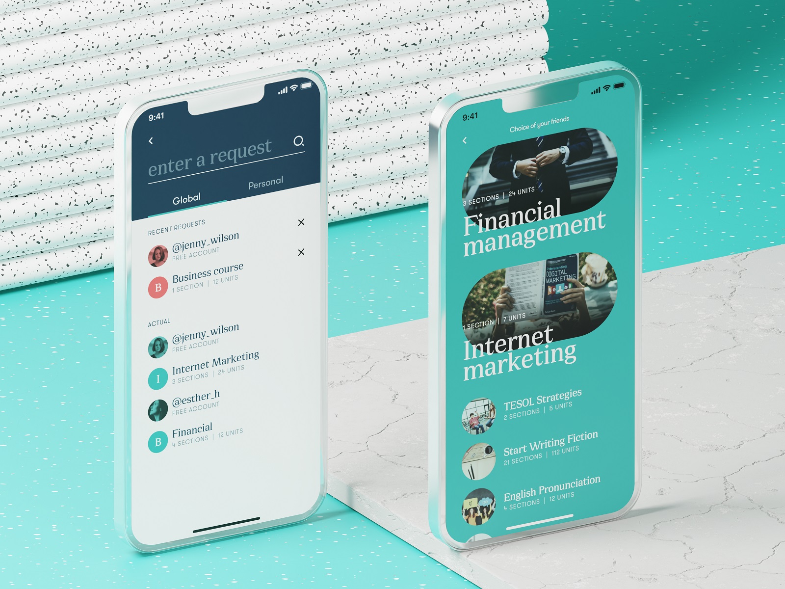
The mobile menu concept is based on color contrast to make the items clearly distinguished.
Even in pastel elements like this one the power of color contrast is clear: it helps to divide the page on the hero section with the CTA and the active section of the menu. Also, pay attention to the vertical lines used as visual dividers for menu items: together with slightly seen images, here they also work as directional cues and help to avoid the illusion of completeness on the page.
In the website design for GNO blankets, the color contrast helps to divide the long webpage into digestible and elegant blocks of content.
Shadows and Elevation: Dividers That Imply Layers, Not Fences
Shadows work as dividers when you want separation without a hard line. Think cards floating above a background, sticky headers, bottom sheets, modals—anything with depth.
Elevation helps when:
- the UI needs hierarchy (what’s above, what’s behind, what’s primary)
- you want “this is interactive” to be obvious
- you’re designing component-based systems (cards, panels, widgets)
Be careful with heavy shadows. Too much depth turns your interface into a tray of floating tiles. The goal is gentle separation—enough to guide, not enough to cosplay skeuomorphism.
Music Learning application uses the effect of volume to make items look clearly divided in a list of tracks.
The catalog screen presenting the items in stock uses drop shadows this way giving the layout more depth and clearly separating the cards from each other.
The mobile app for buying customized bouquets also divides the positions in the catalog with a card standing out from the background. This way the content looks clear and interactive in the interface that looks all light and airy.
Images: Dividers That Carry Mood, Rhythm, and Breathing Room
In content-heavy UI (blogs, long landing pages, editorial layouts), images can act as visual dividers while also improving readability.
They work because they:
- break up text blocks (reducing fatigue)
- reset attention (users re-orient after an image)
- add emotion and context without extra paragraphs
Images as dividers can be photos, illustrations, 3D graphics, or even subtle patterns. If the content is serious, keep the imagery quiet. If the brand is playful, you can let it wink a little. Either way, the divider is doing pacing work.
The university website uses images and videos not only to set the atmosphere but also to divide different blocks of content.
The landing page for the cryptocurrency report uses catchy blocks of 3D graphics with animated Learn More call-to-action. This way the theme blocks are also clearly separated.
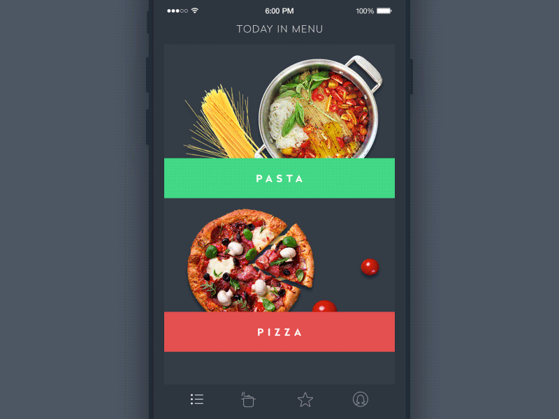
The menu screen for the restaurant app uses images as a crucial element of dividing the options.
How Do Functional Divider Types Differ in Web and Mobile UI?
Visual style is one axis, function is the other. In UI patterns, dividers often fall into roles that repeat across design systems (including Material-ish ecosystems, but you don’t need to worship any guidelines to learn from them).
Full-Width Dividers: When You Need to Separate Major Sections
A full-width divider spans the entire container or screen. It’s useful when switching contexts: “Profile” to “Security,” “Overview” to “Details,” “Cart items” to “Order summary.”
It says: new chapter.
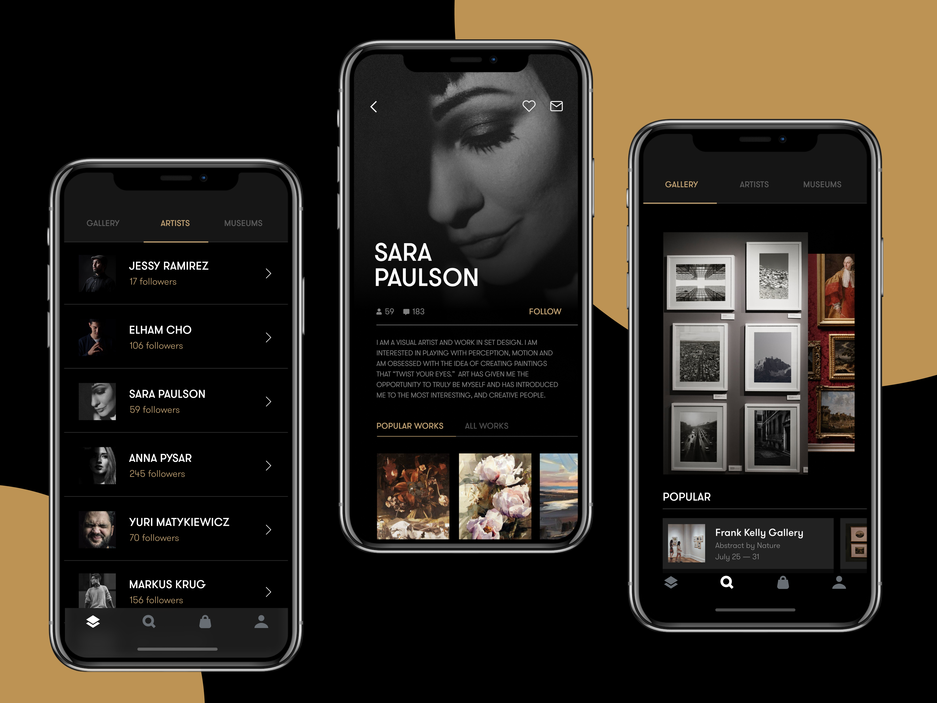
The gallery app uses horizontal lines as dividers in the catalog of artists.
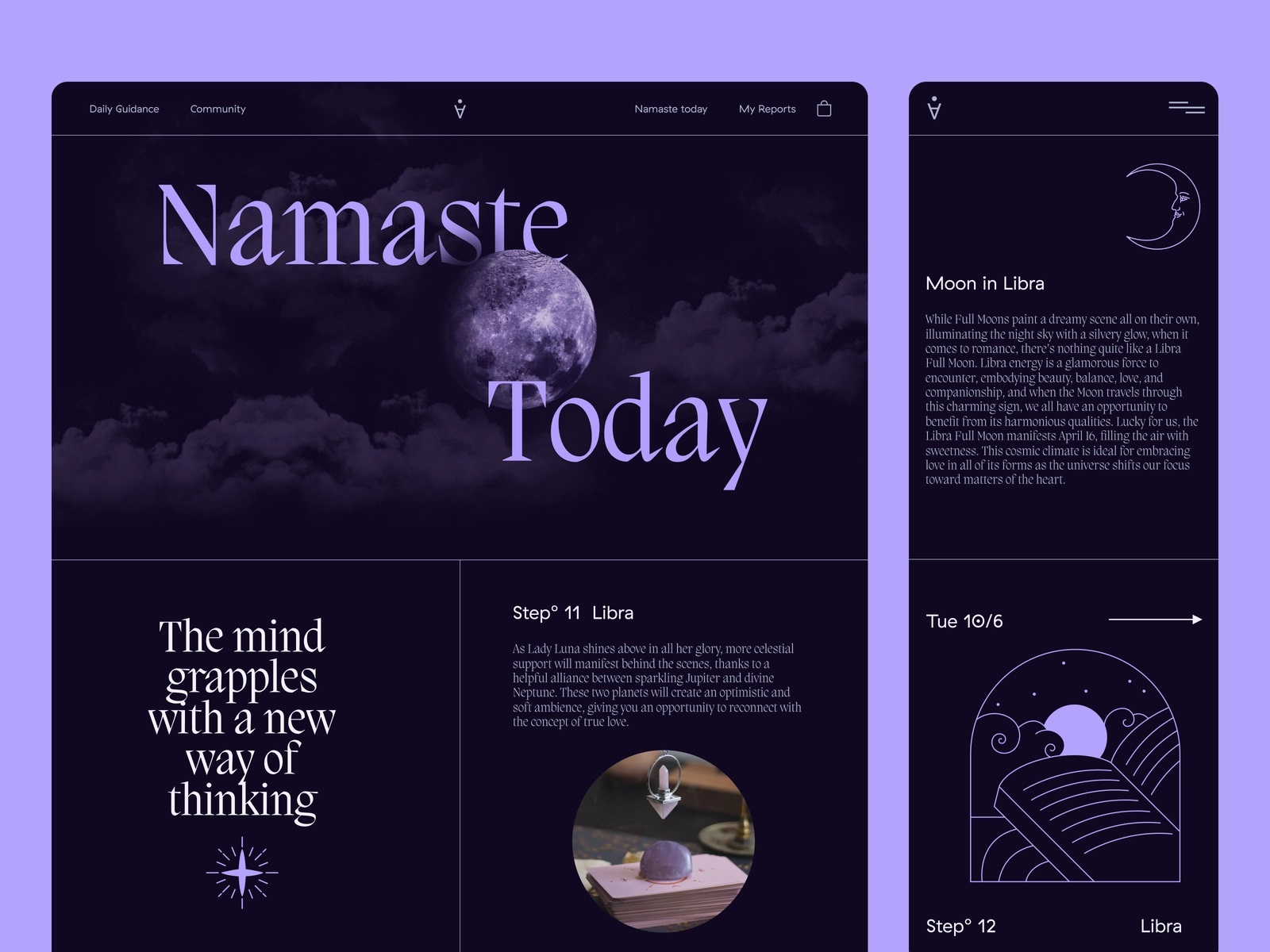
Astrology website uses full-bleed dividers to separate blocks of content.
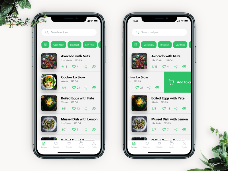
The Perfect Recipe app uses full-bleed dividers to separate the recipes.

The finance app uses slight, barely seen full-bleed dividers to separate the items in the list of expenses.
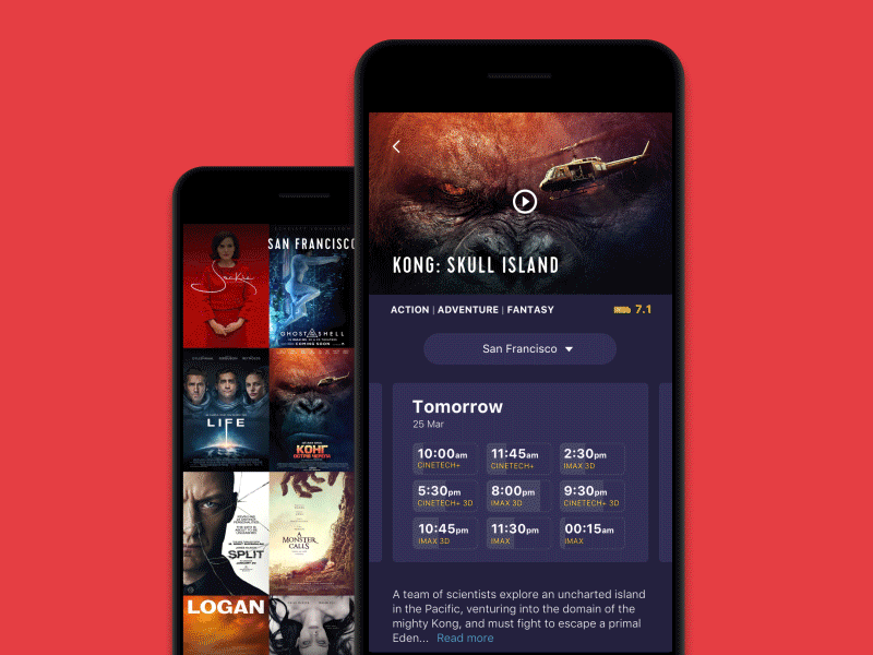
The cinema app uses full-bleed dividers on the check-out screen.
Inset Dividers: How to Divide List Items Without Slicing the Layout
Inset dividers align to content—like starting after an icon column or avatar. They’re the go-to pattern in list UI design because they separate rows while respecting structure.
They mean: same chapter, new paragraph.
The Spa Space website uses lines to organize the options on the menu page elegantly.
The website of the construction features the part with specs that uses horizontal lines as inset dividers.
Dividers With Subheaders: When the Divider Also Names the Group
Sometimes the divider isn’t only separation—it’s a label moment. A subheader above a group (“Notifications,” “Privacy,” “Billing”) reduces cognitive load because users don’t have to infer structure.
This is a small thing that makes interfaces feel “considered.”
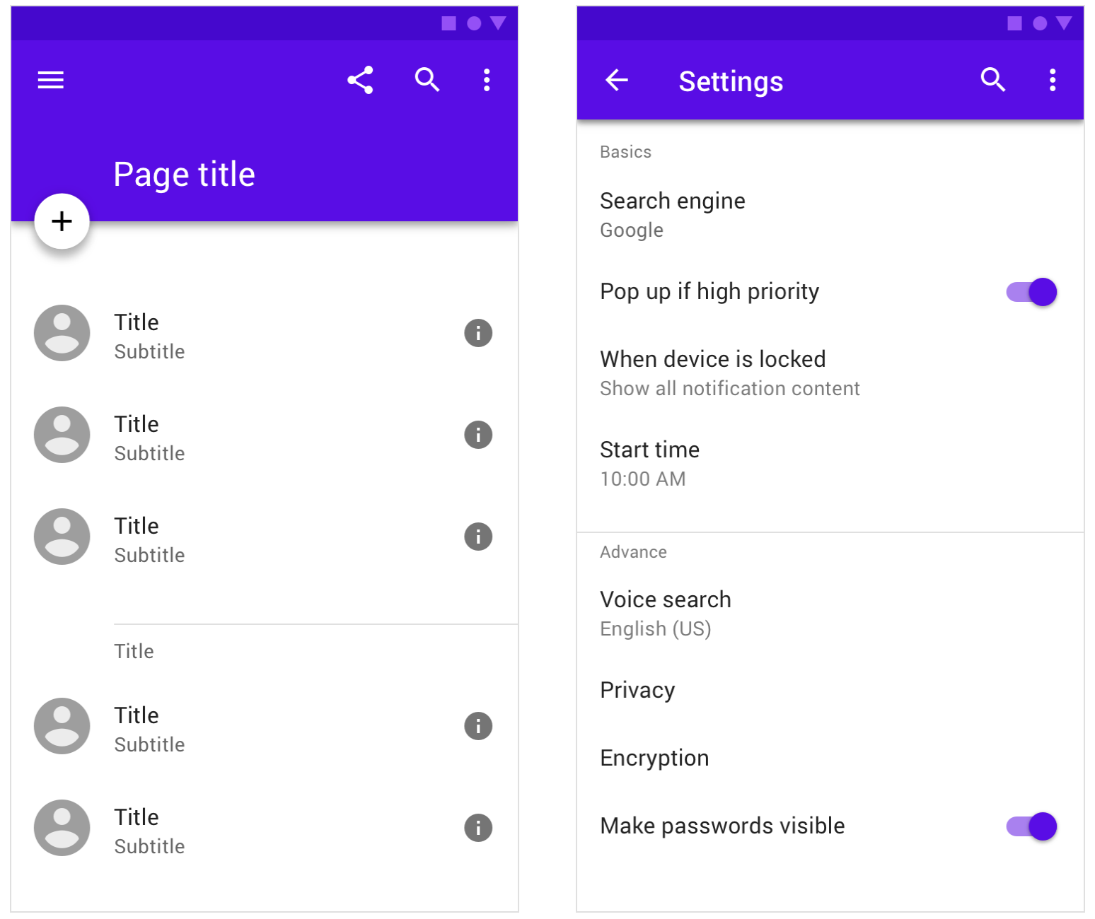
Examples of dividers paired with subheaders in mobile app design
Middle Dividers: For Side-by-Side Values and Micro-Structure
These show up in receipts, comparison cards, stats rows, split pricing, “before/after,” or any place where content is paired.
It’s the divider that prevents “wait, which number belongs to which label?”
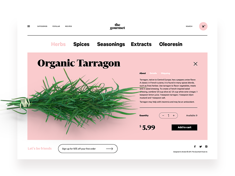
The product page for the ecommerce website selling herbs features the middle divider to clearly separate the check-out interactive zone from the text content describing the product.
Divider Design Tips: How Do You Avoid Visual Noise and Still Keep Things Clear?
This is where most UI divider best practices live: not in the divider itself, but in the choices around it.
1) How subtle should a visual divider be?
Subtle enough that it supports the content, not steals focus.
A good divider feels like:
- a quiet seam in fabric
- a pause in a sentence
- a shelf that holds things without being the main object in the room
If your divider is the first thing users notice, you probably overdid it.
2) How many dividers is too many?
When the screen starts looking “sliced.”
When every item has a border, every section has a line, every card has a shadow, and spacing is tight, your UI becomes a cage of rectangles.
A practical rule: if you’re adding dividers because the layout feels confusing, try fixing hierarchy first—type scale, spacing, grouping—then add dividers where they actually earn their keep.
3) Which divider type should you choose for different UI components?
Here are three fast, reliable matches:
- Lists and settings screens → inset lines or spacing (prevent mis-taps)
- Landing pages and long-scroll web layouts → background color blocks + generous spacing
- Dashboards and cards → elevation and padding, with lines only for dense tables
Checklist: What Makes a Divider Feel “Designed,” Not Default?
- It aligns to the grid (nothing screams “template” like a line that ignores your layout)
- It matches the system (line weight, radius, spacing—consistent across screens)
- It supports scanning (users can find sections fast)
- It respects accessibility (contrast and spacing that don’t punish tired eyes)
- It doesn’t multiply without reason (dividers are seasoning, not the meal)
Common UI Divider Mistakes (the Ones We All Make at Least Once)
- The “line everywhere” approach: turns your UI into a form from 2009
- Random section backgrounds: color used as separation, but without rhythm
- Shadow stacking: card inside card inside card, all floating, none grounded
- Ignoring touch patterns: dividers that look like buttons, but aren’t clickable (pain)

So… Do You Need Dividers, or Do You Need Better Hierarchy?
Both, sometimes. But dividers work best when they’re the last 10%—the finishing seam after the layout already makes sense.
Let’s be honest: nine times out of ten, when a screen feels messy, it’s not because you forgot to add dividers. It’s because the structure’s doing too much. Or not enough. Or it was borrowed from a wireframe that never evolved past “just ship it.”
So if you’re wondering, “Should I add a divider here?”
First ask: Does the content know what it’s doing without one?
If it does, maybe leave it alone. If it doesn’t, fix the structure before you grab the line tool.
Because dividers aren’t decoration. They’re punctuation.
Use them like a writer would—where they help the story land, and never where they get in the way of the voice.
You Made It This Far. Might As Well Keep Scrolling.
Design’s in the details—and we’ve written a bunch about them. Whether you’re tweaking spacing or rethinking the entire flow, these reads might just light the next bulb:
Directional Cues in User Interfaces
How to Make User Interface Readable
Basic Types of Buttons in User Interfaces
3C of Interface Design: Color, Contrast, Content
Negative Space in Design: Practices and Tips
How to Make Web Interface Scannable