“I am not the same, having seen the moon shine on the other side of the world,” the writer and artist Mary Anne Radmacher once said, and each and every traveler would probably support her idea. Our new design collection is also on that side: welcome to review another bunch of practical web design examples devoted to the theme of traveling, sightseeing, recreation, visiting amazing locations, learning more about environments, history, and life in amazing places, and booking good spots for the next holiday destination. Check the set of websites designed by tubik team, trying different styles and design approaches, interactive pages and creative graphics, smooth motion, and skillful use of photo and video content to set the atmosphere and enhance the message to the visitor. Enjoy and get inspired!
Mountain Resorts Website
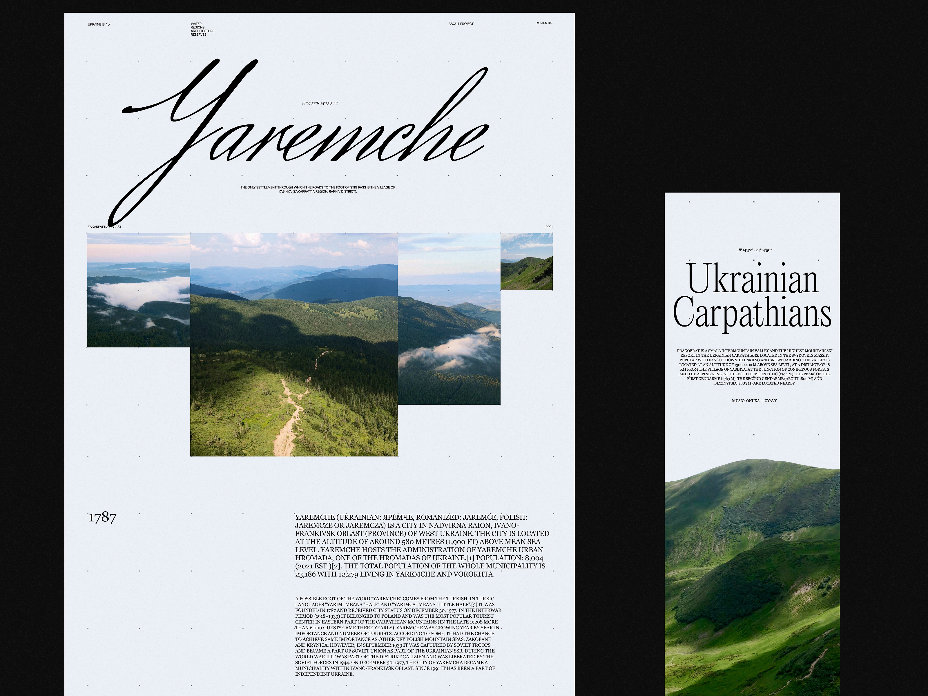
This website design invites you to get stunned by the atmospheric mountain resorts and instantly sets the mood with the impressive video content and elegant typography. The website visitors are welcome to explore a variety of destinations with many interesting details smoothly integrated into the web page design, for example, the latitude and longitude of the specific spots. Also, the design concept literally plays with typographic contrast and uses the prominent cut-off typographic part at the top of some pages or the combinations of different fonts within one headline.
Lumen Museum Website
Here’s the website of Lumen Museum, the charming place that gives this fascination a photographic home with breathtaking views and interesting insights. The museum harmonically combines history and innovations, interactivity, and exploration, covering the subject of mountain photography from diverse perspectives. The website design features a variety of elegant pages, smooth animation, engaging scroll, video integration, and other design solutions to present the amazing museum content online. All the major pages of the website are based on a minimalist layout, impressive visuals, a light background, and mastered negative space: that makes them full of air and freshness and lets the visitors feel it from the first seconds. Also, such an approach ensures that all the diverse visual content, from archive black and white photos to modern shots and videos, will look good on the pages.
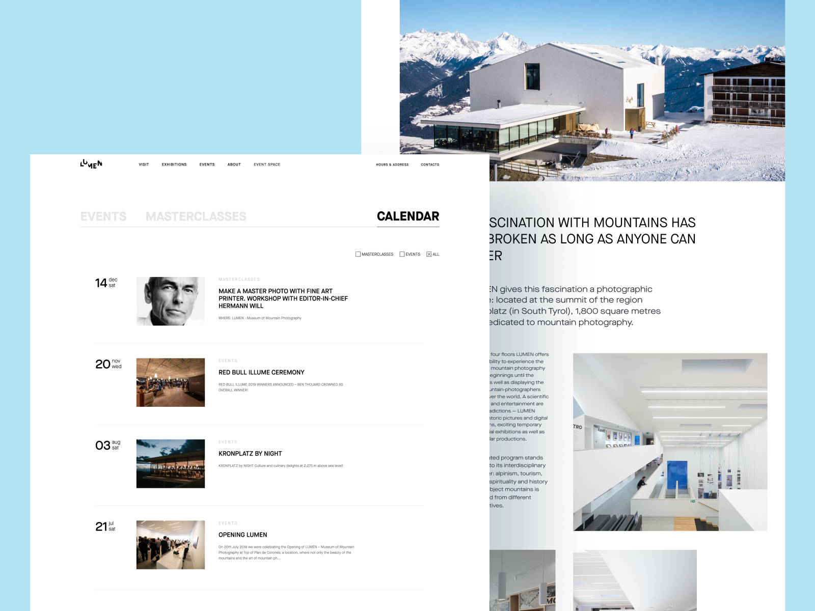
Learn more about this project in the case study about Lumen Museum website design
Nature Expeditions Website
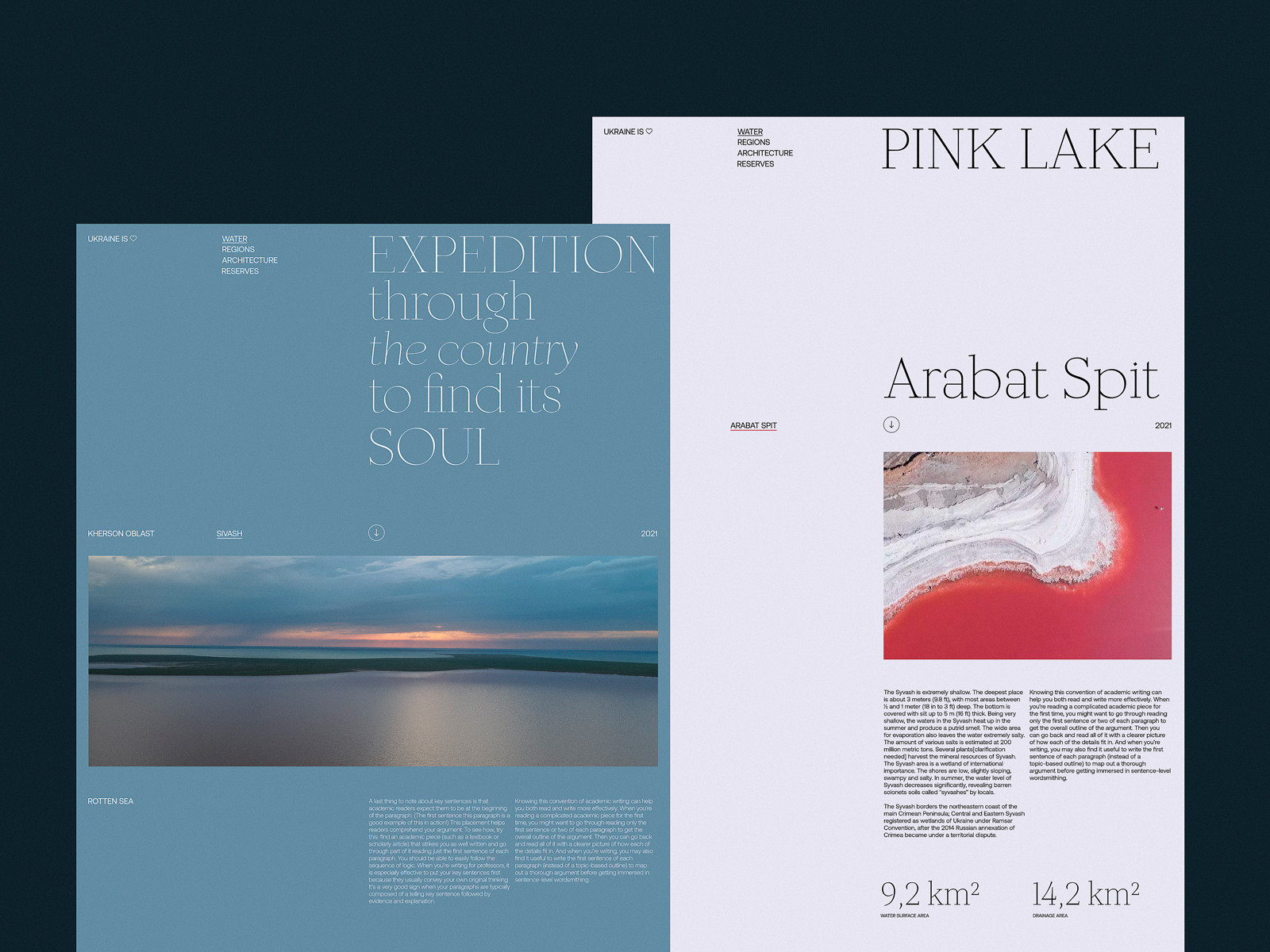
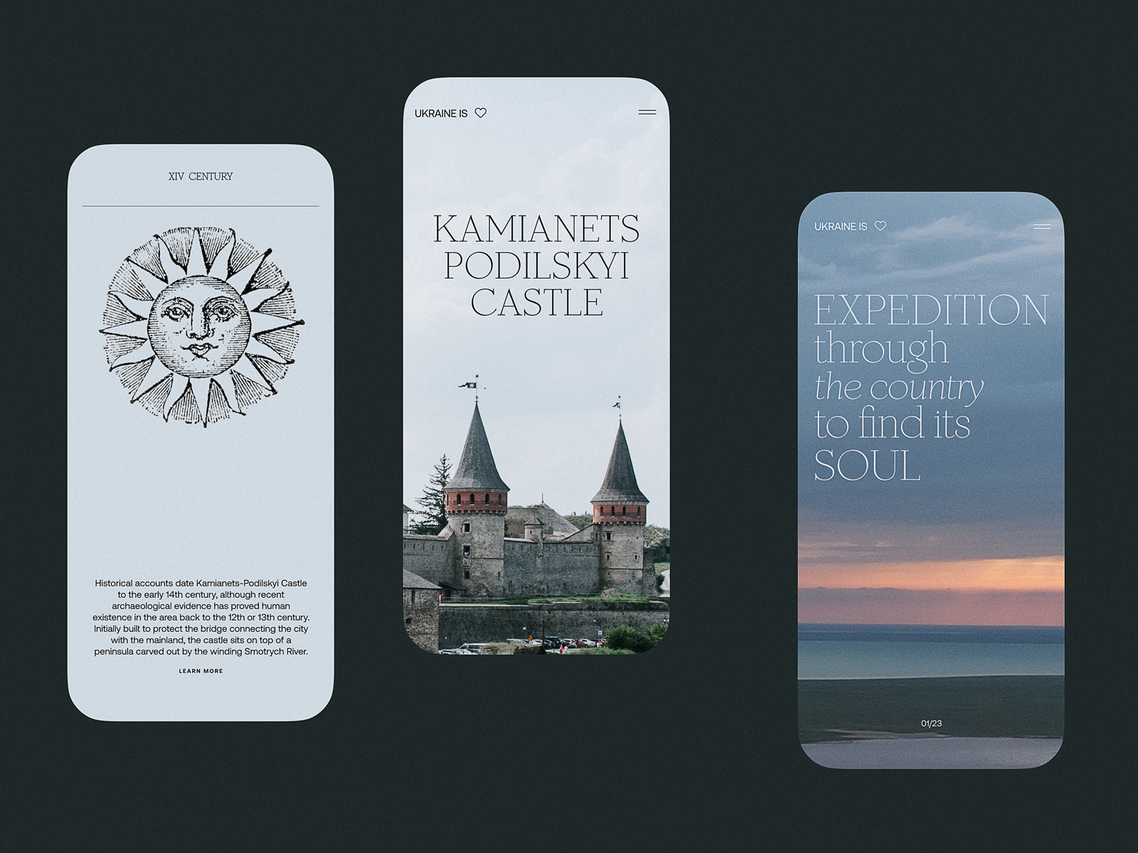
Here’s the concept of the website promoting expeditions that allow travelers to explore unspoiled nature and enjoy unusual destinations. The breathtaking full-screen hero video lets the visitors dive into the mood and get impressed immediately. Trendy shapes, elegant neat fonts playing with upper case and lower case within one piece of copy, colored page backgrounds, and cool motion graphics pack the information in a stylish, emotional, and attractive dress.
Ecotourism Website
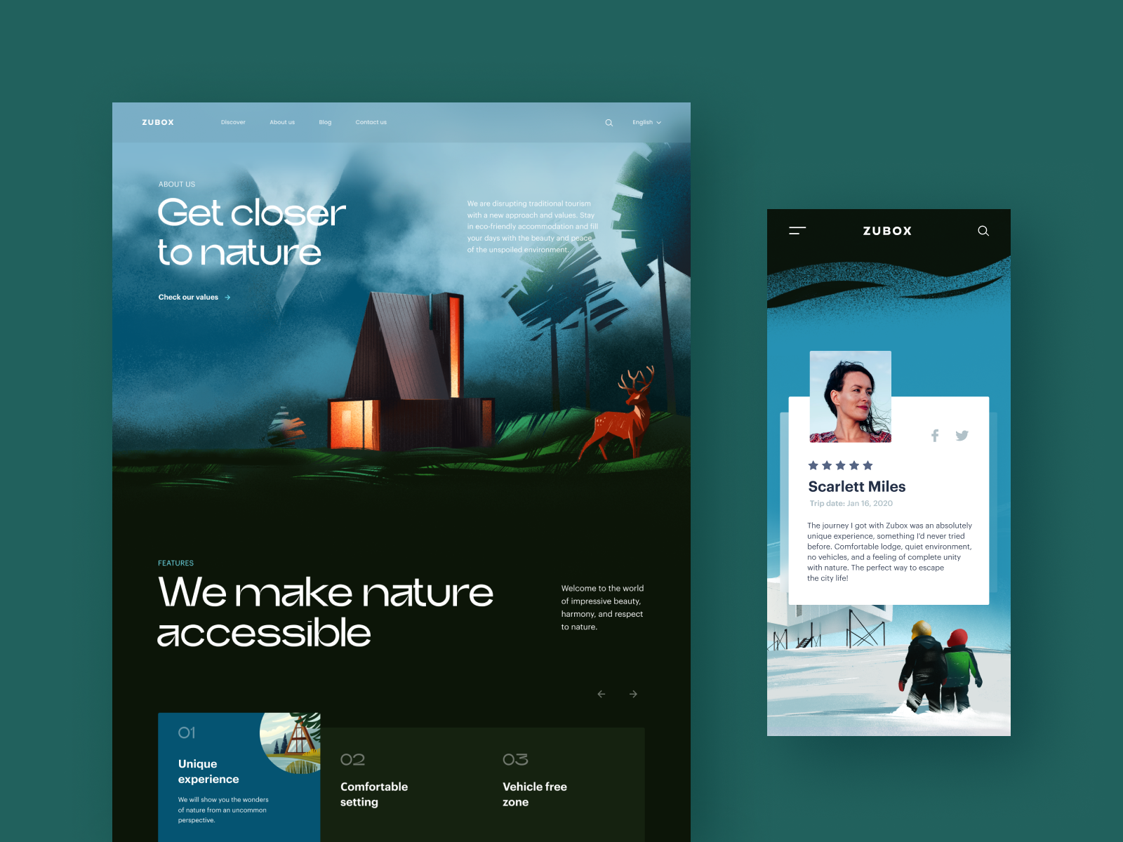
This website was designed to support people that want to try ecotourism and have some rest deep in nature and far from urban hustle and bustle. The design shows the balance of readability and decoration in typography choice, solid visual hierarchy, and thoughtful combination of different types of visuals such as photos and custom theme illustrations. The home page features a stunning hero illustration while the Discover web page tells more about the destinations and types of holidays to book, with the video integration to amplify the effect. Mobile adaptation helps to save visual harmony and allows users to successfully interact with the website from any device.
Museum Website Concept
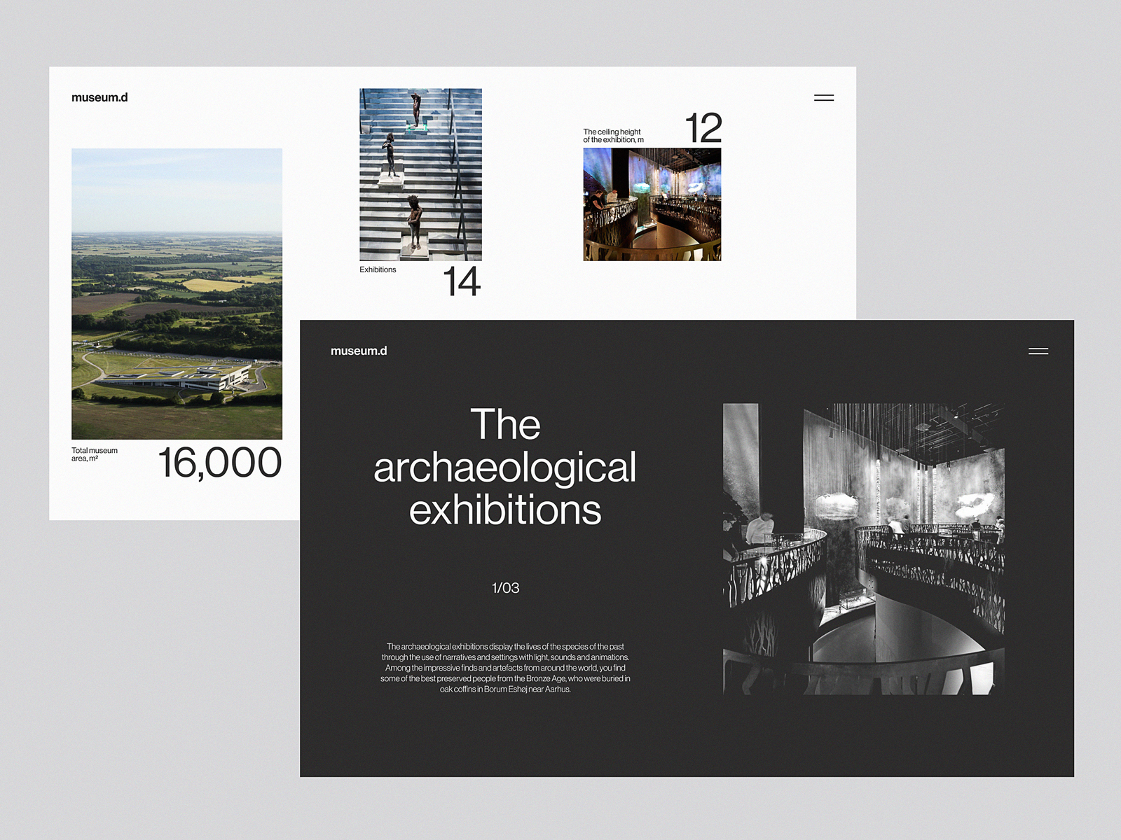
“A people without the knowledge of their past history, origin, and culture is like a tree without roots” Marcus Garvey once said, and that may be the reason why museums will never be out of fashion. This design also touches on that important theme: it’s the website concept for Moesgaard Museum, a Danish regional museum dedicated to archaeology and ethnography. Impressive full-screen photo background lets the visitor instantly plunge into the atmosphere, while a solid typographic hierarchy supports both readability and visual elegance. The website uses interactivity to make the pages more engaging, and the pages demonstrate a thoughtful approach to data organization and visualization.
Geography Blog
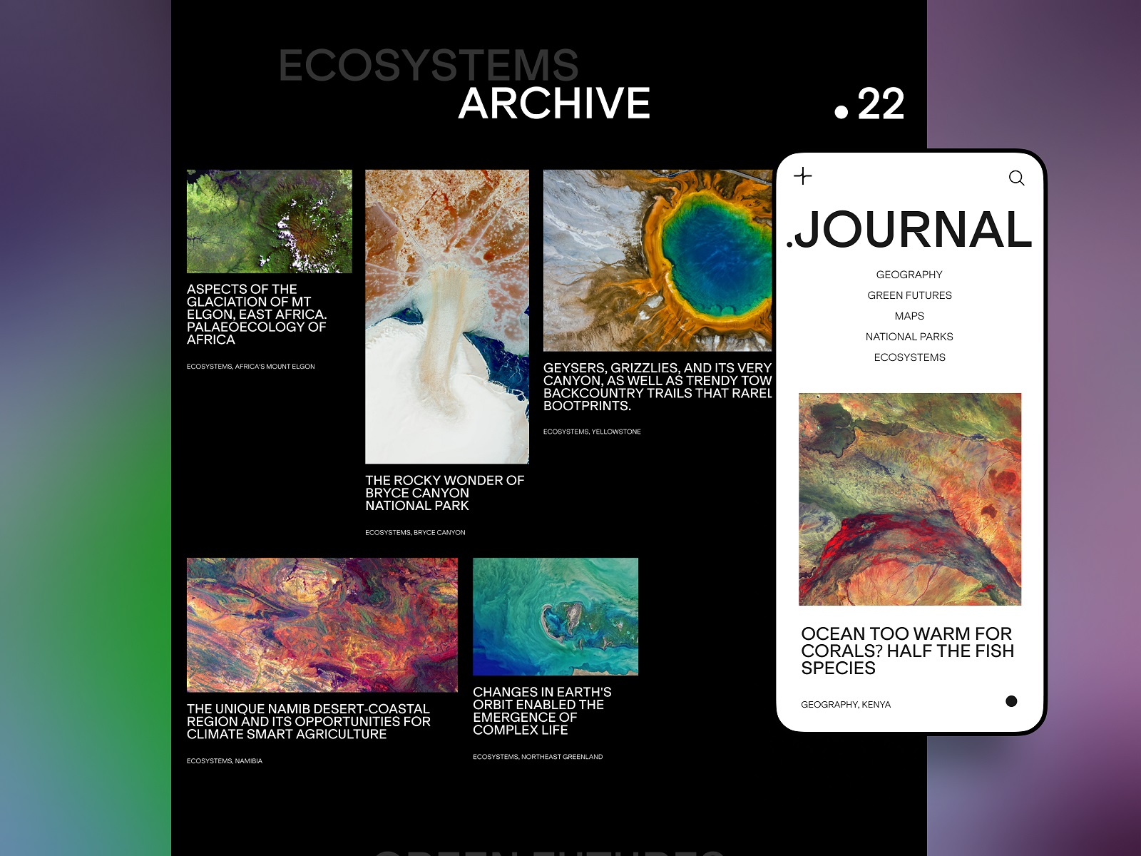
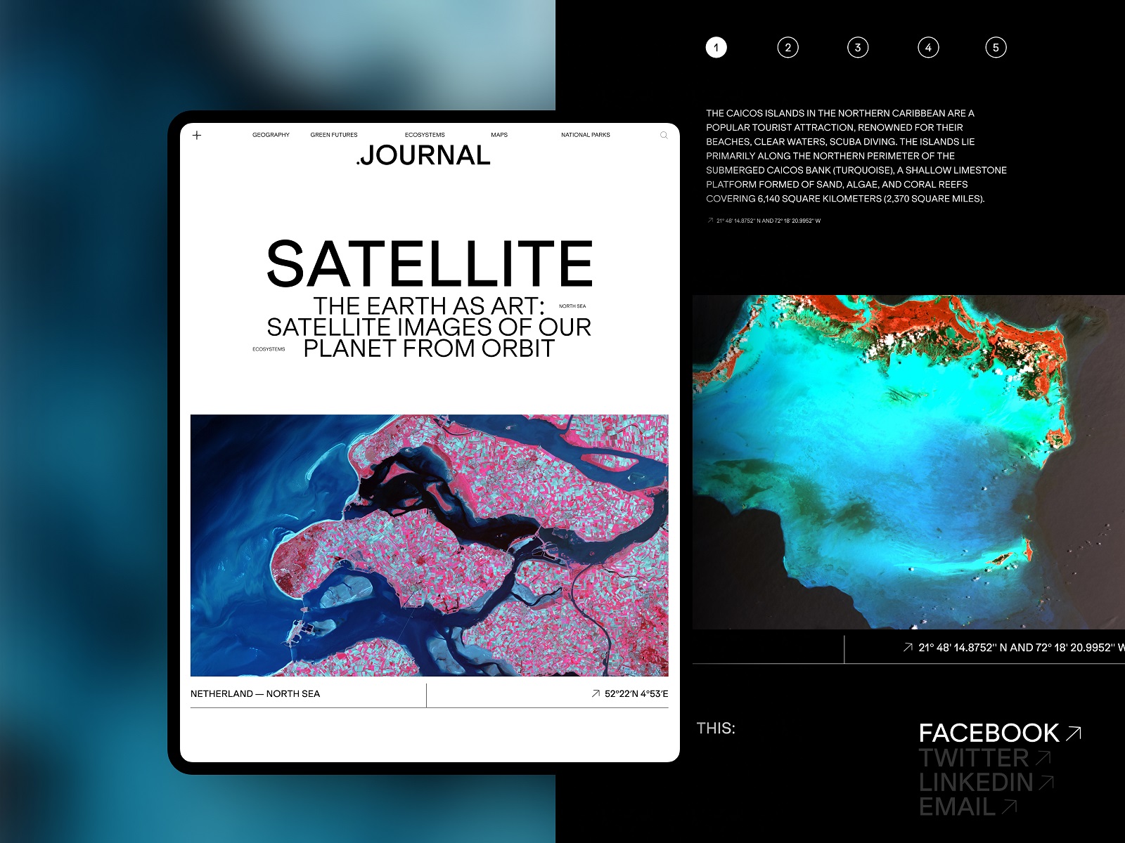
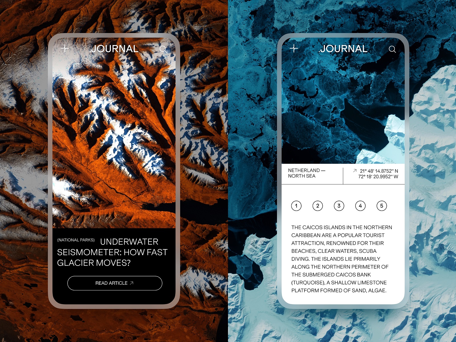
This is the user experience design concept for a niche blog devoted to the topics connected with the environment, ecology, geography, and all things the modern state of nature. Here the design impresses the visitor with the spectacular photo and video content, illustrating informative and important text content and enhancing its emotional communication with the readers.
Event Booking Website
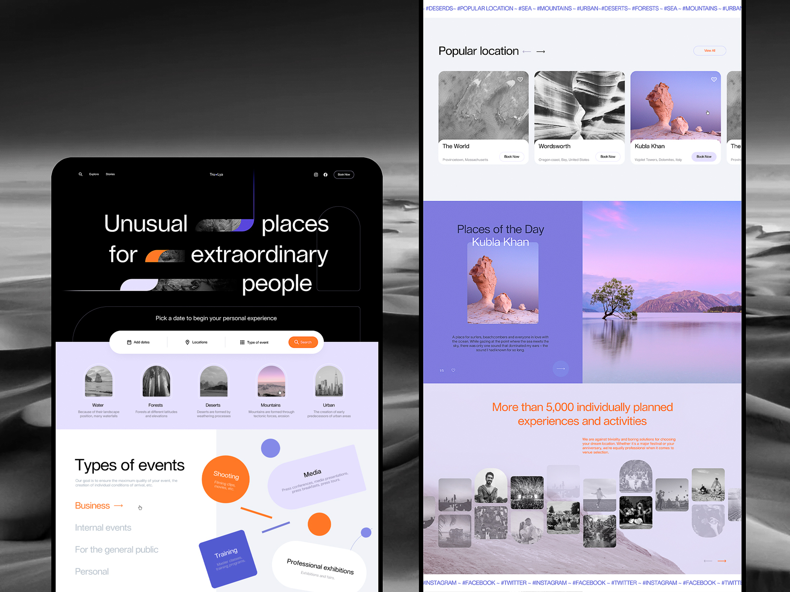
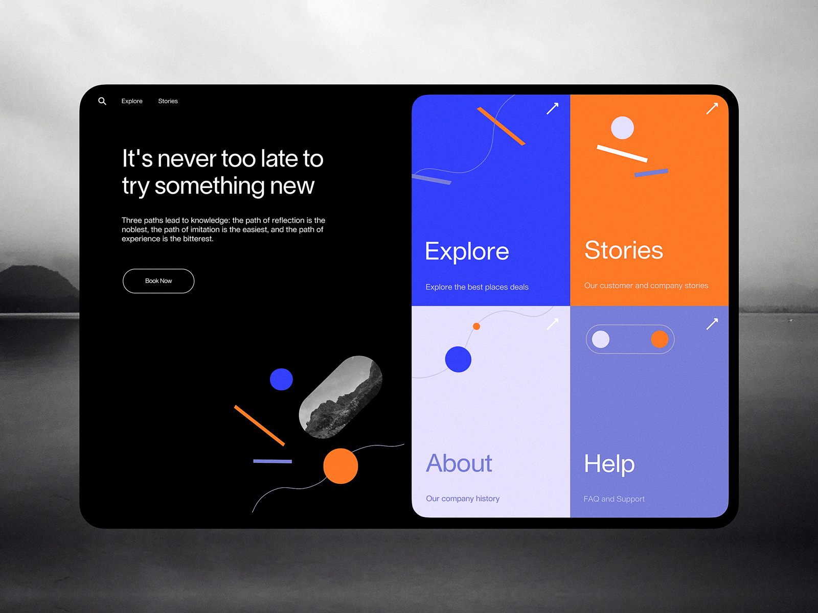
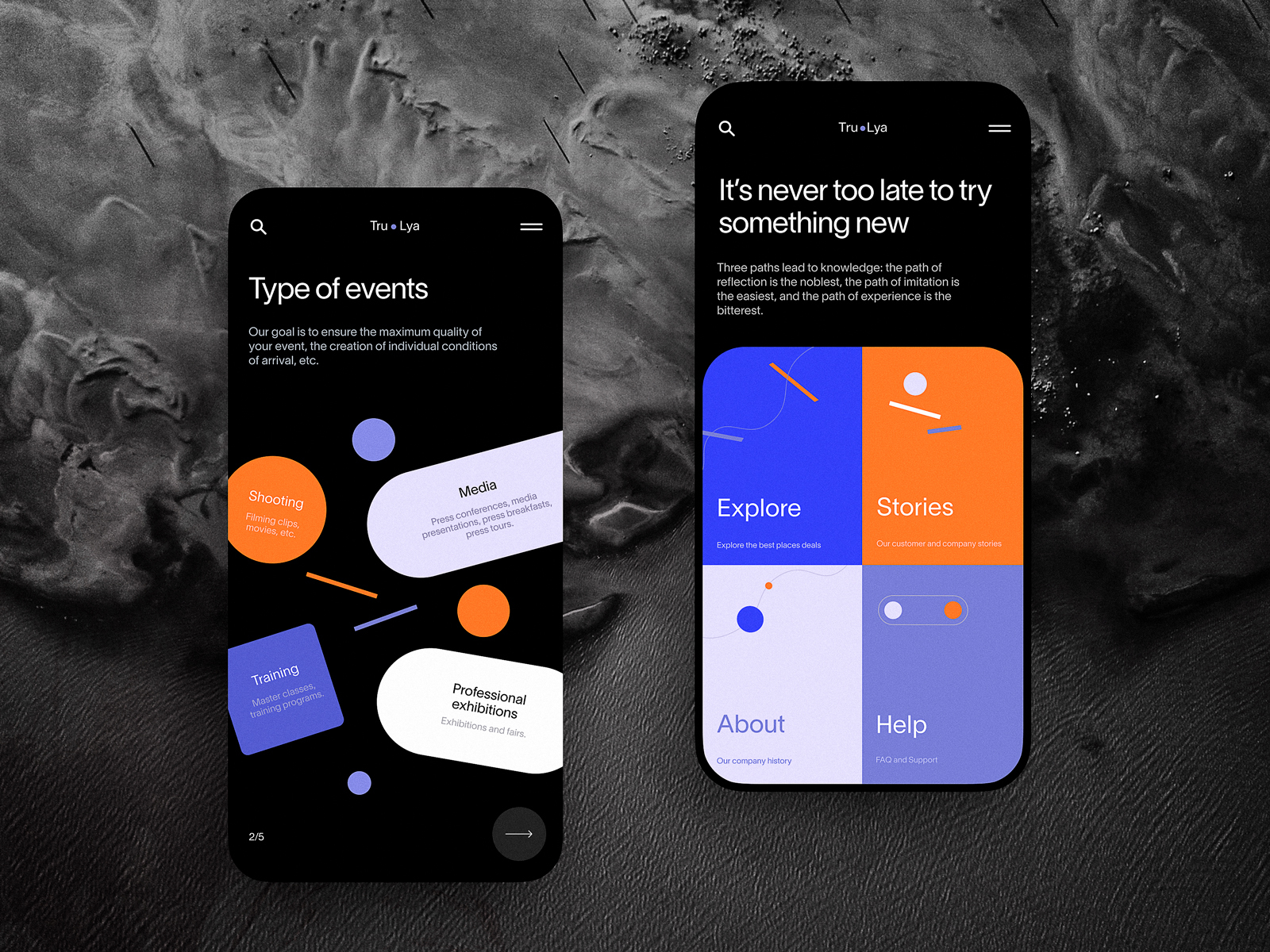
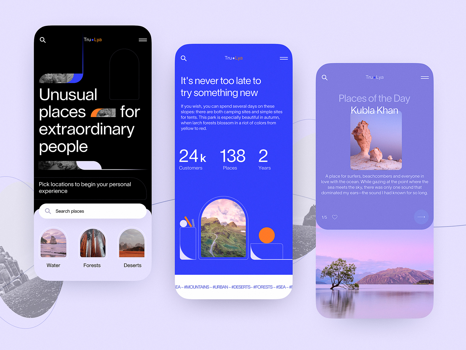
This design concept gives you a look at the website that helps visitors choose and book diverse events and experiences. The home page is made highly functional, with the form allowing users to search the event in the above-the-fold area. In general, the website employs a variety of trendy shapes and minor geometric elements and makes shape and color contrast the primary tool of expressiveness, supporting beautiful photo and video content.
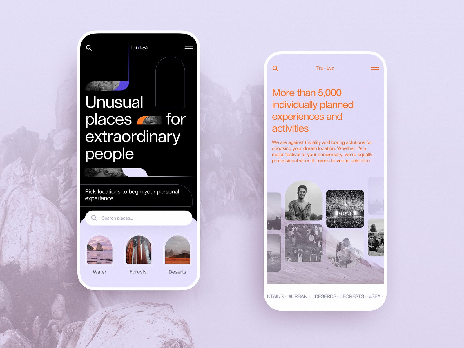
Winter Holidays Website
Take a look at atmospheric web design for the service helping to book accommodation and build routes for amazing winter holidays. The visitors dive into the magic of winter instantly due to the breathtaking video content naturally integrated into a minimalistic and airy web layout.
Yacht Hiring Website
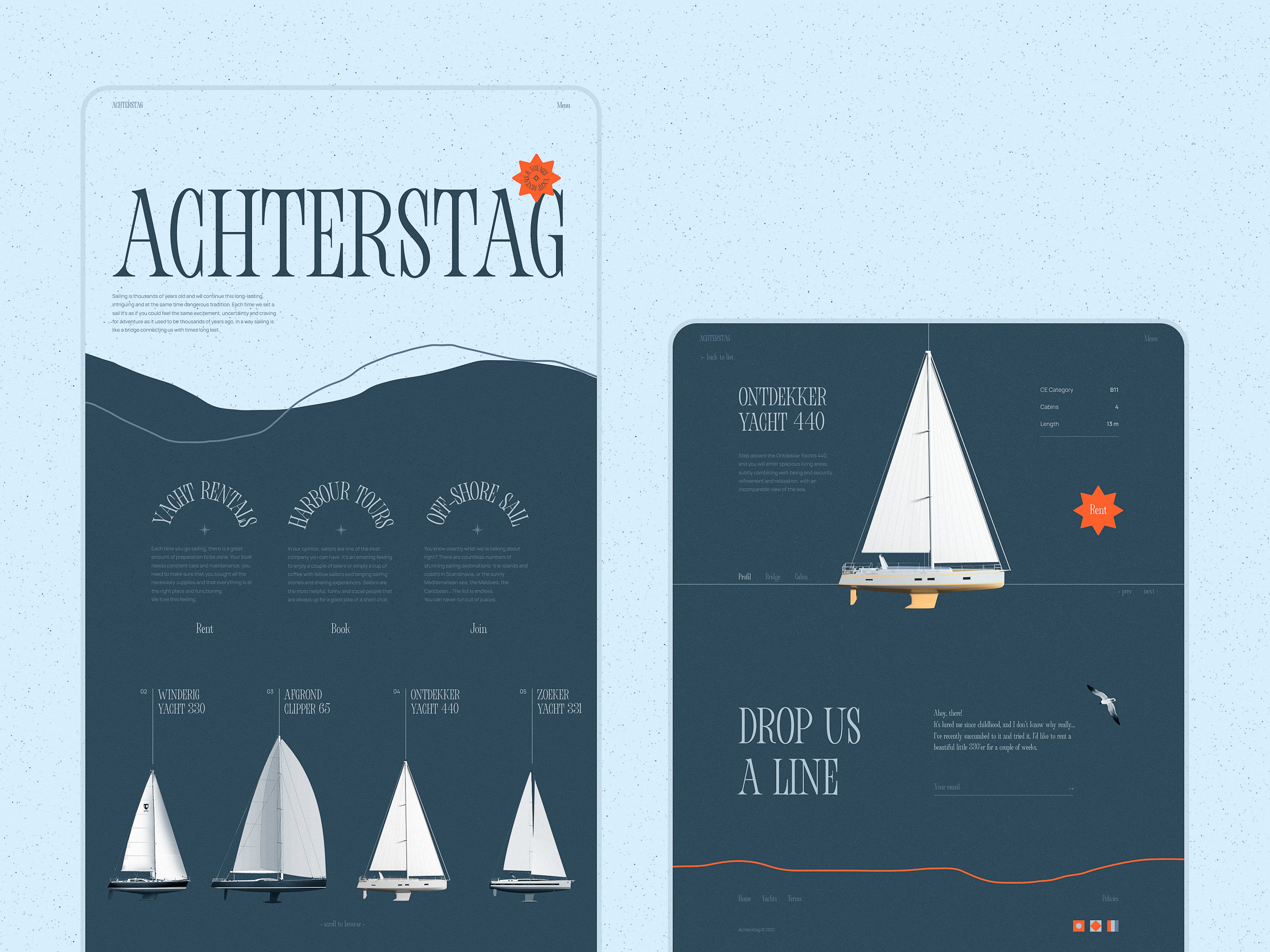
Take a look at the website designed for the service allowing users to find and hire yachts. Atmospheric videos and beautiful photos, as well as the color palette, help visitors dive into the theme of sailing immediately. Interactive yacht visualizations assist in making the process of yacht choice both straightforward and fun, while sophisticated typography, functional color accents, smooth motion, and intuitive navigation make the web pages and their mobile adaptation attractive and easy to use.
New web and mobile design collections by our team are coming soon – don’t miss the updates!
Tubik Design Collections
If you want to check more creative sets of web, app, and graphic design examples, here are some of them.
App Design Ideas: 7 Nifty Mobile Application Design Projects
Information Beautified: Media and Editorial Website Designs
23 Impressive Web Design Concepts for Various Business Objectives
Mobile Design: 14 Stylish and User-Friendly App Design Concepts
Design for Sales: 10 Creative UI Designs for Ecommerce
Save the Planet: Web Designs on Environment and Ecological Issues
Steal the Show: Creative Web Design for Diverse Events
Web Design: 26 Examples of Creative Landing Pages
UI in Volume: 3D Graphics in Creative UI Design Concepts


