This graphic design project will fill your day with the salty smell of the sea and the tasty fish it presents people with. In this case study, we unveil the creative process for the neat and stylish illustration-based packaging design and marketing graphics for the tinned fish brand.
The project was accomplished by tubik designers Maryna Solomennykova and Vlad Radionov.
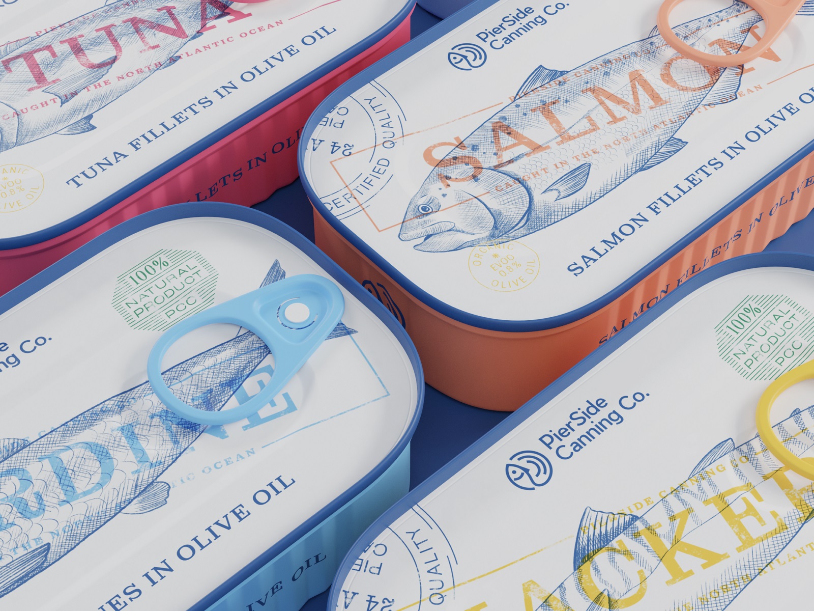
The primary task for this project was to create a set of branded cans for different types of fish. It was designed for the food brand that has already been on the market for quite a long time and positioned itself as the one preserving the best traditions of fishing and canning. So, the general design approach to packaging is aimed at combining traditions and trends.
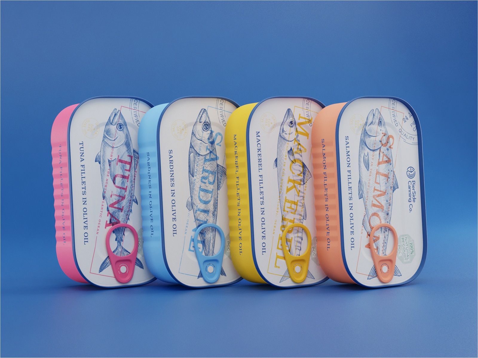
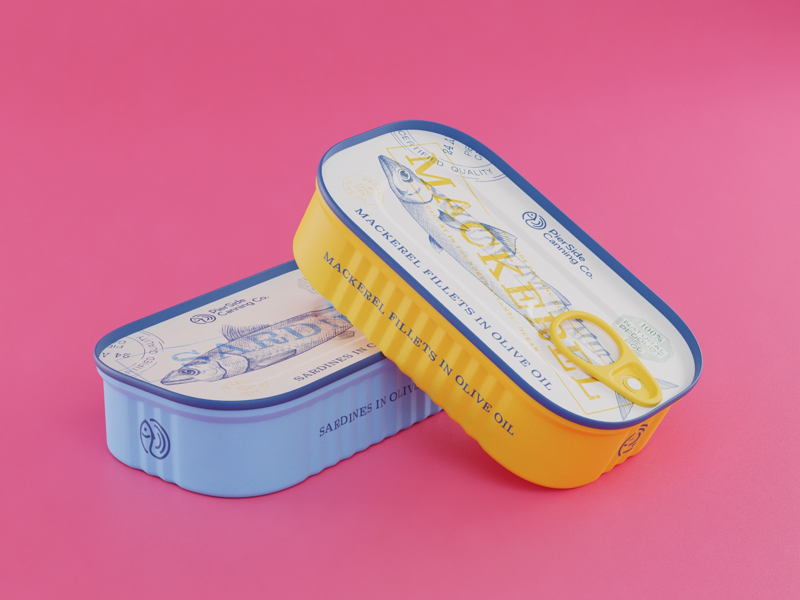
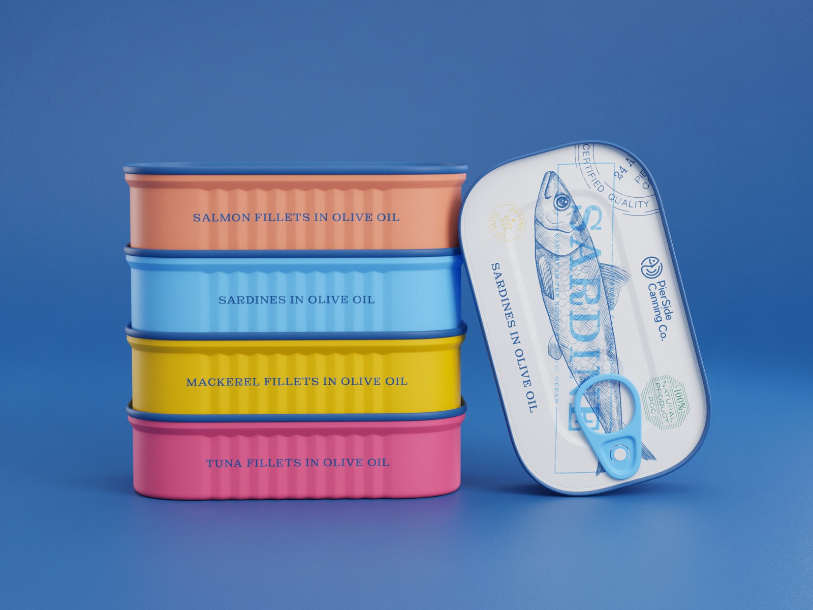
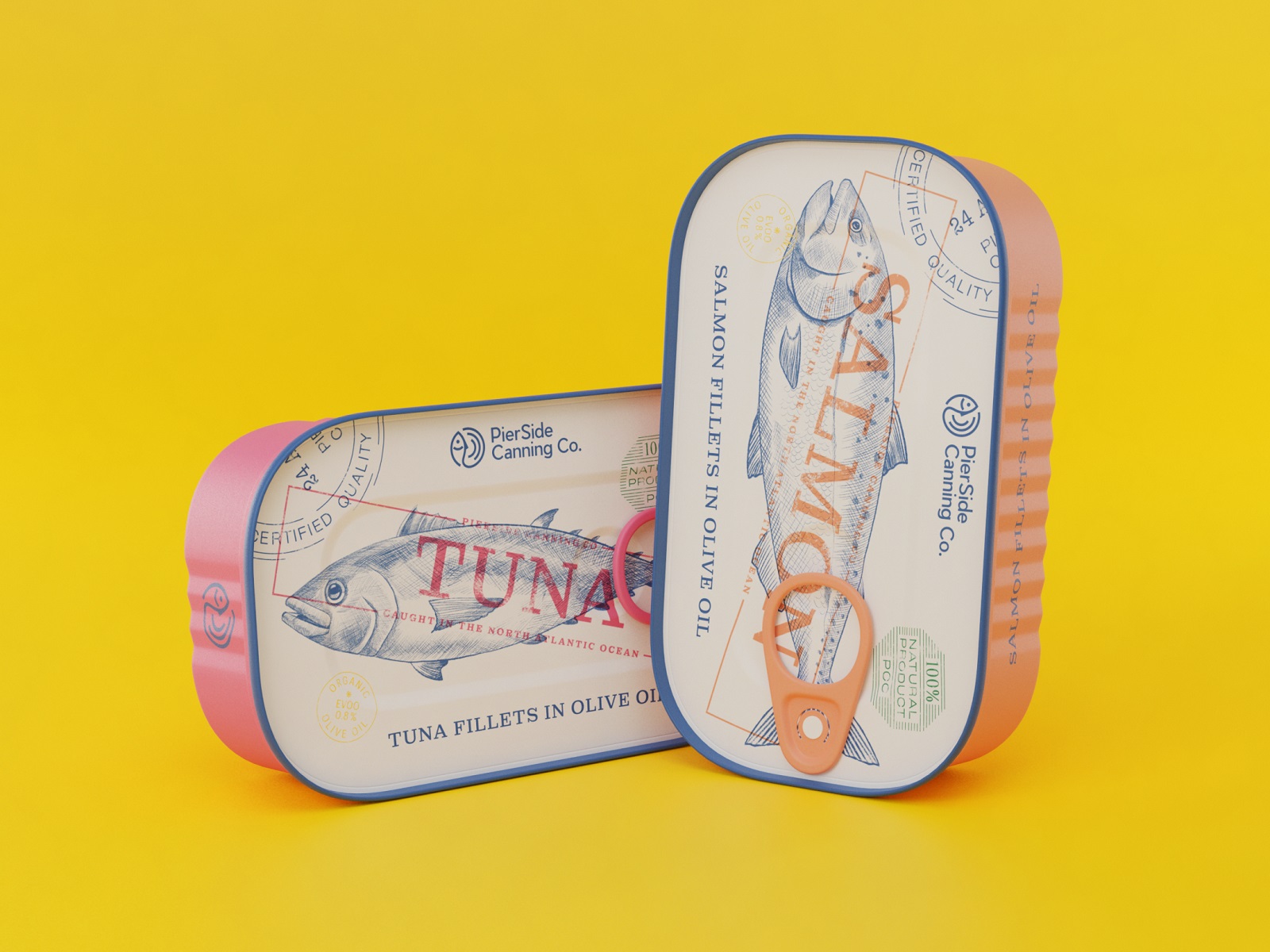
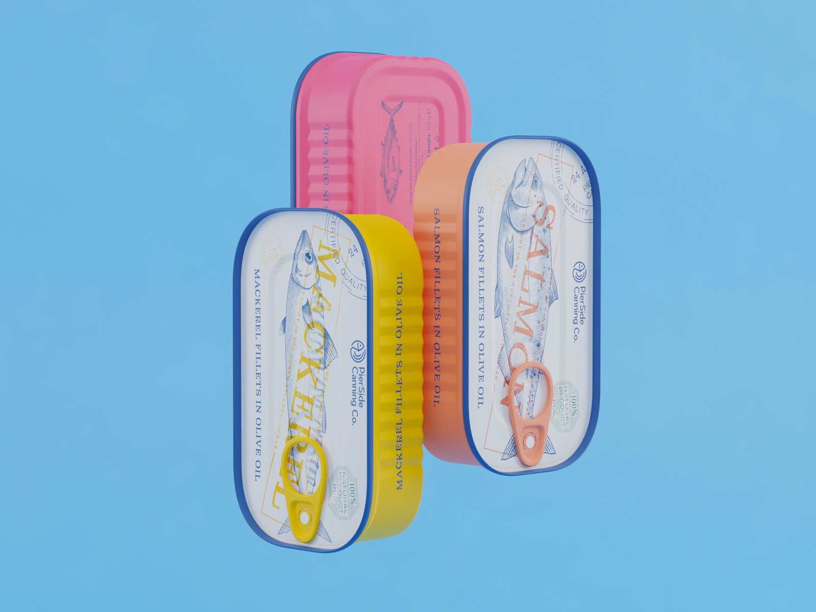
The style search resulted in creating a consistent set of sophisticated and classy monochromatic line illustrations featuring four types of tinned fish the brand sells: mackerel, tuna, salmon, and sardines. Each type of fish has its own packaging color, and the quite contrasting palette chosen for the tins also plays an essential part in boosting their recognizability on store shelves so that buyers can quickly distinguish the needed type among others. Also, another illustration was created as a part of visual support for the story of the brand, featuring a human character.

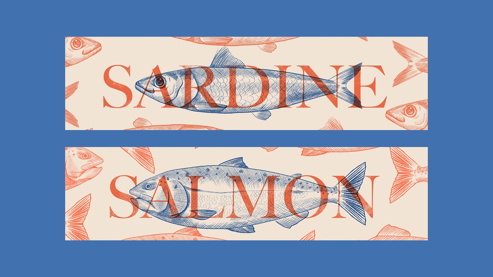
The typography choice fell on a readable, non-decorative font, and the text part describing the type of product uses all caps to make the information easily scanned on both the top cover and on the side of the can for a better customer experience.
Let’s look at all four types of fish tin designs. Check how it integrates illustrations on the top of the tin and combines it with the text.
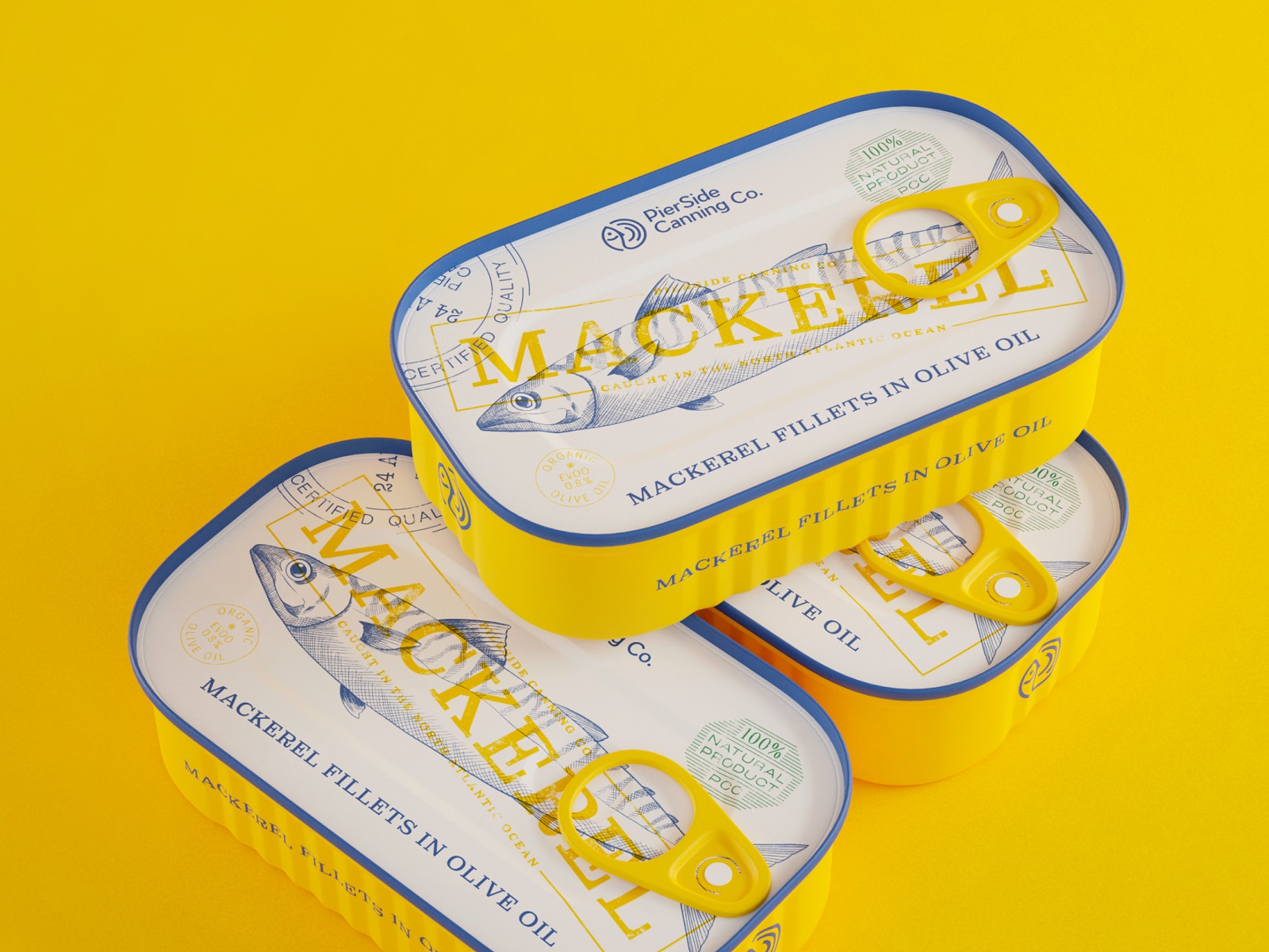
Tinned mackerel packaging design
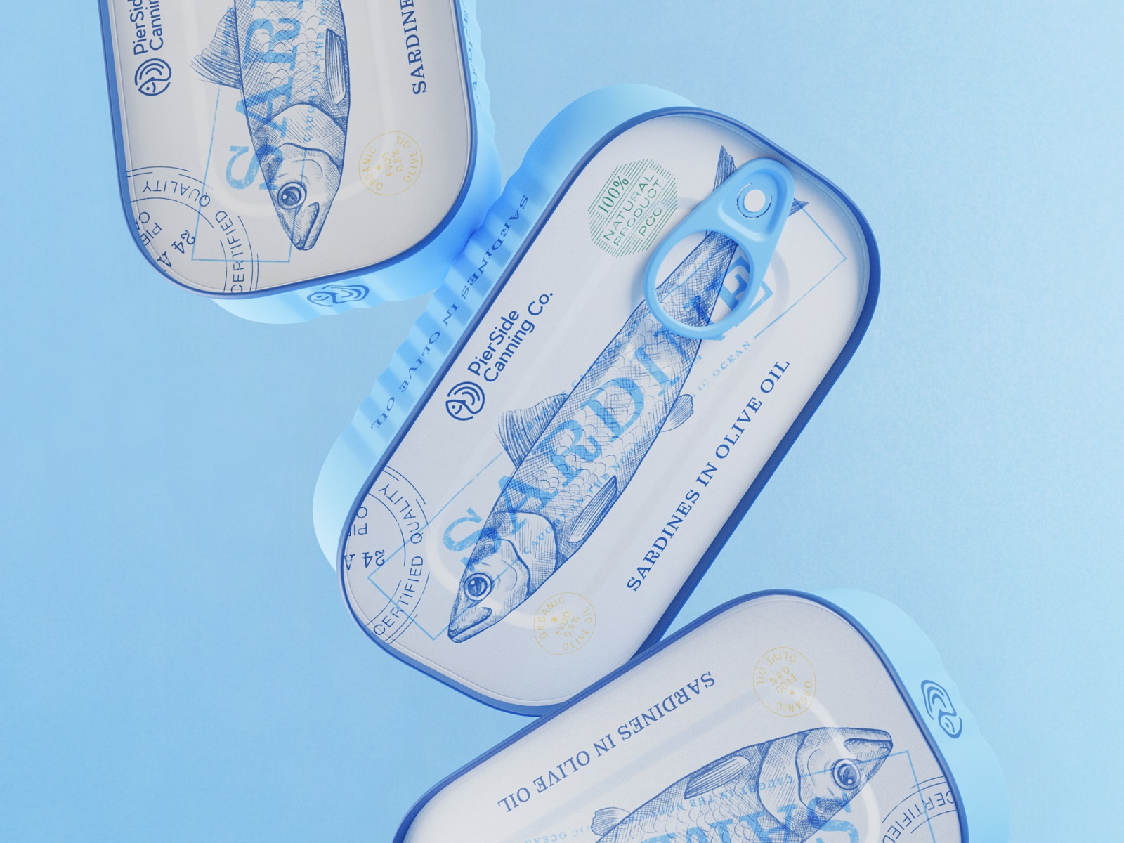
Tinned sardines packaging design
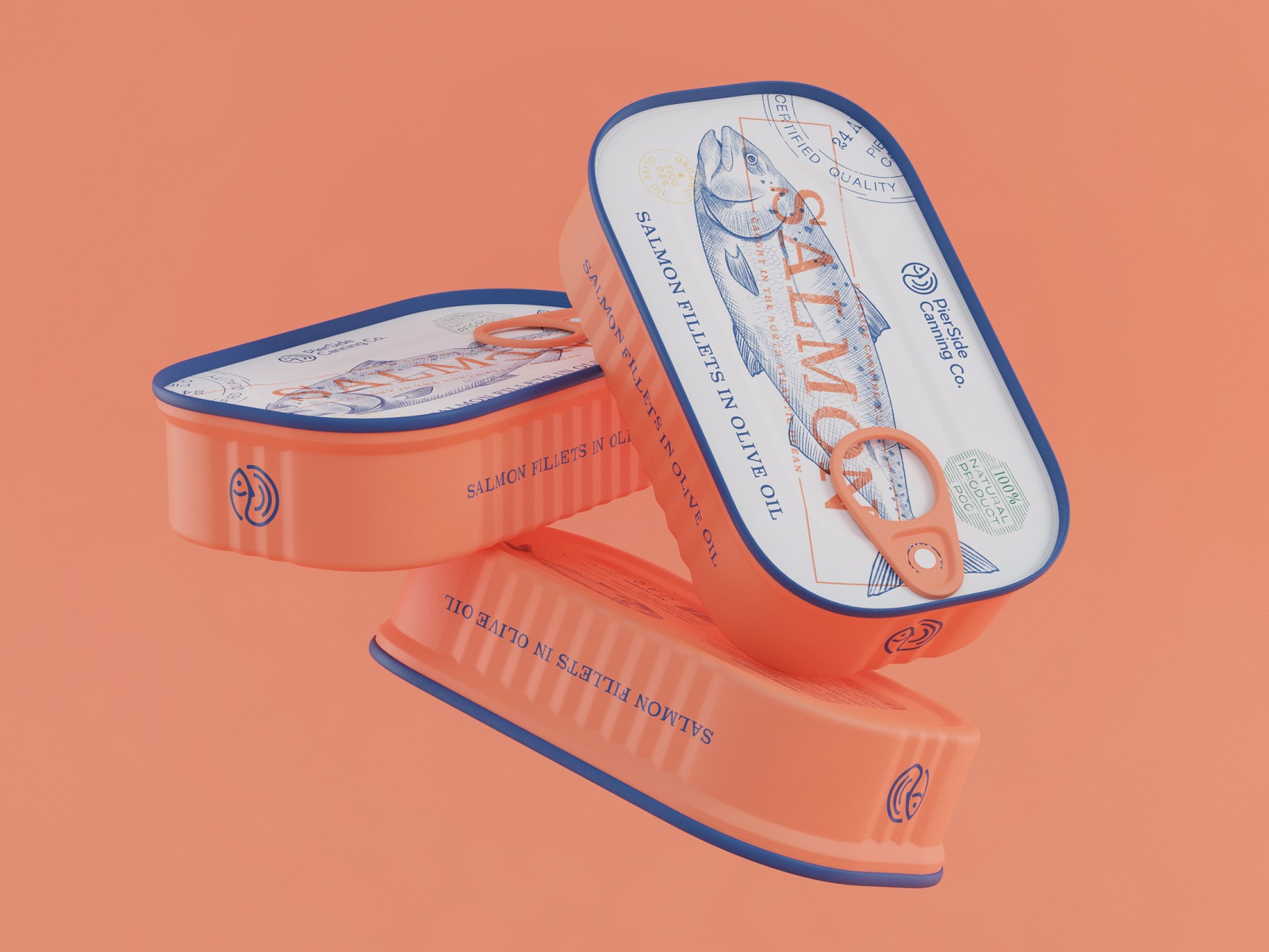
Tinned salmon packaging design
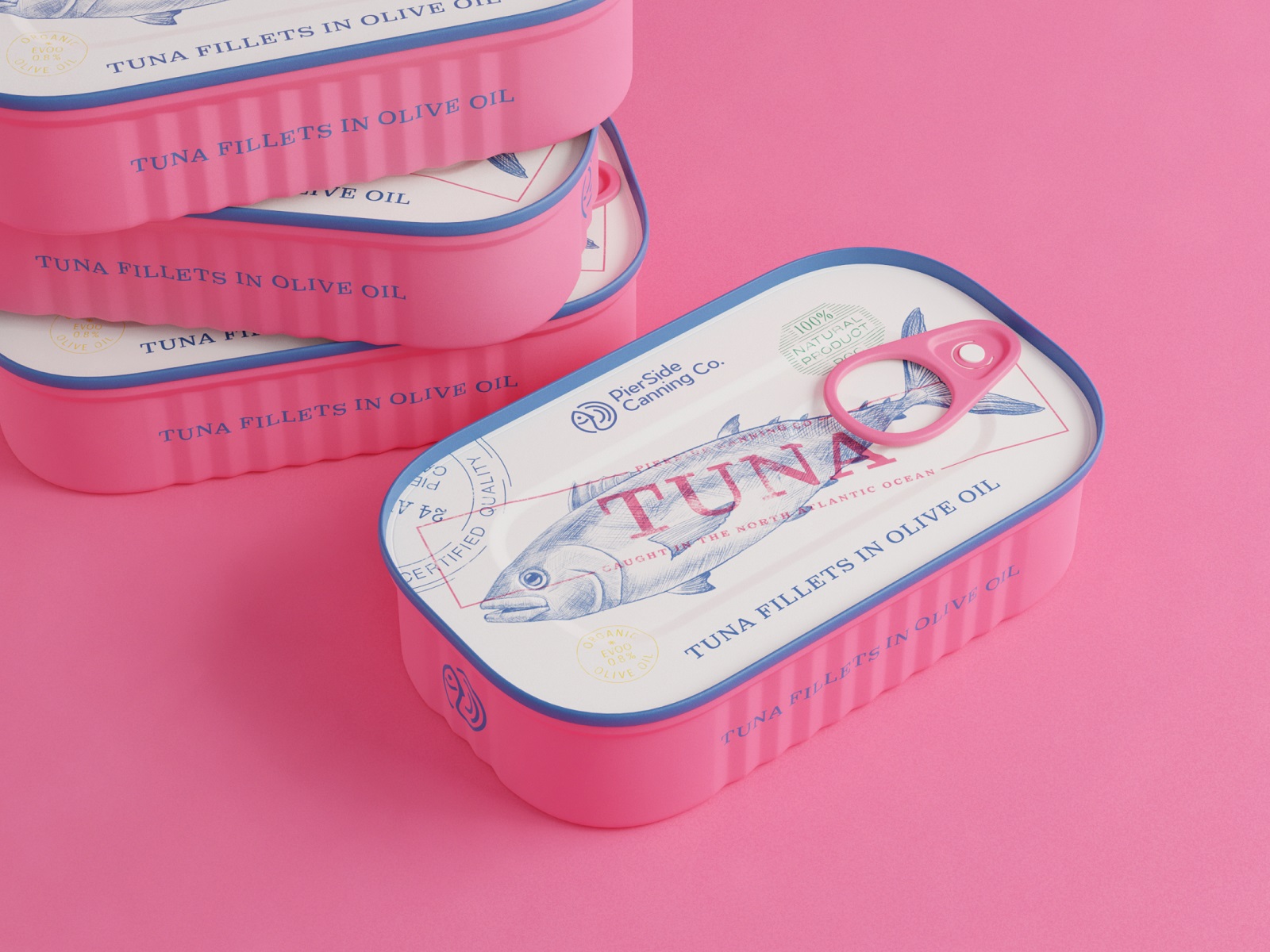
Tinned tuna packaging design
And here’s how the approach works as a system: it gives a consistent presentation of different brand goods, yet at the same time, buyers can easily distinguish the type of fish they want due to the color marking and the illustration on top.
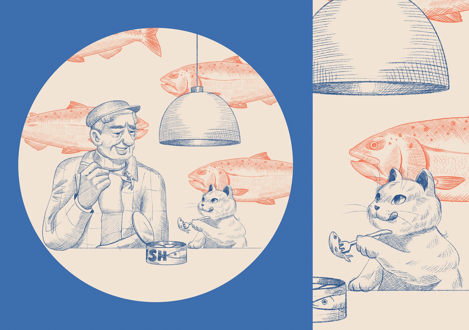
In addition, the design approach was stretched on the other marketing visuals, in particular, the branded store facade design and outdoor advertising poster designs. Also, the concept of a branded thank-you card was developed, with the cute original illustration setting the company story of an old fisherman who started this fish brand years ago and then handed it down to the next generations of the family, continuing and developing his small business.
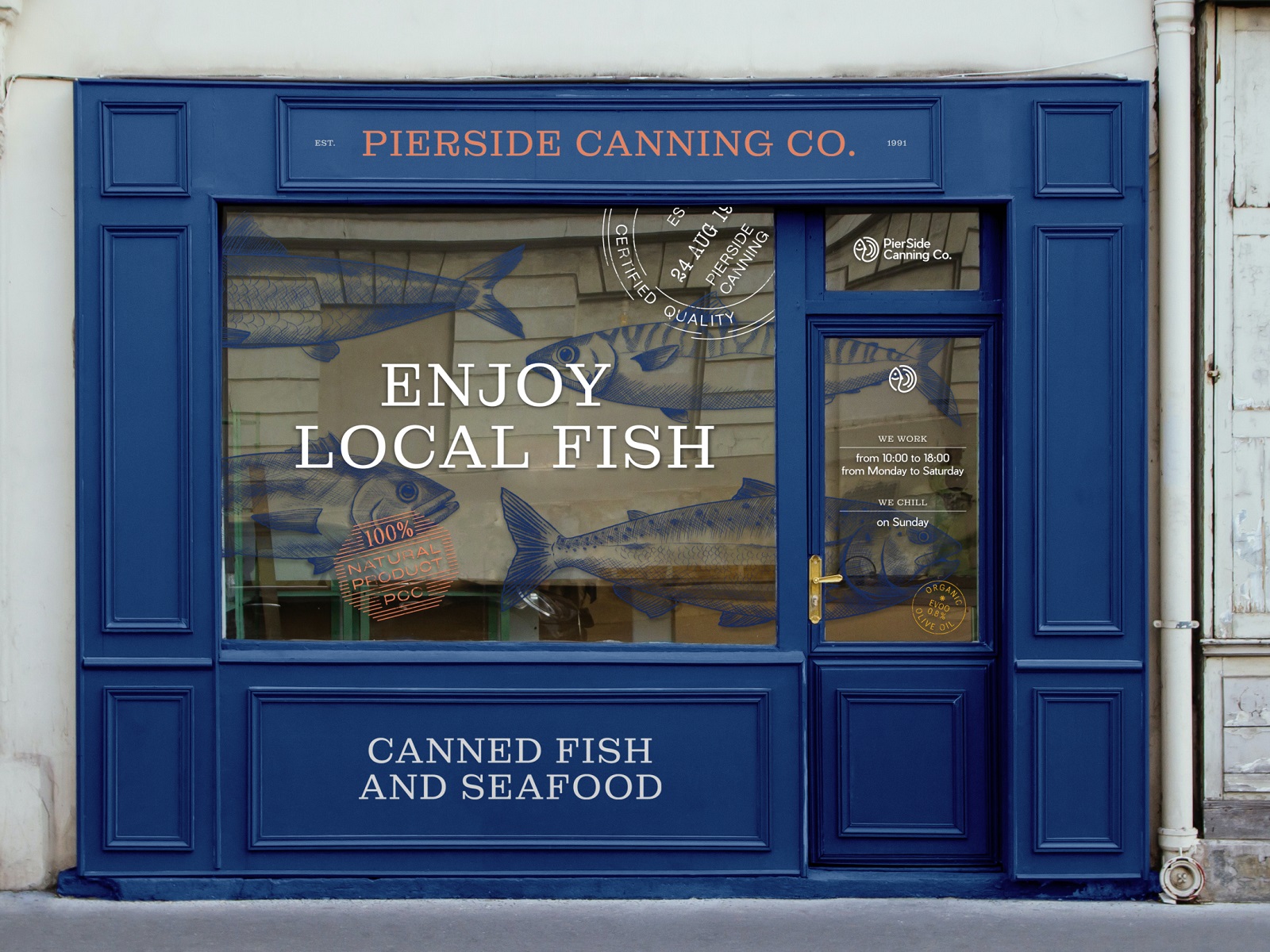
Branded fish store facade design concept
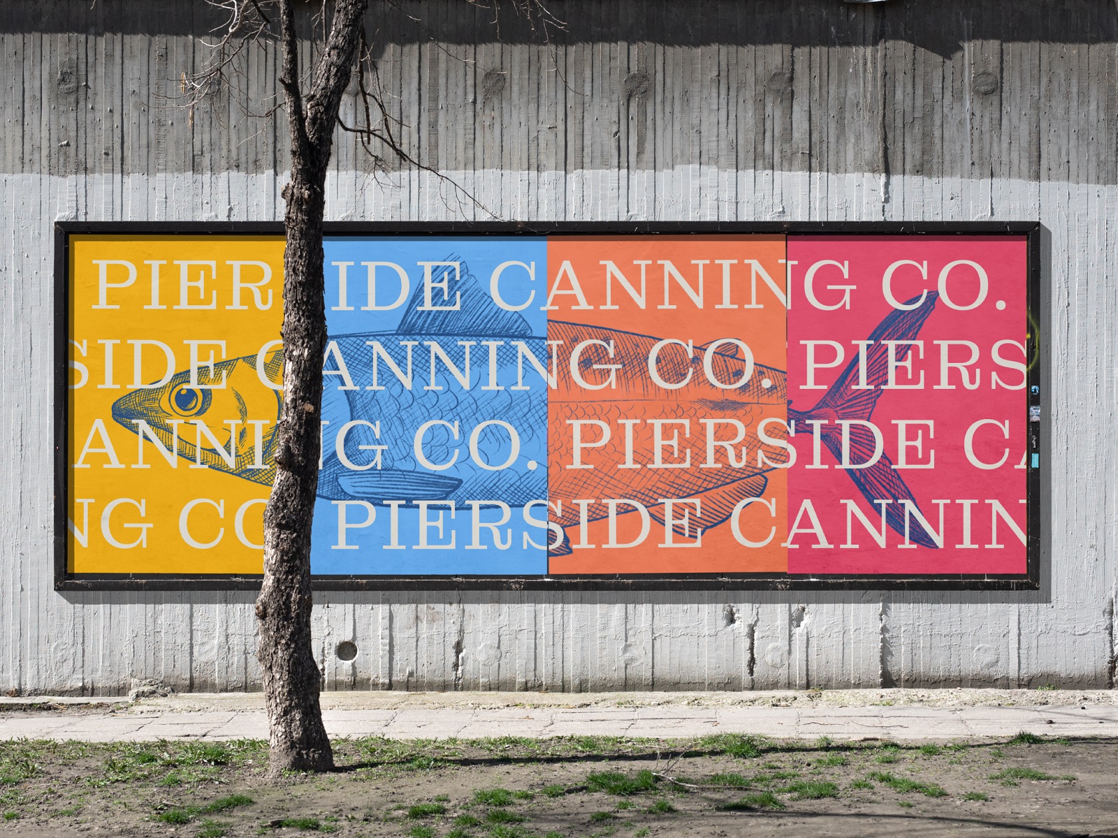
Advertising poster design
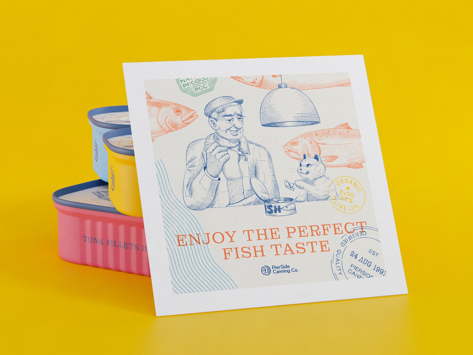
Branded card design with custom illustration
New design case studies from our team are coming soon. Stay tuned!
More Design Case Studies
Here’s a set of more case studies sharing the design solutions and approaches for some of the graphic design projects done by the Tubik team.
KOISI Tokyo. Packaging Design for Japanese Restaurant
Sidra Vivo. Vibrant Packaging Design for Cider Brand
Black Friday. Graphic Design for Marketing Campaign
Aqua Dudes. Cartoonish Packaging Design for Fish Food Brand
Herteas. Packaging Design for Herbal Tea Brand
Nutribite. Tasty Packaging Design for Granola Bars
Milkimu. Packaging and Marketing Design for Dairy Brand
Dance Festival. Creating a Set of Event Poster Designs
Soaplanet. Soap Brand Packaging Design with Travel Spirit
Joossi. Packaging Design and Marketing Graphics for Juice Brand
Pizzatta. Artistic Pizza Packaging Design
Page Turner. Identity and Packaging Design for Bookstore Chain


