It’s crowded out there.
Three million apps in Google Play. Two million more in the App Store. The number keeps growing. The attention span? Not so much. So building a mobile app today isn’t only about clean UI or flawless performance. Plenty of apps are smooth. Plenty are fast. That’s baseline.
What actually matters is presence. Recognition. That subtle moment when someone sees your icon and thinks, oh, that one.
In other words—branding.
At Tubik Studio, we’ve seen how even beautifully engineered products struggle without a clear brand image. And we’ve seen modest ideas gain traction because they understood something simple: people don’t download features. They download feelings, expectations, and stories.
So let’s talk about mobile app branding. Not as decoration. Not as marketing fluff. But as part of the design process itself.
What Is Mobile App Branding?
Branding is a set of marketing and psychological techniques aimed at shaping how a product is perceived. A brand, in turn, is the image that lives in people’s minds—built from recognizable features, consistent communication, and accumulated experience.
Mobile app branding is how users perceive your app while interacting with it.
Its visual identity.
Its tone of voice.
Its reputation.
Branding isn’t a logo pasted on top of UI screens. If you’re wondering how to brand an app, start by understanding this: branding influences user-centered design long before the first screen is drawn.
And it starts with questions.
Questions That Define Everything
Before design and development begin, we always encourage answering a few foundational questions:
- Who will use the app—and why?
- What is its unique value compared to others?
- What does it look like—and what message does that look send?
- What emotions should it evoke?
- What tone and voice does it use?
- Through which channels will users discover it?
When you define your audience and message early, decisions align. UX logic becomes consistent. Visual choices stop contradicting each other. Promotion channels make sense.
When branding comes after design, it feels glued on. When branding is defined before design, it feels inevitable.
Take Cuteen, for example—an app targeted at teenage girls. Its naming, graphics, and interaction patterns were shaped by that audience. It didn’t guess. It committed.
That commitment creates coherence. And coherence builds recognition. That’s one of the most overlooked mobile branding tips out there.

Strategy Begins With Research
Once you know your audience, your problem, and your message, branding becomes structured rather than chaotic.
Strong mobile app branding is grounded in research—understanding users, competitors, and market gaps. Creative collaboration without research is improvisation. Creative collaboration with research is direction.
From there, branding unfolds step by step.
Logo and App Icon: Small Space, Big Meaning
The logo is the visual shorthand of your brand. It can take different forms:
- A symbol tied to functionality or name
- A wordmark—stylized brand lettering
- A lettermark—a single initial
- A combination mark
- An emblem
But mobile apps introduce a constraint: the app icon.
An app icon lives in a tiny square. It must be legible, distinctive, and scalable across platforms. Complex emblems rarely survive that reduction. Wordmarks often shrink into illegibility. That’s why symbols and lettermarks dominate app icons.
Sometimes, a mascot or abstract color composition works instead.
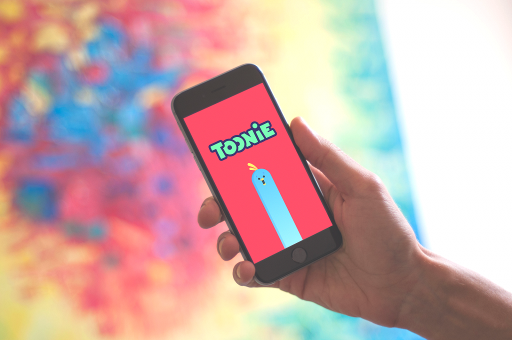
If the brand is already recognizable, designers adapt the existing logo for the icon and use the full form inside the app—for example, on a splash screen. In the Toonie splash screen, for example, the mascot and wordmark coexist—a moment of full brand expression before the minimal icon takes over.
Branding lives in adaptation. Consistency doesn’t mean rigidity.
Keywords: Invisible Glue
Keywords may sound technical. Spreadsheet-y. Dry. However, they’re not. They’re cognitive anchors for your mobile branding and app store SEO.
We usually divide them into three categories:
1. Descriptor Keywords
These define the personality and feeling of the app. Words like:
- “funny, entertaining, bright”
- “helpful, simple, minimalist”
- “business, luxury, exclusive”
Descriptor keywords force alignment inside the team. They answer a subtle but critical question: How should this app feel at 2 a.m. when someone opens it half-asleep?
When descriptor keywords are clear, visual language, tone of voice, even animation timing fall into place. When they’re vague, everything feels slightly off—like a brand having an identity crisis in real time.
2. Brand Keywords
These include the brand name and its variations, extensions, and even typos—like Upper, Upper App, Upper mobile app, Uper.
It’s not glamorous, but it’s crucial for search visibility and brand discoverability. People don’t search perfectly. They search approximately. If you don’t account for that, someone else surely will.
3. Brand-Plus Keywords
Combinations like:
- Toonie tutorial
- Toonie stickers
- Toonie for iOS
- Toonie landing page
These fuel content creation and search visibility.
Keywords aren’t only technical assets. They sharpen thinking. They turn vague impressions into concrete language. And language shapes better design outcomes.
Name, Slogan, and Voice
In a crowded market, a name influences everything:
- Logo direction
- Color choices
- Mascot ideas
- App icon style
- Communication tone
A soft, friendly name invites rounded forms. A sharp, techy name demands structure and edge. And it must survive reality:
- App store rules.
- Domain availability.
- Search competition.
Choose the wrong name, and your brand positioning fights uphill from day one. Choose early and wisely, and your entire visual identity system flows smoother.
The slogan also matters. Even if it barely appears inside the app, it lives everywhere else—landing pages, social posts, email headers.
And then there’s UX writing.
Copy defines the relationship between the app and the user. Friend? Expert? Mentor? Minimal guide? The tone must remain consistent across channels—even if slightly adjusted per context. Inconsistent tone feels like strangers sharing one interface. Consistent voice builds trust quietly, over time.
Graphics: The Emotional Accelerator
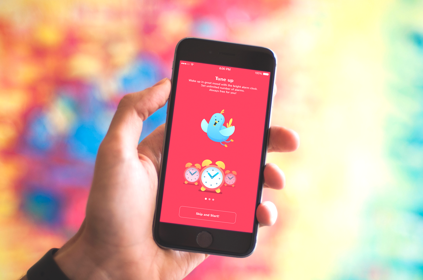
No matter how functional your product is, aesthetic satisfaction influences desirability. Custom graphics add originality—even to common or basic services.
Key graphic elements include:
- Logo
- Mascots
- Custom illustrations
- Branded interactive elements (loaders, splash screens, tutorials)
- Promotional photos
Mascots communicate personality. Illustrations clarify functions. Branded micro-elements add subtle cohesion. When visuals align with tone and purpose, they narrate. When they don’t, they distract.
Product Video: Multi-Sensory Branding
Video activates multiple perception channels at once—visual, auditory, narrative. An explainer or product video introduces features, showcases interactions, and communicates problem-solving potential quickly and vividly.
Platforms like YouTube and Snapchat trained users to consume fast clarity. For OffCents, for example, the explainer video served as both introduction and storytelling device—compressing value into a shareable format.
Personalization and Onboarding
First impressions aren’t formed only by visuals. They’re also shaped by guidance. User onboarding—tooltips, prompts, tutorials—introduces the product gently. Even these small elements carry branding signals in copy and graphics.
They build comfort. And comfort builds loyalty. Personalization deepens this bond.
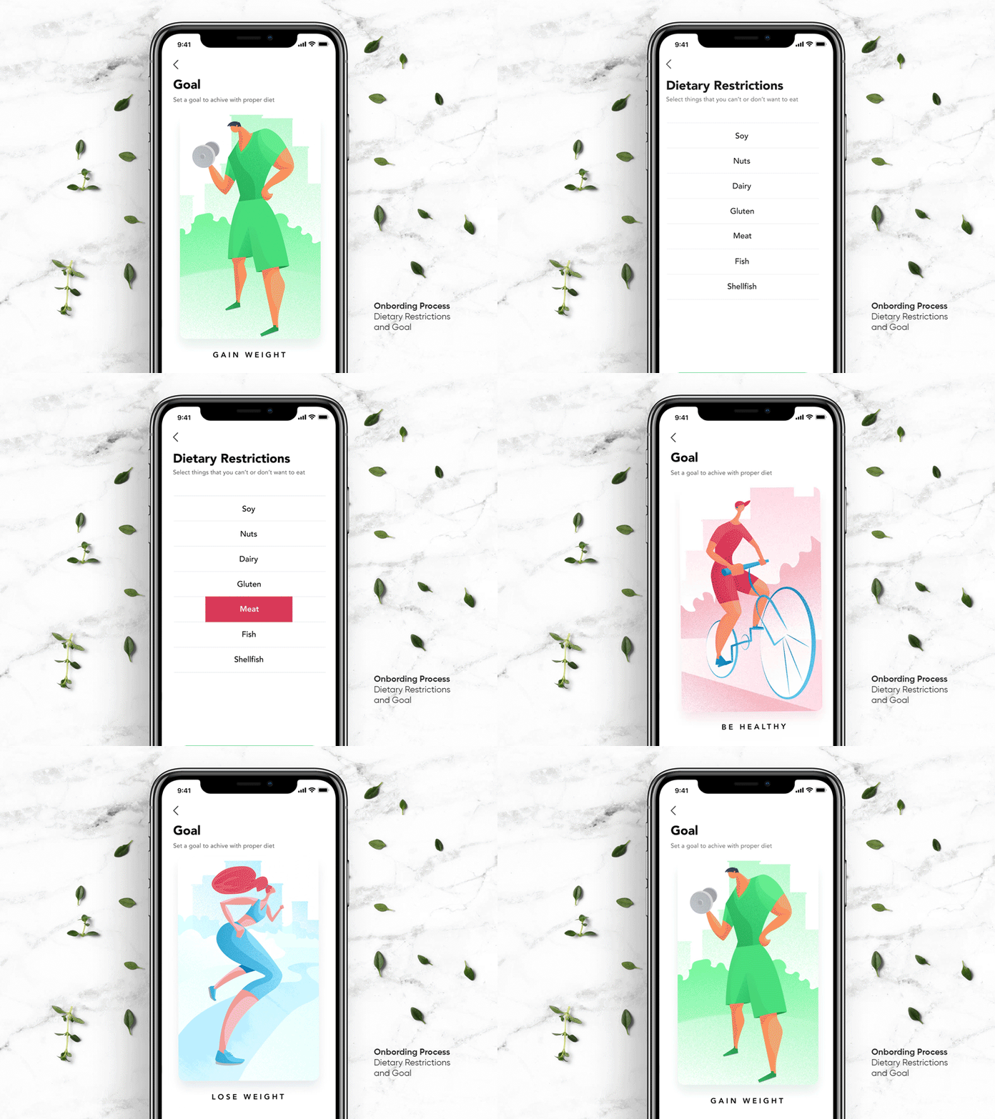
Recipe App, for example, allowed users to set goals and exclude unwanted ingredients. Upper App offered multiple skins to match personal preferences. When users adjust an interface to fit themselves, they feel ownership. And ownership strengthens attachment—that’s one of the most durable mobile branding practices.
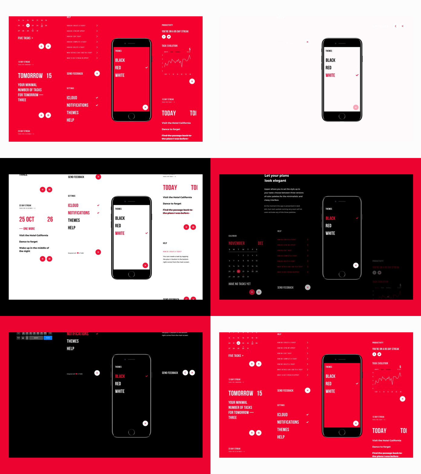
Another example is Upper App which enables users to choose among various skins to make the app looks correspond to their preferences.
Gamification: Motivation With Identity
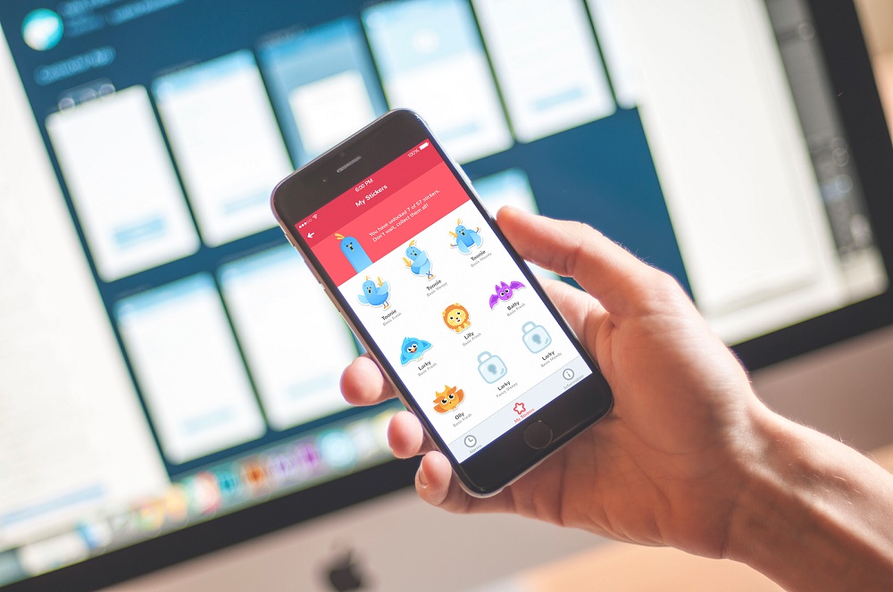
Gamification integrates game mechanics—challenges, badges, leaderboards, bonuses—into non-game environments.
When aligned with brand aesthetics, these mechanics:
- Increase engagement
- Strengthen recognition
- Encourage sharing
Rewards—virtual or real—become promotional tools themselves. Users share achievements, becoming informal ambassadors of positive experience.
Gamification isn’t about turning everything into a game. It’s about structured motivation.
Help and Support: Branding Beyond First Impression
Branding doesn’t end at download. Support systems define how a brand behaves when things go wrong. Especially in complex apps—social networks, e-commerce platforms—users need assistance.
A great coat cannot be made from poor fabric. If support fails, branding collapses. Real branding means caring about the entire journey—not only the launch.
Landing Pages: The Bridge to Installation
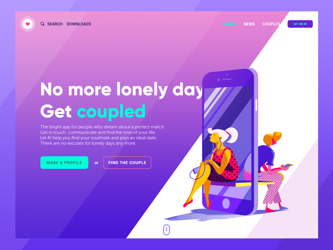
A landing page has a narrow, focused goal: action. For mobile apps, that action is installation. It communicates benefits quickly and clearly—beyond the limited screenshots of an app store listing.
And here’s where it gets interesting.
One product can speak in many voices. Geography shifts expectations. Gender changes references. Behavior reveals motivations. Psychographics expose hidden desires. A thoughtful landing page strategy allows tailored narratives without fragmenting the core brand.
In mobile-only cases, especially, the landing page becomes the digital anchor. No desktop platform to rely on. No secondary ecosystem. Just a focused app marketing gateway that carries the full weight of perception.
Social Networks: Awareness Before Conversion
We’ve all seen brands treat social media like a vending machine. Insert post. Expect sales. It doesn’t work like that.
Social platforms are not merely conversion tunnels. They are rehearsal spaces. Here, a brand practices its tone, tests its visual rhythm, refines its social presence long before asking for commitment.
Promotional campaigns, public pages, comment sections, reviews—they create surface area. And the surface area increases the chances of memory. That memory becomes familiarity. Familiarity reduces risk. Reduced risk increases installs.
It’s subtle psychology. But it’s predictable.
If your brand voice feels coherent across touchpoints—visuals, captions, replies—people begin to sense intention. And intention reads as professionalism.
No urgency banners required.
Brand Ambassadors and Opinion Leaders
Recommendations still outperform banners. Always have. But influence is fragile.
Opinion leaders trade on trust. That trust is their currency. If your app doesn’t deserve endorsement, they know it. And if they ignore that instinct, their audience will punish them for it.
Two truths shape this space:
- Influencers protect their reputation.
- Half-baked products don’t survive exposure.
You can buy reach, but you cannot buy credibility.
A surge of traffic means nothing if the first-time experience collapses under bugs, awkward onboarding, or inconsistent UI. Weak user experience erodes brand equity faster than silence ever could.
That’s why quality comes first. Amplification comes second.
UI/UX and Promotion: One Ecosystem
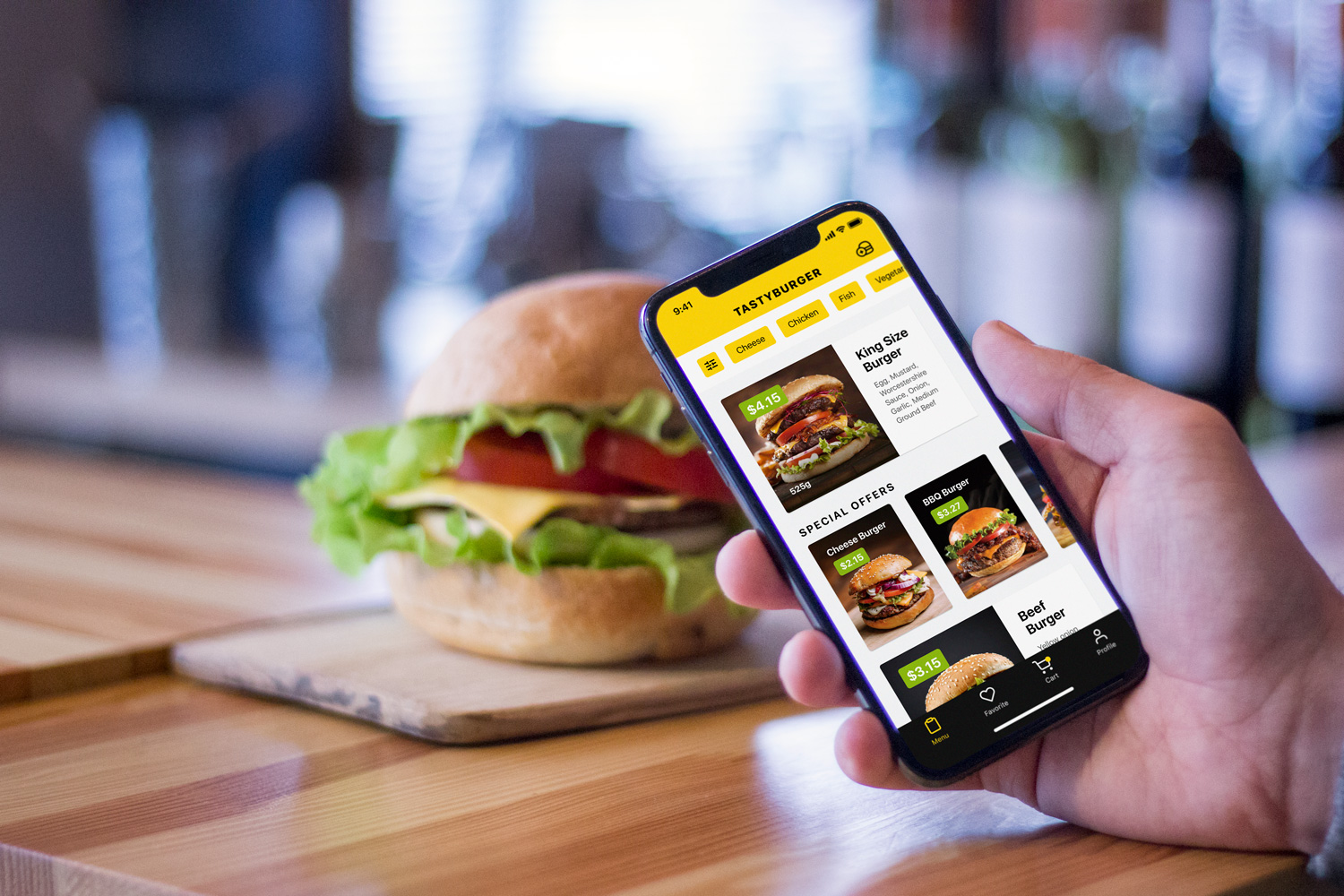
There’s a myth that design and marketing live in different departments. In reality, they often share the same nervous system.
A beautifully crafted interface without visibility remains invisible. A loud campaign promoting a weak product becomes an expensive embarrassment. A sustainable mobile strategy requires alignment between product design and communication design.
UI/UX shapes the promise. Promotion distributes it. Neglect one side, and the other starts compensating.
When the interface feels intuitive, when the microinteractions feel intentional, when the onboarding respects human attention, marketing becomes easier. Every satisfied user becomes a quiet reinforcement of your app branding.
The Real Point
Branding shapes discovery, interaction, and memory. It informs color systems and typography. It influences copy tone and onboarding flow. It determines how landing pages speak and how influencer campaigns feel.
In a market flooded with alternatives, technical competence is expected. Branding is what creates coherence. And coherence reduces cognitive friction.
When everything—interface, messaging, outreach—feels like it belongs to the same mind, users relax. Relaxed users explore. Exploration turns into a habit, the quiet foundation of loyalty.
At the end of the day, people don’t fall in love with features.
They fall in love with clarity.
And clarity is a competitive advantage no update can patch in later.
Recommended Reading
If mobile app branding sparked something, you might want to explore the bigger ecosystem around it:
6 Creative Stages of Branding Design: Step-by-Step Guide
Mobile App Design: Big Guide into Types of Mobile Applications
UX Design for E-Commerce: Principles and Strategies
The Role of Branding in UI Design
Business-Oriented Design. Know Your Target
Short but Vital. Key Abbreviations in Design for Business
Business Terms in Design for E-Commerce. Sales Basics


