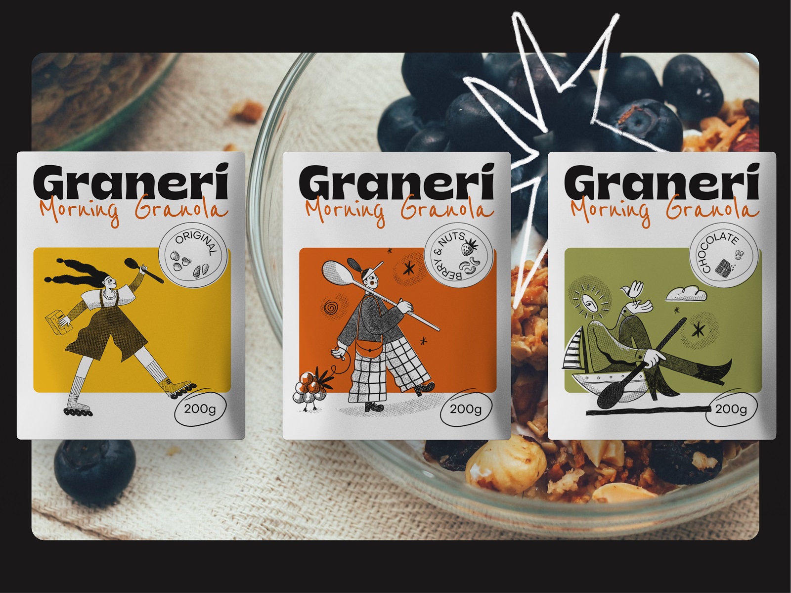
One more graphic design project is up to be unveiled, tasty and energetic. In this case study, we invite you to see the packaging design and visual identity for a brand of granola and healthy breakfasts, employing cheerful custom illustrations.
The project was accomplished by tubik designers Arthur Avakyan and Yaroslava Yatsuba.
The design process included such creative stages:
- idea and design approach
- logo design and a consistent set of brand illustrations and graphic elements
- packaging design system for granola considering different types of granola packaging
- developing a stylistic approach for the marketing visuals that would help to strengthen and enhance the product recognizability and brand awareness
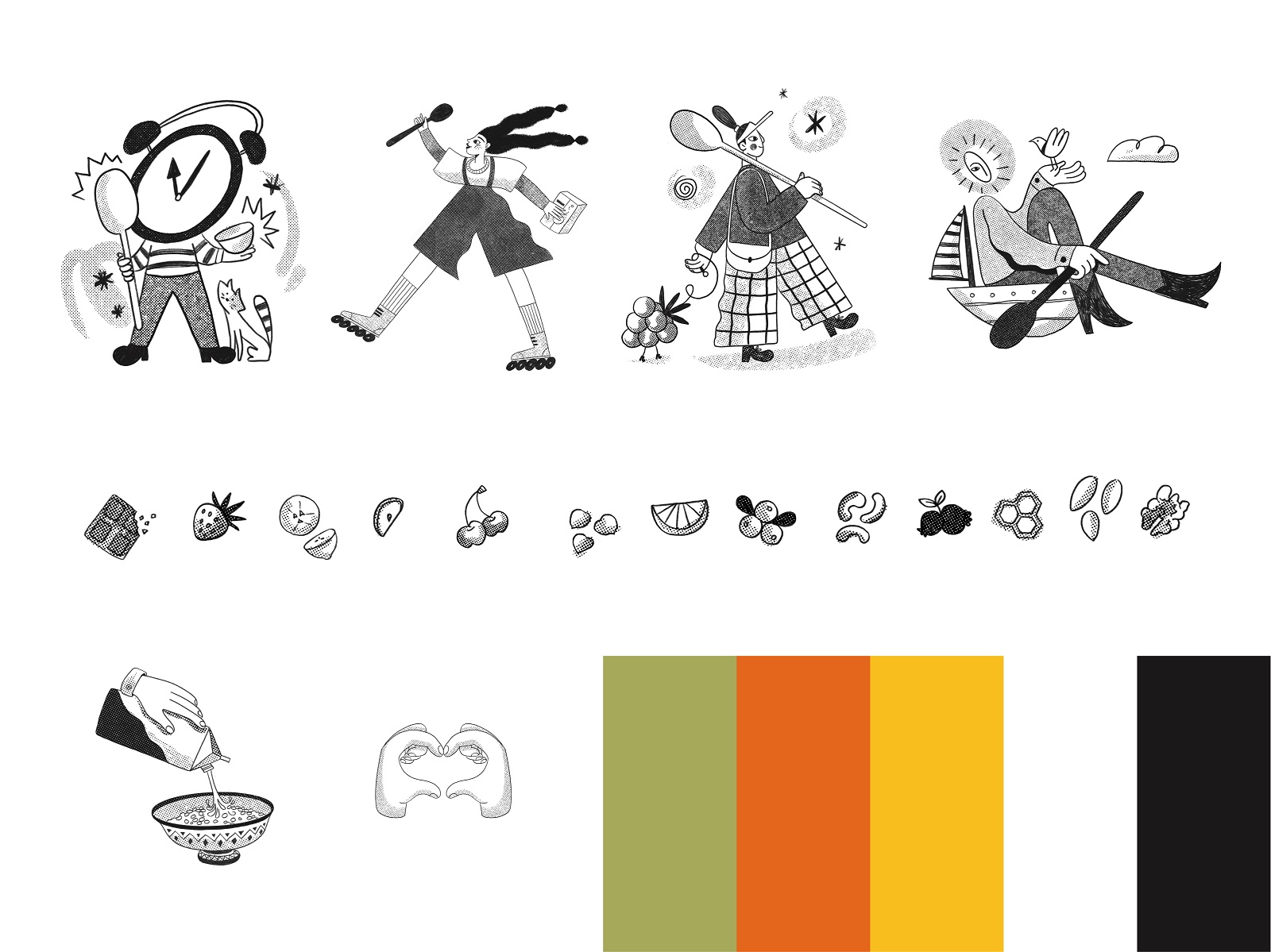
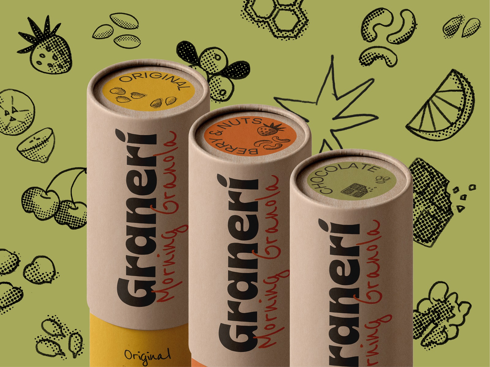
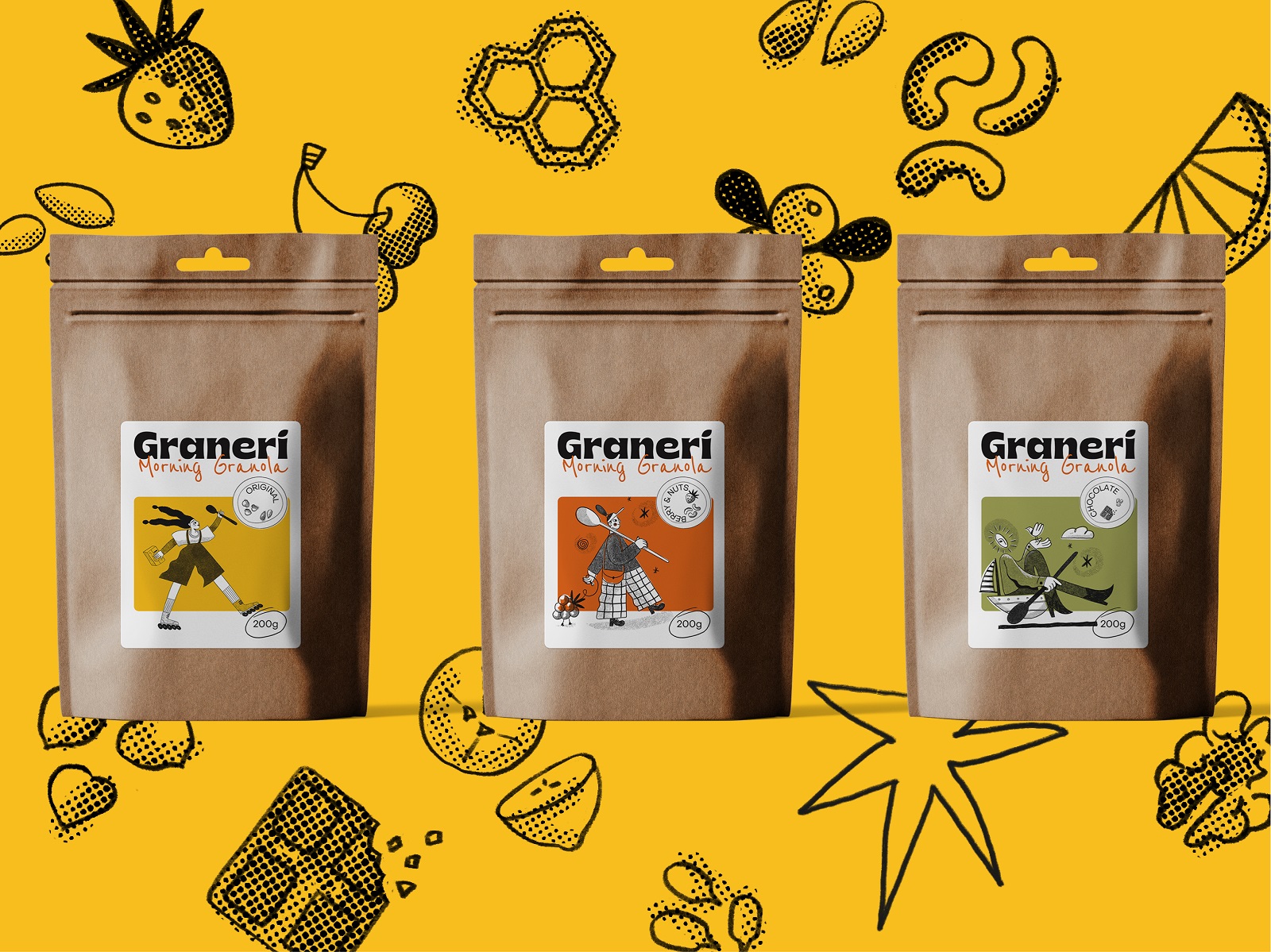
So, the team started from the generation of the style approach to decide upon a color palette and a set of graphics that would be integrated into all the branded visual communication. The contrastive line artworks created for the project are dynamic and lively, and they present two groups: human characters and minor graphics of food ingredients. The color palette is based on sunny, warm shades of green, yellow, and orange, which, in combination with classic black and white, give designers a flexible tool for creating emotional and efficient graphic design for this marketing campaign.
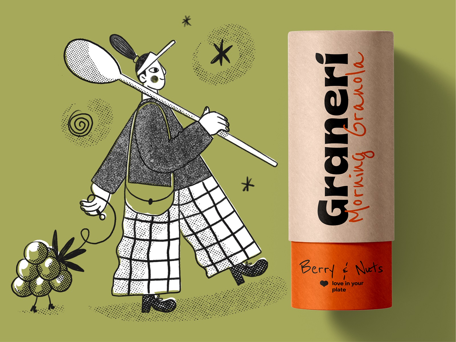
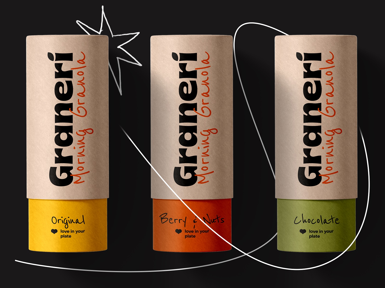
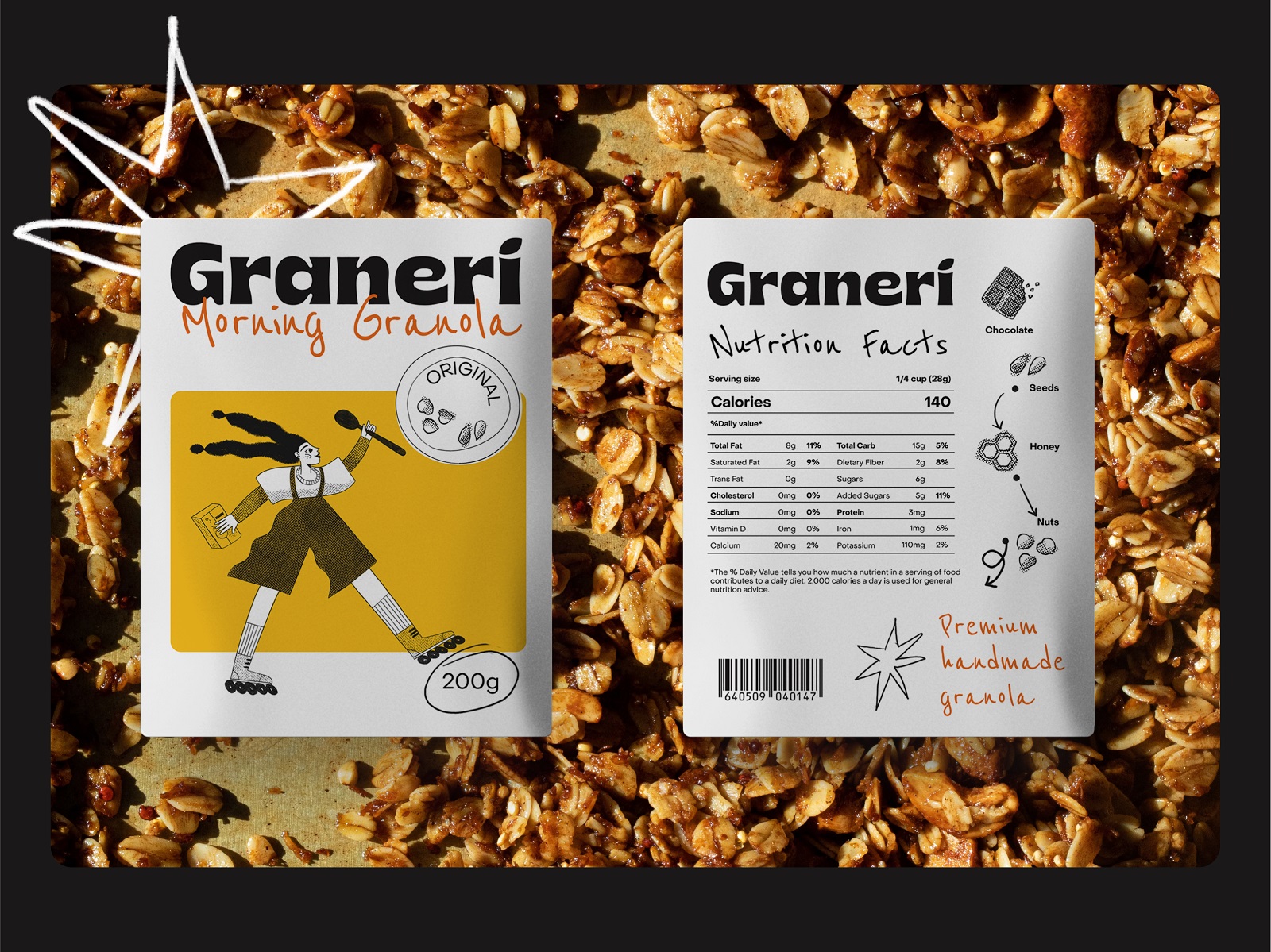
The typographic choice for both packaging design and marketing materials combines a bold, prominent font for the brand name logo, a decorative calligraphic font for major text content and taglines, and a neat, readable sans-serif typeface for more text information about the product. This thoughtfully arranged typographic combination provides effective and attractive contrast and allows the addition of elegance and emotionality to the brand’s visual communication.
The packaging design stage involved working on three primary types of packaging: tubes, pouches, and labels for the transparent packets. Each of the types required its own approach and had own specific requirements. Here’s a glance at the tube packaging for the granola. This type didn’t involve much integration of illustrative graphics due to its construction, so it mostly plays with colors and typography.
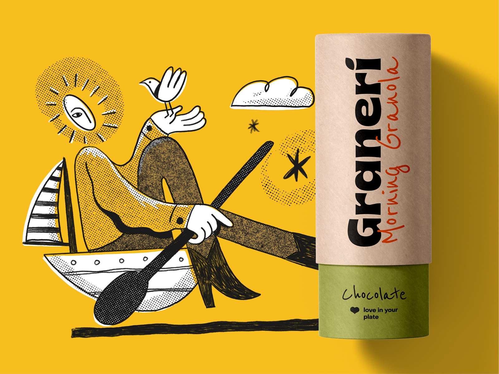
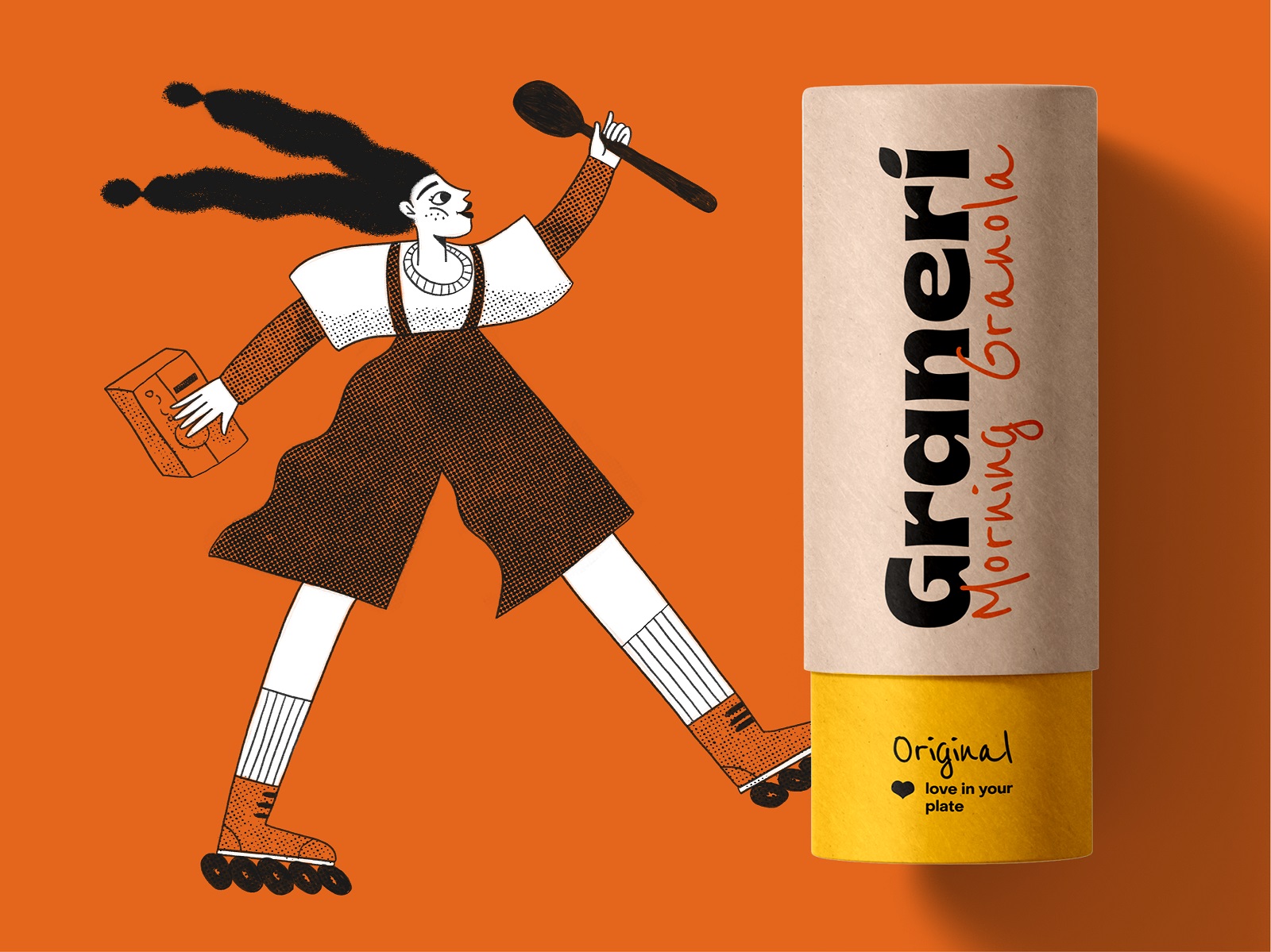
Meanwhile, pouches and transparent packet labels allowed the designers to integrate illustrations as the instant visual element sharing the vibes of cheerfulness and making the packaging catchy and recognizable on the store shelves.
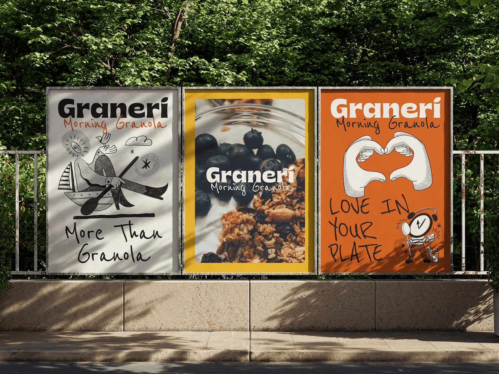
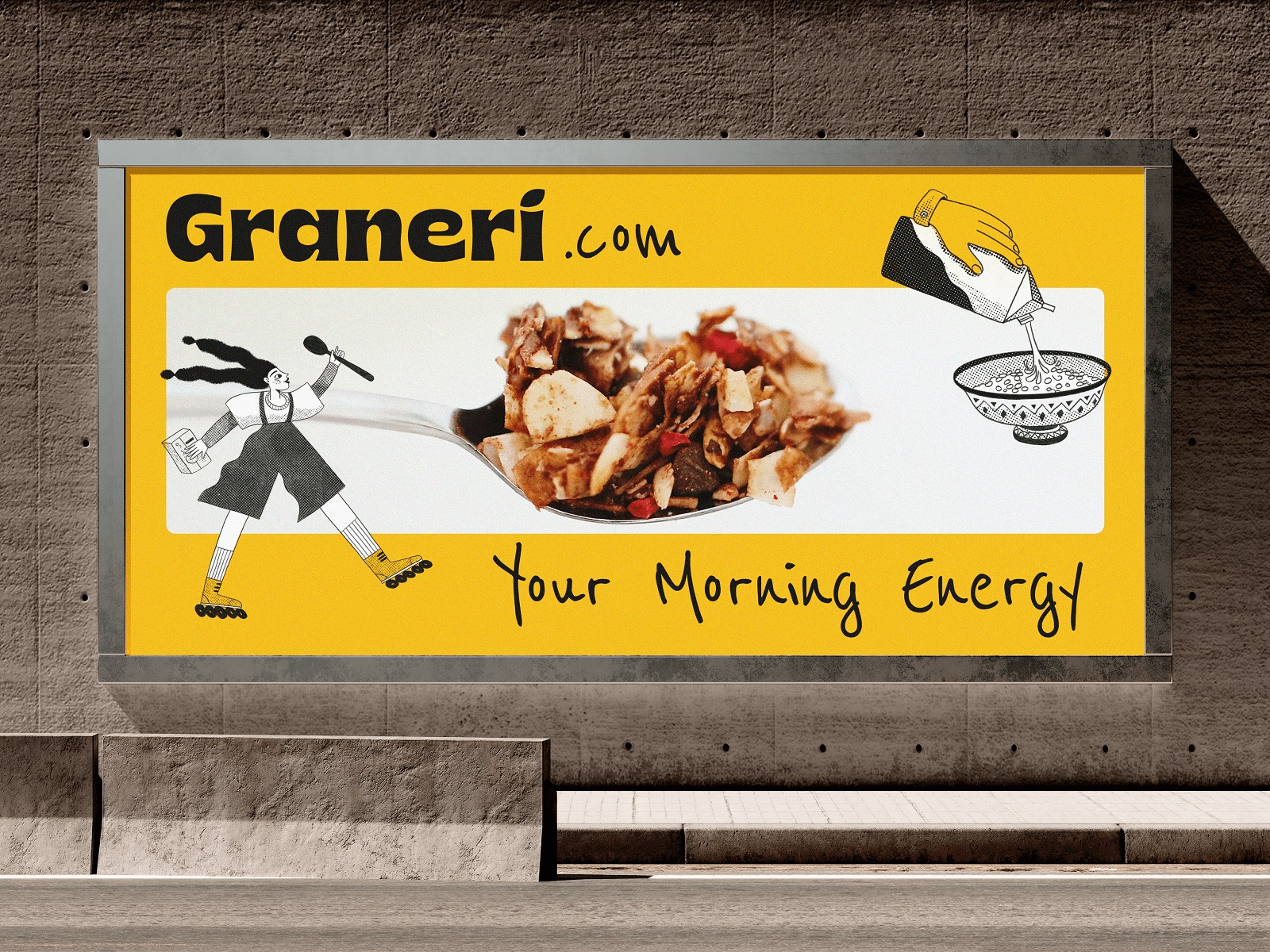
Also, the visual style approach was stretched on the advertising graphic design, for example, posters and billboards.
New design case studies from our team are coming soon. Stay tuned!
More Design Case Studies
Here’s a set of more case studies sharing the design solutions and approaches for some of the graphic design projects done by the Tubik team.
Pencils of Promise. Picture Book Creation Process Step by Step
Gofe. Packaging and Marketing Design for Coffee Brand
12 Bright Projects on Visual Identity and Packaging Design
Love Sign. Gift Box Packaging Design with Romantic Vibes
PierSide. Packaging Design for Tinned Fish Brand
KOISI Tokyo. Packaging Design for Japanese Restaurant
Sidra Vivo. Vibrant Packaging Design for Cider Brand
Fairytale. Picture Book Illustrations and Design
Aqua Dudes. Cartoonish Packaging Design for Fish Food Brand
Herteas. Packaging Design for Herbal Tea Brand
Nutribite. Tasty Packaging Design for Granola Bars
Milkimu. Packaging and Marketing Design for Dairy Brand


