When you’re building something meant to sit close to someone’s skin—a wearable healthtech product, no less—the product isn’t the only thing that needs to feel personal. The story, the science, the interface—they all have to connect. This is the healthtech web design case study of FluxWear, where UX decisions weren’t just aesthetic—they were empathetic.
In this case study, we’ll walk through the research, strategy, and design process behind the website for FluxWear’s flagship product, SHIFT—a neuromodulation device designed to reduce stress, relieve pain, and improve focus. From wireframes to live Webflow implementation, every step was guided by real human stories and product-specific UX needs.
Introduction to the FluxWear Project
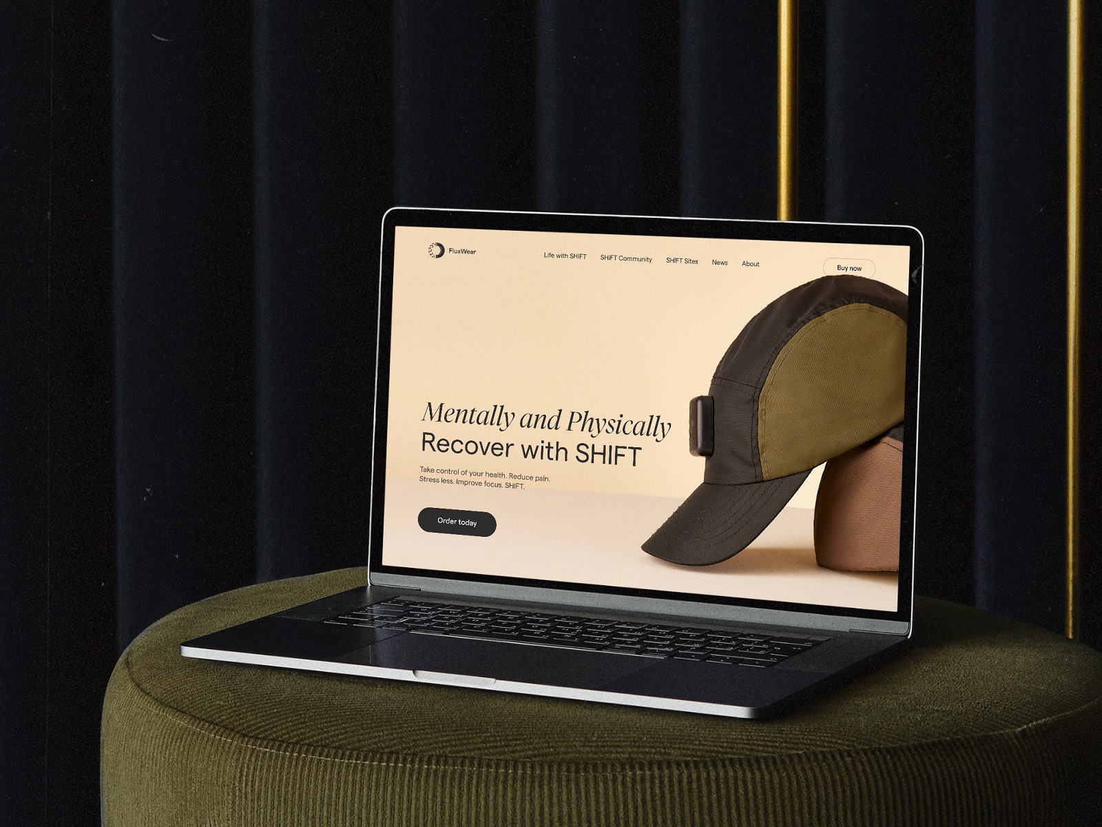
FluxWear is a health tech startup focused on wearable neuromodulation. Their first product, SHIFT, is an FDA-registered, patent-protected device that delivers pulsed electromagnetic field therapy (PEMF) to help users reset physically and mentally—in just 25 minutes. It’s already being used in clinics across the U.S., supporting people dealing with chronic pain, anxiety, migraines, poor sleep, and more.
The design for health tech brands like FluxWear isn’t about visuals alone—it’s about trust. In a crowded space of wellness gadgets, the challenge was clear: how do we present SHIFT not as a gimmick, but as a clinically-backed, emotionally compelling tool? The site needed to inform, convert, and reassure, while reflecting the product’s sleek, calming presence.
Project Background & Challenges
FluxWear came to us with a clear goal: launch a healthtech website development solution that would grow awareness, build credibility, and support direct product sales. The brand’s visual identity was already defined, but they needed a web experience that could carry it—blending storytelling, science, and simplicity.
User Groups & Pain Points
The site had to speak to multiple audiences:
- End users, often young adults or wellness-focused professionals, seeking accessible solutions to chronic conditions.
- Healthcare providers, interested in incorporating SHIFT into treatment protocols.
- Parents, educators, and counselors, looking for tools to support mental health in teens.
This wide scope meant the UI/UX health tech case study needed to account for varied levels of tech literacy and emotional states. The tone had to be both confident and compassionate—less “clinical brochure,” more “guided discovery.”
UX Research & Strategy
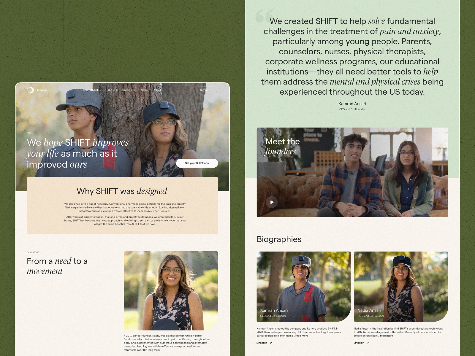
The team started by building out user personas based on direct input from FluxWear’s founders and users. This wasn’t abstract research. The device itself was born from a personal story: co-founder Nadia’s battle with Guillain-Barré Syndrome and years of ineffective treatments. That vulnerability became central to the UX—we needed the site to feel real, warm, and hopeful.
Competitive & Industry Analysis
We audited a range of health tech websites: from major players in neuromodulation to wellness wearables with big marketing budgets. Many were heavy on science, light on story—or vice versa. Our takeaway? Clarity wins. So we built a structure where every scroll told you something new, and every block had a purpose.
Design Process & UX Decisions
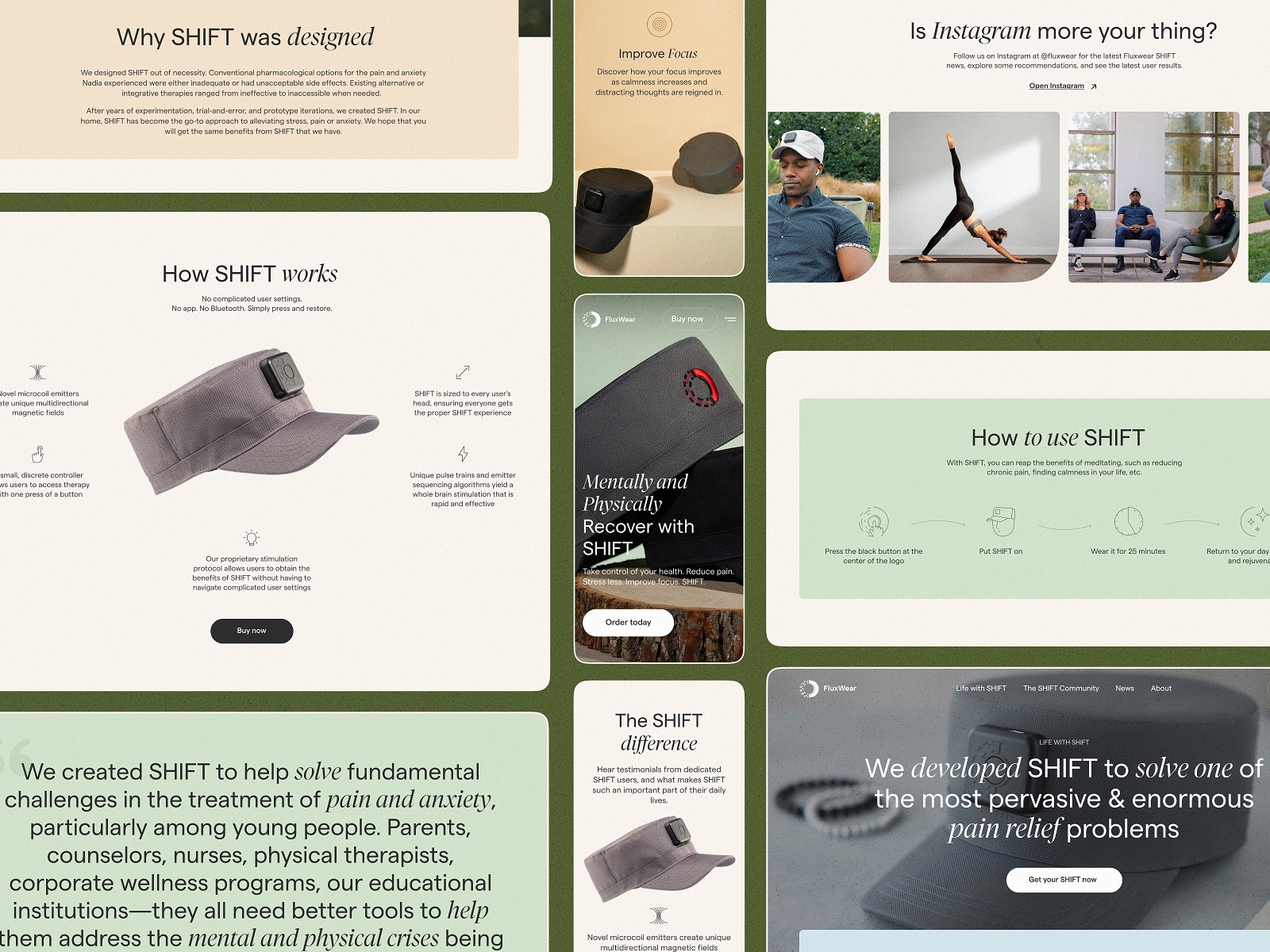
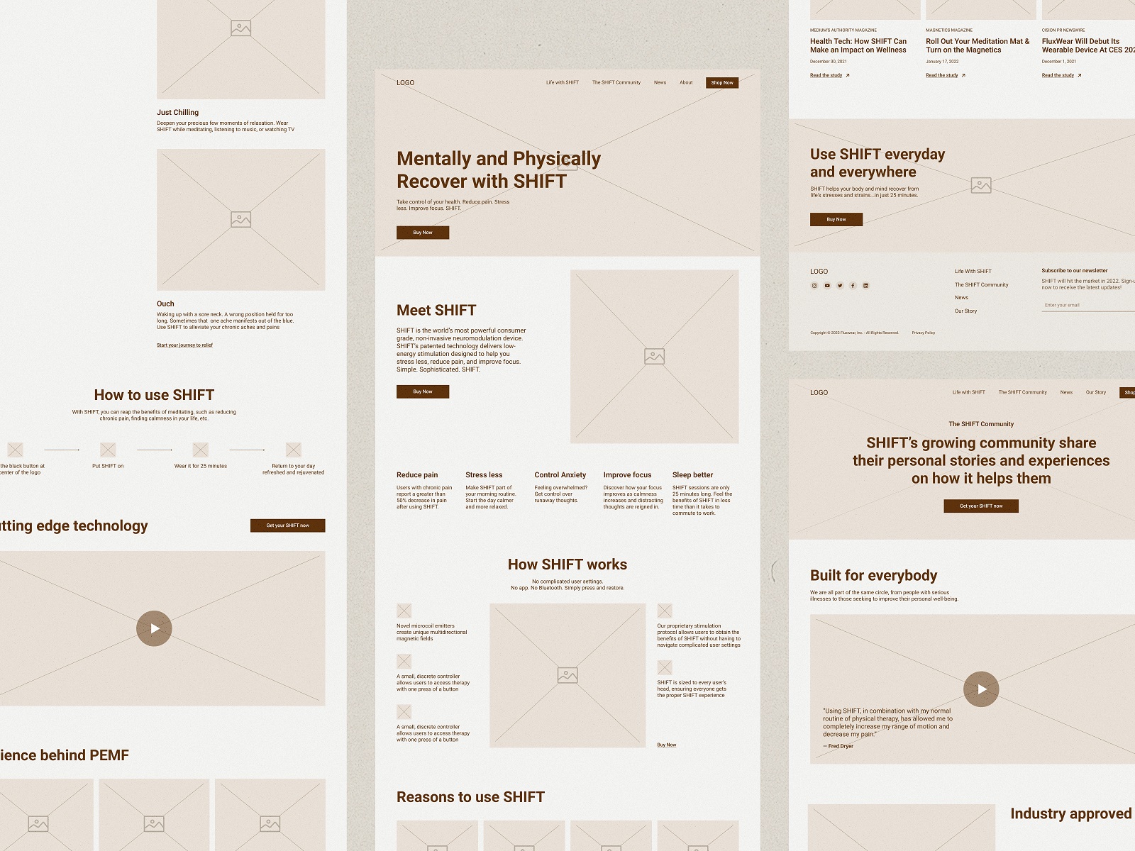
In the early stages of this design process, we built detailed wireframes to map user flows and hierarchy. The goal? Create a scannable layout that allowed users to self-direct—whether they came in with a problem to solve or were just curious about SHIFT.
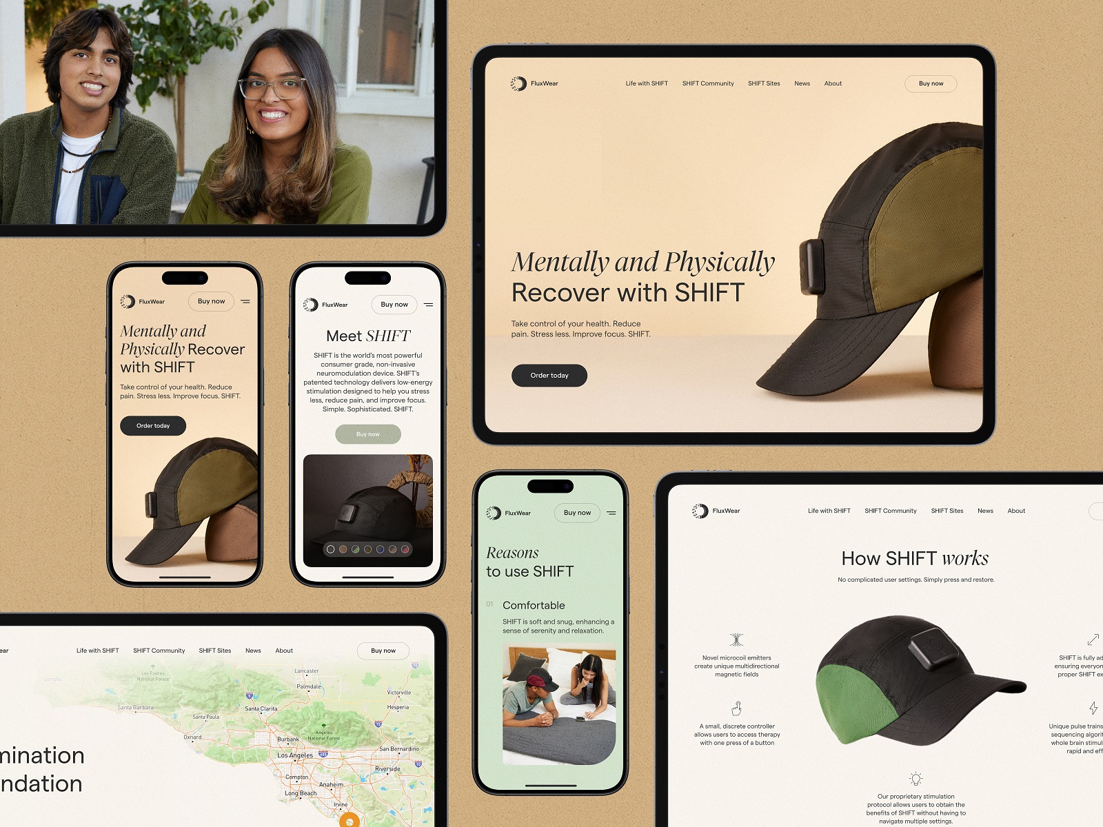
We also designed with mobile-first behavior in mind. For wearable tech users, conversion often happens on phones. We treated scroll not as a nuisance, but as a narrative tool—letting users “read” the product story as they explored.
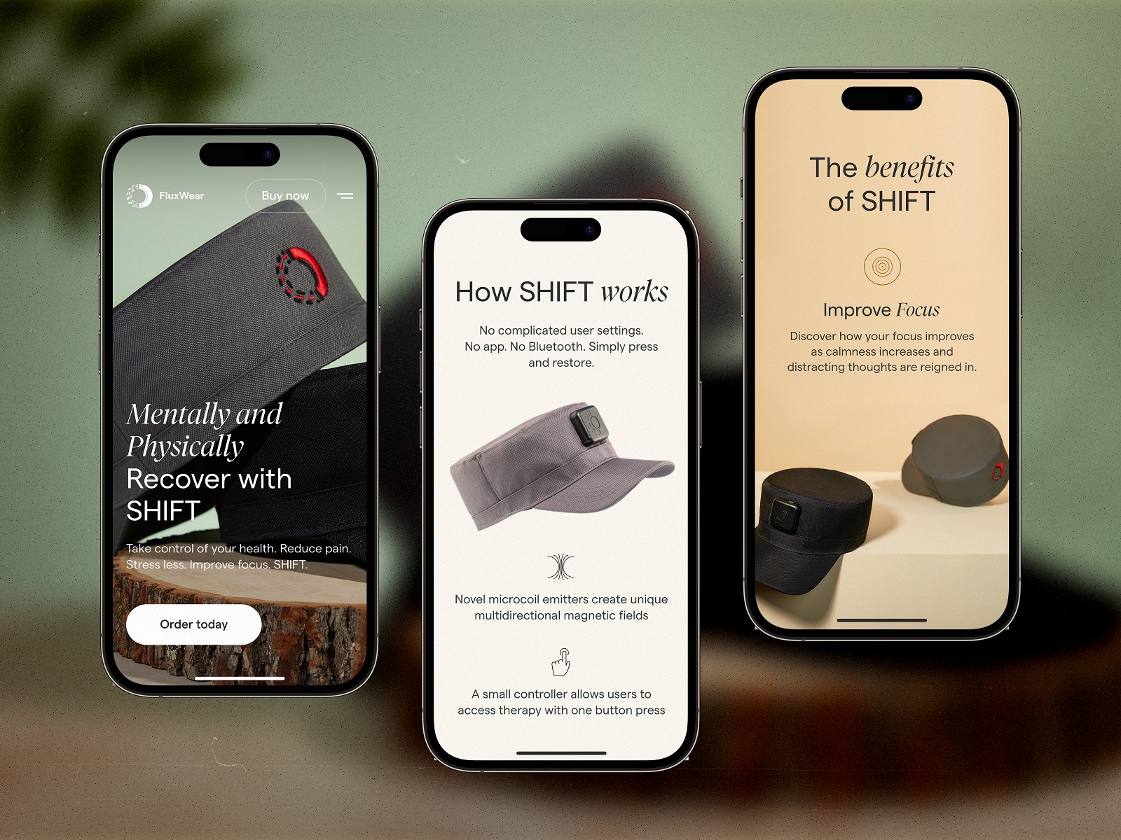
Key UI Components for Healthtech UX
- Sticky Header with Purchase CTA: Always within reach, never intrusive. The header navigation supports smooth UX while keeping conversions in sight.
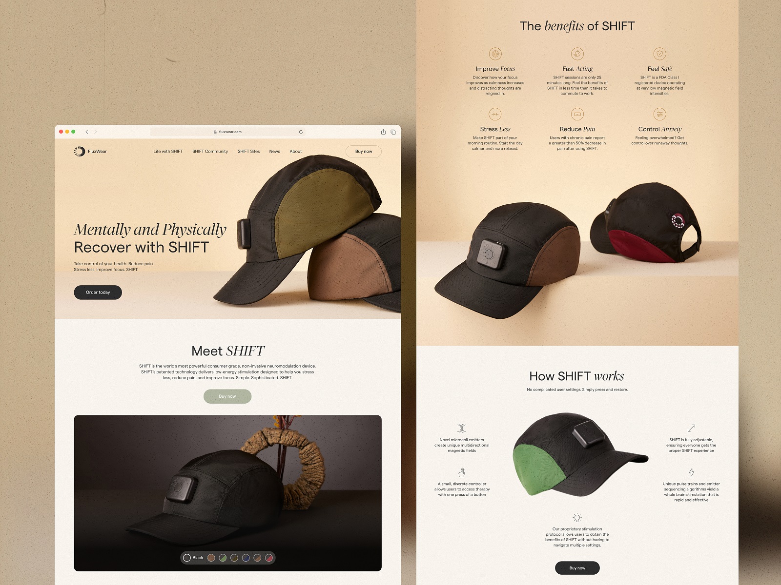
- Switchable Product View: A color toggle under the product render lets users see SHIFT in its two available colorways instantly—a small but satisfying interaction.
- Rounded UI Elements: The product itself is soft-edged and wearable. The website reflects this through rounded buttons, smooth transitions, and pill-shaped image containers.
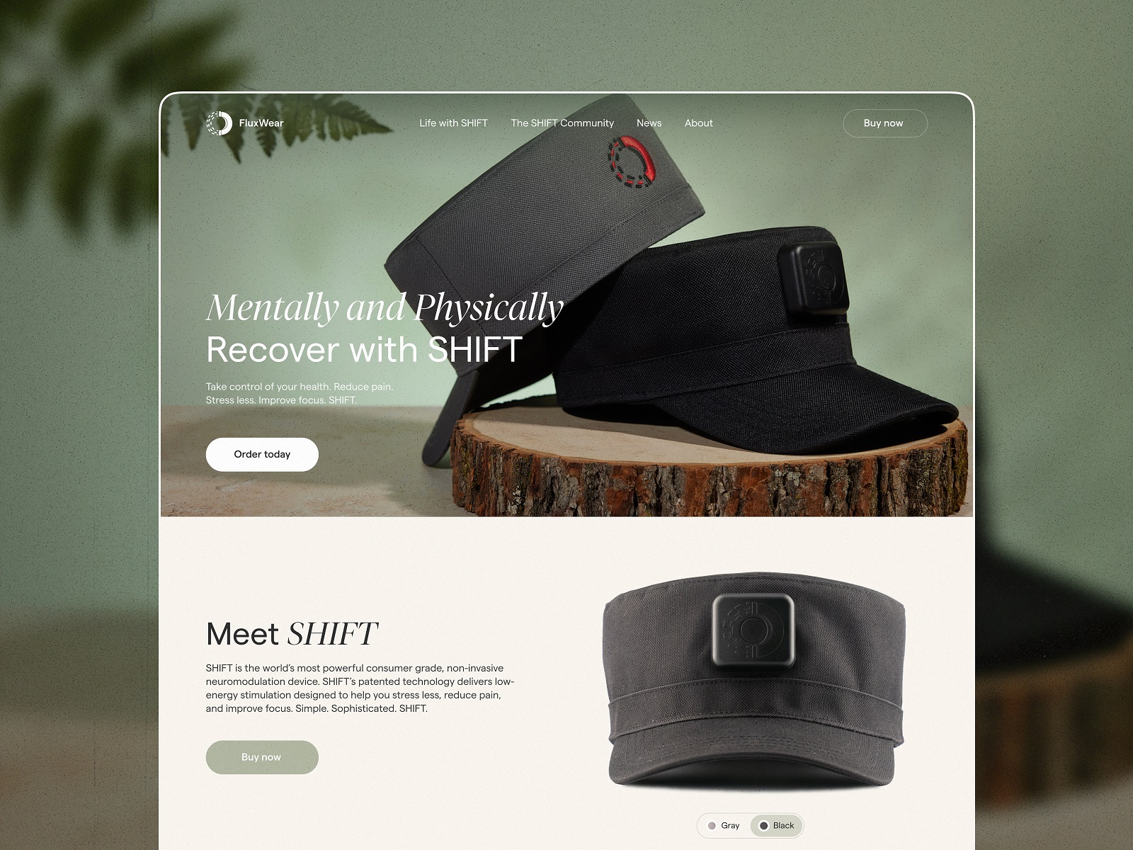
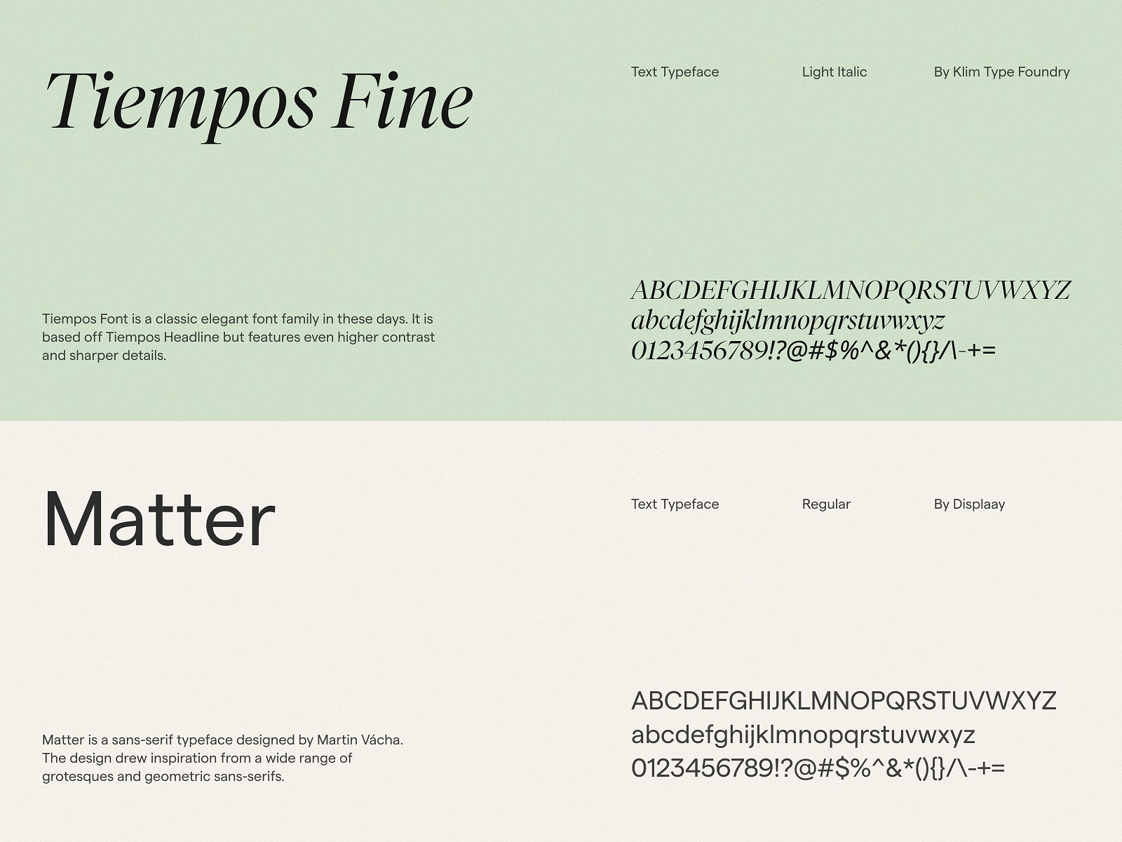
The typography pairs Matter (a clean, modern sans-serif) with Tiempos Fine, a serif that adds a touch of editorial flair—a nod to SHIFT’s medical legitimacy without going full “hospital website.”
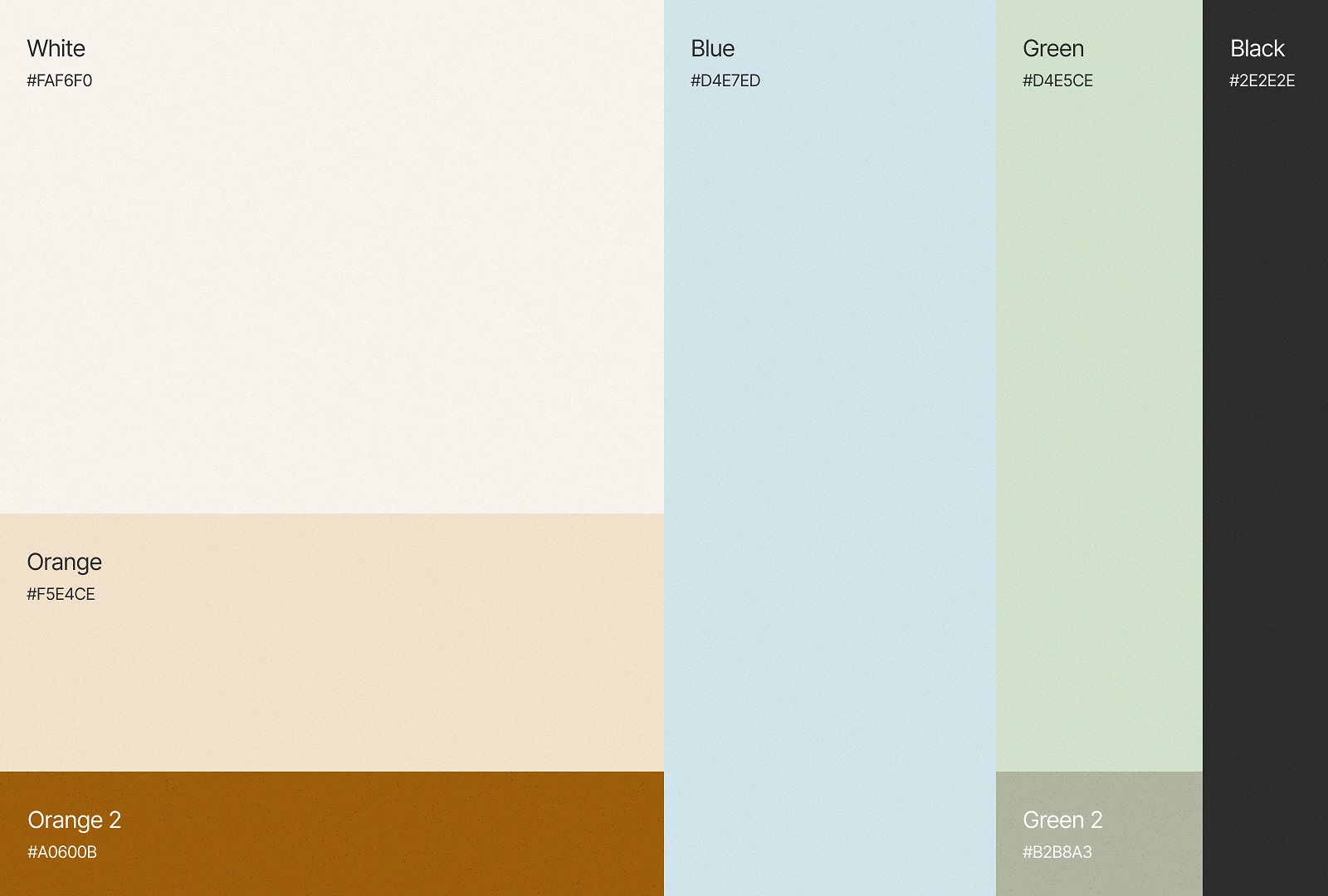
Color-wise, the palette leans earthy and soothing—beiges, browns, pale greens—with minimal black for contrast. No clinical coldness here. The visual tone says, “safe,” “calm,” and “modern.”
Development & Technical Implementation
The live site was built in Webflow, allowing the FluxWear team easy editing control post-launch while preserving the high-fidelity design. This also enabled fast prototyping and visual testing directly in the browser.
This FluxWear web design choice gave the client agility—from campaign updates to product variations, they can now roll out changes without external dev dependencies.
Responsive & Performance Considerations
The site performs across all devices, with thoughtful reflows of complex content blocks like:
- Embedded videos
- Scroll-triggered image reveals
- Data visualizations
Image assets were compressed and lazy-loaded for performance. Content sections were modular—cleanly stacking or collapsing depending on screen width. This wasn’t just about aesthetics; in responsive healthtech UX, clarity and speed equal trust.
Results & Learnings
What made this UI/UX health tech case study successful?
- Story-first layout—the site leads with emotion, then supports with science.
- Visual consistency with the product itself—SHIFT doesn’t just appear on the screen, it echoes through the site.
- Editorial tone—instead of shouting benefits, the copy unfolds like a conversation.
As SHIFT evolves (new models, new colors), we recommend further personalization—possibly allowing users to self-select conditions and get a tailored experience. A smart chatbot or symptom-based page variations could be a natural next step.
Key Takeaways for Designers & Product Teams
- Designing for health tech is designing for doubt. Users don’t know if the product will work. Your website has to answer their questions before they ask.
- Emotional clarity is UX. Tone, rhythm, and typography affect trust more than you think.
- A wearable product deserves a wearable interface. The UI should feel like part of the product—not a separate sales layer.
This healthtech web design case study proves that when UX meets empathy, even the most complex technologies can feel human.
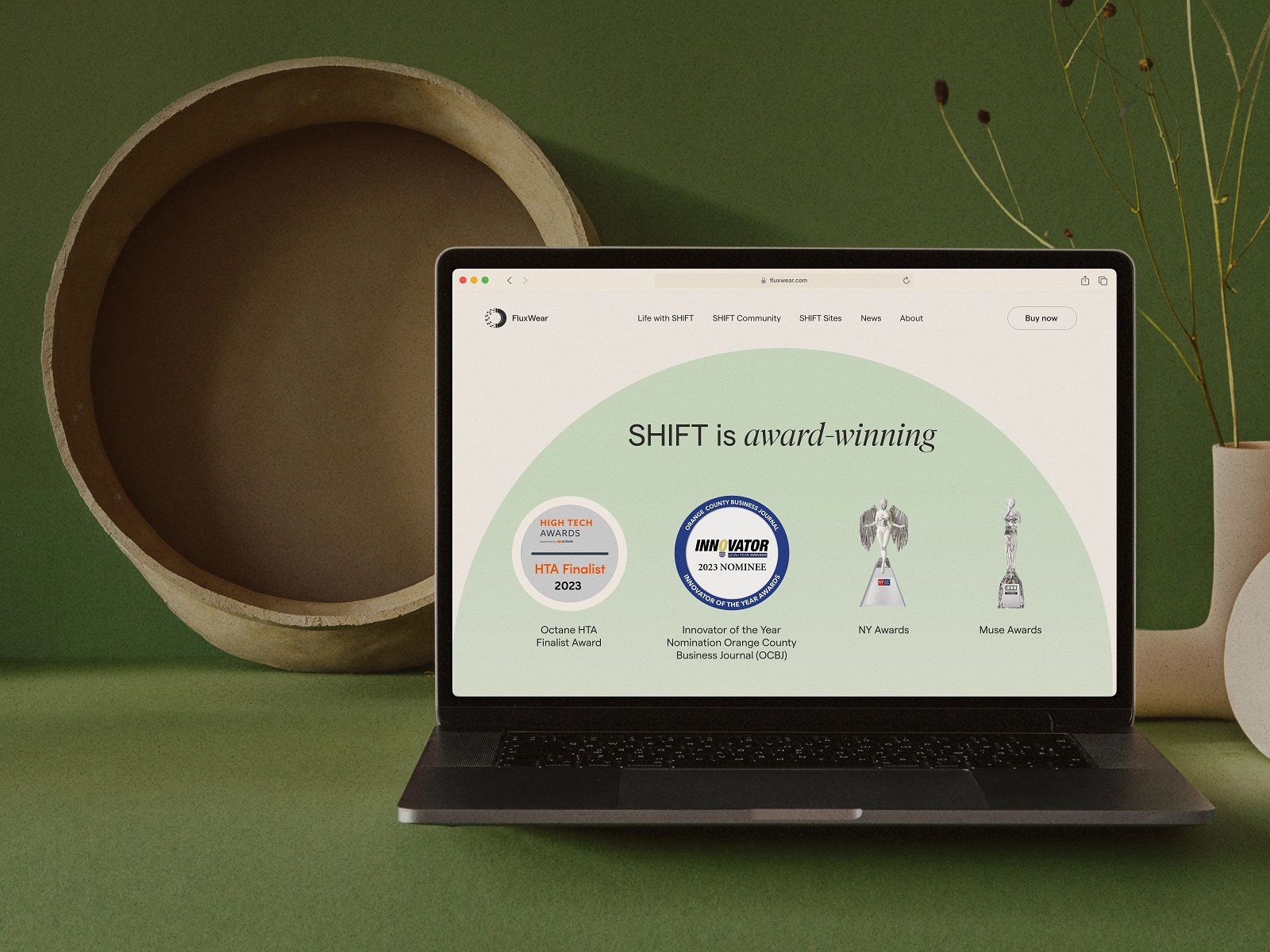
In 2023, FluxWear reached new levels of recognition. They got the Innovator of the Year Award nomination by the Orange County Business Journal (OCBJ) and the Octane HTA 2023 Finalist.
And in this video, you can watch the client’s review of our collaboration on this project (timecode 4:17)
Recommended Reading
Curious to explore more? Check out these related reads from our team:
Magma Math. Web Design for Educational Platform
Synthesized 2.0. Web Design for High-Quality Synthetic Data Platform
HotelCard. Brand Identity for Hotel Offers Service
Nibble Health. Identity and UX Design for Healthcare Fintech Service
Physica Magazine. Web Design and Graphics for Scientific Blog
CSConnect. Website Design for Immersive Experience Marketing Platform
ProAgenda. Identity and Website Design for Golf Management Service