
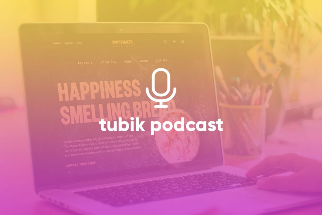
A web page is a system in motion. The moment you load a screen, something begins to move—not just pixels, but perception. Your eye scans, your thumb scrolls, your brain decides. The anatomy of a web page isn’t about decoration. It’s about how structure shapes behavior—what we notice, trust, click, and ignore.
This guide breaks down how the essential web page elements—from headers and buttons to breadcrumbs and sliders—guide user flow, reinforce meaning, and build trust. When placed with intention, these elements don’t just decorate a page. They direct it.
Because good website structure isn’t about what’s visible. It’s about what’s felt. It’s rhythm. Pacing. Weight. Timing. This is web page anatomy in action.
What Is Web Page Anatomy in UI/UX Design?
Web page anatomy refers to the structural system behind a web page’s user experience—the layout, flow, and behavior of its elements as they guide interaction, perception, and decision-making.
It’s not the visuals. It’s the logic beneath them.
While “layout” often implies fixed placement (boxes, columns, rows), anatomy is more dynamic. It considers how the eye moves, how the thumb scrolls, how decisions unfold. It’s the invisible scaffold that shapes first impressions and long-term trust.
Anatomy = Skeleton of Movement
A well-designed web page moves with the user. This movement is shaped by:
- Eye path – Where users look first, and where they go next.
- Scroll path – How vertical or horizontal motion reveals content and shifts attention.
- Decision zones – Areas where users pause, evaluate, and act (think: CTA sections, pricing tables, signup forms).
All of these are defined not just by layout, but by priority.
Why Page Structure Shapes User Behavior
A web page isn’t read like a book—it’s scanned, tapped, skimmed, and judged in seconds. Good website structure doesn’t fight that behavior. It works with it.
Let’s break down the key ways web page anatomy shapes how users behave, engage, and convert.
Visual Hierarchy & Eye Tracking
Visual hierarchy is the arrangement of elements by importance—using size, color, contrast, and position to guide the user’s eye along a deliberate path.
Most users don’t read. They scan.
Studies using eye-tracking show patterns like the F-pattern or Z-pattern, depending on the page’s content type. A strong hierarchy tells users: “Start here. Then go there. Now act.”
Design Tips:
- Use bold headers, larger type, and color contrast for priority elements.
- Keep secondary actions visually quieter.
- Align with natural reading direction (left-to-right for most languages).
Common mistake:
Overstyling everything equally—if all elements shout, nothing gets heard.
Scroll Momentum
Scroll momentum is the user’s perceived rhythm and motivation to keep moving down the page. Each scroll is a choice: continue or bounce. Strong page anatomy uses pacing—alternating between content blocks and visual “breathers”—to sustain motion.
Design Tips:
- Use whitespace and clear section breaks to prevent fatigue.
- Alternate dense information with lighter visuals or icons.
- Break long pages into scannable chunks with sticky anchors or TOCs.
Common mistake:
Wall-of-text layouts or motion overload (e.g., scroll-jacking) that break the natural rhythm.
Cognitive Load
Cognitive load refers to the mental effort required to understand and interact with content. A good web page structure minimizes this load, making complex tasks feel simple and intuitive.
Design Tips:
- Group related items together (Gestalt principle of proximity).
- Limit on-screen choices—3–5 per section is a sweet spot.
- Use clear labeling. Avoid ambiguous terms like “Explore” or “Discover.”
Common mistake:
Overloading a section with too many links, buttons, or visual distractions. Every added element is an added decision.
Trust Perception
Trust perception is the immediate feeling of reliability, safety, and credibility a user gets when landing on a page. It happens in milliseconds. Before they read your value prop. Before they scroll.
Structural cues that build trust:
- Clean, modern layout with grid alignment
- Visible contact info and footer navigation
- Secure-looking forms and buttons
- Consistent branding and micro-interactions
Design Tips:
- Use visual consistency: same spacing, fonts, and CTA styles.
- Reduce “dark patterns” or manipulative tricks—they kill credibility.
Common mistake:
Messy alignment, broken grids, or low-quality assets that instantly create doubt.
Micro-Conversion Logic
Micro-conversions are small actions that lead users closer to the main goal—like clicking “Learn More,” playing a video, or opening a pricing tab. Well-structured pages anticipate these actions and guide users toward them—without overwhelming or forcing the outcome.
Design Tips:
- Place CTAs next to meaning-rich content (e.g., after testimonials or feature lists).
- Use progress indicators for forms or onboarding flows.
- Make secondary actions visible, but less dominant.
Common mistake:
Pushing the main CTA too early, before the user has context or confidence to click.
14 Core Design Elements of a Web Page
Every web page is a choreography of parts—each element with a purpose, position, and rhythm. Below are the foundational web page elements that shape user behavior, guide decisions, and turn structure into experience.
Each one starts with a clear definition, then dives into its UX role, visual rhythm, and design guidance — including when it helps, when it hurts, and how to get it right.
1. Header—Orientation Layer
The header is the topmost section of a web page that provides orientation, navigation, and key access points (logo, menu, CTAs).
UX Role:
Acts as a compass—it anchors users, establishes brand identity, and enables fast decisions. On mobile, it’s also where thumb-friendly design matters most.
Visual Weight & Rhythm:
- High visual priority (users scan top-left to top-right first)
- Sticky headers aid long-page scrolls but must be slim
- Balance space: too heavy, and the content feels buried
When It Helps:
- Offers quick access to nav, search, language switch
- Builds consistency across pages (external UX patterns)
When It Hurts:
- Overstuffed with links or dropdown
- Overlapping content on scroll (especially mobile)
Shipping company website uses the header zone effectively: it includes a company logo in the left corner and the prominent contrast call-to-action button in the right corner, placing the links to core navigation in between. The header zone is clearly separated from the rest of the page by the horizontal line used as a visual divider.
Bennett Tea website uses a stylish and minimalist sticky header, with the brand element in the center, links to core pages in the left part, and a shopping cart button in the right corner.
2. CTA Button—Decision Trigger
A CTA (Call-to-Action) button prompts users to take a key step: buy, sign up, book, explore, etc.
UX Role:
It’s where passive viewing turns into active engagement. It must feel timely, visible, and trustworthy.
Visual Weight & Rhythm:
- High contrast with surroundings
- Consistent shape and style across page
- Proximity to relevant content boosts conversions
When It Helps:
- Next to testimonials, product features, forms
- After content that explains or reassures
When It Hurts:
- Too early in the flow
- Competing CTAs that fragment decision logic
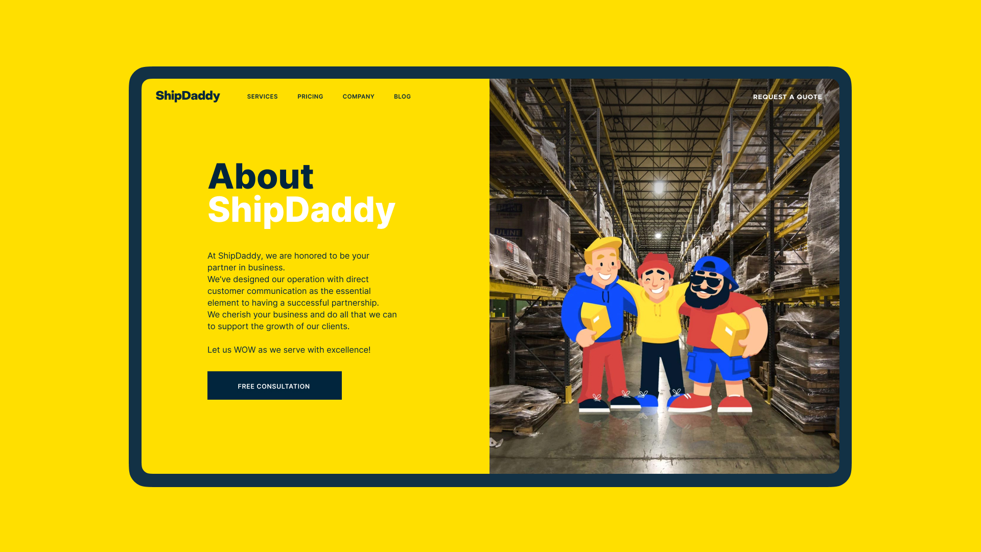
About page for ShipDaddy website is a good example of the call-to-action element instantly noticeable in the general webpage layout.
The web page for Mayple is formed of several sections and uses a set of consistent call-to-action buttons for each combining them effectively with the same CTA in the header, this way allowing visitors to move on from different points of their browsing the page.
3. Hero Section—Emotional Gate
The hero is the above-the-fold section that introduces the page with a bold visual, headline, and often a CTA.
UX Role:
Sets the tone. It’s a brand’s first impression and emotional handshake. This is where interest is won or lost in seconds.
Visual Weight & Rhythm:
- Bold typography and/or media
- Minimal distractions
- Scroll cue (like an arrow or animation) helps
When It Helps:
- When used to create mood or clarity at a glance
- With high-quality visuals or motion used with restraint
When It Hurts:
- Heavy media that slows load time
- Ambiguous or generic headlines
Options for a hero section design on a landing page design for Uni fintech service
Hero section for the home page on the Energizou website catches attention and impresses visitors with a beautiful animated illustration.
4. Navigation Menu—Choice Architecture
A menu is a structured set of navigational links that help users move across different sections or pages.
UX Role:
Enables clarity and speed. It mirrors the site’s mental model and helps users act without friction.
Visual Weight & Rhythm:
- Moderate weight—should feel available, not dominant
- Grouped logically (3–7 links ideally)
- Adapts to screen size
When It Helps:
- Clear labels, grouped categories, sticky nav on scroll
- Mega-menus for large catalogs or enterprise sites
When It Hurts:
- Dropdowns stacked within dropdowns
- Hidden menus on desktop
Interactions with a menu on the event booking website
The e-commerce website selling glasses uses the vertical menu with primary navigation in the top left corner of the page.
The book festival website uses a hamburger menu opening the access main pages.
5. Search—Intent Shortcut
A search bar is an input field that lets users type queries to find specific content or products.
UX Role:
It bypasses exploration and delivers answers. Especially vital for e-commerce, knowledge bases, or media-rich platforms.
Visual Weight & Rhythm:
- Moderate visibility
- Ideally top-right or top-center
- Instant feedback (autocomplete, suggestions) boosts use
When It Helps:
- On large websites with 50+ pages or complex catalogs
- Where users know what they want (e.g., product name)
When It Hurts:
- When hidden behind an icon or non-functional
- When zero-result pages offer no fallback
The booking website features the form for the advanced search in the above-the-fold area of the home page.
6. Breadcrumbs—Spatial Awareness
Breadcrumbs are horizontal navigational links that show a user’s position within the site hierarchy.
UX Role:
They reduce confusion, improve findability, and offer secondary navigation paths.
Visual Weight & Rhythm:
- Light visual touch (small text, thin spacing)
- Horizontal, ideally just under the header or hero
- Avoid visual clutter or over-nesting
When It Helps:
- On multi-level e-commerce or blogs
- When users land deep via search
When It Hurts:
- Flat websites with few levels
- When structure is inconsistent and breadcrumbs mislead
The product page on the e-commerce website uses a breadcrumb trail as a secondary level of navigation.
7. Forms—Trust Interface
Forms are input-based UI blocks that collect user data—email signup, contact, checkout, onboarding.
UX Role:
They’re where users talk back. Every field is a friction point—or a trust signal.
Visual Weight & Rhythm:
- Clear visual grouping
- Logical flow (left to right, top to bottom)
- Progress bars for long forms
When It Helps:
- Simple, fast interaction flows
- Field autofill, input masks, and validation
When It Hurts:
- Overlong forms, bad mobile UX, confusing errors
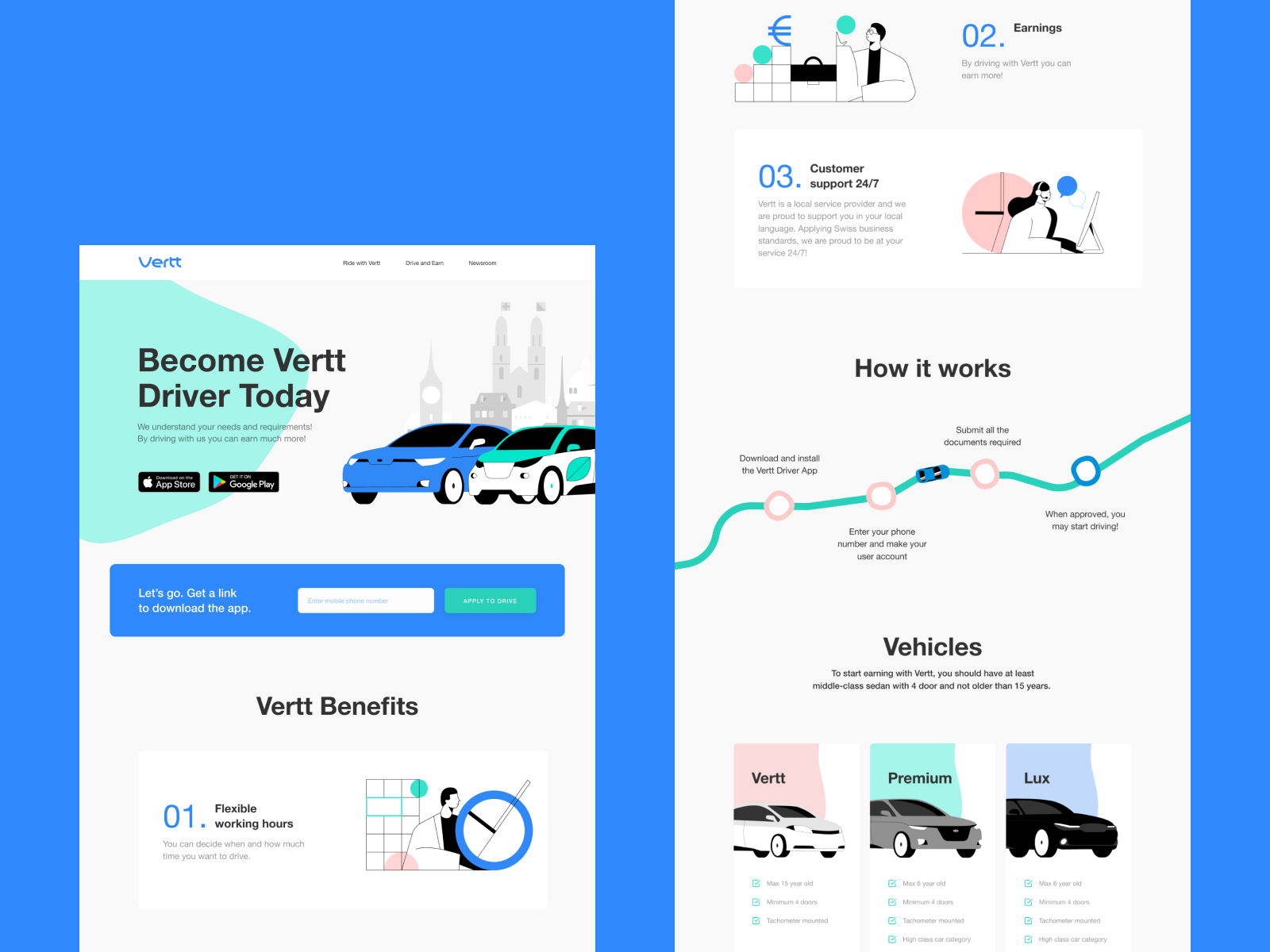
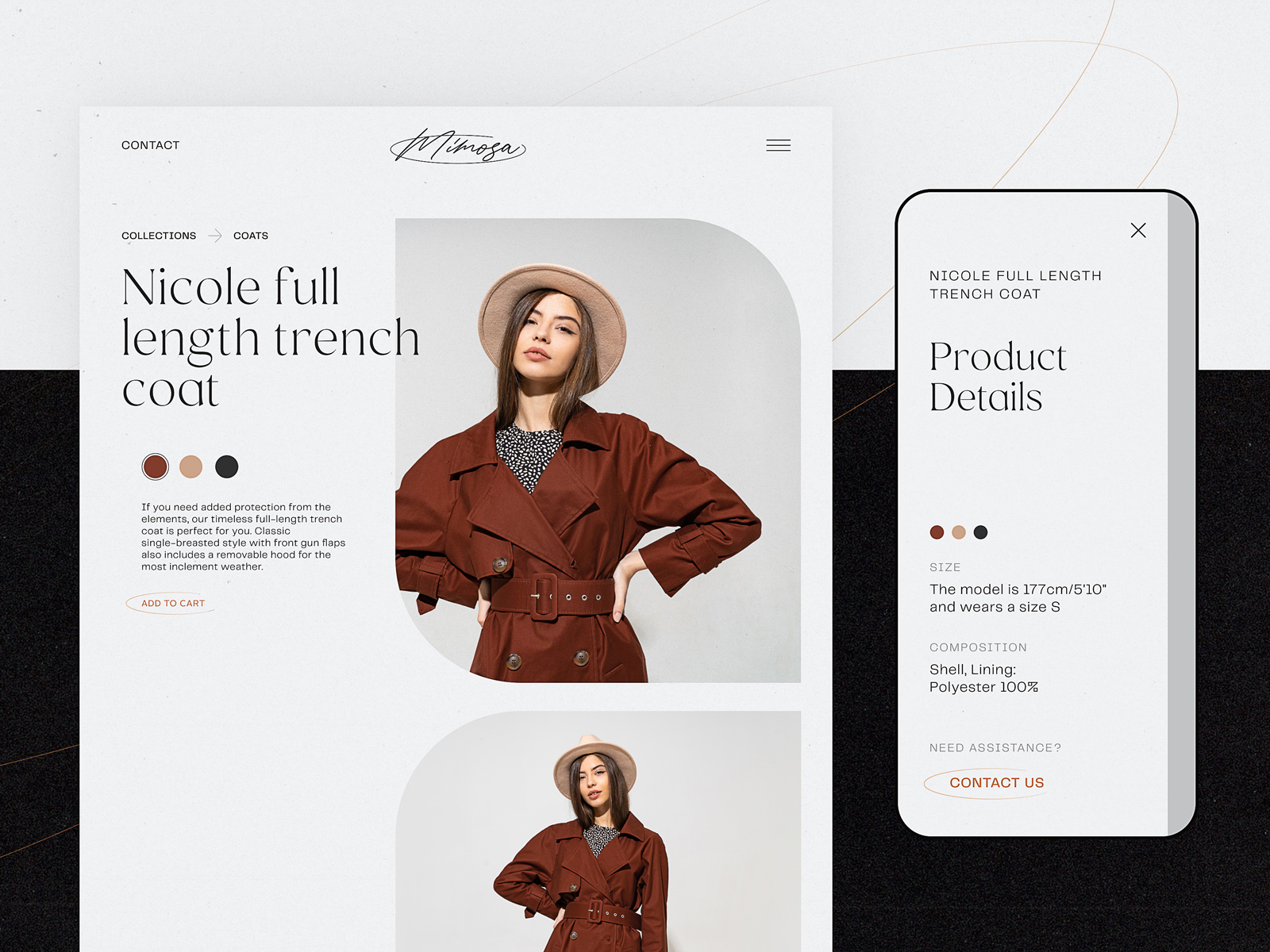
The landing page for Vertt features a simple and visually defined form, allowing visitors to leave their phone numbers and apply for a drive.
This page of the ecotourism website features a contact form with which visitors can tune their search.
8. Cards—Scan Language
Cards are self-contained visual blocks that group related content: product previews, blog posts, pricing options.
UX Role:
They simplify scanning, comparison, and modular content layout. Cards create structure without boxes.
Visual Weight & Rhythm:
- Equal dimensions per row
- Hover states or shadows for interactivity
- Scroll-friendly on mobile (carousel or stacked)
When It Helps:
- In product grids, pricing plans, blog feeds
- With imagery or icon + headline structure
When It Hurts:
- Inconsistent card sizing
- Overcrowded or overstyled interiors
The Chinese restaurant website uses an irregular grid of cards to present the menu of the restaurant.
Art Institute blog uses ultra-minimalistic cards, separated only by negative space but organized clearly to be distinguished.
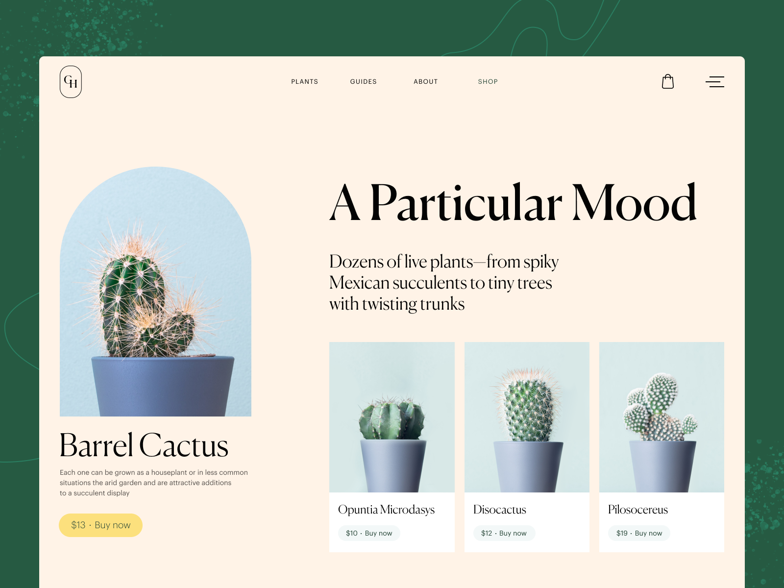
On the plant shop website, cards help to organize the options of related items.
9. Video—Motion Accent
A video is a media element that uses motion to demonstrate, explain, or evoke emotion.
UX Role:
Brings life, builds trust, and delivers clarity—especially for complex tools or emotional storytelling.
Visual Weight & Rhythm:
- Heavy element—should be balanced
- Autoplay muted, with visible controls
- Loop vs. play-on-click depends on purpose
When It Helps:
- In product demos, testimonials, background loops
- Where text can’t explain the feeling
When It Hurts:
- Poor compression, autoplay with sound, poor loading
The website of the service that organizes camping holidays uses video as an atmospheric visual hook in the hero section, setting the needed atmosphere in split seconds.
10. Progress Indicators—Patience Logic
Progress indicators show users how far they’ve come in a process (e.g., reading, filling a form).
UX Role:
They make time feel shorter. By revealing completion, they build motivation.
Visual Weight & Rhythm:
- Thin bars or labeled steps
- High contrast but unobtrusive
- Scroll or input-based triggers
When It Helps:
- In long reads, onboarding, multi-step forms
- Where completion feels rewarding
When It Hurts:
- When inaccurate or buggy
- Overused in short content
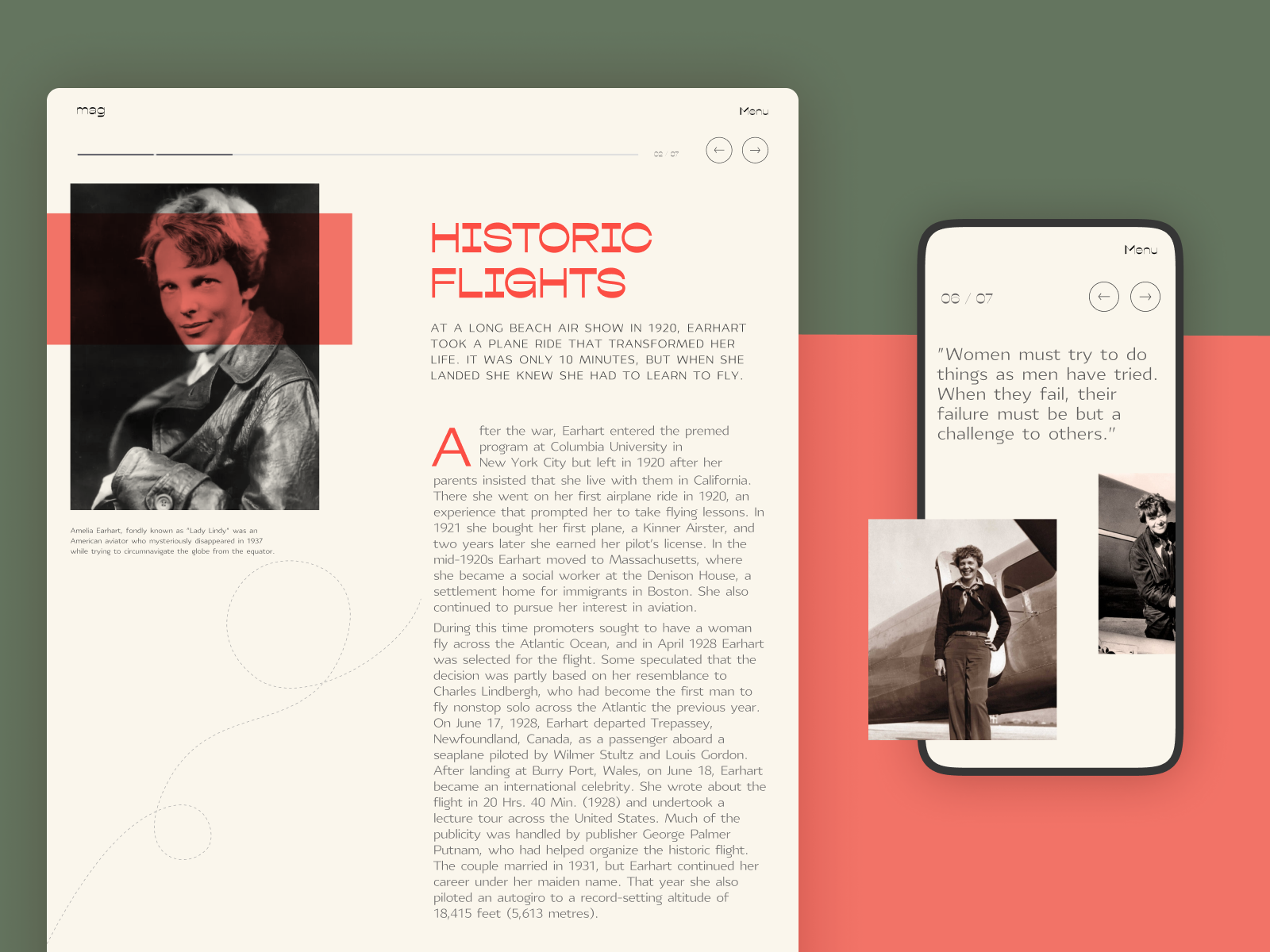
The article page on the website devoted to famous women in history uses the progress indicator in the top part of the page to help readers understand their current position and the general amount of content ahead.
11. Sliders—Controlled Motion
Sliders rotate content within a fixed frame, allowing users to swipe or wait for timed transitions.
UX Role:
They condense space and add movement—but risk distraction or blindness if overused.
Visual Weight & Rhythm:
- Medium visual priority
- Manual control is key
- Avoid infinite autoplay on mobile
When It Helps:
- For e-commerce product variations, testimonials, or before/after views
- Where space is tight but content is dynamic
When It Hurts:
- Homepage hero sliders (banner blindness)
- Slow load, mobile UX bugs
The original slider for the concept of a website for the designer’s portfolio
12. Tags/Categories—Lateral Discovery
Tags and categories classify content, making it discoverable via filters, links, or taxonomy.
UX Role:
They power related content, improve search UX, and aid in content exploration.
Visual Weight & Rhythm:
- Low weight (chips or pill-style labels)
- Uniform spacing, non-intrusive
- Clickable with subtle hover feedback
When It Helps:
- In blogs, portfolios, and CMS-based pages
- With auto-sorting or filtering features
When It Hurts:
- Overused (tag clouds, cluttered UIs)
- Vague or duplicate categories
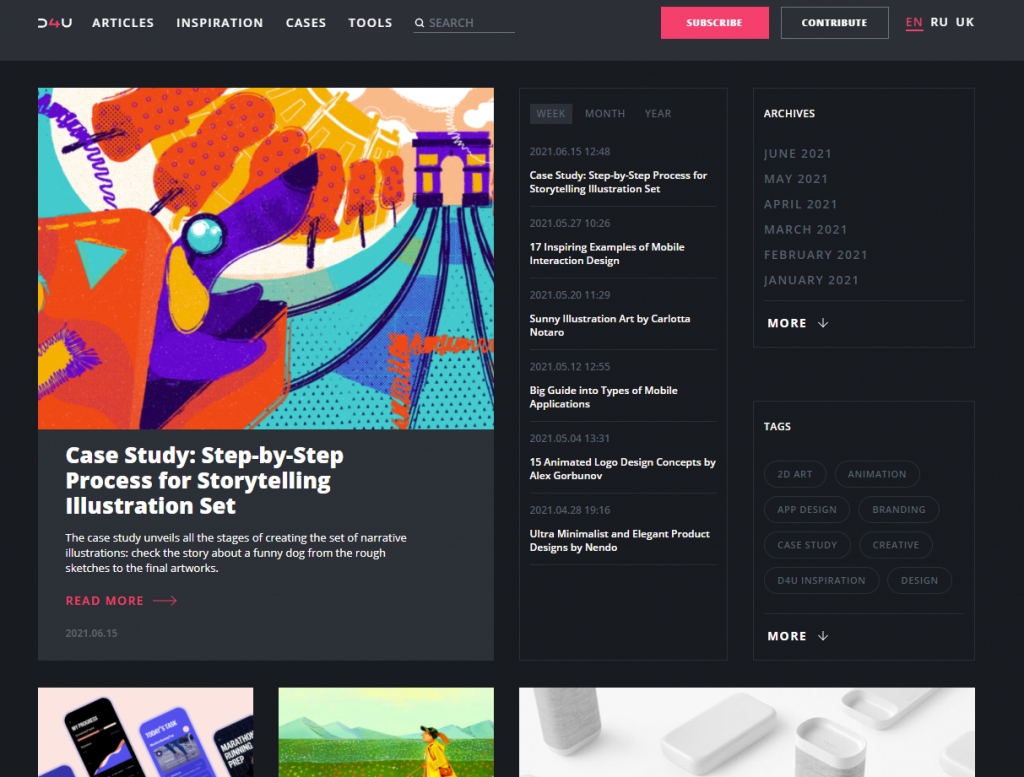
Design4Users blog uses tags for faster navigation not only inside the articles but also on the home page.
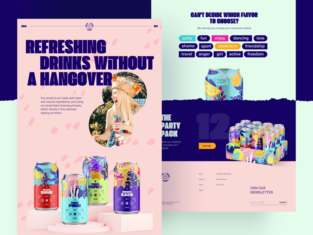
The bright and playful website concept for the brand of party drinks uses interactive tags to let users tune their choice of the drink they want
13. Footer—Closure & Trust
The footer is the section at the bottom of the page that provides secondary navigation, contact details, and support links.
UX Role:
It’s the user’s last stop—or safety net. It offers reassurance, resources, and next steps.
Visual Weight & Rhythm:
- Dense but low contrast
- Structured columns or clean stacks
- Visual echo of the header
When It Helps:
- On long-scroll pages, ecommerce, blogs
- Where users may need support or legal info
When It Hurts:
- Unstructured lists, bad mobile stacking
- Heavy forms or popups that delay scrolling
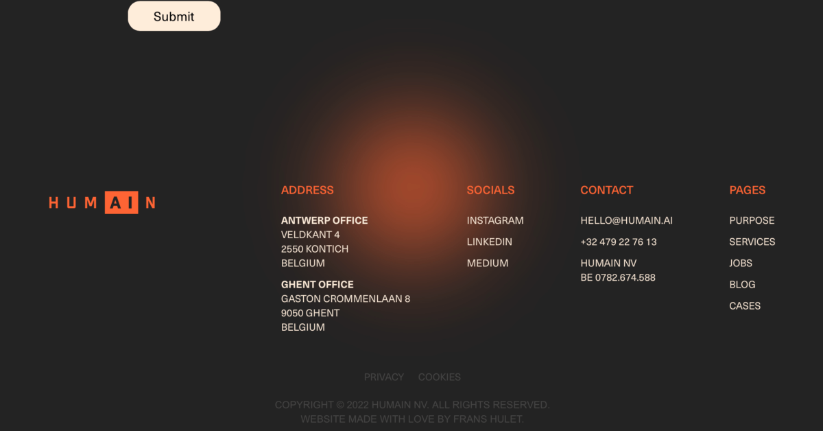
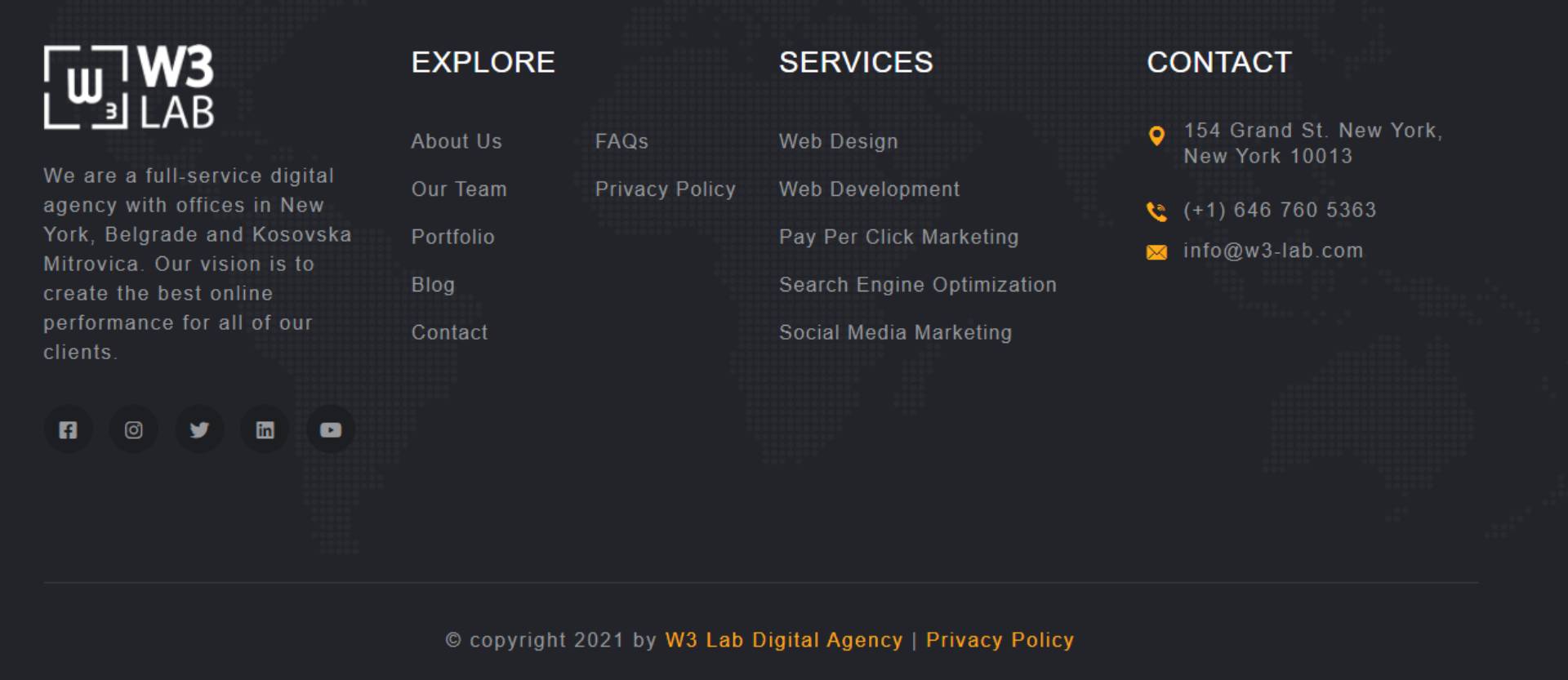
Several footer examples on modern websites
14. Favicon—Memory Anchor
A favicon is the small icon that appears in browser tabs, bookmarks, and mobile shortcuts.
UX Role:
It’s a micro-branding element that builds familiarity and helps users recognize your site across tabs.
Visual Weight & Rhythm:
- Visually tiny, but high repetition
- Must remain readable at 16×16 pixels
- Use strong color and shape contrast
When It Helps:
- In tab-switching, bookmarks, mobile homescreens
- When reduced to a recognizable symbol
When It Hurts:
- Overcomplicated icons, illegible shapes, or missing favicon
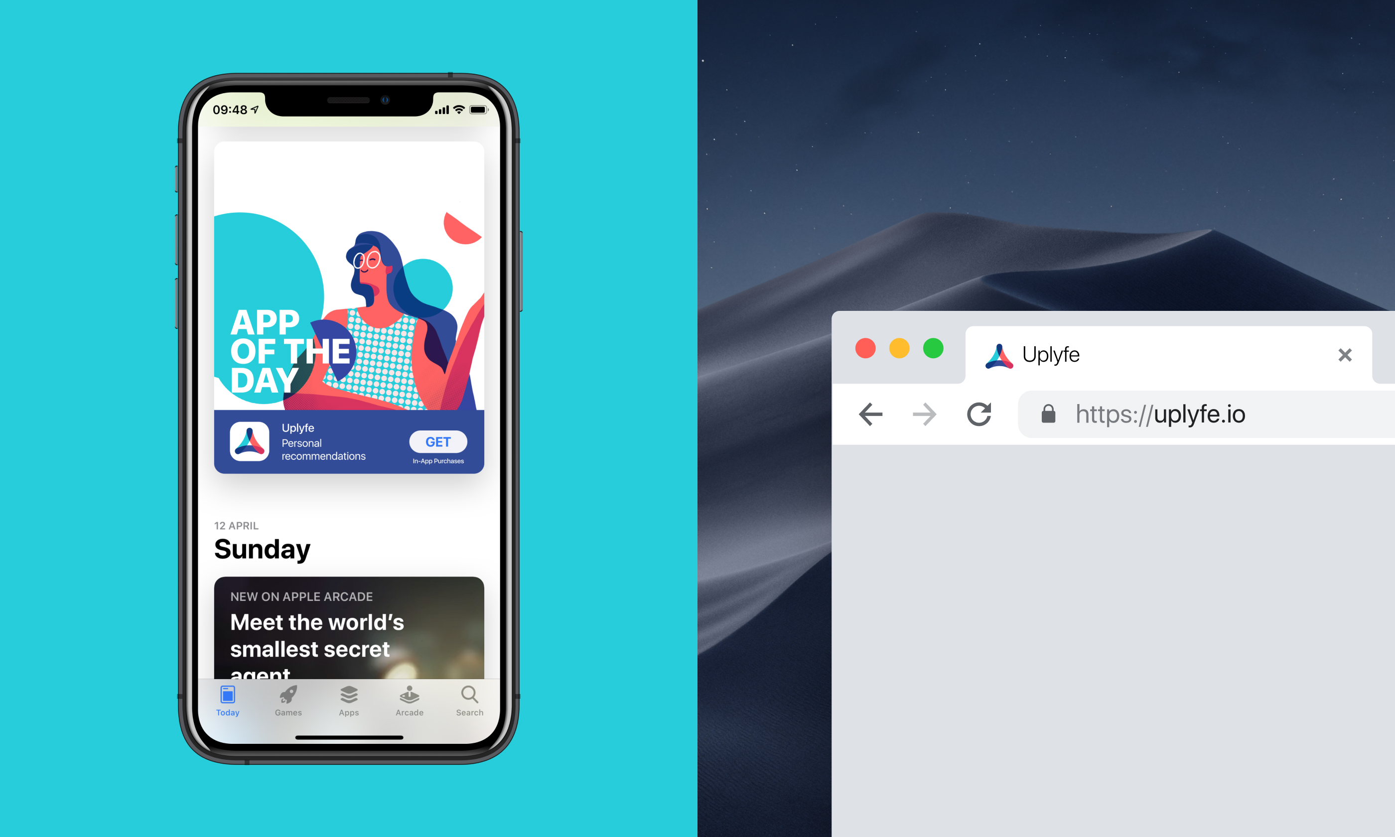
Favicon design for Uplyfe landing page
Page Anatomy by Website Type
Not all websites are built the same—and neither is their page anatomy. Different site types prioritize different flows, elements, and pacing. Below, we break down how core web page elements shift based on function and audience.
SaaS Websites
Focus: Education, trial conversion, and product trust
Structural Priorities:
- Hero with clear value prop + CTA (“Try Free”)
- Demo video or animated UI in hero or second section
- Feature cards with icons and short blurbs
- Social proof (logos, testimonials, reviews)
- Pricing table with toggle options (monthly/yearly)
Essential Elements:
- CTA buttons (repeated, scroll-linked)
- Forms with minimal fields
- Sticky nav with “Log in” and “Try Free”
- Video blocks for onboarding or use case demos
Design Mistake to Avoid:
Cluttered navs with too many links or product jargon. Focus on clarity.
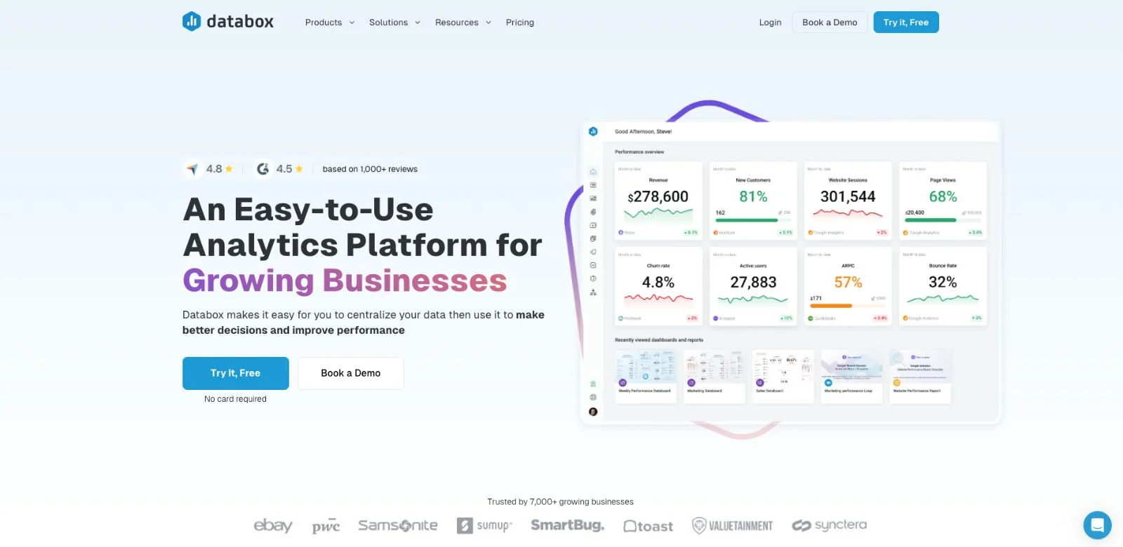
Databox is a great modern example of a SaaS website
E-commerce Websites
Focus: Product discovery, trust, and fast checkout
Structural Priorities:
- Search bar with autocomplete and filters
- Product cards in grid or slider
- Mega menu for product categories
- Breadcrumbs for category clarity
- Cart preview / sticky checkout CTA
Essential Elements:
- Trust indicators (badges, ratings, reviews)
- Filters and sorting in left sidebar or top bar
- Wishlist or save functionality
- Checkout form optimized for mobile
Design Mistake to Avoid:
Hero sliders with irrelevant promotions that distract from product focus.
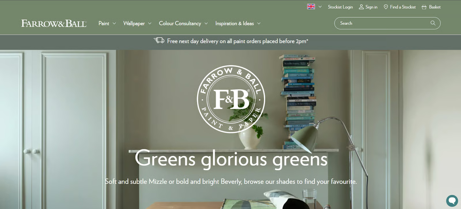
Farrow & Ball, a UK-based manufacturer of luxury paint and wallpaper, has a great website design
Landing Pages
Focus: Single action—signup, download, register, etc.
Structural Priorities:
- Bold hero with 1 CTA, 1 message
- Visual rhythm (scroll momentum is key)
- Sectioned persuasion: problem → solution → proof → CTA
- Form with minimal friction
Essential Elements:
- Sticky CTA or jump link
- Testimonials or case studies
- Visual or product mockups
- Scroll progress indicator
Design Mistake to Avoid:
Multiple CTAs competing for attention. Stay focused on one thing.
Griflan agency landing page design
Blogs / Media Websites
Focus: Content discoverability and lateral exploration
Structural Priorities:
- Grid of article cards
- Tag/category navigation
- Pagination or infinite scroll
- Sticky TOC on long-form posts
- Footer with related articles
Essential Elements:
- Author + publish date metadata
- Share buttons
- Embedded media (video, quote blocks, etc.)
- Newsletter signup in footer or between articles
Design Mistake to Avoid:
Overloaded sidebars or too many pop-ups. They kill reading flow.
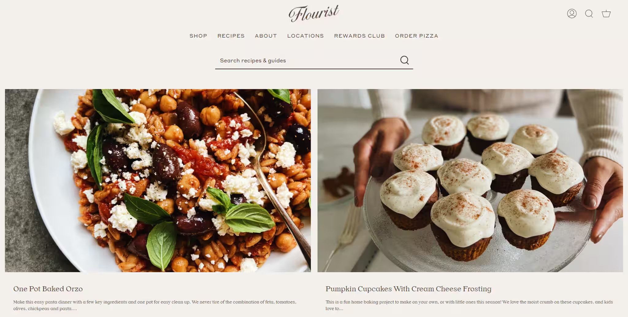
Flourist, modern food blog example
Mobile-First Websites
Focus: Thumb-friendly interaction and streamlined content
Structural Priorities:
- Stacked layout with generous spacing
- Sticky header with hamburger + CTA
- Carousel-style cards or sliders
- Tap-sized buttons and inputs
- Footer nav (as primary or secondary menu)
Essential Elements:
- Mobile-optimized forms (keyboard type logic)
- Lazy-loaded images or video
- Clear scroll cues (especially on long pages)
Design Mistake to Avoid:
Desktop-first design scaled down—results in cramped layouts and missed interactions.
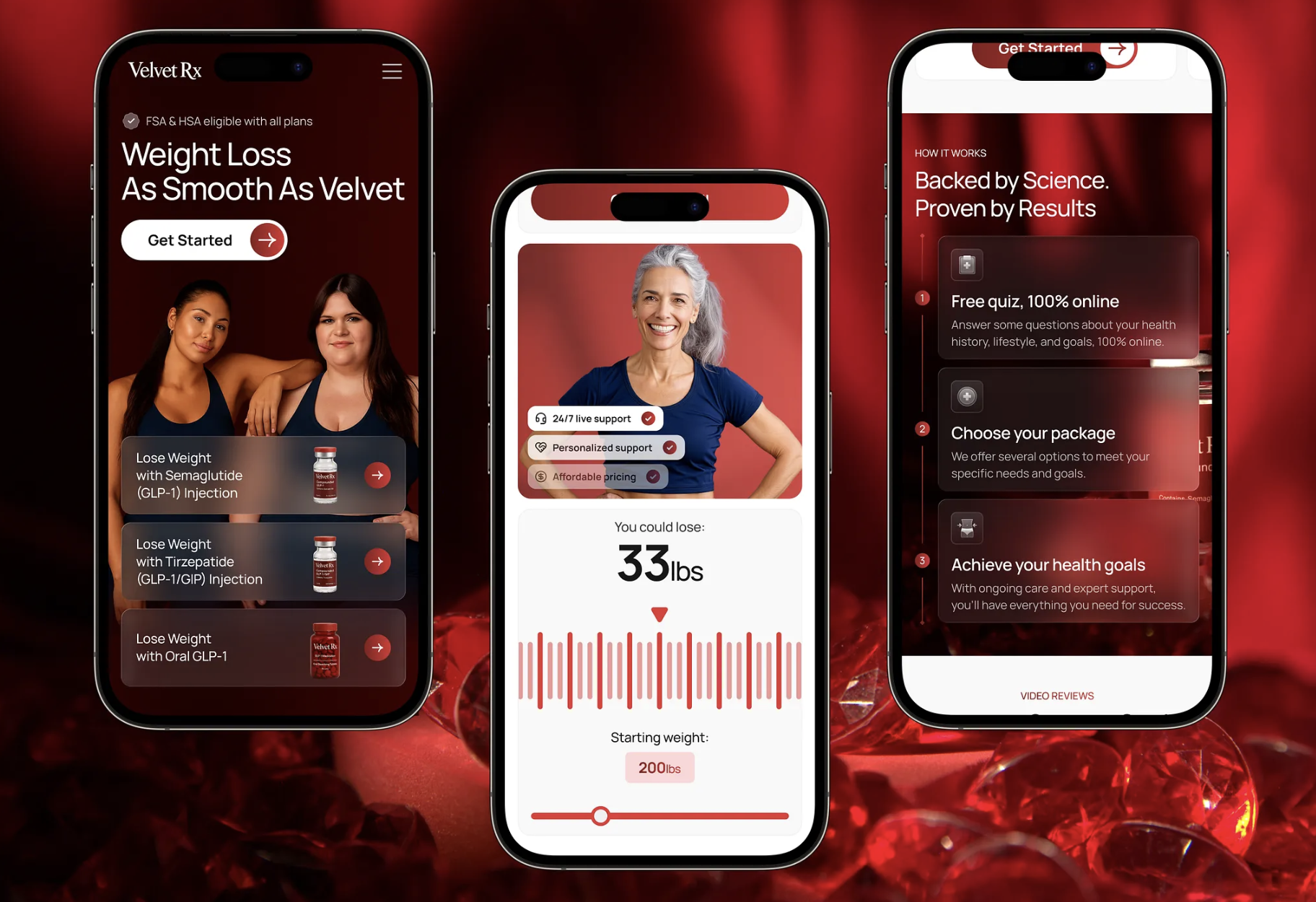
Modern wellness website design for Velvet Rx
Common Design Mistakes in Page Structure
Even well-designed websites fail when web page elements are misused, overdone, or misplaced. Below are the most common structural mistakes we see—and how to avoid them.
Too Many CTAs
Mistake:
Throwing multiple primary CTAs (“Buy Now,” “Subscribe,” “Start Free Trial,” “Learn More”) into every section—hoping one sticks.
Why It Hurts:
It fragments the user journey and adds decision fatigue. Instead of guiding action, it overwhelms it.
Fix:
Choose one primary CTA per screen or scroll section. If needed, place secondary actions with lower visual weight (e.g., text links or ghost buttons).
Hidden Navigation
Mistake:
Burying the menu under hamburger icons (on desktop!) or relying on hover-only dropdowns.
Why It Hurts:
Users can’t act if they don’t see their options. Hidden navigation delays orientation and adds friction, especially for first-time visitors.
Fix:
Make top-level paths visible—especially on desktop. Only use hidden menus on mobile or when space is truly limited.
Missing Breadcrumbs
Mistake:
Ignoring breadcrumbs on deep or multi-level content platforms (e.g., ecommerce, blogs, directories).
Why It Hurts:
Users lose their place—and bounce. Without breadcrumbs, backtracking becomes trial and error.
Fix:
Add a light, horizontal breadcrumb above the title or hero. Ensure it updates dynamically and matches site hierarchy.
No Internal Linking
Mistake:
Pages that don’t connect—every screen is a dead end.
Why It Hurts:
SEO suffers. User engagement drops. Bounce rates climb.
Fix:
Link related blog posts, product features, or case studies within content. Use tags, sidebars, or “related reads” in the footer or post-end.
Overuse of Sliders
Mistake:
Homepage sliders that auto-scroll through content—especially at the top of the page.
Why It Hurts:
They’re ignored (banner blindness), slow down load time, and bury your best content in motion.
Fix:
Use sliders sparingly—only when variation is essential (product views, testimonial rotations). Always provide manual controls.
Heavy Hero Images
Mistake:
Full-screen hero banners with uncompressed media, oversized images, or auto-playing video.
Why It Hurts:
Slows down page load (especially on mobile) and pushes valuable content below the fold.
Fix:
Compress images. Use lazy loading. Test LCP (Largest Contentful Paint) to monitor impact. Only use video if it truly adds value.
FAQ
What are the main elements of a web page?
The main web page elements include the header, navigation menu, hero section, CTA buttons, search bar, breadcrumbs, content blocks (like cards and sliders), forms, video, progress indicators, tags, footer, and favicon. Each plays a structural role in guiding user flow and shaping perception.
What is the most important part of a web page?
It depends on the goal, but usually, the hero section and CTA button carry the most weight. The hero grabs attention, while the CTA drives action. Without clarity at the top and a clear next step, users bounce or hesitate.
What elements affect SEO the most?
The elements that most impact SEO are:
- Header structure (H1–H3s) for semantic clarity
- Internal linking (menus, breadcrumbs, tags)
- Fast-loading media (optimized images, video)
- Content hierarchy that matches user intent
Also: avoid sliders that hide keyword-rich content and use alt tags for all visuals.
What should every website include?
At minimum, every website should include:
- A clear header with navigation
- A defined value proposition (usually in the hero)
- Accessible CTAs and forms
- A footer with trust and support info
- Mobile-responsive design for all core elements
These are the backbone of usable, findable, and high-converting pages.
What is above-the-fold content?
Above-the-fold content is what users see before they scroll. It includes the hero section, headline, intro copy, and often a CTA. It sets the tone, builds trust, and signals what the page is about. If it fails, users may never scroll further—which is why it matters so much.
Useful Articles
More pieces on usability, behavior, and the quiet art of making things feel right:
5 Basic Types of Images for Web Content
UX Design: How to Make Web Interface Scannable
How to Design Effective Search
Web Design: 16 Basic Types of Web Pages
Take My Money: UX Practices on Product Page Design
Directional Cues in User Interfaces
Negative Space in Design: Tips and Best Practices
Error Screens and Messages: UX Design Practices
From Zero to Hero: Look at Hero Images in Web Design
