This case study unveils another bright and tasty graphic design project on a food branding theme. In it, we worked on the concept of the extended set of packaging design and marketing graphics employing vibrant custom illustrations for the vegetable producer brand.
The project was carried out by tubik designers Arthur Avakyan and Yaroslava Yatsuba.
The design process supposed several creative stages:
- finding a general identity design approach and, based on it, developing the logo design
- creating a consistent set of illustrations and graphic elements that would fit various design goals
- working out the packaging design system considering the different types of products the brand produces
- developing a stylistic approach for the marketing visuals that would help to strengthen the brand recognizability, memorability, and communication
The color palette for the visual identity shares summer vibes and is based on sunny, warm shades of natural vegetable colors. Combined with black and white for the background and text parts, the color set becomes a flexible tool for creating emotional and efficient graphic design for various marketing design needs.
The logo design presents a combination mark with a typographic part featuring the brand name and the company establishment year and a symbol part resembling a lovely growing leaf; this combination of elements and their style together create a friendly and cheerful look. The logo can be efficiently used in color and monochromatic versions.
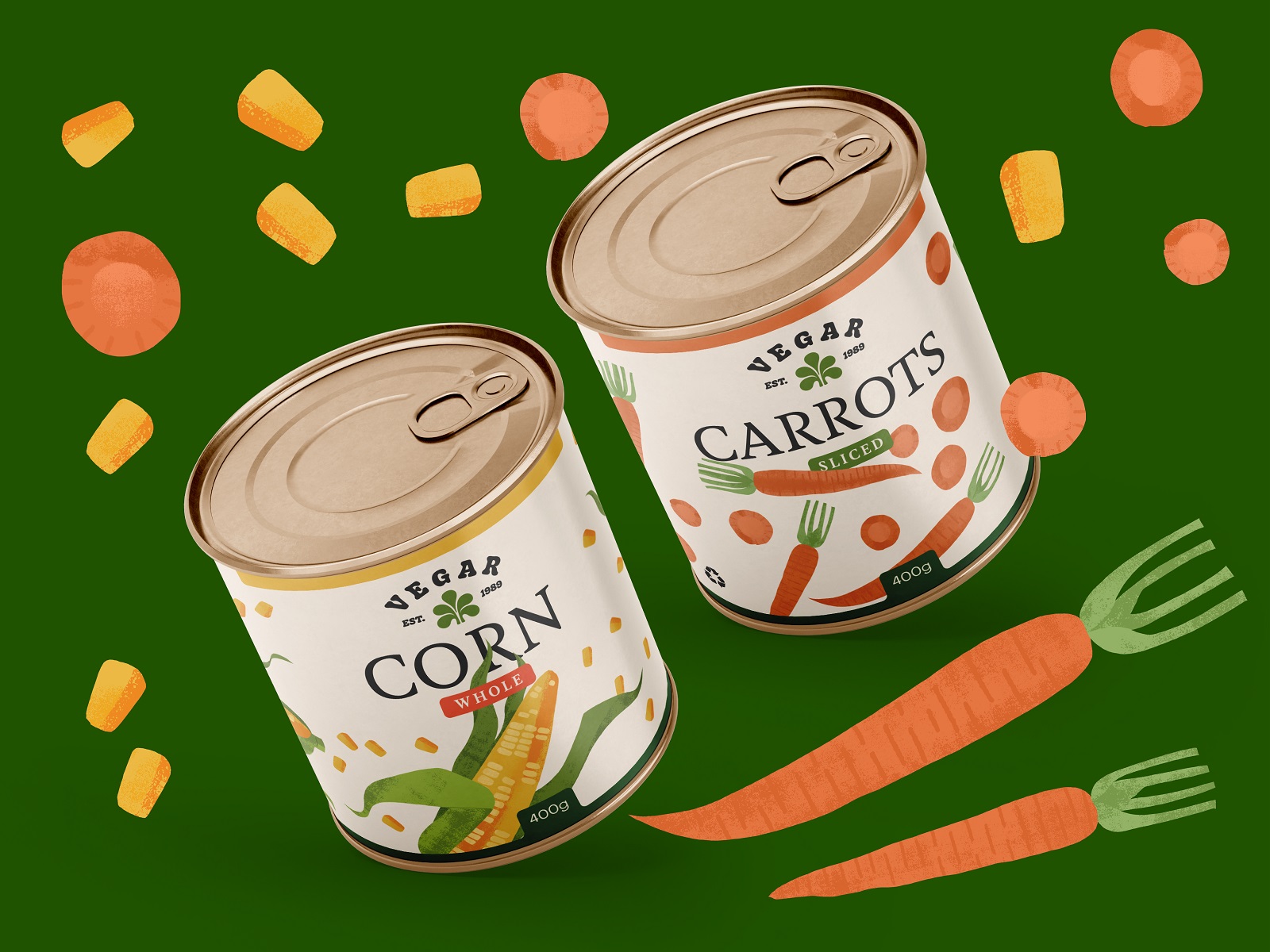
When the general visual identity approach was decided upon, the next, most diverse stage of the project was working on packaging design. This included considering various types of packaging for canned vegetables, frozen vegetables, and freshly picked vegetables and turning the creative outcome into one consistent design system uniting all these various brand products.
Here’s a glance at the cans’ design: attractive and bright to draw buyers’ attention from the store shelves or in a catalog of an e-commerce website, they are also informative and skimmable to quickly learn all the needed knowledge about the product.
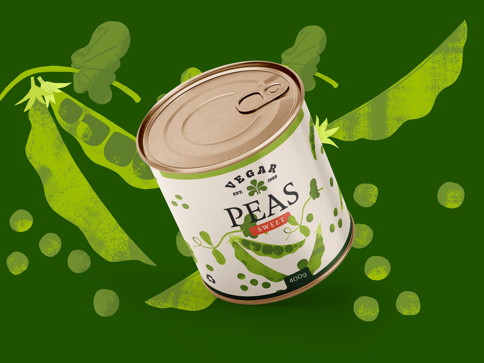
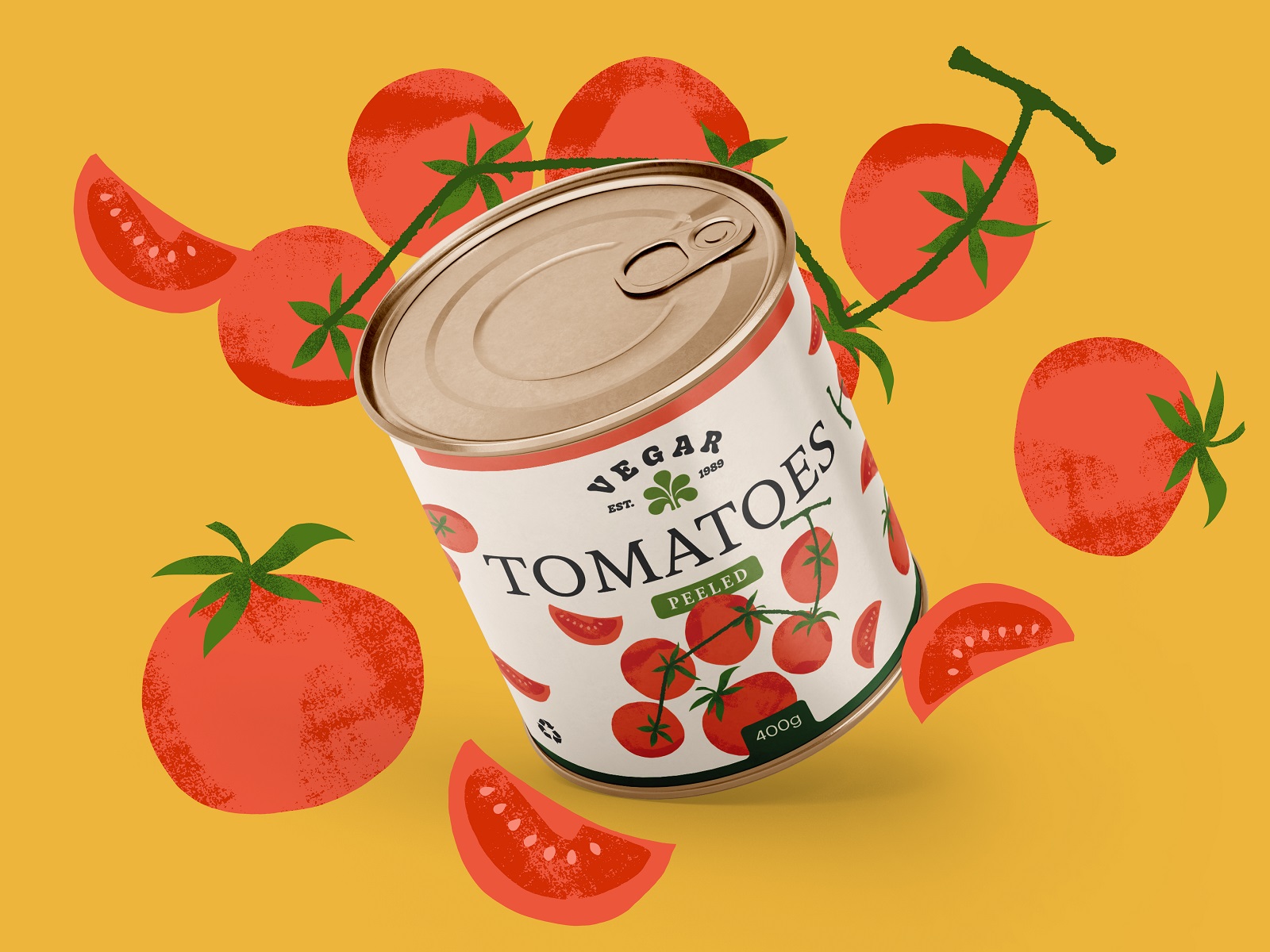
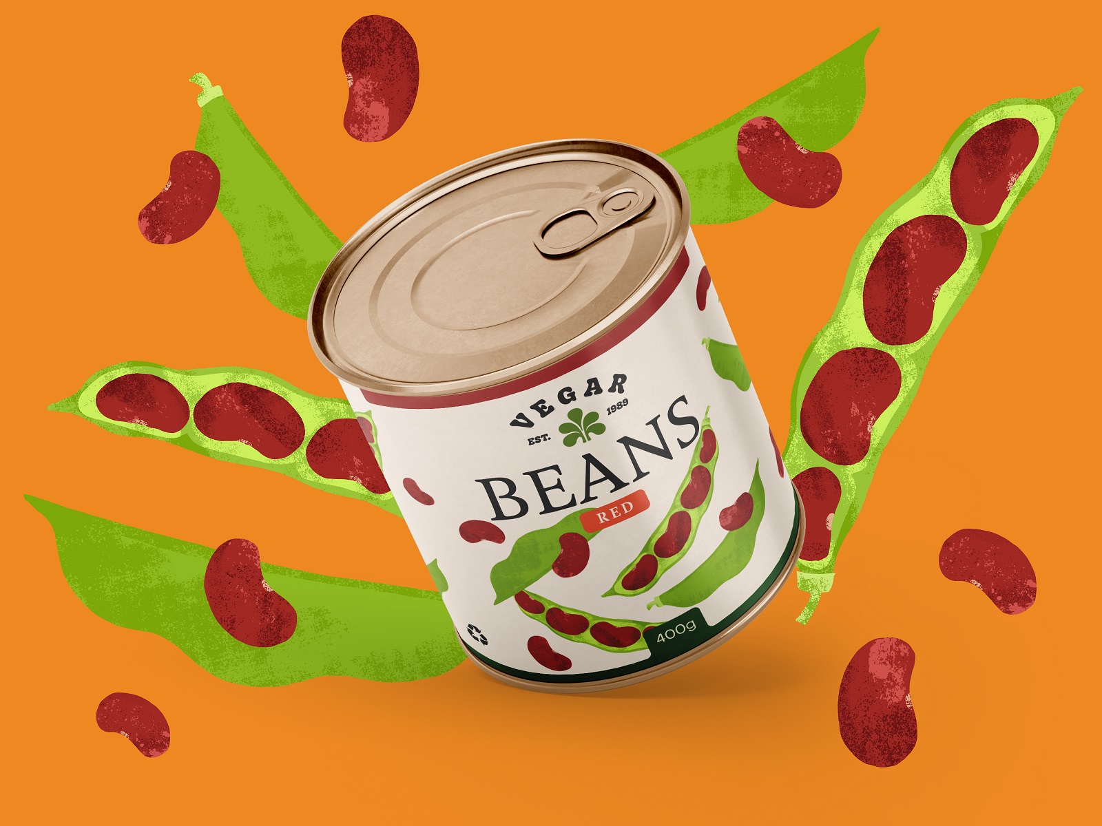
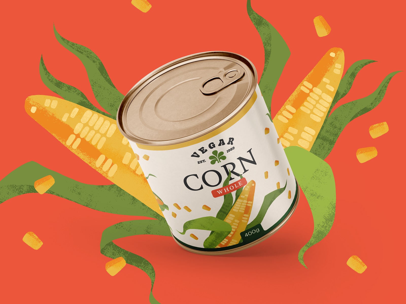
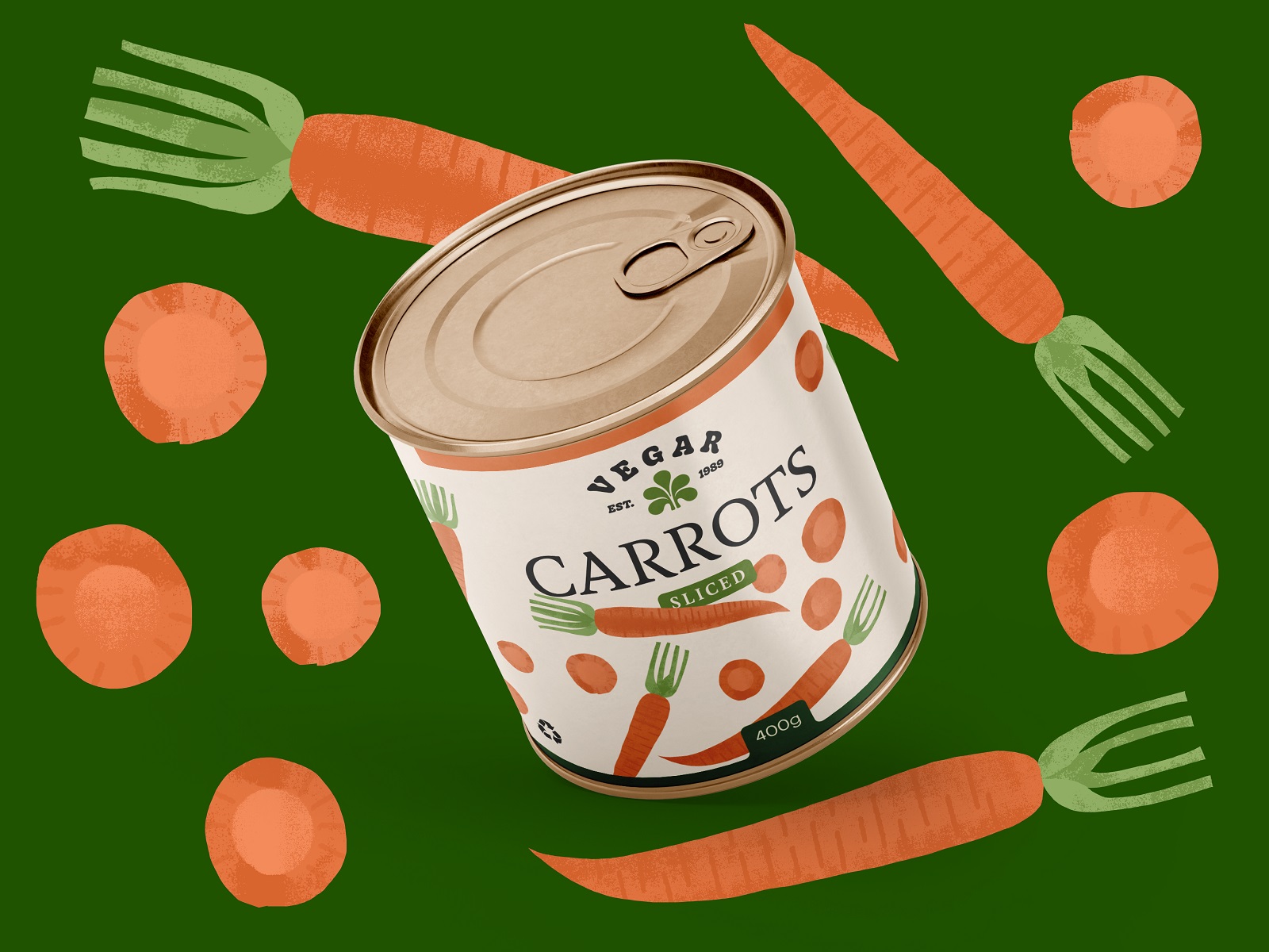
And here’s a closer look at the can packaging labels.
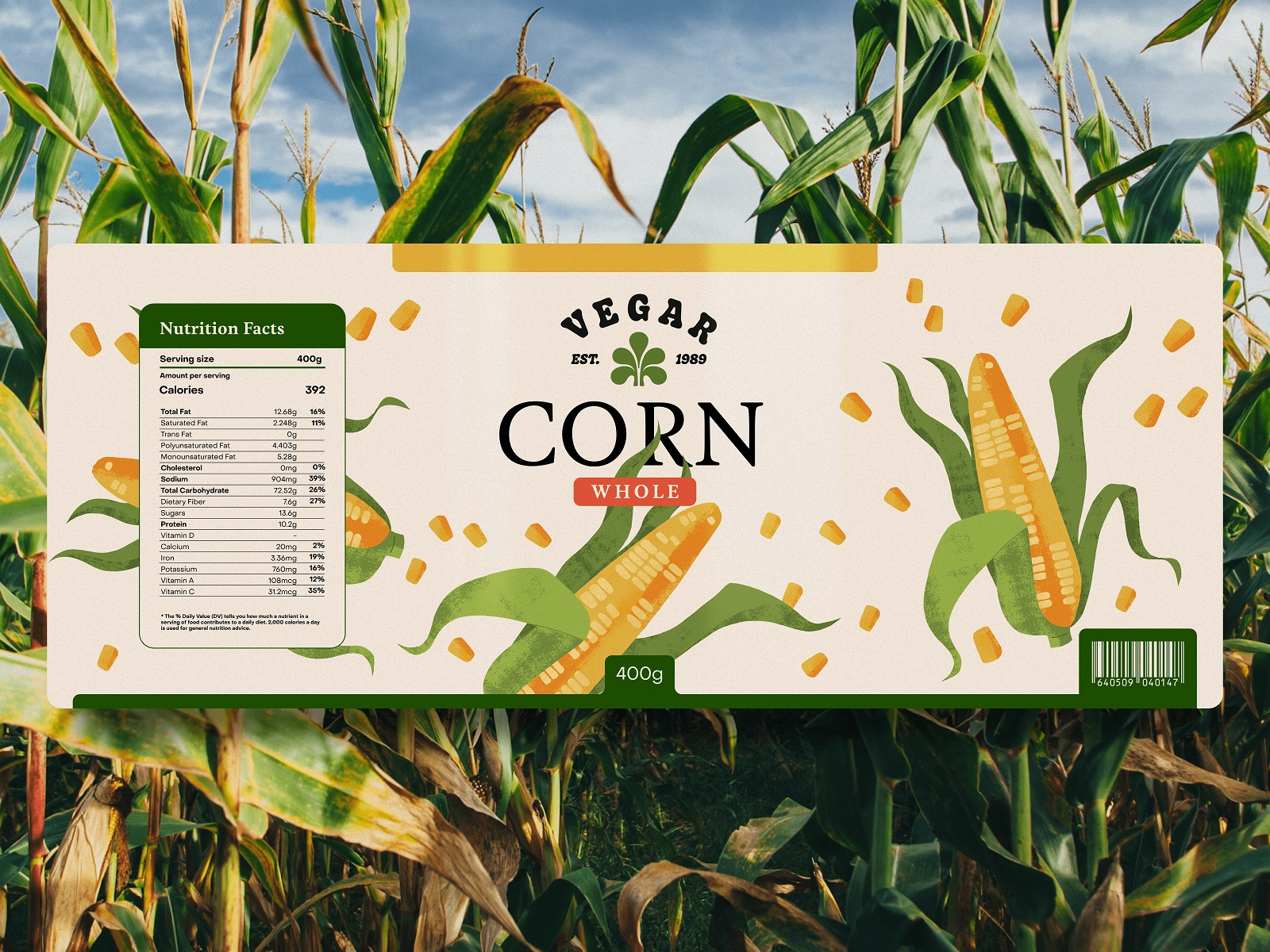
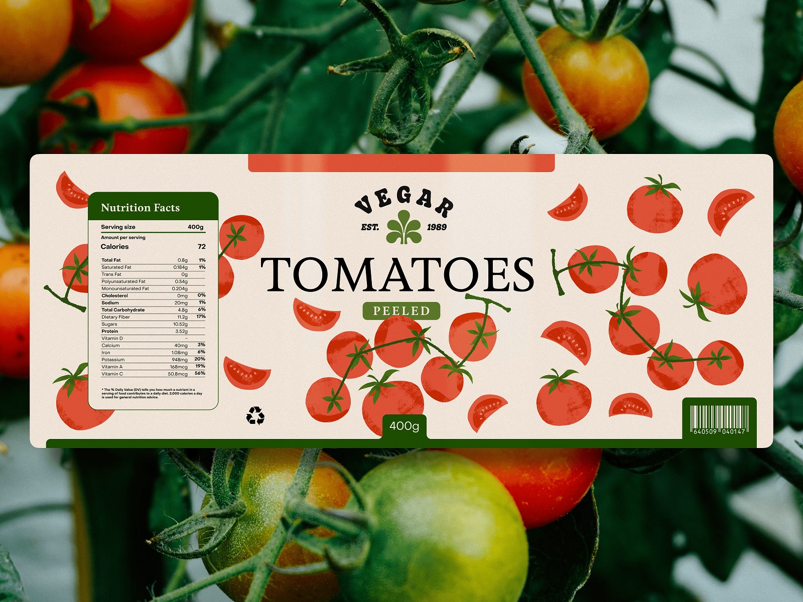
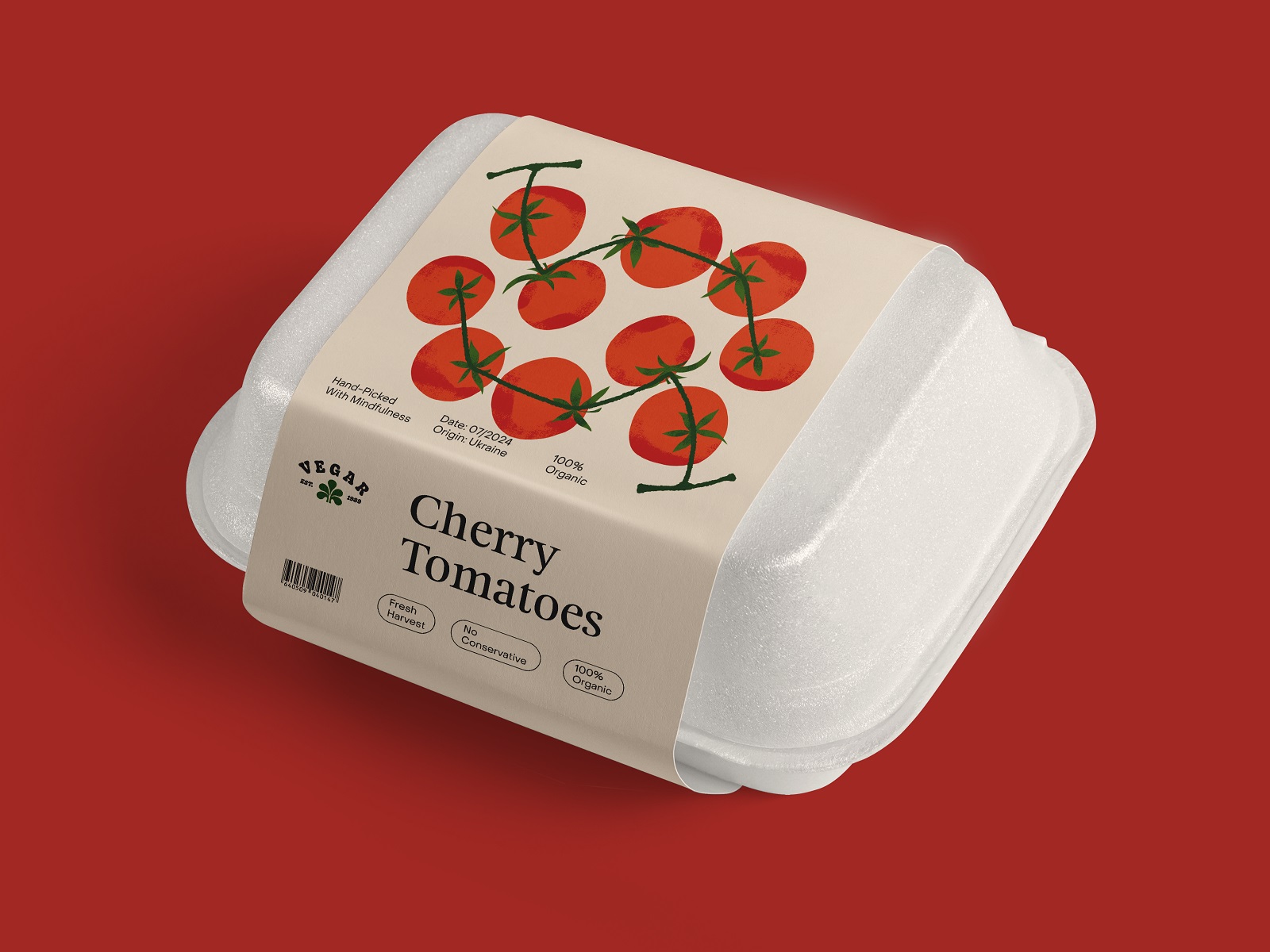
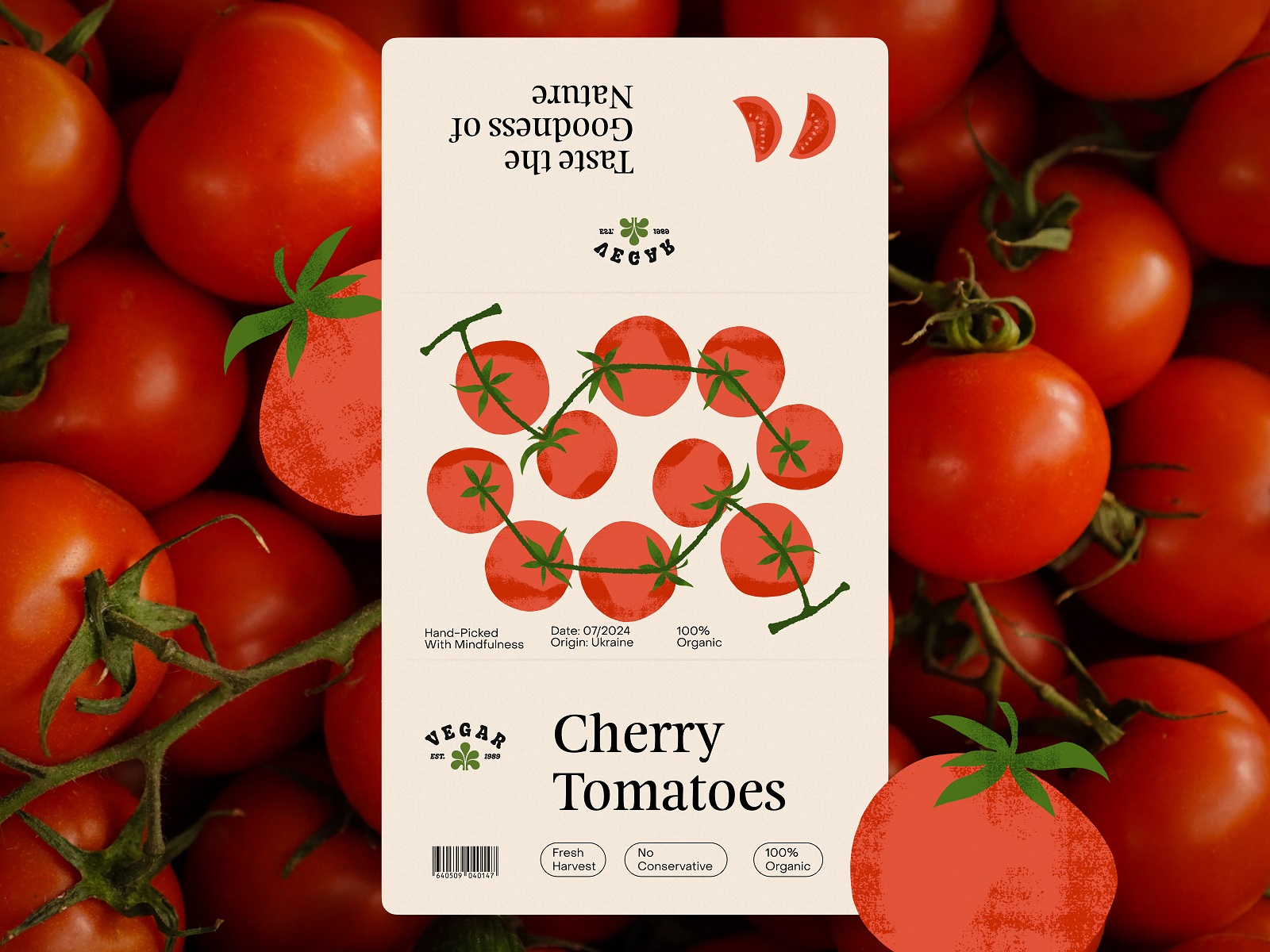
The next type of packaging to work on was boxes for freshly picked vegetables, for which the cover label design had to be created. Here’s what the design process resulted in.
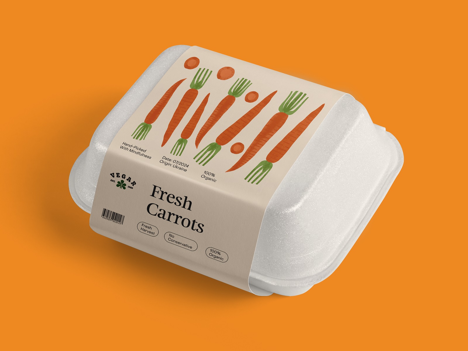
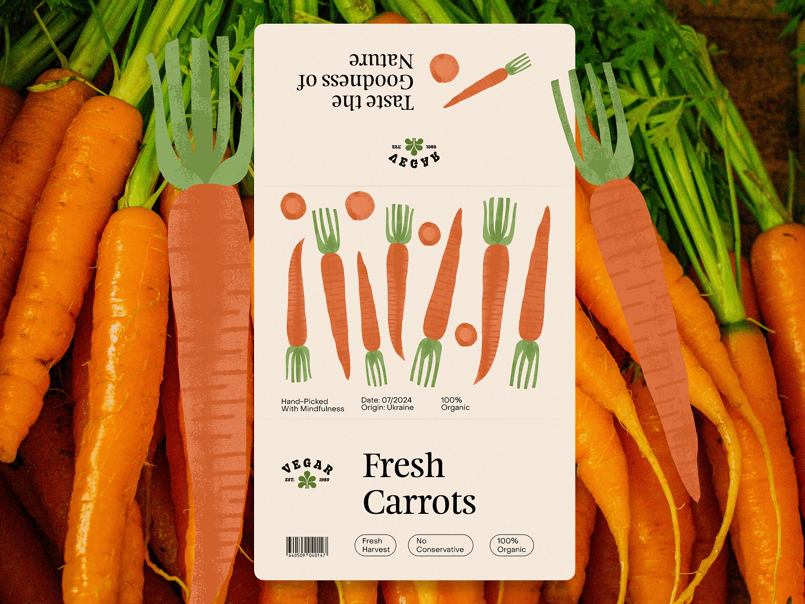
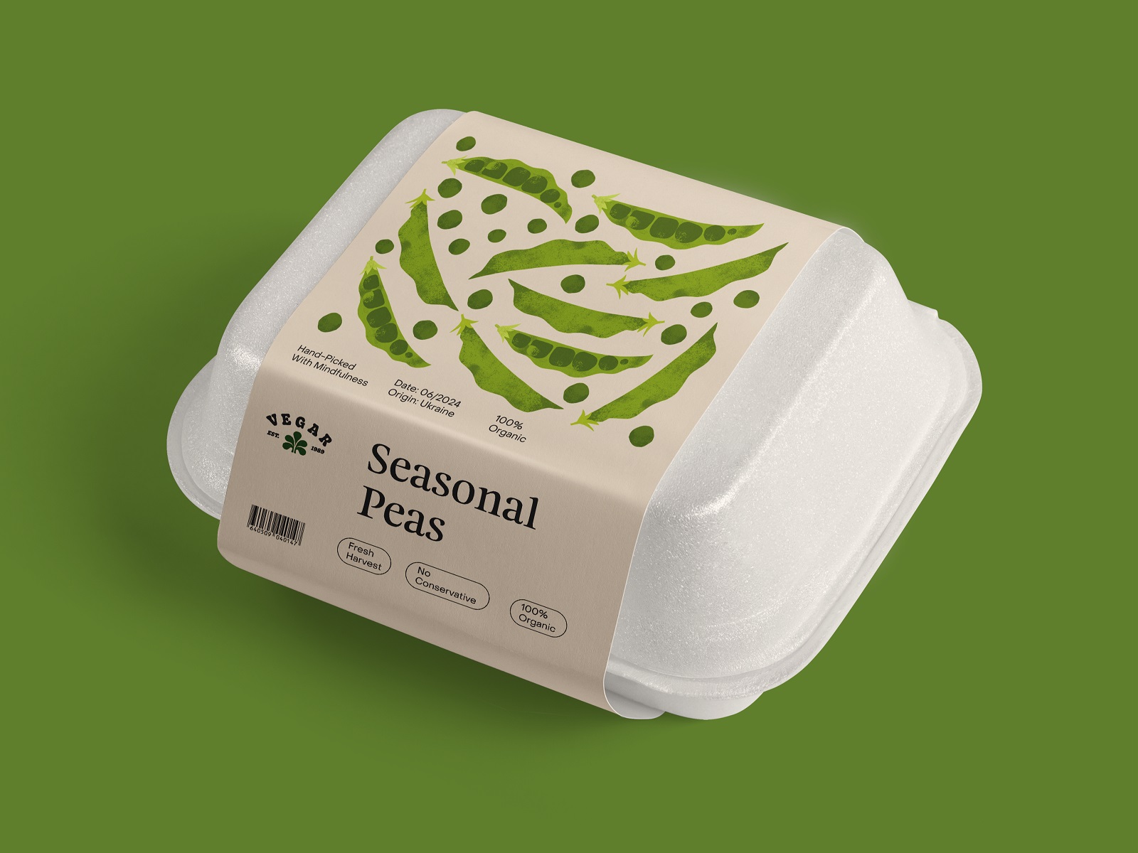
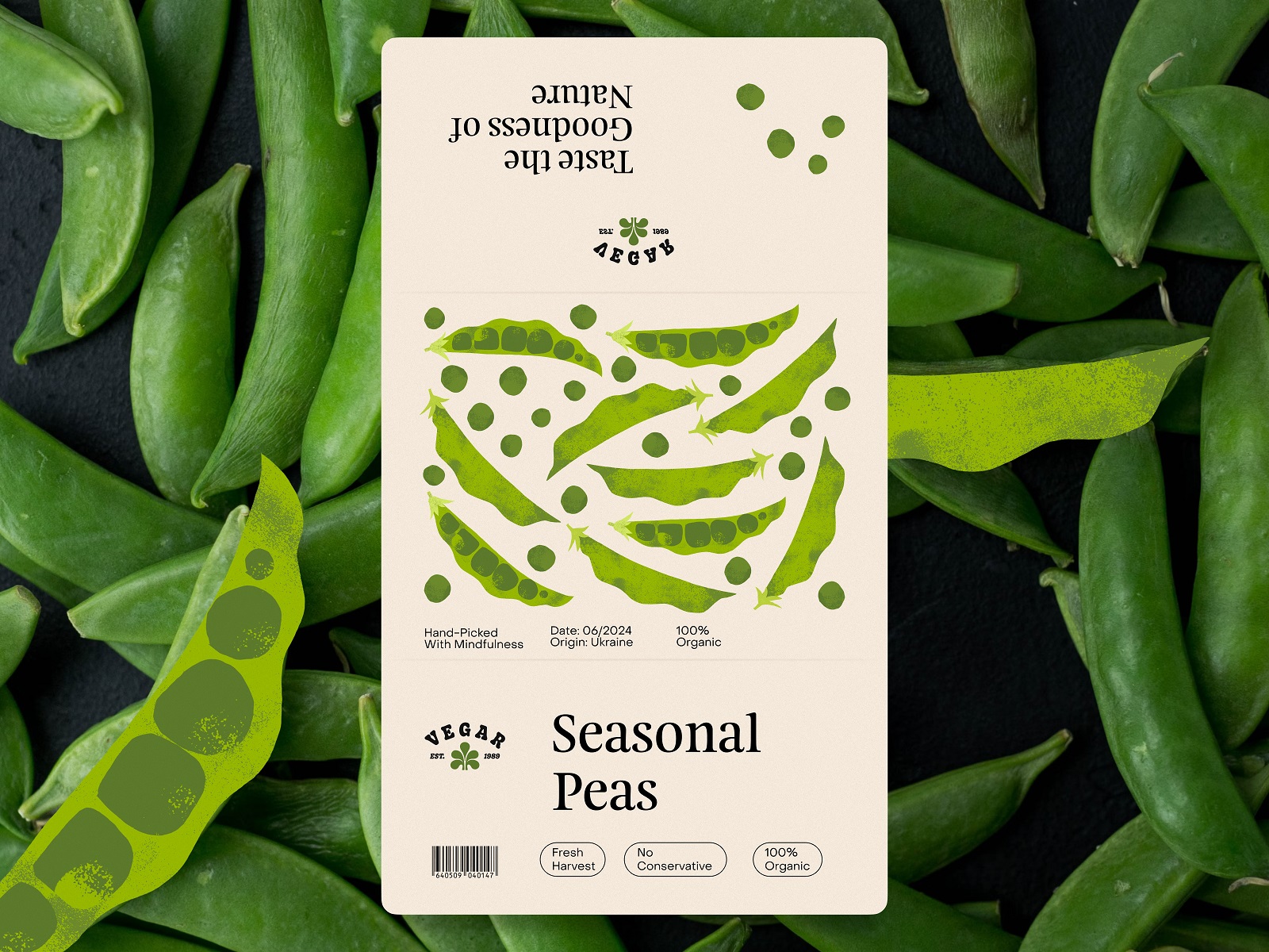
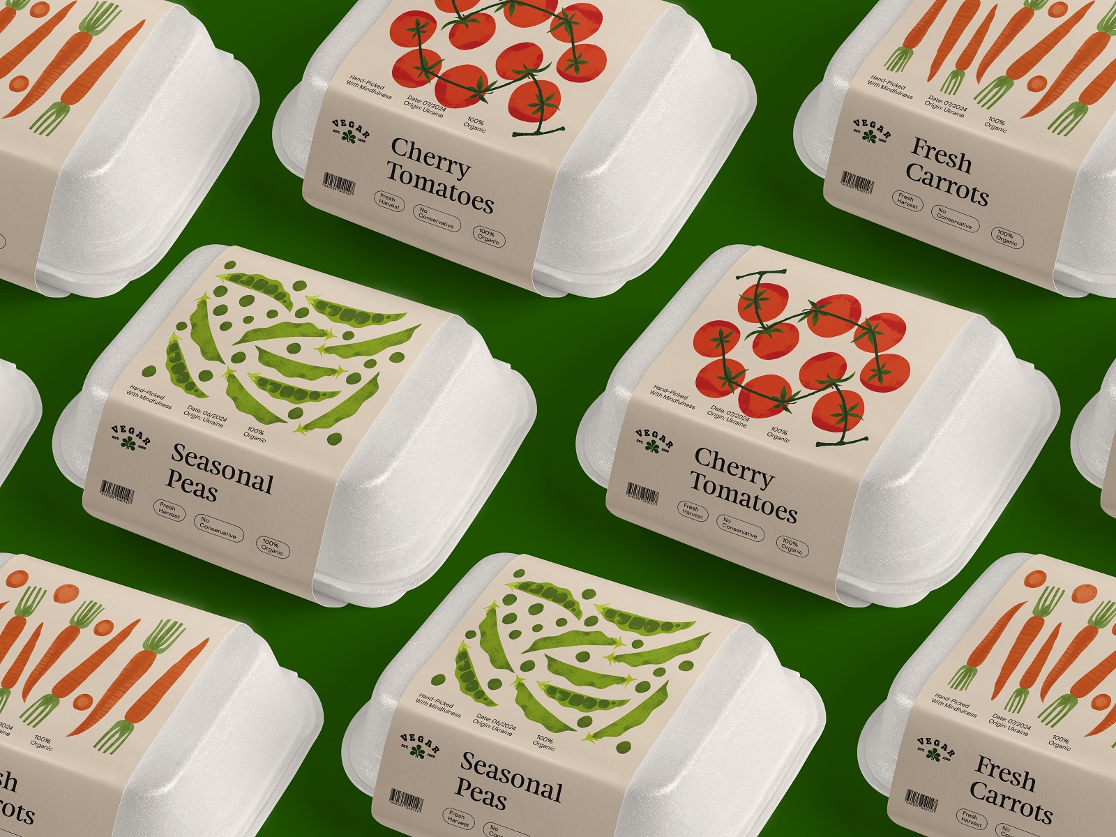
Other types of packaging to consider were packets for frozen vegetables and bottles for vegetable juice.
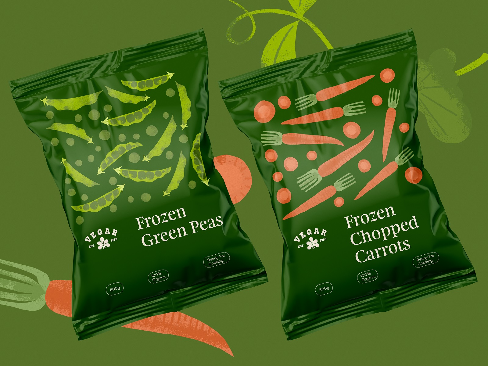
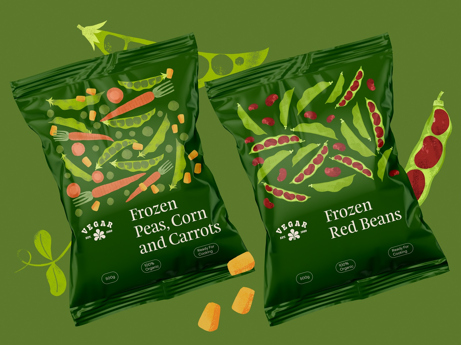
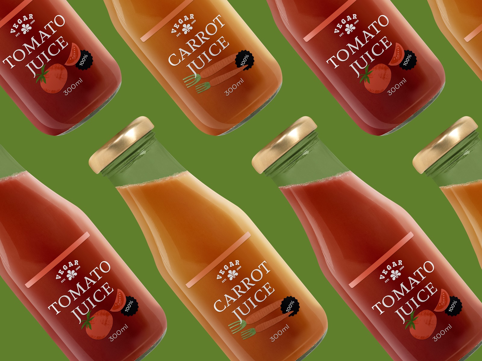
And one more essential creative task was to think over the brand presentation in different marketing materials and advertising, such as posters, billboards, branded items, and the like. Take a glance at some of them below.
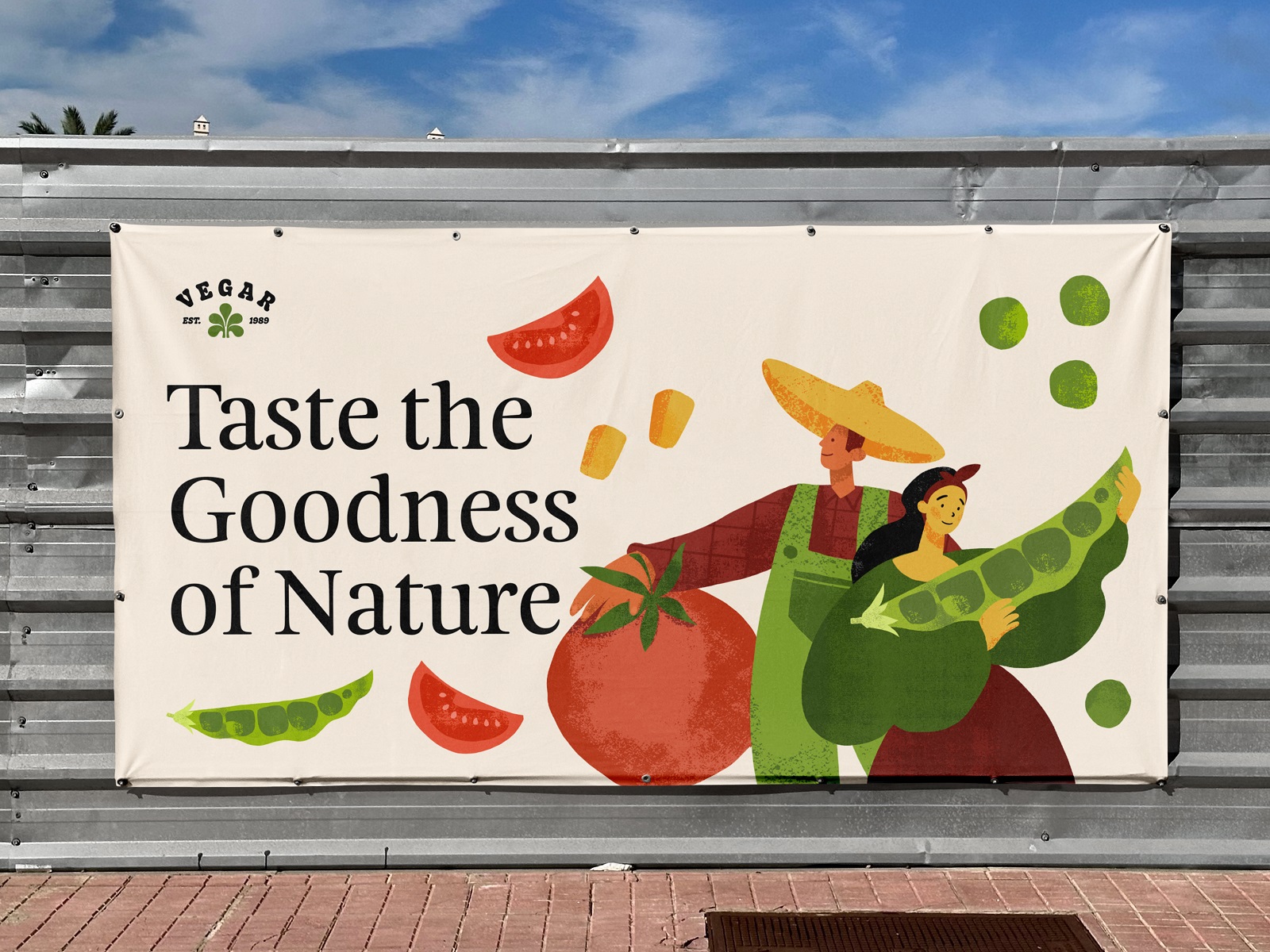
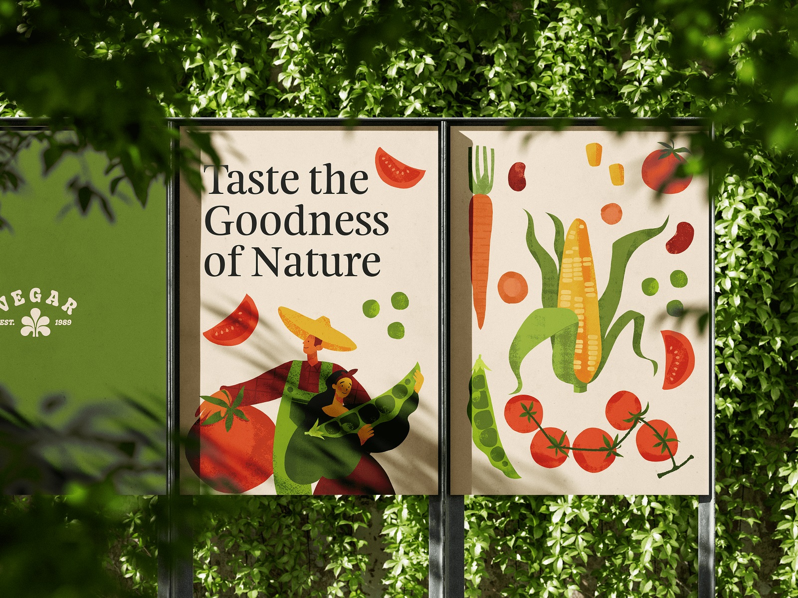
Outdoor advertising posters design
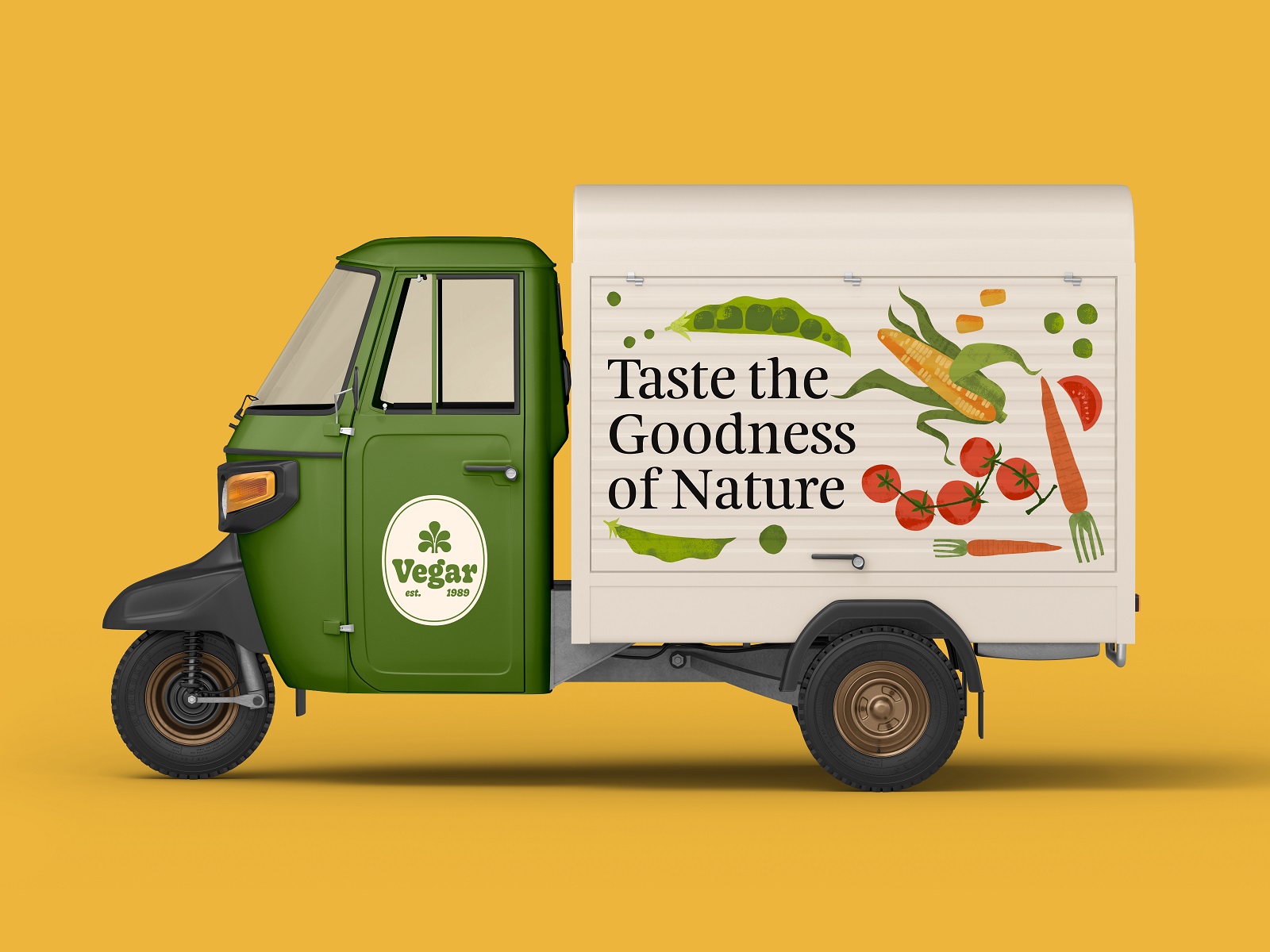
Branded truck livery design
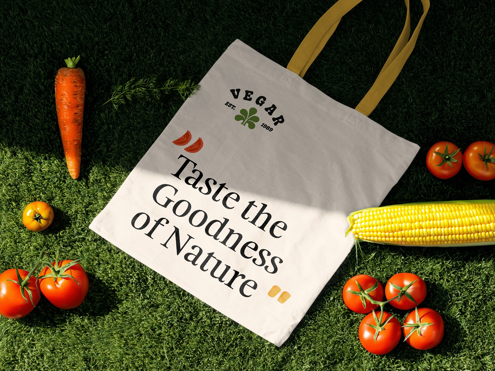
Branded tote design
New design case studies from our team are coming soon. Stay tuned!
More Design Case Studies
Here’s a set of more case studies sharing the design solutions and approaches for some of the graphic design projects done by the Tubik team.
Lagerby Llama. Mascot Design for Ecommerce
Graneri. Artistic Granola Brand Packaging
Digital Art Case Study: Product Characters Illustration Concept
Pencils of Promise. Picture Book Creation Process Step by Step
Gofe. Packaging and Marketing Design for Coffee Brand
Illustration Case Studies: Visual Storytelling Art for User Experience
12 Bright Projects on Visual Identity and Packaging Design
Love Sign. Gift Box Packaging Design with Romantic Vibes
PierSide. Packaging Design for Tinned Fish Brand
KOISI Tokyo. Packaging Design for Japanese Restaurant


