The year is almost over – so, it’s high time we looked back and reviewed what it has brought for UI and UX designers. Traditionally, we have collected a big set of popular design trends for websites and mobile applications and supported them with a variety of UI examples from our team. Enjoy and get inspired!
3D Graphics
One of the hottest trends of this year is the integration of various 3D graphics into mobile and web interfaces. Applying this kind of graphics to UI is quite a challenge that requires specific skills and artistic eye to be crafted well. In addition, it’s time-consuming. However, it is definitely eye-catching and users will never pass by not noticing it. The 3D renders often look photorealistic which is a big advantage for user interface design. This kind of graphics may save the game in cases when photo content you need is impossible to get or highly expensive.
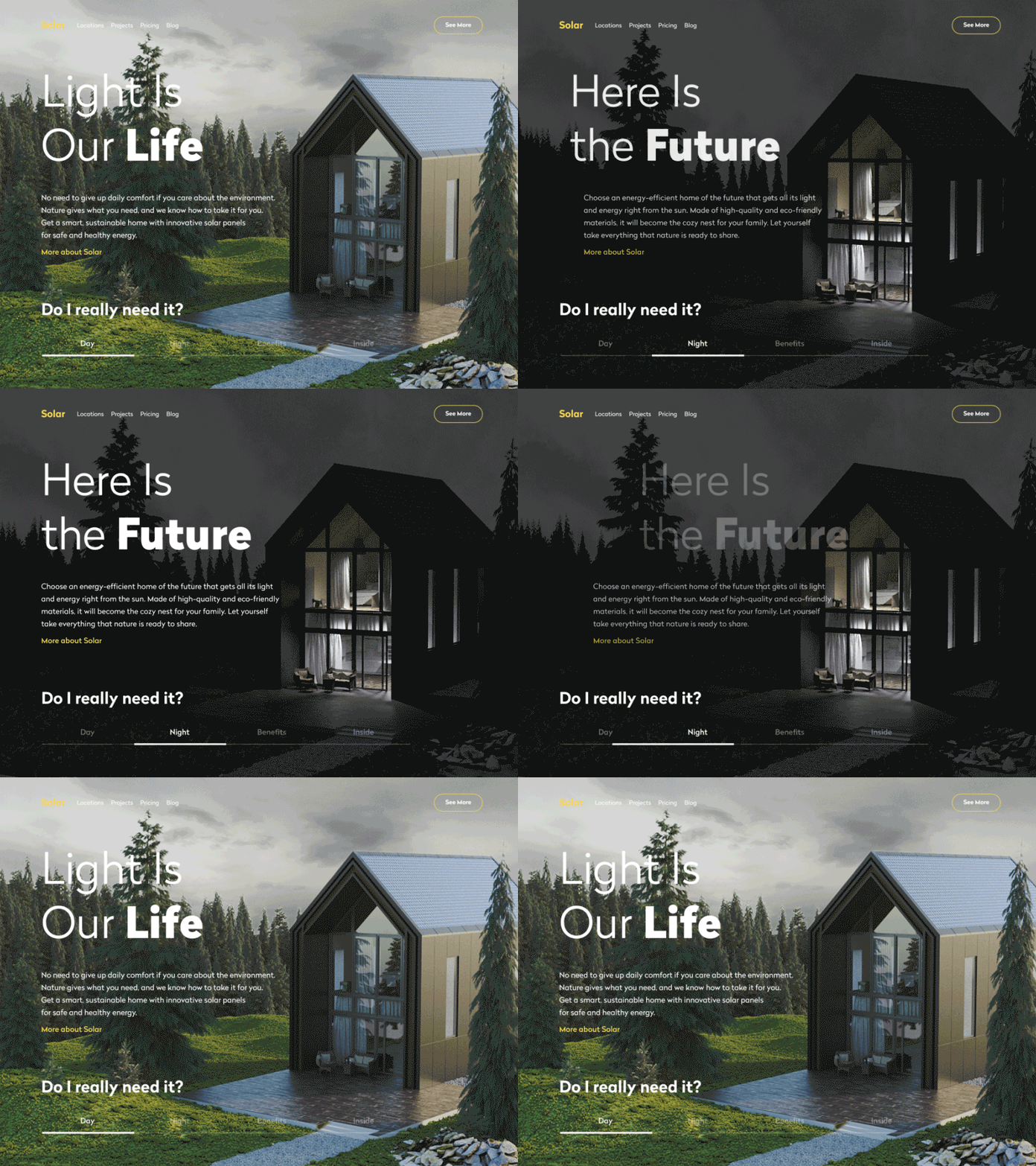
That’s a website of a company that designs and builds sustainable homes using solar power to get all the needed energy. 3D rendered model of a house allows users to see the photorealistic image of the offered service and even manipulate it to see the view in day and night mode.
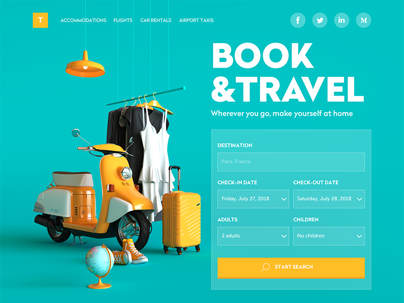
This website of a booking service uses 3D graphics as a big theme image that takes the left part of the page and catches user’s attention at once. Not only does the artwork set the theme but also makes the interface beautiful.
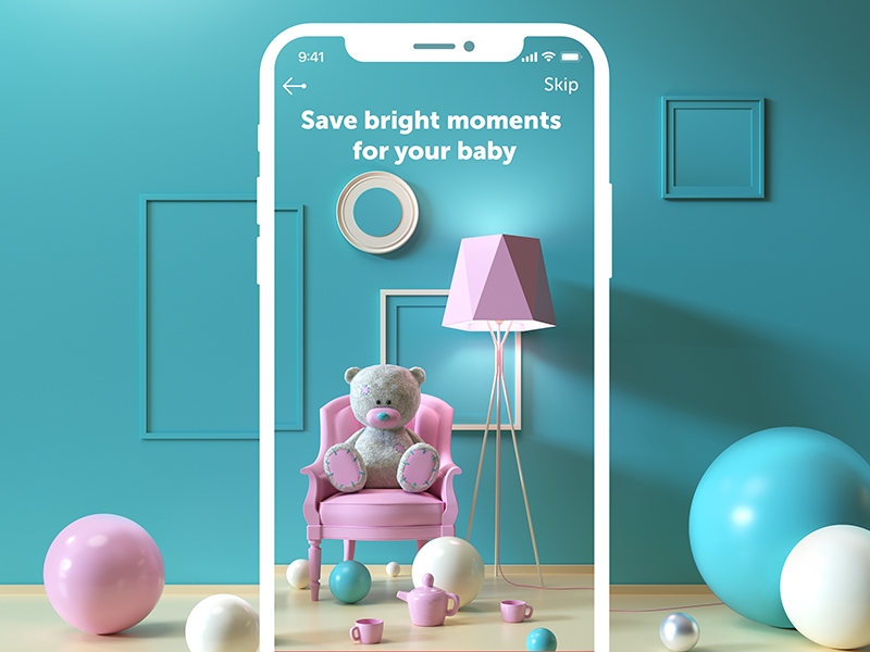
Here’s the onboarding screen for My Baby app, a cute mobile diary to save all the precious stuff such as photos, videos, and achievements. 3D graphics set the mood and theme instantly in an elegant and attractive way.
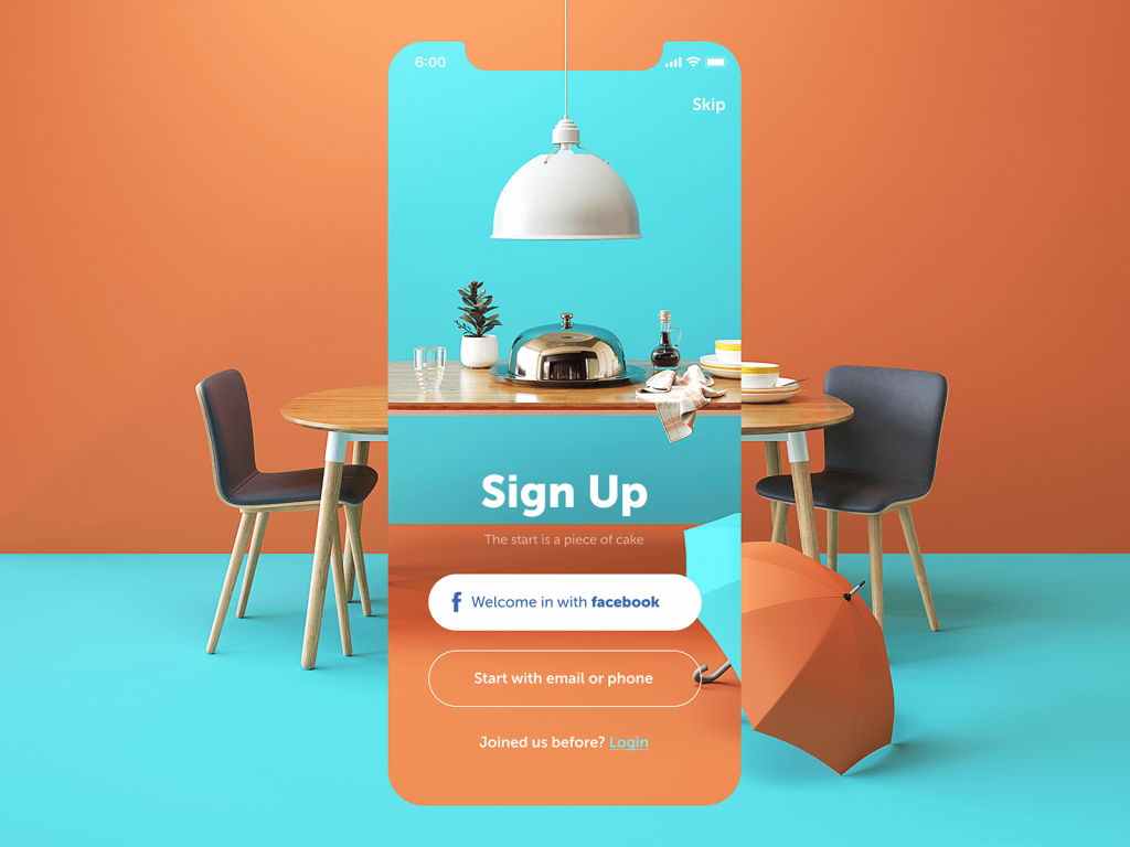
With catchy and elegant graphics, even the basic app screens like sign-up will look tasty and capture users from the first seconds of interaction. Here’s how it is realized for a restaurant app.
This is a part of an app for a creative studio Moon where children and teens study design and animation. The splash screen animation based on 3D renders is definitely out of the box, isn’t it?
Personalization of Interactions
This year is marked out with a strong movement to deeper and more sophisticated personalization for the user experience of digital products. Designers strive to present more functionality that enables users to customize the features according to their personal needs.
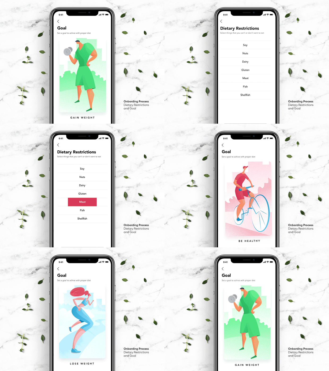
The Perfect Recipe app allows for setting the goals users strive to (losing or gaining weight, keeping a healthy diet and the like). In addition, users may mark the ingredients they avoid using so that the app didn’t show the recipes containing them. This way each user gets a personalized feed, recommendations and search results.
The Perfect Bouquet app allows users to create and order bouquets with all the details they want.
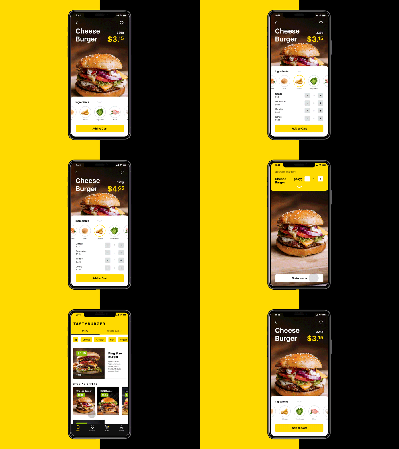
The Tasty Burger app provides users with the opportunity to customize their own burger adding or excluding particular ingredients before making the order.
Full-Screen Background Images and Video
As you could also notice from previous examples, another trend growing its presence, especially in UI design for websites, is the usage of full-screen background visuals. Those may be photos, specially rendered visualizations or even videos. Such an approach helps to make the screens visually and emotionally appealing as well as support the integrity of all the layout elements.
Here’s a website design for a service organizing different types of balloon trips. It gives users a deep perspective of the screen due to unframed full-screen images with motion effects creating a strong association with a smooth flight on a ballon.
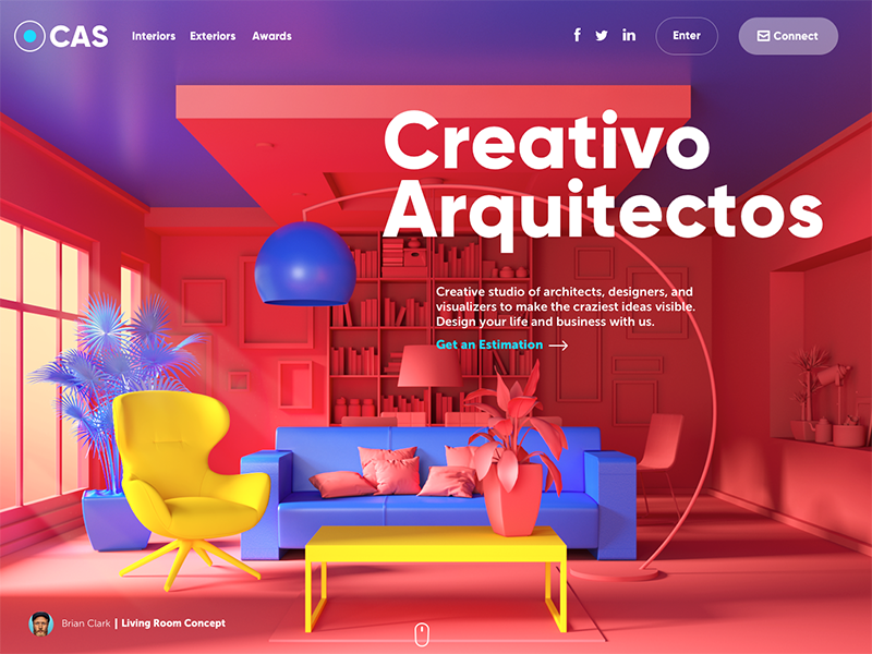
Here’s the home page of the website made for the design studio specializing in exterior and interior design visualizations. The high-quality original graphics rendered for the page take all the background area: this way the image immediately sets the theme and presents the company services.
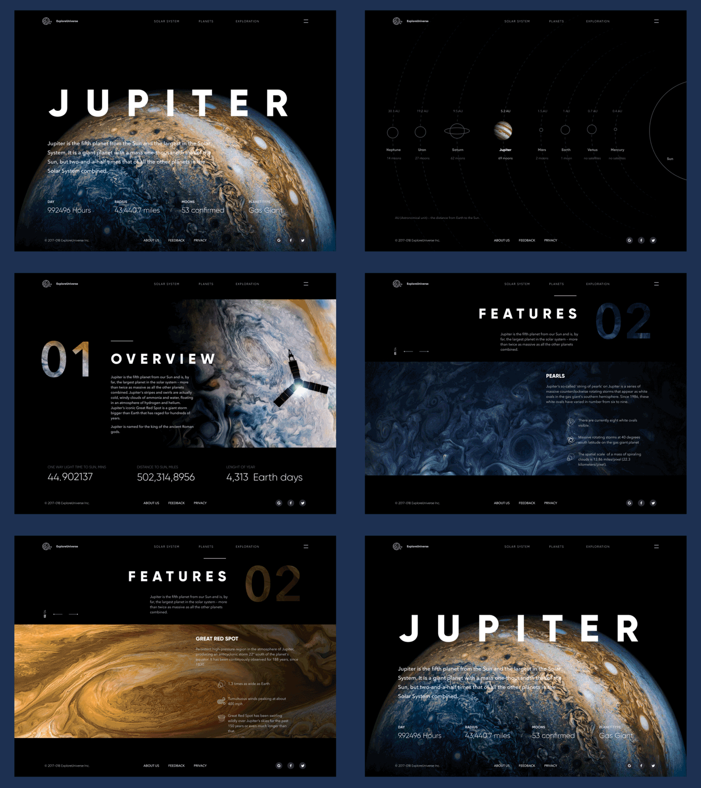
This is a UI concept for Explore Universe, the interactive online encyclopedia devoted to the Solar System, its planets and interesting explorations. Photo, video and graphic assets are integrated into the dark background to support the visual connection with the theme. Smooth animation supports the feeling of diving into the endless outer space.
Complex Digital Illustrations for Web
Custom digital illustrations are steadily getting more and more presence, especially on web interfaces. Featuring a variety of styles, custom graphics effectively support the quick perception of the information on the page or screen. What’s more, they set the solid ground for originality. Websites and apps apply custom mascots, icons, and illustrations to enhance the looks of a page or screen as well as boost usability and intuitive navigation. In addition, images improve the accessibility of UX design pushing the limits of perception for users who have natural problems with text recognition, for example, non-native speakers for the website language, dyslexic users or non-reading preschoolers.
This trend also actively stretched on creating digital illustrations as title images for blog articles, as well as we do here on Tubik Blog. It’s definitely a cool trend because it adds meaningful and informative beauty to blogs and websites we often read as well as broadens the creative horizons for artists.
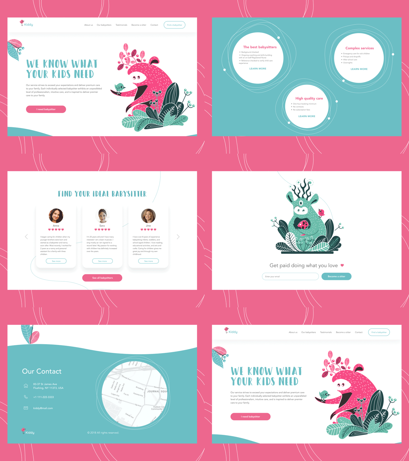
Here’s a landing page for Kiddy, a platform that makes hiring a babysitter just a piece of cake. Isn’t it cute? The feeling of cuteness and positivity is supported by several factors, among which animated custom illustrations with funny characters play the key role. They transfer the message and the mood, create the needed atmosphere before the user starts reading about the service, and give all the page a unique look.
Also, this year designers pushed the limits of web graphics with sophisticated animation.
That’s the landing page for a conference where illustrators and digital artists share their experience. Custom hero illustration and it’s animation make the web design catchy and original.
Visual Storytelling
The trend of custom graphics has opened a wider perspective to storytelling in the interfaces. More and more websites and mobile apps turn to specially designed characters showing the story, setting the atmosphere, sending the message or presenting the benefits in the way that corresponds to the mood, tone, and voice of the platform. Original characters help to make the interactions more human-like, set strong visual associations with the real world and instantly transfer the needed mood. What’s more, depending on the composition, the characters may become an effective tool to make the page or screen dynamic and lively.
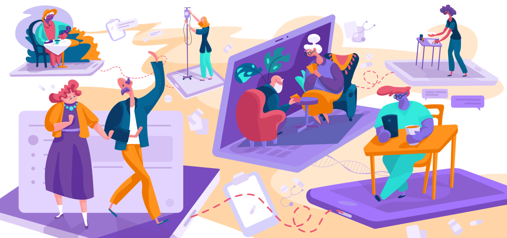
This set of custom illustrations was made for one of our recent projects Florence App. It is an online marketplace where self-employed nurses can find high-paying shifts across the UK. Characters create visual storytelling and present the features and benefits of the app.
This is a landing page for the company that offers a full cycle of services for marketing and promotion. Custom digital illustrations enable storytelling with quick visual prompts about the nature of the offered services, set the mood with a vibrant color palette and support the integrity of all the parts of a page.
Buttonless Interactions
Buttons are still one of the vital elements of UI design, yet this year we see more creative experiments on mobile user experience from the perspective of UI interactions without buttons. This approach saves precious space on the screen for more information and it is even believed to be the initial step to the virtual interfaces based on gestures only.
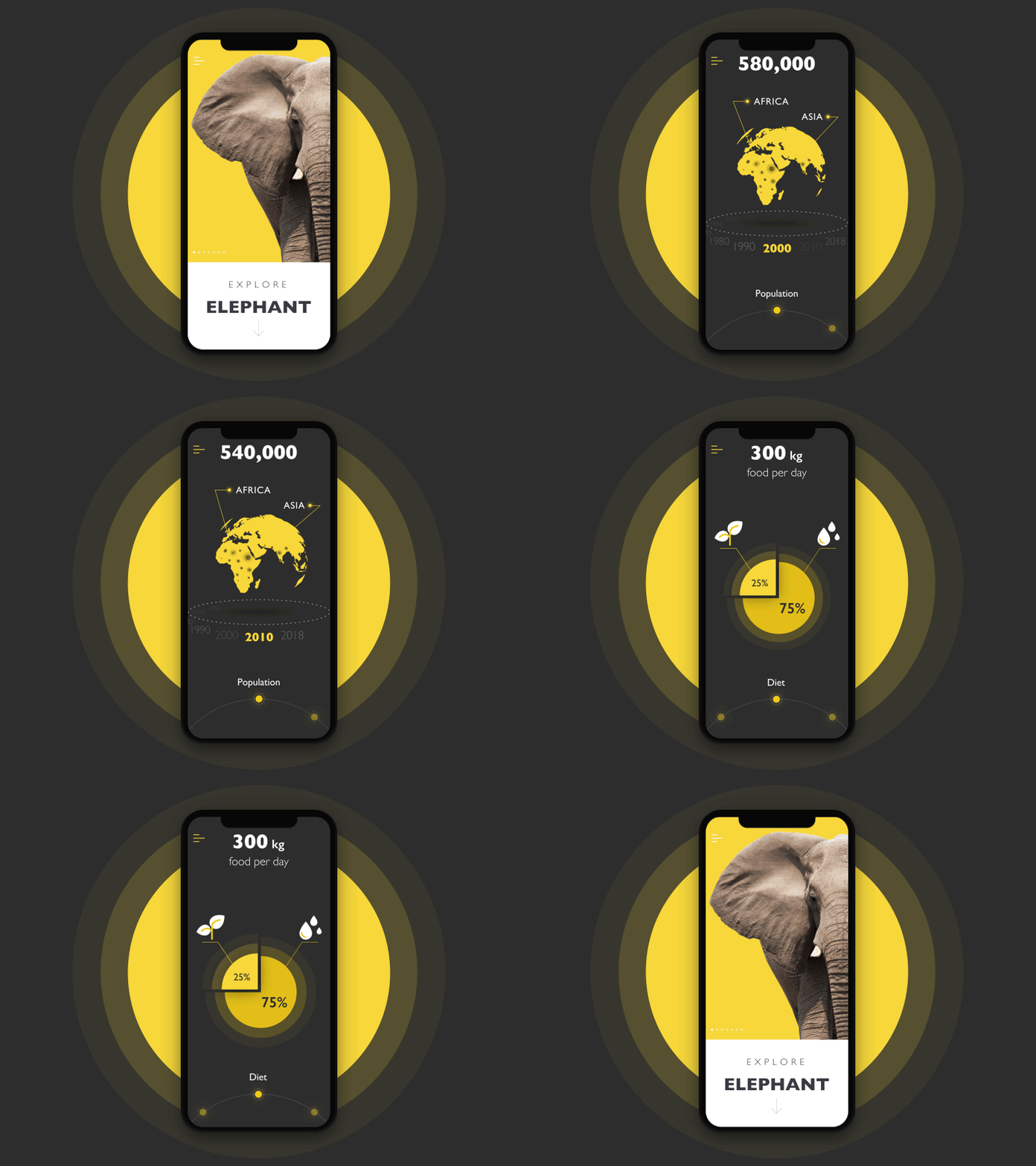
This encyclopedia app presents interactive infographics for a variety of themes, this time elephants. All the interactions with the data happen based on gestures without any buttons applied in the layout.
UI-Oriented Branding
2018 continued the massive trend of the redesign for branding: global and local companies, products and brands changed their logos and brand visuals mostly aiming at simplification of forms and details. One of the reasons for the trend was striving for better usability and navigability of brand elements as more and more businesses competing for the higher online presence. So, both new and redesigned logos were created to be more UI-friendly and effectively perceived on a variety of digital devices and layouts. Furthermore, animated logos became a trend making identity symbols more interactive and strengthening brand awareness.
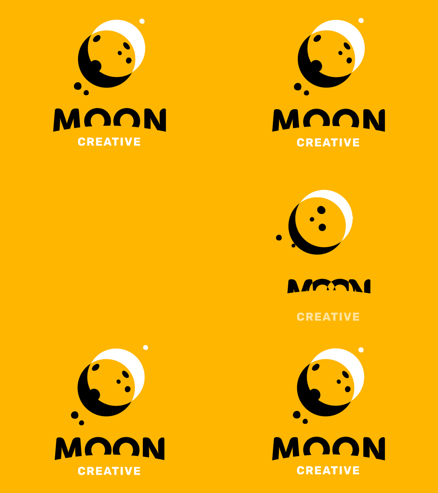
Logo design and app branding for Moon Creative, an educational facility for children and teens studying design and animation. The color palette, animated logo, interactive elements and animations inside the app feature a consistent approach to the company brand.
Catchy and Handy UI Animation
As well as in the previous year, 2018 didn’t experience any loss of interest in interface animation. Not only does it add life and motion to the interaction process but it also significantly improves usability. User experience becomes more informative and engaging while manipulations with the elements of interaction get more clear and respond to the user in an understandable way. So, this year designers worked well on a variety of buttons, tabs, charts, preloaders and scroll animations.

Here’s a set of interactions of a Finance App, the application enabling people to track their expenses and income individually or in a group. UI animation supports intuitive navigation and draws users’ attention to the core elements and changes.
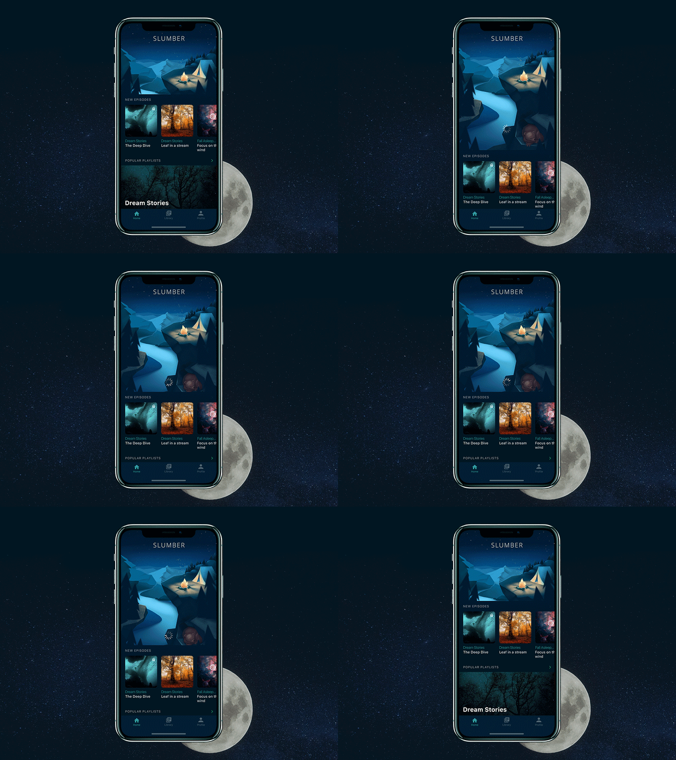
The Slumber app features a nice and catchy point of the main screen – a custom illustration that is animated together with preloader and makes the process of waiting not boring and aesthetically appealing.
Prominent Typography and Carefully Crafted Taglines
Bold and catchy typography continues to keep its high presence in web and mobile layouts. It usually becomes one of the key design elements and designers pay much attention to keeping it readable and scannable: typographic hierarchy and choice of proper fonts are among the core tasks of every UI design project. More and more often, we come across websites and apps in which text is not only the source of information but also the core element of design and the center of user experience. What’s more, this year shows more care about copywriting for UI: in particular, informative and catchy taglines showed themselves an integral element of web design.
Here’s a corporate website for a company that provides the full range of services in architecture and construction. Minimalist layout, high readability, catchy animation of keywords and descriptions of services and contrast limited color palette – that’s the choice for this UI design.
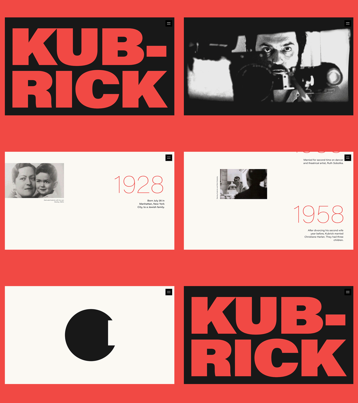
Here’s design for an elegant biography website devoted to Stanley Kubrick‘s path of glory, life, and creative heritage. It’s easy to see that contrast and elaborate typography were chosen as the main tools of expressiveness in this design.
High Readability
One more aspect that drew active and deep attention of UI and UX designers this year was general readability, for not only core copy elements such as taglines, brand names or calls to action but also the rest of content in the text. It resulted in a careful choice of fonts and font combinations for web and mobile interfaces, with intense preferences to simple and highly readable fonts rather than complex and artistic ones.
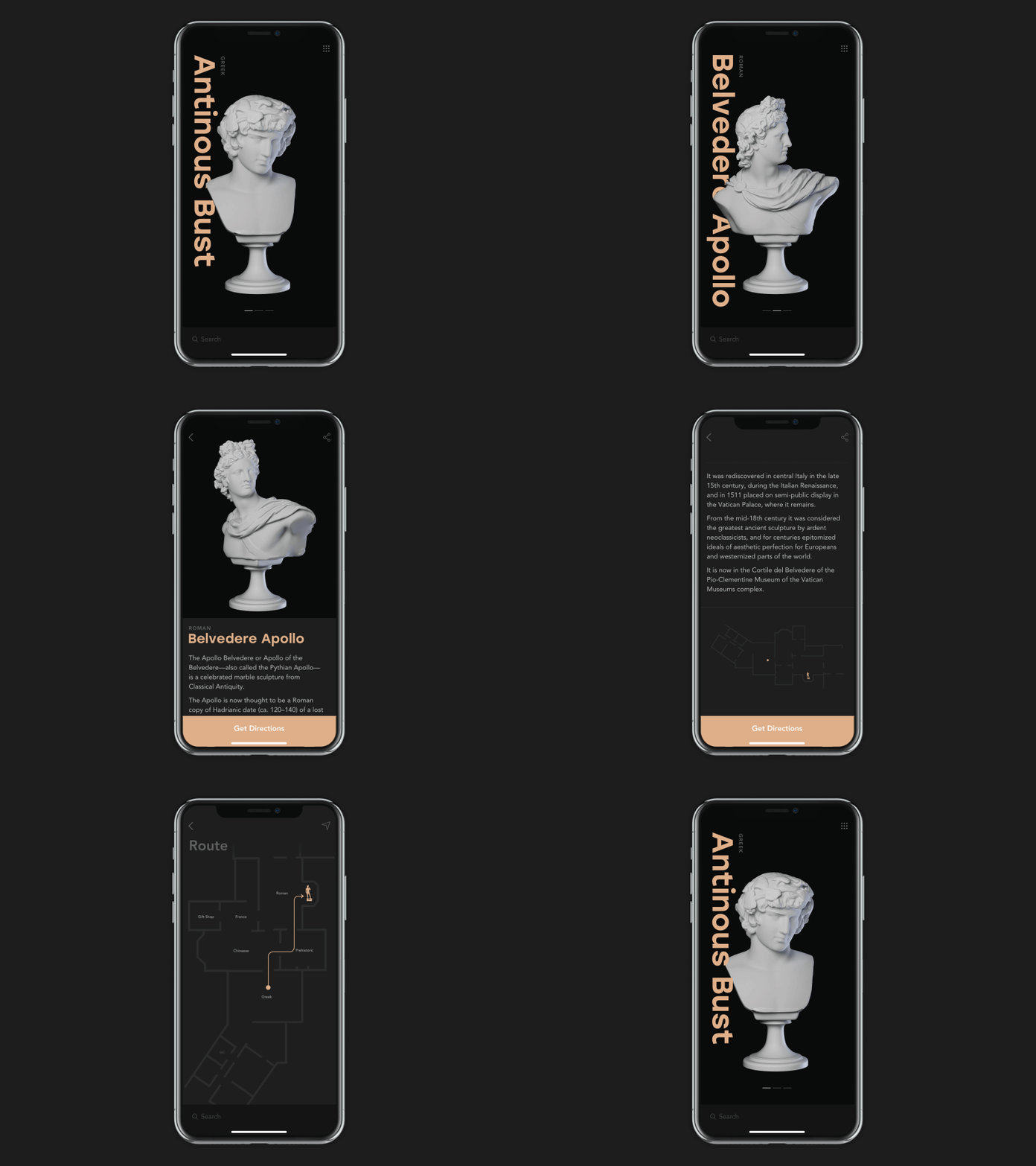
This is a concept of an interactive museum app supporting visitors: it helps to check the available exhibits, learn more about them in split seconds and can even make a route through all the museum to the exhibits you want to see. Stylish and prominent visuals are connected with easily readable fonts to make an app convenient for use on the go.
Experiments with Transitions
With more and more accessible and improved tools for motion design, animation of scrolling and transitions between screens saved its popularity both for web and mobile interfaces. Creative and original transitions enhance user experience making it natural for the human eye and adding grace for basic interactions.
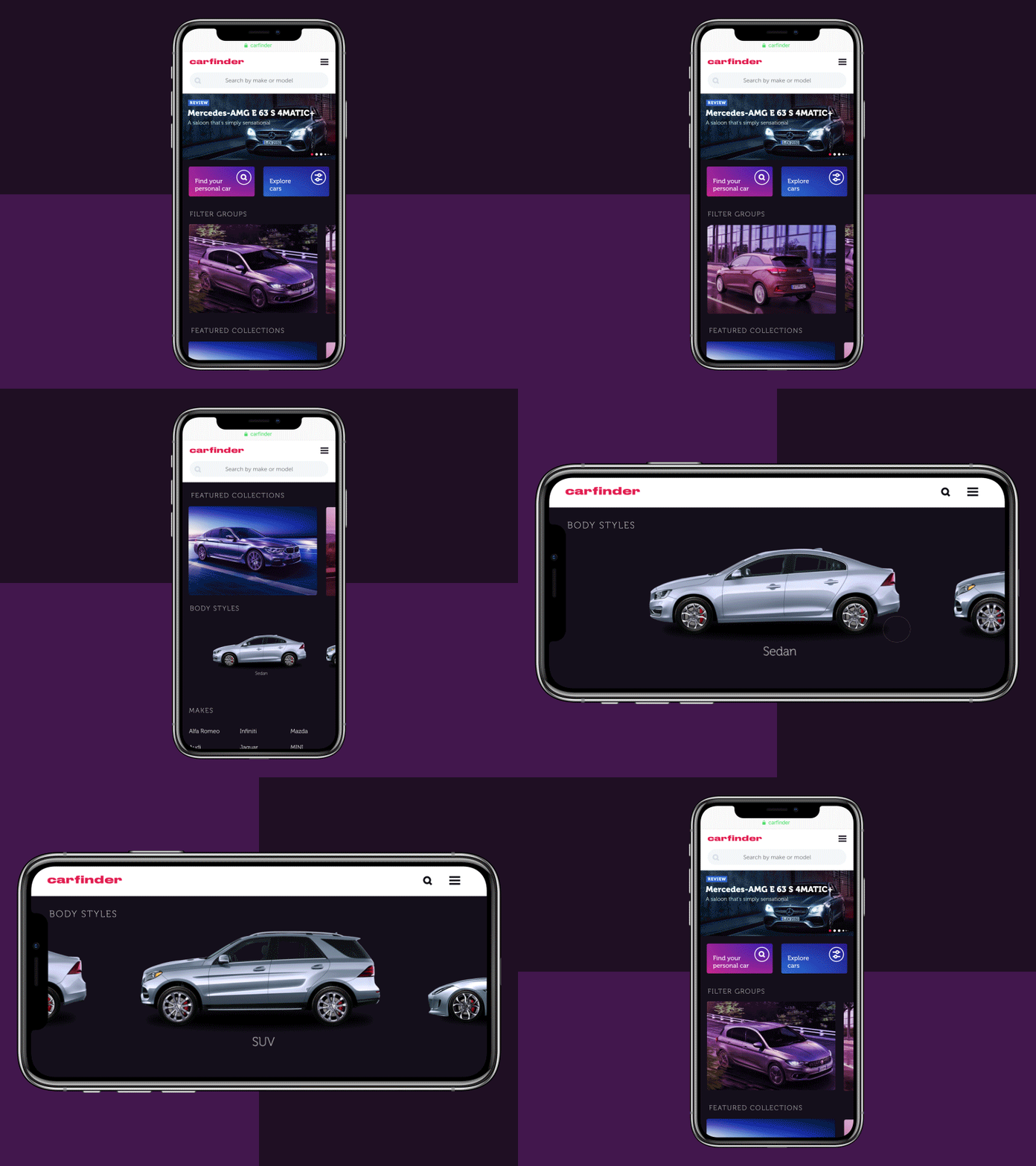
This UI concept is a helping hand for those who are in search or just want to keep up with the auto news. The shown set of interactions for a web application Carfinder makes diving into the world of cars easy and elegant with special effects and engaging motion.
Catchy Hero Images
Hero banners are big images catching the user’s attention in the first seconds of interaction with a webpage. They contribute much to the attractive visual presentation of the main content. Hero banners proved themselves as highly effective in setting the mood or transferring the message. Moreover, as well as any other striking graphics on web pages, this is a kind of content that is both informative and emotionally appealing. Prominent hero banners can satisfy multiple goals such as:
- catch users’ attention
- transfer the message visually
- support the general stylistic concept
- set the needed theme, mood or atmosphere
- demonstrate the core benefits or items effectively.
These are the reasons for designers to turn to this technique for the diversity of web pages today.
Here’s a website design inspired by the theme of bright childhood: a landing page for a chain of kindergartens that features a cute and funny animated mascot.
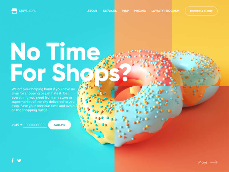
It’s a home page of a website for delivery service that buys and delivers what clients need from any stores of the city. Based on a catchy and original color palette combined with a prominent hero image makes design tasty and engages in learning more about the service.
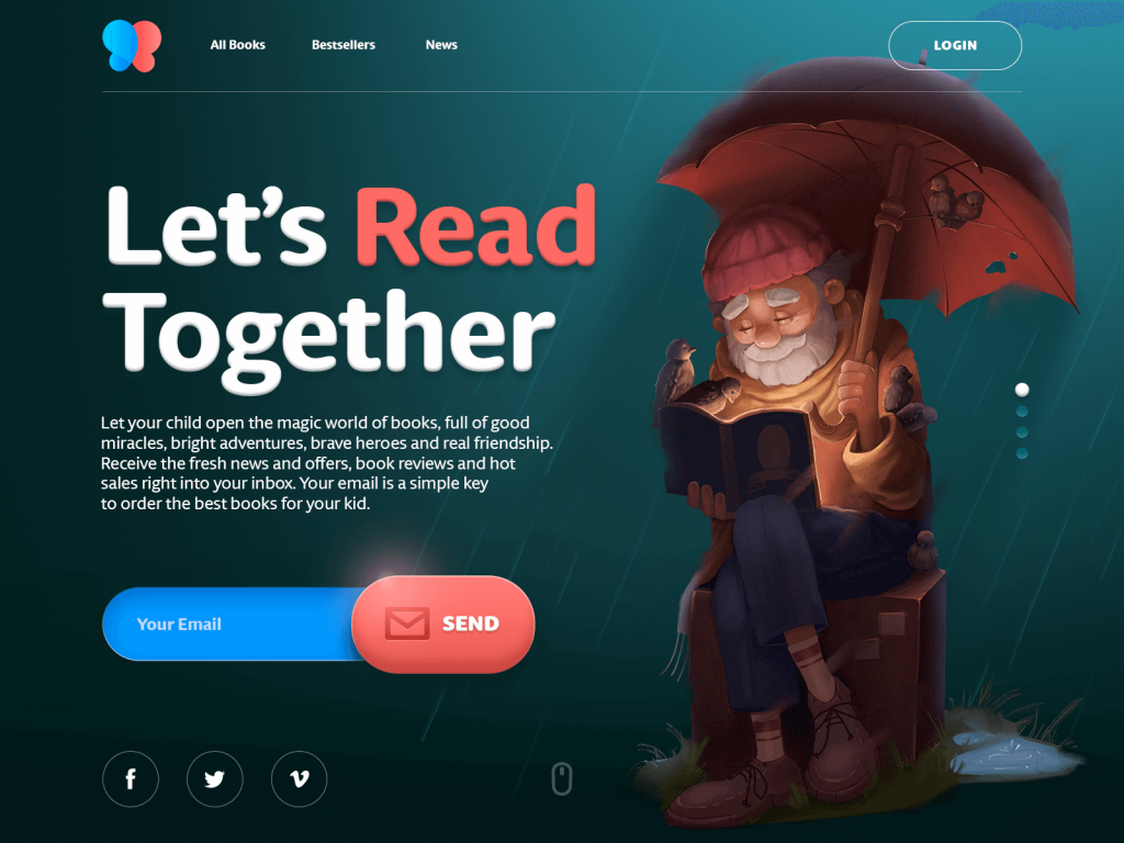

Here’s one of the pages for an e-commerce website selling books for kids. It is a bright example showing how custom hero illustration sets the mood and theme. Together with the itch to skeuomorphism in interactive details, it makes an attractive UI solution.
Artistic UI Details
The previous examples feature one more trend of this year which is increasing cases of the art integrated into user experience design. Although functionality is the foundation of user interfaces, yet users are first of all people, whose decisions and preferences are driven with not only logic but also emotions and aesthetic pleasure. So, artistic elements have proved their role in catching user’s attention and adding positive vibes to user experience in the aspect of desirability.
Homepage design for a CryptoBlog features sophisticated abstract 3D graphics made up in an artistic manner.
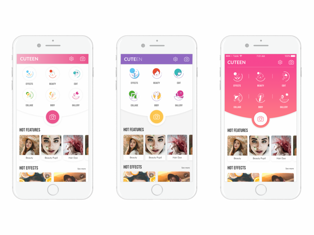
Artistic icons designed for the Cuteen app add elegance and beauty to the general UI layout.
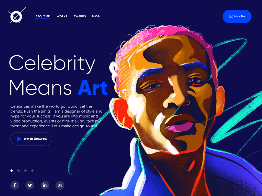
Here’s a concept of a portfolio website for a designer that specializes in projects for celebrities, entertainment, music, and film production. Dark background in combination with the custom hero illustration look more vivid and sets the association with the atmosphere of a concert stage.
Split Screens
One of the hot trends of this year is the active usage of split screens in both web and mobile interfaces. This trend is nothing new – it goes away and comes back in various spheres of design, and now it’s definitely back and alive. The approach is believed to be effective in terms of responsive design as you may play with content variations not missing the consistency. What’s more, it opens the limitless area for color combinations and experiments. Some websites use split screens to present the duality of options of equal importance. As for mobile, split screens become a user-friendly trend for interfaces based on the dark or bright background scheme. It is a step towards proper readability in them which is often the issue of debates: applying boxes or spaces with the light background for core data blocks, designers solve this problem and add elegant contrast to the screen or page.
![]()
The Watering Tracker app uses a horizontally split screen: the upper part with the dark background is favorable for the elegant presentation of charts and visuals while the lower part applies the light background to keep the high level of readability.
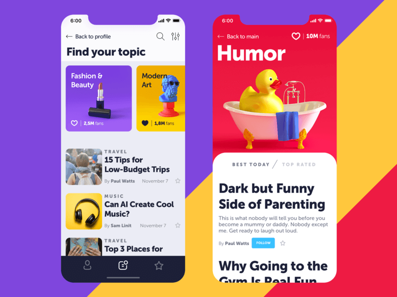
Here’s a mobile UI for a simple blog app. The top part of the main screen features topics to read which a user can swipe horizontally and make a choice; also there are hot articles from the followed topics. Each category is supported with cool visual content in 3D. Split screen allows for good readability of text content in this bright interface.
Multilayered Layouts
Creative experiments are constantly carried out by UI designers to find new interesting ways of making the webpage engaging and interactive. One of the growing trends is applying several interactive layers that make scrolling experience and interactions look original.
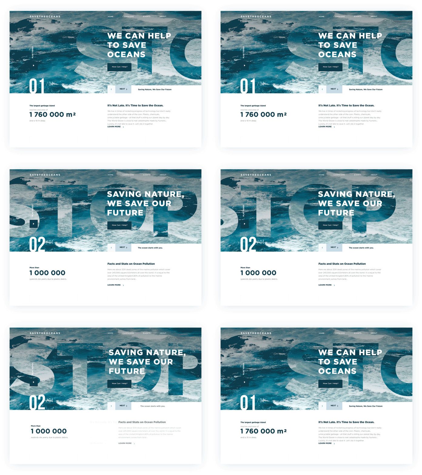
This is the animated concept of a charity website devoted to saving the oceans. The designer makes two layers of the copy move simultaneously when the slides change. By the way, the concept features one more popular trend of using textures and photos as the underlayer of text content, so-called image-filled typography.
Quality Photo Content
One more widely-used trend of this year is careful and balanced usage of high-quality and artistic photo content. Photography is a good way to impress users with realistic and clear visuals as well as set the needed associations. With rapidly developing photo stock websites, designers have more and more opportunities to find good images; still, for many projects, especially e-commerce ones, the creative teams shoot the original content totally corresponding to the goals of the product. It is especially noticeable in the spheres close to everyday life such as fashion, toys, food, drinks, etc.
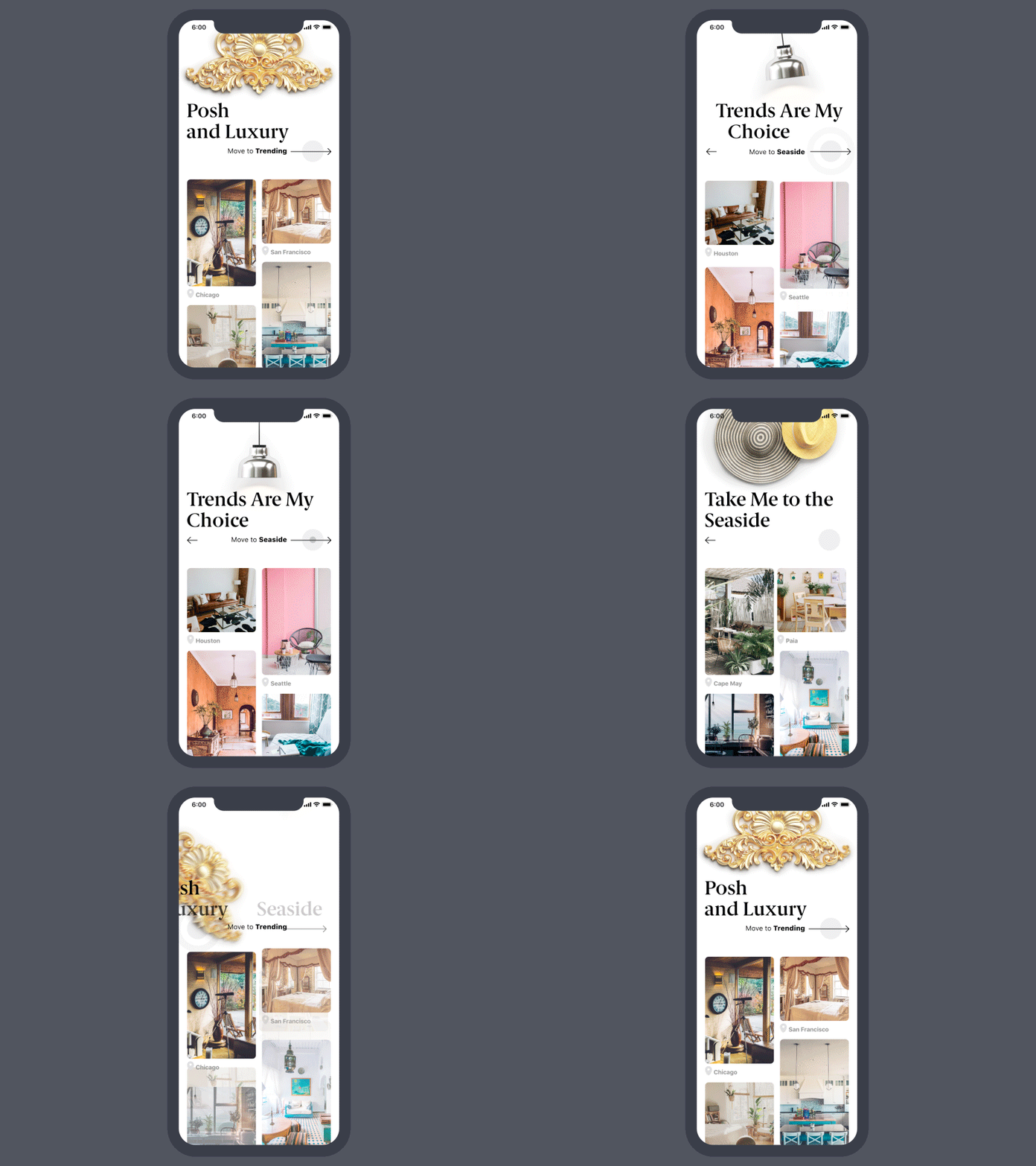
This UI design for the lodging app features a perfect combination of 3D graphics and high-quality photo content in one layout.
Growth of Video Content
Different types of promo and explainer videos were boosted to appear on screens and pages. No wonder, they serve efficiently for marketing goals and increase brand awareness. A creative and catchy video is a good way of attracting customers’ attention and the proven method of informing them quickly and brightly. A video activates several channels of perception — audio, visual, sound — simultaneously and enhances them with the power of storytelling. All the mentioned factors tend to make the presentation via video strong and memorable especially if based on high-quality graphic design and animation. People are daily overloaded with tons of information of all kinds, so most of them aren’t ready to devote much time to learning about products or services, especially the new ones. In these conditions, videos have become the way of communication which is dynamic, informative and attractive. However, the issue of loading speed for a webpage moves forward and should be tested carefully on different devices.
Here’s an example of an explainer video for OffCents app promotion.
And this one is an example of an explanatory animated video supporting the blog article about gamification in UI/UX design.
Web Pages in Poster Style
The trend for using prominent visual content got one more perspective on web pages that look and feel like posters. In the case of properly chosen images and stylish typography, it allows the page to stand out and attract user’s attention to the offer.
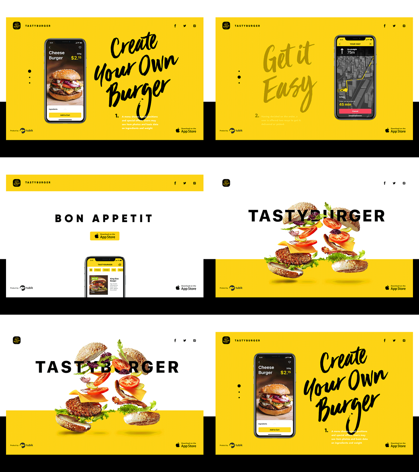
The landing page for the Tasty Burger app is based on the attractive and catchy animation: tasty fresh burger creates a mouthwatering effect to immediately set the theme and emotional appeal, original lettering gives it a poster-style appearance.
Color Experiments
The trend of the color experiment also didn’t suffer any loss in popularity, bringing out new original combinations. It’s natural as color is one of the most powerful ways to add message and mood to an interface as well as make it look aesthetic and attractive. Anyway, effective color experiments are not just pure creativity: even the most creative and surprising combinations are based on the knowledge of color theory, color psychology and practical experience of UI designers.
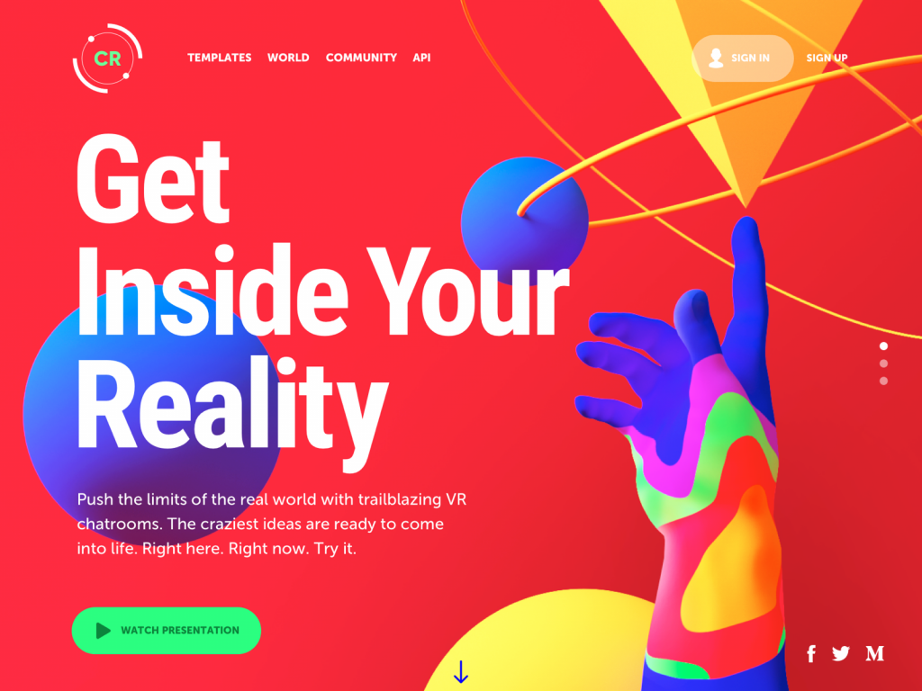
This concept presents the design for a web platform sharing templates for virtual chatrooms based on the craziest ideas. The visual presentation is made out of the world with bright and even psychedelic color combinations and catchy 3D graphics connecting a human-like element – hand – with geometric shapes symbolizing the variety of modern technology.
The year 2018 kept on building up the vast diversity and searching for effective ways of increasing the usability of interfaces. And that is what we find the most user-friendly trend. Millions of users use apps and websites as a part of their daily routine; they have different tastes and preferences, and particular feelings of what is comfortable and looks nice for them. The more options for looks and features we design for them, the broader range of diverse options that an endless global community of users will get to find the ones which fit their specific needs and wishes. And now we are looking forward to new trends in the upcoming year.


