With the rocketing number of brands, companies, and services, the number of diverse logos also grows. Sure, that’s exciting and challenging to be a part of that process, and even more – to take a chance and uncover some of design outcomes to you. Time for a new collection of logo designs by the Tubik team: check a fresh issue of our logofolio featuring 16 logo design examples for various companies, services, and products.
Logo for Dry Cleaning and Laundry Service
This is a logo designed for Levapp, the company providing on-demand dry cleaning and laundry services. The identity design is based on simple shapes that, if you look attentively, form a combination of L and A in a symbol, presented in a lovely and catchy color combination.
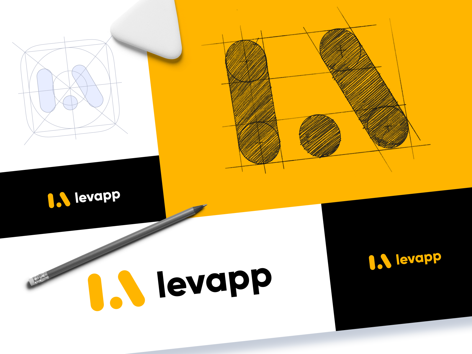
The branding sign is amplified by a smooth and dynamic motion for the options of use in digital products.
Logo and Identity for Traveling Service
Here you can take a glance at the logo and identity design for gotikket, the company that offers an easy-to-use service helping travelers to cover their needs. The wordmark shares a positive mood and is balanced with a contrasting bold color palette.
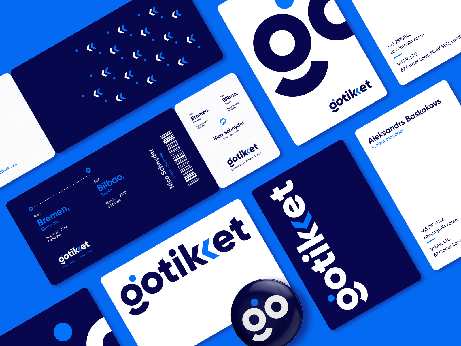
To add even more fun and make the logo lively, here’s an animated version.
Logo for Bakery
This is a logo design and branded packaging concept for a small bakery, Gustavo, named after its founder. Custom illustration featuring the baker’s silhouette is combined with a sophisticated typography part for the brand name and contrasting sans-serif font for the explanatory part.
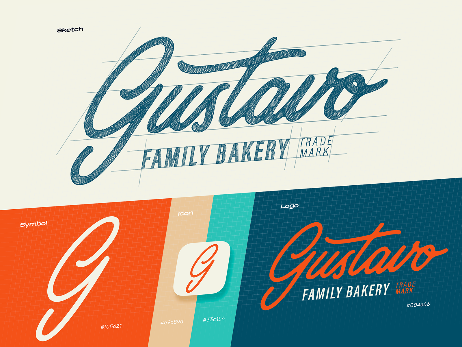
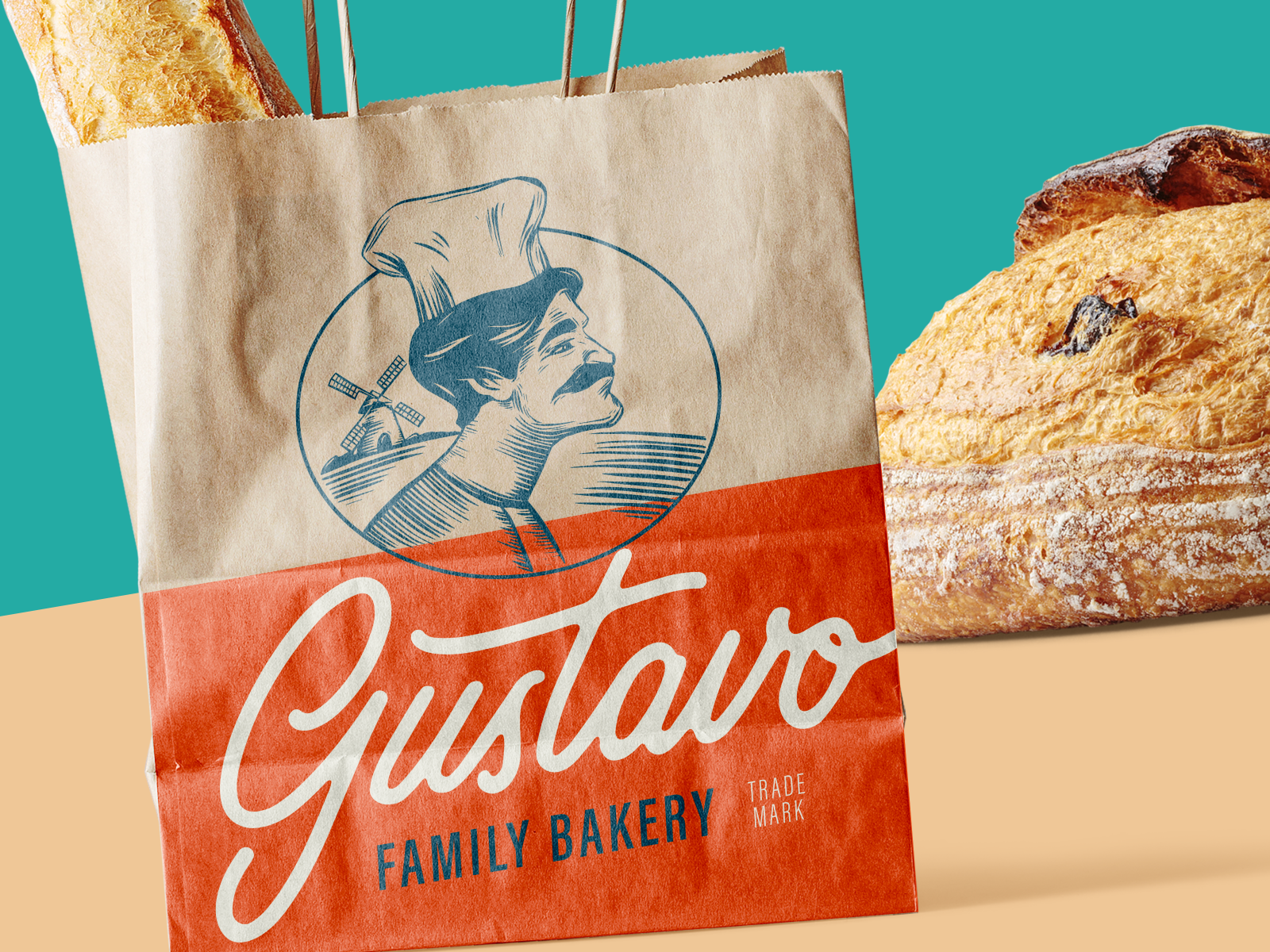
Logo animation to be used for the goals of web marketing adds even more elegance and smoothness to the idea.
Logo for Venture Studio
Logo design for Redmind, a design and technology venture studio headquartered in Stockholm. It’s a solid and bold wordmark whose visual originality is based on using negative space and color contrast.
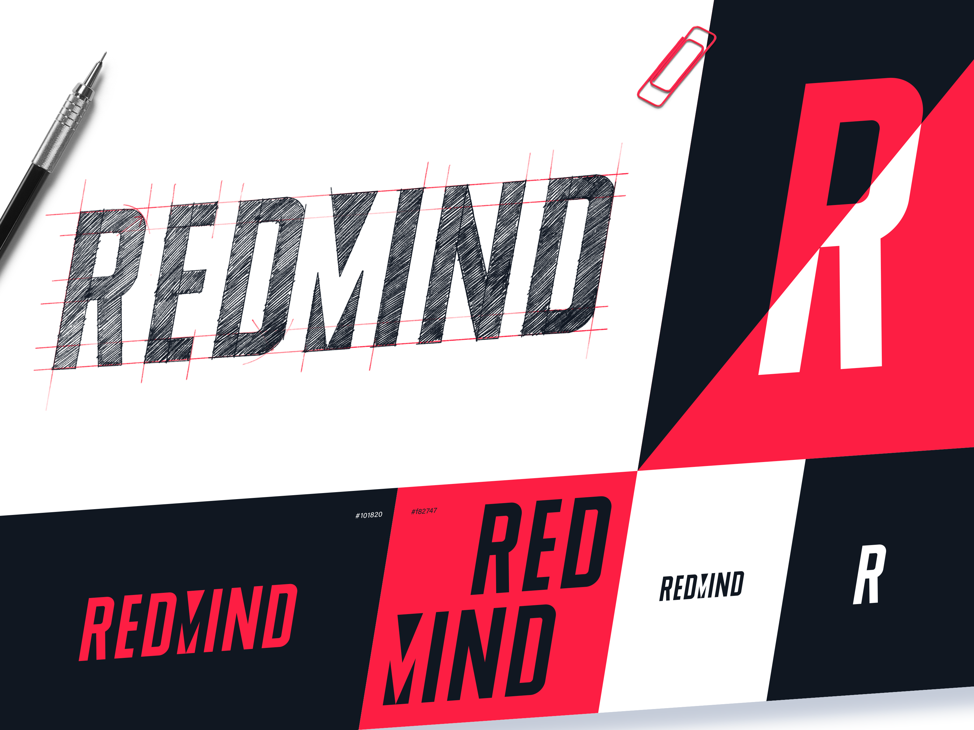
Logo animation concept catches an eye and plays with colors.
Logo for AI-Based Chatbot Service
This symbol has been designed for Ortico, the platform producing and supporting AI-based conversational user interfaces and bots. Logo animation allows for making the smooth curves of the brand sign even more expressive for digital interactions.
Logo for Flight Rights Protection Company
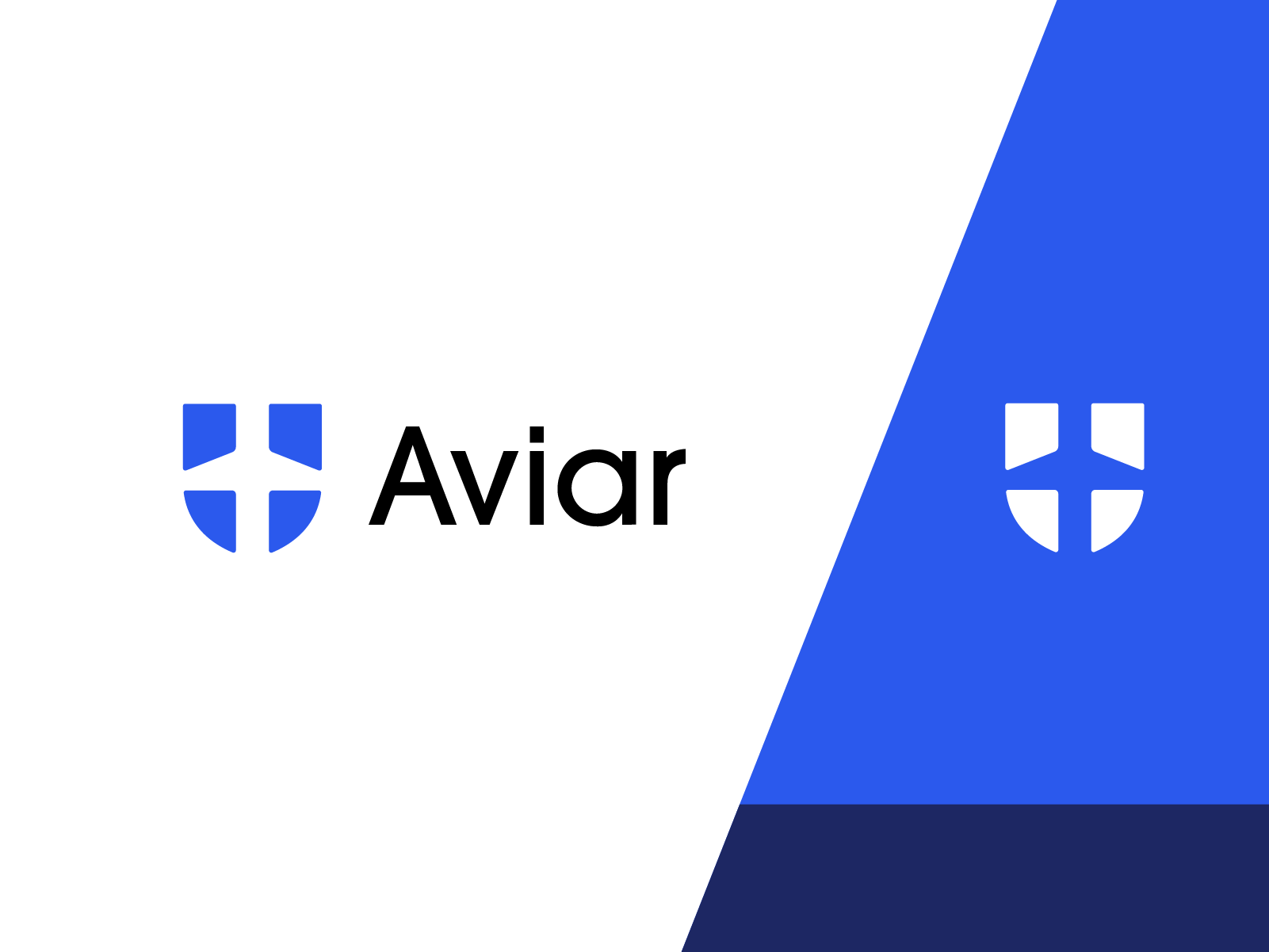
This symbol has been designed for Aviar, the company that deals with flight rights protection. The designer created an elegant and bold symbol playing with visual metaphors of a plane and shield combined with the power of negative space.
Logo for Wine Brand
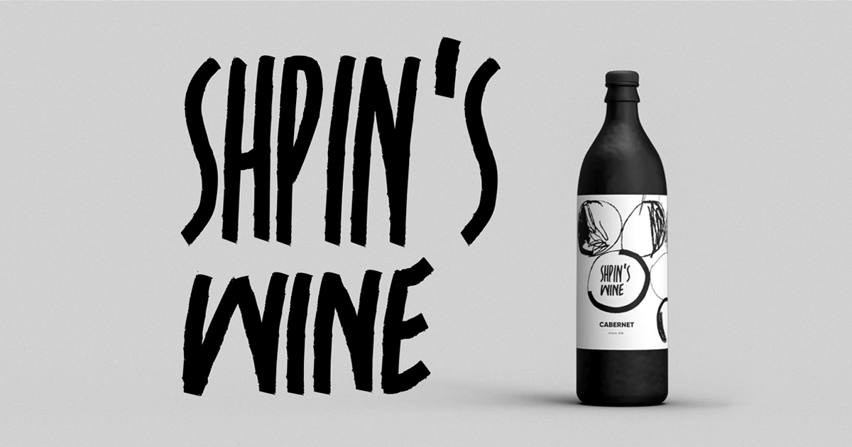
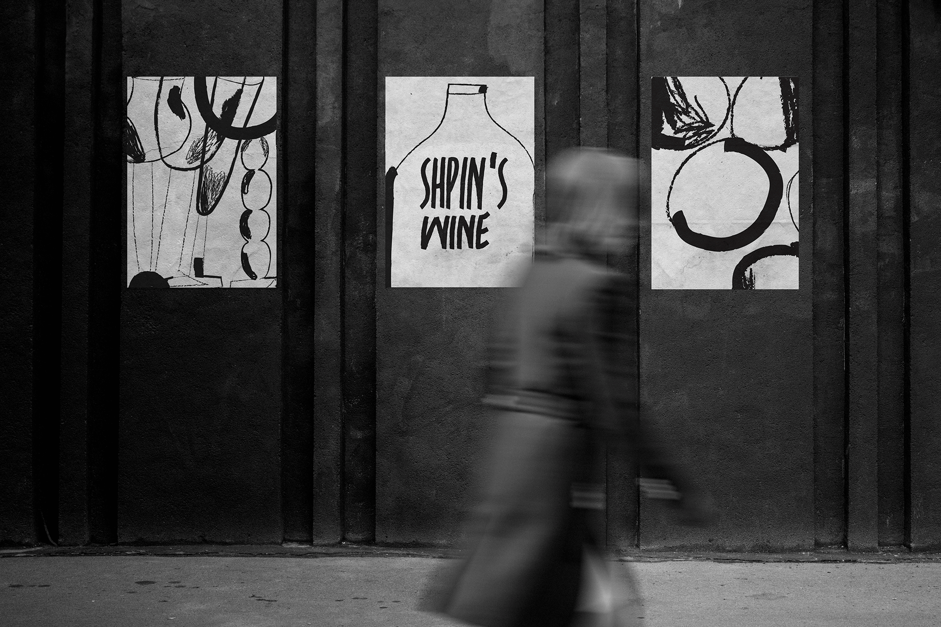
Shpin’s wine is a brand that originates in a small winery, where the love of wine has grown into a family business. It involves the whole family in the process of creating a unique and exclusive wine based on the tradition of classic winemaking. Here in Tubik Blog, we’ve shared the creative process for the brand identity: idea search, logo design, original illustrations inspired by art, and integration of all that stuff into the web interface. Take a look at the final logo variant.
Logo for Heavy Blankets Brand
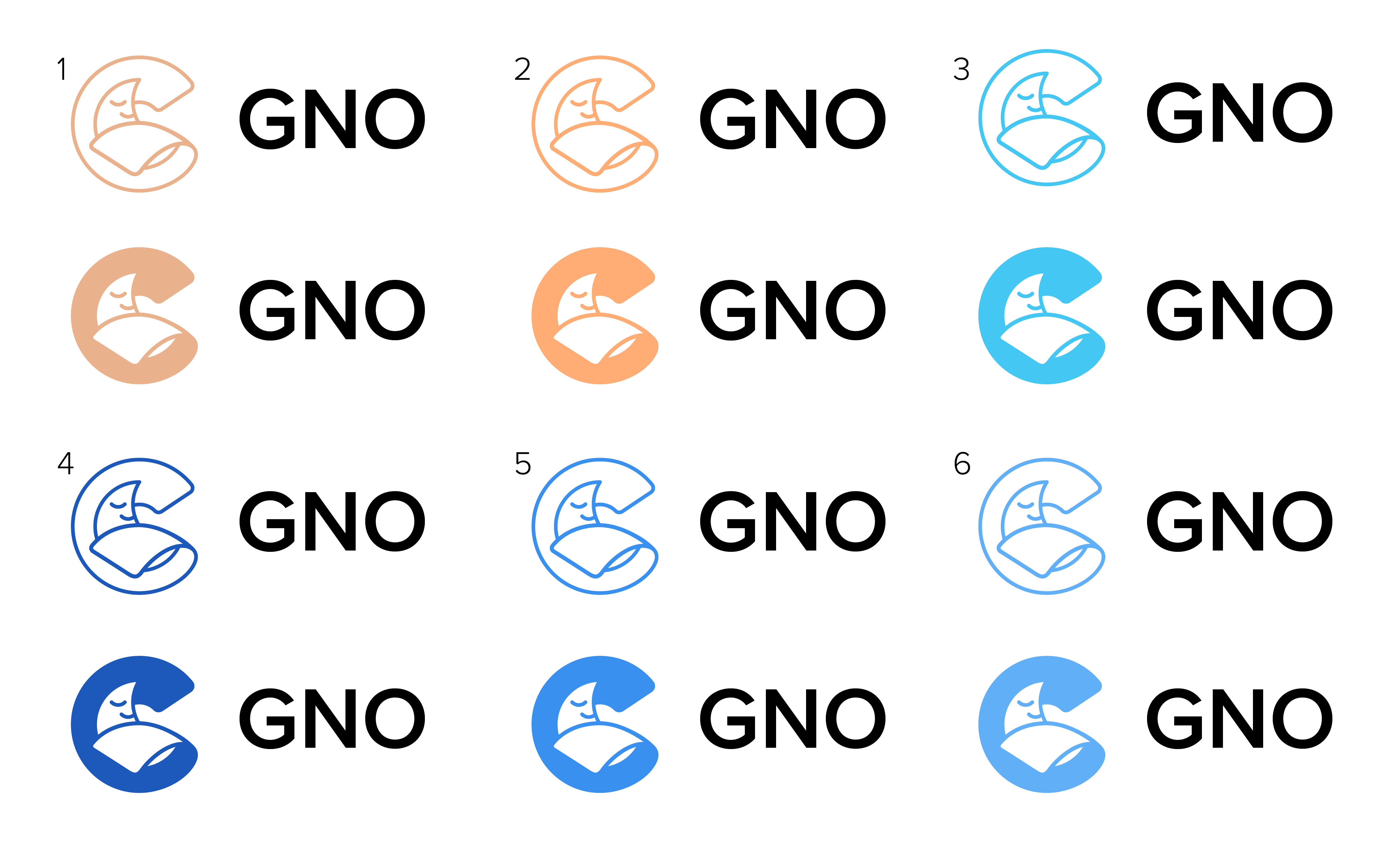
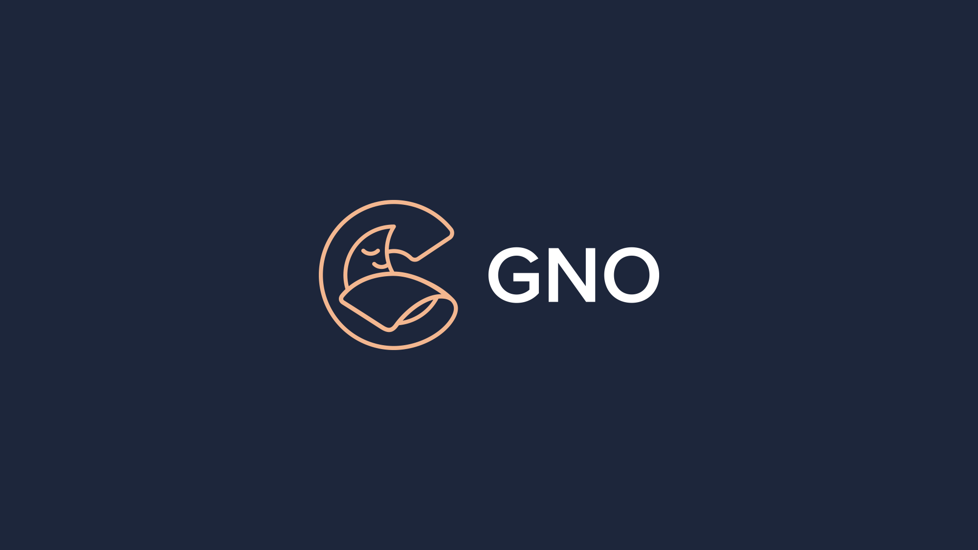
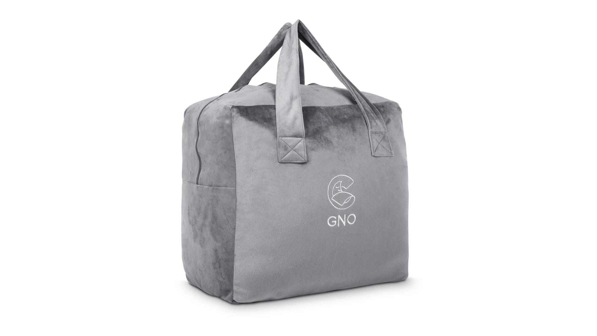
Here’s the logo designed for GNO Wellbeing, the brand that produces and sells heavy blankets that let people get a good sleep that helps them to achieve their goals. Through creative search and iterations, the team came up with a final logo: a beige outline logo symbol of a sleeping moon accompanied by a solid and simple typography part.
Logo and Brand Mascot for Party Game
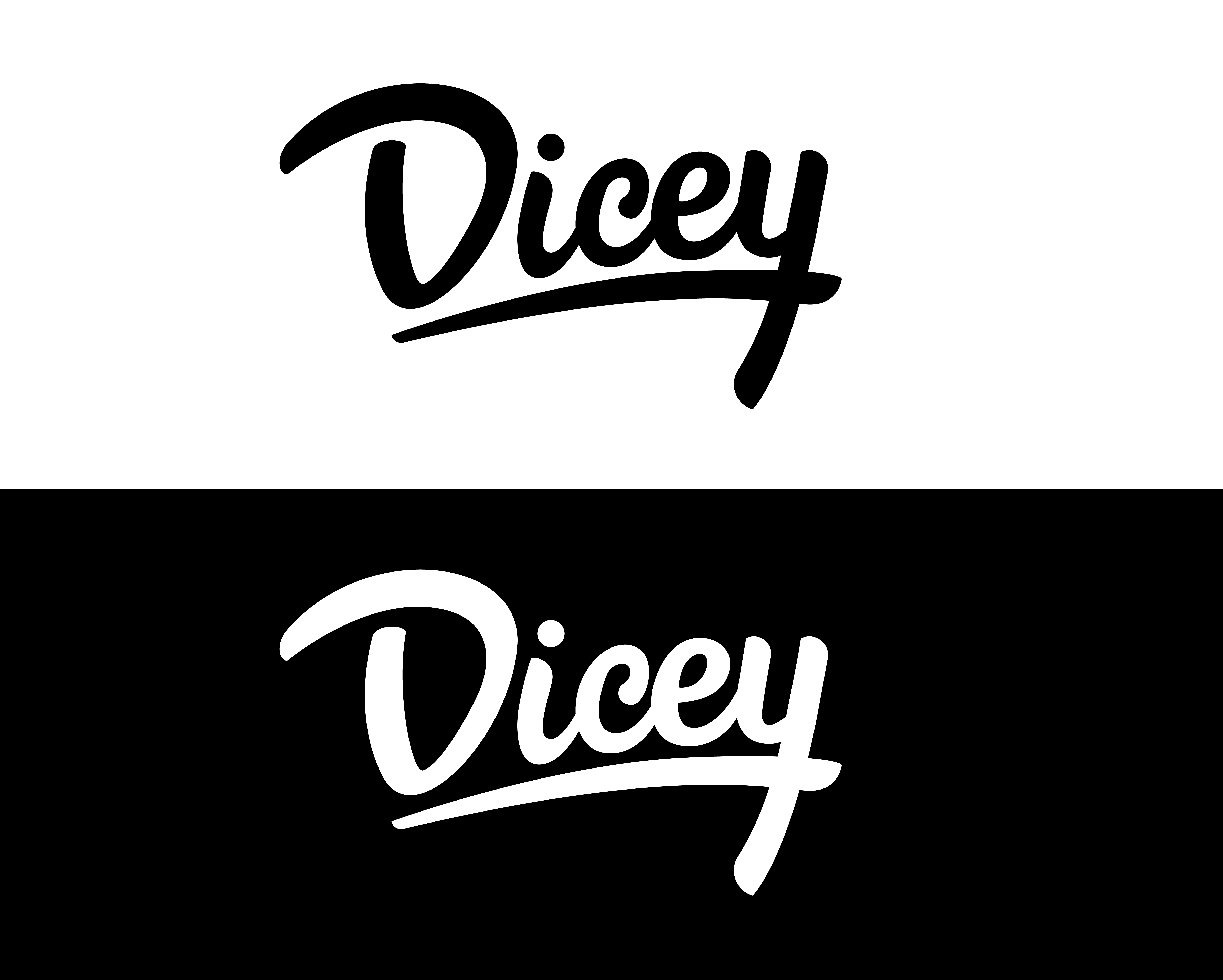
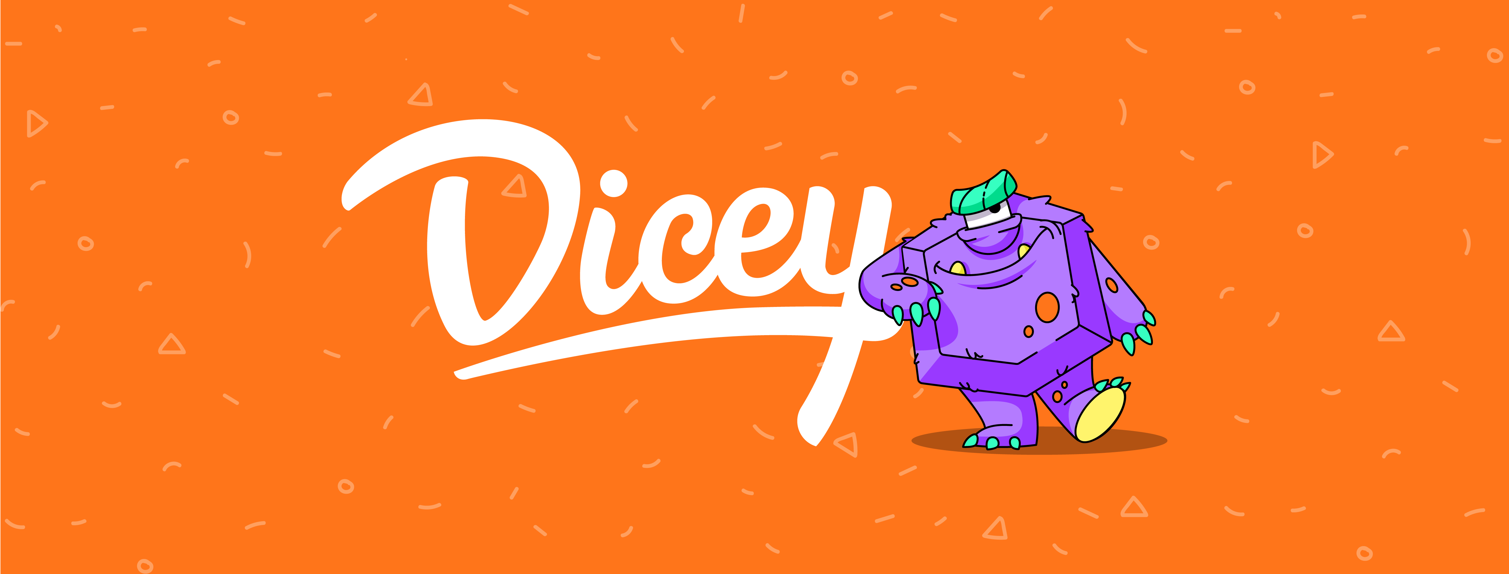
Here’s a glance at the branding design for a fun party game called Dicey. The creative process for this project didn’t get separate parts for the logo and mascot character. The wordmark uses smooth lines; it’s elegant and stylish but also playful and friendly.
Logo for Photo Sharing Service
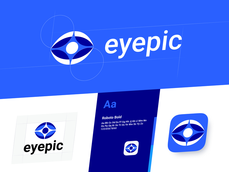
This is a brand sign for Eyepic, the new-age photo-sharing service. The concept features color variations for the dark and light backgrounds as well as options for the vertical and horizontal composition of the elements in the combination mark. Also, you can see the design solution for the app icon.
Logo for Food Delivery Service
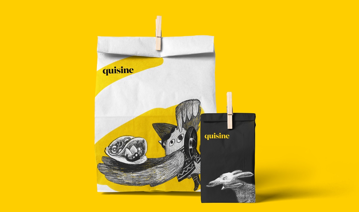
Quisine is an innovative service that delivers food of different national cuisines. It’s easy to use; it offers a big diversity of meals typical for different countries; it provides quick delivery and adds innovations to the entire customer journey, from making an order to receiving a meal. That’s what the brand image was based on. The company name presents a compilation of two aspects: quick cuisine. two contrast colors were chosen for the brand presentation, yellow and black.
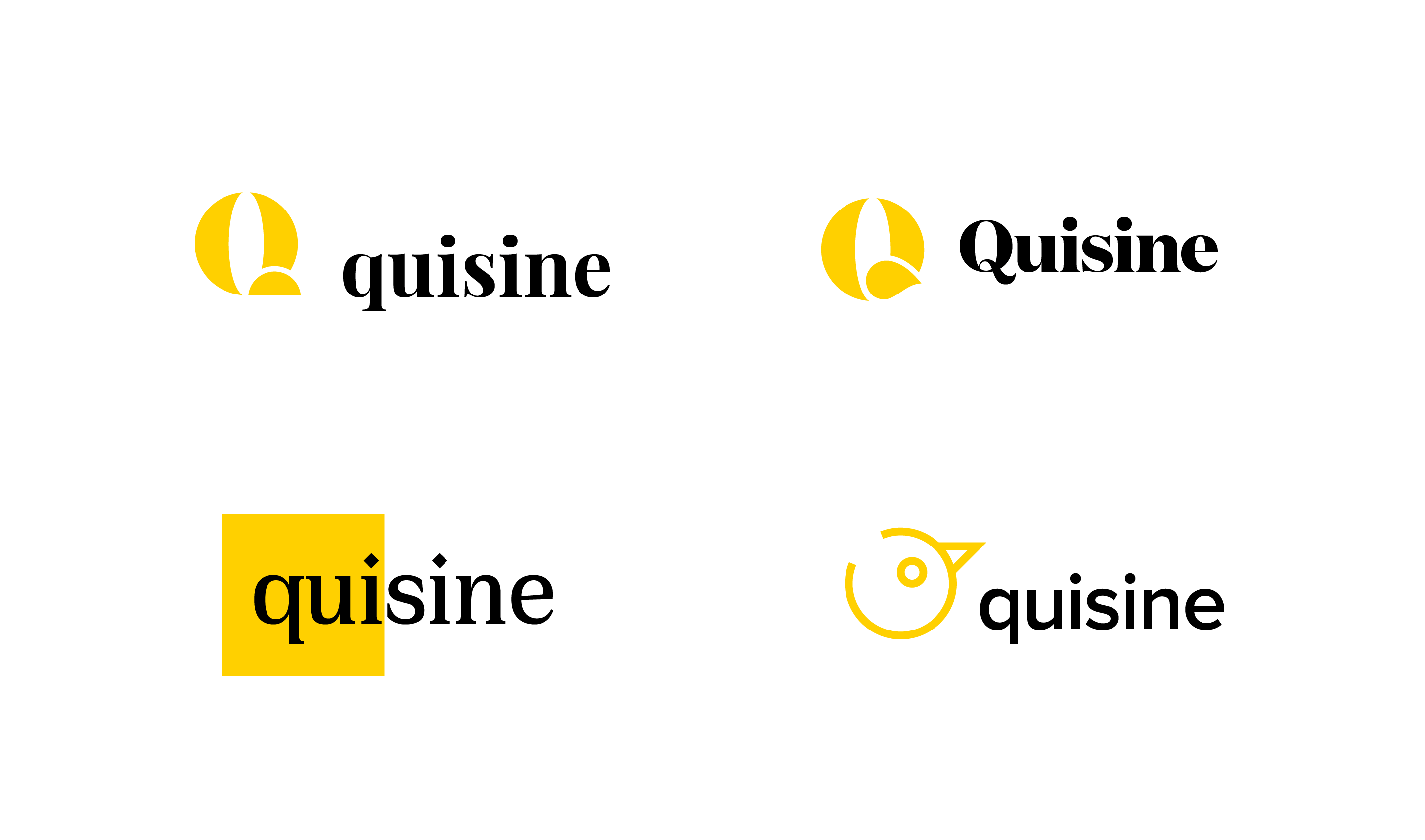
The choice of the font for the final logo was made in favor of serif to share the vibes of high-quality meals and fine dining.
Logo for CRM Service
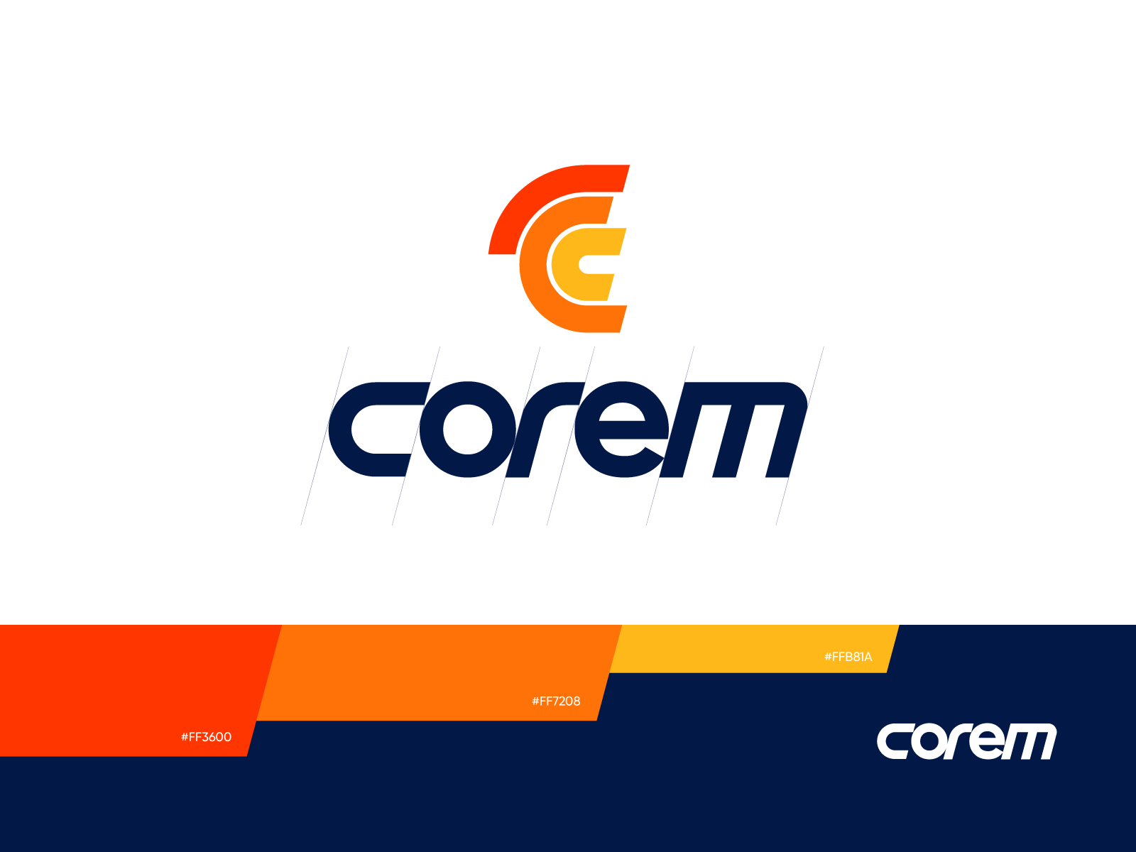
This sign has been designed for the digital product, a CRM system that helps to manage clients, segment audiences, and make communication more productive and focused. The logo presents a combination mark, including a symbol and a typographic part for the brand name. The elements of the logo work well both together and separately, depending on the branding and marketing goals. The color palette combines the feelings of energy and stability that lie at the core of such a service.
Animated Logo for Book Review Website
Today, logo animation is one of the ways to make brand presentation catchy and dynamic in digital products and web marketing strategies. Here is an example of a kind: take a closer look at the animated logo for Reviewed, the website of book reviews.
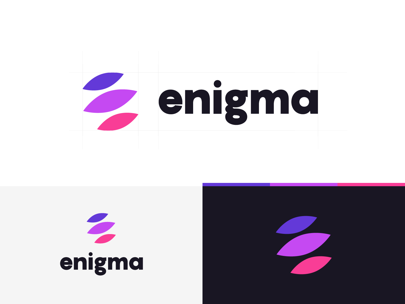
Logo for Crypto Startup
This logo has been created for the cryptocurrency startup called Enigma. The combination mark includes a symbol and a typographic part for the brand name. The elements of the logo work well both together and separately, depending on the branding and marketing goals.
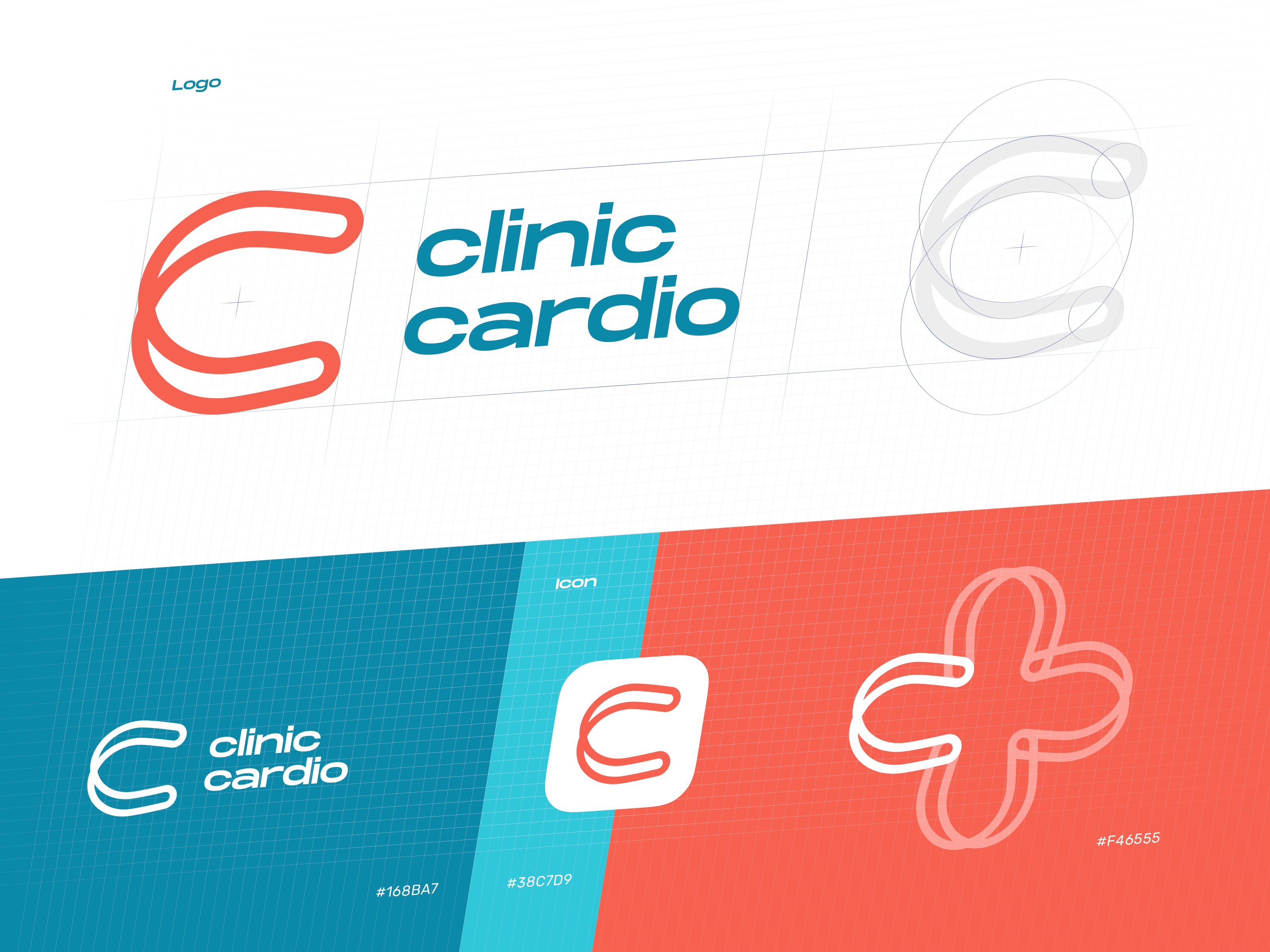
Logo for Healthcare Service
Not only purely commercial and business projects need a solid brand strategy and identity design. Charities, healthcare, education, and the like also have to care about their branding to get a chance of connecting to their target audience. Here’s a symbol created for a health service focused on cardio problems and helping people to keep their hearts healthy. The logo is aimed at being used on a wide variety of carriers and media, both offline and online.
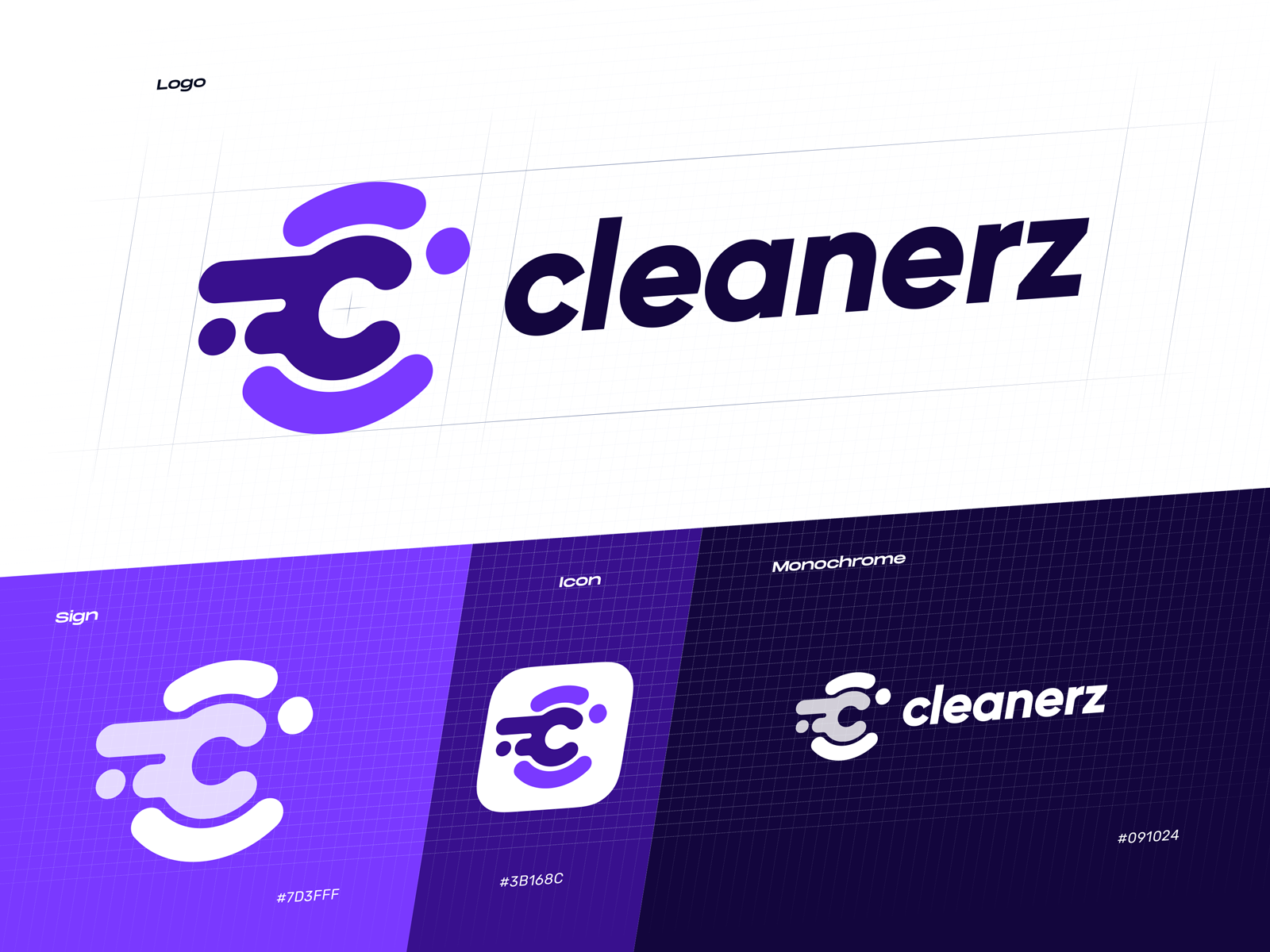
Logo for Car Cleaning Service
This one has been designed for the mobile app of Cleanerz, a service that provides innovative car cleaning on the spot with the use of eco-friendly technologies. For the brand logo and an app icon, the lettermark was chosen and transformed into a dynamic sign combining the energy of water and the power of fast movement.
Today’s list is over, but studio practice is full of many other interesting examples of design concepts for different purposes and needs. Don’t miss new presentations and case studies in our future posts.
Useful Articles
Here’s a set of articles for those who search for insights into logo design and brand identity creation.
Branding Design Process in Tubik: FAQ from Clients
Collection of Creative Logos for a Variety of Brands
Remember Me. Basic Types of Efficient Logos
Shape and Color in Logo Design. Practical Cases
Design Me Live: The Power of Mascots in UI and Branding


