The year is coming to its end at the rocketing speed, and it’s time for us to take a look back, remember and analyze what has already been done. Perfect time for our traditional reviews of what’s been popular in design. This year we are broadening the scope and add one more design trend review for Tubik Blog readers, devoted to graphics and illustrations. Traditionally, packed with tons of design examples by studio designers. Welcome to check!
Line Art
One of the trends in graphic design that really evolved this year is line art. Based on the popularity of clean and sophisticated outline graphics and typography, it moved to the next level, presented with more and more line illustrations and artworks integrated into branding, web design and printed stuff.
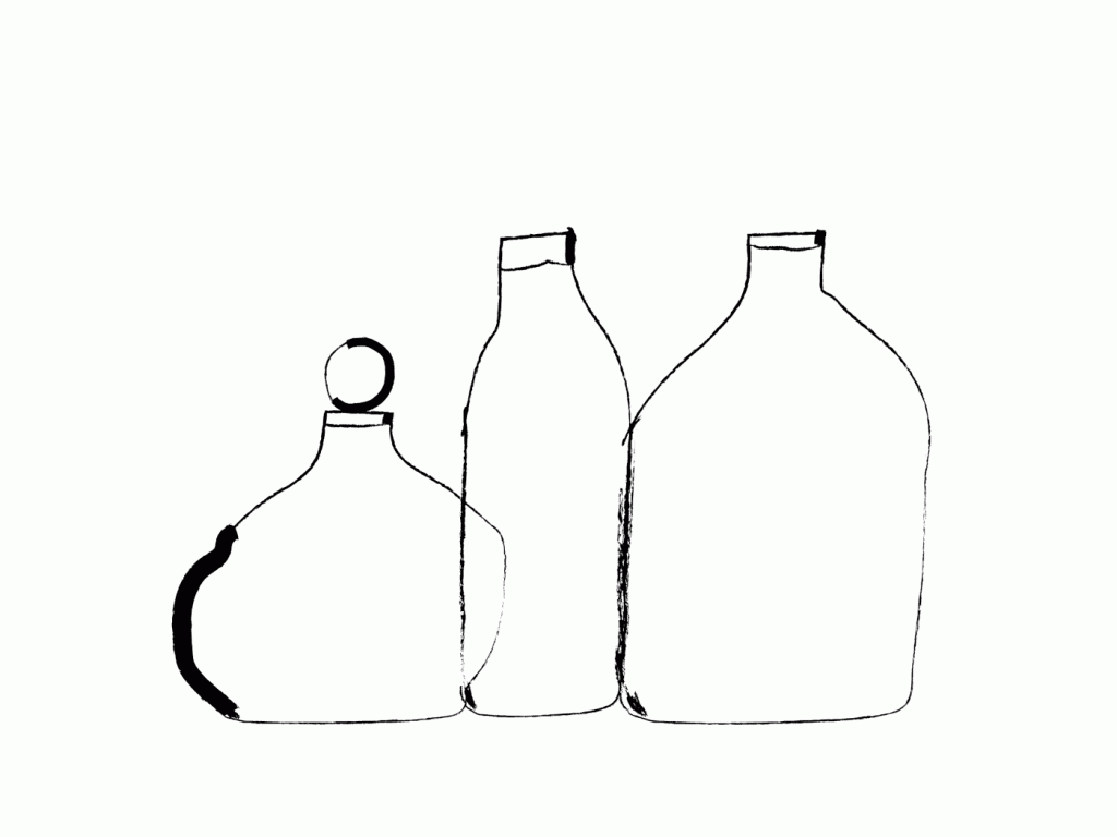
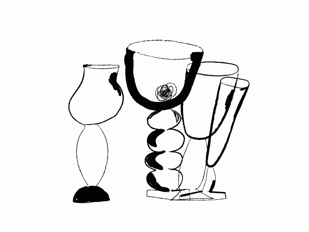
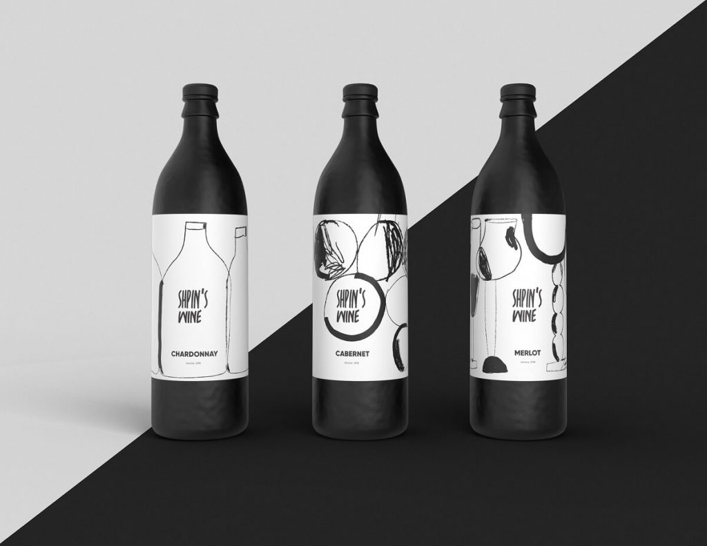
Artistic line art applied to Shpin’s Wine identity design
Broken Proportions
As for digital illustration, the year 2019 let the trend of broken proportions get even more solid positions. It started getting established last year, yet this year it achieved the amazing diversity of styles, plots, exaggerations or tinifications, and visual metaphors. Such an approach is definitely effective in setting visual originality, wished so much by brands. Still, to be done harmonically and beautifully, it requires real artistic talent from the illustrator: to break the rules, you need to know them perfectly!

Illustration for digital service featuring people with unusual body proportions
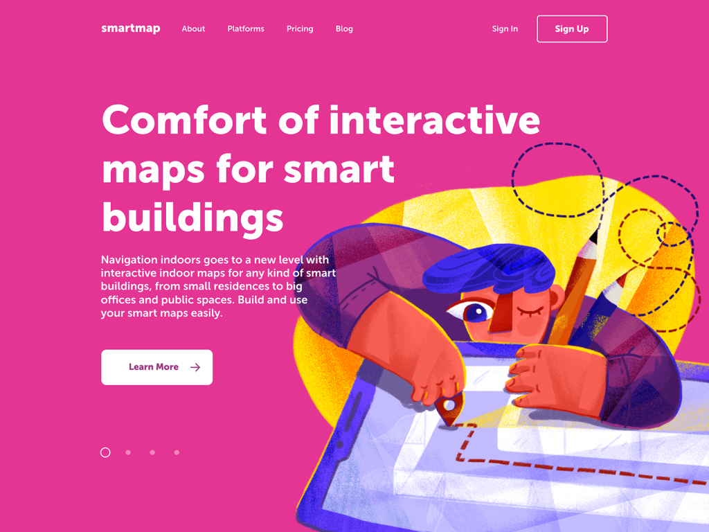
Hero illustration for a landing page featuring a character with uncommonly broken body proportions
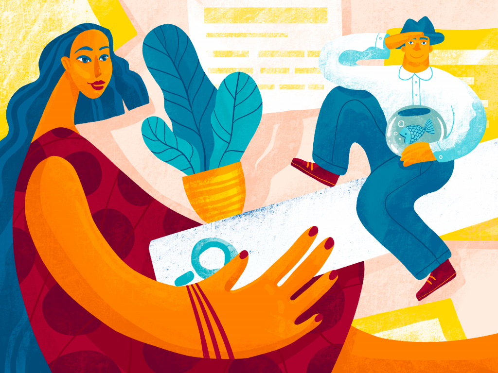
Blog illustration on design process using broken proportions and perspective
Dynamic Composition
This year brought lots of graphic design examples and digital artworks based on dynamic compositions. Perhaps, the fact-pace modern world dictates that trend: we see more and more characters and graphic elements moving, running, flying, swimming, cycling, doing anything except standing still.
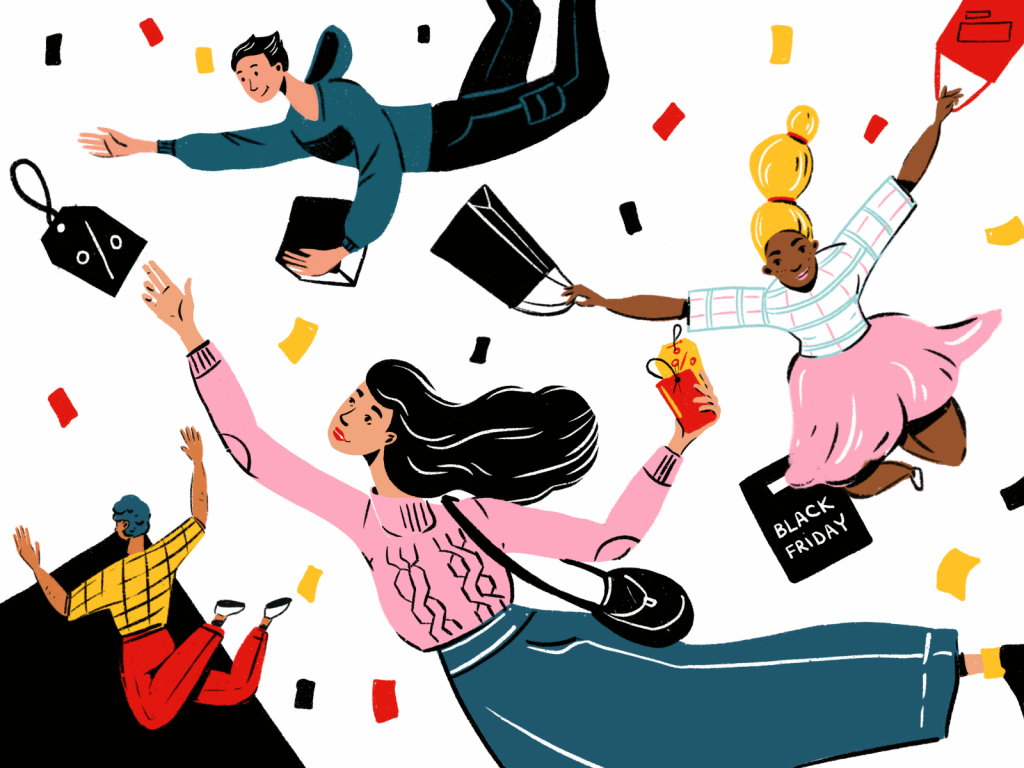
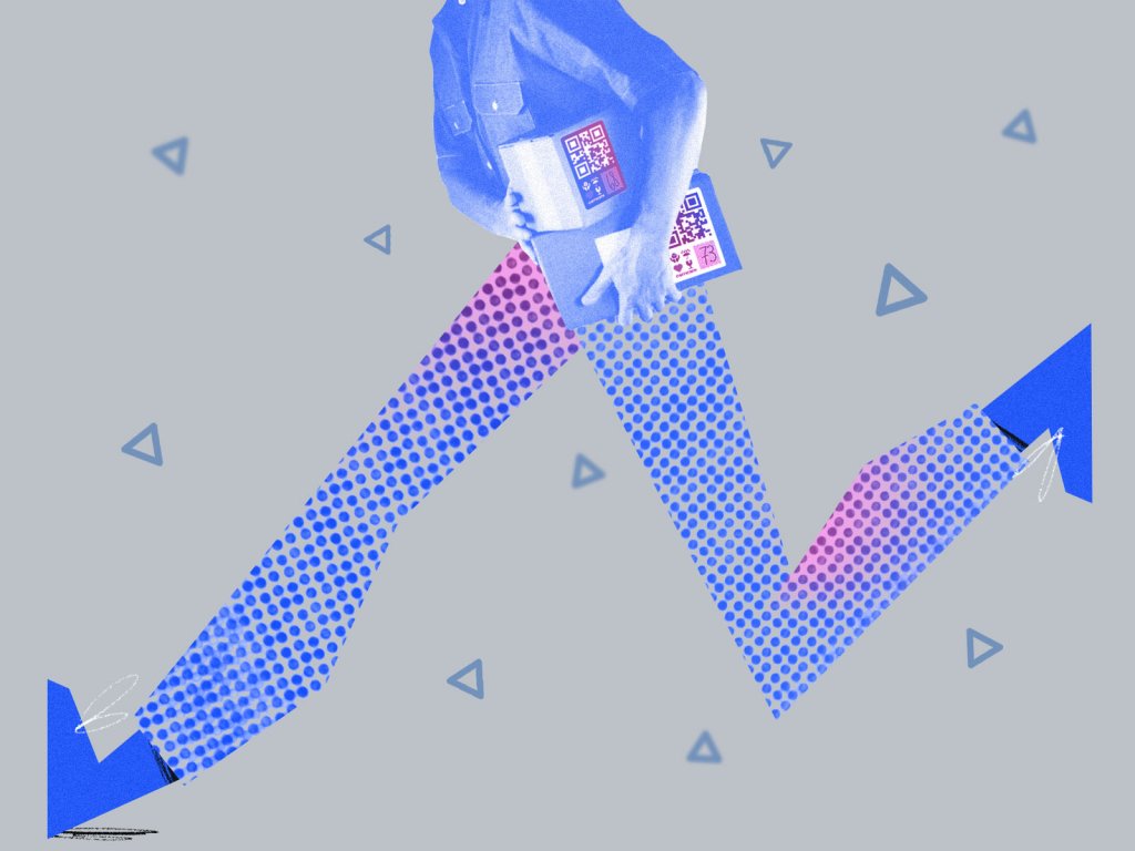
Dynamic composition applied to the illustration on ecommerce and shopping
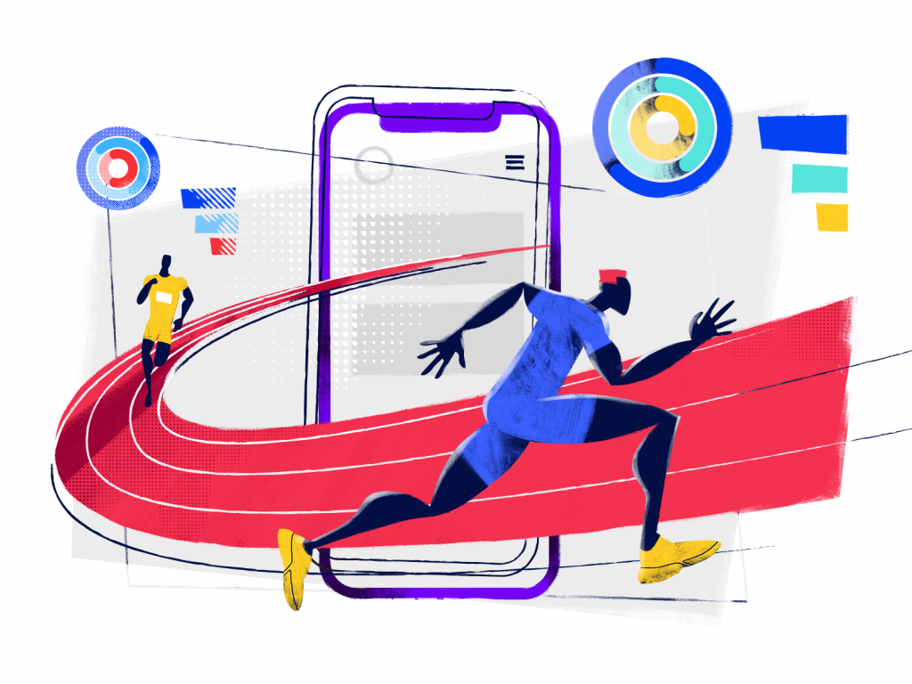
Illustration devoted to the theme of UX design instantly transfers the feeling of speed and races
3D Art and Animation
The trend of graphics in volume seems to reach more and more popularity this year, covering multiple design tasks and goals. No wonder: 3D art gives depth and realism where it’s needed, allows designers to step beyond the limits of two dimensions and sets solid connections to the objects of the physical world.
Lovely 3D illustration and animation created for onboarding of the Status App
3D animation showing the cosmic power of creative UX design process
Gradients
Gradients are still in fashion, especially when it comes to digital art. Thoughtfully touched gradients allow to add atmospheric depth to the image and create the original attractive style.
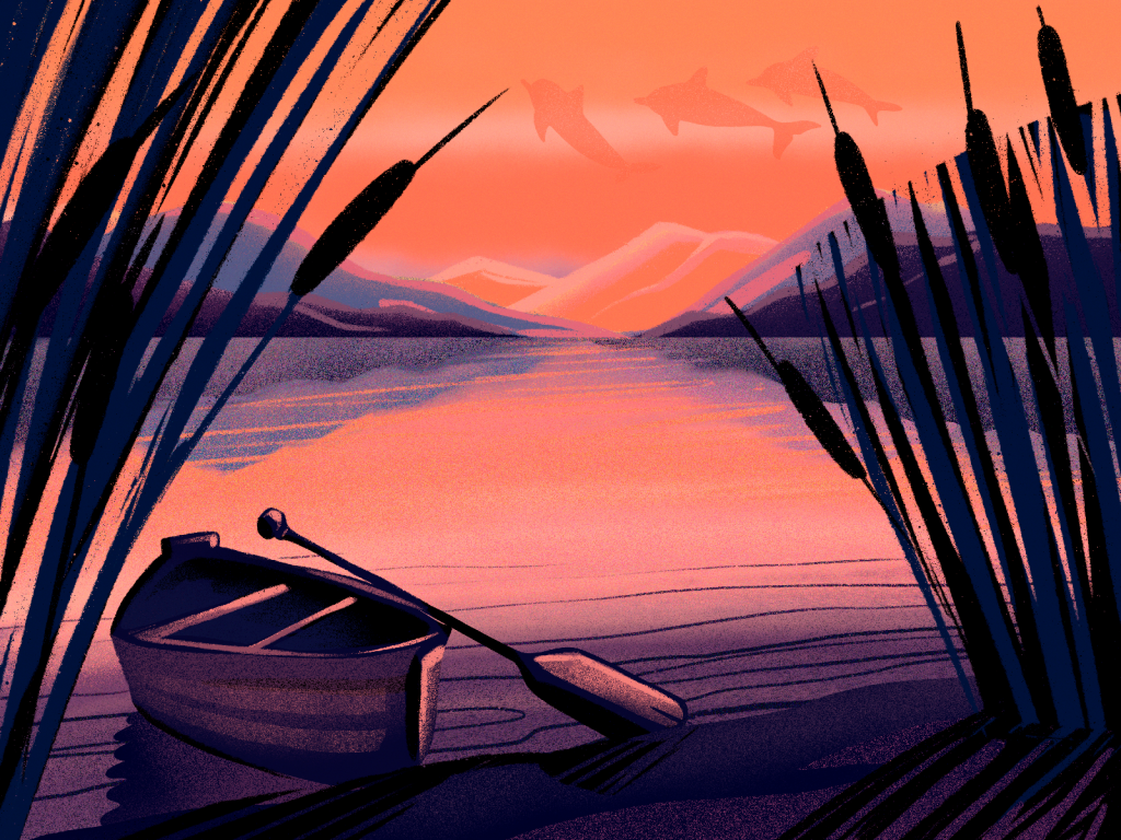
Atmospheric sunset river illustration built on a gradient approach
Visual Noise Effect
Visual noise seems to be one of the most popular visual effects in illustration this year. It instantly makes the digital artworks cozier and adds natural vibes to digital art.
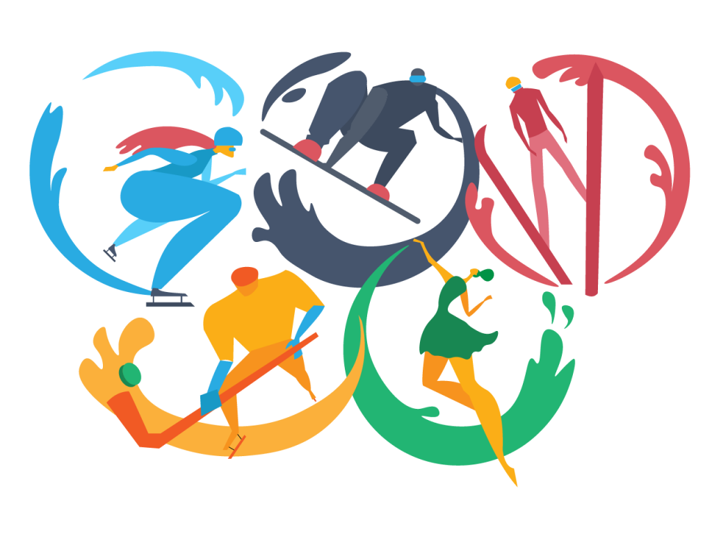
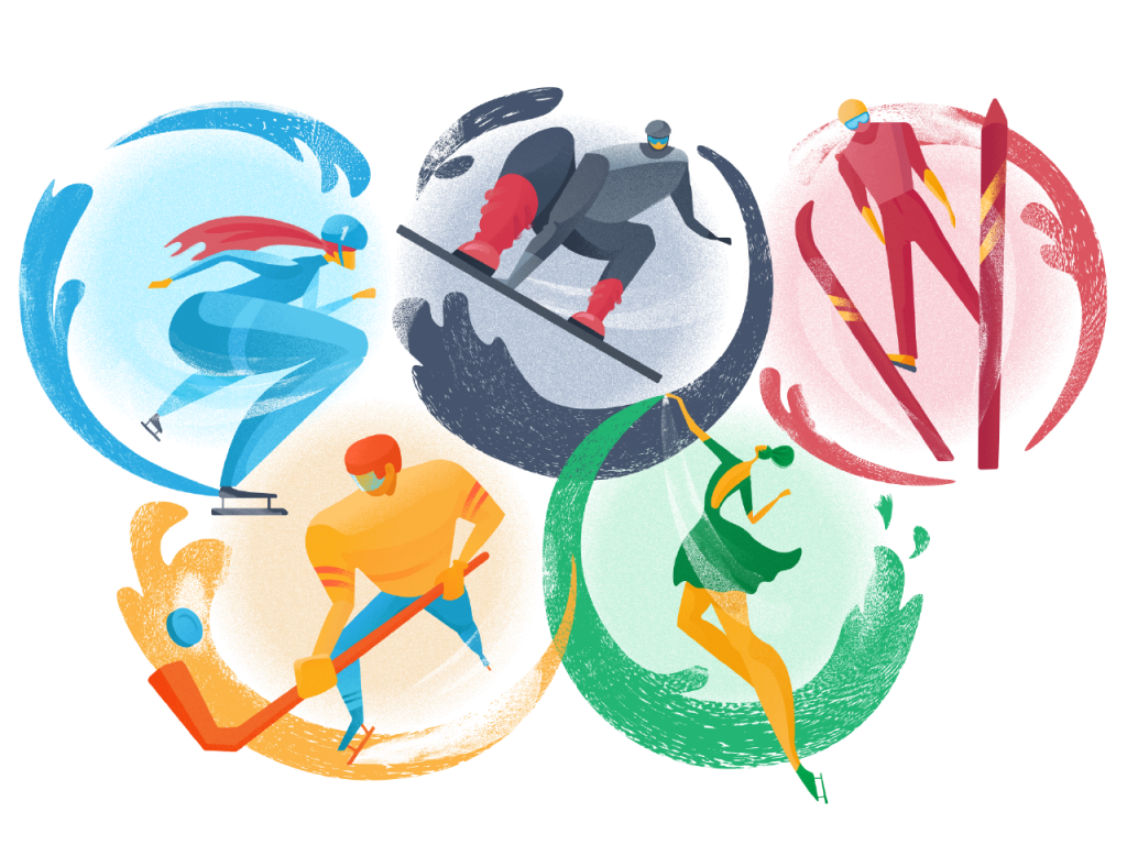
The Winter Olympics illustration shows how visual noise effect changes the artwork style and performance (up – without noise, down – with noise)
Surrealism
This year digital art appears to step much closer to high arts than ever before. One of the ways to do it has been integrating the elements of surrealism into illustrations and branding. It definitely gives the outcome that is quite specific and out-of-the-box, so both artists and brands should be ready for all kinds of feedback. The comments and emotions on it can be either positive or super negative, yet there’s one thing for sure: nobody will stay indifferent. Isn’t that what people and brands strive to get?
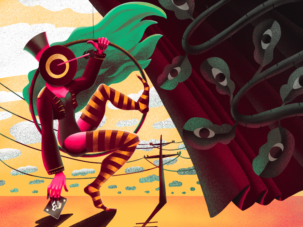
Surrealistic illustration inspired by artistic world heritage in this style
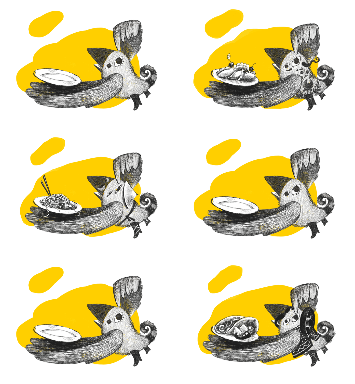
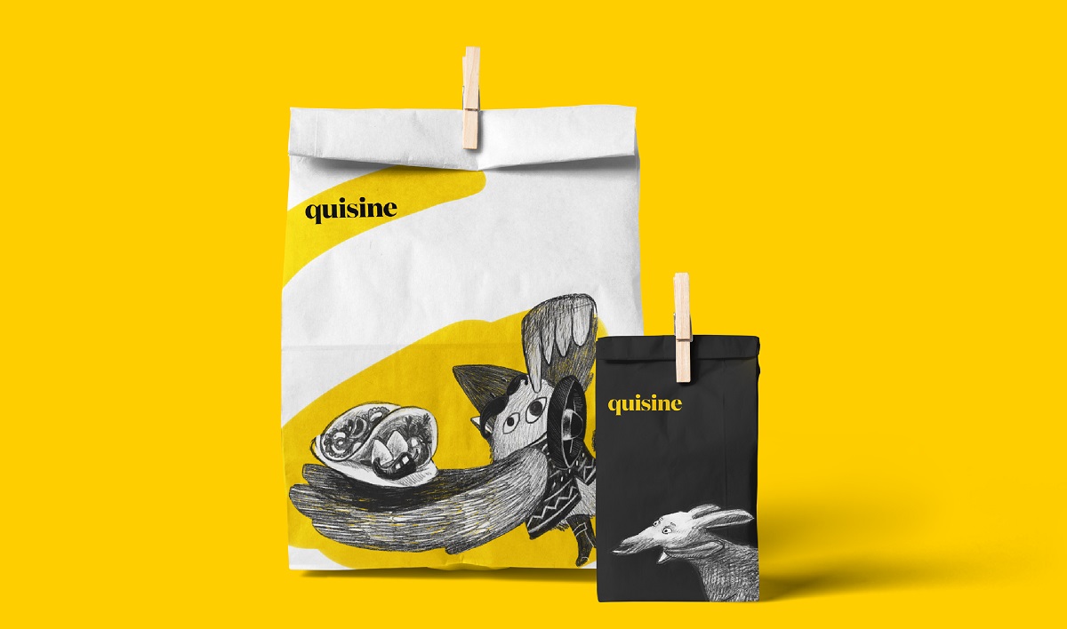
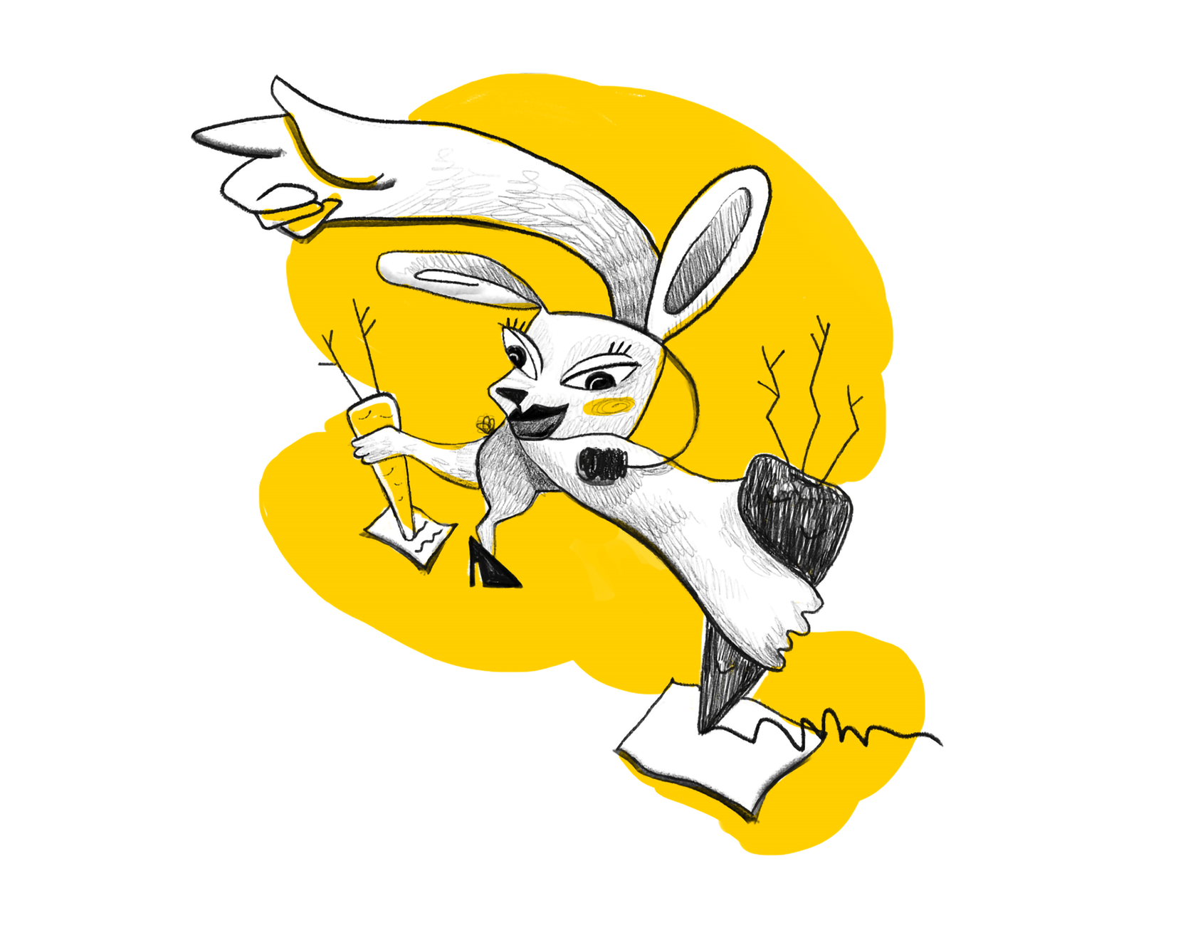
Surrealistic characters integrated into identity design for the food delivery service called Quizine
Primitivism Vibes
Another popular way of adding classical art to graphic design is the primitivism direction. Yes, those illustrations that are referred to as “my kid can paint better”. Anyway, the ones that do understand that particular art direction, make fun and enjoy the best sides of primitivism integrated into digital art.
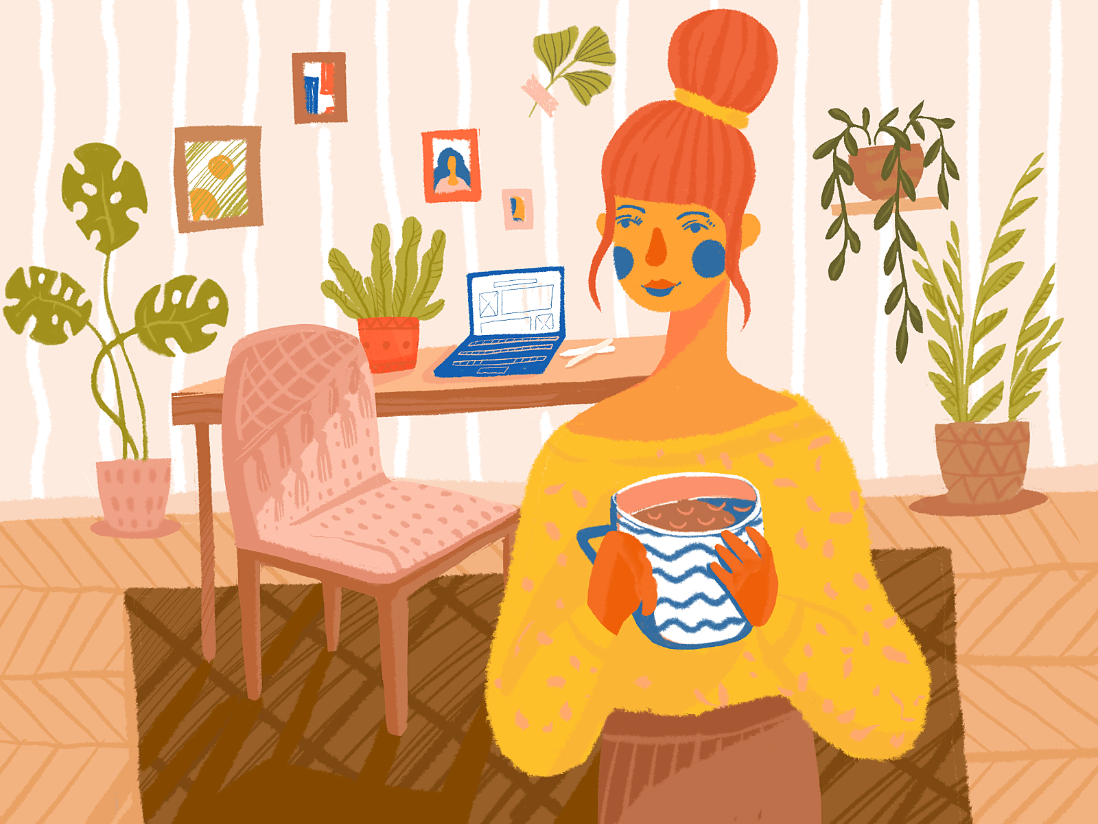
Digital illustration reflecting the creative approach with primitivism vibes
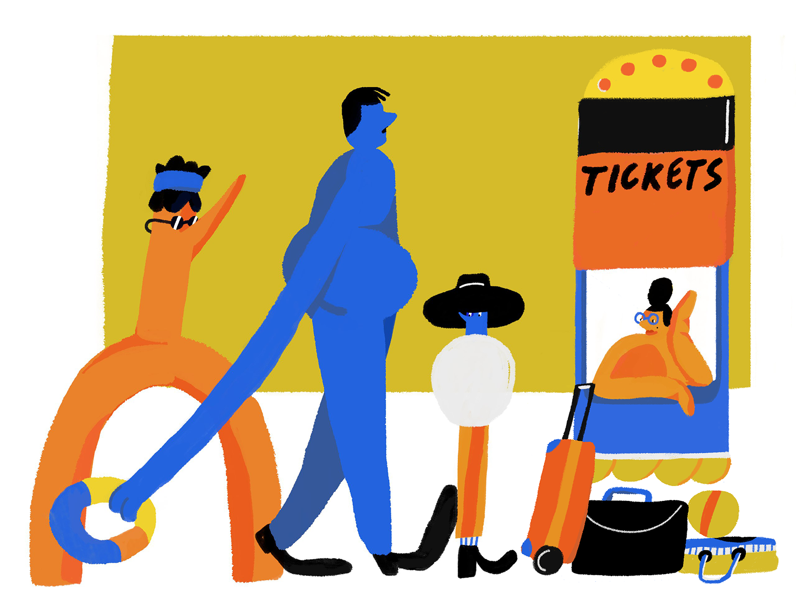
Artistic digital illustration with the vibes of primitivism and surrealism
Flat Lay Art
Although we can hear that flat lay has lost its positions in photography, graphic design and digital illustration seem to not care about that. It may be inspired by the best food-photographers that still make special art of flat lay evolution, elaborate and high-quality pictures of workspaces, and many other factors. Anyway, due to a variety of tools, brushes, and textures, flat lay has got a new breath in illustrators’ artworks this year.
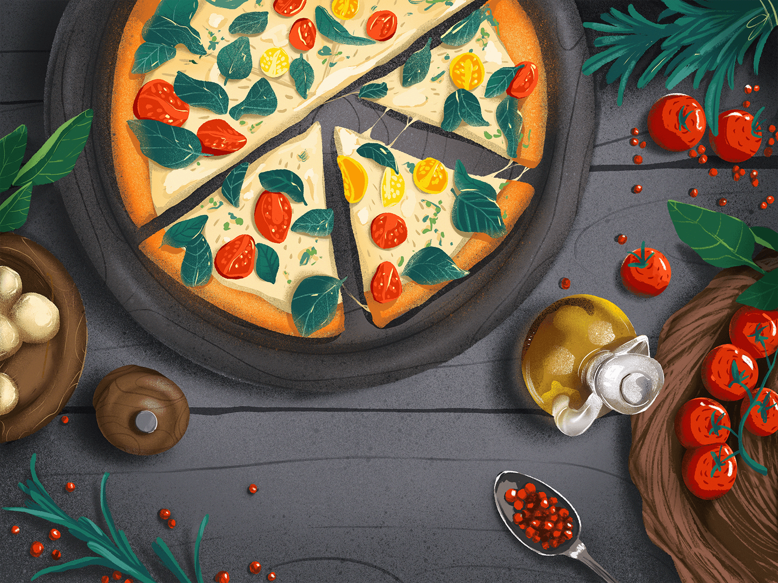
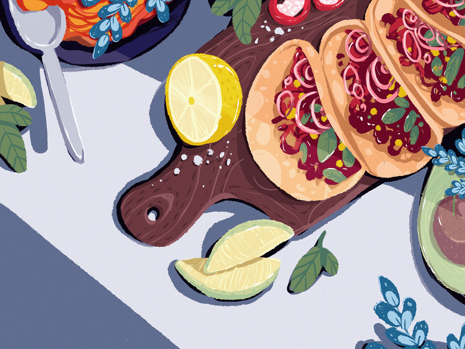
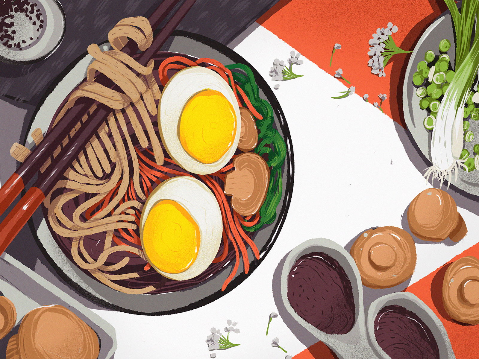
A series of food illustration in flat lay style
Geometric Motifs
Nothing seems to be more harmonic and clear to the human eye than geometric shapes and patterns. This year, geometry continued establishing itself as an integral part of digital art and branding. Creative combinations and lovely patterns based on it are also very effective in creating emotional background and mood, considering the psychology of shapes.
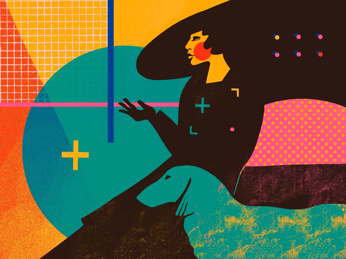
Geometric motifs used in title image for the blog article about visual dividers
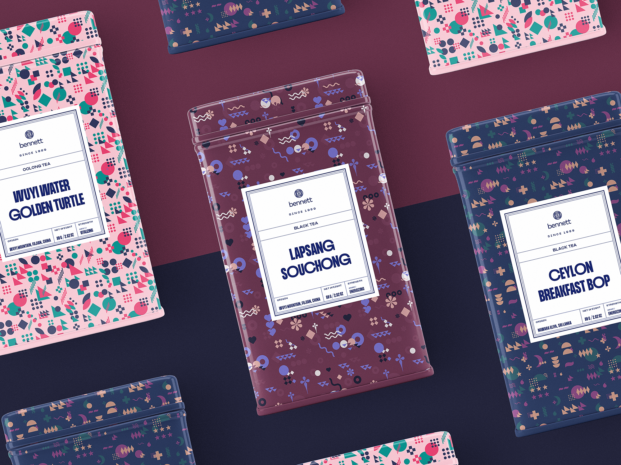
Packaging design for Bennet tea brand, based on geometric pattern
Nature Motifs
One of the most debatable and popular themes of recent years is living with respect to nature and love for our planet. Sure, design and arts responded to it diversely. As a result, we observe the growing popularity of nature motifs and themes in identity design, artistic elements added to user interfaces for web and mobile, illustrations and animation.
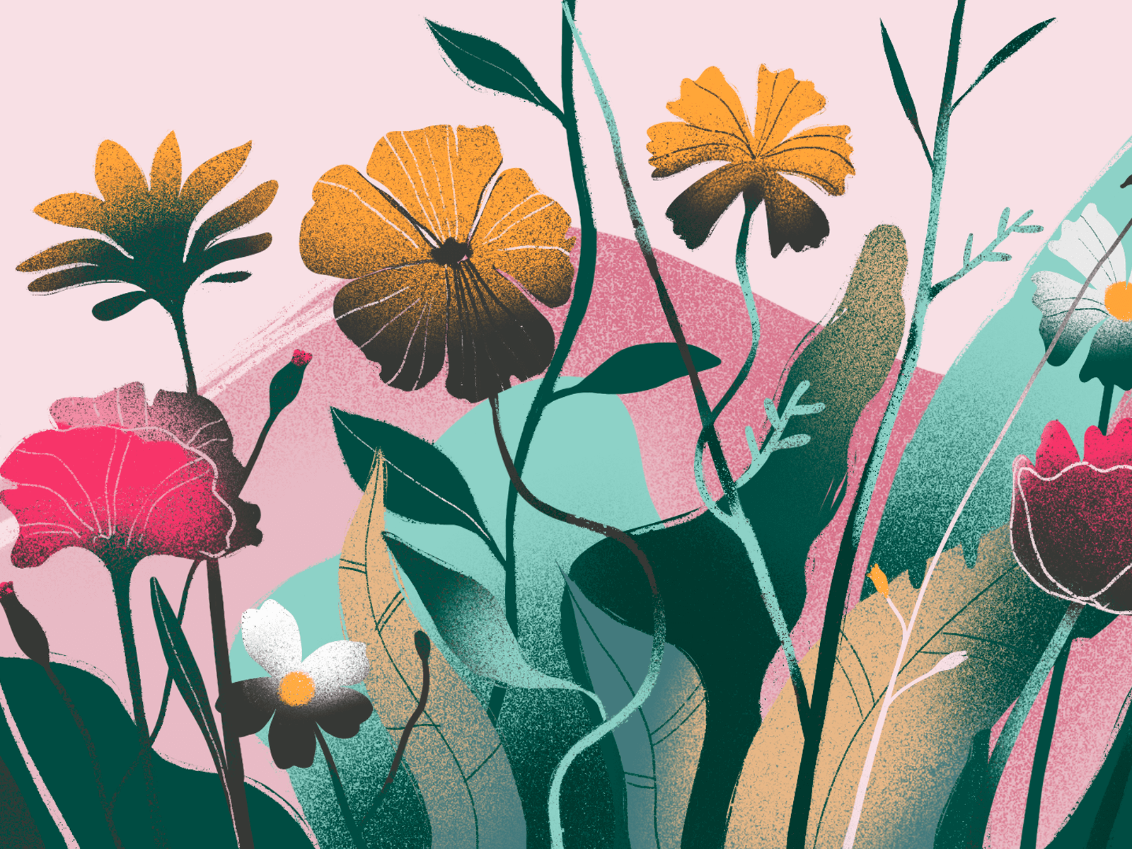
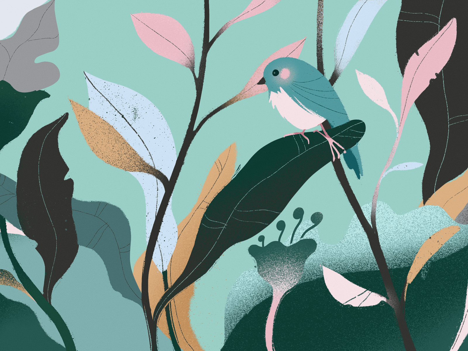
Digital artworks created for the website devoted to zero-waste living
Playing Off Negative Space
Negative space has always had great artistic potential, but it’s not the skill that’s easy to tame. This year it got trendy in both logo design and illustration, making identity and visuals artistic, unique, and eye-catching.
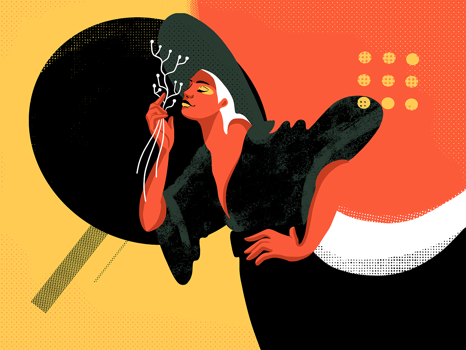
Illustration playing with the negative space and color contrast
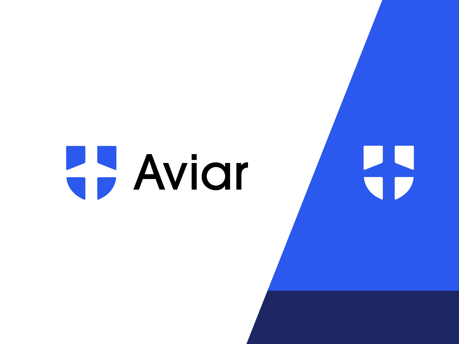
This symbol has been designed for Aviar, the company that deals with flight rights protection. The designer created an elegant and bold symbol playing with visual metaphors of a plane and shield combined with the power of negative space.
Limited Color Palette
As well as in user interface design, the domain of graphics made a step to creative experiments withing limits and restrictions. Color as the most expressive and emotional factor of graphic design, for sure, took the top position in the rating of limits. So, more and more graphic designers and illustrators choose to provide their designs within a very limited color choice or even monochromatic palette.
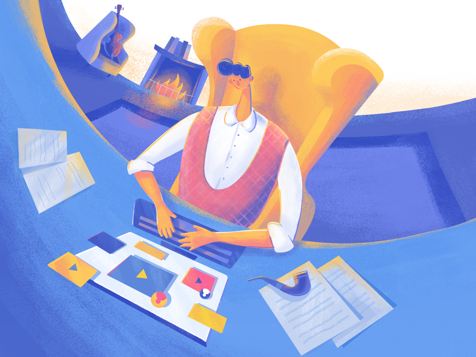
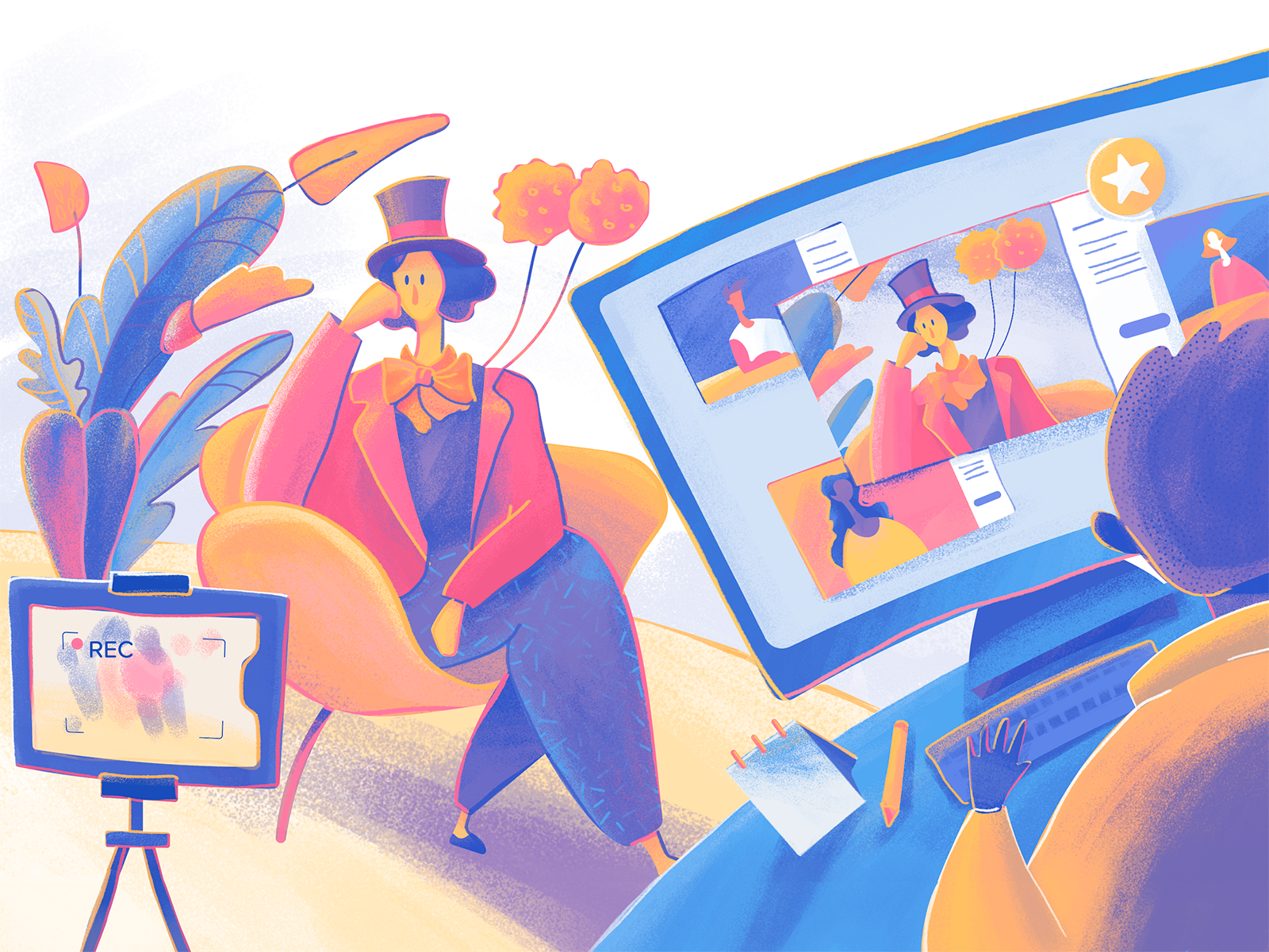
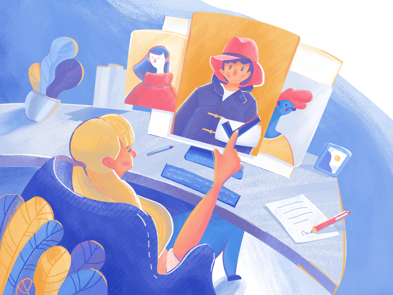
The limited and defined color palette for the big set of brand illustrations for Moonworkers project allows for strengthening the visual consistency of the brand image
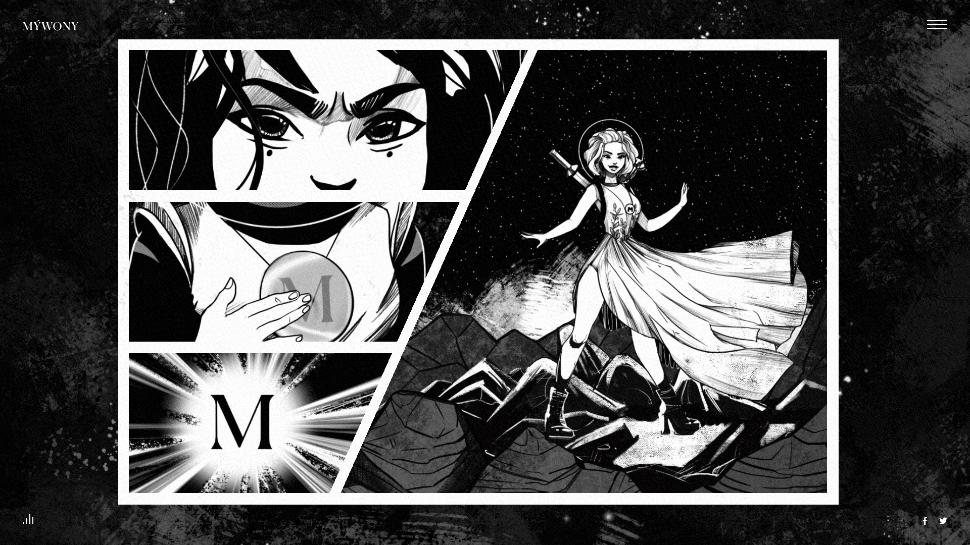
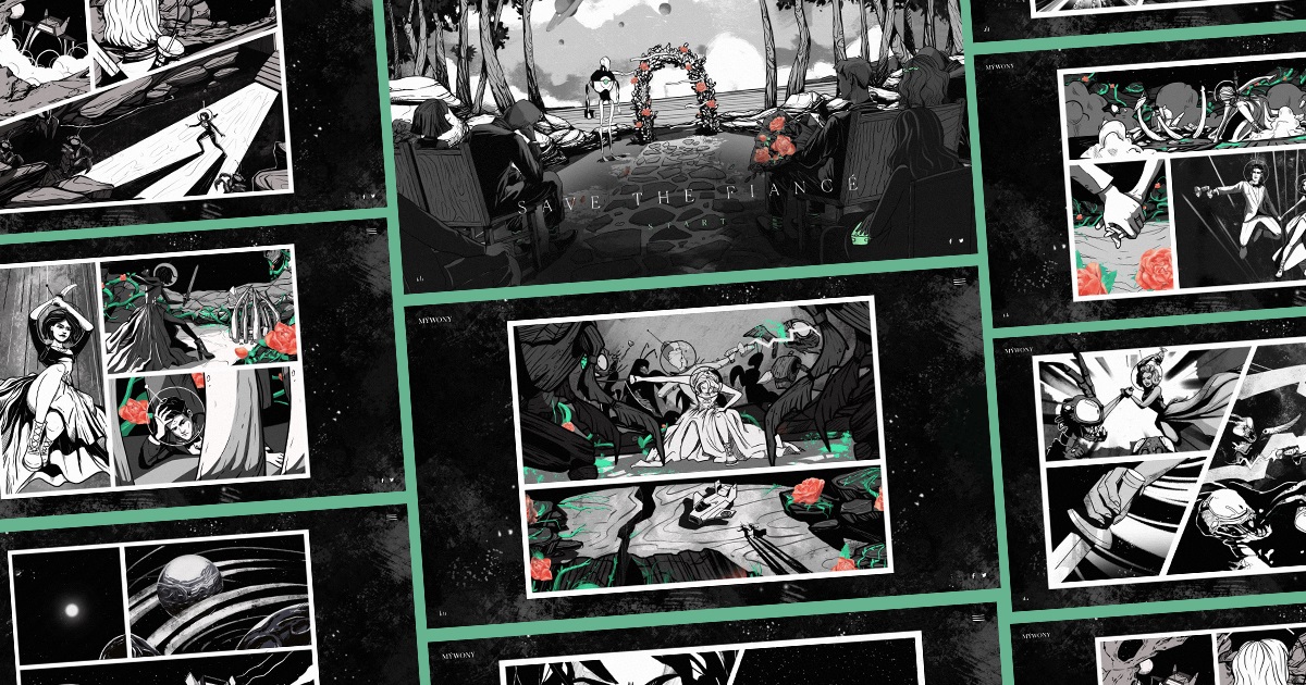
Original graphics for MYWONY brand intro is done in the style of classic comic books and wrapped in monochrome palette with rare bright color accents
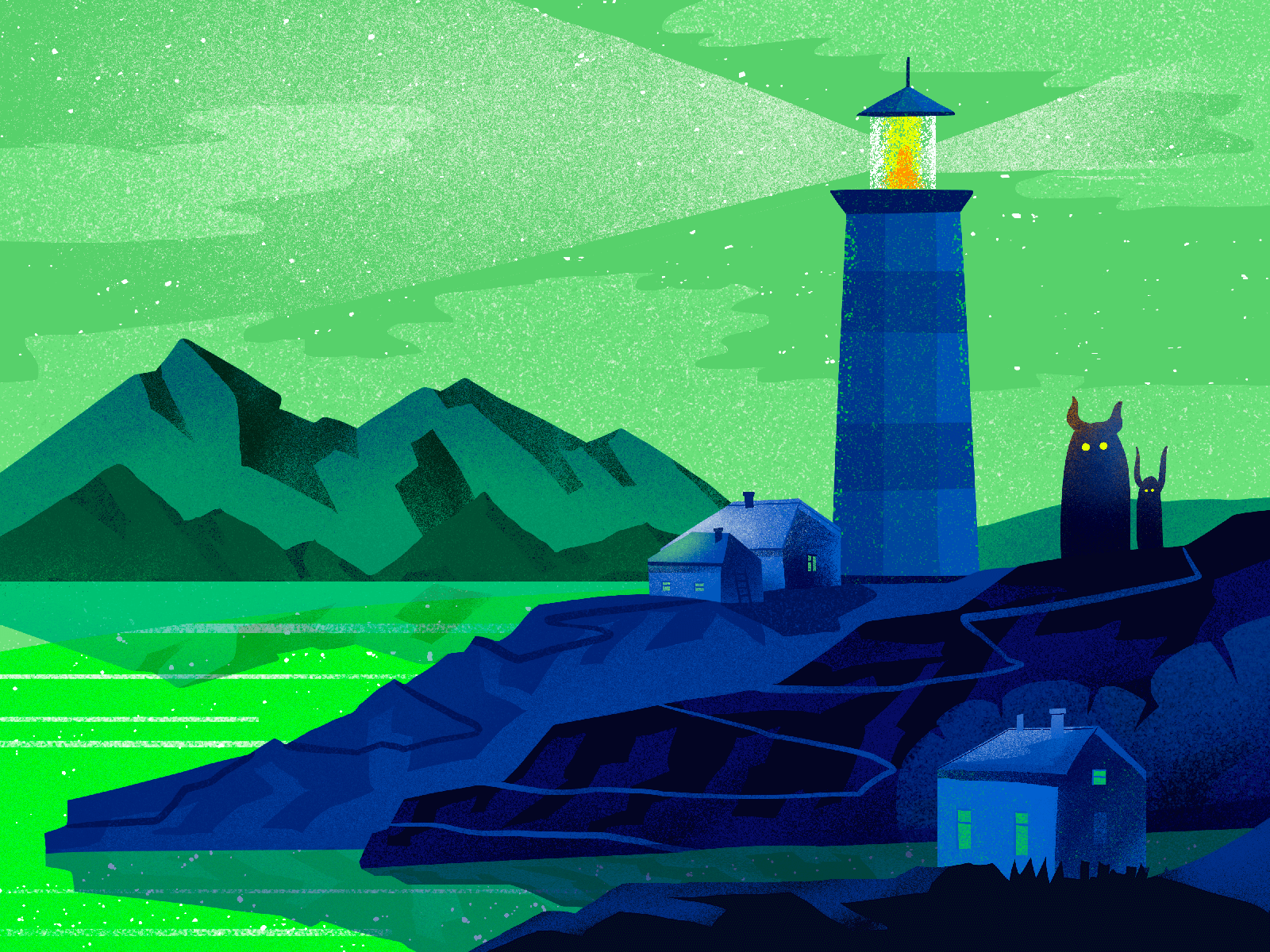
Atmospheric digital illustration based on a limited color palette
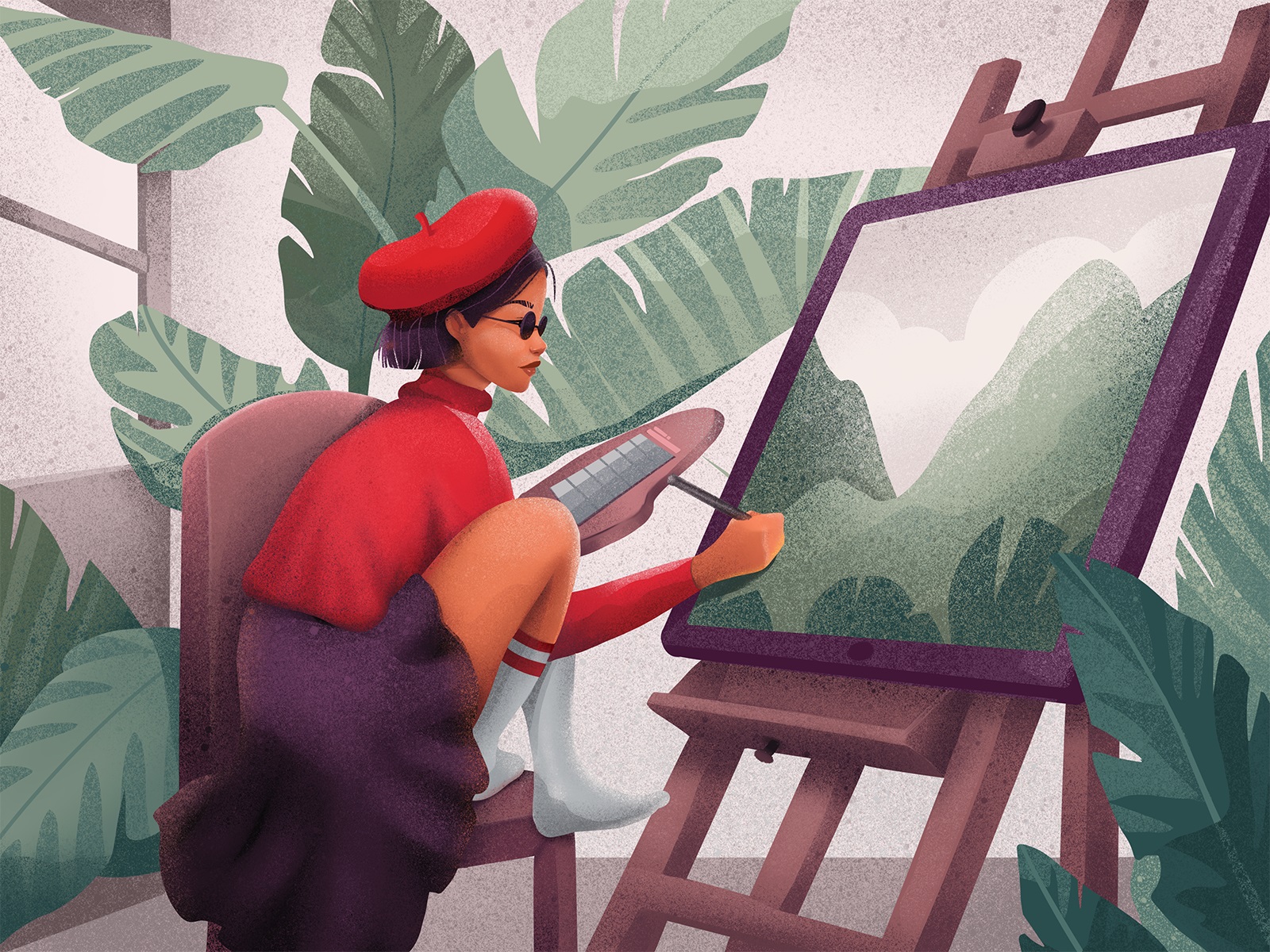
The artwork performed in limited and muted color palette setting a particular mood and emotional background
Expressionist Shadows and Contrasts
Another popular trend in the digital illustration is visual expressionism achieved with high color contrast and exaggerated shadows. The artworks of this kind are always catchy and atmospheric. Perhaps, that’s the reason why such an approach is especially broadly presented in illustrations featuring landscapes, architecture, and interiors.
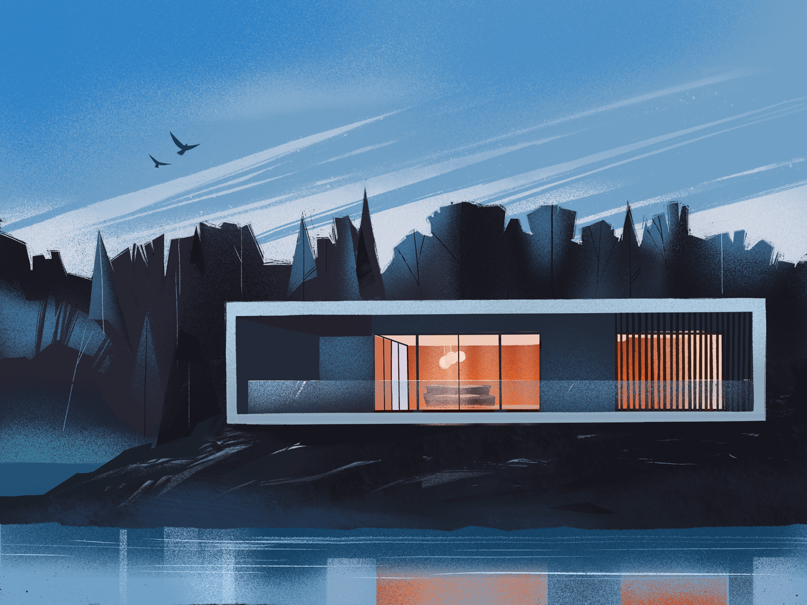
Deep shades, long shadows, and harmonic contrast accents in the digital illustration sharing the vibes of isolation and melancholy
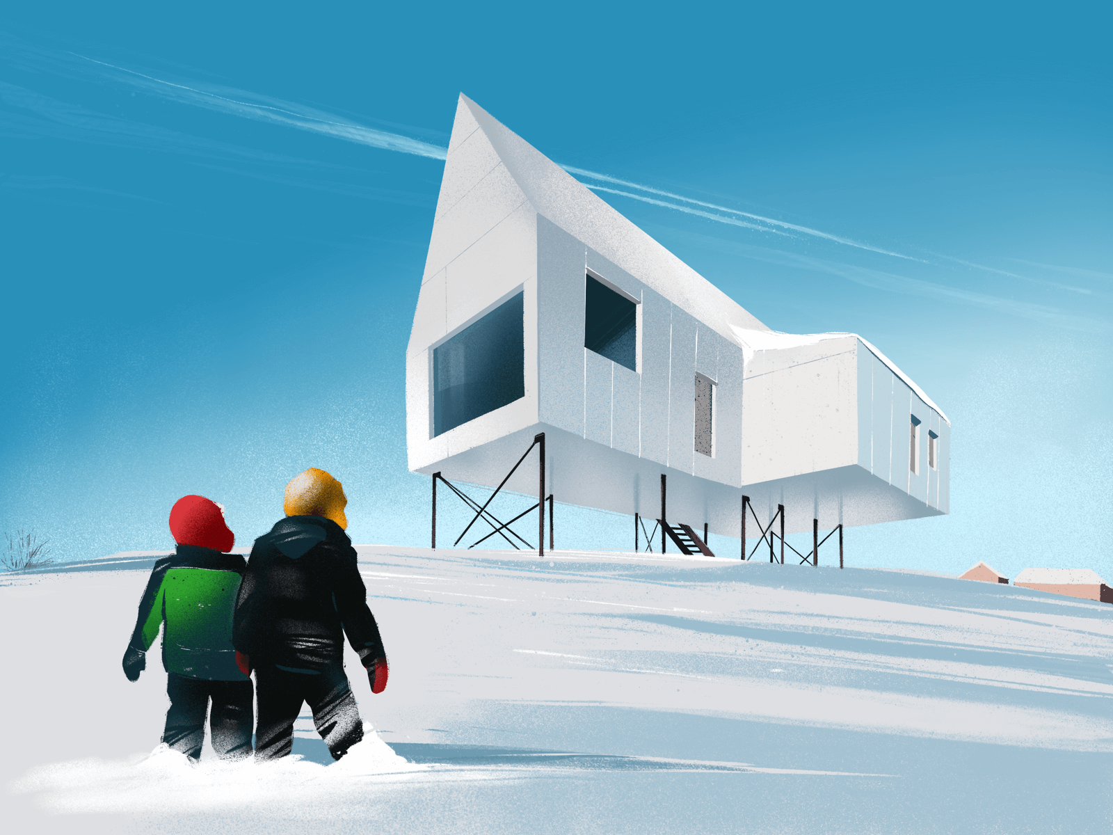
Expressive color accents making the winter look even more white and fresh in the artwork
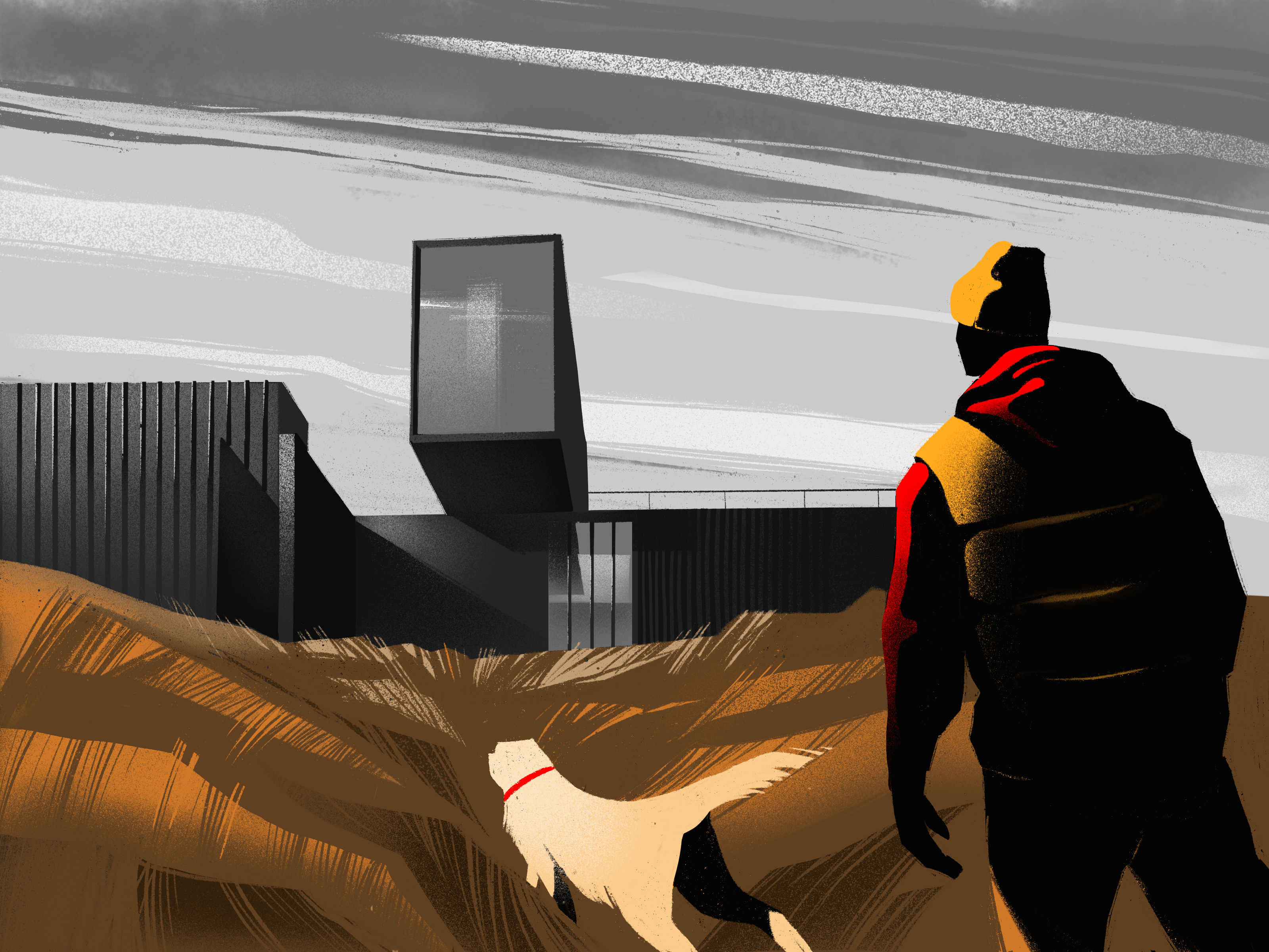
Pastel autumn vibes in the expressive illustration playing with light and shadows
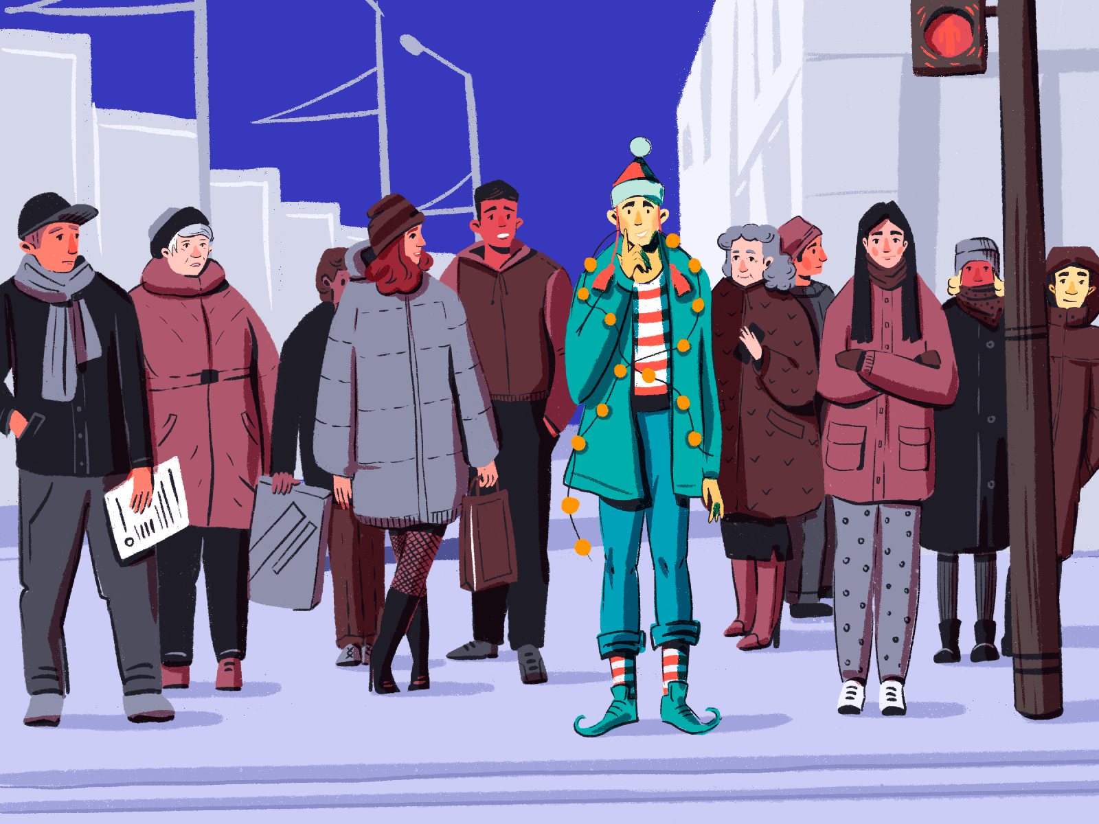
The Christmas illustration using color contrast as the main artistic and emotional device
Animated Details
Recently presented Procreate functionality for animation may amplify the presence of one more popular trend: animating some details of static illustration instead of making everything move. Animating only some details, designers draw viewers’ attention to the specific elements or zones, let us concentrate on something significant, make illustrations more playful and lovely.
Lovely winter illustration adding liveliness and mood with the animated snow, winking, and pattern on the sweater, yet leaving the background absolutely static
Glitch Effect
Glitches are still in fashion this year, so they are quite often presented in typography animation to catch even more attention to the most important detail or message.
Glitch effect applied to promo graphics by Tubik designers for Designmodo
Logo and Identity Motion
Motion applied to brand elements has been growing its presence for this year. Animated logos and identity details make brand UI-friendly, add more interactivity, and allow designers to add more emotion to the brand image.
Hypnotizing and futuristic logo animation for the platform producing and supporting AI-based conversational user interfaces and bots. Motion allows for making the smooth curves of the brand sign even more expressive for digital interactions.
No doubt, it was the year of creative fun, sophistication, and diversity. Let’s open the new one hoping it will be even brighter, smarter, and obviously beautiful in the spheres of graphic design and digital art.
Illustration Collections and Digital Art Case Studies
If you want to see more collections of illustrations or discover how they work in particular design projects, here’s the set of posts for you.
Digital Art: 40+ Inspiring Illustrations on Diverse Themes
15 Illustrations to Share Winter Beauty and Christmas Magic
Moonworkers. Digital Illustrations on Film Production
Quisine. Branding Design for Food Delivery Service
Dicey. Logo and Mascot Design for Party Game
MYWONY. Storytelling with Brand Intro Design
Florence App. Illustrations for Healthcare Service
Tubik in Paris. Design Process for Narrative Illustration
Winter Olympics Illustration. Step-by-Step Process


