Digital illustrations present one of the hot trends for the last couple of years in design. You may see them in web and mobile interfaces, advertising, posters and tutorials, they are used in infographics, manuals, and books.
What is the reason for their success?
- Custom illustrations establish the solid foundation of originality and artistic harmony, they add a pinch of style and creativity to an interface, printed item or branded stuff.
- Illustration creates visual triggers and metaphors that quickly transfer the necessary message.
- Graphics provide effective support to the copy applied in the web or mobile interface.
- Illustrations are a well-checked tool of creative storytelling.
- Illustrations have a significant power of setting the emotional appeal.
- Custom graphic design sets the ground for aesthetic satisfaction which grows the desirability of the project.
- Illustrations are memorable and catchy, so they work well in growing brand awareness and recognizability.
- Digital illustration is effective in creating animated short videos and interactive elements to make the interactions live and elegant.
- Illustrations based on the interesting visual metaphors make the design unique and engaging.
- People perceive images faster than words so illustrations used wisely can make the interactions simpler and faster.
Today, we have collected for you a gallery of creative digital illustrations by Tubik designer Yaroslava Yatsuba. She has already shared tips on creating original flat illustrations and unveiled her own approach to the illustration design process. Her artworks are always full of interesting details, vivid colors, unusual shapes, and deep metaphors. Playing out with the proportions, well-balanced contrast, curves and textures, the designer makes her graphics dynamic and elegant. This time we offer you to check a big bunch of elaborately crafted flat illustrations she made for Tubik blog articles and other projects.
Design Process Illustrations
This block shows the set of artworks reflecting the design process and presenting the theme of UI design.
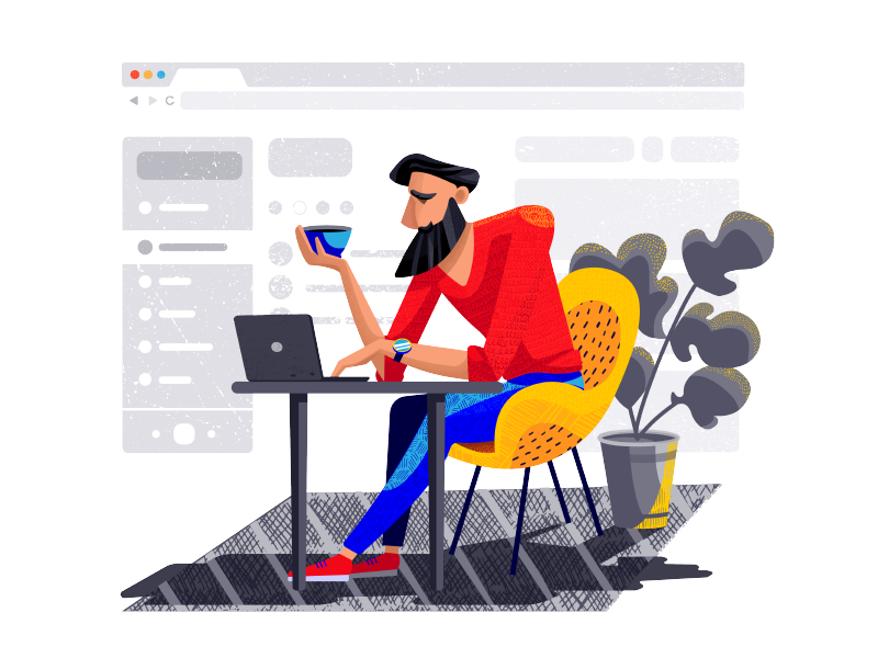
The illustration shows what interface design process can look like – it was created to present the article about Gestalt theory in UX design. Here designer uses static composition and creates a catchy look with color contrast and variety of textures.
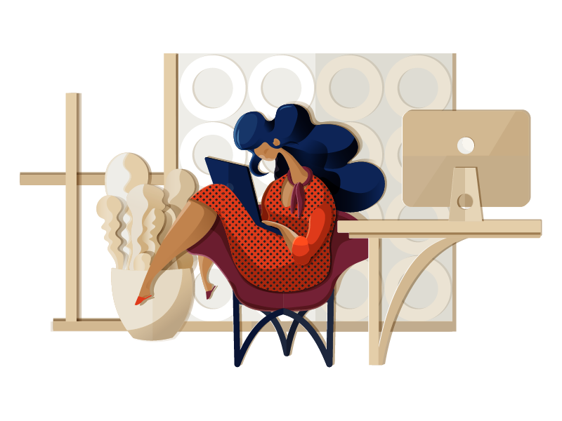
Do you know the feeling when design becomes not just your job but also life? This illustration is about those for whom design never stops and feels like home where life is bright and elegant. Playing with textures and layers, the designer creates the feeling of the application cut out of paper. The artwork also served as a title image for the article devoted to home page design strategies.

Designers know how easy it is to get caught up in the whirlpool of variants, elements, options on the way to creating a user-friendly app or website. To reflect this feeling, the designer makes the composition dynamic and uses a quite unusual color palette. The picture also presented our article about UI design trends.
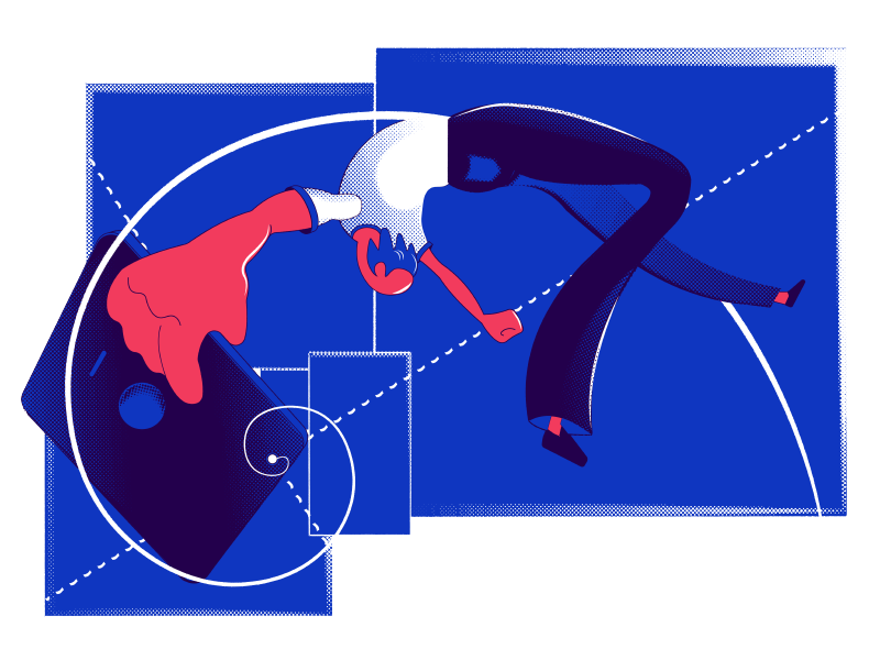
It’s often thought that design is far from maths still practice shows that logic, balance, and precision are vital in creating user interfaces. This illustration presented a post devoted to Golden Ratio in UI Design. It also applied dynamic composition strengthened with a variety of geometric shapes and curves.
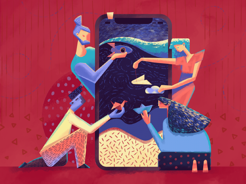
Adding motion to user interfaces is a topic of hot debates. Still, designers find numerous ways and approaches to breathing life into UI with animation. This topic inspired the metaphor for the title illustration of the article about UI animation. The smartphone plays the role of a curtain wall or screen, like the one used in a puppet theatre and designers reflect actors each of which shows a specific model of motion performance.
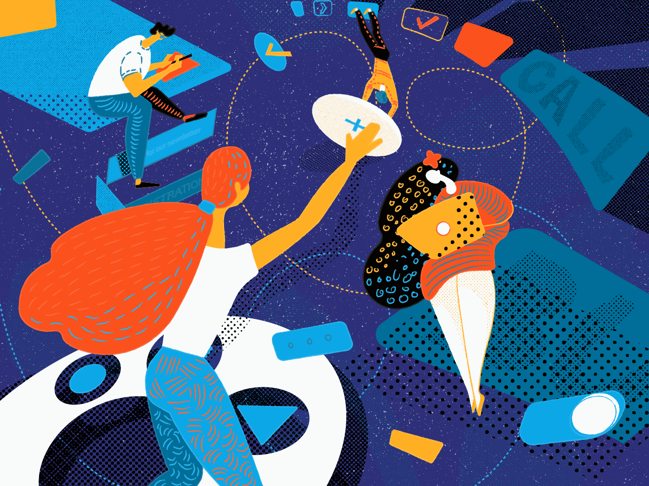
A button is one of the most powerful UI elements: it transforms a passive user into active. So, the choice of size, shape, color, and placement of buttons is a kind of magic in the UI design process. That’s the story behind the illustration.
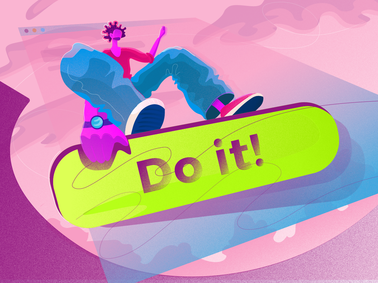
One more picture devoted to the theme of CTA buttons design in UI applies the character that reflects the idea of confidence and determination. The designer uses an unusual perspective and this way makes the composition original and catchy.

Perhaps, each UI designer faced the feeling that the creative process can be compared with rising a new building: you need to consider tons of factors, think over functionality, structure and “facade” and step-by-step make it live from digital bricks and mortar. That is the metaphor behind the illustration.
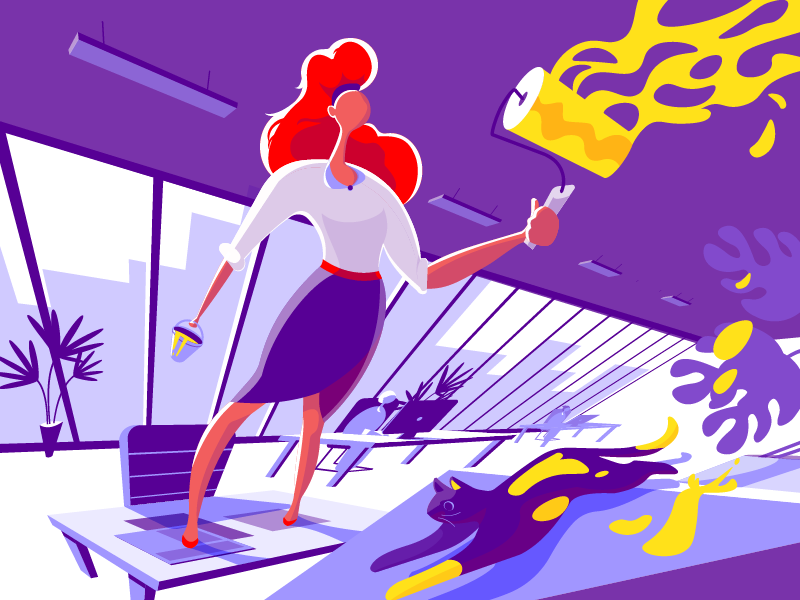
This illustration was created for the UX design article called 3C of Interface Design: Color, Contrast, Content. The keyword “Color” is used as a core semantic element and showed the literal process of coloring something with paint. The contrast is reflected in the color palette of the artwork while the content is shown with the elements of the furniture in the office shown in the picture. The cat becomes a bright detail which adds dynamics and humor to the scene.
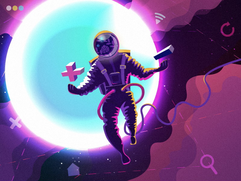
With all the tons of decisions and choices which designers have to make, it sometimes seems that design is an endless universe. That metaphor inspired the illustration applied as a title image for the blog article about using light and dark background in UI design.

Creating clear and intuitive navigation of a website or mobile app is one of the core challenges for designers. This illustration presents the topic of interface navigation as a process that needs balance and thoughtfulness.
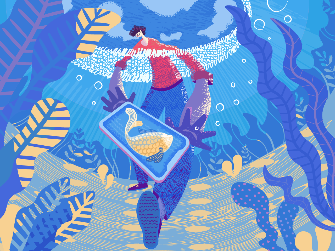
One of the crucial challenges for graphic designers is finding the original style. In the article on flat illustration, Yaroslava shared practical tips on how to catch this golden fish and applied the same metaphor in the title illustration.
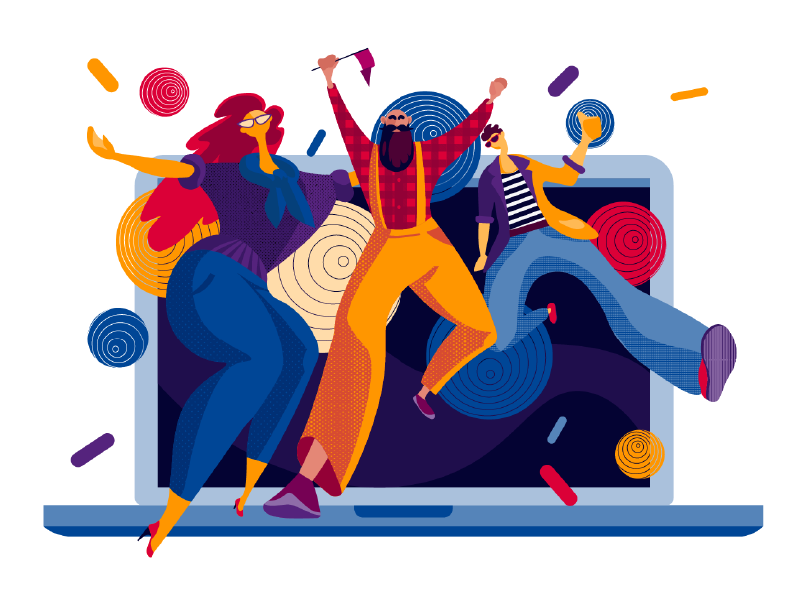
This illustration is full of party vibes – no wonder, it presented the year review of the studio achievements before the New Year holidays. It visualizes the designers’ party – and when designers party, they do it brightly! Getting filled with emotions to transform them into user-friendly beauty – that’s the story here.
Business and Social Illustrations
One more set of artworks was created to present various themes on personal and professional life.

The success of a business is often determined with productive collaboration and teamwork: one soldier, whatever talented and skillful, does not make a battle. Uniting strong sides of each player, teams can move the mountains and accept challenges that cannot be solved alone. This idea lies behind the illustration. It also served as a title image for the article about design strategies for B2B.

This illustration is deeply social: it’s devoted to World Cancer Day which was marked globally on 4 February. The slogan for this year was “We can. I can” – and this is how the designer saw it, in one illustration showing all the path from pain to life. United, we will fight it!
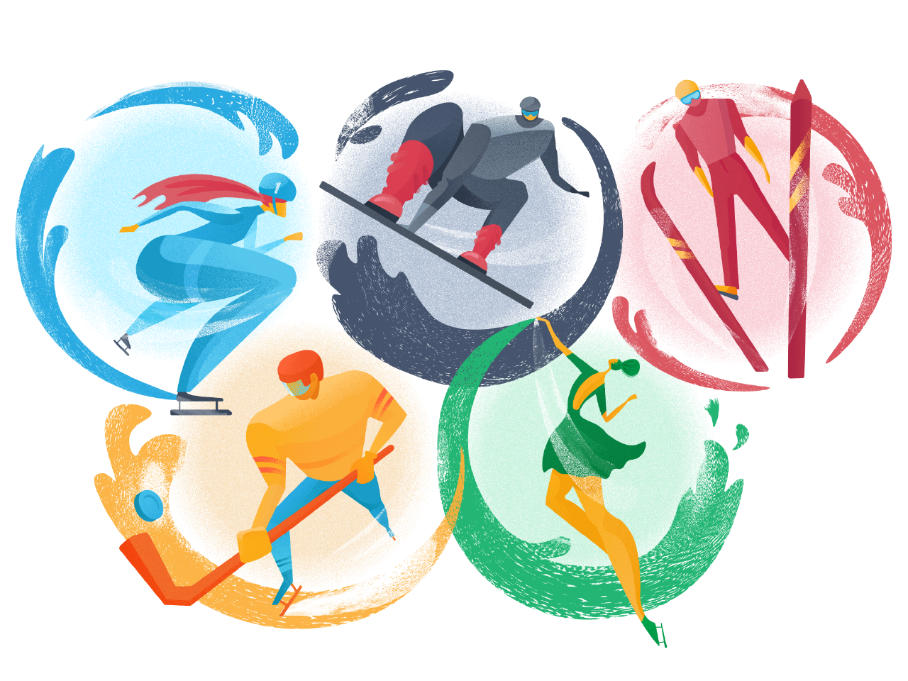
The artwork supports the spirit of the Winter Olympic Games sweeping the world in January. It is based on the well-recognized symbol of the event, the Olympic Circles. The dynamic images of athletes presenting different kinds of sports are inscribed into them creating an integral composition. If you want to see all the details and a step-by-step process for this artwork, check it in a fresh illustration case study in our blog.

Shopping takes a great part of our life: in a fast-paced world of today it is often a kind of race which we tend to combine with tons of other tasks – and modern technology helps much to do that. That was the theme for this illustration which presented the article about design strategies for e-commerce.
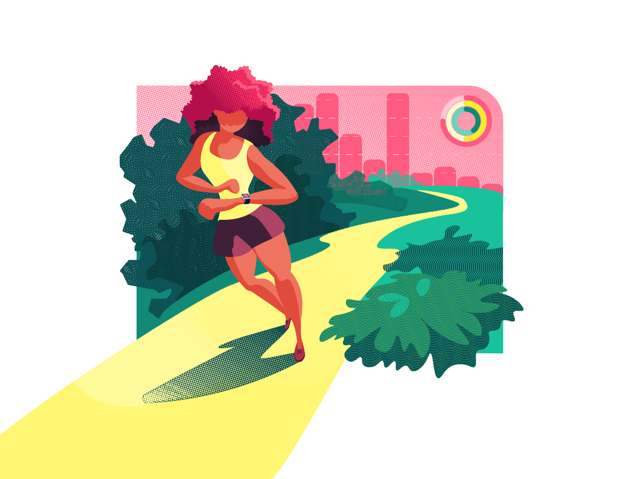
One more artwork setting the theme of the article: looking at it, it’s easy to catch the vibes of design for sports and fitness.
Illustrations Applied in UI Design
One more set of illustrations is shown in web and mobile interfaces: these examples let you check how custom graphics make interfaces stylish and support visual hierarchy.
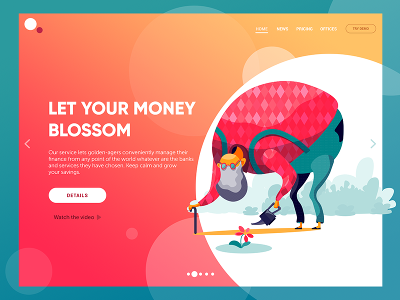
Work hard to rest brightly – this is, perhaps, the motto of golden-agers worldwide. Here’s the concept of a website of financial service helping pensioners manage their finance effectively and grow their savings. The illustration immediately transfers the message keeping it consistent in combination with the tagline and copy block. This way the webpage looks catchy while all the elements in the layout harmonically work together.
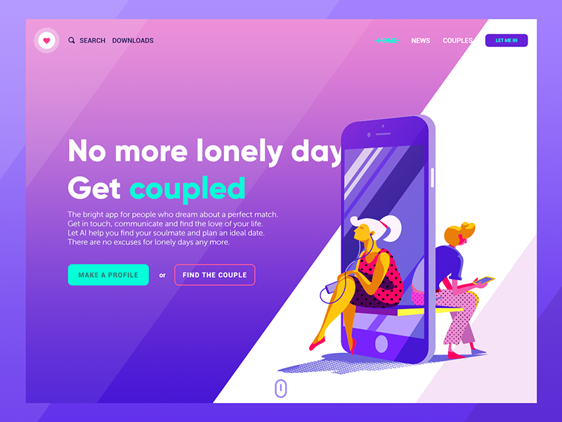
Love is in the air – and the Internet is not the exception. Here’s the concept of a landing page for a dating app letting people find their perfect couple. The illustration presents the theme making a bright visual trigger and effectively combining the image of the device uniting people.
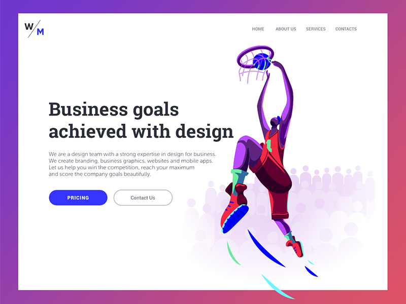
The real business works the same way as sports: study your competition, set the strategy, boost your skills and get your point. Here’s the landing of a digital agency that’s ready for the highest business challenges and knows how to win the goals – that’s the message quickly transferred by the bright hero image.
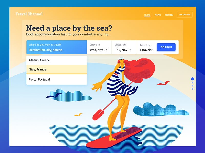
This is a design concept for a simple service helping users to find accommodation by the sea. Theme illustration supports the needed atmosphere and creates a strong emotional appeal.
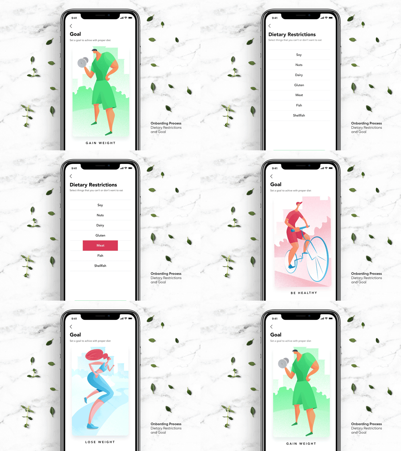
Here’s the set of interactions for Perfect Recipes, a mobile app for easy cooking and shopping. Here you see the screens that allow users to set the goals and make the recipe list personified. The illustrations are used to visualize the goals in a bright and original manner.
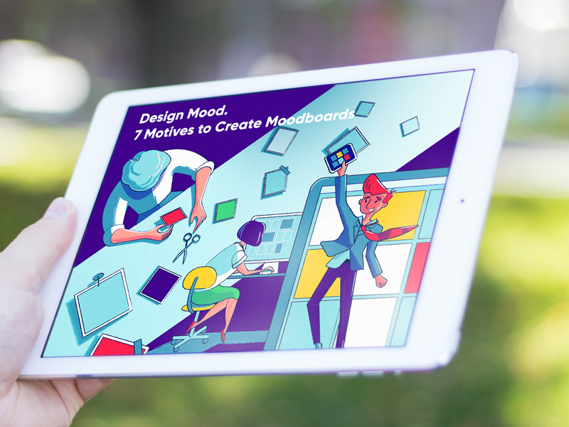
Here’s the example of how a blog title illustration looks in the real interface. This one reflected the stages of the creative process and presented the articles devoted to using mood boards in design.
The presented set shows, how many diverse goals can be achieved in design with creative flat illustrations. Among them, one of the vital goals is adding elegance and artistic harmony to the digital products used more and more often these days. Make no mistakes, people want to see the websites and mobile apps not only functional but also beautiful. No doubt, new illustrations are coming soon, so don’t miss our new posts here.
Illustration Collections and Digital Art Case Studies
If you want to see more collections of illustrations or discover how they work in particular design projects, here’s the set of posts for you.
Digital Art: 40+ Inspiring Illustrations on Diverse Themes
15 Illustrations to Share Winter Beauty and Christmas Magic
Moonworkers. Digital Illustrations on Film Production
Quisine. Branding Design for Food Delivery Service
Dicey. Logo and Mascot Design for Party Game
MYWONY. Storytelling with Brand Intro Design
Florence App. Illustrations for Healthcare Service
Tubik in Paris. Design Process for Narrative Illustration
Winter Olympics Illustration. Step-by-Step Process
26 Digital Artworks About Design Process
Read the guide on creating an original illustration for blog or landing page


