Making a landing page interesting and catchy is as important as its being informative and clear. Today’s case study shares the design flow of creating a bright landing page for a company with a diversity of services it offers to its clients. Tubik designer Ludmila Shevchenko shares now only the stages of the project but also useful tips for designers.
Project
Landing page for the agency that presents different services
Process
The given design is a landing page of the agency website. The task was to create a unique, totally new vision of the service for the client. The website had to stand out from similar ones, be noticeable and remarkable for a user. Inspired with the task, based on user research and market exploration, the designer decided to solve this task using color and shapes, searching for the perfect combination of these methods.
Sketching and Wireframing
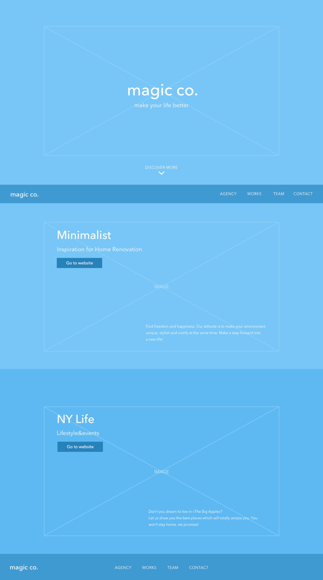
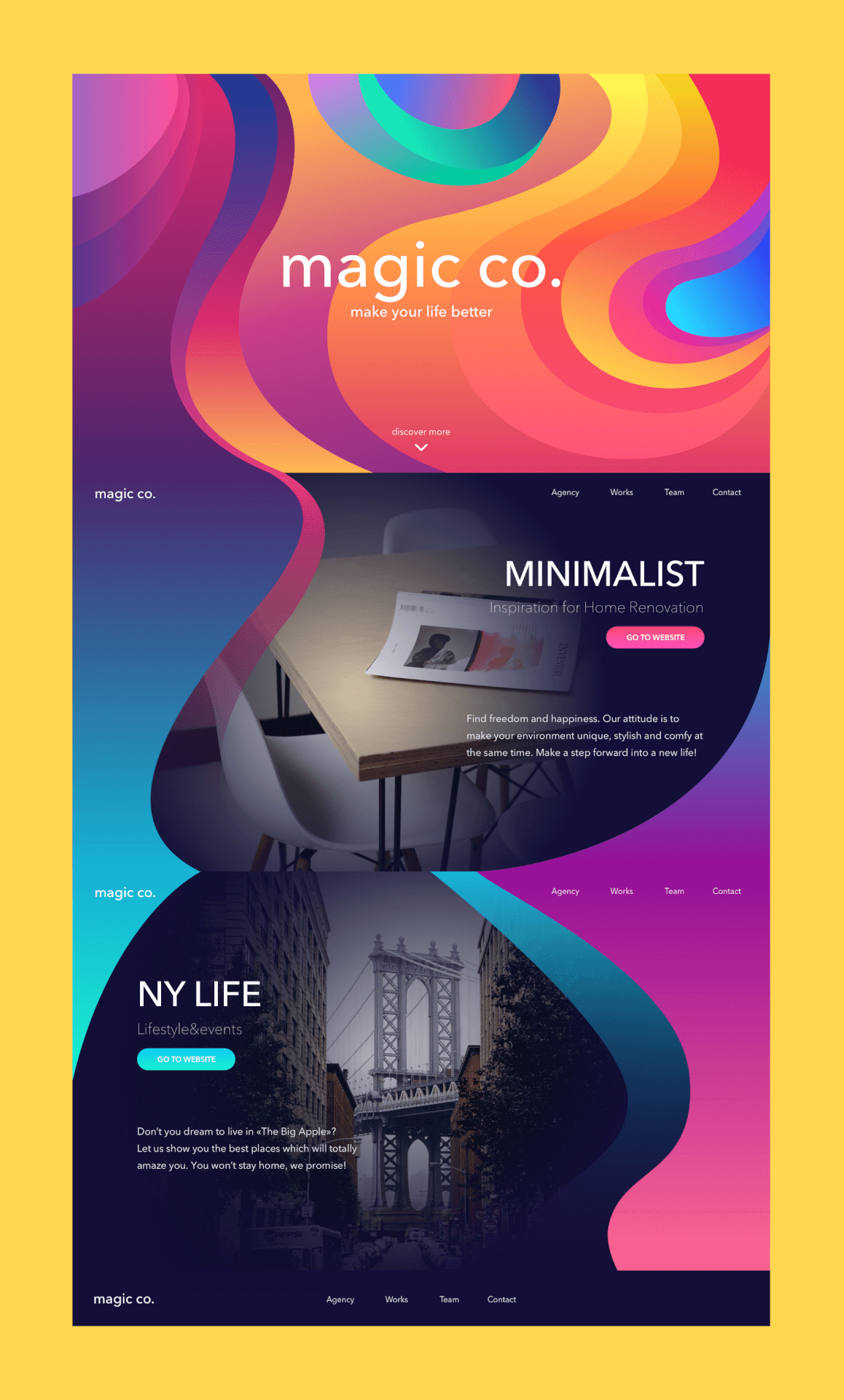
The work started from UX wireframing when the straightforward structure has been chosen. Here the designer worked out the structure of several sections each devoted to diverse offers. Having each section as a new page, we gain the experience where user attention is concentrated specifically on the information of that section. Ludmila mentions that for her, even when the overall structure doesn’t have a lot of elements, it’s still easier to make the first steps by sketching on paper. The connection of the ideas and instant hand moves can bring to the new ways of representation and composition. While you’re sketching your first vision, the new idea comes to your mind. So, she believes that sketching in the classic old-fashioned way is the best way to blow up creativity.
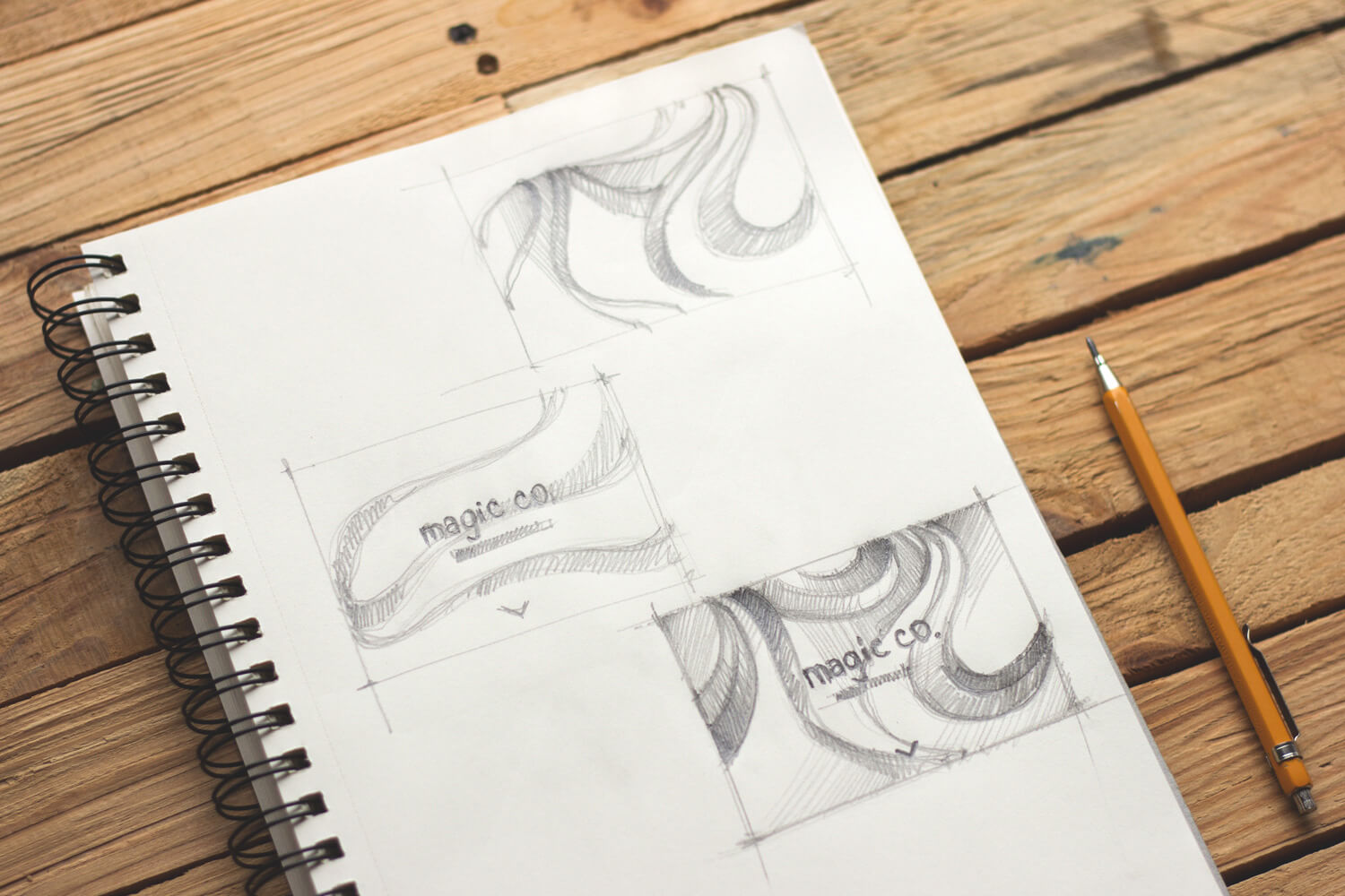
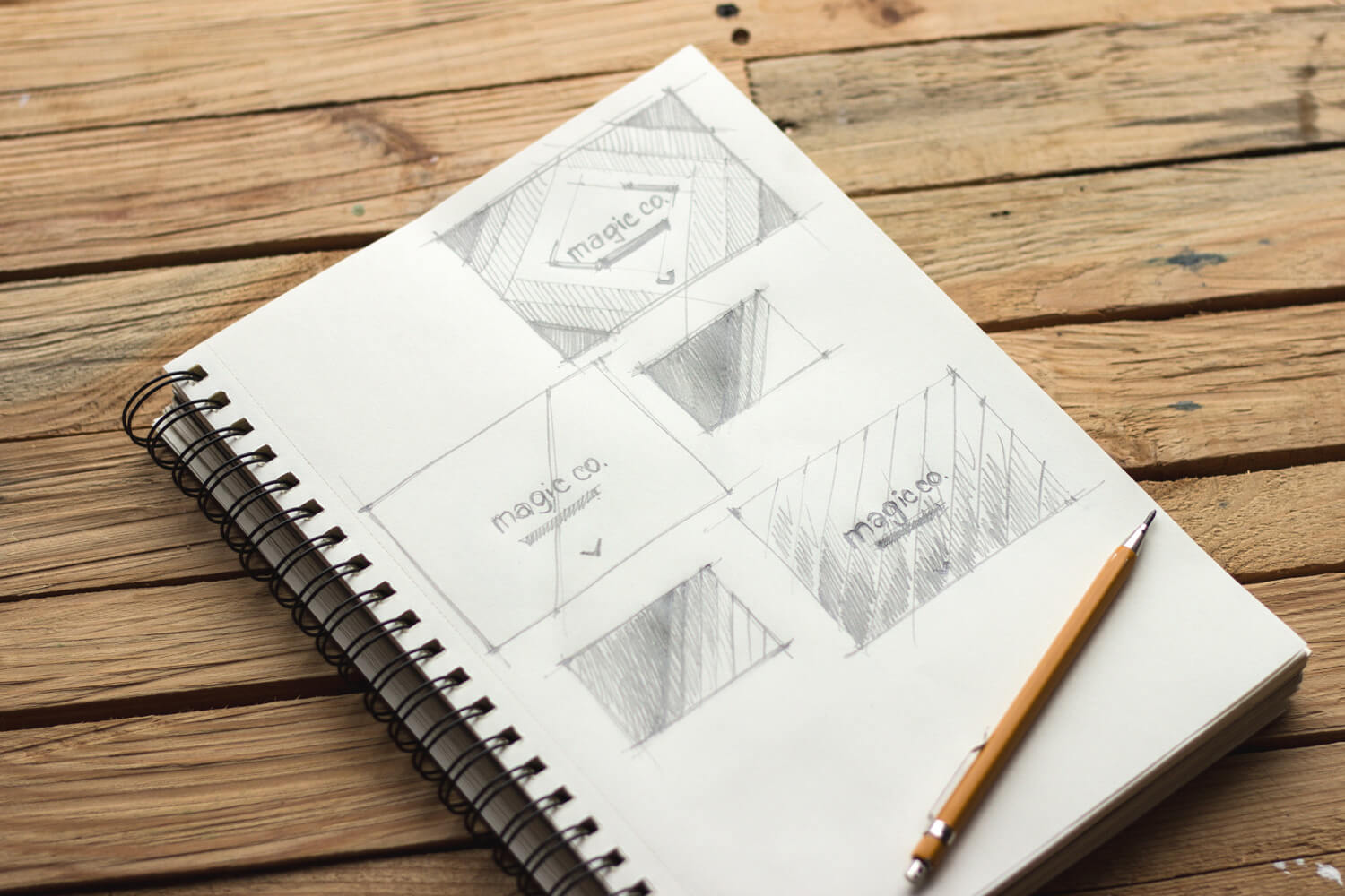
After shaping the idea on paper and structuring it in mind, she draws the UX in Sketch. Depending on the task, the first explorations can be shown to the client whether in hand-drawn sketches or digital wireframes as it happened in this case.
UI Design
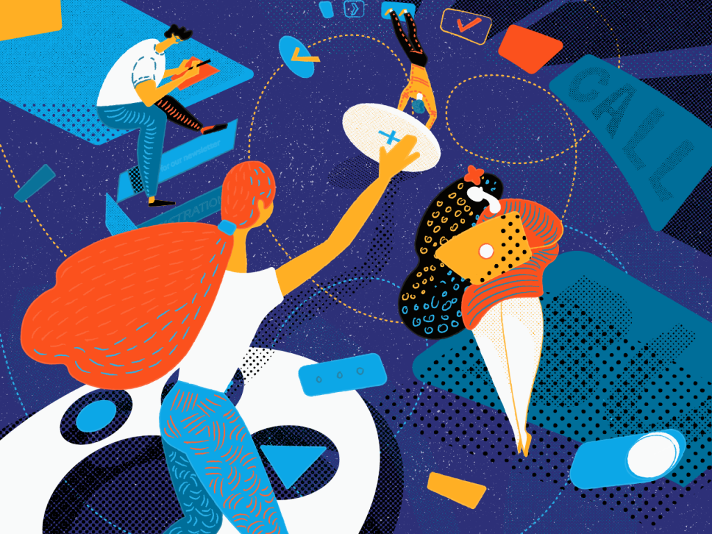
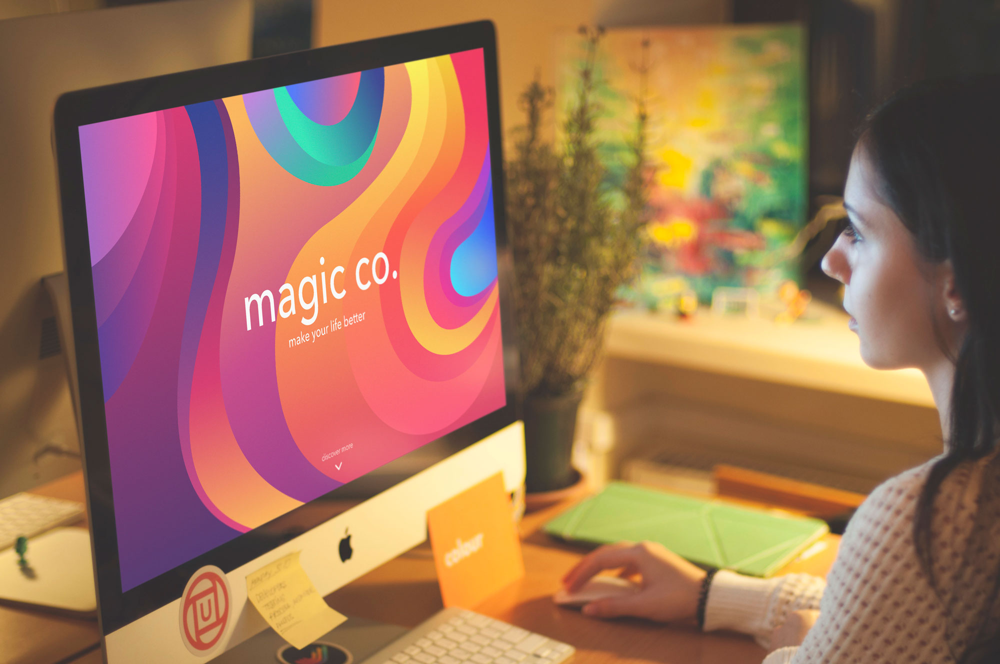
Next, she started to work on UI design. As the first part of the page had only the company name, slogan, and arrow inviting to scroll, the idea was to create a bright and engaging background. The designer started to create an abstract combination of elements keeping in mind that it can be further animated. The first variants were strict figures like rectangles and squares but then she came up with the idea that rounded shapes would look more friendly. As a result, they symbolize the mystery behind the imaginary scenes that the user was invited to discover. Having a slight movement we added liveliness to the page.
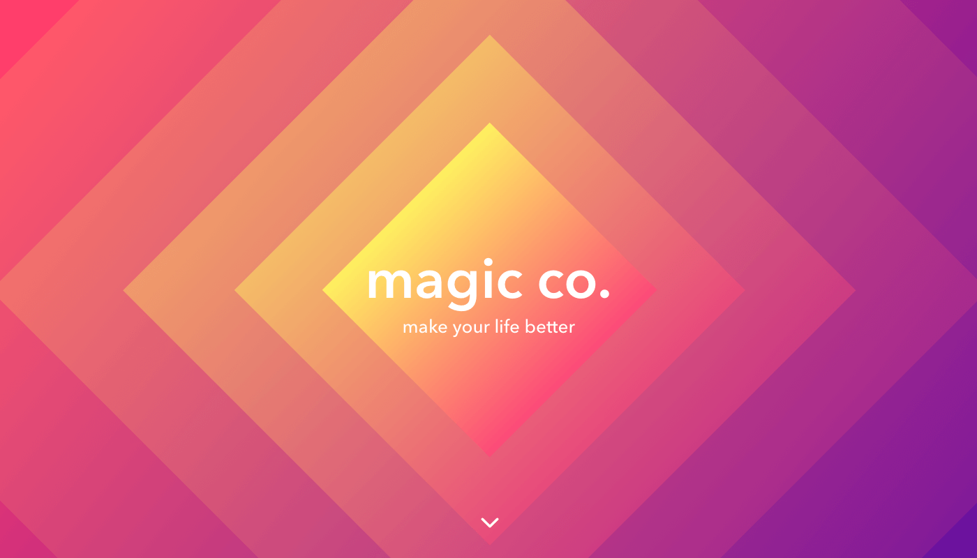
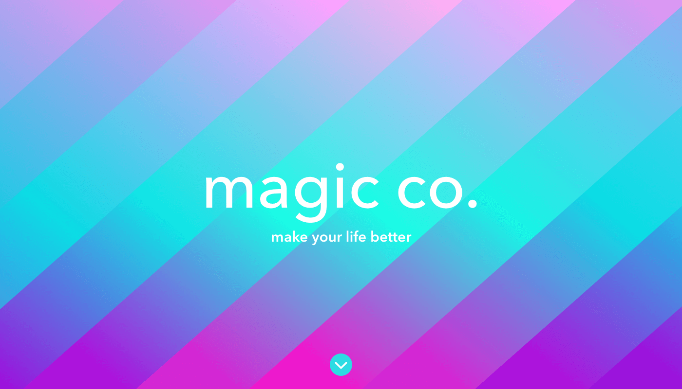
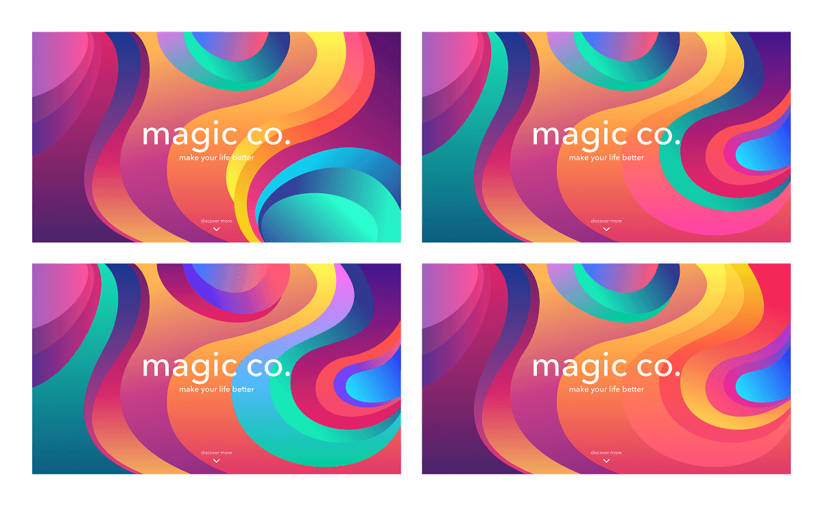
The selection of color is always one of the most interesting parts of the design process. Keeping the vivid and attractive mood in mind, the designer started to search for the combination of the gradient as with their help the picture becomes lively. It’s not easy to emphasize certain steps of color selection as it’s a creative process with constant research. Overall, she got 4 variants based on the specific color palette, and among them, she chose the one that kept the harmonious combination of contrast and integrity. The final option had calmer gradient combinations in the middle, where company name and slogan were located, to keep readability at a high level. On the sides, the contrast is higher.
Working with color especially in the project like this is fun and at the same time challenging task. As for the flow, Ludmila says she can search for the gradients combinations on the separate page to look whether colors make a smooth color transition or on the contrary, there appears a third color in between. Also, she keeps her attention on the colors themselves as they should be clean and vibrant enough.
Then, the waves continued to appear in all sections preserving the feeling of consistency and integrity. They were the reference to the abstract composition on the first page and the elements that add planning. The CTA buttons support waves and gradients. The background had photos that could be partially seen and with the help of transparent shading the information and CTA buttons stood out.
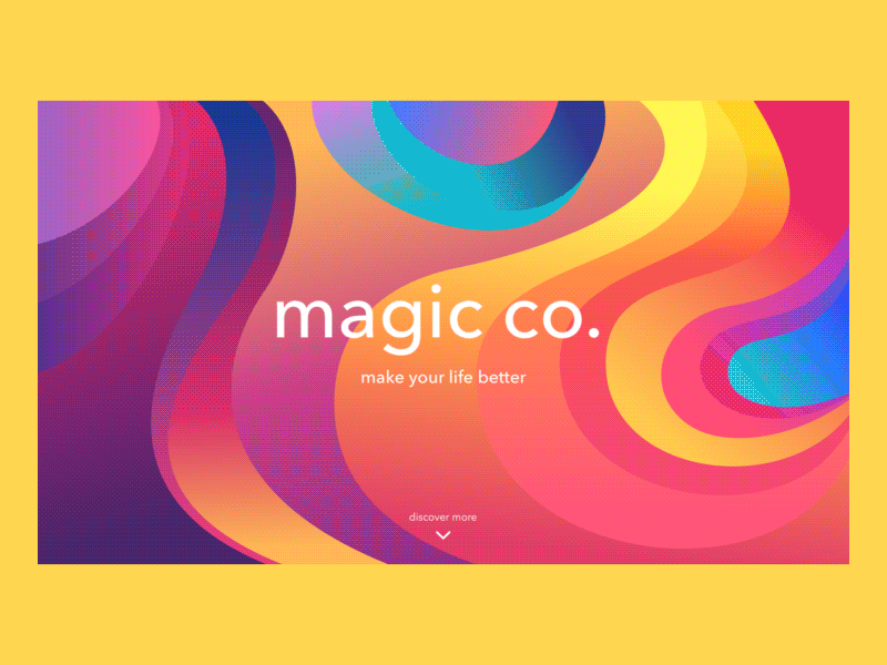
Last but not least, the animation was added to show the way all elements interact with each other and to represent the live view. It was a good example of teamwork: different approaches and hints breathed life into the design with motion.
The designer tried different color combinations laying the gradients on the shape. During that phase, she could change some colors in gradients, turn the gradation, and reduce the opacity. In such a process, it’s vital to mind the contrast and check whether you need a high or a little contrast in certain layout zones. Another tip is to check whether the colors of gradients laying one next to another do not ruffle.
Creating the curve, you’re recommended to try using as little anchor points as possible also checking that the curve moves smoothly in these points.
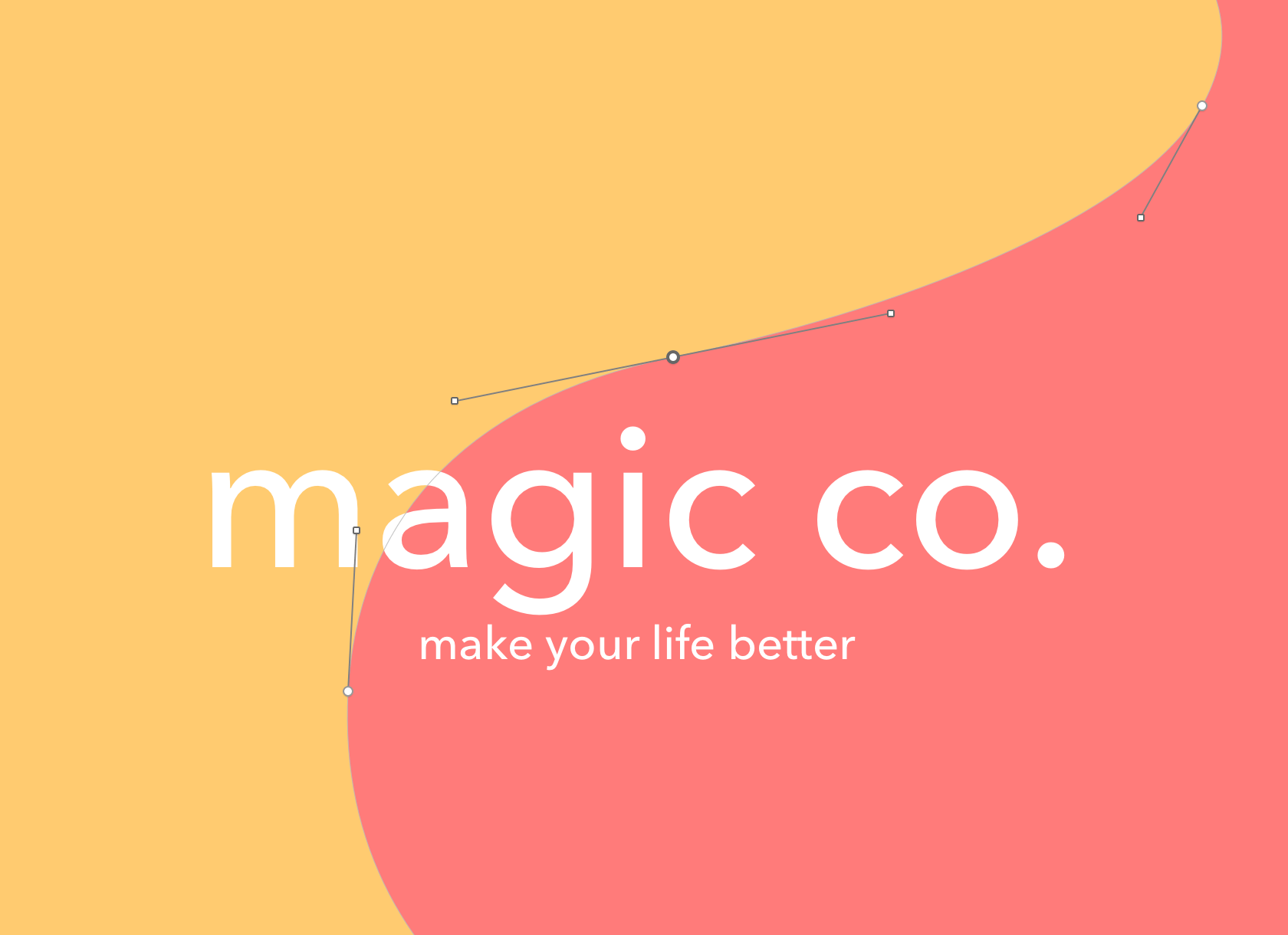
As for the gradients in this project, the designer’s idea was to combine warm and cold shades in a way that in the final look the overall picture will keep the warm feeling at the same time being innovative, bright, and youthful. The main gradients were yellow-orange-red, pink-purple, vivid cyan-blue. Creating multiple gradients in one color scheme, she tried to change the shades of the main colors, increase or reduce their intensity and opacity. This way the brightest color combination was set and then there come the lighter gradients. Combining the gradients with totally different colors, she checked whether the edges had an appealing performance so that the page won’t look over contrast.
Bonus: Designer’s Tips for Boosting Skills
The Tubik designers are often asked to share some ideas and tips about boosting the professional level and productivity of the creative process. Ludmila shares the following:
- First, you should train your taste watching the examples of design in all spheres, following not only mobile, web designers, and companies but also the influencers in such spheres as graphic design, architecture, photography, and art. This way you will always know what directions are on the top right now, what ideas are trendy and catchy.
- Next, you can challenge yourself creating some small tasks that you will make when you have spare time between work. It’s about creating concepts or solving the issues on current themes.
- There always exist the basic topics you can enhance such as typography, composition, color, or when it comes to the other side – self-development and work process improvement.
- One of the books the designer would really like to recommend is “Interaction of Color” by Josef Albers: it shares the color studies, principles and even illusions you can create using color.
Useful Case Studies
Here’s the list of practical case studies for further reading on the theme of UI/UX design
Colony. Landing Page Design for Collaboration Platform
Watering Tracker. UI Design for Home Needs
Home Budget App. UI for Finance
Night in Berlin. UI for Event App
Big City Guide. Landing Page Design
Vinny’s Bakery. UI Design for E-Commerce
Upper App. UI Design for To-Do List