It is not a secret that the fast-paced and dynamic development of web and app design brings new trends into other spheres of creativity in non-stop mode. No doubt, illustration is one of the fields which is constantly and significantly affected by all the numerous changes and currents in the Web. Working on different projects and preparing various shots for Dribbble and Behance, Tubik Studio designers get regularly updated on how multipurpose and versatile illustration can be. So, today we would like to present to you the new case study, this time about illustration for a web online editing service.
Earlier we have already presented here the case study telling about the creation of a logo for the online editor Ribbet by Tubik Studio designer Arthur Avakyan. This article continues telling about the collaboration with the same customer. This time the assignment was concentrated on illustrations for the site created by the other designer Evgeniy Tomashevsky.

Evgeniy Tomashevsky working on sketches
Task
Designing thematic illustrations for the specific feature of online photo editor Ribbet.
Tools
Pencil sketching, Adobe Illustrator
Process
Undoubtfully, most — if not all — the illustrations on the web fulfill several functions instead of one. They should be not only decorative stuff but can also become important features of the user interface and in cohesion with other elements of the layout help to guide a user and make using the site faster, easier and more enjoyable.
The illustrations accomplished by Tubik Studio for Ribbet were no exception. To be more particular, the task for the designer was to create a pack of thematic illustrations that would reflect the ideas of popular annual events. The images were intended to work as fancy cards that could be used for instant creating invitations for birthdays, weddings, parties as well as nice postcards and other pretty stuff.
So, given to the task, the whole pack of illustrations needed to have the same format and style providing the feeling of consistency. Moreover, it was important to make it corresponding to the general design of the site. This requirement was eased due to previous studio work: Tubik Studio designers had worked with Ribbet on a new design of the site and new logo, which soon are going to be presented on the site itself and are already widely seen in Ribbet social networks accounts. So, starting work on illustrations, the designer had already got the general concept of the editor design. It influenced the general style of the images as well as a selection of appropriate colors and shades.
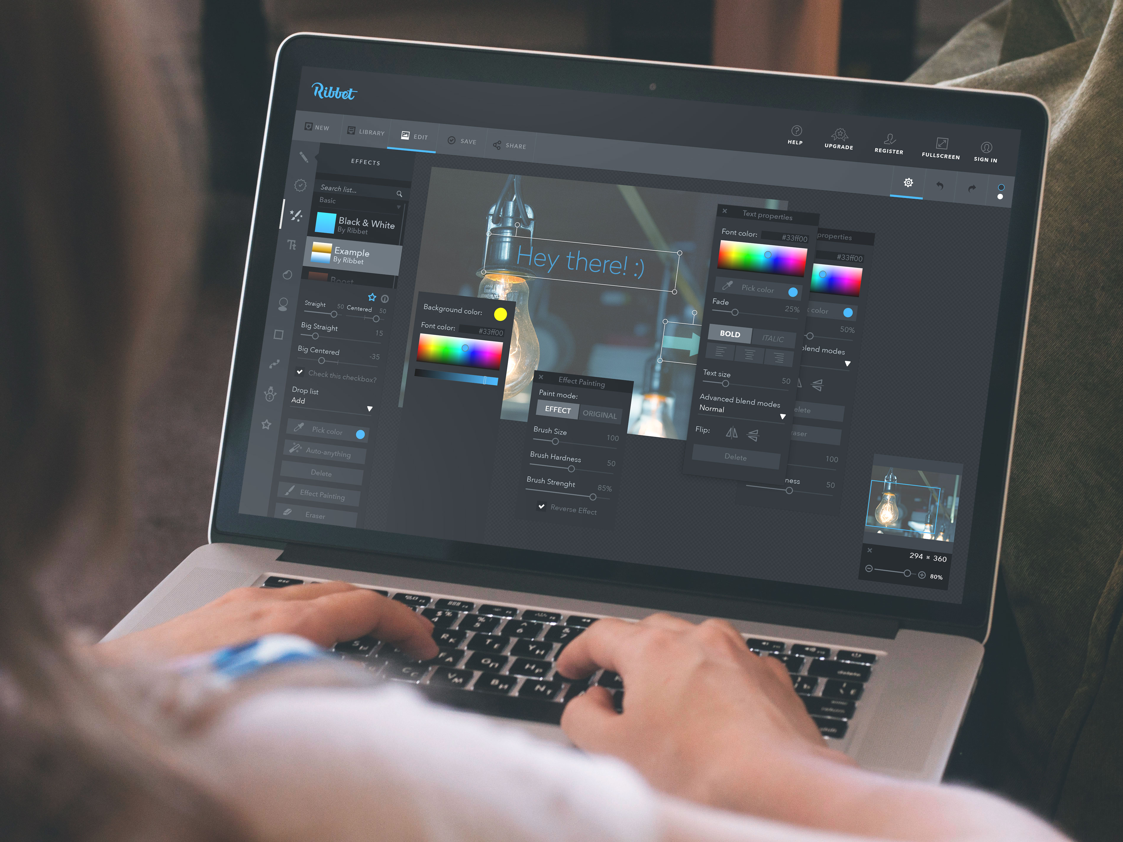
The general design of the website and logo for Ribbet by Tubik Studio
In the process, it was also vital to remember that the images had to obtain a high level of adaptability and be recognizable, bright and clear in all sizes possible to be seen at. Moreover, they had to be ready to save their beauty and style in the printed version as well. As you can see, the designer had to keep loads of things in his mind.
The first stage of the work required making choice about the general stylistic decision which would satisfy all the parts of the assignment. Although there are numerous stylistic trends for digital illustration nowadays, in this case, a search of the style was not really long and the decision was made to create all the pack of illustrations in flat design stylistics. It matched efficiently with the general stylistic concept of the site and was obviously defined as trendy and diverse.
After deciding on the general style, the next stage witnessed the most creative and elaborate part of the process which was classic old-school pencil sketching. The designer worked hard and devoted a lot of soul and passion in creating catchy details, pleasant-looking backgrounds and bright characters that would be easily recognizable, capturing, stylish and fancy.
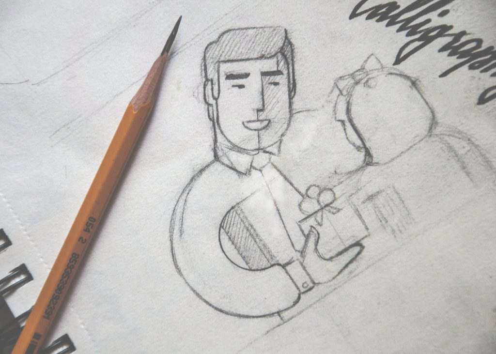
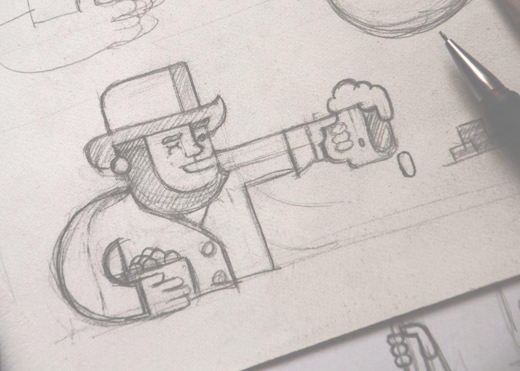
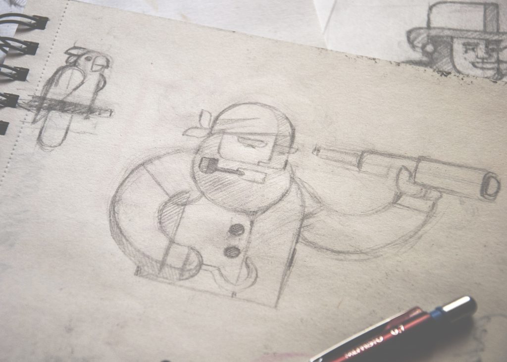
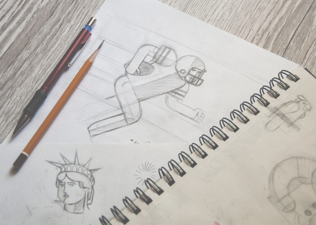
A tiny part of the sketching stage
When all the ideas were completed and agreed-upon, the sketches were converted into their digital body by means of Adobe Illustrator.
One more part of the task included sophisticated and thorough work with color. The reason was that it had to correspond not only with the general design of the site but it was also vital to reflect color associations which users typically have for specific holidays, events and special occasions. This kind of multipurpose solution could make the user experience even more effective and pleasant. So, the designer accomplished this work with a deep research of common color associations about holidays and only afterward selecting the colors that would fulfill both association and general consistency sides of the editor idea.
Having processed each image thoroughly, the designer presented bright and catchy flat illustrations for the pack of thematic fancy cards, some of which you can see below:

St. Patrick’s Day card

Thanksgiving Day card
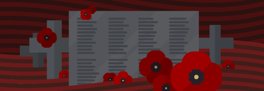
Remembrance Day card

New Year card

Mother’s Day card
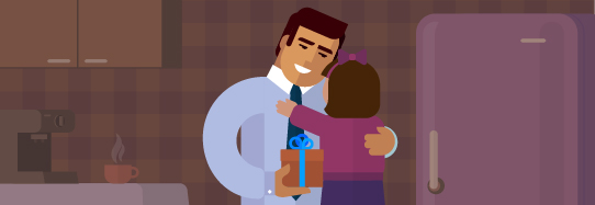
Father’s Day card

Valentine’s Day card

Wedding Day card
As it can be seen, the images covered the wide range of religious, public and family holidays.
The customer, fully satisfied with all the work presented, has already been using the images actively in their social network accounts as the promotional materials for new features of Ribbet service.
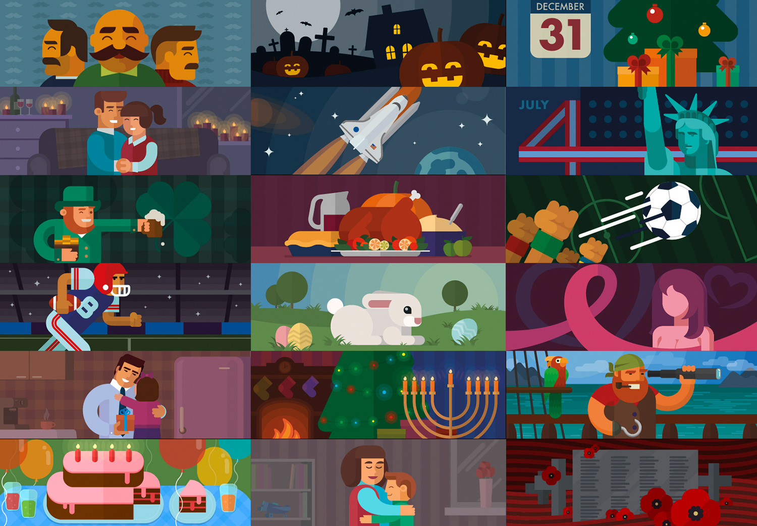
The set of cards from Ribbet Facebook page
This assignment was full of creativity and inspiration. It has become one more case proving how much sophisticated and rigorous work should be done to create the bright multipurpose digital illustration. It also showed that doing preliminary research can help to make the result even more efficient.
More Design Case Studies
Quisine. Branding Design for Food Delivery Service
Moonworkers. Digital Illustrations on Film Production
Logo Design: Collection of Creative Logos for a Variety of Brands
Dicey. Logo and Mascot Design for Party Game
MYWONY. Storytelling with Brand Intro Design
Inspora. Brand and UI Design for Virtual Stylist
AppShack. Logo Design for a Digital Agency
LunnScape. Identity Design for a Landscape Company


