Hopefully, you remember our previous article, which presents the first part of ABC of Product Design. We promised not to dally with the second part – so here it is. Let’s move on and make our ABC complete, adding more features essential for modern product design.
P for pleasant, personalized
The first P-feature mentioned is closely linked to a positive user experience. Being pleasant doesn’t deal only with appearance, it takes into account all the features creating user’s pleasure. So, it works in tight connection with previously mentioned features, because the pleasant feel of the product is the result of making it intuitive, lively as well as attractive.
It’s also really important to think about making the product personalized. The functions, which provide the user with the feeling of personalization, for instance, enabling them to add or customize the features of the design (avatars, changing styles, type or font, customizing part of functional) or provide strong communication with the user, have more chances of being successful and popular. One of the functions can be neatly organized prompts or tutorials on the web or app product. Another form is the correct input text. For example, some investigations and reports on conversion analysis show that input prompts using a first-person pronoun (I) are in a lot of cases more efficient than those which contain the second person pronoun (you). Supposedly, it happens due to the more natural feeling of personalization.
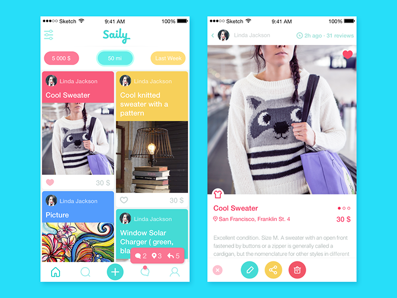
Q for quality
This feature, obviously, doesn’t need extended explanations and comments. According to our studio philosophy of work, this is the primary feature of any product behind any design task. High quality is the foundation for usability, utility, and desirability, three basics able to not only attract but also retain users.
R for readable
The basic and literal meaning of this trait is easily explained. Lack of attention to the correct use of types, fonts, colors, and placement can have a huge level of influence on usability rates as well as pleasant-looking appearance. Moreover, this is the problem that sometimes cannot be revealed and formulated verbally by users, so it transforms into the horribly blurred characteristic, a sort of “I don’t know what is wrong with but something definitely is”. Even the best animation, thought-out transitions, and flows can move your product to nowhere if the copy is too small or illegible.
Explaining the feature of readability in wider and somehow metaphoric meaning, we can say that the product is readable when the user easily understands its functions and “read” its abilities and possibilities step by step without difficulties. So, in this meaning, it is the synonym to intuitive.
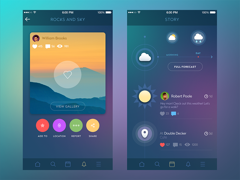
Social Network App
S for stylish, simple
The first feature mentioned for letter S deals with the visual characteristics of the product, meaning its correspondence to a certain style. Among all the numerous definitions of style, we suppose the following one by as the most exact for our topic: style is a comfortable and elegant mode of existence (American Heritage® Dictionary of the English Language, Fifth Edition. Copyright © 2011). Giving your product the style, you make it catchy and support the feeling of harmony mentioned in the previous part of our design alphabet.
The characteristic of being simple, as well as intuitiveness and ease of use, is one more synonym showing that the aim of the most modern product is to help people deal with various issues of everyday life. So, looking for new ways and decisions, it’s important to remember that they should provide simple solutions for the user’s problem, which means hard and sophisticated work for the designer, as it’s well-known that making things simple is the hardest work.
T for trendy
Trendy here shouldn’t make you consider only the looks of the product. As it happened with other features, its real sense lies much deeper. We see the definition of “trendy” as able to follow the most modern trends efficiently combining them with the best classic solutions approved by UI/UX analysis through the times.
![]()
Multimedia Icons Presentation
U for understandable, user-centered, useful, unique
We can see that U-letter is highly diverse in our ABC. And it’s natural, actually, as the most important word of product design – “User” – starts with this letter. So, all the U-features are concentrated basically on the user. To be successful, a product has to be understandable ( feels like a synonym to readable in its wide and metaphoric meaning above) so that the user wasn’t confused with illogical operations or transitions, the absence of the essential elements of the layout or unsuitable color and font choice.
The product has to be user-centered which means that all the solutions, schemes, ideas, and versions should be totally concentrated on deciding the target users‘ problem, and this should be the main concern of the designer from the very start of the process.
The product should be useful, especially if its aim is not to entertain the user, but also to educate, help, provide means of communication, ease any process or keep tracking and control, etc. If the product is useful, it will retain and grow the target audience steadily.
And finally, the product should be unique. As we have mentioned in the article about UX/UI to make your product viral, the flavor of uniqueness can be applied not necessarily to the whole product – it can be a small feature of UX or interesting solution for UI and branding, which will make your product stand out of the crowd and survive in the competition.
V for viable
At the time of the MVP trend, the concept of making the product viable is one more concern for designers, as it can be deeply analyzed in the first stages of design via extended user research and market research. Thinking about the core target audience and solving their problem instead of trying to please all and everyone, the designer is able to build a strong community of loyal users whose further analysis will show the way of adding new features and extending functionality.
W for well-done
As well as quality, this feature doesn’t need much comment. When designers do their best to analyze finding the best solutions and devote part of their soul to the products they create, the users of the product will definitely catch and feel it.
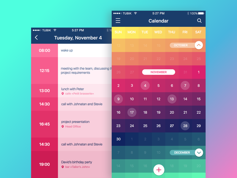
Calendar App
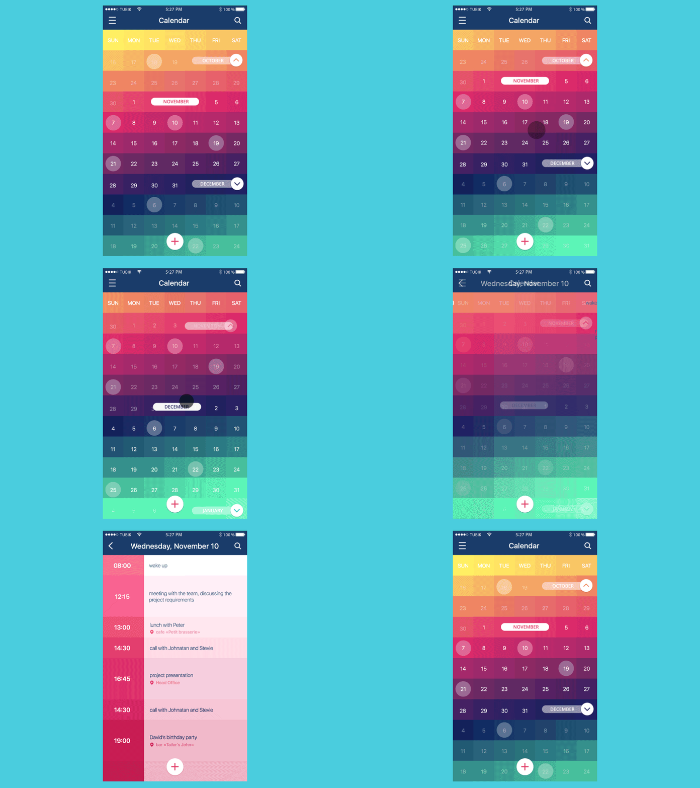
Calendar App Animation
X for xenial
Xenial is actually a characteristic that means being friendly and open. For many products, this is the way to support a strong contract with the user. When your product makes a person feel home, that is the way to success. The only thing to consider here is that home is where your heart is, so it can be anything that makes you interested and comfortable. Vice versa, any kind of tension means that sooner or later, the user will try to find something more comfortable and user-friendly.
Y for yummy
Yummy actually is the total synonym to “delicious,” analyzed in the previous post. Once again, this characteristic reminds how important it is to find the functions satisfying the user’s appetite by means of well-thought-out UX and beautiful efficient UI.
Z for zestful
In one of its definitions, zestful means full of interest or excitement. There is no secret that people are highly curious and inquisitive creatures, so the small element of mystery and intrigue will inevitably add user interest to it as well as a small pinch of spices that makes all the meals much more desired.
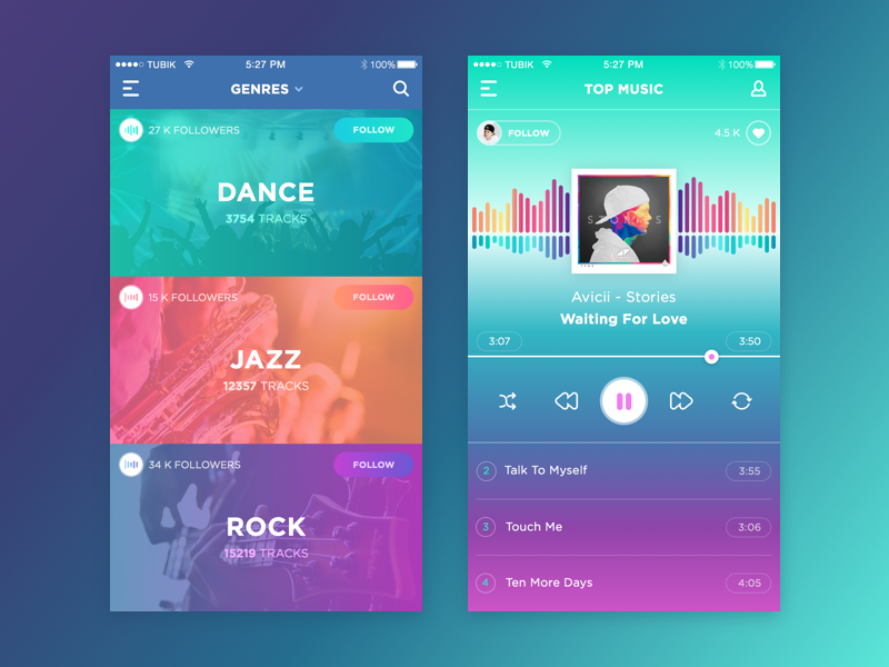
Music App
Well, here is the completed set of our ABC features, and as you can see, there are lots of them hiding behind all the letters of the alphabet. Combining them with the aim and target audience of a project can be helpful in creating a well-done product.
And now it’s time for a bit of entertainment and exercise: let’s apply this ABC to famous and popular products.
Apple: Attractive+Pleasant+Personalized+Logical+Efficient
Google: Global(doubled!)+Original(doubled!)+Logical+Engaging
Facebook: Flexible+Attractive+Comprehensive+Engaging+Bright+Original(doubled!)+Kaleidoscopic
Quora: Quality+User-centered+Original+Readable+Attractive
Microsoft: Multifunctional+Intuitive+Clear+Readable+Original (doubled again!)+Stylish+Flexible+Trendy
Instagram: Intuitive+Natural+Stylish+Attractive (doubled!)+Global+Readable+Meaningful
and finally, we cannot avoid our own studio name
Tubik: Trendy+User-centered+Bright+Intuitive+Kaleidoscopic
Continue our exercise with your own ideas and designs and let the inspiration be with you!
Useful Articles
Here’s the set of articles on more aspects and best practices of user experience design.
Error Screens and Messages: UX Design Practices
Visual Dividers in User Interfaces: Types and Design Tips
Directional Cues in User Interfaces
How to Make User Interface Readable
Basic Types of Buttons in User Interfaces
Negative Space in Design: Practices and Tips


