A sufficient landing page plays a vital role in a successful web marketing campaign. It presents a specific product or service so that the visitor could find the needed information quickly and without distractions. The effective landing page draws potential customers’ attention to an offer and makes them take certain actions contributing to high conversion. To make it work appropriately, it’s important to create a landing page design according to the target audience’s preferences.
But what if the target audience is quite broad and includes different personalities? Today we share a new case study showing the creative stages of a powerful user interface design of a landing page for a collaboration platform. The designer assigned to this case was Ludmila Shevchenko.

Task
Landing page design with custom illustrations for a digital collaboration platform.
Process
The client is a British company Collectively Intelligent Limited from London, the curator of a digital collaboration platform called Colony. The platform enables people all over the world to build companies together online. Communities can coalesce around a project and collaborate together, collectively controlling funds, and sharing in the project’s revenue — all without trusting, or even knowing, the people with whom they are collaborating.
The client made a request for a landing page design that would convey the value of their proposition in a simple and approachable way. Colony is a sophisticated, complex product, so the major task was to help people to understand how it works and what benefits they can get from it. After considering all the aspects, the designer moved to the creative process.
Landing page design
Some may think: if a landing page includes all the possible details about a product, the customers will be more likely to get interested in it. Nevertheless, the major task of an effective landing page is to concentrate users’ attention on the specific offer. It is usually managed via a minimalistic visual presentation that is focused on several UI elements like CTA buttons and application forms.
To create a landing page design with the appropriate central points, the designer has planned the structure of a layout divided into several sections, which would prioritize UI elements. An effective visual hierarchy helps people receive information gradually.
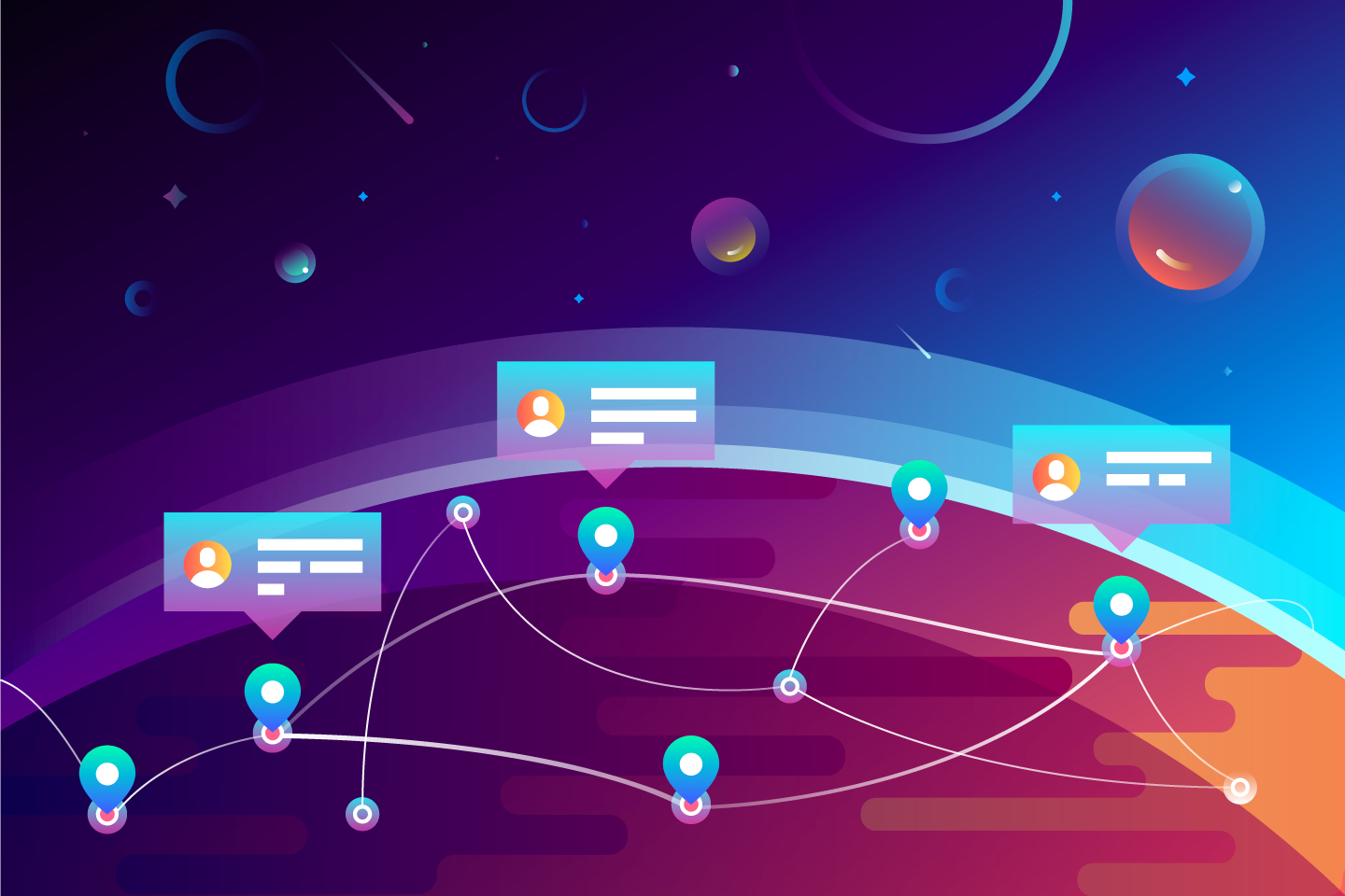
Custom illustrations are often applied in a landing page design as UI components helping users comprehend the idea of a product and its features. So, when the structure of a landing page was chosen, the next task was to find the style for the theme illustrations seen, which would be applied in the hero section. To broaden the number of options, graphic designers, Arthur Avakyan and Denis Boldyriev, were engaged in the brainstorming and creative search. The designers experimented with the theme for illustration to show — the Earth with users who collaborate or the heroes in space accomplishing the super space missions. Here are the results.
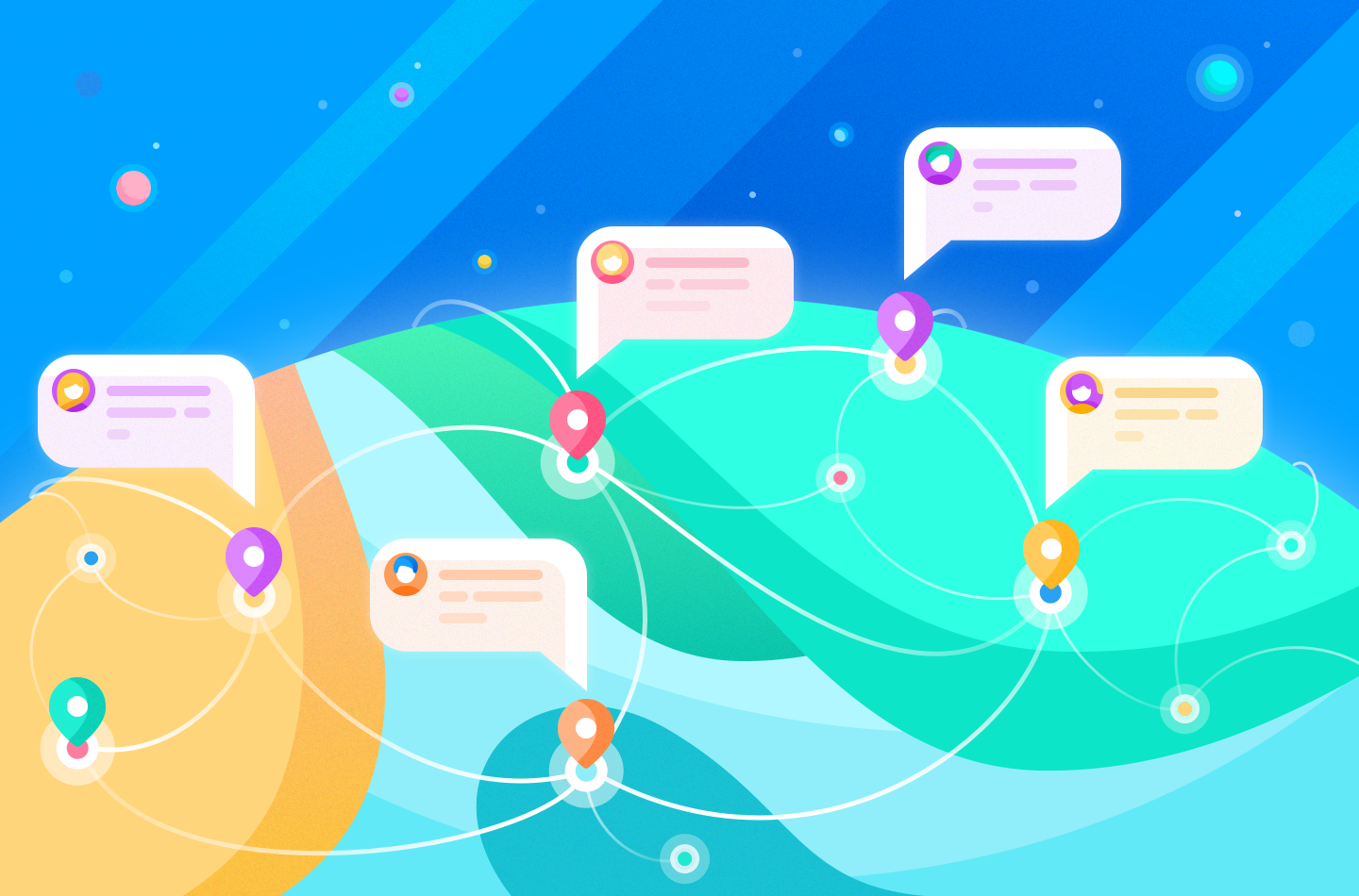
Style offered by Ludmila Shevchenko
Style offered by Arthur Avakyan

Style offered by Denys Boldyriev
The designers showed illustrations in different styles and color schemes so that the user interface design combined friendly, approachable and consumer solutions, also transferring the feel of a thoroughly competent product from a company that only accepts excellence. The illustrations were focused on the objective of showing how Colony helps people around the world to communicate and successfully collaborate.
The client has chosen the direction applying the light background and smooth lines as it looked closer to the business style. Considering the chosen direction, Ludmila created variants of illustrations that would suit the user interface elements of a landing page.
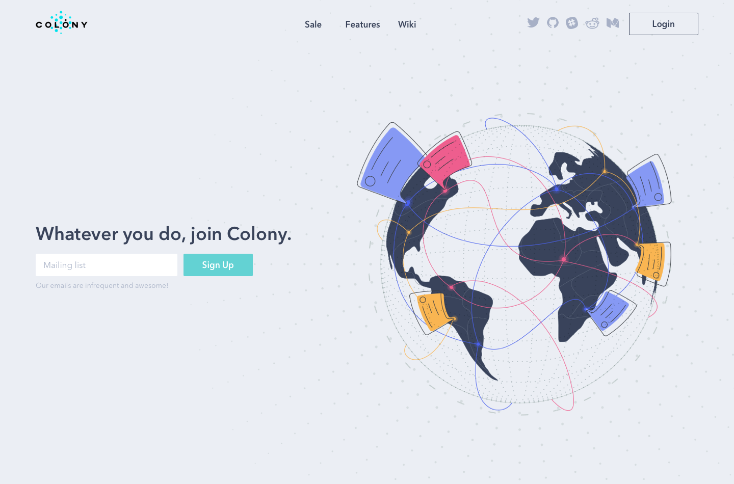
Worldwide connection
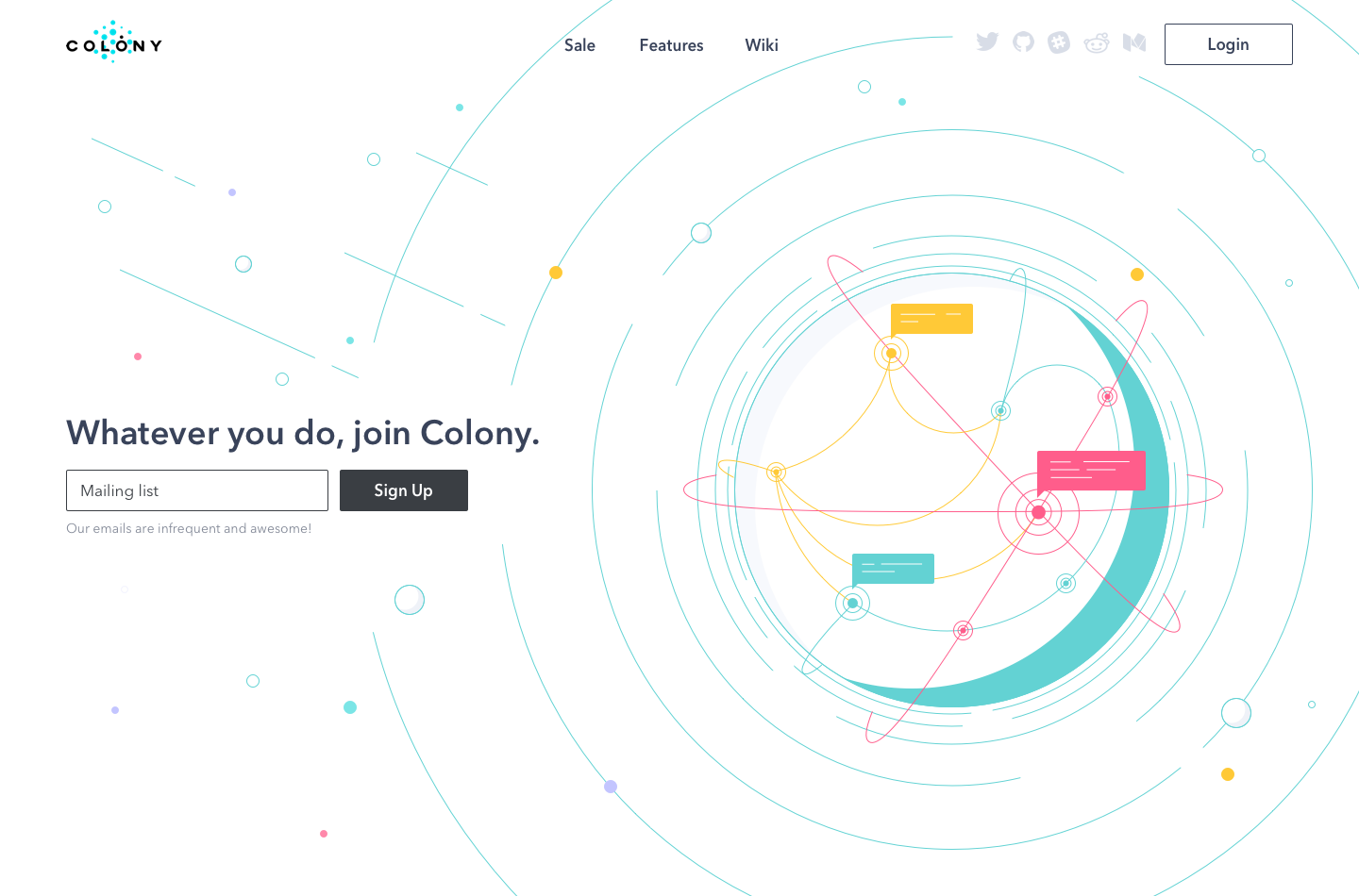
Connect the Earth
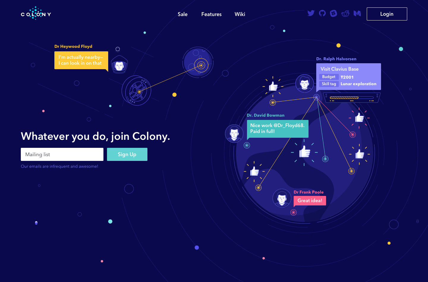
Space mission
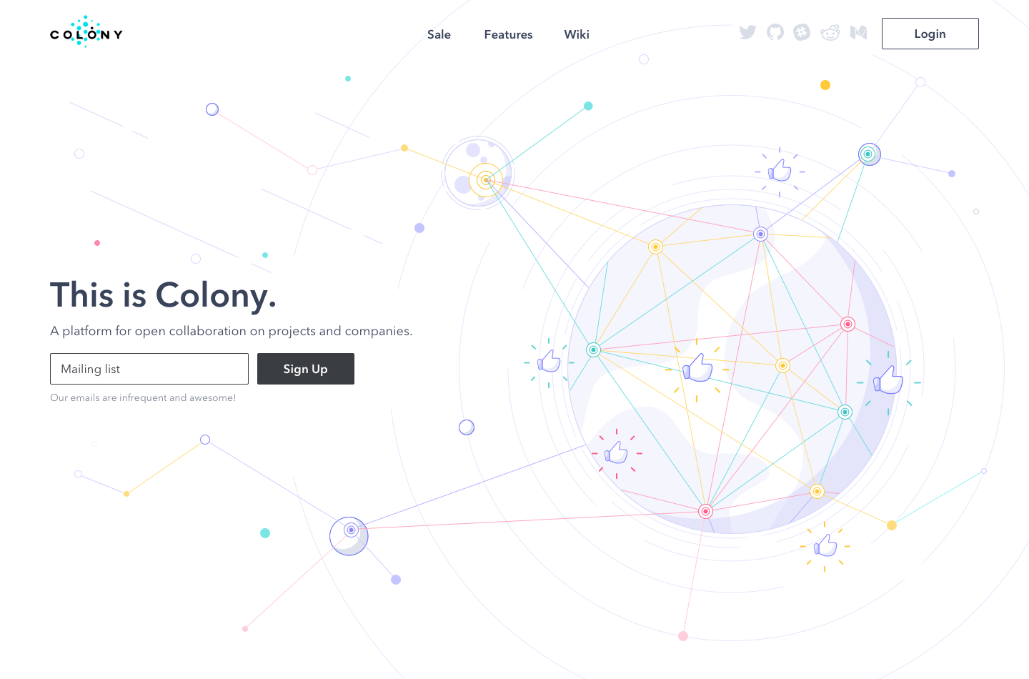
Universal connection
When the illustrations were presented to the clients, they asked to combine the visual presentation of the fourth variant with the idea of user illustrations, as in the third picture shown above.
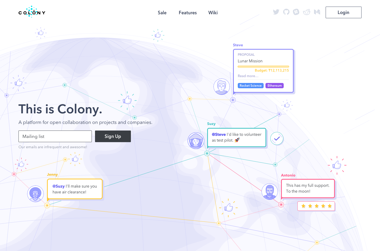
After all the changes were made, we received the final version. UI elements are combined in harmony with the theme illustrations, which show the Earth with users who collaborate at a significant distance. The color palette includes several bright colors — the periwinkle color is used as the major one with pink, yellow, turquoise, and violet accents.
Features illustrations
The next task was to create custom illustrations for features presentation. To make a holistic landing page design, the features were illustrated in the same style and color palette. The major aim was to present the features in a simple and clear form so that users could quickly comprehend the essence of this product. Also, the illustrations were planned to be followed by microcopy revealing the basic description of the features within one sentence. That’s why the designer worked on the typography, which would have suited the graphics and UI as a whole. Let’s see the results.
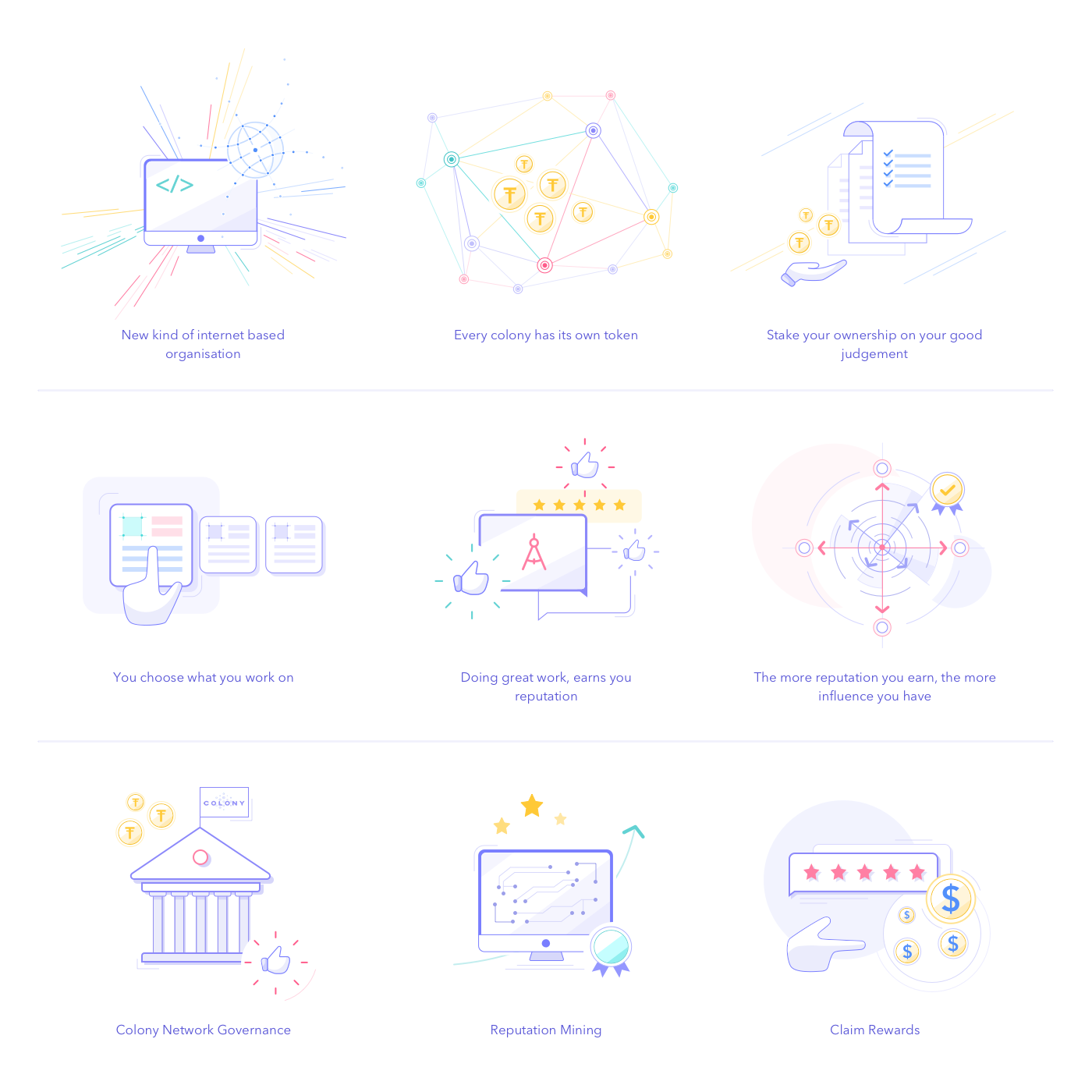
As you can see, all illustrations have a lot of white space and subtle elements reflecting the sophisticated principle of the company. Thanks to the colors used in graphics, the interface looks friendly and appealing. Typography components work in harmony with the graphics and other UI elements.
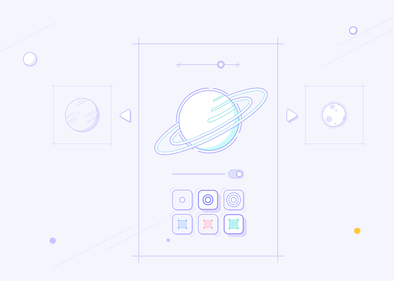
To make a consistent interface, the designer also created illustrations for a product story — a brief description of what it is and why people need it. The story is a good way to catch the attention of potential customers, and the beautiful custom graphics increase the chances of a pleasant impression from it. Here are the illustrations created for this aim.

Token sale page
Colony is a kind of unique network with its own rules and money. Every colony has its own token. To distribute ownership, users earn tokens by doing work. The more tokens they hold, the more of the colony they own. Tokens let staking your ownership on your good judgment when proposing tasks or claiming someone should be paid.
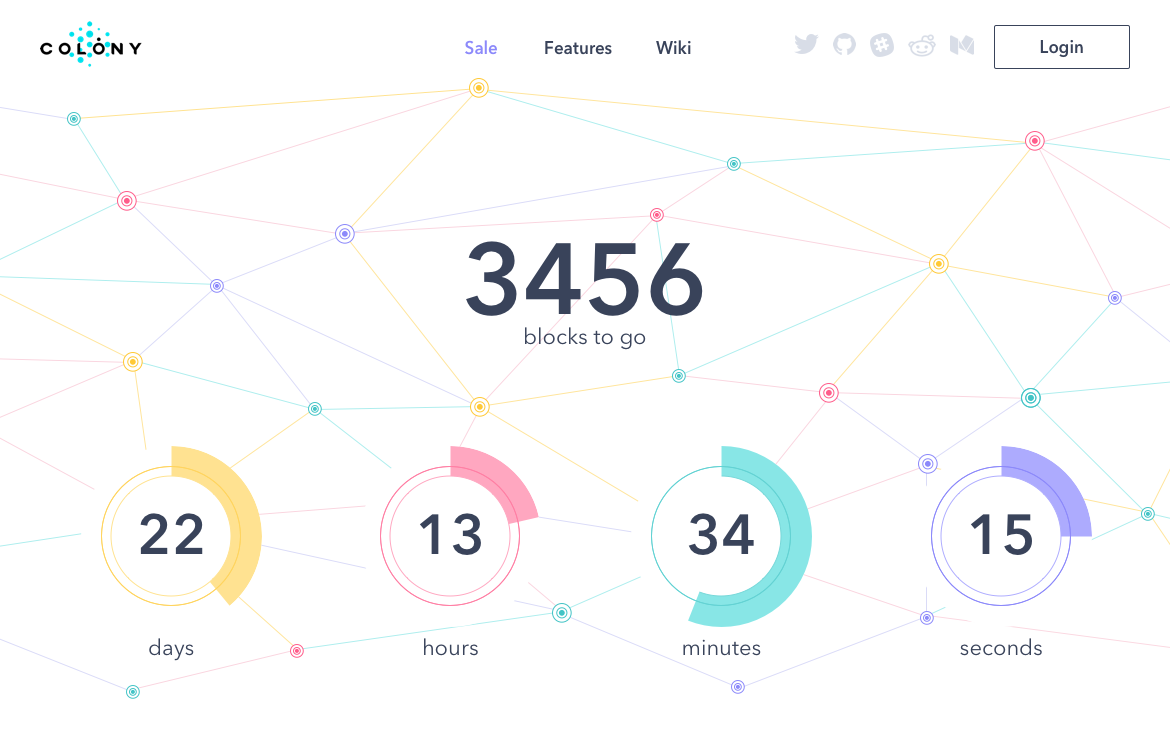
To catch people’s interest and inform them about the beginning of the token sale, the client wanted to create a page showing countdown to the special date. The designer applied the same style and colors as in the landing page design to increase brand recognition. The countdown showed days, hours, minutes, and seconds which were presented in colorful circles. Here is the final version of the sale page design.
The presentation of a new unique product can become a challenge for designers. It’s important to catch people’s attention and show all the facets of the product. The powerful landing page design helps to gain visibility and gather a user base even before the product launch as well as tell a story that would interest potential customers.
Recommended Reading
If you are interested to see more practical case studies with creative flows for UI/UX design, here is the set of them.
Watering Tracker. UI Design for Home Needs
UI Experiments: Options for Recipe Cards in a Food App
Home Budget App. UI for Finance
Night in Berlin. UI for Event App
Big City Guide. Landing Page Design
Vinny’s Bakery. UI Design for E-Commerce
Upper App. UI Design for To-Do List
Health Care App. UI for Doctors
Wedding Planner. UI Design Concept


